Обзор лучших ресурсов по разработке бренда, разработке упаковки
contact us | ok@ohmycode.ru
contact us | ok@ohmycode.ru
Established in 2016, Multiply is the UK’s first FCA-approved, automated financial advisory app aimed at people who want to handle their money better but don’t have the extra money to spend on a financial planner. The AI-based app provides impartial advice and recommends the financial products one needs, from savings accounts to pensions, insurance to investments, and more, based on each person’s finances. Toward the end of last year, Multiply introduced a new identity designed by London, UK-based Ragged Edge.
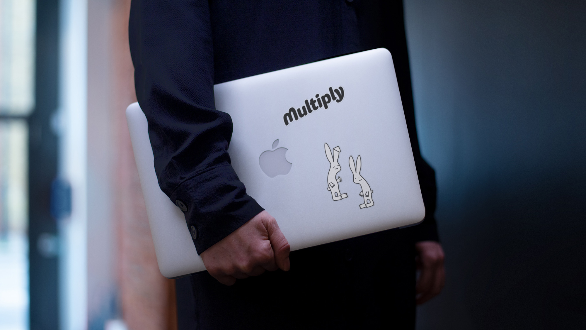
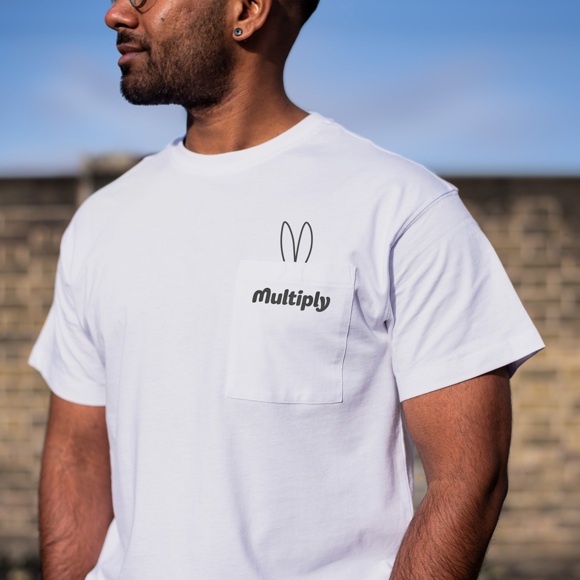
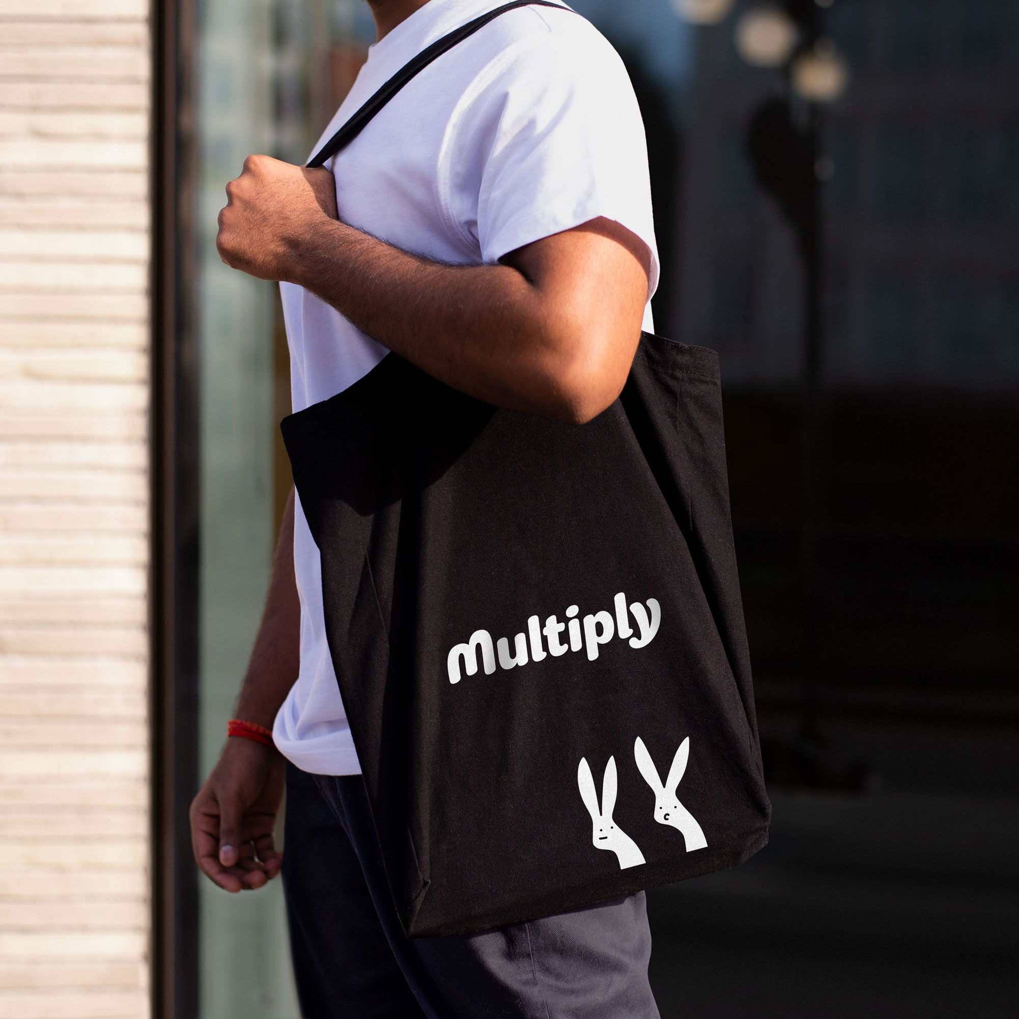
Rabbits. Multiply. When you see it, you get it. The visual identity is all about that confidence. And the tongue-in-cheek tone of voice demands to be heard. In a category of look-a-likes and sound-a-likes, it all comes together in a stupidly simple but surprisingly deep brand. A brand that can both educate and motivate.
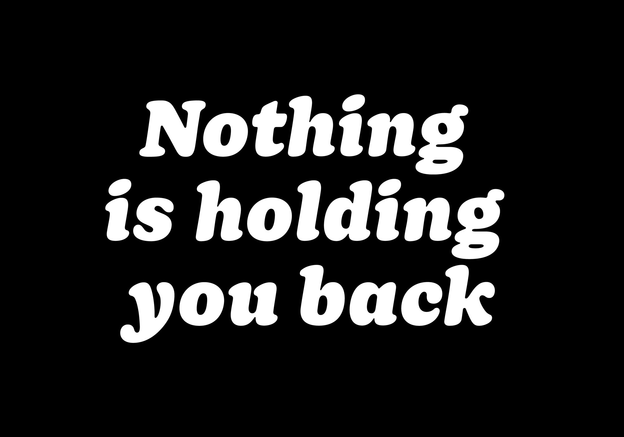
The old logo (sorry for the small, blurry image) was decent in terms of execution and type choice but the multiply symbol replacing the tittle of the “i” made it look like you got an answer wrong and it was x’d out, which is not something you want in financial planning. The new logo, at first glance, is a charming, friendly, bubbly, wordmark that looks fun and inviting — the opposite of what one might think about when thinking about financial planning. At second glance, once you’ve seen the rabbits, the initial “M” of the logo reveals a pair of rabbit ears in the negative space and then it becomes even better. The wordmark (and the identity) uses Sharp Type’s Doyle Black Italic, which is a contemporary take on my personal favorite, Cooper Black, which is a typeface so prevalent that I think it engenders a lot of familiarity, making a finance AI app a little less scary and cold.
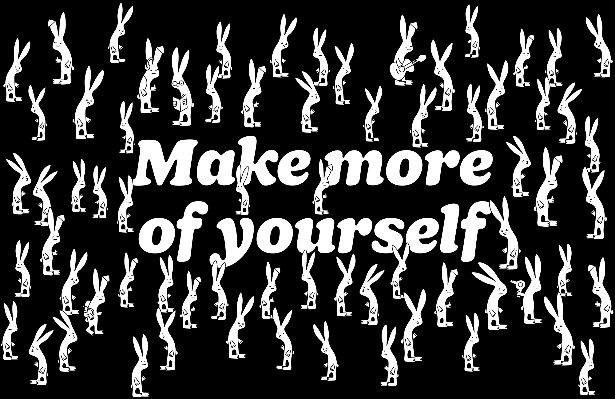
The rabbits are fantastic both in concept and execution. The former might seem like an obvious choice — rabbits multiply, duh — but it’s also the kind of concept that most people would laugh off in a brainstorming session as too silly or obvious and disregard it, which makes them all the more enjoyable. Their execution is just right too, they are not childish or overly cartoony and instead have a certain The Far Side aesthetic and personality to them that’s quite refreshing at a time when brand illustrations are in dire need of something memorable and original, which I feel like these are.
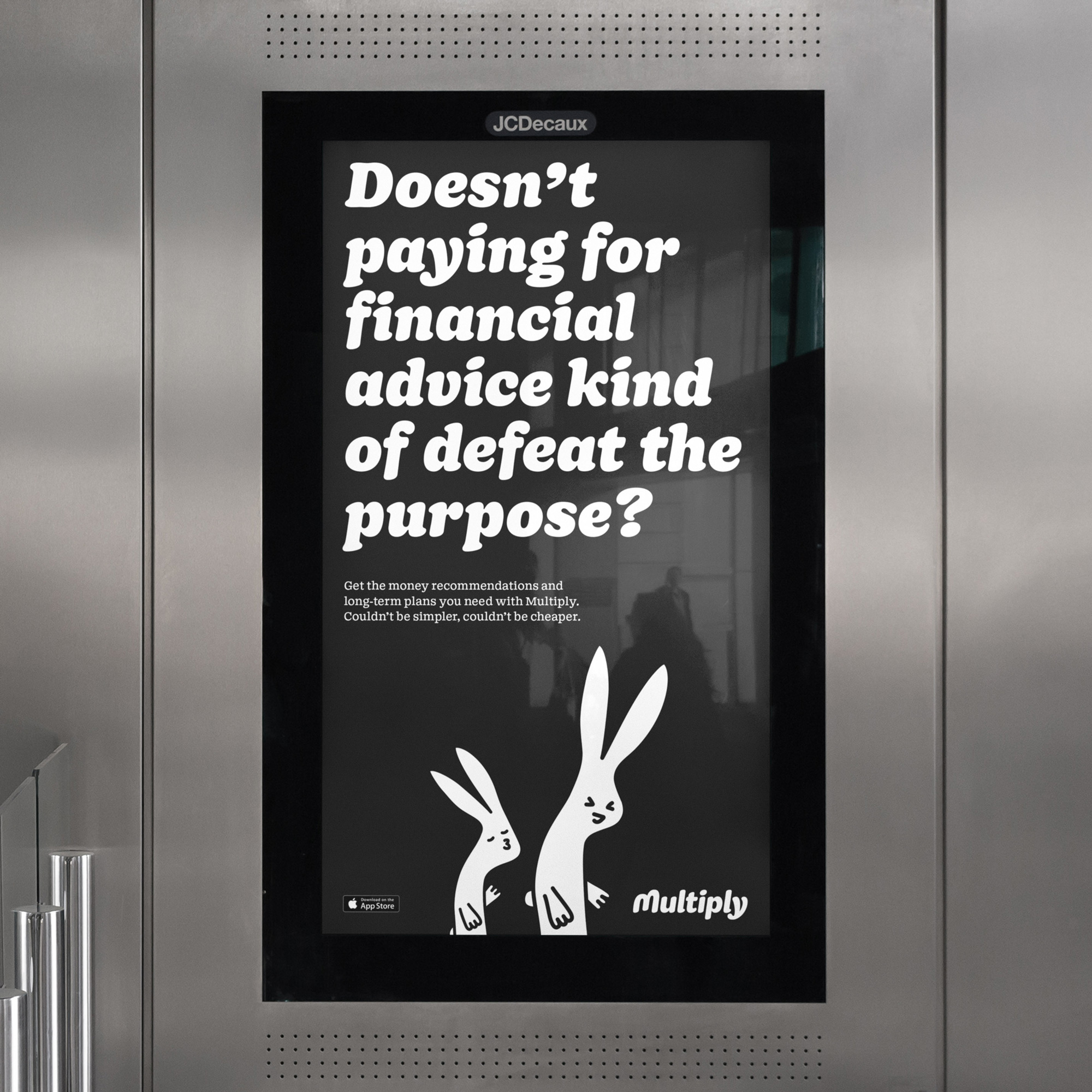
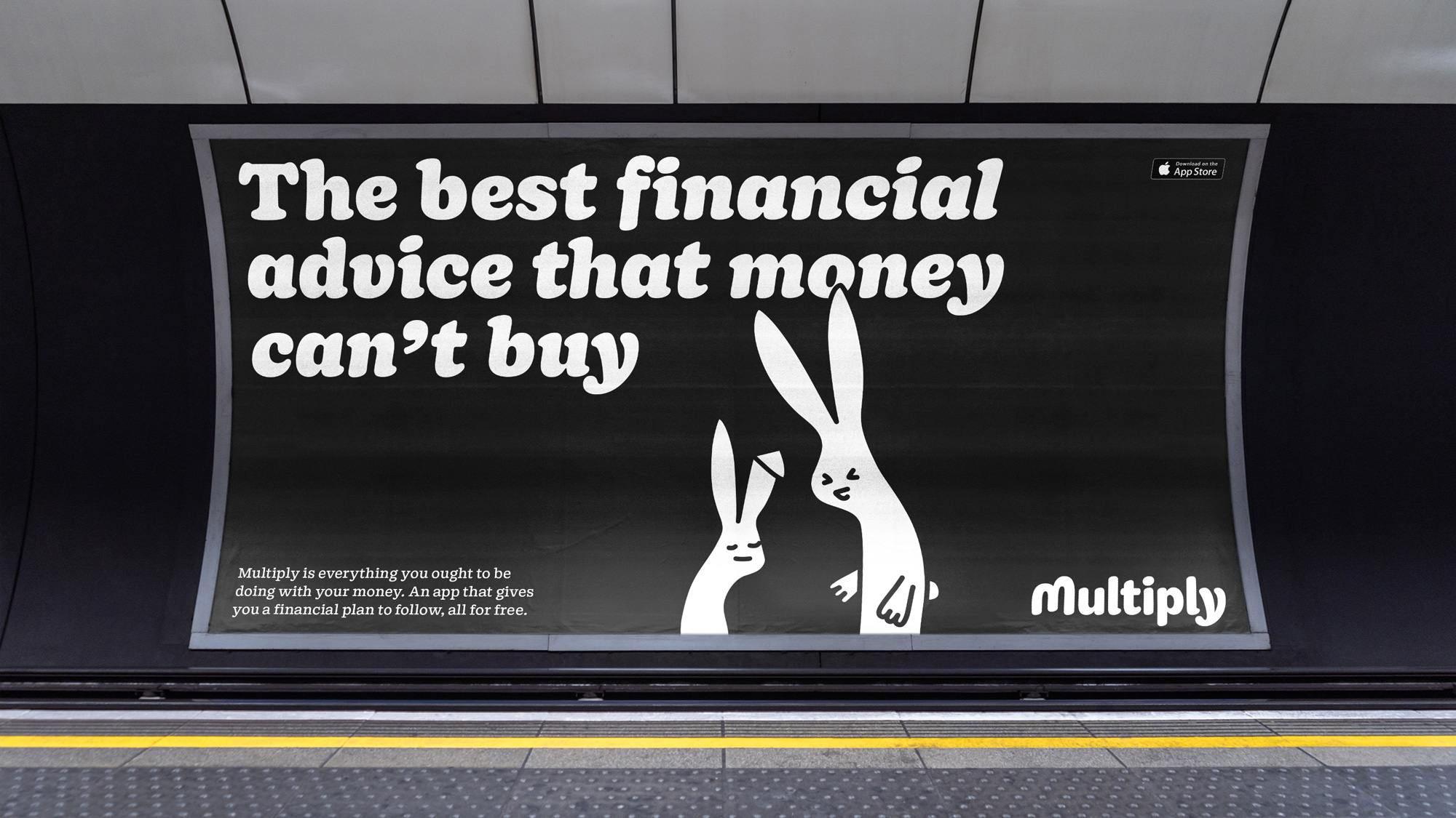
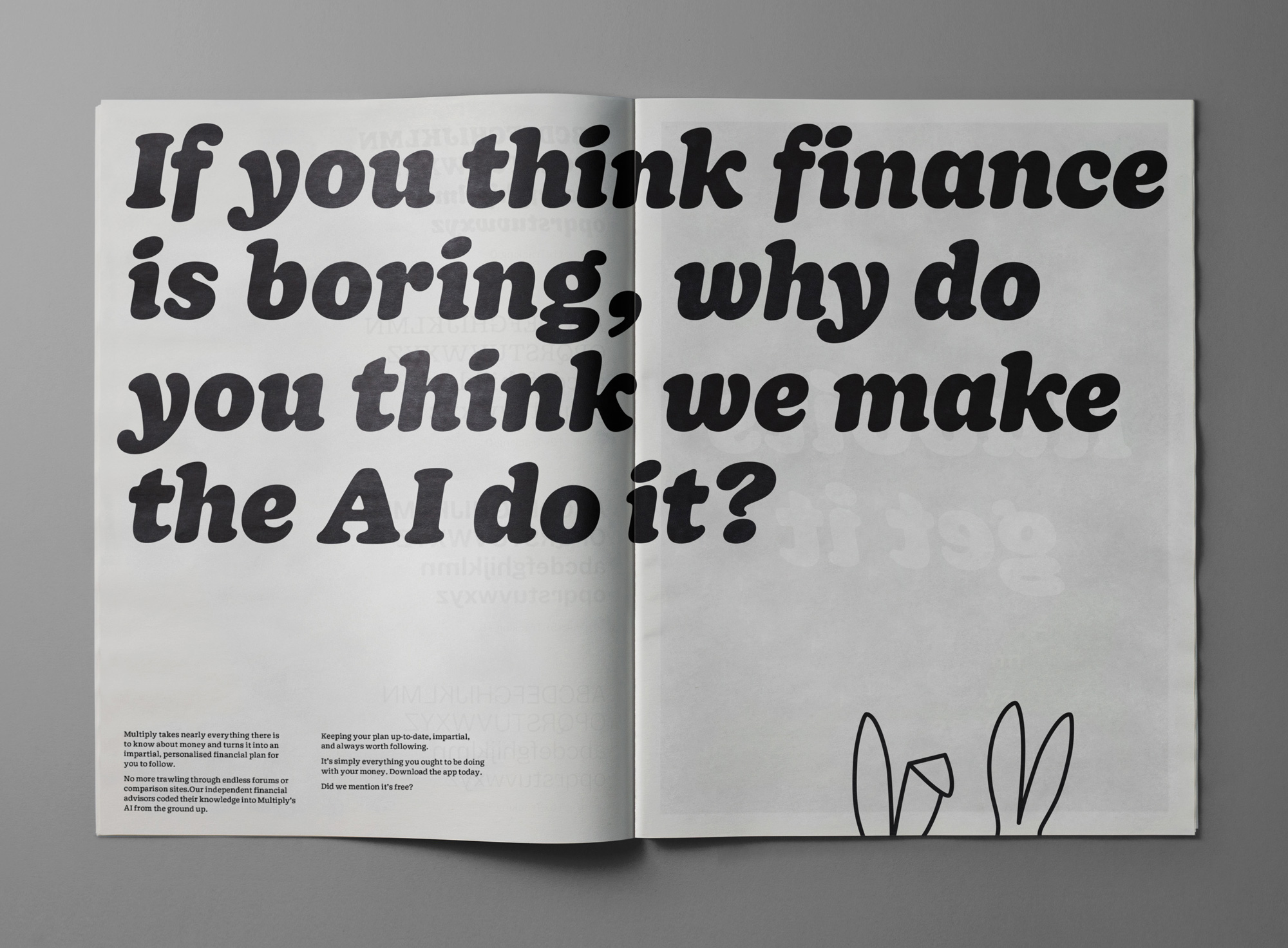
As mentioned, I am a huge fan of Cooper Black and I had totally forgotten about the existence of Sharp Type’s Doyle so this identity brings a big, fat, ball-terminal-y smile to my face. I mean, look at the size of those apostrophes. The deadpan layouts with the big type and in all black-and-white is a perfect delivery for the silly typeface and along with the financial copywriting paired with the rabbits, the messages are sure to land.
Overall, a pretty great evolution that takes the brand just far enough before it’s too silly or untrustworthy and is able to change the preconception of what a finance AI app can look and sound like, all while delivering an enjoyable visual and verbal language.
 each year since publication began in 2006

 Новости Союза дизайнеров
Все о дизайне в Санкт-Петербурге.
Новости Союза дизайнеров
Все о дизайне в Санкт-Петербурге.