Обзор лучших ресурсов по разработке бренда, разработке упаковки
contact us | ok@ohmycode.ru
contact us | ok@ohmycode.ru
Established in 1869, Heinz is an American food processing company headquartered in Pittsburgh, PA, where it was founded by Henry J. Heinz 151 years ago when he first started selling horseradish, pickles, and vinegar. Today, Heinz manufactures thousands of food products in plants on six continents and markets these products in more than 200 countries and territories. In 2015, Kraft and Heinz merged to form The Kraft Heinz Company, the third-largest food and beverage company in North America and the fifth-largest food and beverage company in the world. Earlier this year, Heinz introduced a new master brand designed by Jones Knowles Ritchie.
(Yes, I’m aware we’ve had a lot of Jones Knowles Ritchie-ness this month with Popeyes last week and Foot Locker yesterday. For the record, they are not being given any kind of preference or priority, it’s just how the brand rollouts and case study publications have synched.)
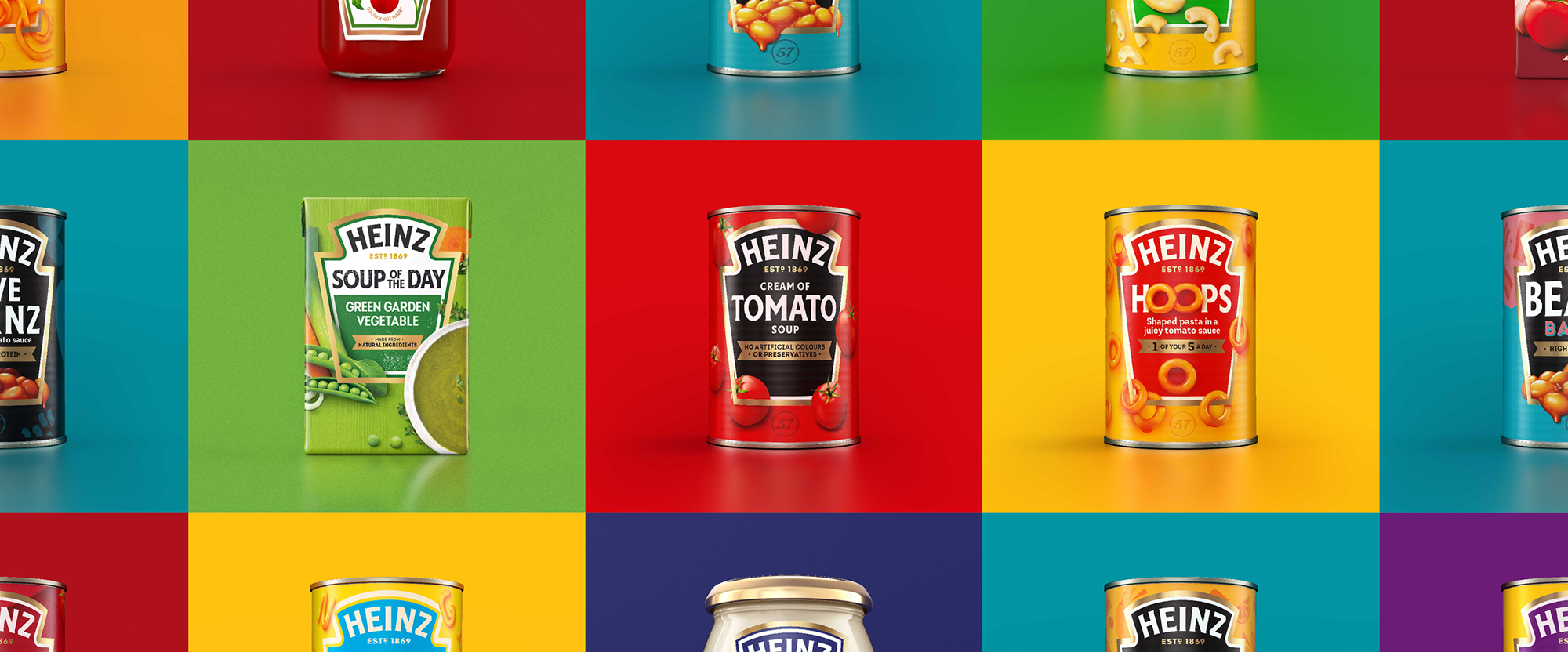
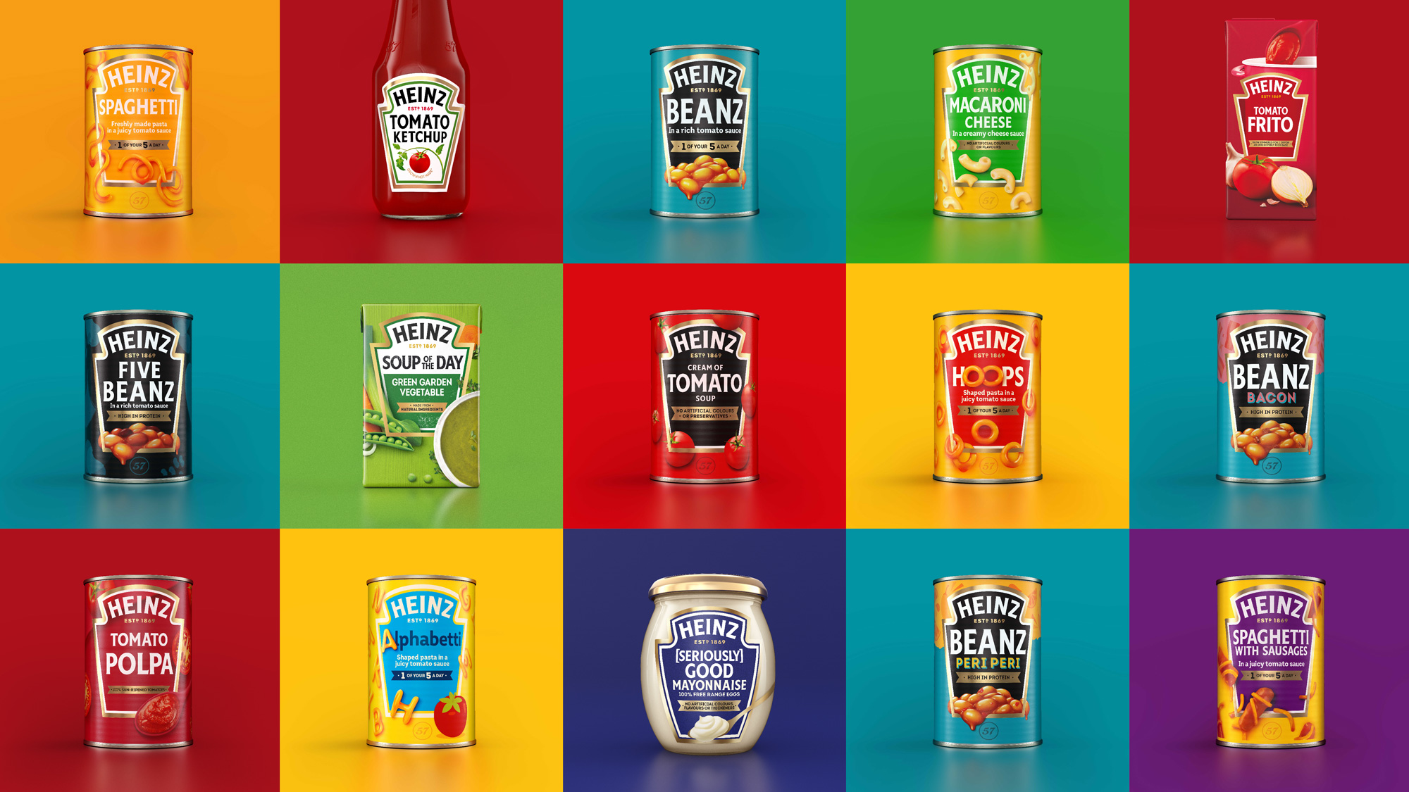
The new cohesive brand identity unites Heinz’s expansive portfolio across over 20 product categories globally and features refreshments to the logo, visual identity, brand strategy, packaging, tone of voice and brand experience touchpoints. Since the redesign began to hit shelves in the UK earlier this year, Heinz has reached over 32 million customers and seen an 11% average lift in year on year sales volume.
When I first received the project I was having a hard time framing my thoughts around it because everything made sense and looked very attractive as presented but I was missing a point of comparison to get a better sense of how much real improvement was happening here. So I used the very pretty image above to cobble together some “before” examples to help me (and you). As a disclaimer, these may not be the 100% correct before images or they may differ from what’s available in your market but I limited the image search to images from the last year so it should be fairly representative of what existed before and, yup, it was all over the place.
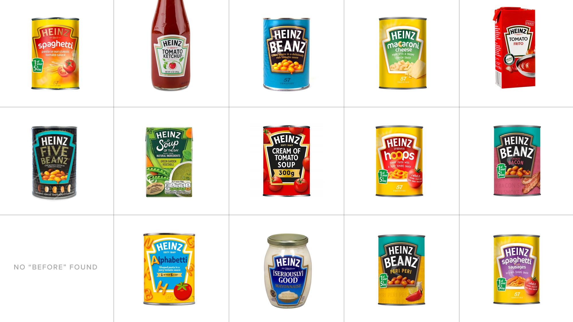
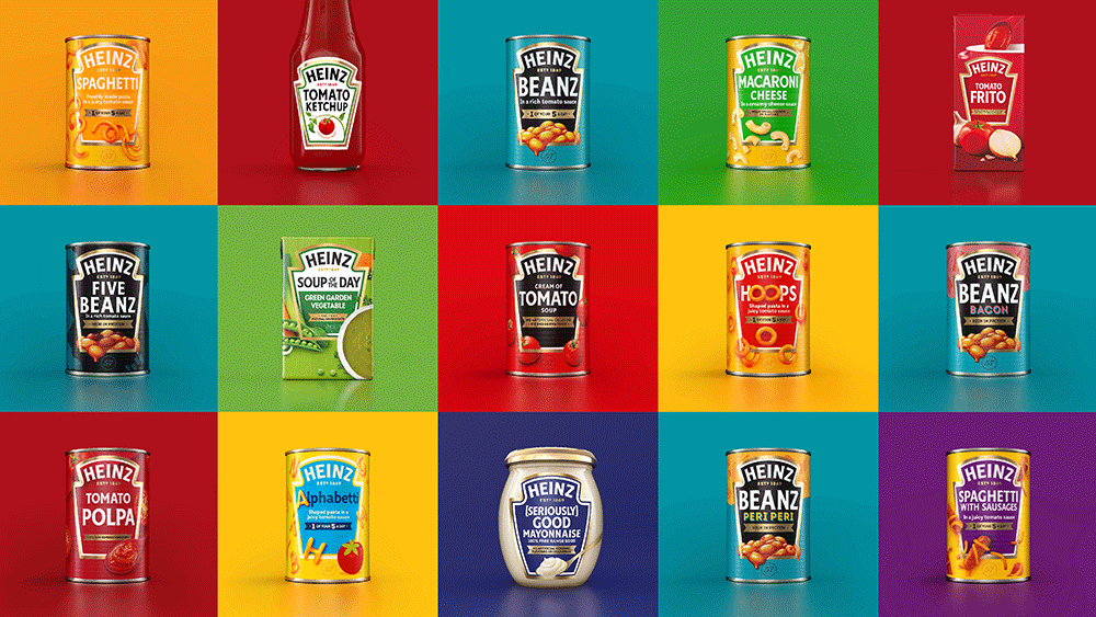
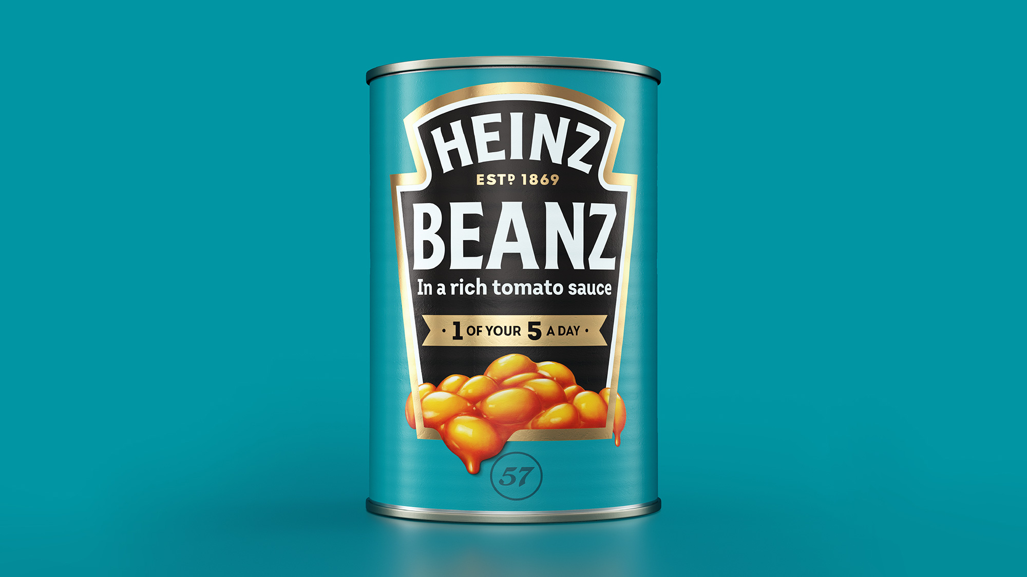
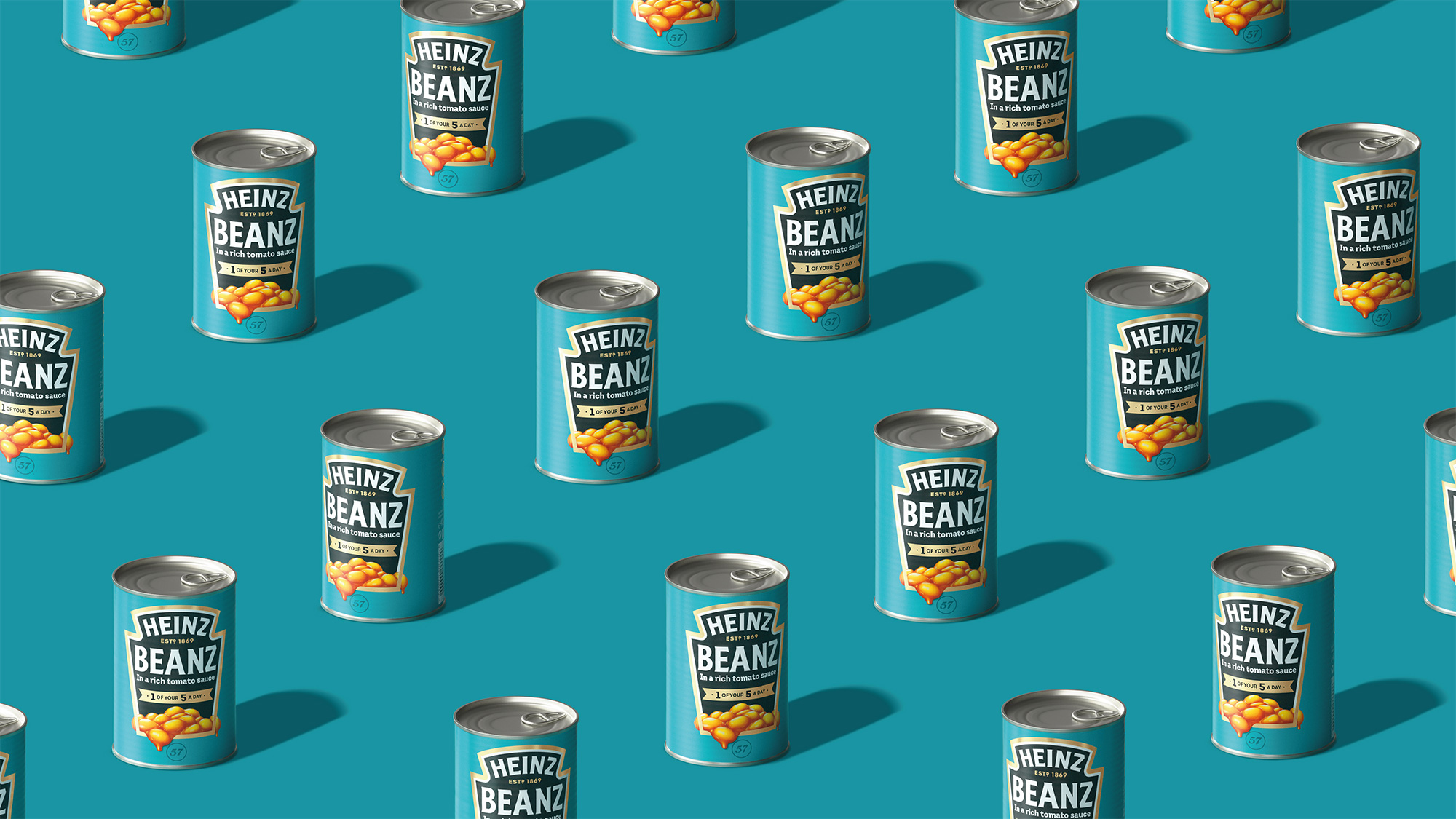
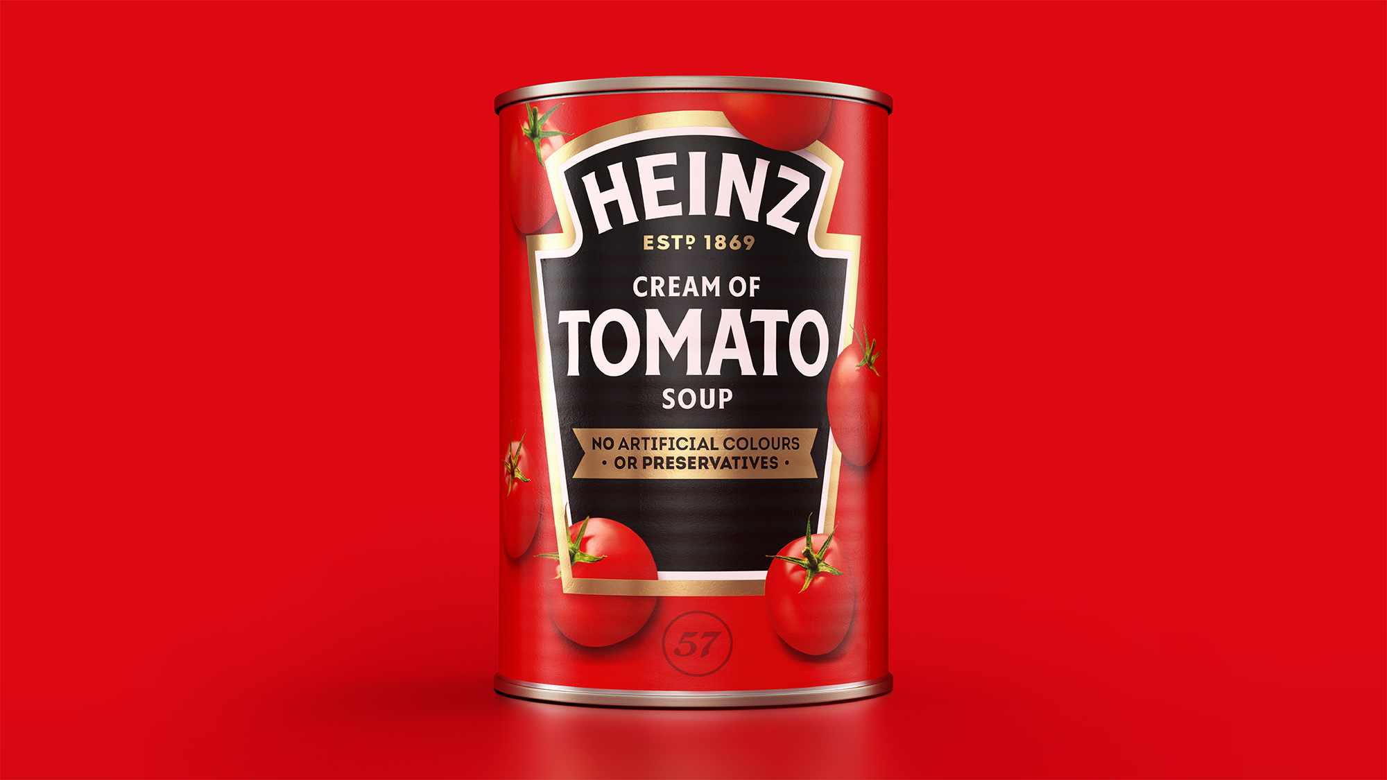
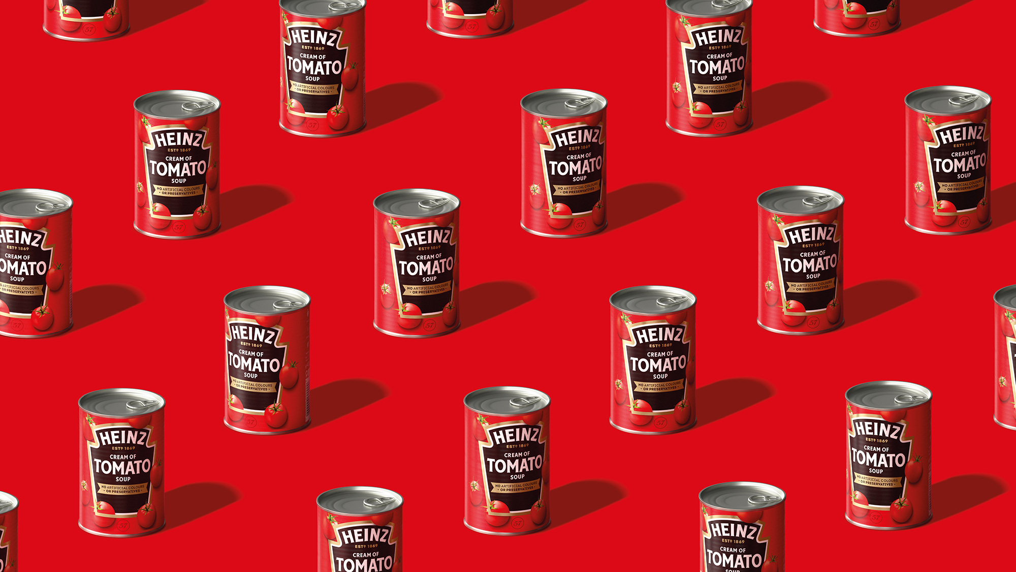
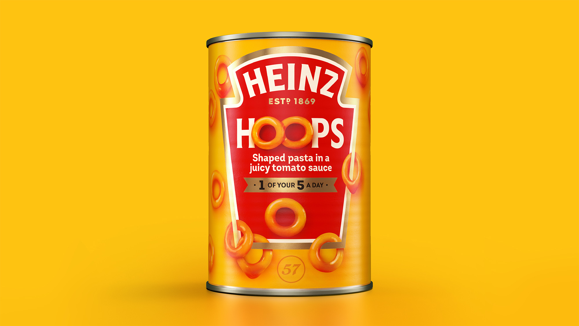
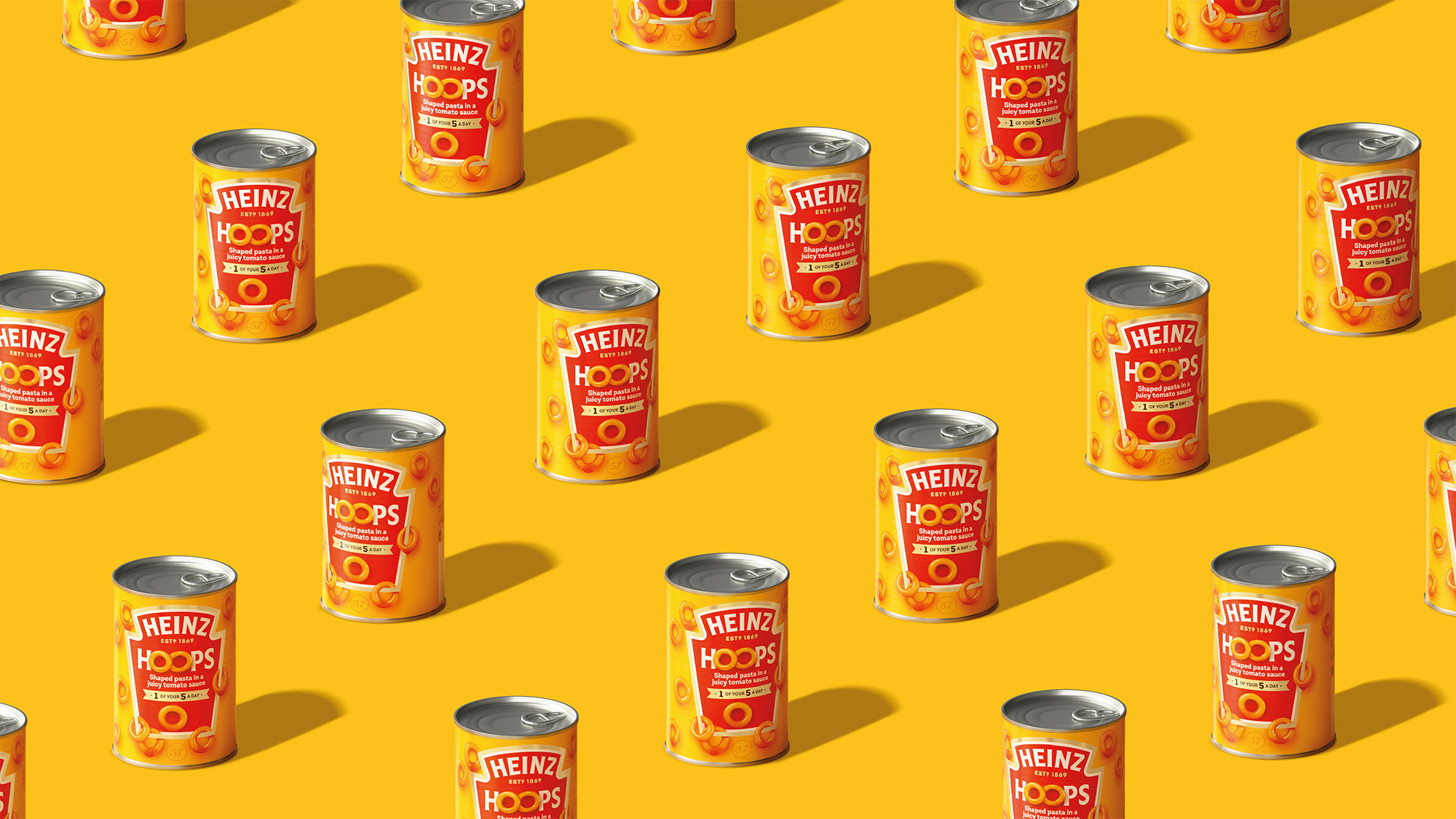
The premise of the packaging hasn’t really changed from the previous versions: whatever the container is, the iconic keystone shape is placed front and center (and large) with product photography and descriptions in it. There are a few significant improvements: There is now only two strokes to the keystone graphic, whereas before it could be three, it could be four, or it could be an inline treatment — the ketchup bottle seems to get a pass, as it still has four strokes. There is no more curved typography other than the Heinz logo, which now allows it to stand out more instead of blending in with all the other type-on-a-curve treatments. There is now a limit on typefaces used with only a few examples using anything other than the brand typeface, Label Sans. This instantly creates not just more consistency but elegant consistency, which is not something we often associated with Heinz products. Finally, the obligatory depictions of the ingredients and/or product on the packaging seem to have a more realistic illustrative style. Overall, the new packaging system looks infinitely better while retaining everything that is recognizable about Heinz.
“We know that iconic, distinctive assets are key to enhancing the effectiveness of your brand through all channels - whether that be paid, earned or owned. Working with JKR, we have created a cohesive set of assets that will help align the Heinz brand across all markets, uniting everyone behind the brand purpose to help deliver growth long-term” said Victoria Sjardin, Vice President of Marketing for the International Zone at Kraft Heinz.
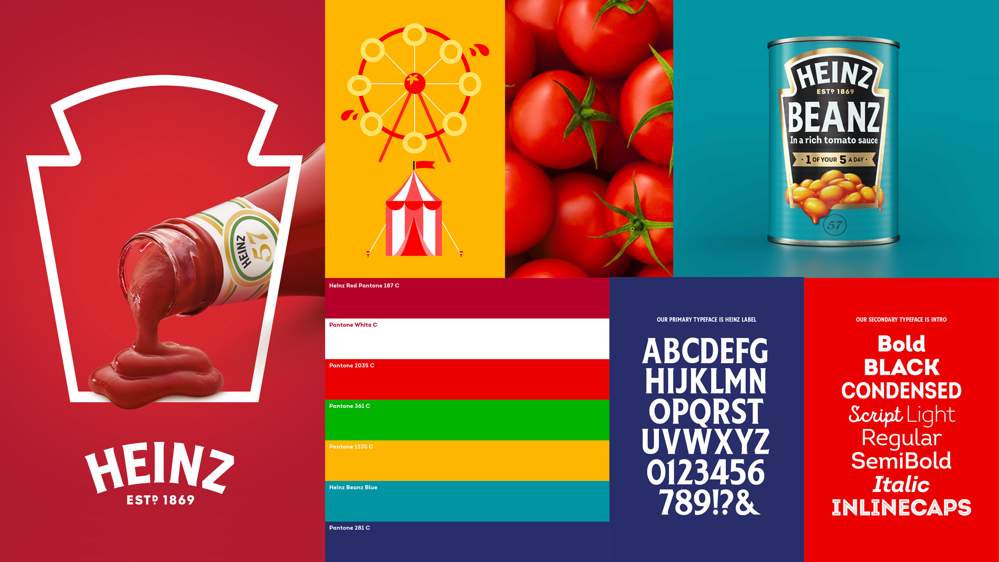
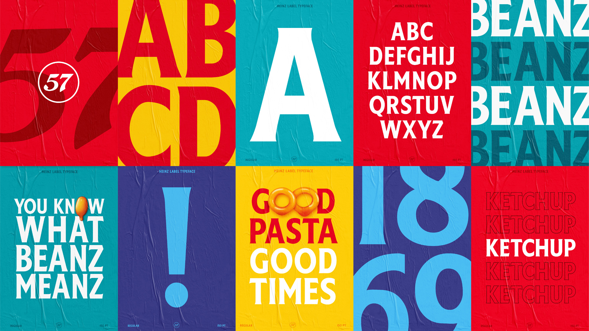
Part of what makes the new master brand work so well is the custom typeface that builds on the flared sans serif logo (below) to give Heinz a consistent and cohesive typographic visual language that is Heinz-ish from beginning to end. Also, condensed flared sans serifs are not all the rage right now so this helps set them apart quite easily. The identity is complemented by Fontfabric’s Intro, which comes in a variety of styles including script and inline, all of which are very happy and bouncy.
“Heinz is a brand for everyone, loved by everyone. You can find it in Michelin-starred restaurants through to roadside cafes around the world,” said Jonny Spindler, Managing Director at JKR. “With that in mind, we wanted to create brand unification across categories, geographies and brand experience touch points so that no matter how or where you experience Heinz, you’re able to celebrate its simple greatness.”
“Our primary ambitions were to distinctively connect each element of the brand’s design ecosystem and to utilise iconic assets, like the Heinz keystone, in new and interesting ways,” said Spindler.
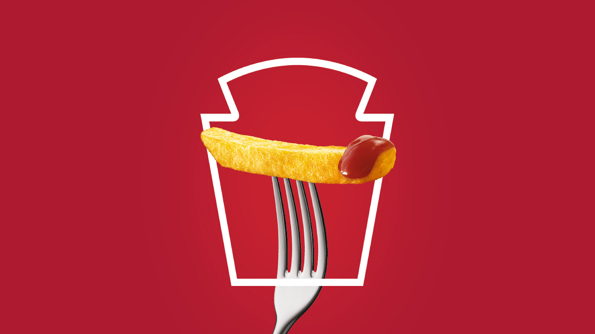
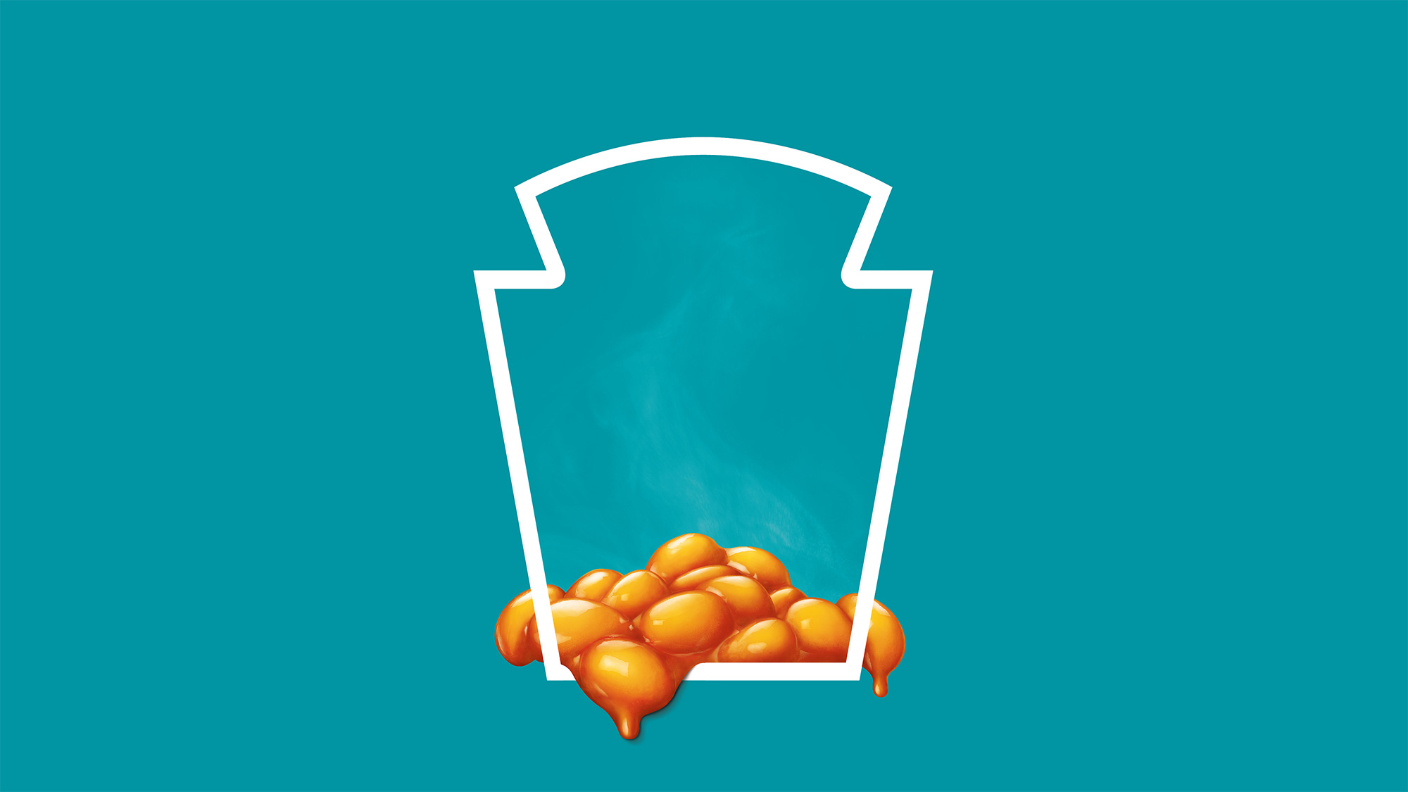

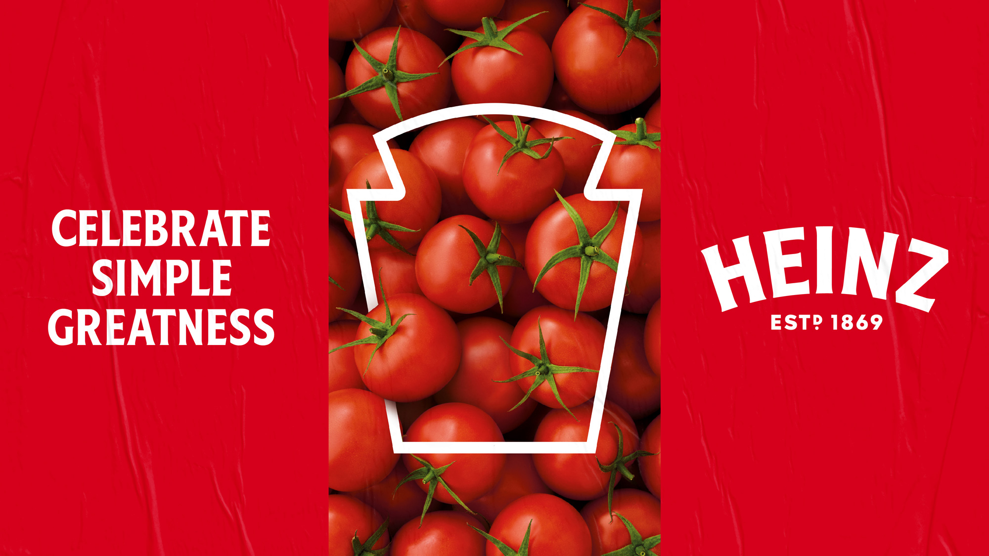
Using the keystone graphic in these more “abstract”, minimalist compositions is a great way of building even more equity into this iconic shape and establishing an instant connection between it and staples like ketchup, mayo, and beans Beanz.
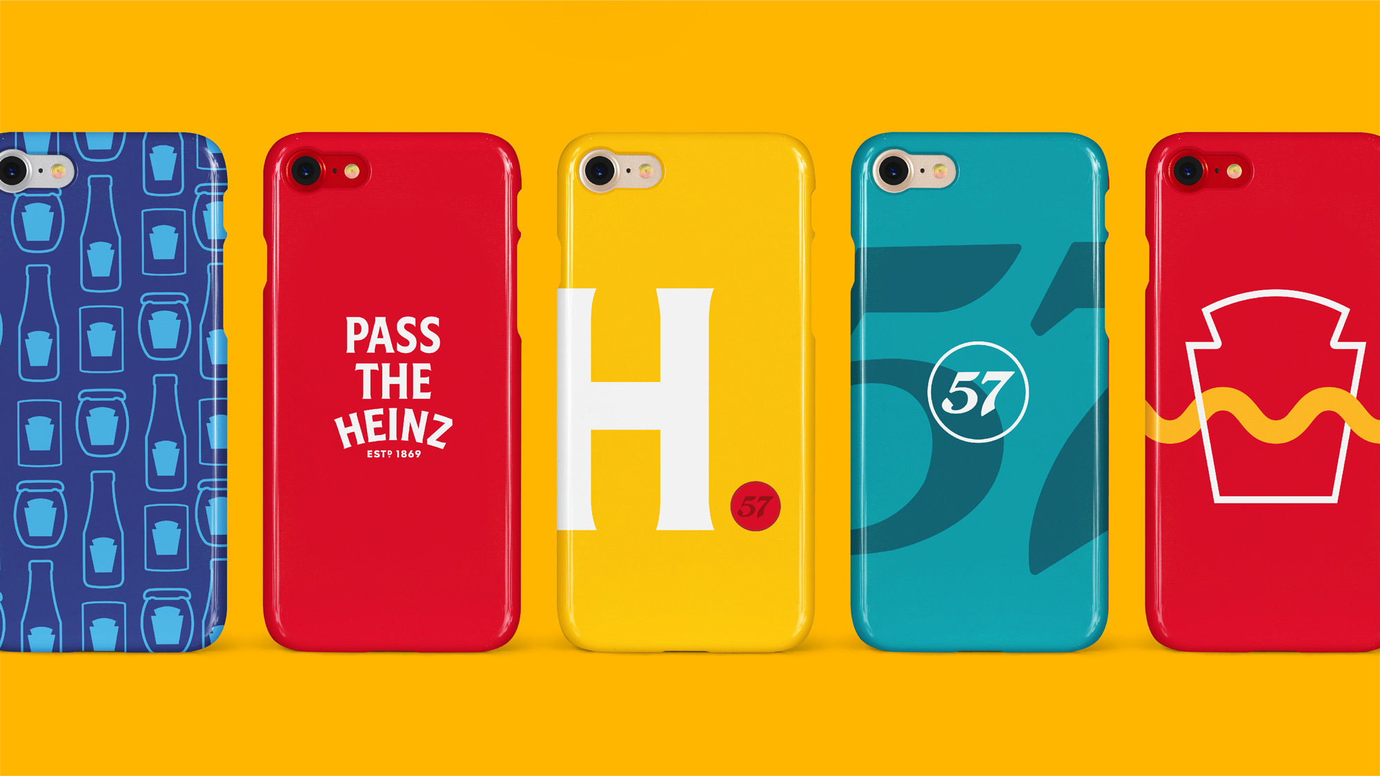

Overall, this is a really great evolution that integrates the existing iconography of Heinz as a more purposeful set of ingredients that come together in a more sophisticated way but without becoming too fancy or trying to be anything it’s not. I can also see this leading the way to a slew of covetable brand merch a la KFC or Dunkin’, which not all brands can pull off.
 each year since publication began in 2006

 Новости Союза дизайнеров
Все о дизайне в Санкт-Петербурге.
Новости Союза дизайнеров
Все о дизайне в Санкт-Петербурге.