contact us | ok@ohmycode.ru
contact us | ok@ohmycode.ru
Established in 2000, Stefanie Nelson Dancegroup (SND) is a contemporary performance ensemble based in New York, NY. Founded by artistic director Stefanie Nelson — whose choreographic work has been described as “instinctual, untamed, and edgy” — the group produces original work in partnership with performers, visual artists, and composers, presenting their work nationally and internationally. Late last year, SND introduced a new identity designed by New York-based Gretel.
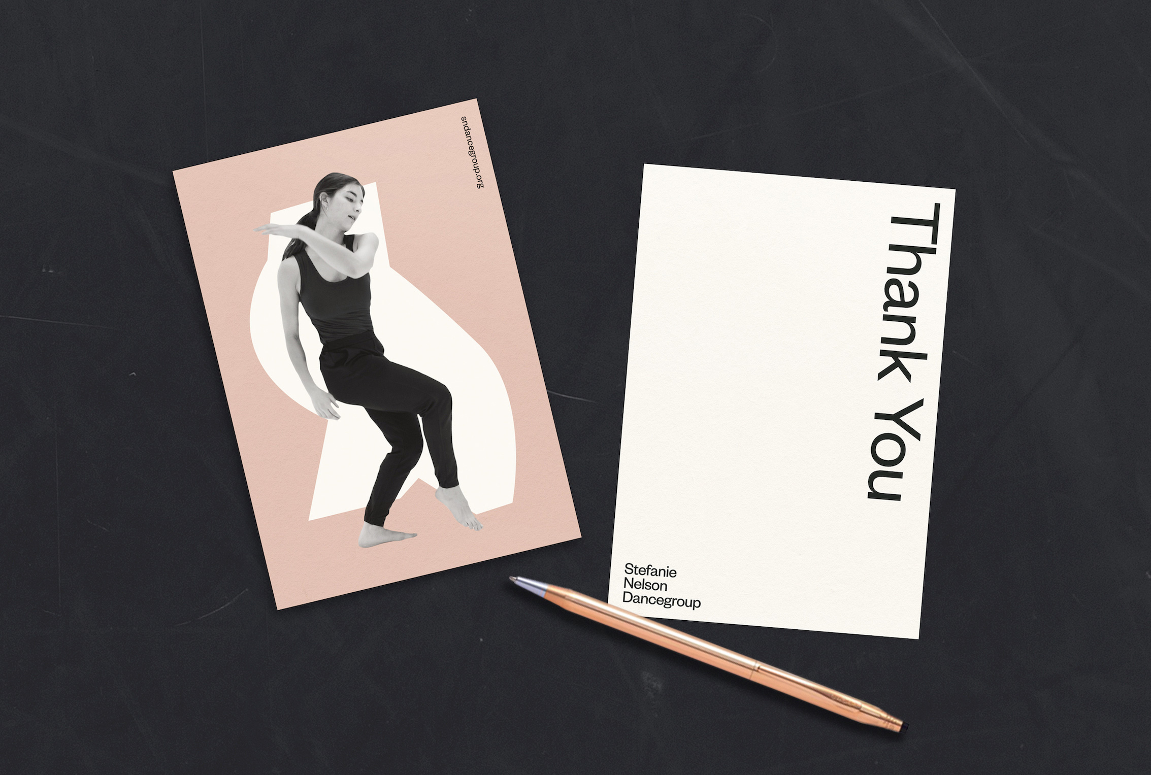
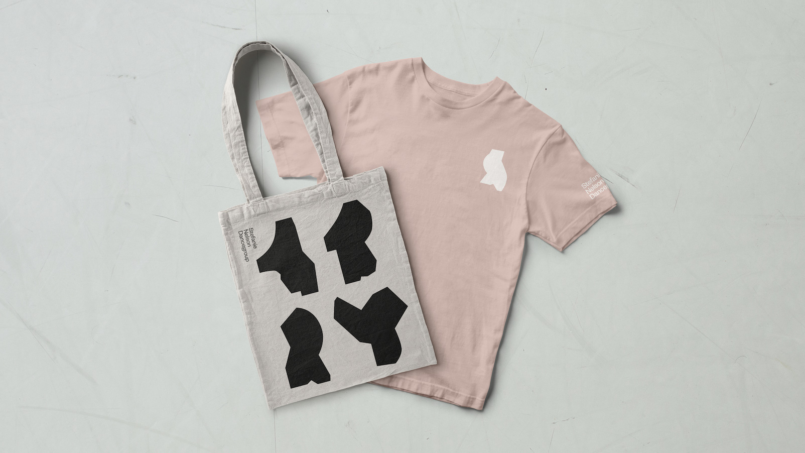
The SND monogram echoes the geometry of movement. Never seen the same way twice, the letters are meant to interact and respond to the photography, circling and interacting with the subjects the way other dancers would in the space. As a counter balance, the full logo resolves in a state of rest and quiet.
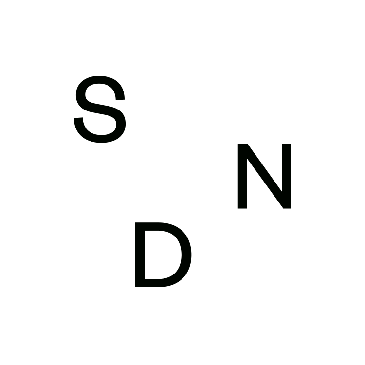
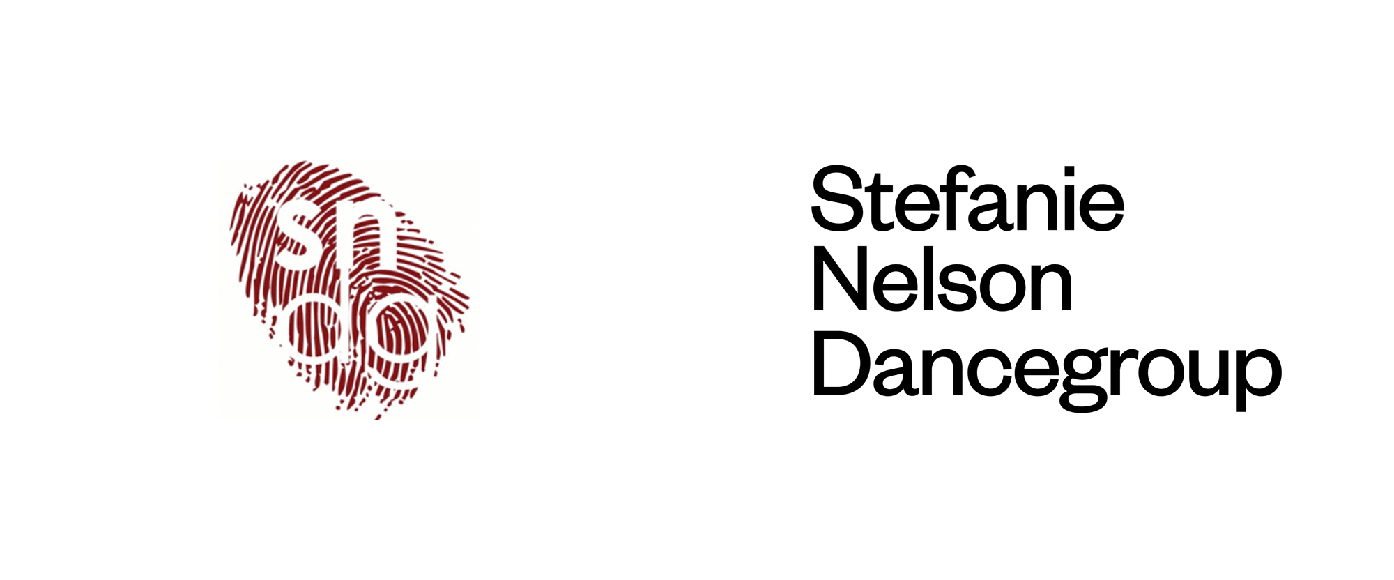
The old logo — sorry for the poor resolution on it — was not good, with a really bad “sndg” composition knocked out of a fingerprint that I’m sure was a metaphor for something… not readability, that’s for sure. The new logo, typeset in Klim Type Foundry’s Founders Grotesk, comes in two variations: a wordmark with the full name and a monogram with the three initials. In both cases, the light sans serif approach has that culture-meets-edgy vibe that goes well with most museums, galleries, and orchestras, which is to say it’s not entirely novel but effective. It’s hard to argue against Founders Grotesk since it’s such a crisp sans and set so nice and tight, it definitely looks good on such a long name. The monogram is fine and probably hints more at the notion of dance and movement than the wordmark and its flexibility is put to good use in the applications.
To capture this spirit we explored graphic shapes that allow for bold assertions of movement and physical form. The geometric language serves as a library of bodily abstractions that can express and suggest movement in a way that feels spontaneous but grounded, instinctive but intentional. These gestures now serve as totems for the company.
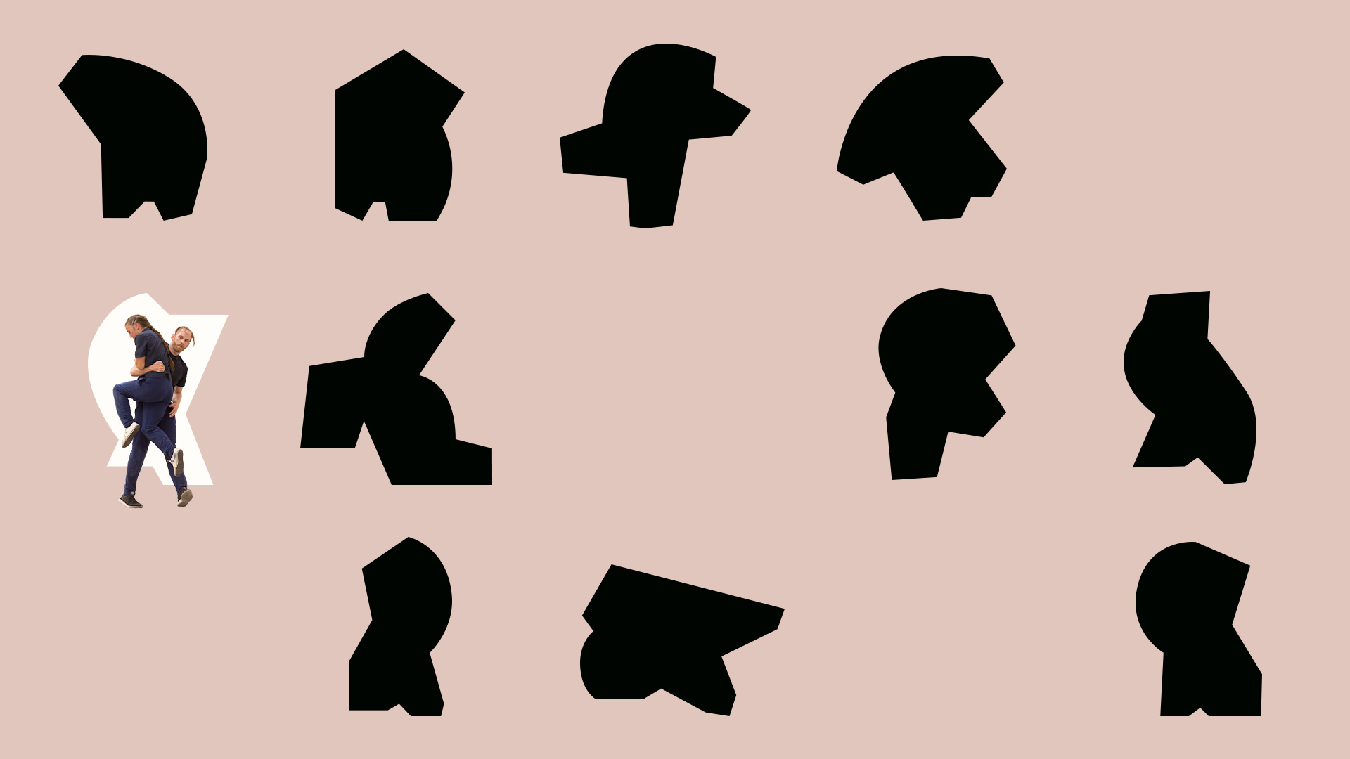
Like Houst recently, the identity kicks into high gear with a set of bold shapes — bold shapes are having a moment, y’all! (don’t let the trend hit you on your way out) — derived from dance movements. What I love about these shapes is how they contradict what we think of as dance, which is light and airy and fluid, and these are the complete opposite: heavy and solid and clunky yet they still convey a sense of motion and contortion. Obviously, when paired with a photo of the actual dance move — not to mention with animation — they work better but even on their own they are intriguingly beautiful and strong elements.
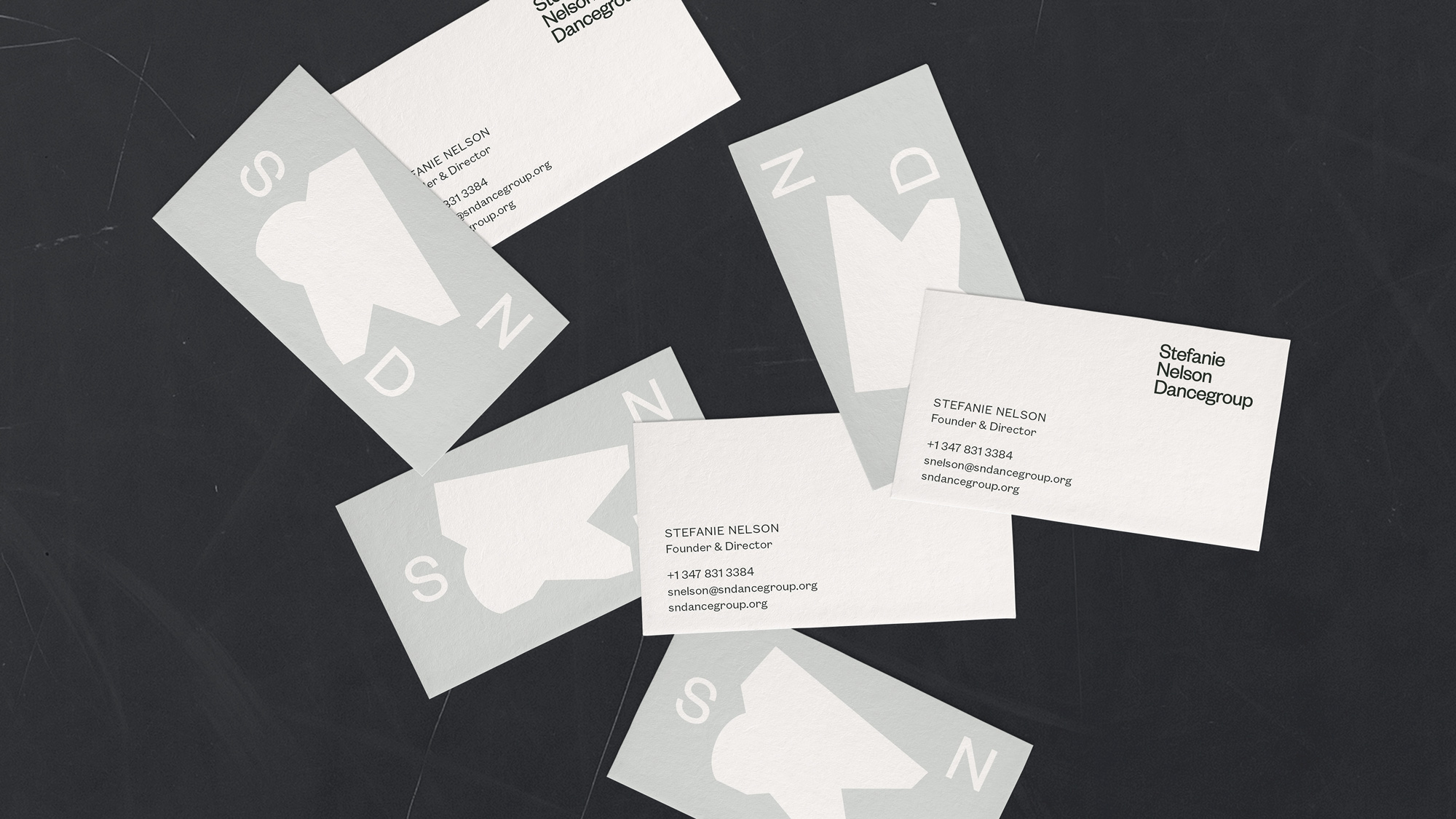
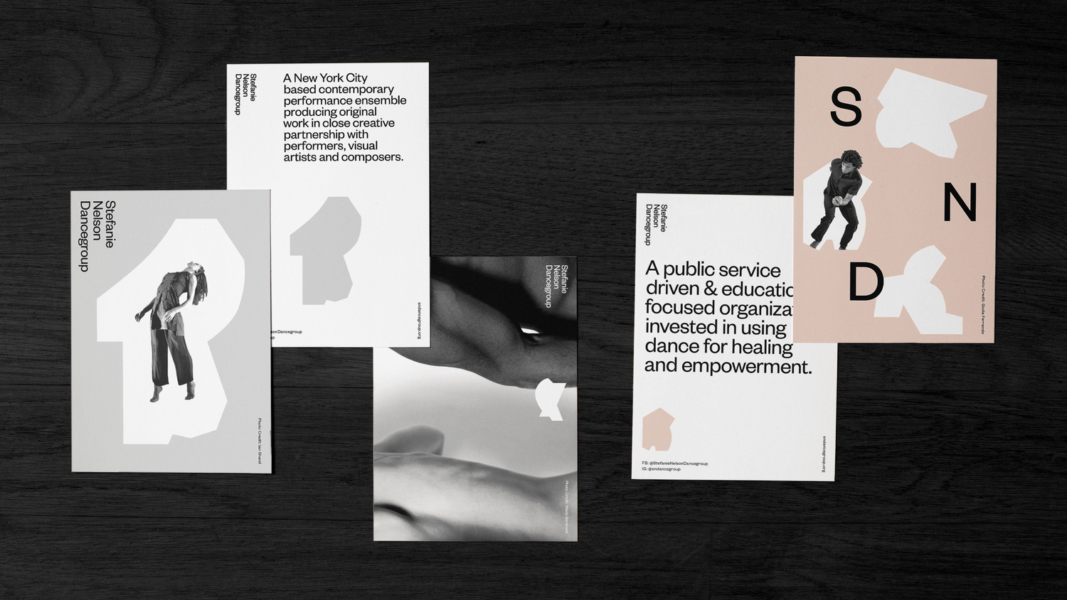
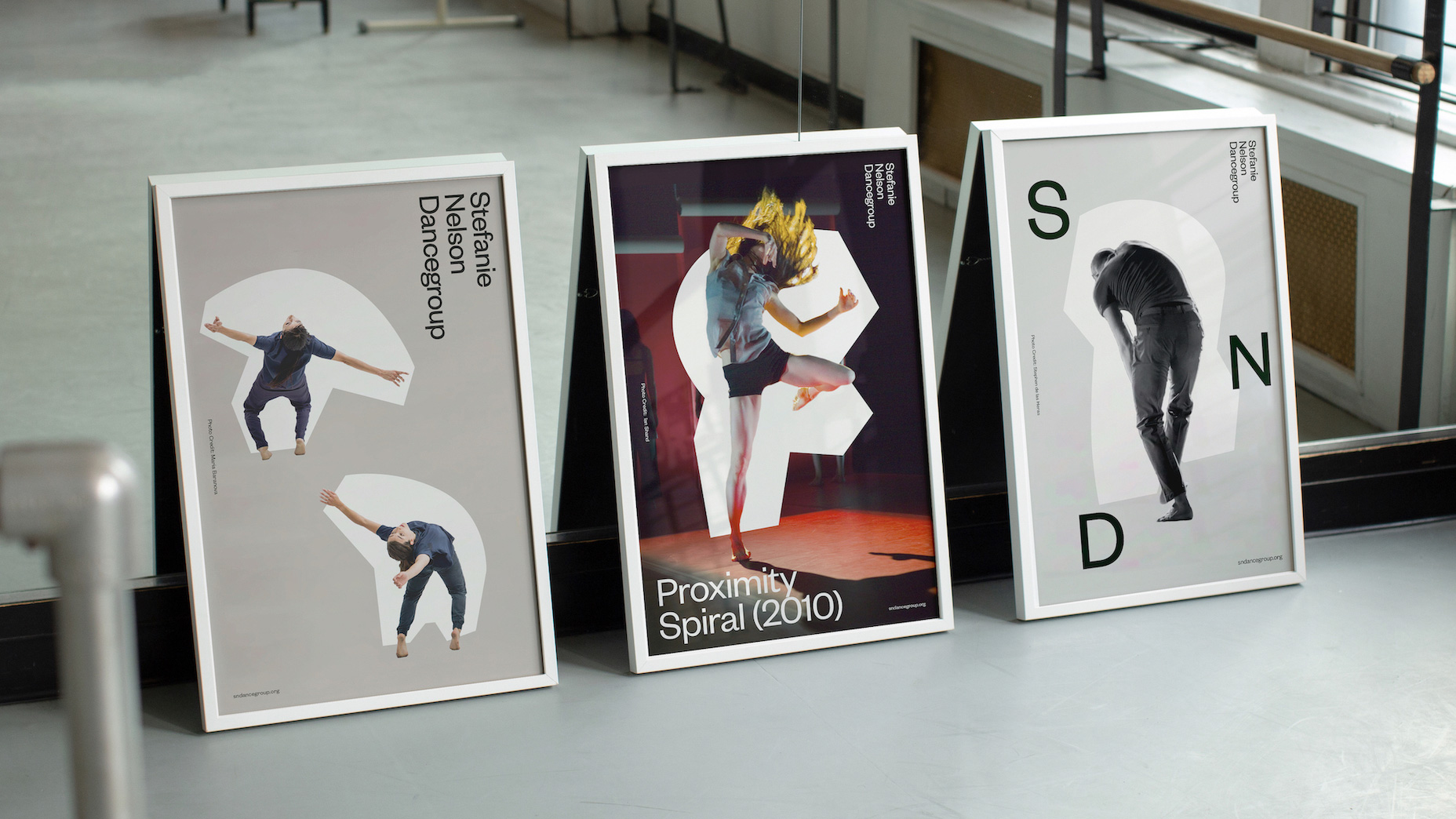
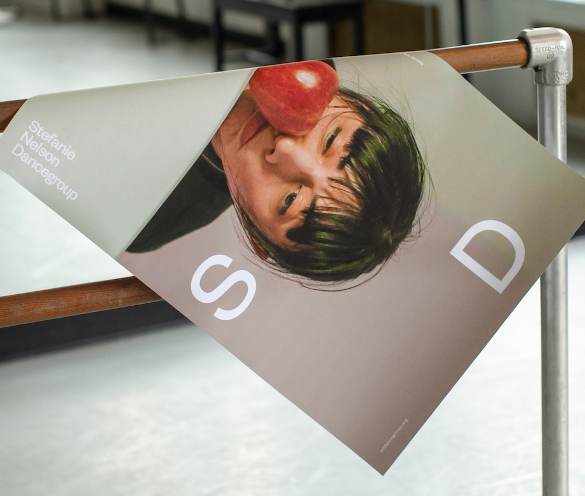
The applications are elegant and contemporary with stark layouts that mix the shapes, imagery, and typography in great compositions with a color palette of light gray and peach mixed with black and white that looks refined. The one element I’m not sure about is the sideways wordmark but sideways elements abound from print to digital applications, so it’s not out of place — it just keeps jumping out for me.
Dance Italia is a summer program founded by Nelson in 2011 and a sub-brand of SND. While both speak the same geometric language, DI uses the shapes as outlines and disjointed segments that add to the kinetic feel. The vibrant palette skews younger, decidedly more adventurous than the parent.
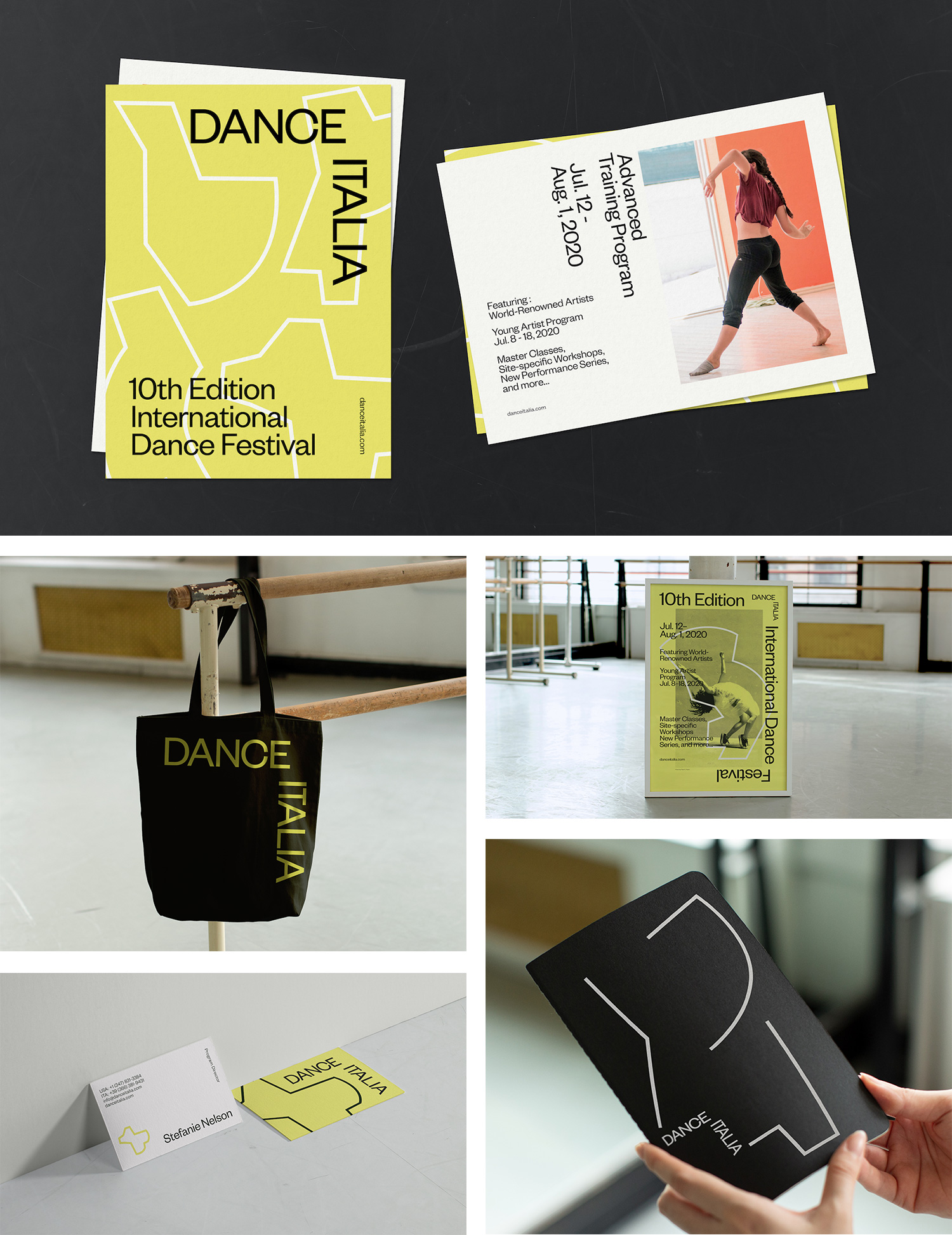
As a bonus, there is this Dance Italia stuff that works quite well as a spin-off of the main identity with matching typography, a happy lemon-esque color, and stroked shapes.
Overall, this is a great identity with an unexpected approach to representing dance and establishes a visual presence that makes this small dance group look like an international powerhouse.

 Новости Союза дизайнеров
Все о дизайне в Санкт-Петербурге.