Обзор лучших ресурсов по разработке бренда, разработке упаковки
contact us | ok@ohmycode.ru
contact us | ok@ohmycode.ru
Established at the end of 2019, Saudi Arabian Logistics (SAL) is a global logistics hub, which means that it provides ground handling and logistics services on a global scale linking land, air, and sea transportation and clearance to ensure the seamless movement of goods. Originally the ground handling division of Saudia Cargo, the leading provider of ground handling services for international air cargo carriers operating at the Kingdom of Saudi Arabia’s main international airports, SAL was created as a separate entity to expand from being solely ground handling into a full logistics company serving the Gulf area. The new identity was designed by the Madrid, Spain, office of Interbrand.
SAL has been positioned and designed to be worthy in stature as a customer-focused logistics ecosystem made up of people committed to helping their partners and customers achieve their personal and professional goals.
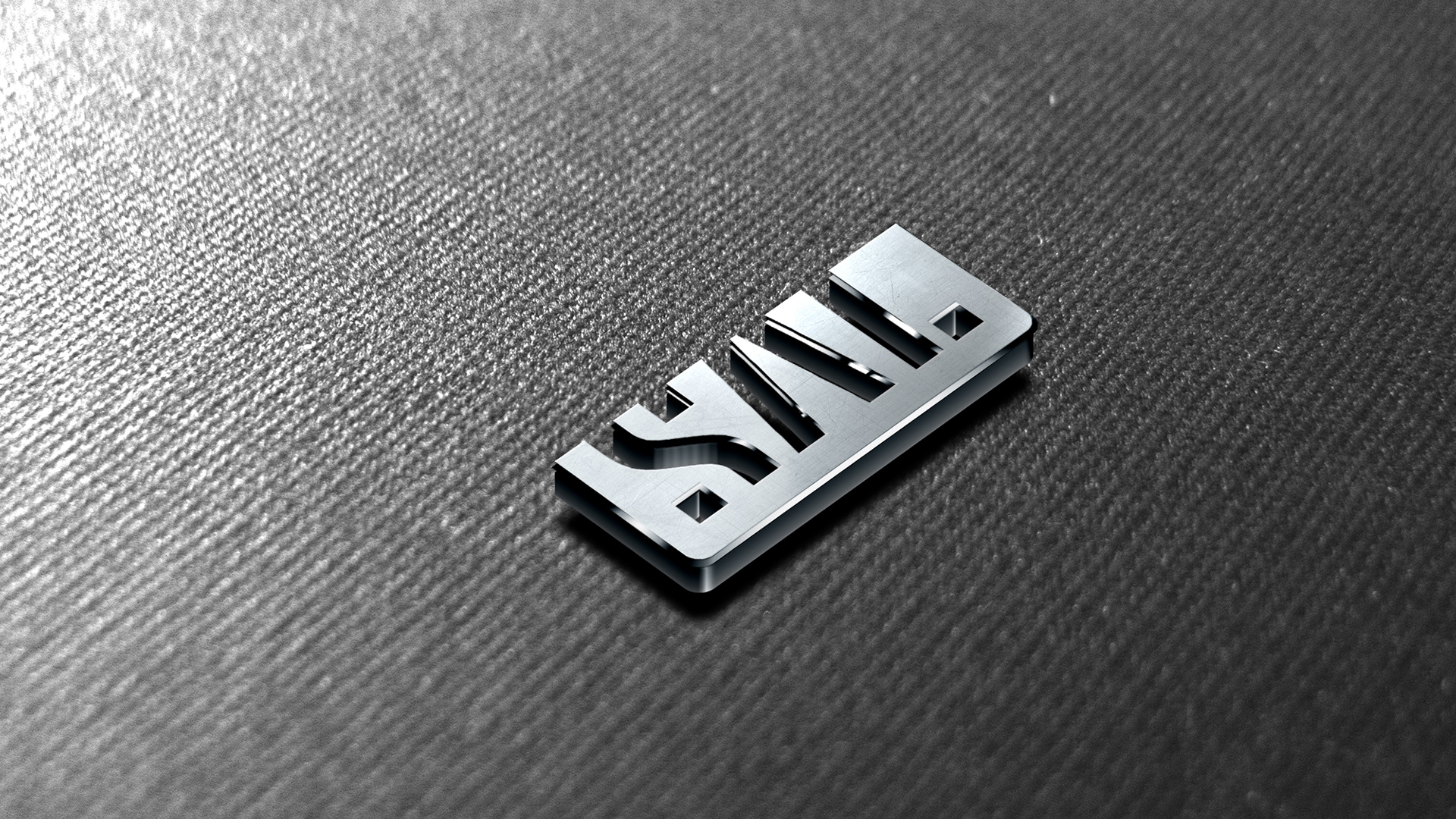
Starting with the very name (SAL), the strategic intent is brought to life, manifesting in acronym form a true connection throughout an international network dedicated to find the way across oceans (by Sea), flying in the skies (by Air), and running on rails and on highways (by Land).
To sum up the ambition of evolving to become a driving force in national and regional transformation, the mandate is made clear in the Brand Claim developed for the entity: SAL Delivering Impact.
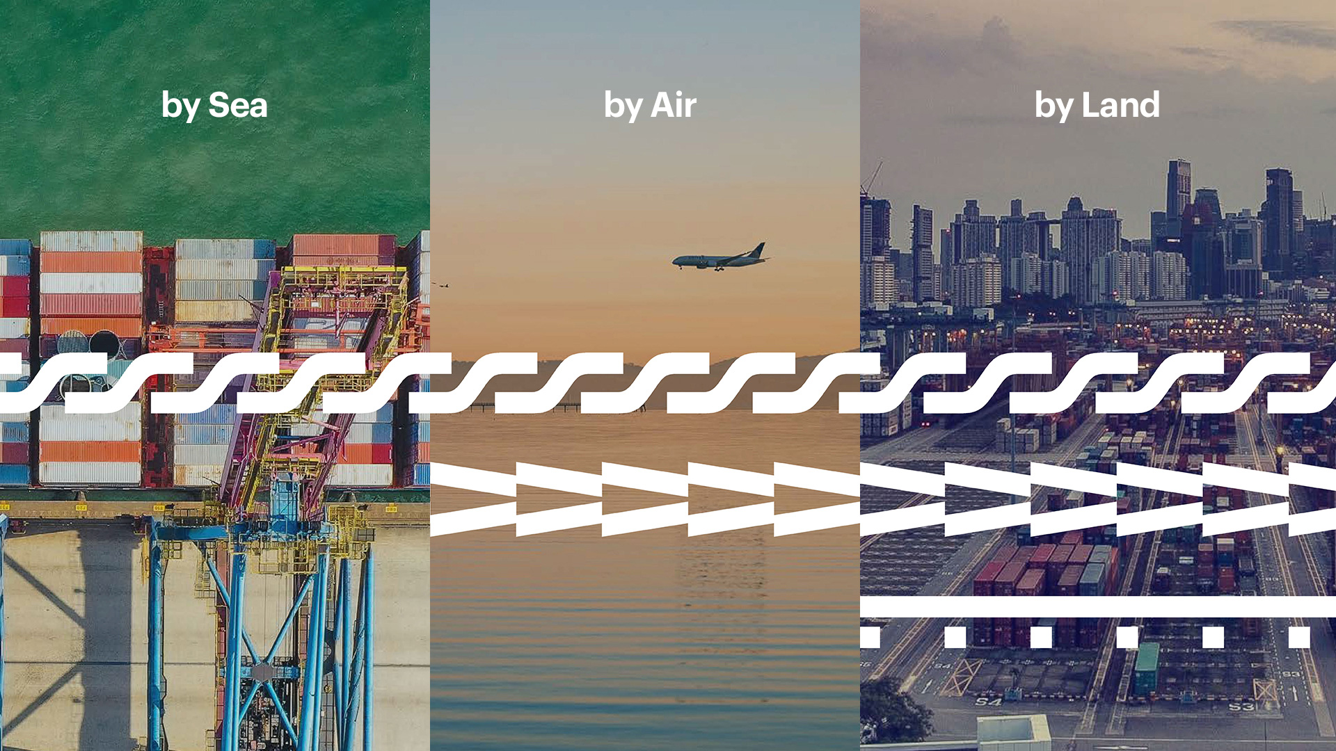
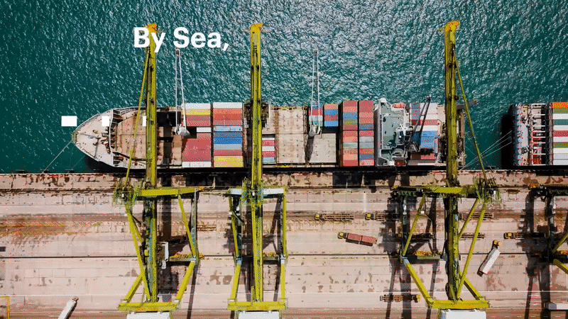
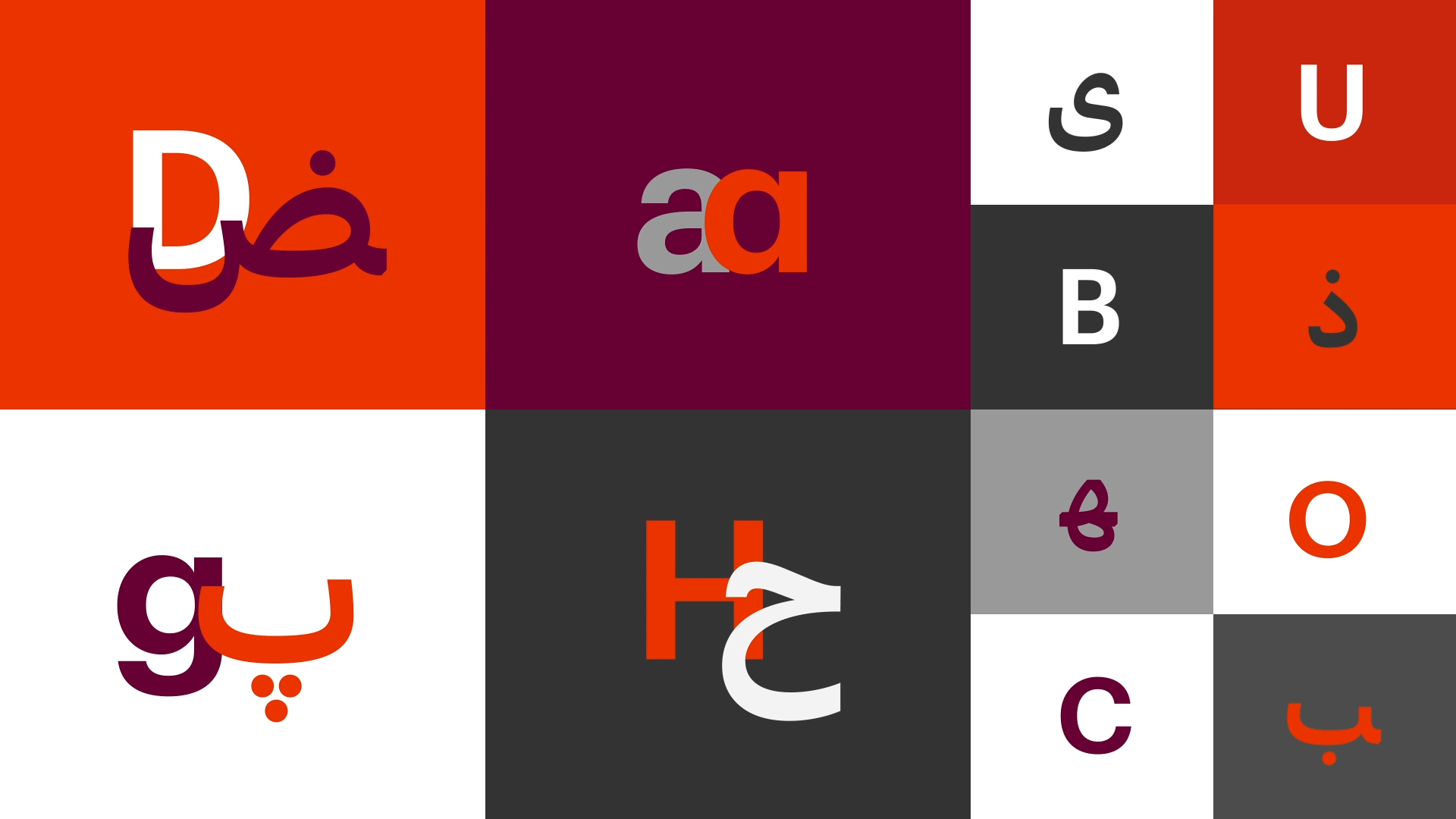
While the SAL acronym officially stands for “Saudi Arabian Logistics”, its secondary unpacking as “Sea, Air, Land” is the kind of high-hanging fruit brand strategists live for. It seems so elemental once presented but it’s such a great — pardon the jargon — synergy between corporate naming and brand essence that doesn’t happen often. Interbrand has also done a fantastic job of translating sea, air, and land into abstractions of waves, planes, and train tracks that double as an “S”, “A”, and “L”, respectively when the units of the patterns are rotated and isolated. Even without that interpretation, which I didn’t get at first but only until I saw the video, the logo is really good, with a stencil design that looks as something you would see on the side of crates, trucks, and cargo containers but with a corporate, buttoned up vibe that makes the logo appear quite serious. I love how the squares that are part of the “S” and the “L” are the same and the overall rhythm and balance of the logo is so well achieved considering how relatively “awkward” the letters are. Even the ® mark helps balance it all by neatly sitting in the top right corner filling in the wide counterspace left in the “L”. Long way of saying, I really like the logo.
Also really digging the color palette. It’s robust and lively without being the hyper bright colors still on trend today.
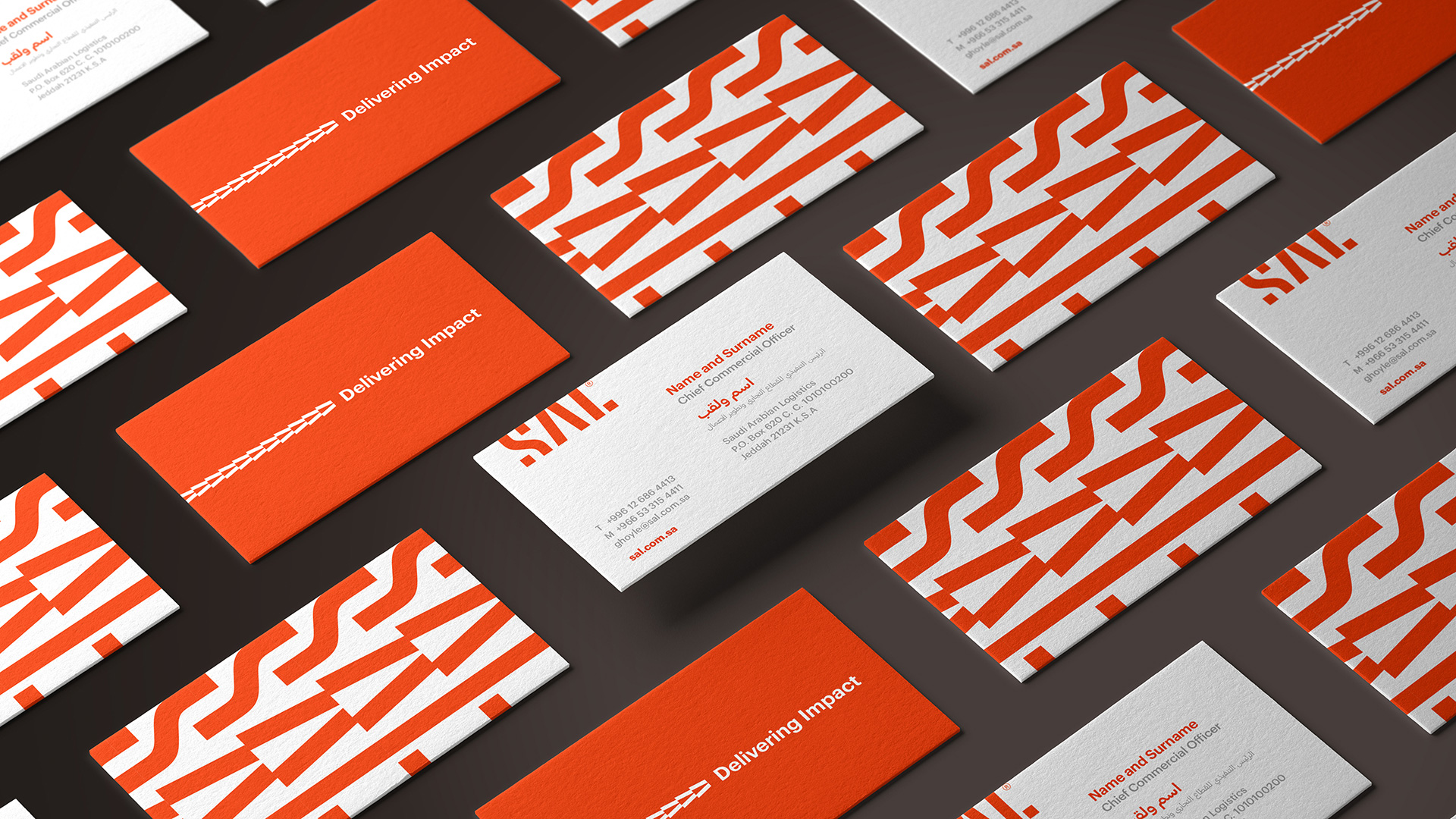
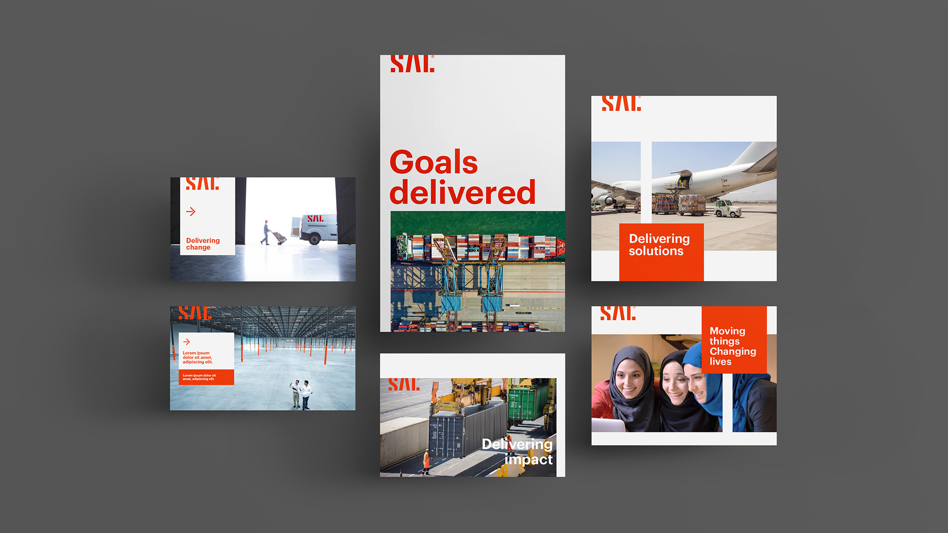
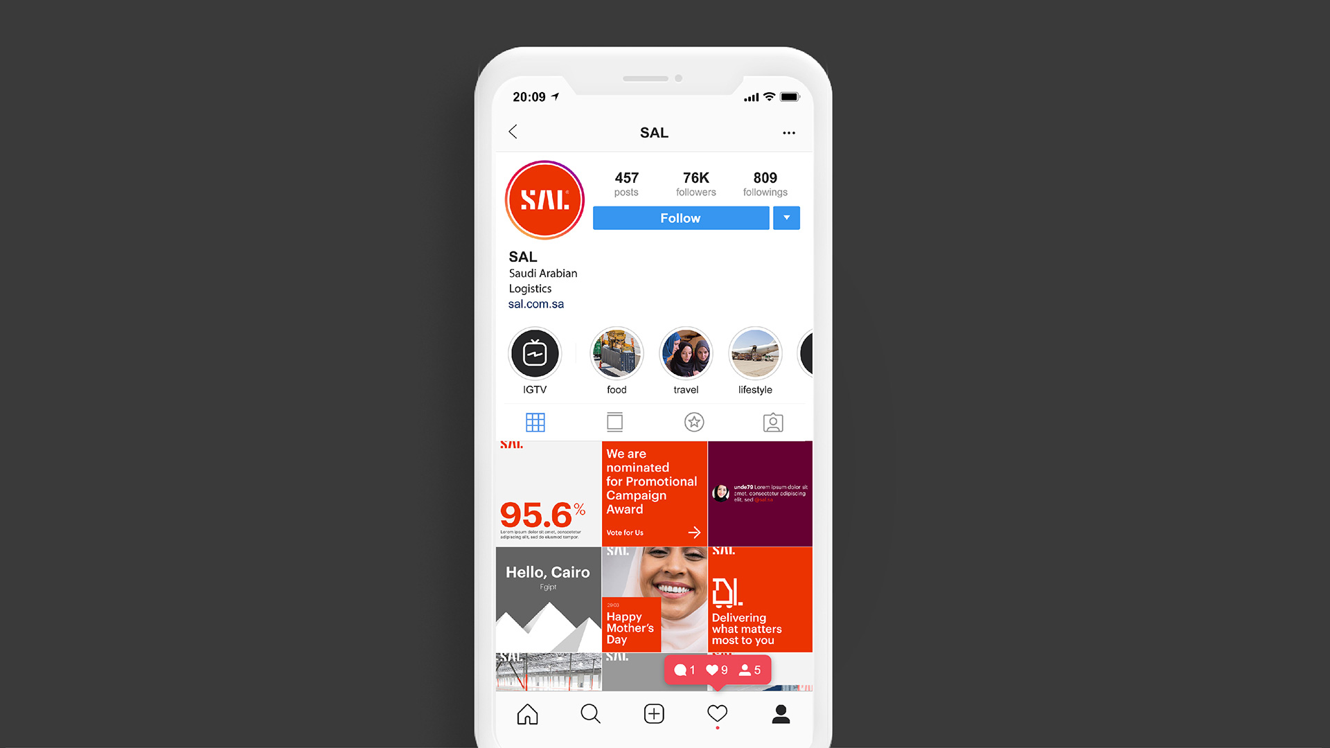
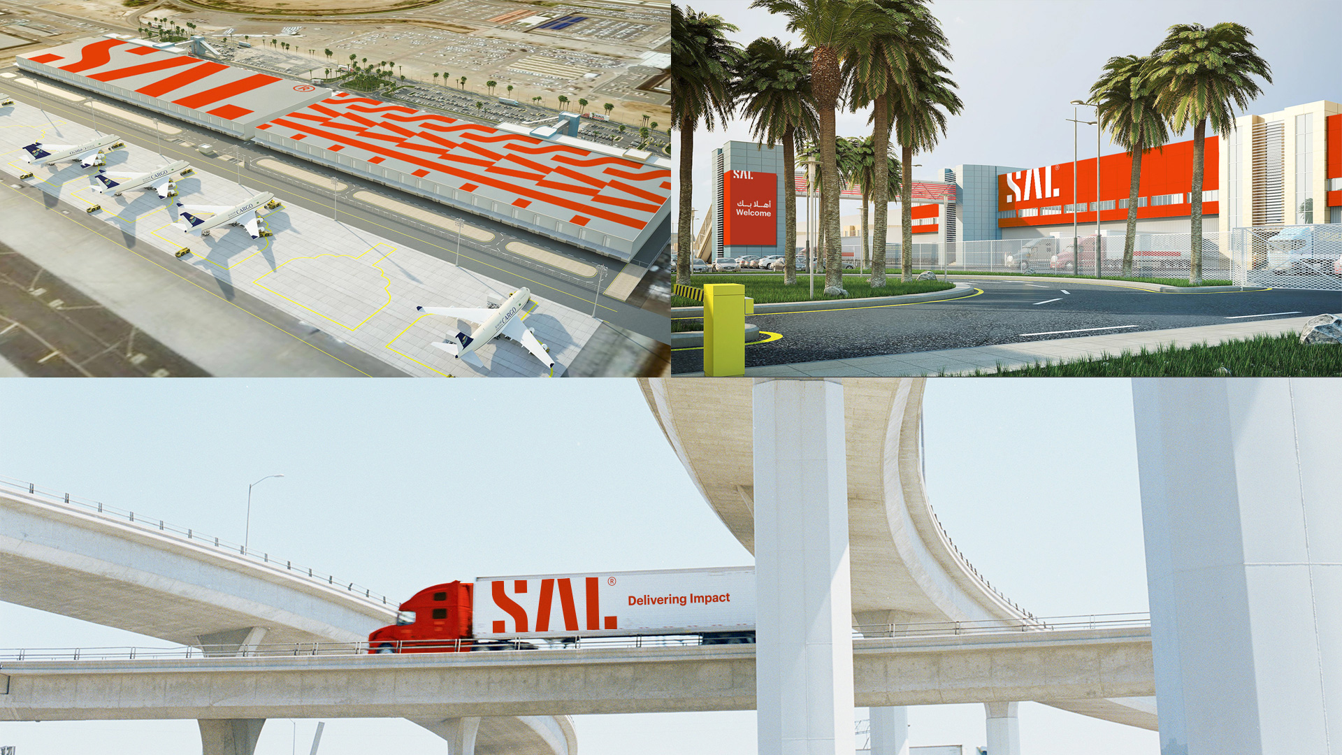
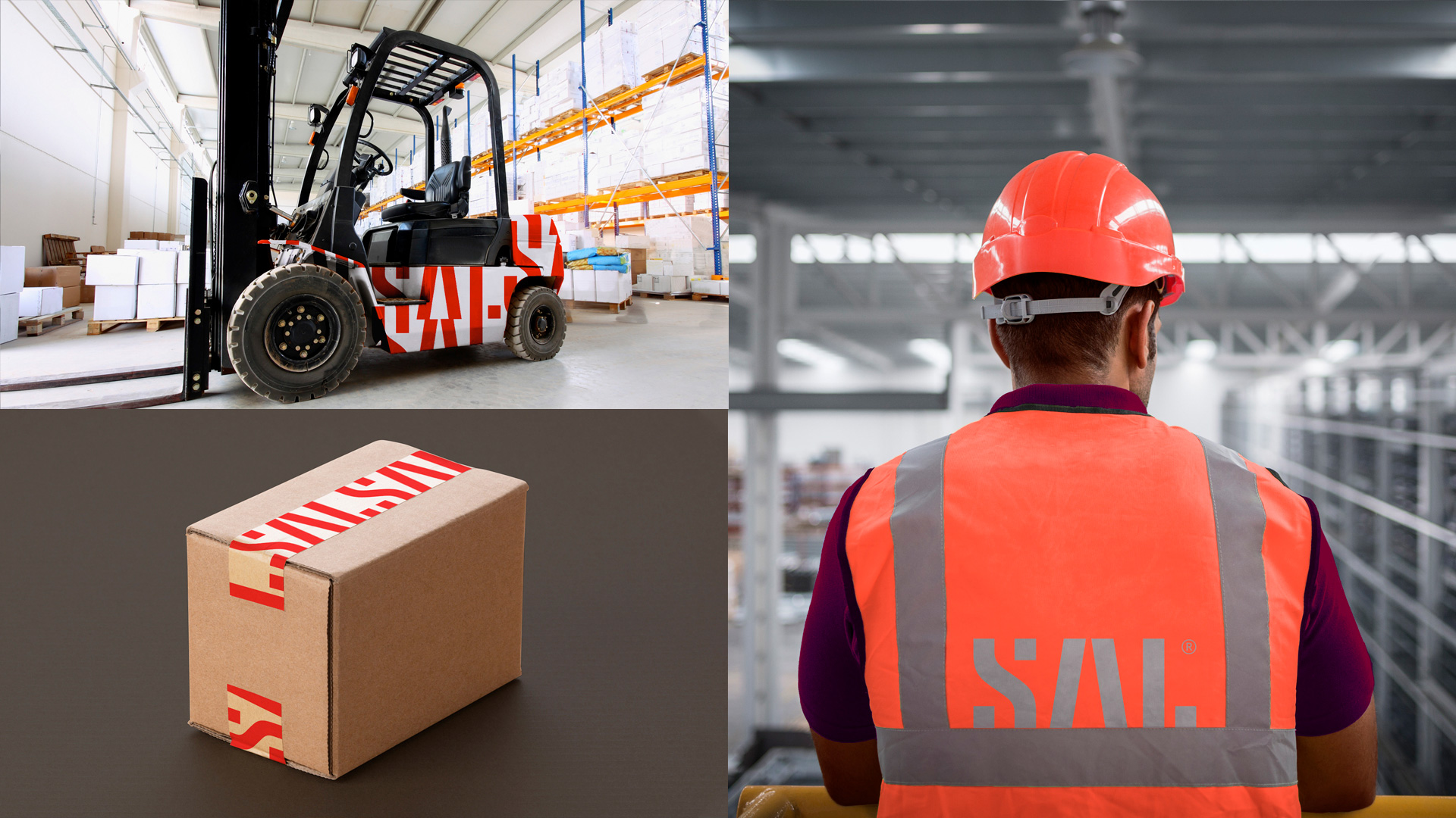
The applications are solid and have a one or two moments of visual flair that are pretty good, in particular the big patterns of “SAL” turned sideways. I love how the logo snaps to the top of the layouts — which I know is asking for trouble in print products, but a render can dream — and the overall airiness of the layouts. I would like to see more pops of the plum color in there but that’s a minor quibble.
Overall, this is a great corporate identity that manages to be innovative and original but still very much within the comfortable visual language of business-to-business — in the Middle East no less — that makes it read as grown-up business people coming to the table to do serious business while some design blogger rejoices in the Midwest.
 each year since publication began in 2006

 Новости Союза дизайнеров
Все о дизайне в Санкт-Петербурге.
Новости Союза дизайнеров
Все о дизайне в Санкт-Петербурге.