Обзор лучших ресурсов по разработке бренда, разработке упаковки
contact us | ok@ohmycode.ru
contact us | ok@ohmycode.ru
Established in 2017, POWEN is a new solar energy service in Spain, focusing on solar panel installations for people’s homes and small-to-medium-sized companies’ places of business. A part of renewable energy firm, Fotowatio, POWEN also aims to become a source of information and education about solar energy as well as drive renewable energy forward in the country. The identity for the new company has been designed by Saffron.
From the idea of ‘give power to the people’ we created POWEN. A name to convey the strength of the principles and mission of the company that simultaneously sounds strong in every market.
To create a visual identity based on the defined strategy, Saffron’s design studio brought the logotype to life. The identity was designed to mirror the smart control panels that the company provides to empower their customers’ usage.
One important thing to consider about the name is that it’s not pronounced like “Power” in English — even though that’s a very evident source for the name — but rather as “Paw-gwen” (more or less in phonetic English), which turns it into a relatively random/made-up word (a la Xerox) for most Spanish-speaking people. I’m not a big naming connoisseur but in whichever way you pronounce it, there is something slightly odd about the name.
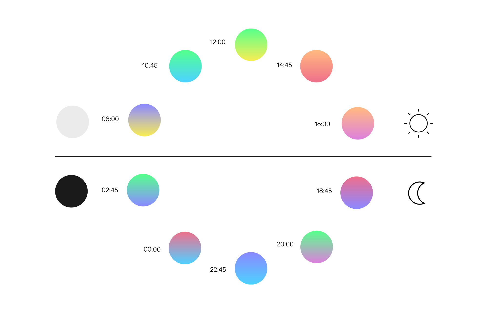
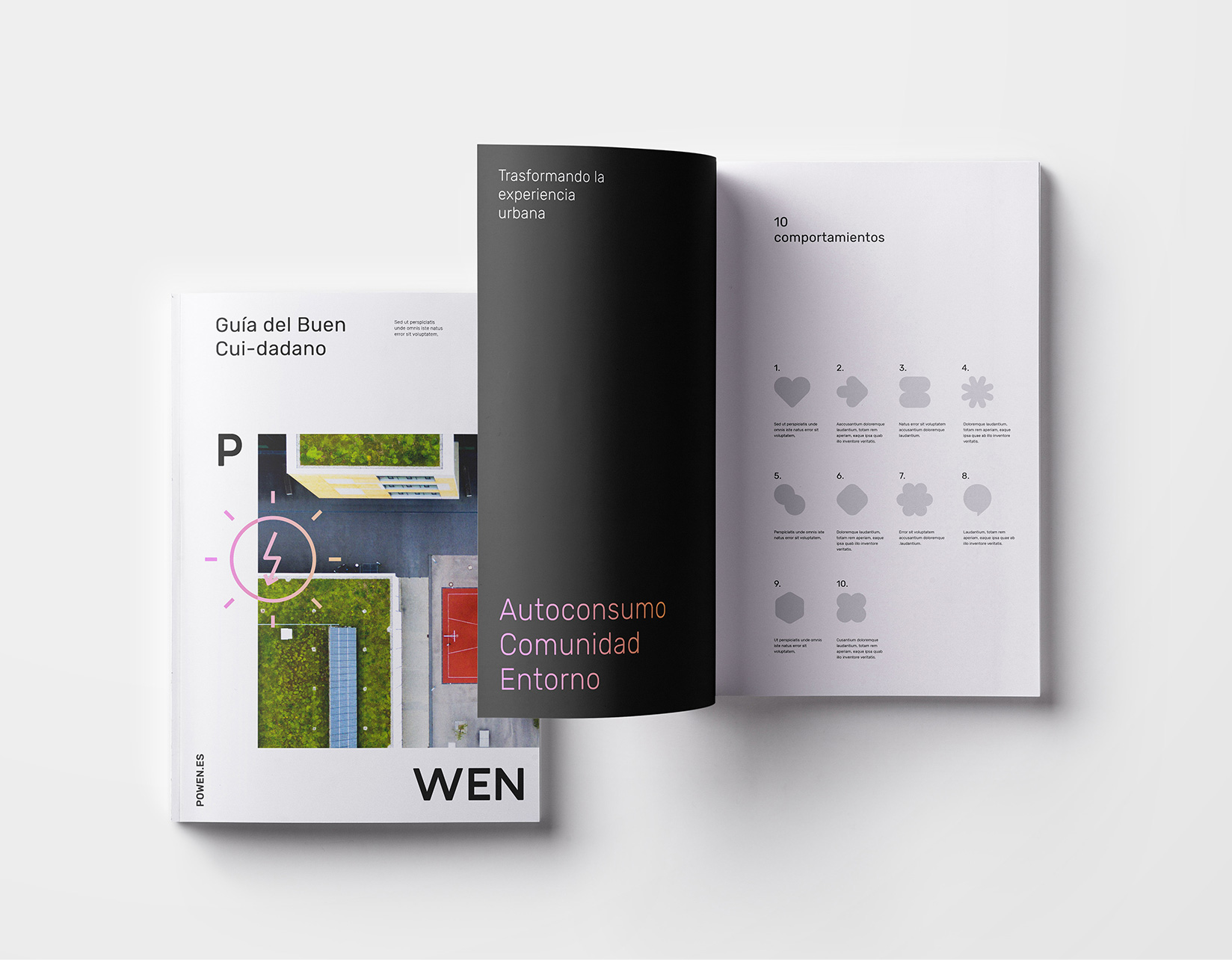
To reflect the brand’s role as an engaged educator, communicating in real time we crafted a set of malleable graphic emotions to illustrate the ever-changing state of energy. These states are enhanced by a powerful colour palette inspired in the changing colours of light throughout the day.
This was accompanied by clear typography and a system of pictograms that adapt to the needs of the business to communicate complex information in a simple way.
The combination of these elements allows the brand a visual expression that represents its mission and brand purpose, creating an open interaction between the company and the user.
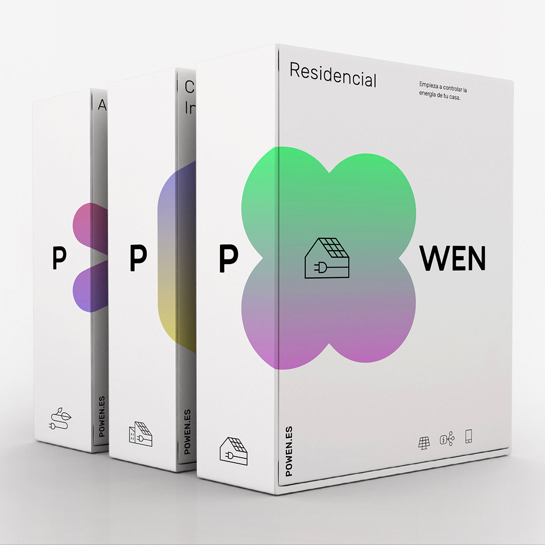
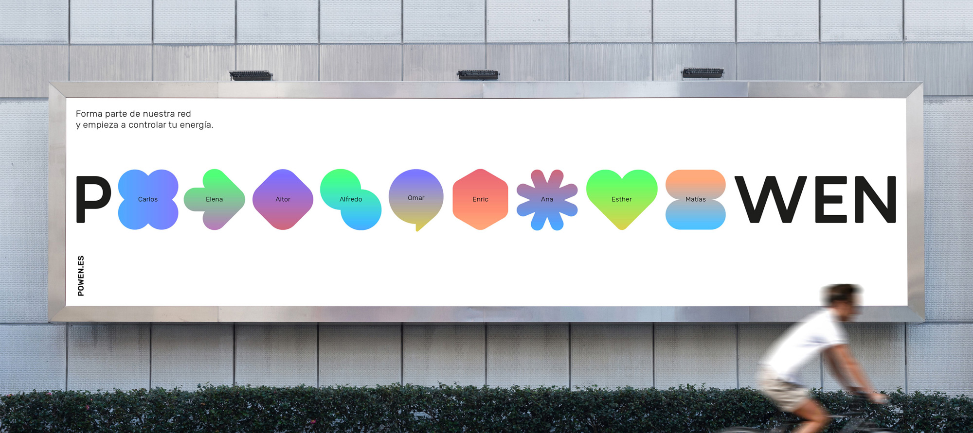
The logo uses a simple, nondescript sans serif to deliver a range of abstract icons in place of the “O”. It’s a bold move given that it’s a new name being introduced to the market but since most of the icons are round/square it’s not that difficult to decipher them as “O”s. Even though each icon means something I doubt anyone will be able to decipher that. Still, they activate the logo in an interesting and memorable way that makes it demand some extra attention. The shapes are interesting and, colored in gradients, they stand out nicely from the all-black typography. As far as how the logo might be interpreted by someone interacting with this brand for the first time and without the backstory of the icons and colors, I think there is something visually positive about the colorful shapes inside the more corporate-like typography… almost like a flower growing in a harsh environment, which is a nice metaphor for renewable energy… a bright spot in an otherwise gloomy climate outlook. But if that’s too metaphorical, the shapes with gradients look happy.
Using the “o” of Powen as the container we adapted its shapes to contain different messages, moods and symbols. No longer housed as a signature in a corner, it becomes central to the message across all communications. It provides a reminder of the ubiquitous presence of energy in the lives of customers, powering everything they do, reminding them of its power.
The icons in the logo can increase in size or quantity as well as include messaging within them. The latter starts getting muddy with the black landing on some of the less attractive gradients (like the one that says “…se transporta”) but I do like the approach of letting the icon get slightly bigger in different layouts.
The free Rubik Light font has been nicely paired with some matching icons that give it a little extra panache, given that it’s a font that so many people can use.
Our approach to the visual identity shows that brands can flex within a strong identity to reflect the company’s daily needs. In Powen’s case, this has allowed us to boost the brand’s recognition and provide them with an identity built for longevity over time.
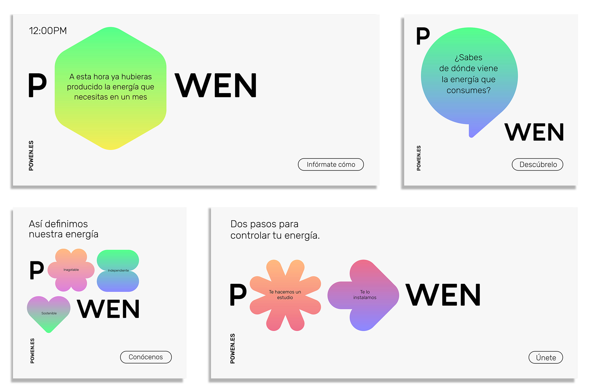
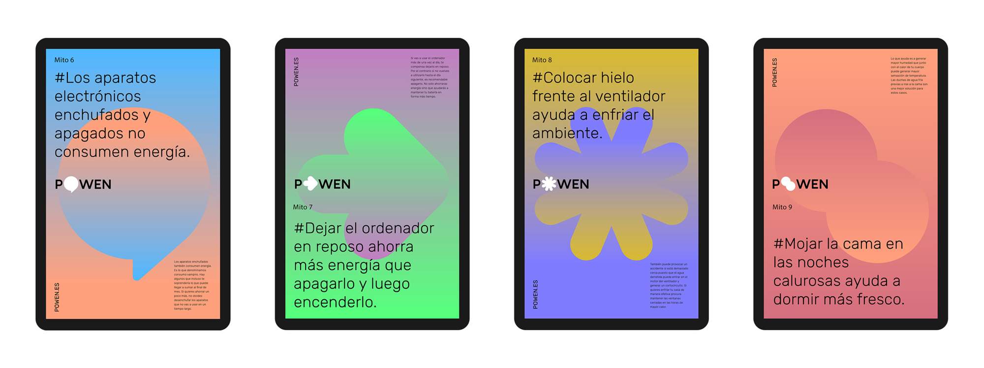
The applications are great and, again, a bold move as they challenge readability and push the limit of how far they can go where users will still read “POWEN”, whether it has a big icon or various smaller icons separating the “P” from the “WEN”, sometimes even keeping the two parts of the name diagonally separated. The posters are a little extreme in their gradient waterfalls so maybe stick with the layouts that have stronger use of white space and tension. Overall, this feels like a 1960s flower power aesthetic crossed with a utility provider corporate aesthetic, which is a funky but interesting intersection.

 Новости Союза дизайнеров
Все о дизайне в Санкт-Петербурге.
Новости Союза дизайнеров
Все о дизайне в Санкт-Петербурге.