Обзор лучших ресурсов по разработке бренда, разработке упаковки
contact us | ok@ohmycode.ru
contact us | ok@ohmycode.ru
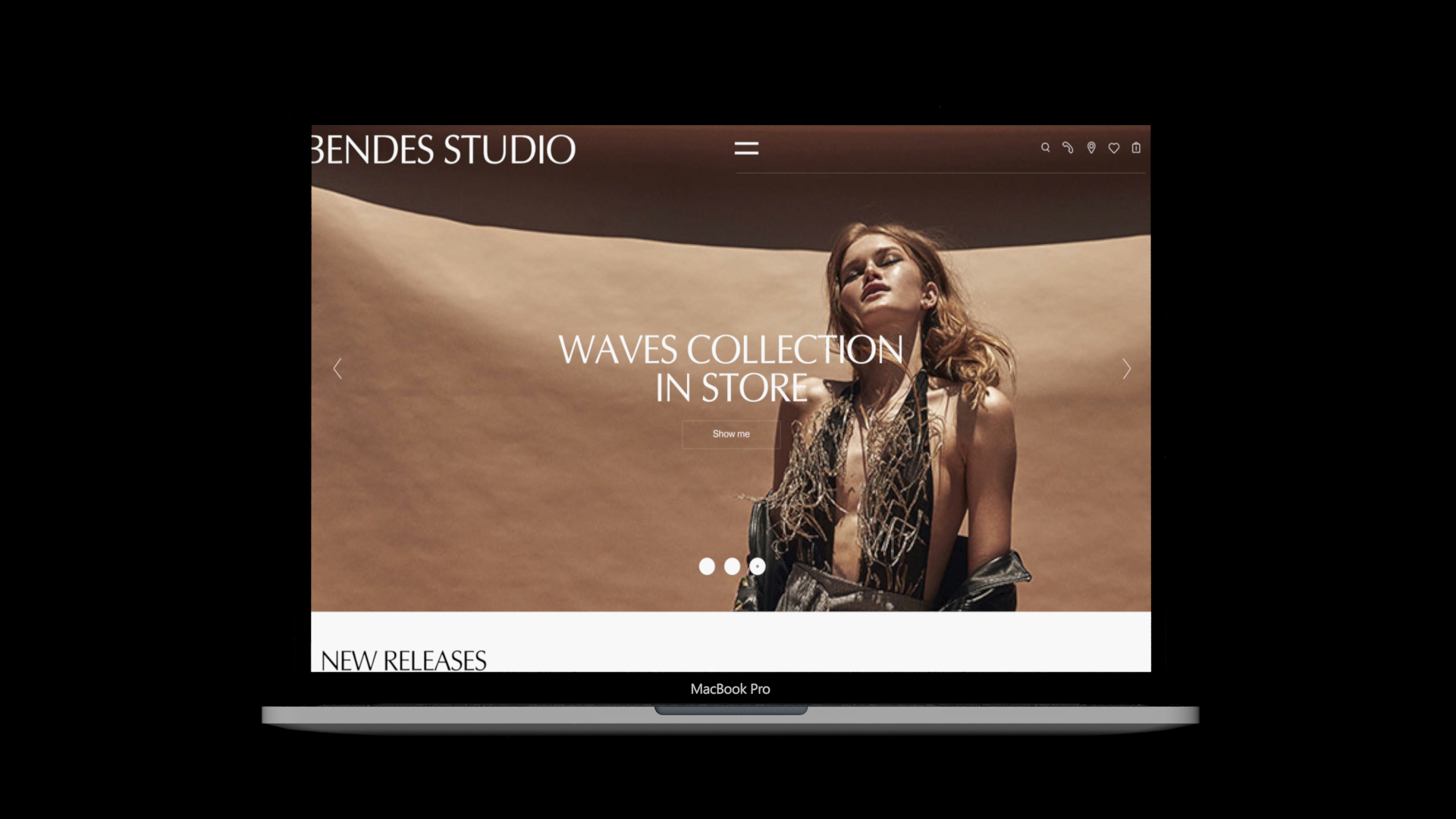
Established in 2010, Bendes is a jewelry designer in Moscow, Russia, specializing in wedding and engagement rings. Through one retail location and a comprehensive online store, the company has expanded to offer a wider range of rings for men and women for all occasions. Recently, Bendes introduced a new identity designed by Moscow-based [email protected].
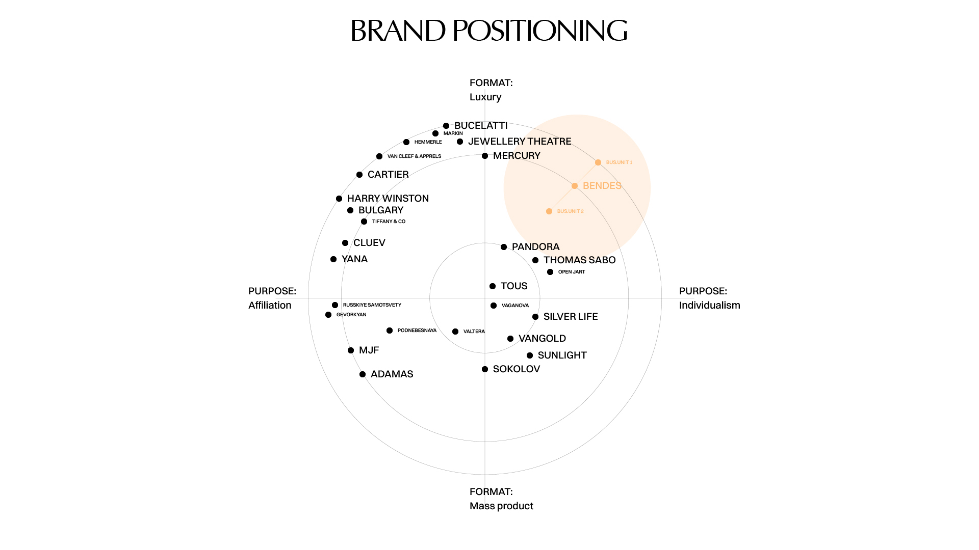
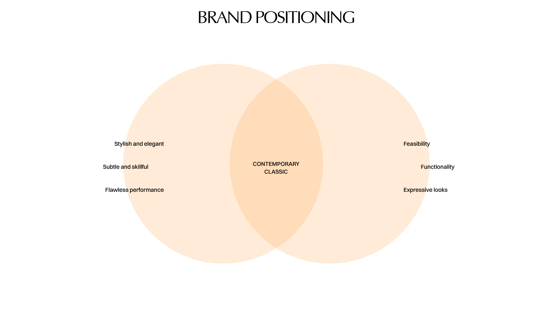
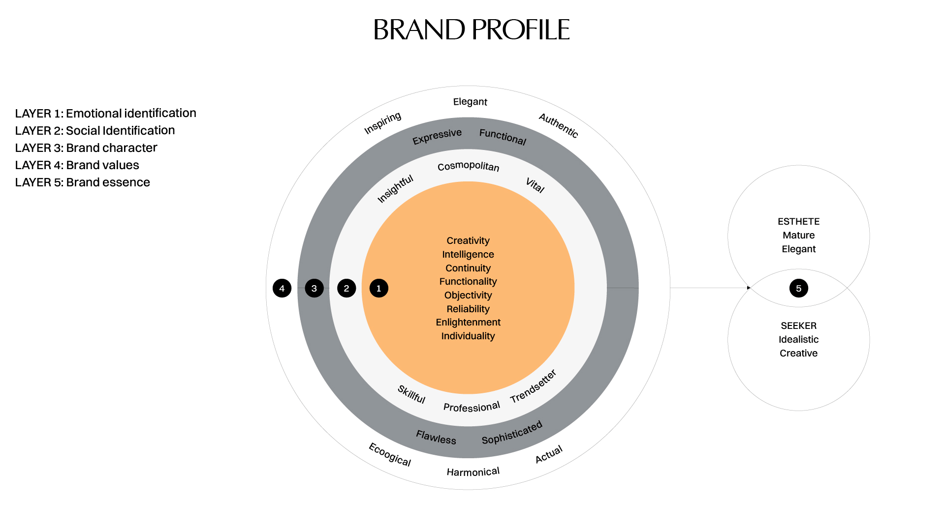
Within the framework of platform setup, our team discovered the essence of the brand, its design philosophy, communication policies, main attributes, characteristics of every interaction with the audience as well as key archetypes as the Aesthete (Adult, Elegant) and the Explorer (Creative, Idealist). This allowed us to accurately form graphic language and key methods in the system of identification.
For those of you that have previously expressed in the comments that one needs more background on the strategy before being able to form an opinion… there you go.
In the previous version of Béndes Studio attributes of the brand lacked congruency and existed separately that is why we moved towards its identification redesign and developed a central brand constant. We based our work on the principles of timeless design that revolved around harmony, composition and tempormatics.
The design process of the constant elaboration started off with the selection of the font that reflects “the voice” of the brand to the fullest. In the main version of the logo we preserved capital letters and changed the font for flowing antiqua whiсh is a hybrid form of antiqua and gothic fonts.
To construct an integral visual identity it is focal to convey the main ideas of the brand in a visual metaphor. It is obvious what this metaphor is from the name (BEND)ES. In English “to bend” means to shape into a curve or angle. This concept was a starting point for the creation of a mood board with meanings and expedients which are associated with Béndes Studio brand.
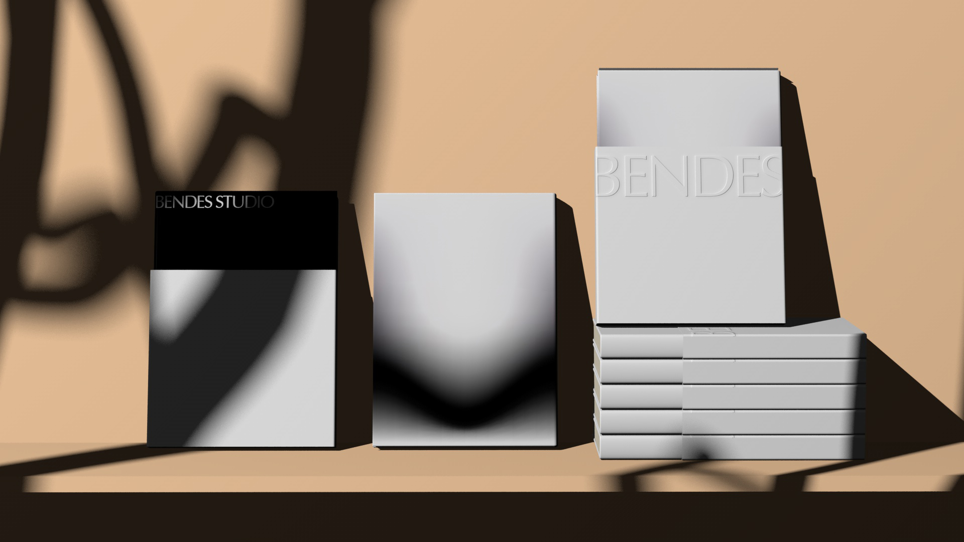
The old logo was awkward, with a strange icon that I’m sure was meant to be the silhouette of a ring on the outside but no idea what the inside butterfly thing was meant to be but surely nothing you would want to put your finger through. The wordmark was equally weird with the most dramatic “B” I have seen in a while. So, nothing lost when moving away from the old logo. The new logo uses the free AGOpus font, which is a less flared version of the ubiquitous Optima. The logo is not great, it’s not bad, it just… is. Even though the packaging application does, in the end, save it, it would have been nice for the logo to have something more special about it.
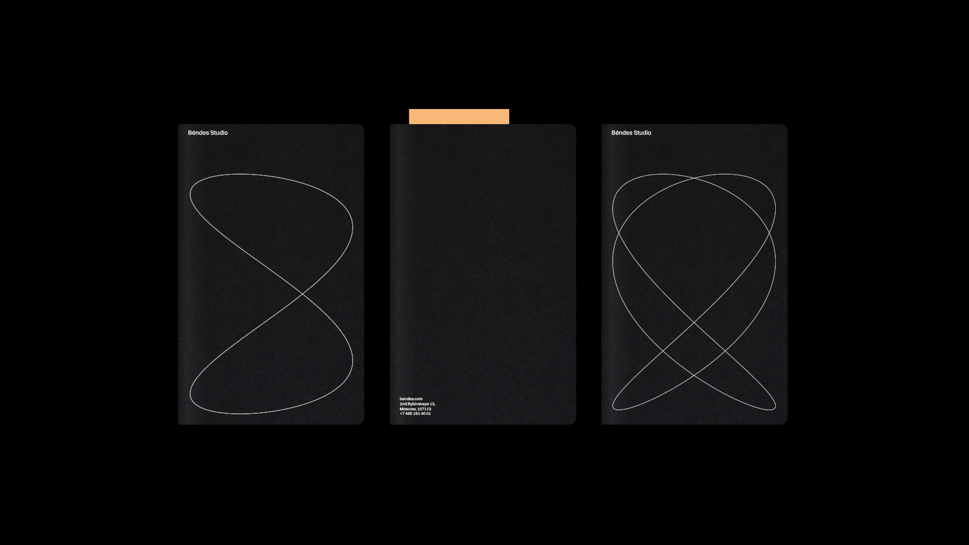
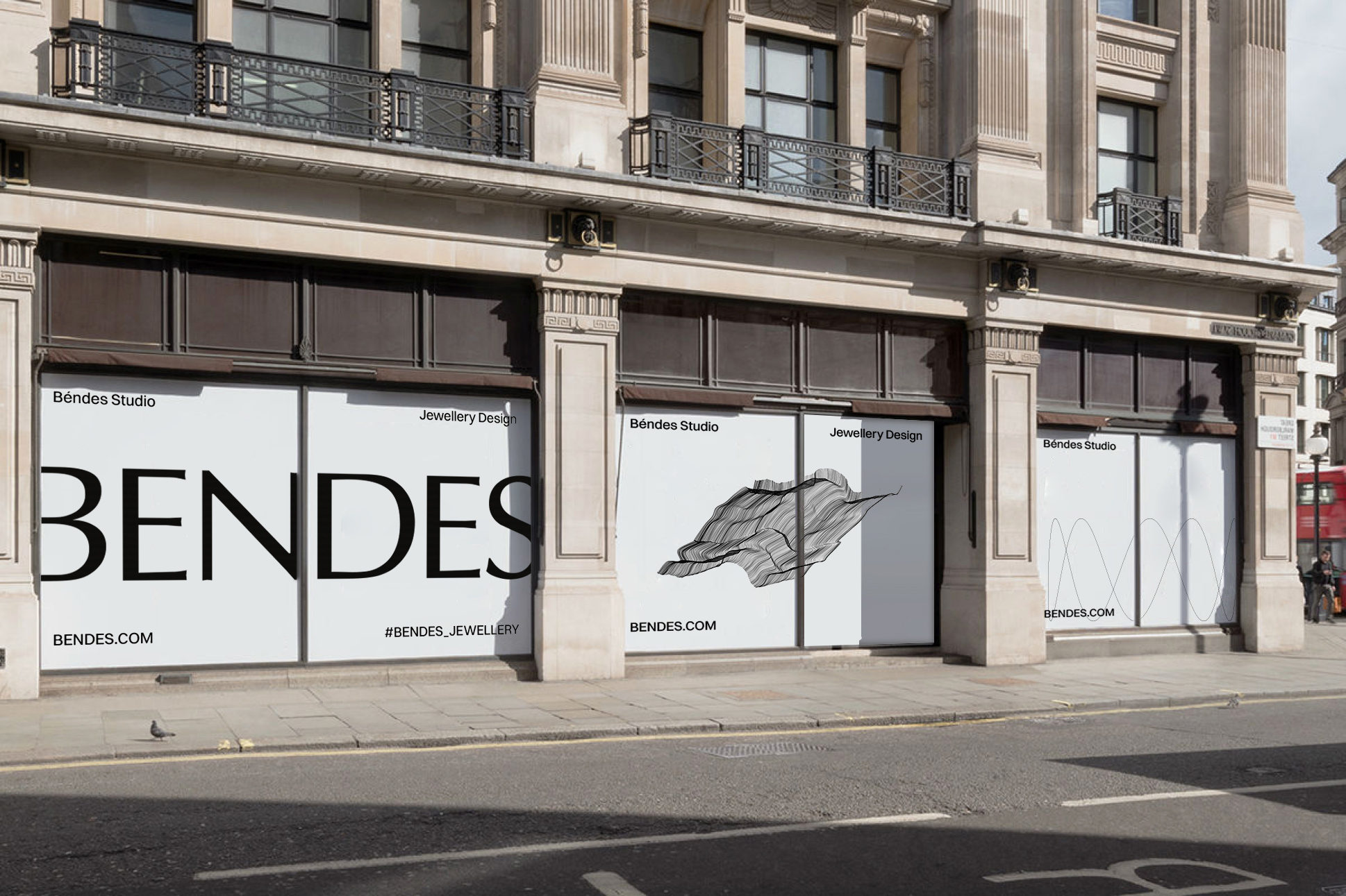
The principle curvature of the matter formed the basis of the graphic technique with multiple lines that represent a sequence of coordinates generated by the code. A modern interpretation of natural landscapes and forms is one of the indications that modern jewelry art proceeds its advancement in a digital sphere. The logo has an unusual method of affixing: left and right ends go beyond the borders of a two-dimensional plane. Thus the classic graphics is transformed into a fresh avant-garde tactic.
Of all the things in the project, this is the one I still don’t understand conceptually nor enjoy in application.
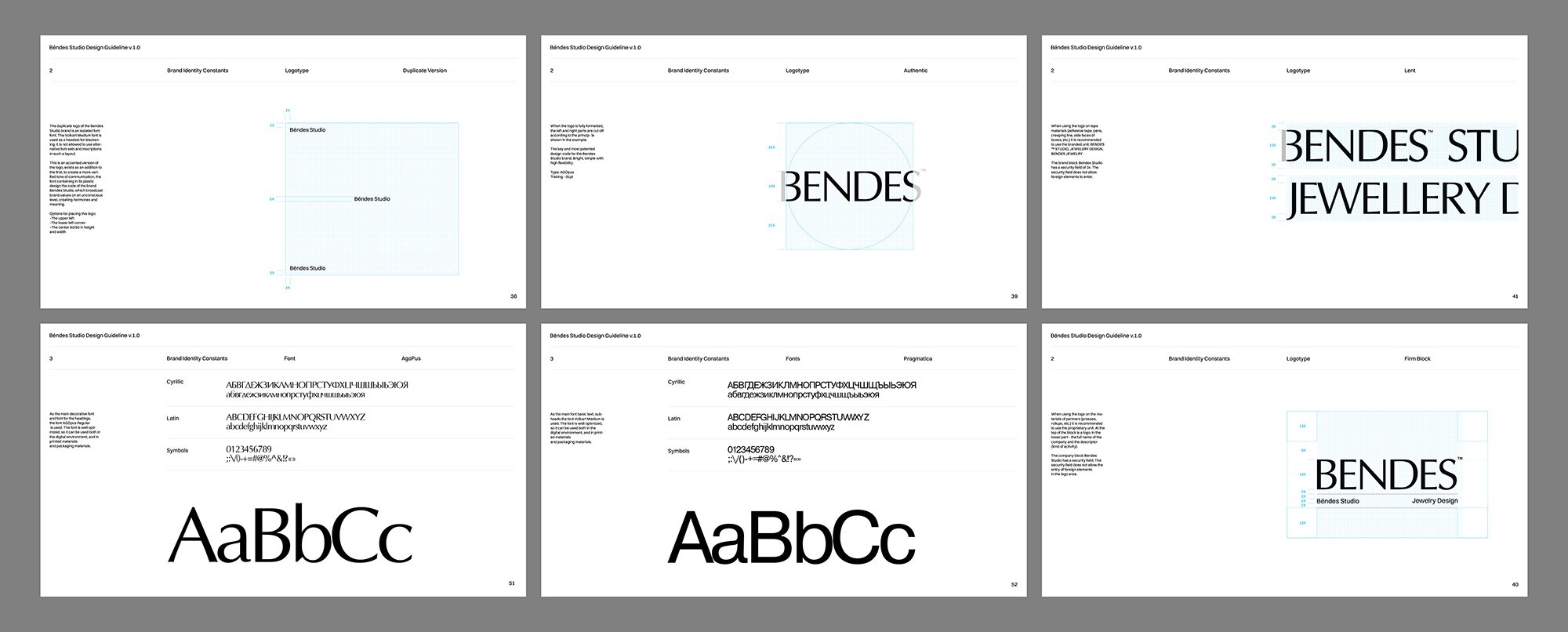
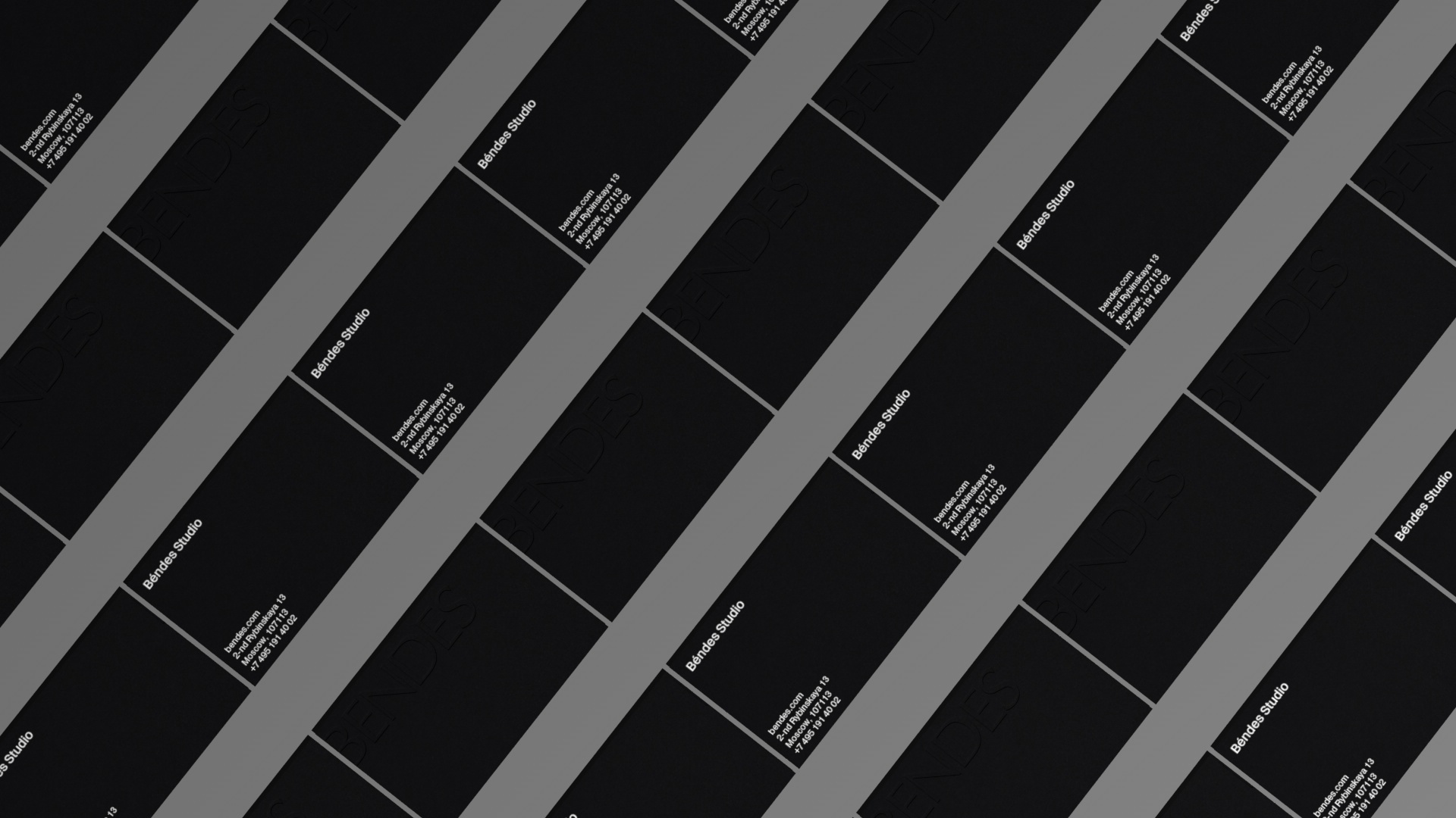
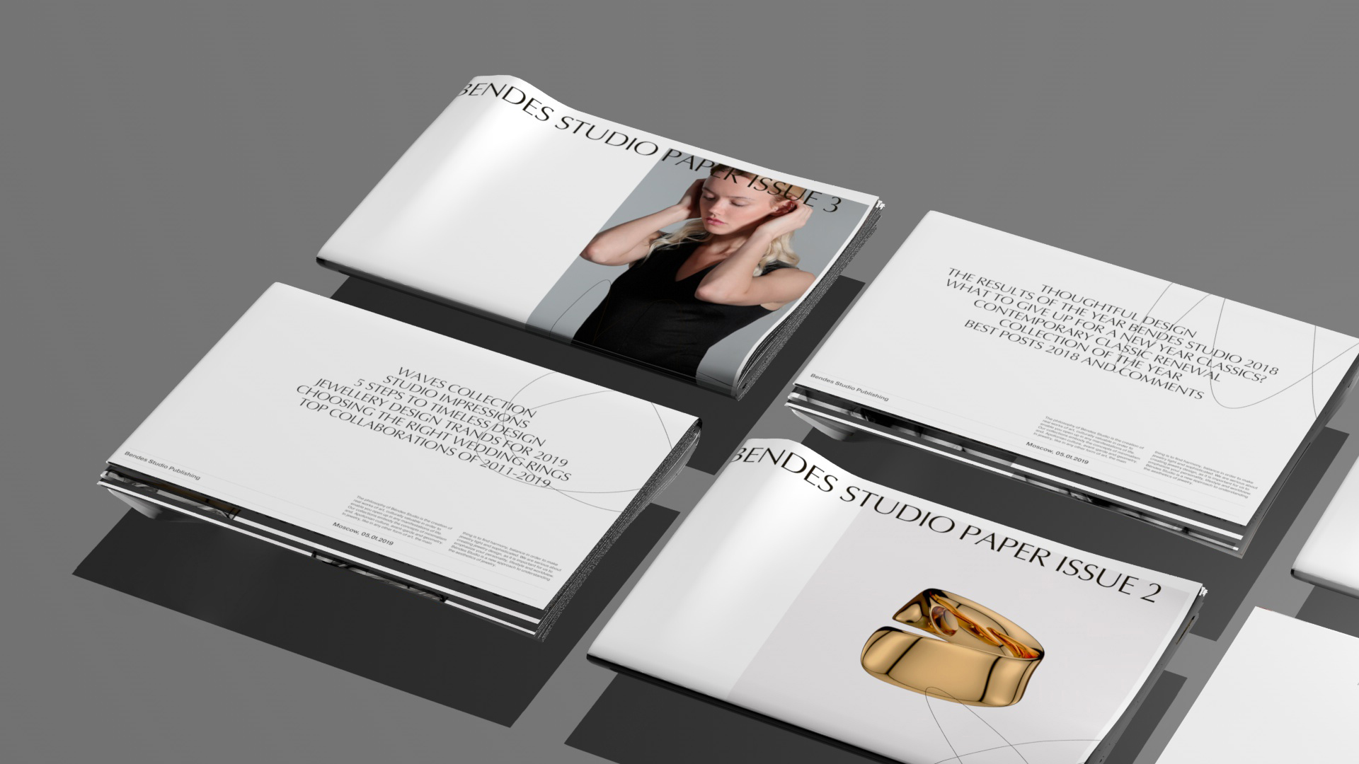
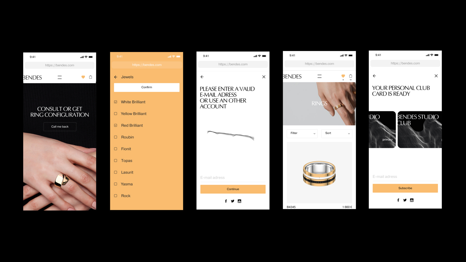
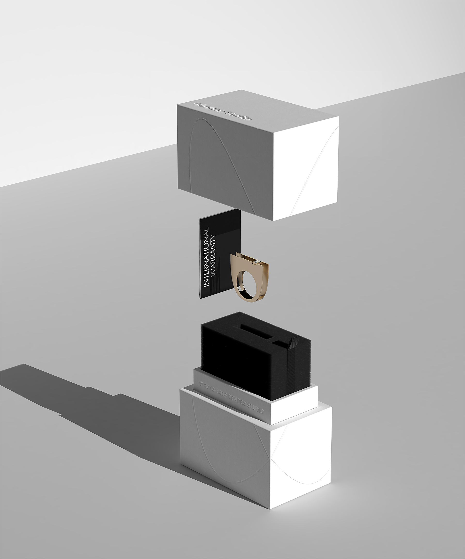
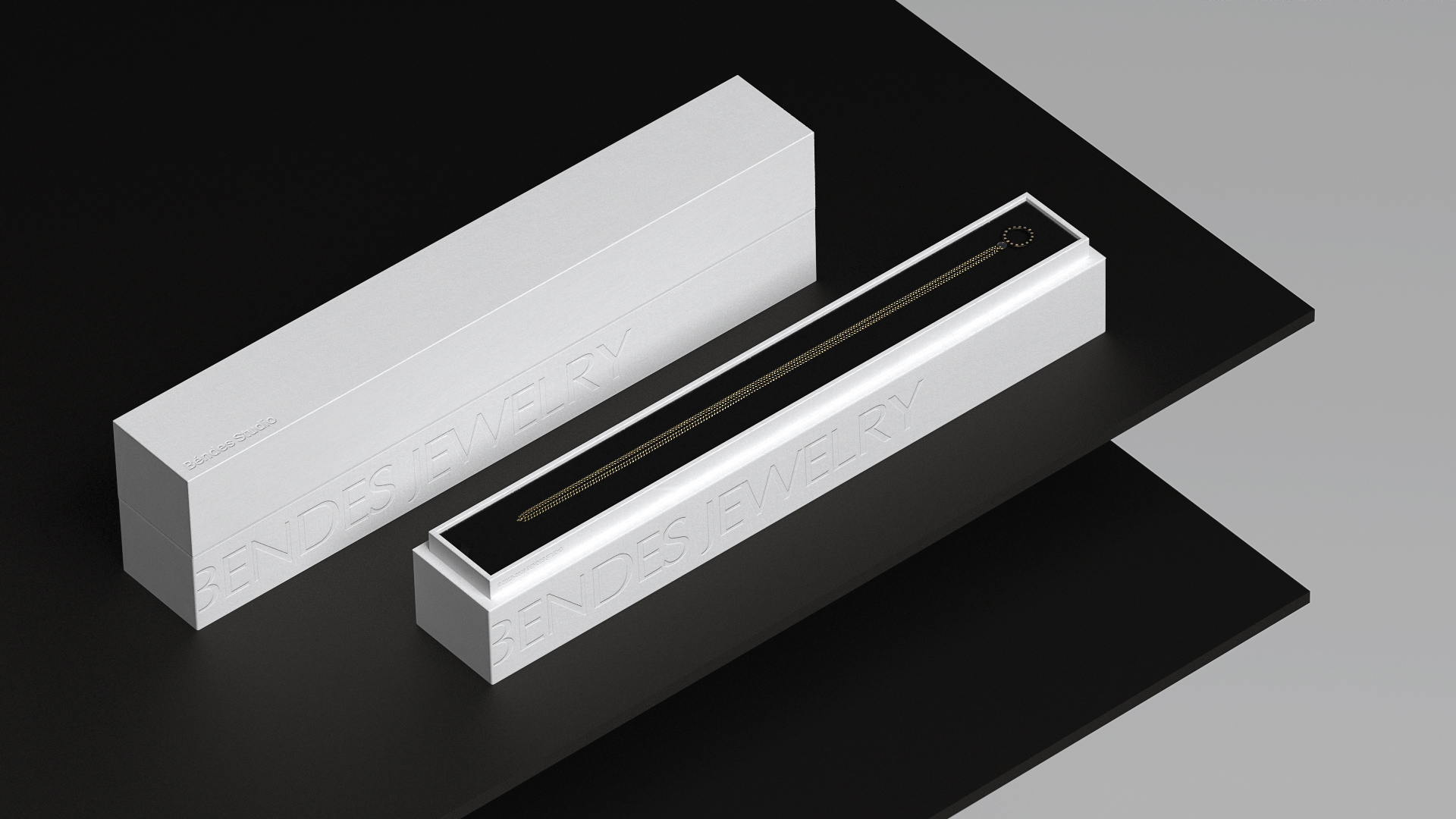
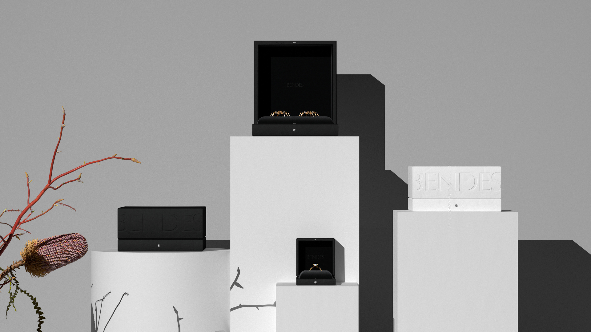
Béndes Studio employ two versions of the logo. A version of «BENDES» in uppercase is designed for external communication and bringing attention: advertisement, social media. A more austere style of «Béndes Studio» in lowercase is ideal for native branding formats: small packaging and cases, tags, blanks with technical information and questionnaires.
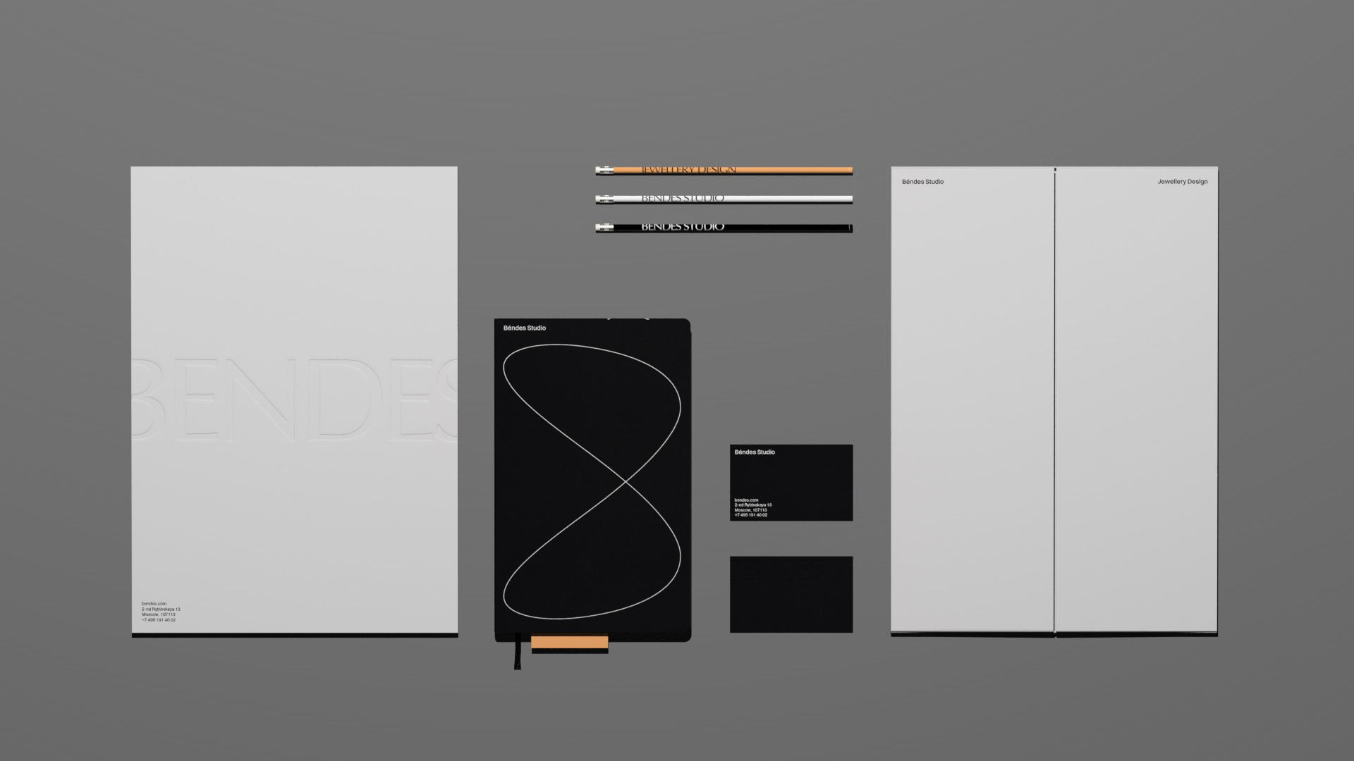
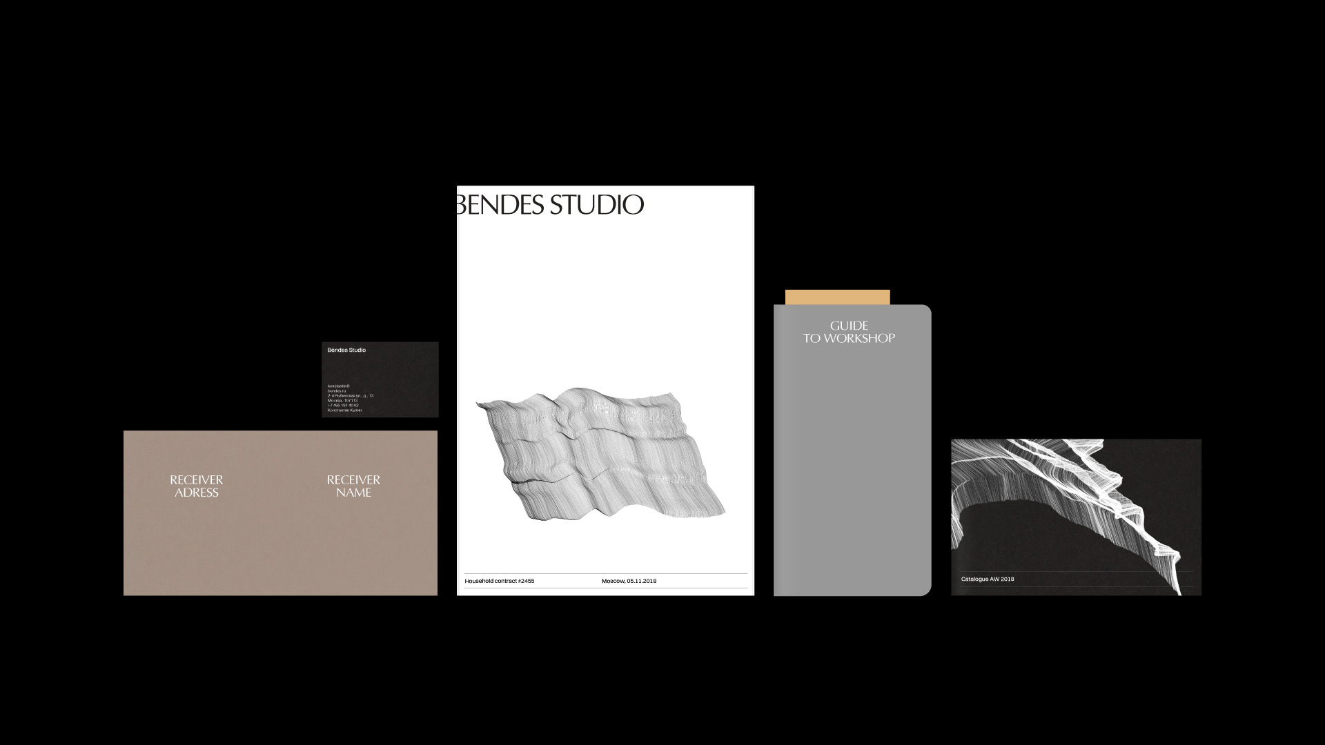
Although everything is relatively pleasant in the applications, the combination of the two logos and two names — “BENDES” in AGOpus and “Béndes Studio” in Pragmatica (and sometimes also in AGOpus but uppercase and without the accent) — is very confusing. I even had to clarify with the designers if they were different things, which they are not. The print applications seem stuck between wanting to be classic and contemporary, mixing centered and flush-left compositions in odd ways and combining the two fonts that don’t quite gel.
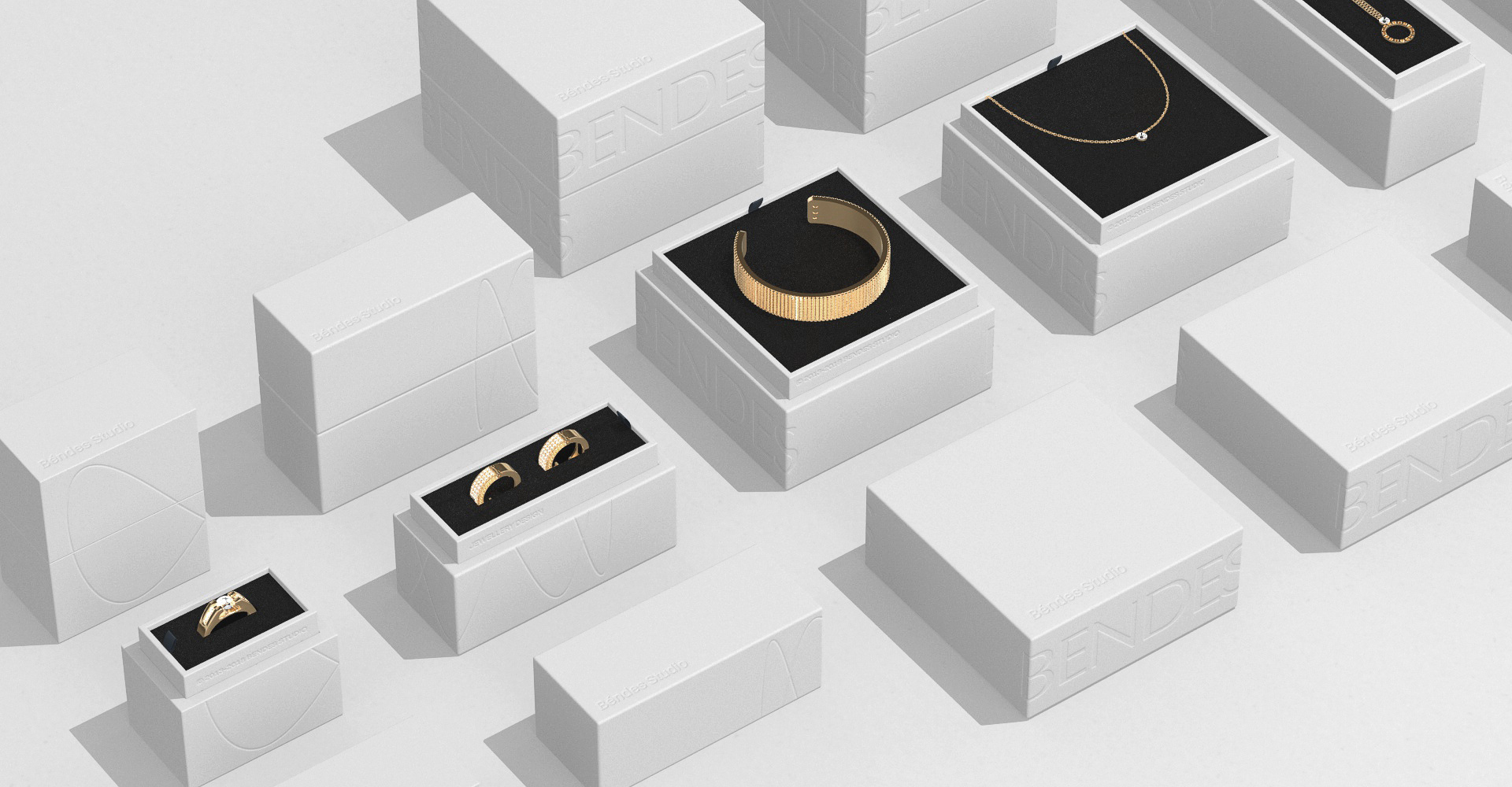
Our team came up with two types of packaging for the products:
— white boxes made of a design cardboard — are basic for Béndes Studio products with interior design foam rubber for jewelry safekeeping.
— black leather cases — designed for special occasions, their interior is made of velour.
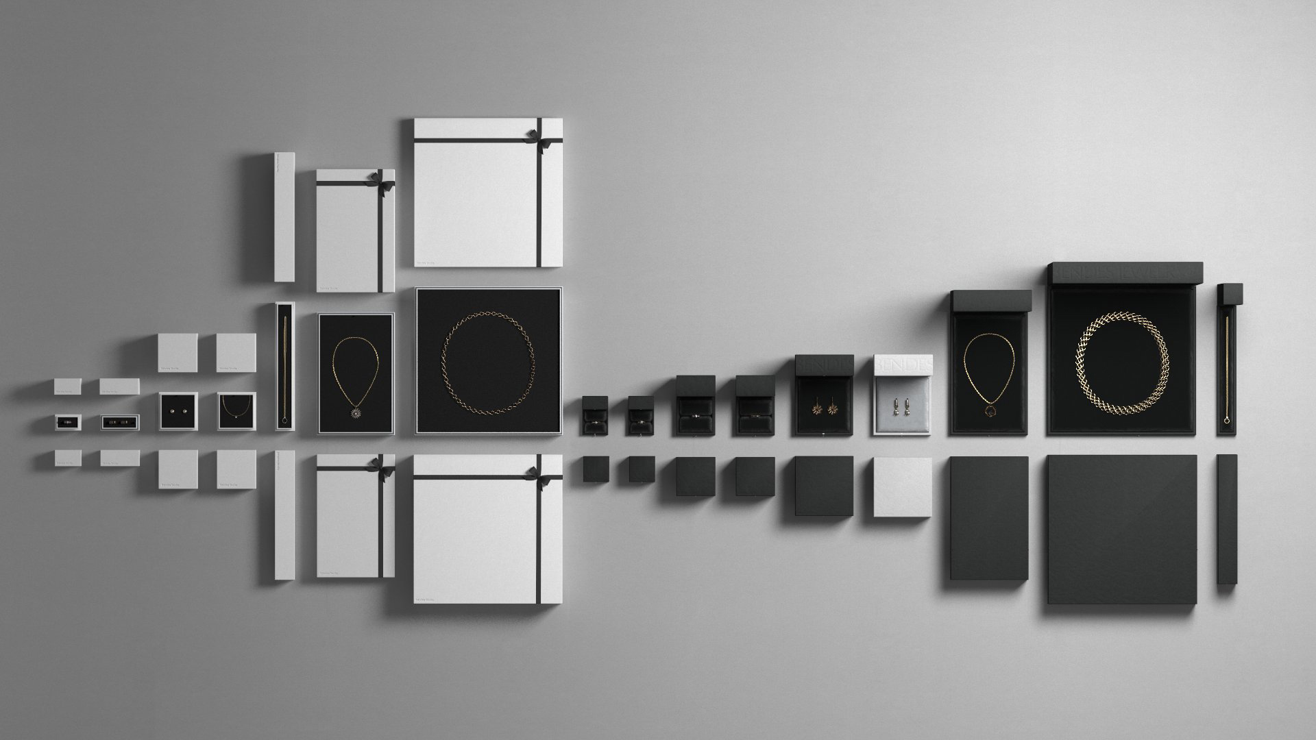
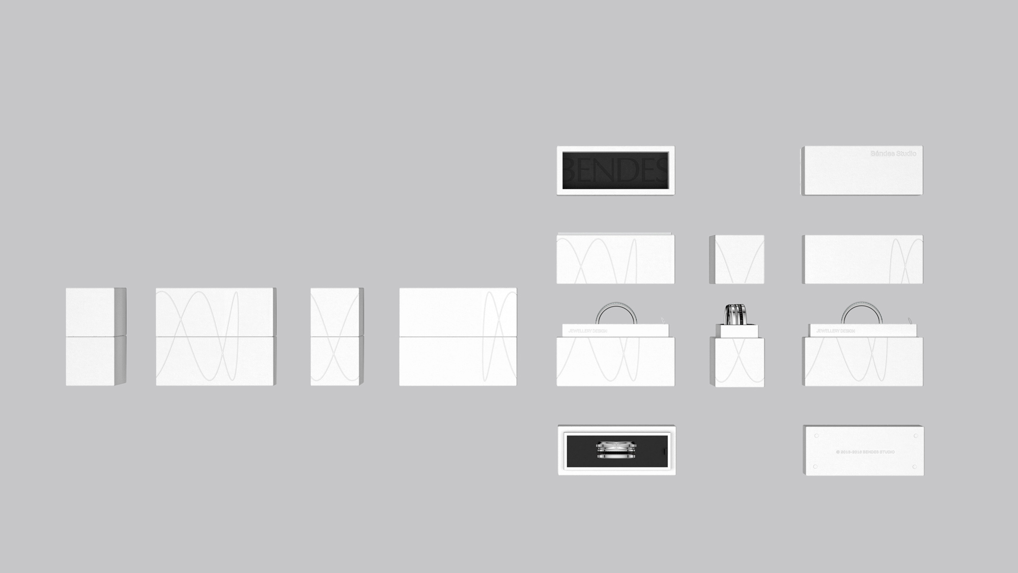
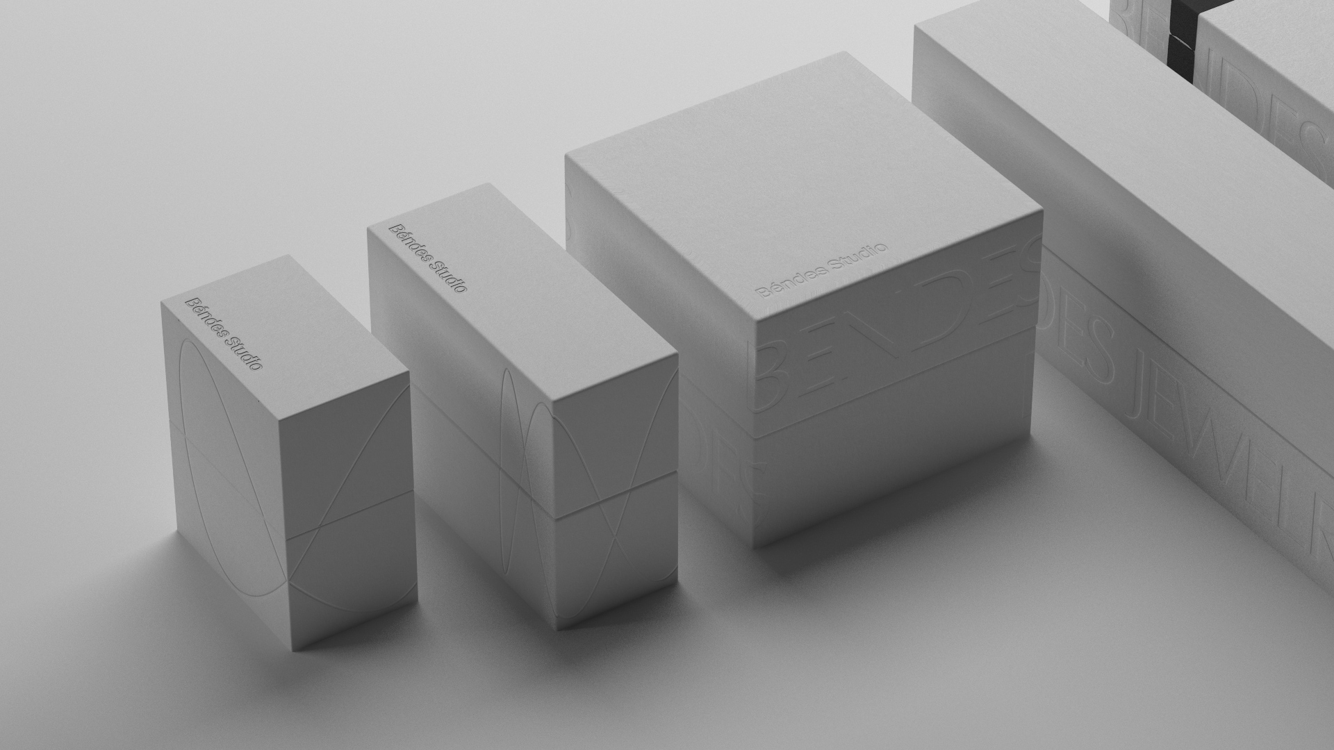
The packaging is a much better manifestation of the design ideas, starting with the cropped logo that wraps around the box and the more minimal use of the wavy line that adds an interesting contrasting element. The double name — BENDES and Béndes Studio — still trips me up but aesthetically it Pinterests well.
Overall, there is nothing surprising or overly exciting about the identity and packaging, hitting a lot of expected notes for a jewelry brand. The packaging is nice to look at and when the main logo bleeds off the edges it starts to develop into something much more interesting but I think the main logo needed something more nuanced than what a free font has to offer and the print applications need to have more conviction about what kind of brand it is: classic and elegant or one that randomly drops generative wavy lines on things for no evident reason.

 Новости Союза дизайнеров
Все о дизайне в Санкт-Петербурге.
Новости Союза дизайнеров
Все о дизайне в Санкт-Петербурге.