Обзор лучших ресурсов по разработке бренда, разработке упаковки
contact us | ok@ohmycode.ru
contact us | ok@ohmycode.ru
Established in 1862 in Baltimore, MD, by Frederick August Otto Schwarz, FAO Schwarz is the oldest toy store in the United States and possibly its most famous. Moving to New York, NY, in 1870, FAO Schwarz opened its flagship store in the General Motors Building on Fifth Avenue, made famous by Tom Hanks’ Big in 1988. Since then, the toy store has had many ups and downs: going through multiple ownership changes, opening as many as 40 retail stores, filed for bankruptcy twice in the early 2000s, and ultimately (and most dramatically) closing its flagship store in 2015. In 2016, ThreeSixty Group acquired it from Toys ‘R’ Us and since 2017 has been rolling out a new identity, designed by Orange County, CA-based Mattson Creative, that finally hit the big stage when they reopened FAO Schwarz in a new location in Rockefeller Center on November 16, 2018.
The old logo, that made its debut way back in 2010, introduced a creepy harlequin and some okay but not great typography. In the years since then, FAO Schwarz has, as related to me by Mattson Creative, used multiple different logos and this new version, in a way, feels like it’s been the FAO Schwarz logo for decades. It’s simple and classic, with an elegant flared serif and while, in general, I am not a fan of fleuron-like elements, the holding shape adds a nostalgic, vintage touch to the logo. But, to be honest, we are not here for the logo and I know this identity is not exactly the most breaking of news but the identity system is all kinds of awesome.
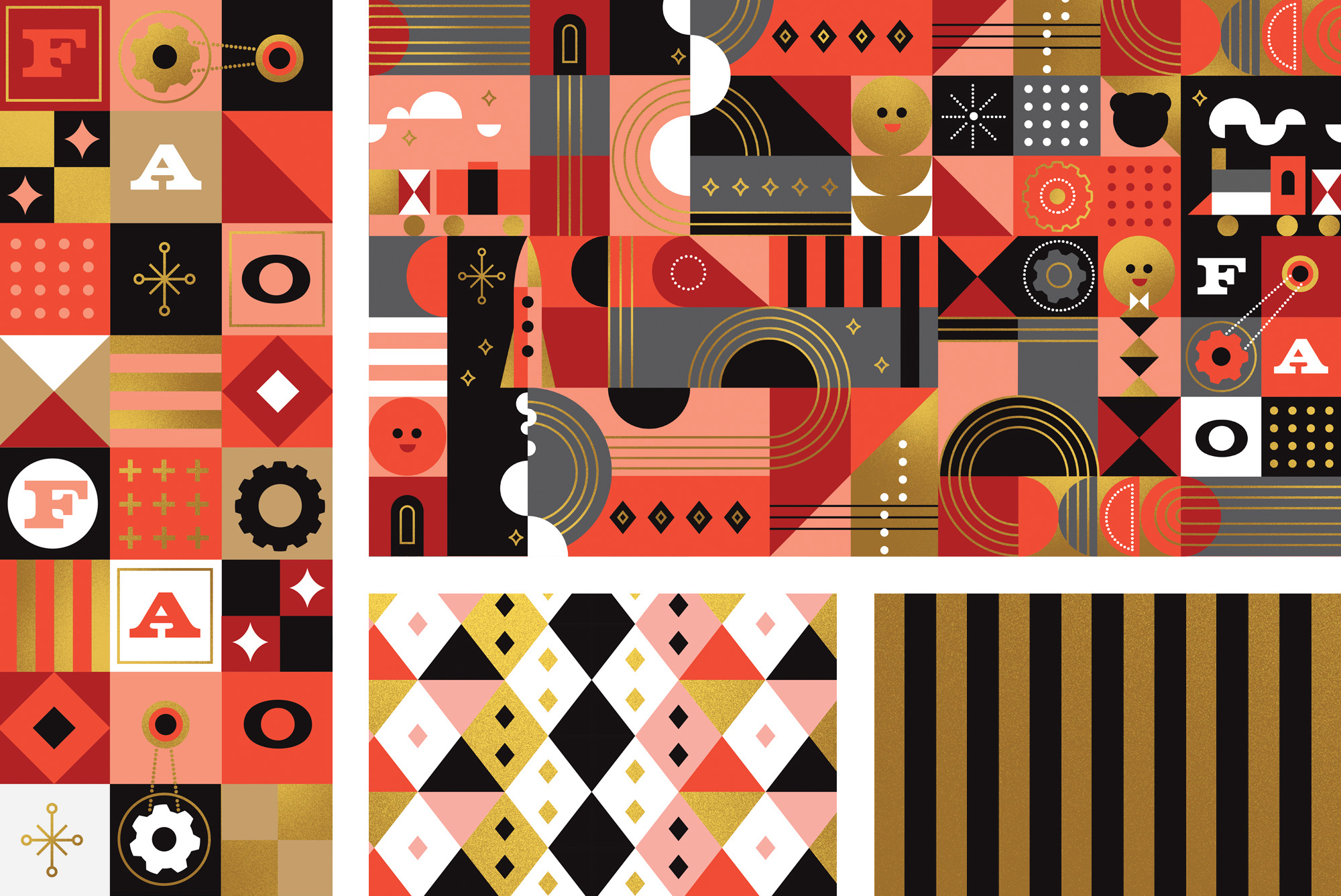
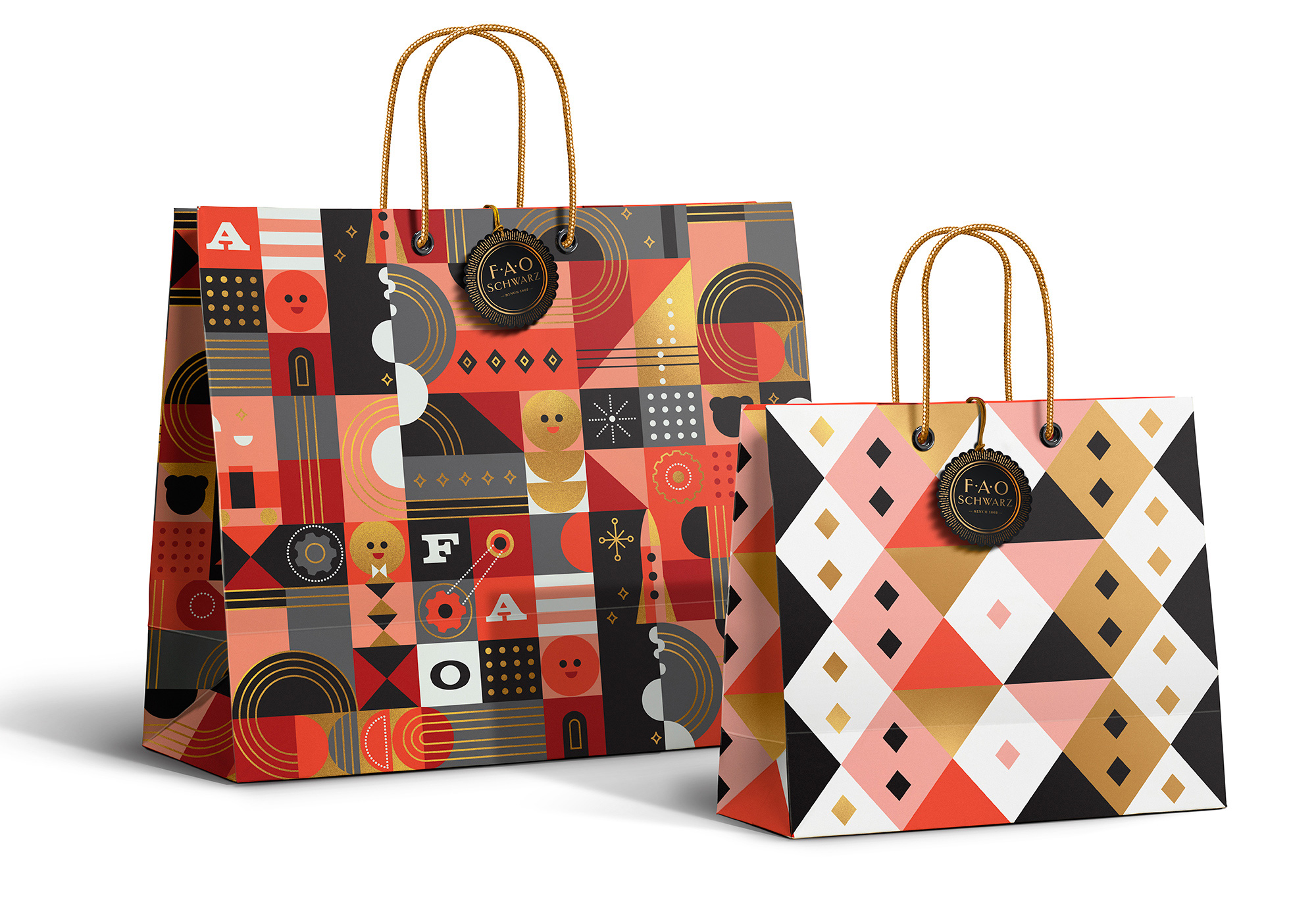
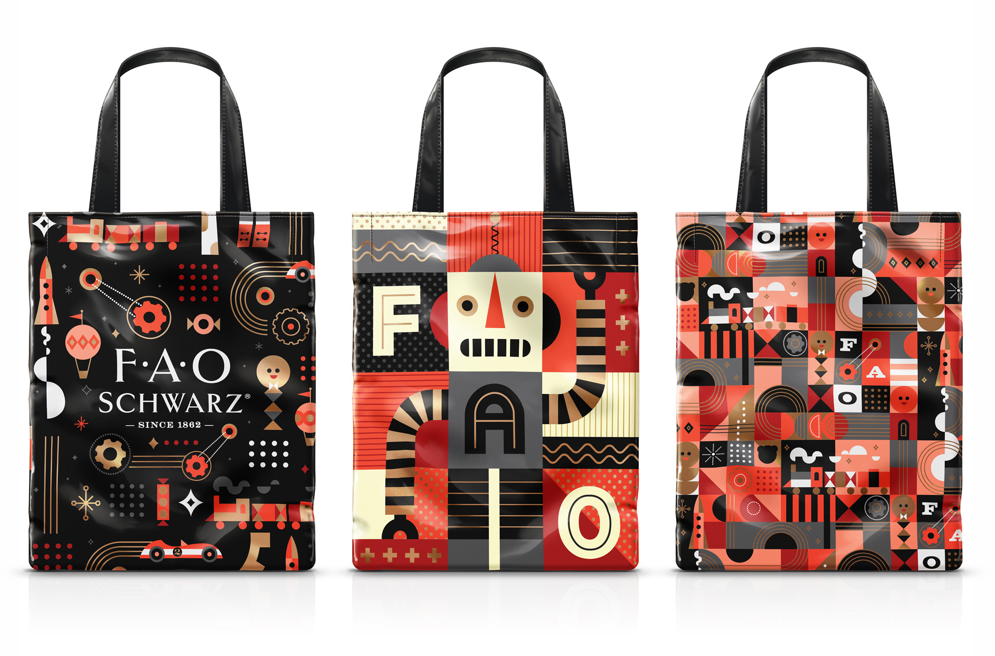
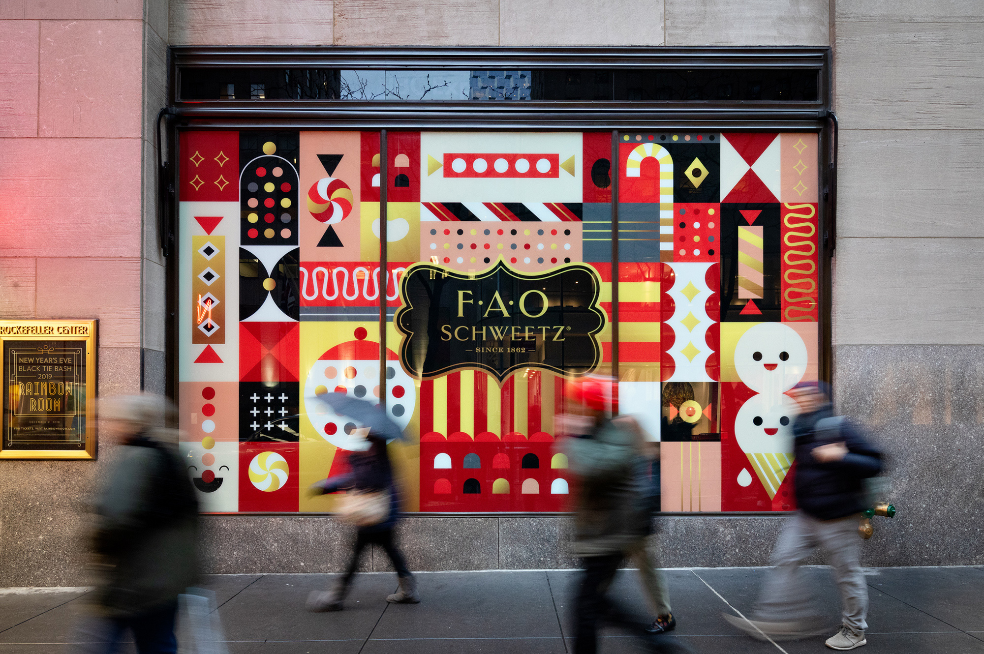
The system hinges on a set of delightful patterns that evoke the idea of toys without referencing any particular kind of toy through abstract representations of fun things like cars and balloons and trains and candy and robots that are perfectly on cue regardless of whether you go there to buy LEGO, create a Build-a-Bear, or leave with only bags of candy. The color palette of black, red, pink, gold, and white is amazingly perfect for all genders and all ages and the overall combination of design elements makes it feel both accessible and luxurious (maybe more the latter, but still). The patterns can be cropped to focus only on a few elements, they can be mixed and matched, they can be repeated endlessly, and they can be easily accentuated by the fleuron-shaped logo.
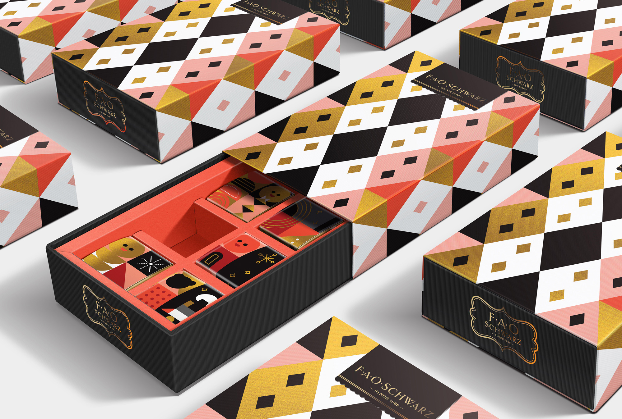
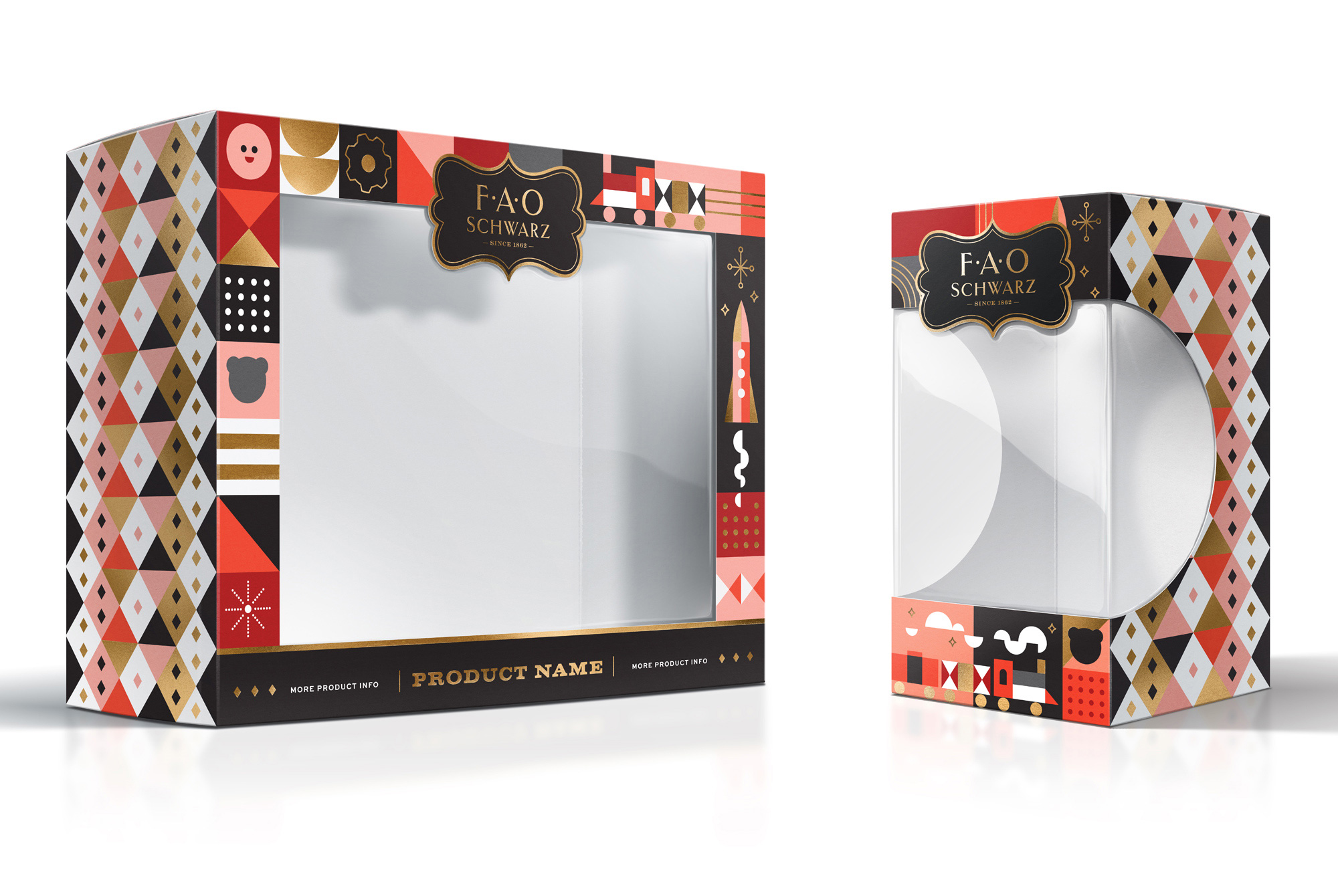
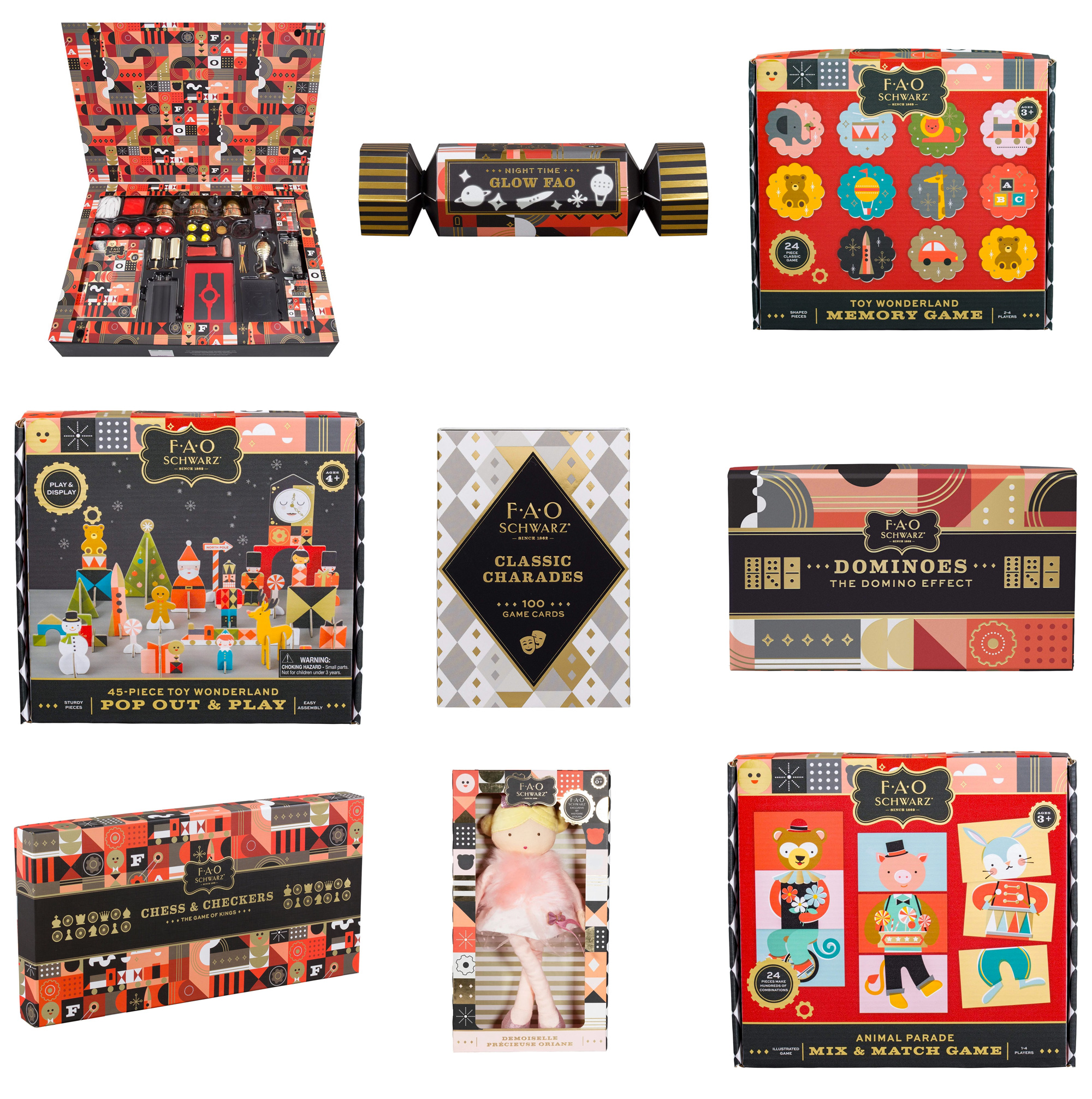
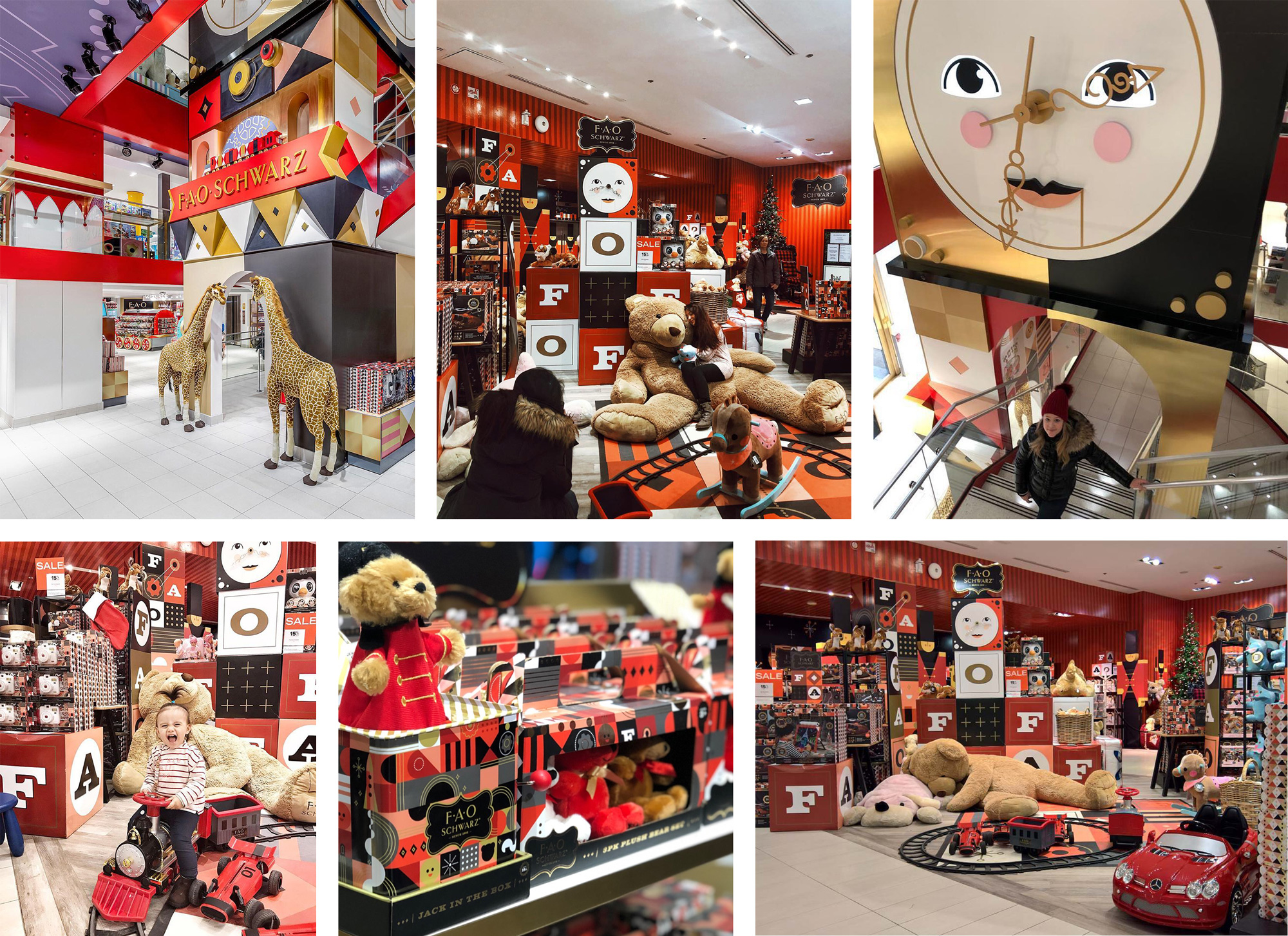
Amidst all the toy brands you can buy at the store, FAO’s own brand stands out beautifully with consistent yet flexible packaging. The addition of the bold slab serif works great with the logo and patterns, while a few dingbats here and there add a little more glitz.
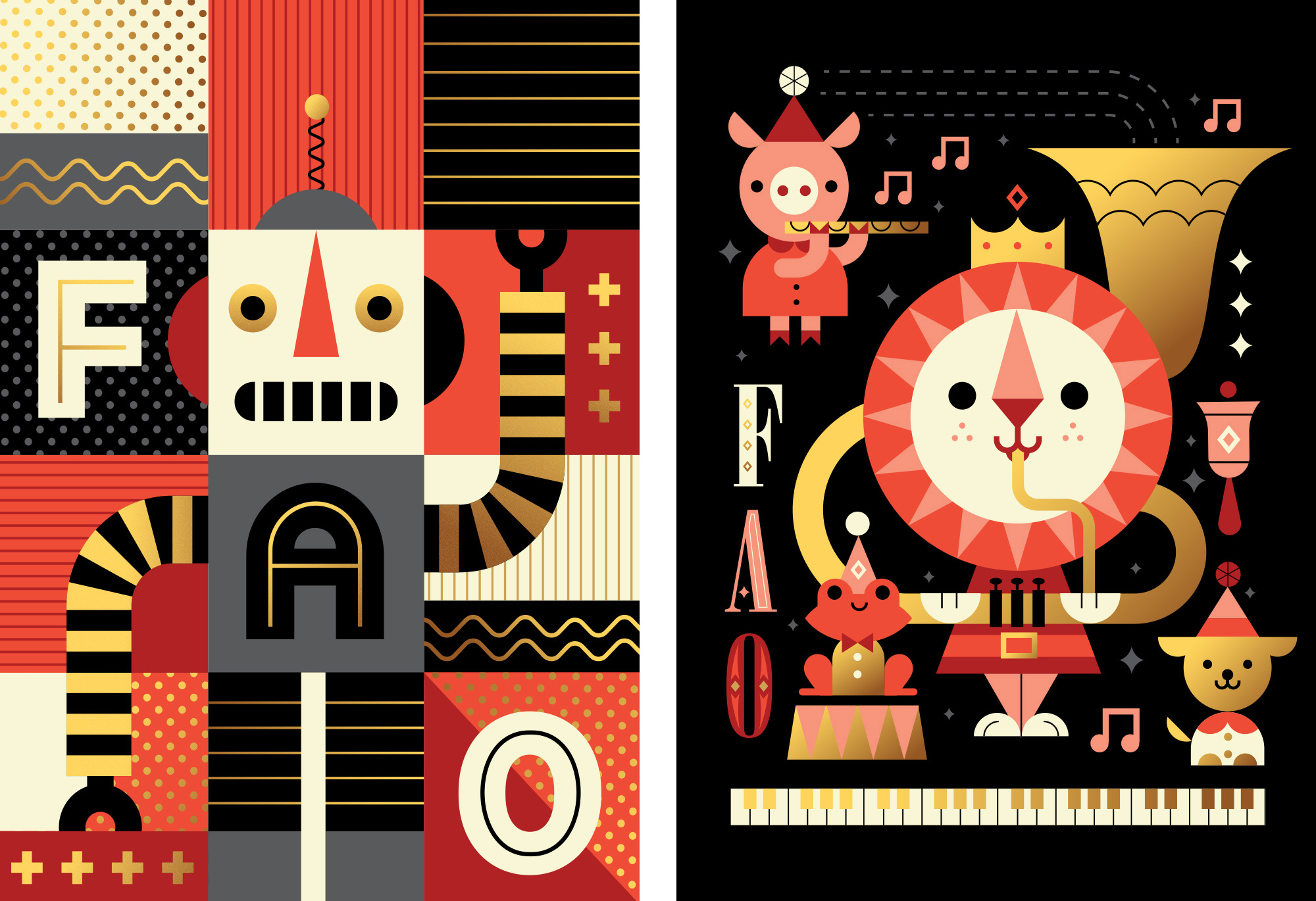
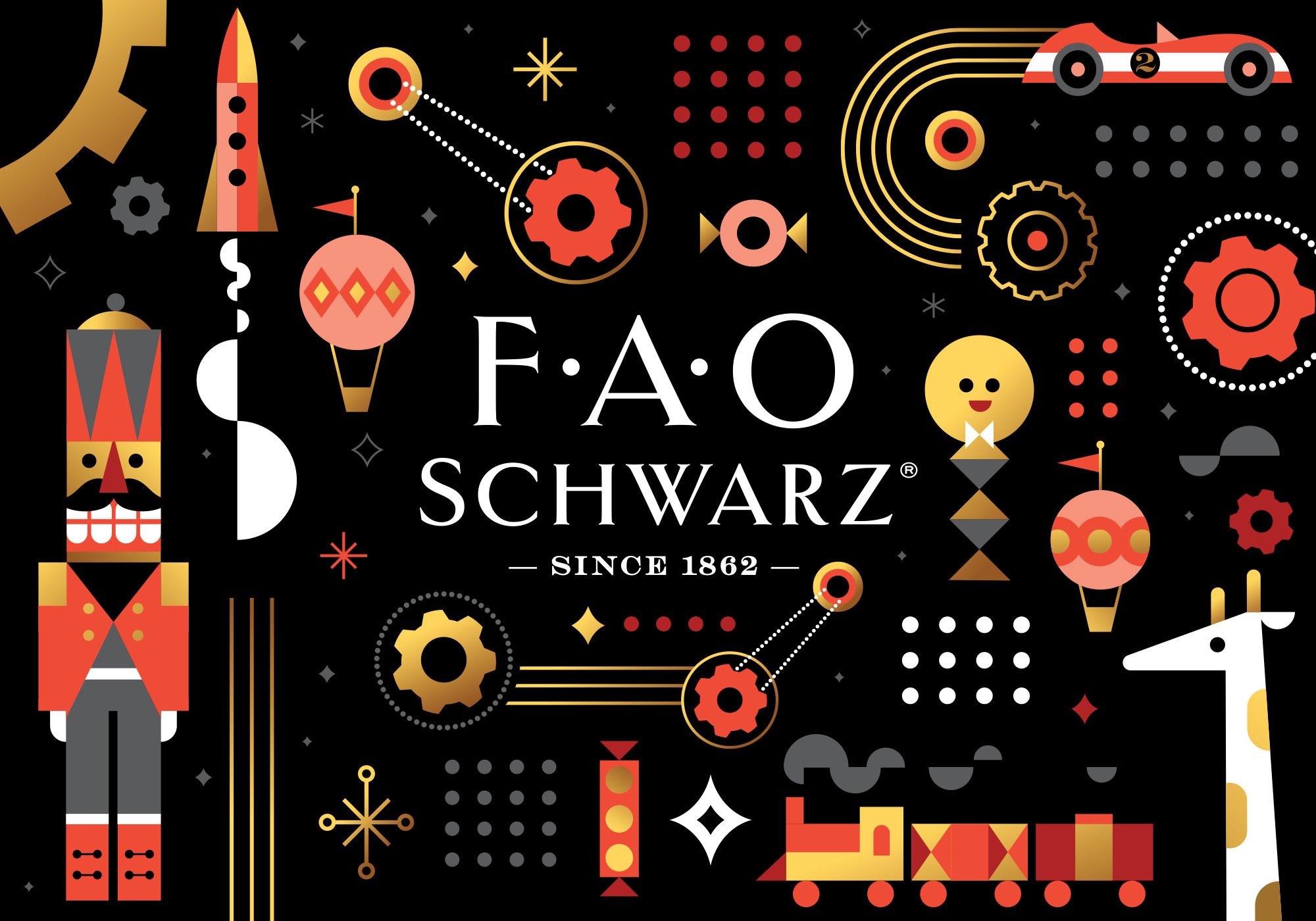

The illustration work is pretty fantastic too, adding even more elements to play with in compositions or on their own. Both the patterns and the illustrations have a strong Disney’s “It’s a Small World” vibe — it’s my favorite Disney ride, so to me, this whole approach is very pleasing.
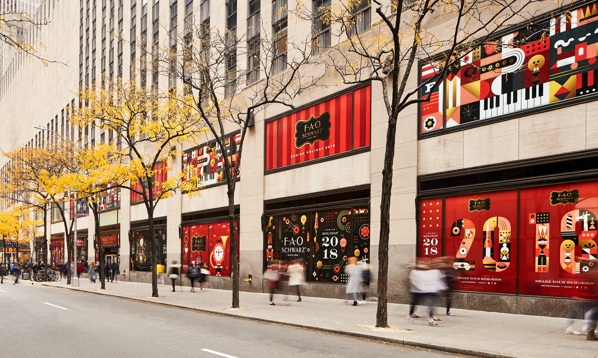
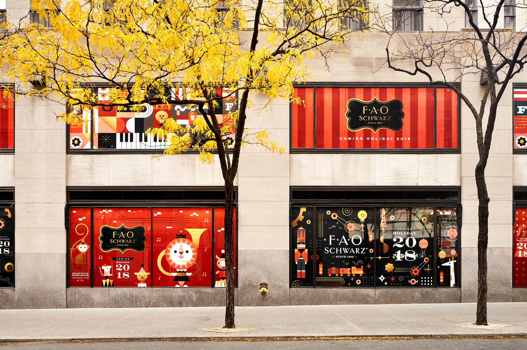
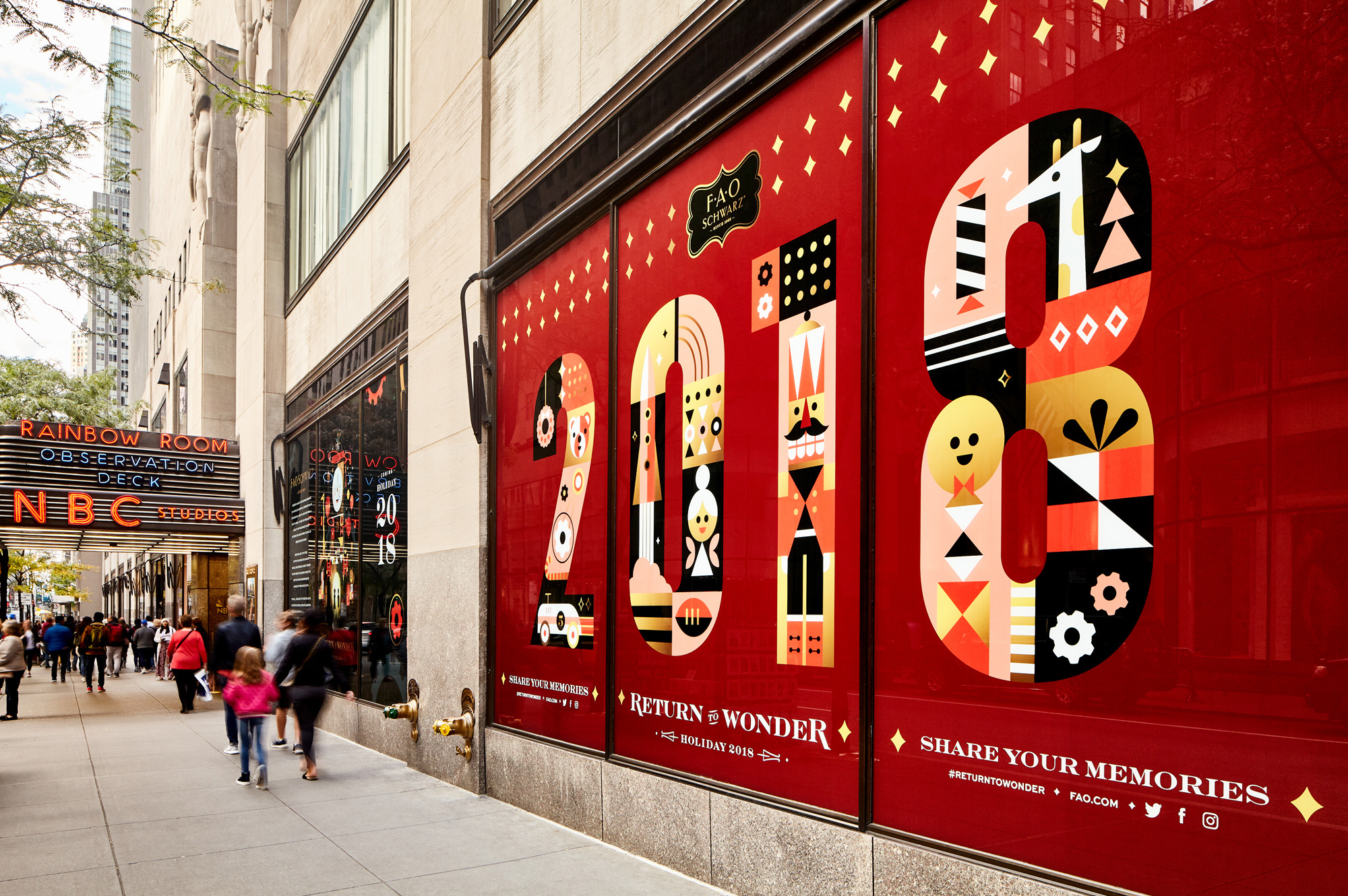
The windows on the exterior of the store are peppered with the patterns and illustrations and are neatly framed by the clean lines and tan color of the building itself, creating a perfectly modular backdrop for the system to lure people into the store.
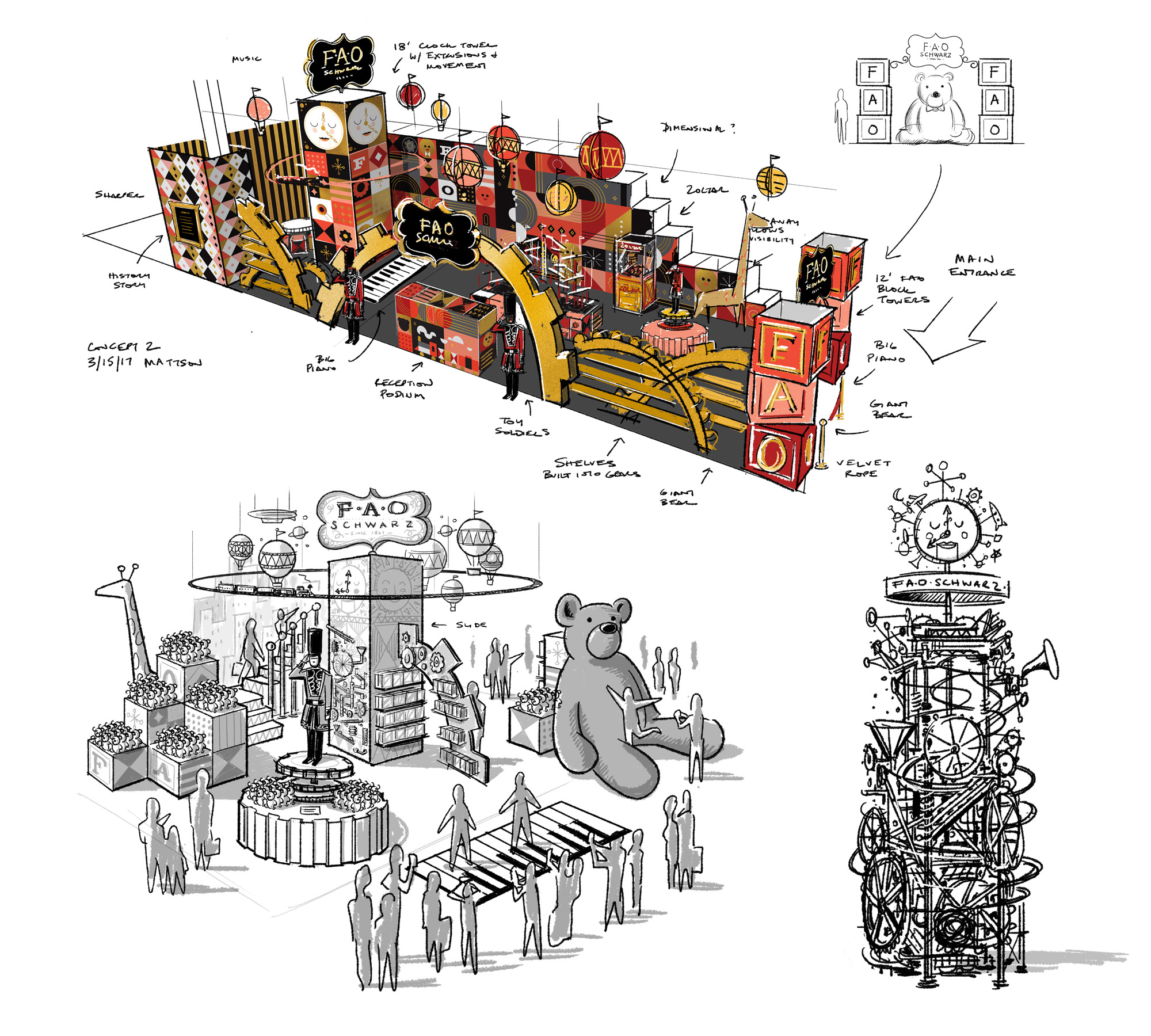
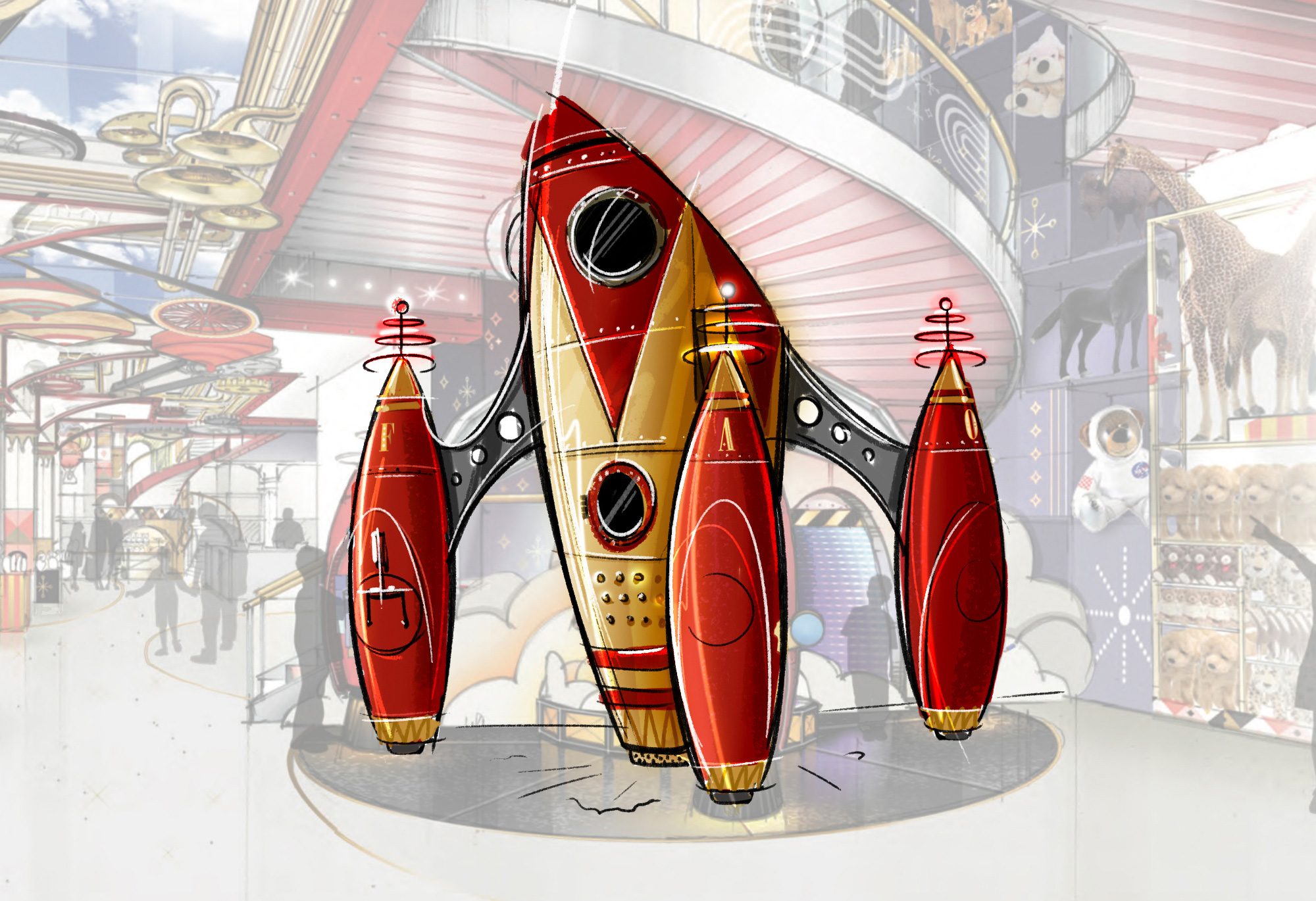
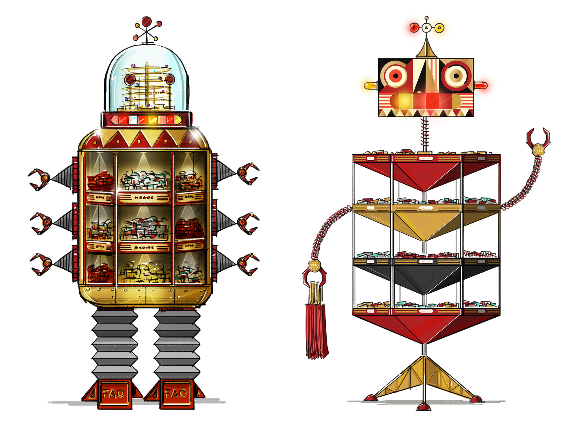
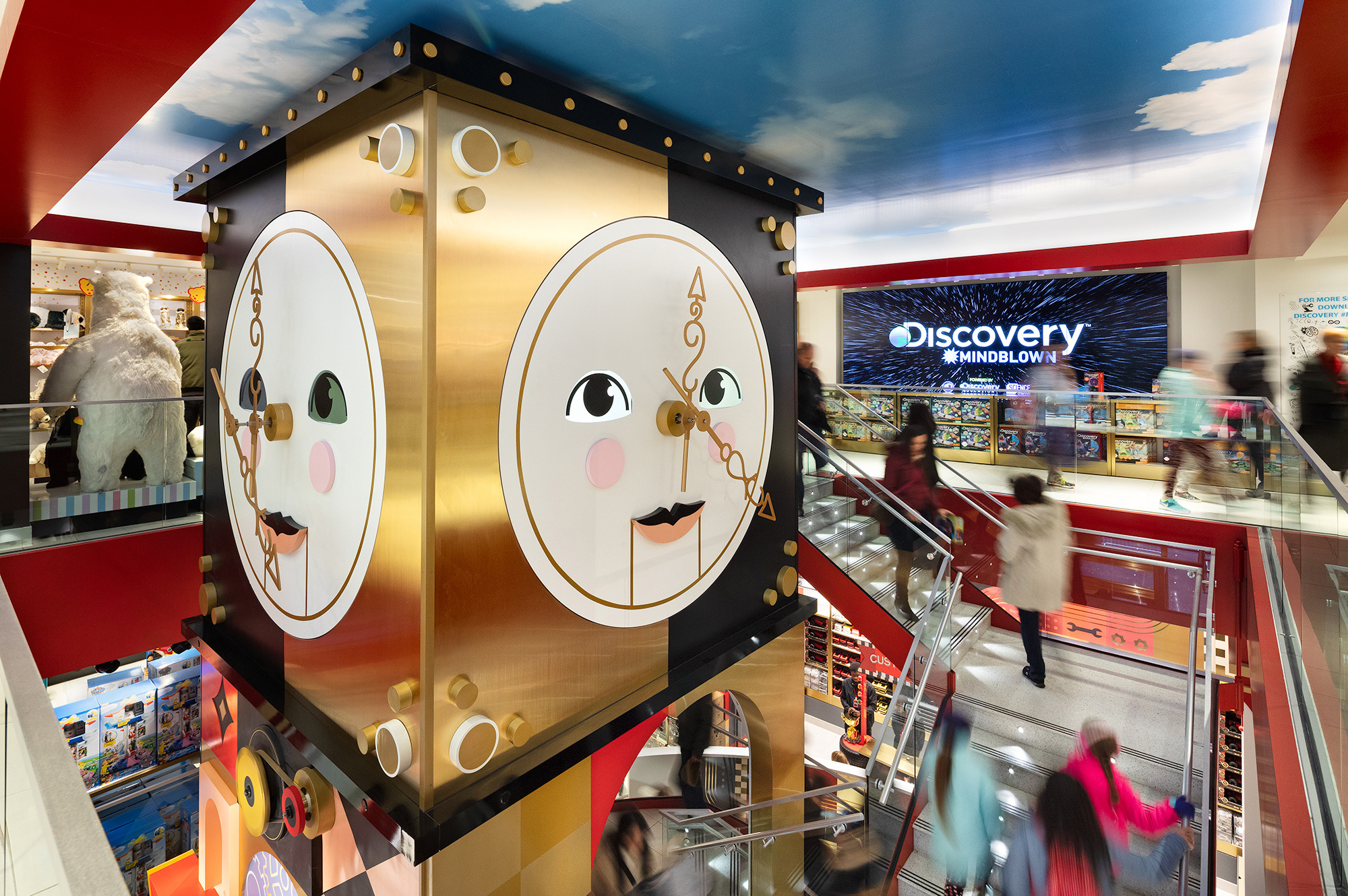
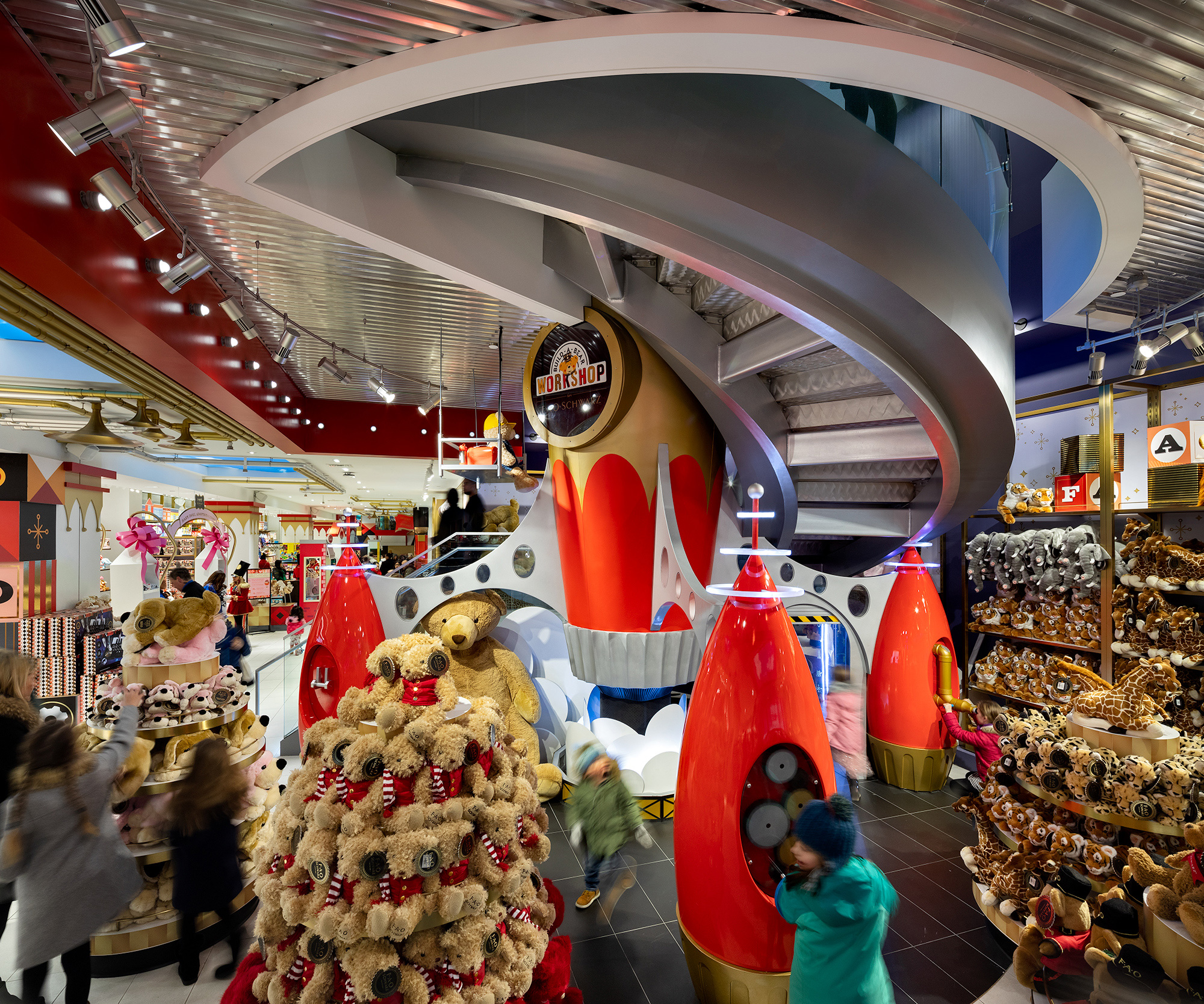
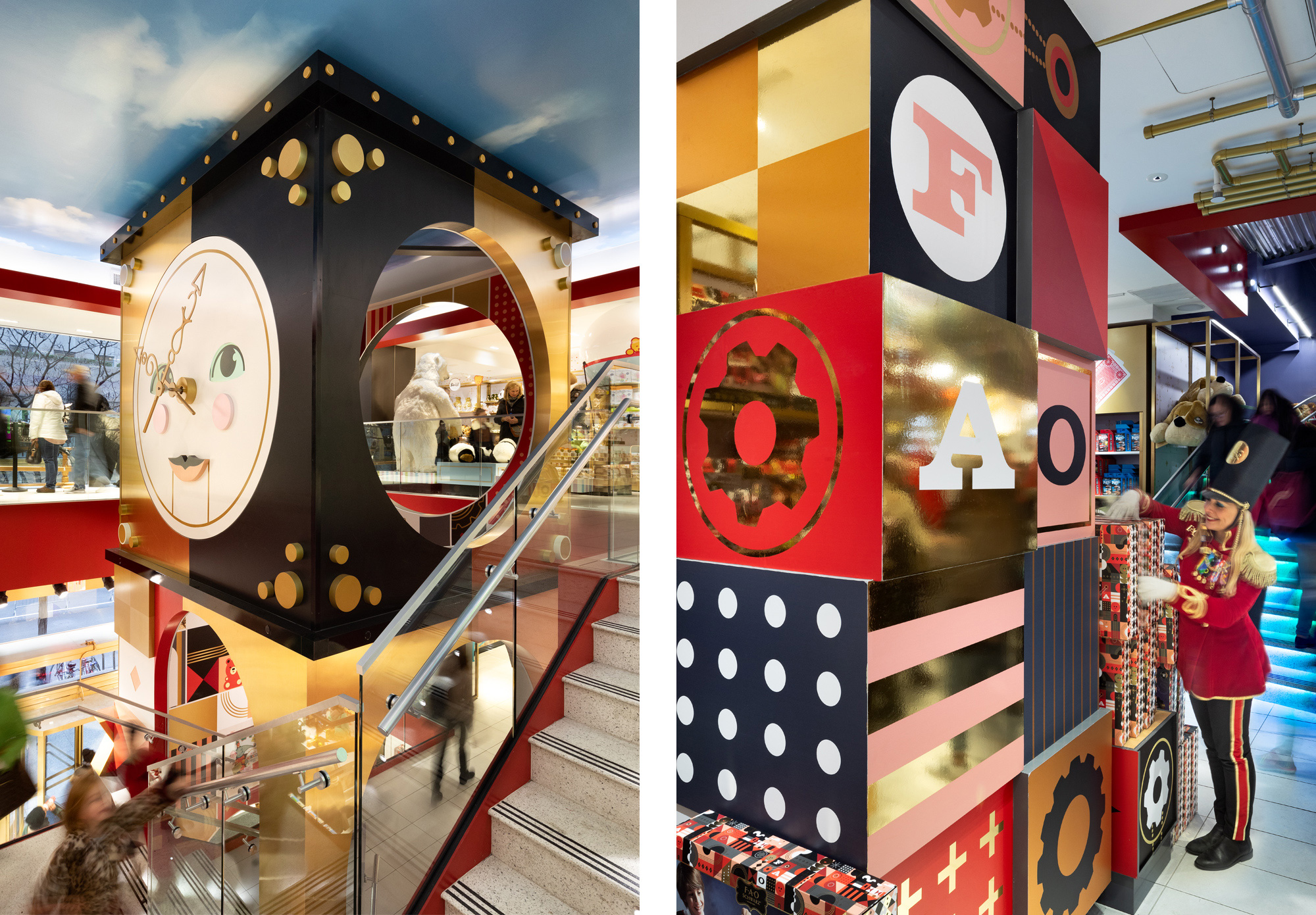
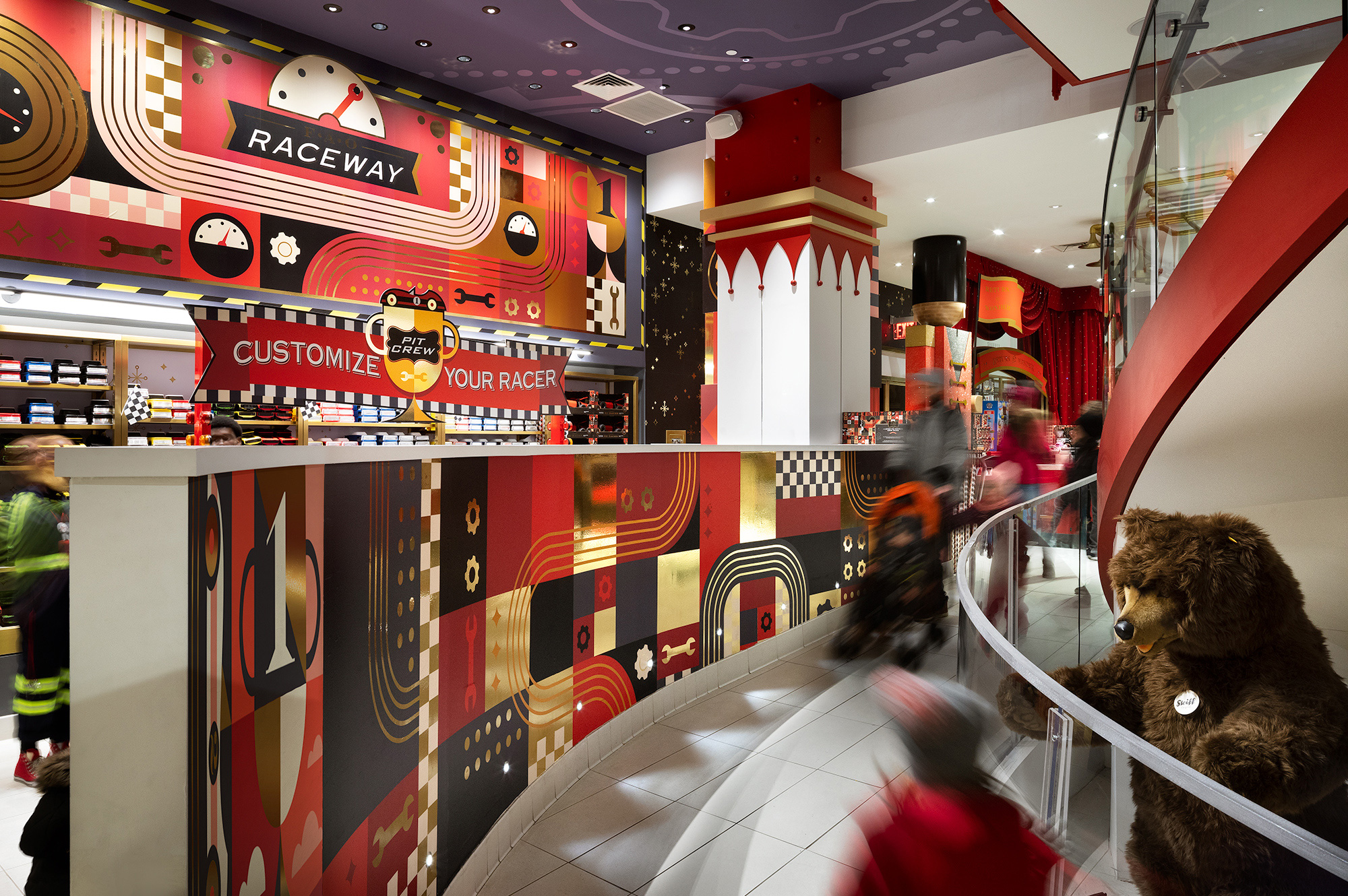
The interiors are crazy. I happened to be in New York in Thanksgiving last year, a few days after it opened and the line to get in was a bit intense but I really wanted to check it out and it’s amazing in there. It’s basically like stepping into a real-life, life-size guidelines document. The whole store is the identity system, from the shelves to the wallpaper to the products and while you might think “Isn’t that too much?” you would be right, and it’s glorious.
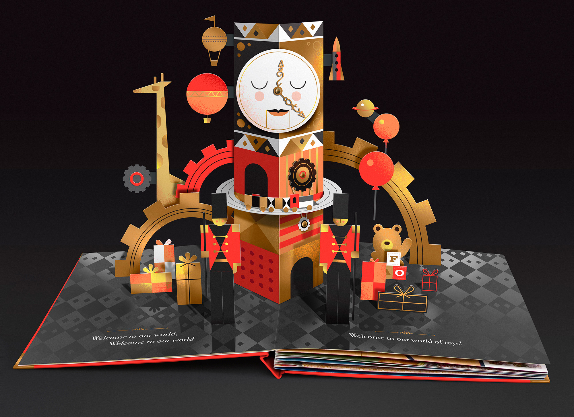
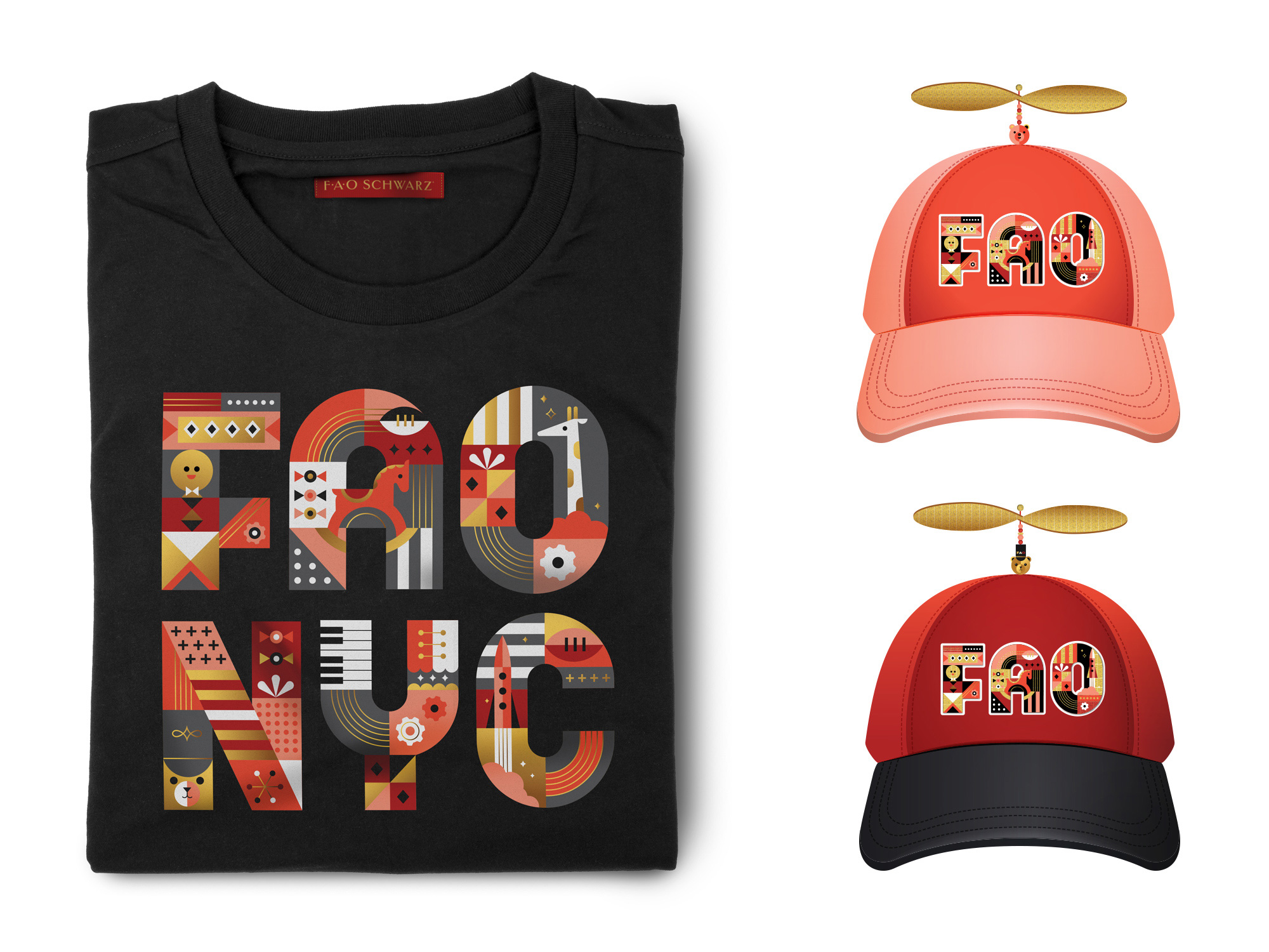
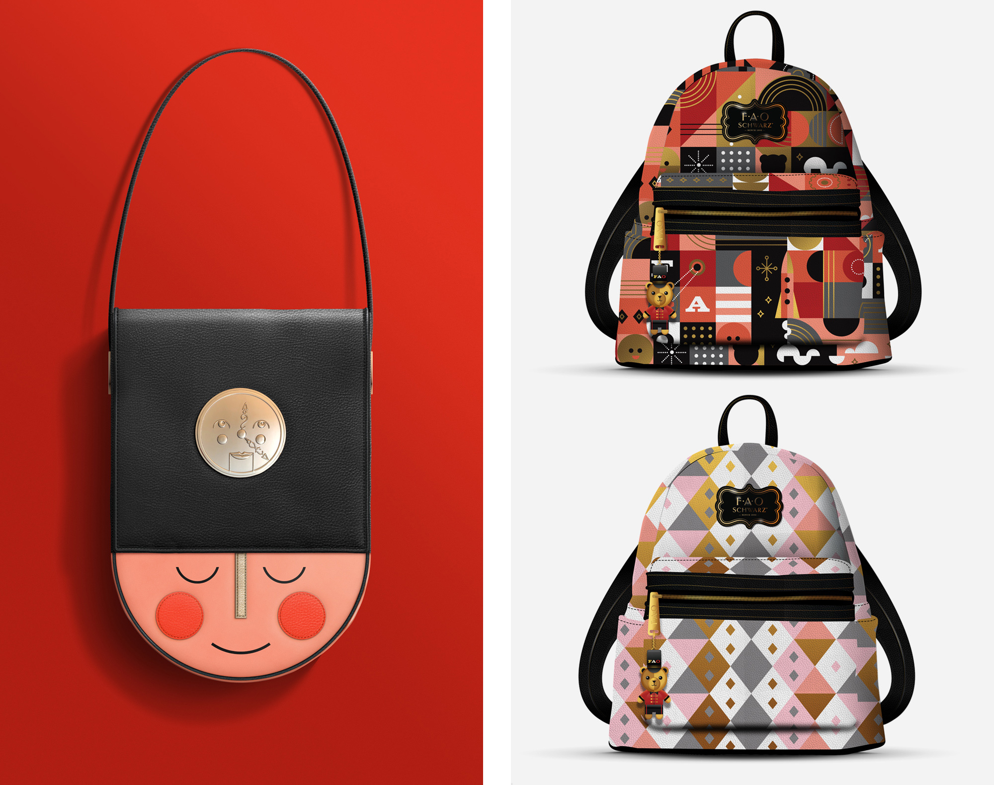
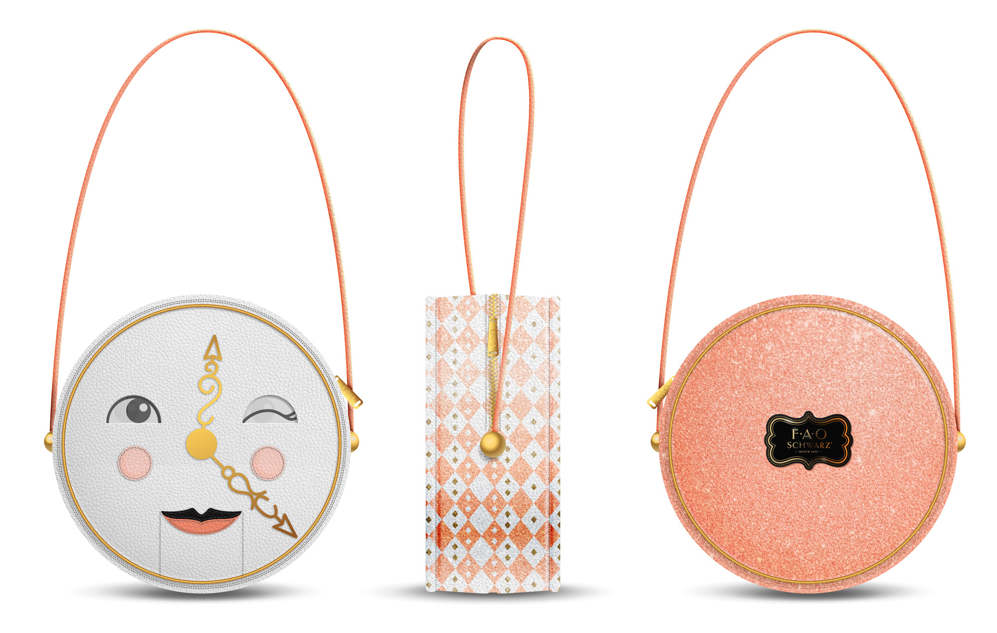
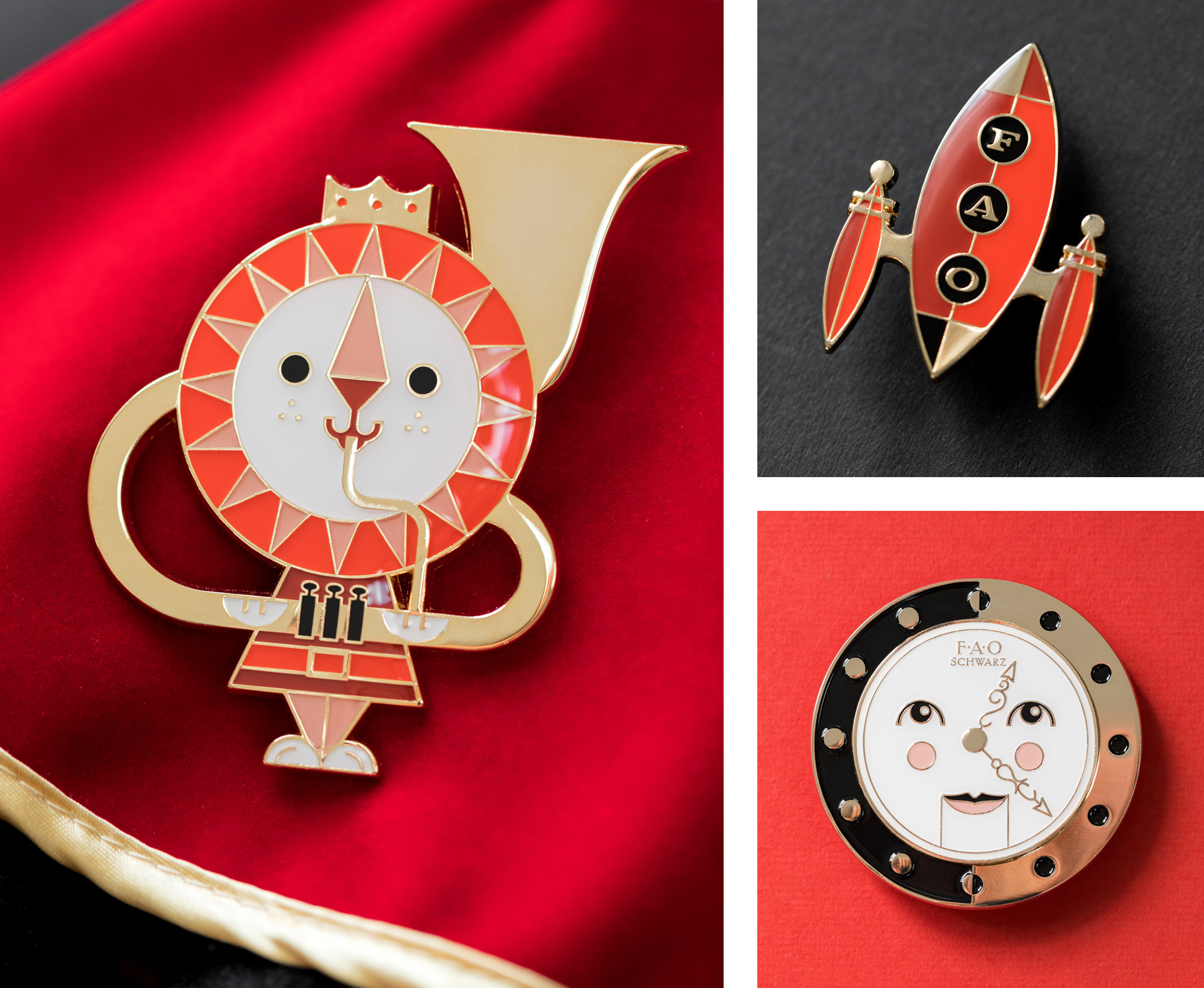
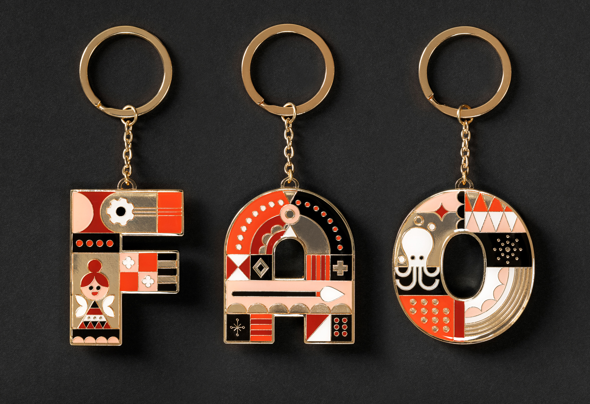
Even the dreamed-up merchandise becomes a reality in this project, with some great FAO Schwarz-brand products that are down-tight covetable and collectible. Like a kid in a candy store, Mattson Creative went wild with this project and the enthusiasm is evident from start to finish.

 Новости Союза дизайнеров
Все о дизайне в Санкт-Петербурге.
Новости Союза дизайнеров
Все о дизайне в Санкт-Петербурге.