Обзор лучших ресурсов по разработке бренда, разработке упаковки
contact us | ok@ohmycode.ru
contact us | ok@ohmycode.ru
Established in 2019, FENTY is a new fashion house founded by Robyn Rihanna Fenty, acting as its CEO and artistic director, in collaboration with LVMH, the French multinational luxury goods conglomerate. The brand will live online and in pop-up shops, offering ready to wear fashion, shoes, and accessories for women, FENTY, as is to be expected reflects the personality and tastes of Rihanna and “embraces a fundamental freedom: a freedom from convention and rules”. Launched in May, the identity for FENTY was designed by London, UK-based Commission.
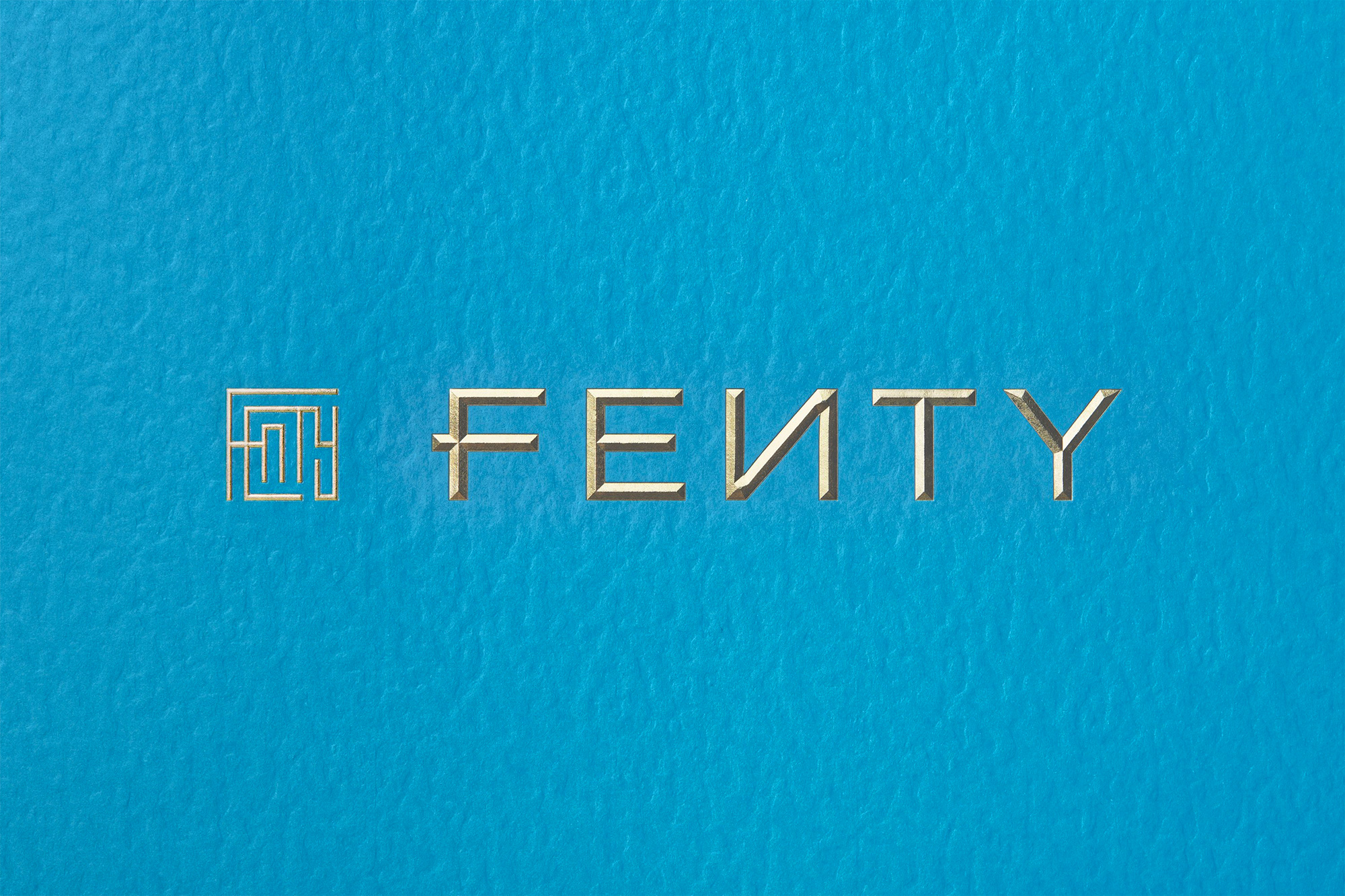
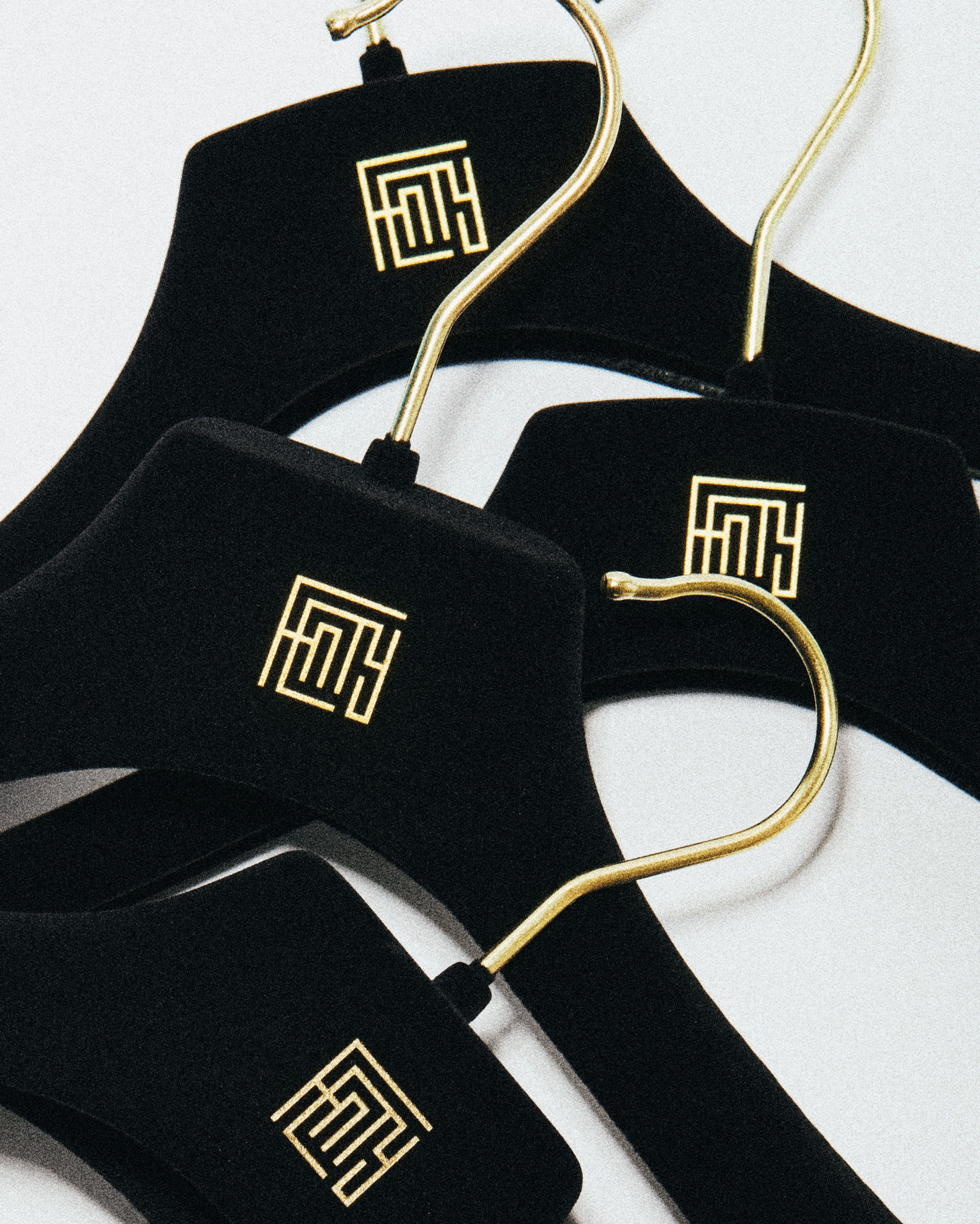
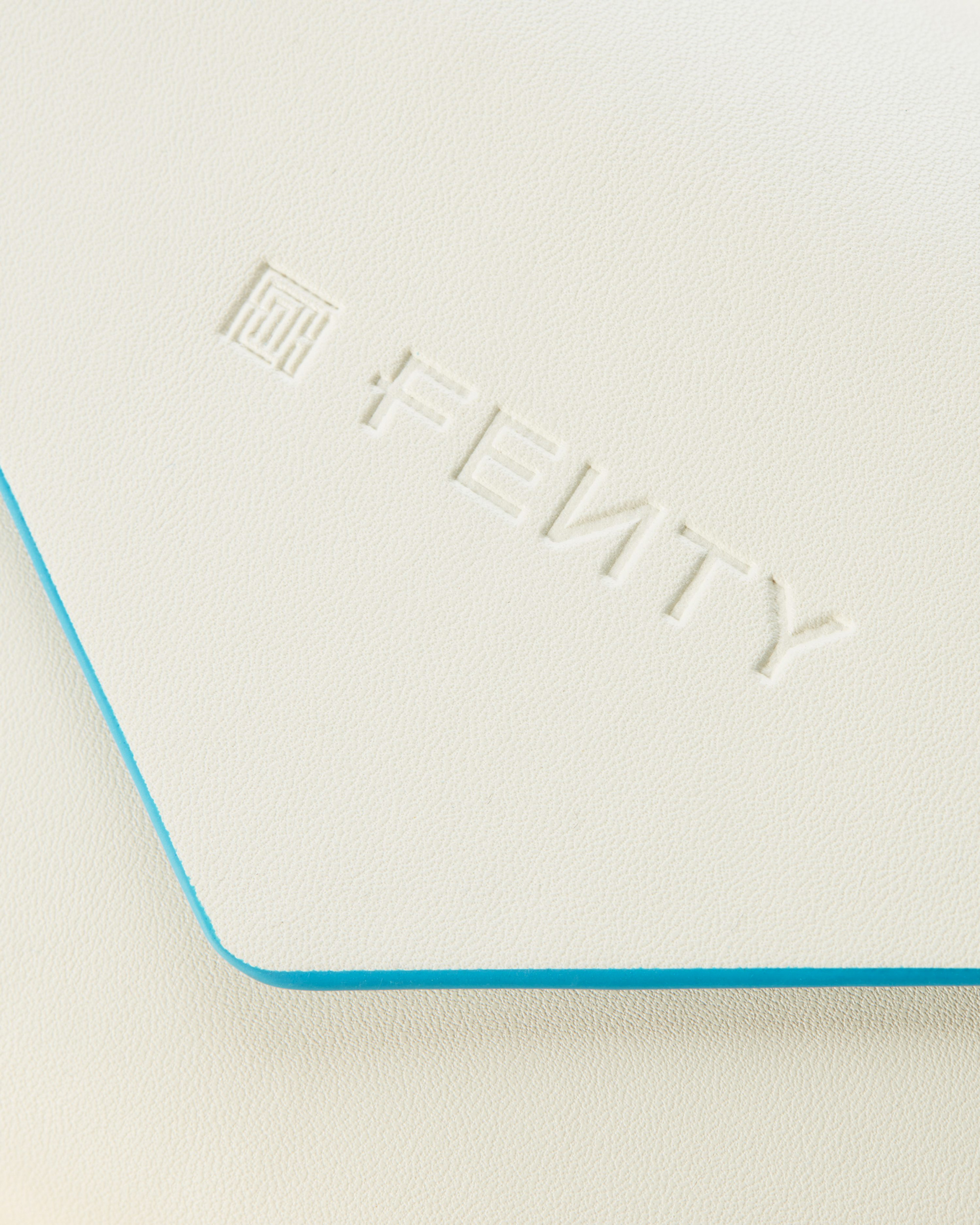
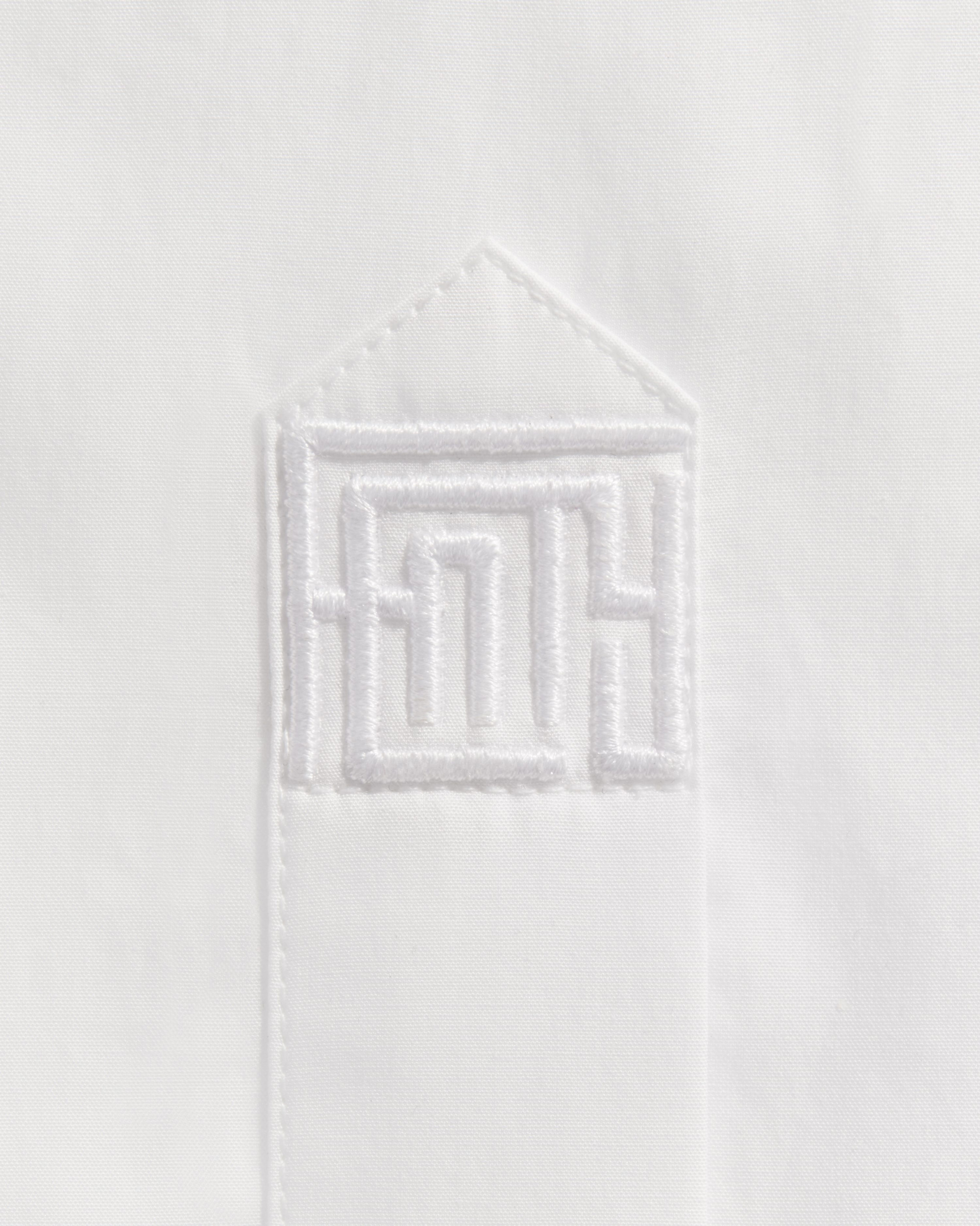
The Maze - the core logo - is inspired by traditional monograms that interlace every character of a name. The strong geometric forms of F E N T Y create an icon that resembles many things from circuitry to a greek key. New, but familiar, The Maze aims to reflect the complexity of Rihanna’s character.
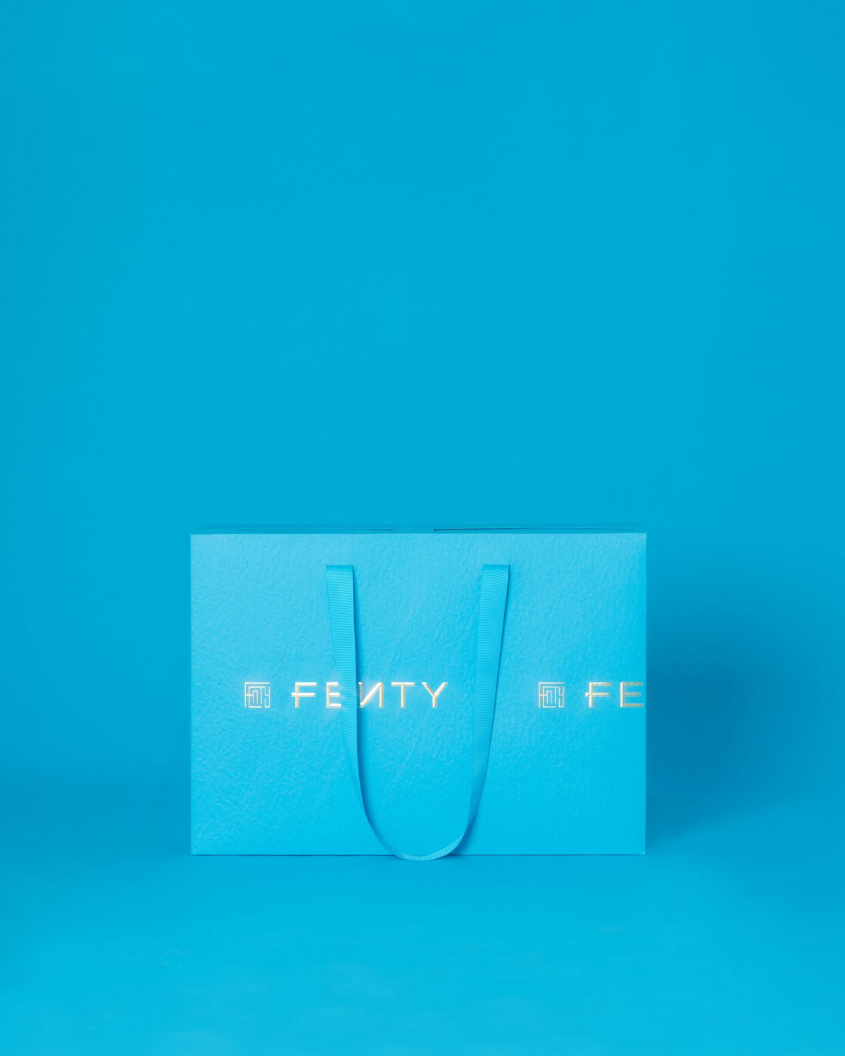
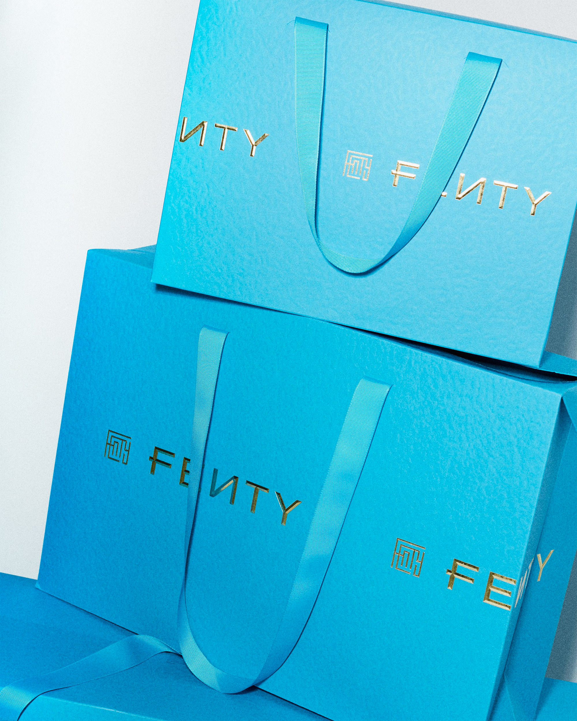
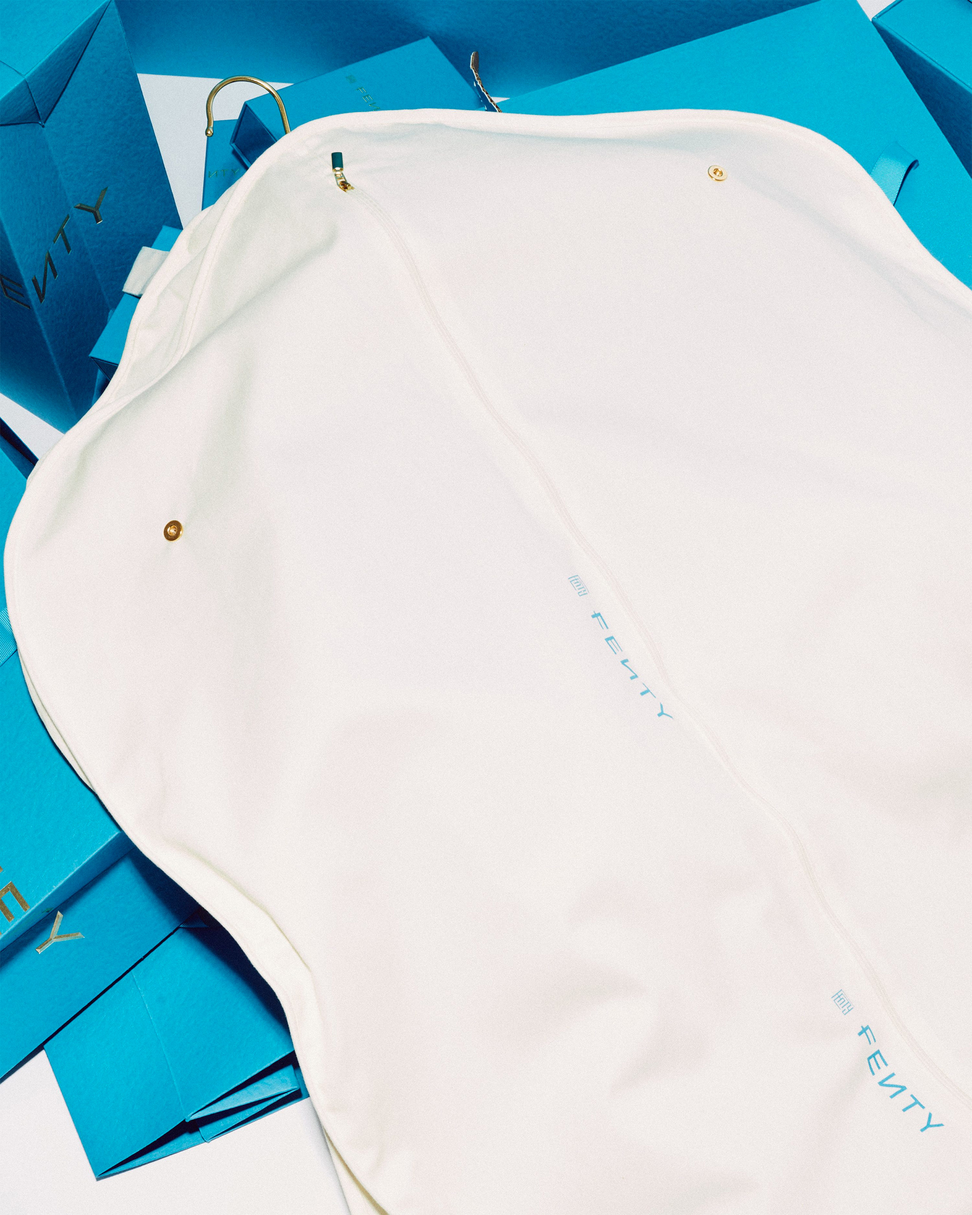
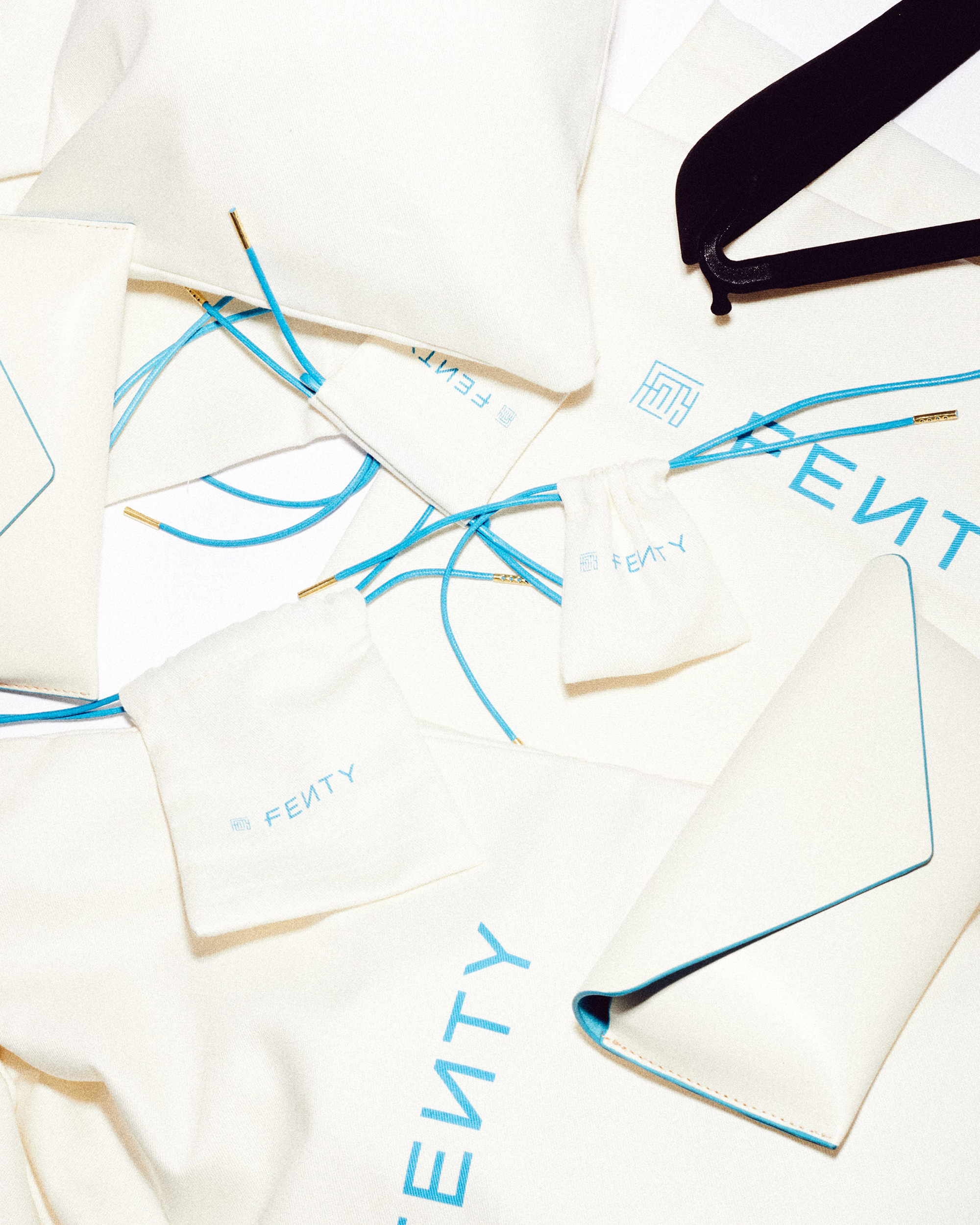
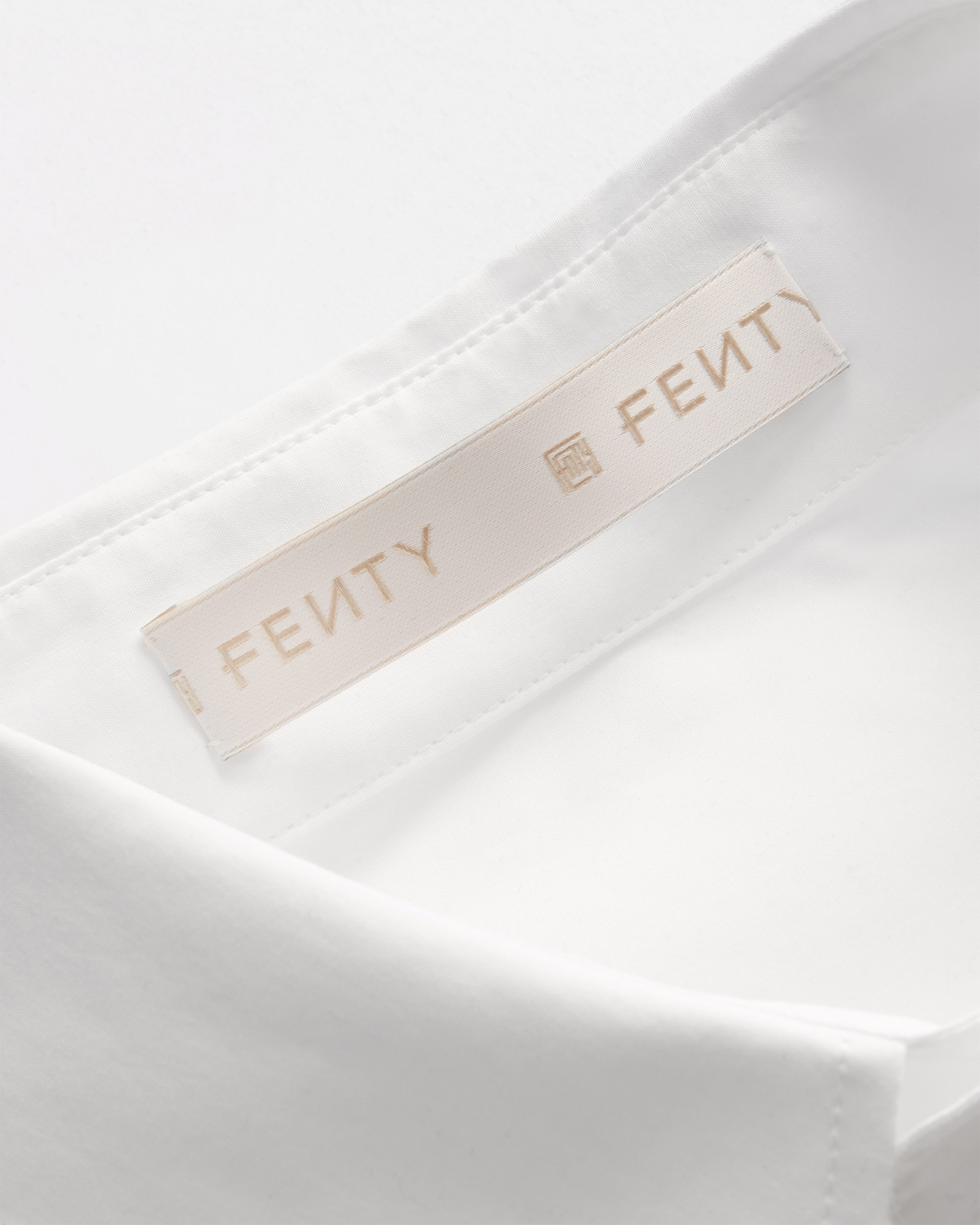
The logo ticker - referenced from constantly moving news tickers - features throughout fenty.com and is adapted into call-to-action buttons, release announcements, and category headers across the site as well as the packaging and labelling. The logotype is often used in isolation across product details, from zippers to cap branding.
At first glance, especially with the wordmark, it’s tempting to dismiss this yet as another black, deadpan sans serif following the direction of other fashion brands but two simple details move the needle into a more distinctive range: the reverse “N” — which actually comes from Fenty Beauty, Rihanna’s other consumer brand — and the crossbar of the “F” that extends to the left. Neither are groundbreaking but both give the wordmark sufficient personality and start to evoke the “freedom from rules” approach of the brand. The monogram is a funky combination of uppercase and lowercase letterforms somewhat awkwardly interlocked together. On its own I don’t quite like it — don’t hate it either — but I really like how it works small when it’s paired with the wordmark as it creates a little bundle of texture that becomes more graphic and less typographic.
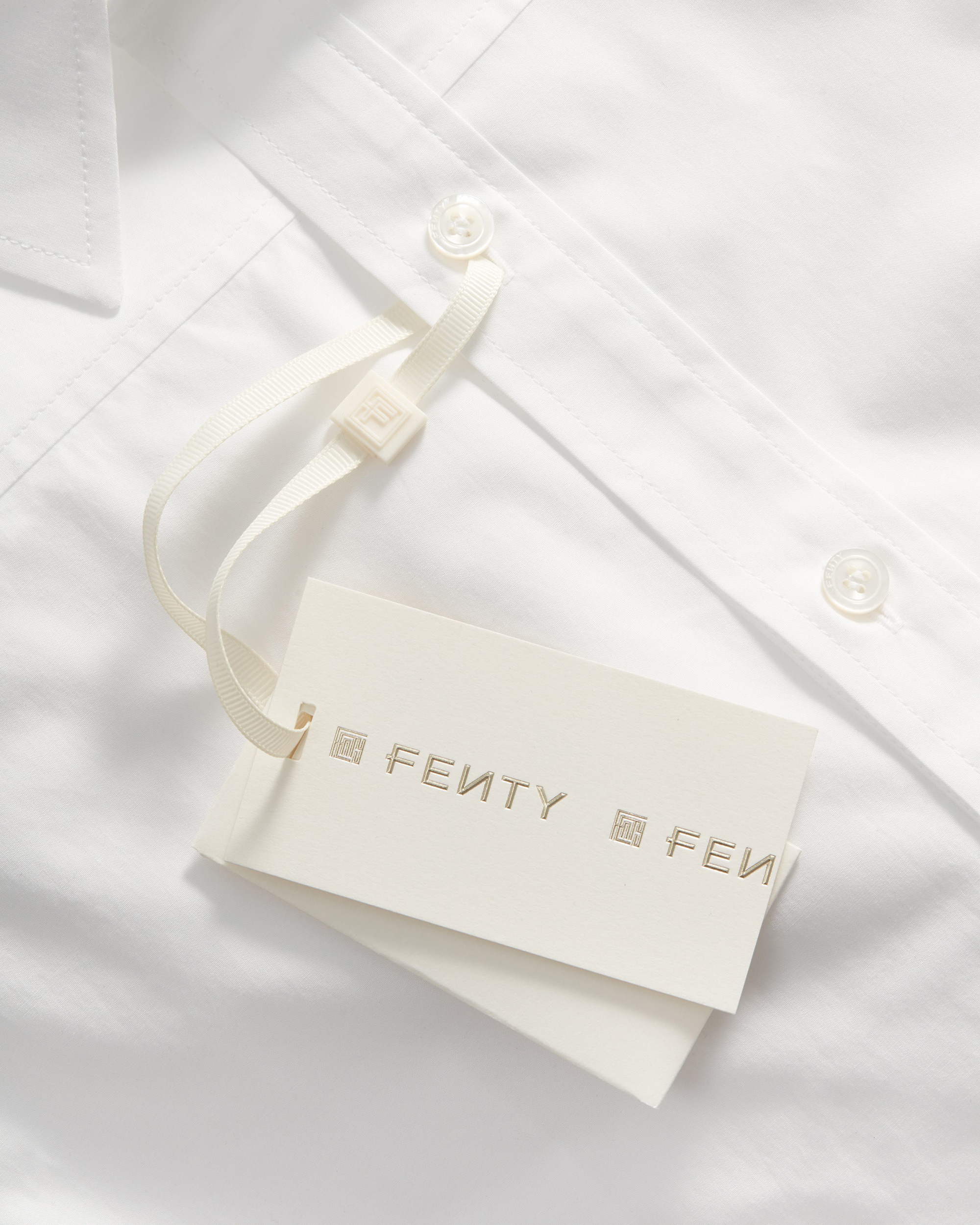
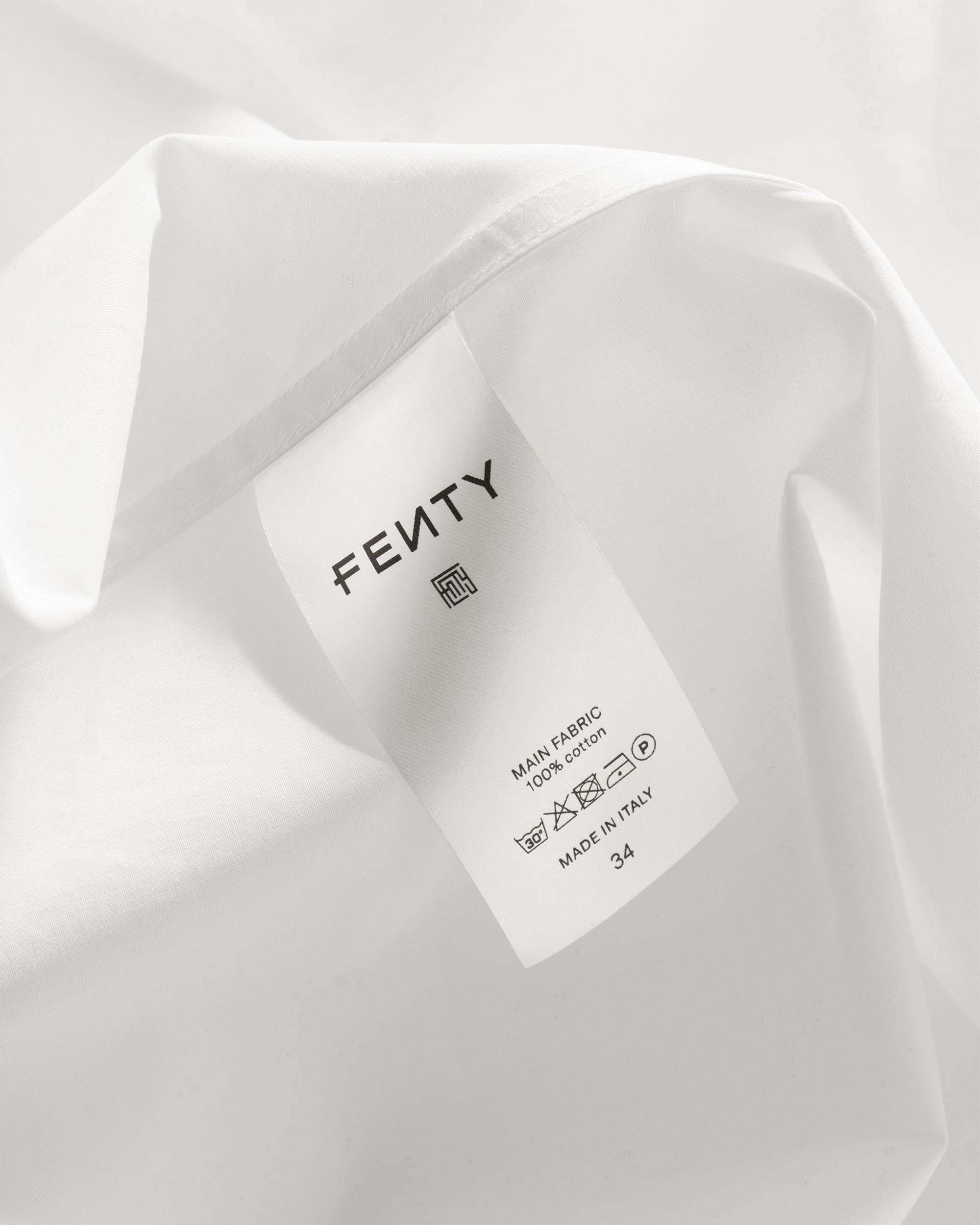
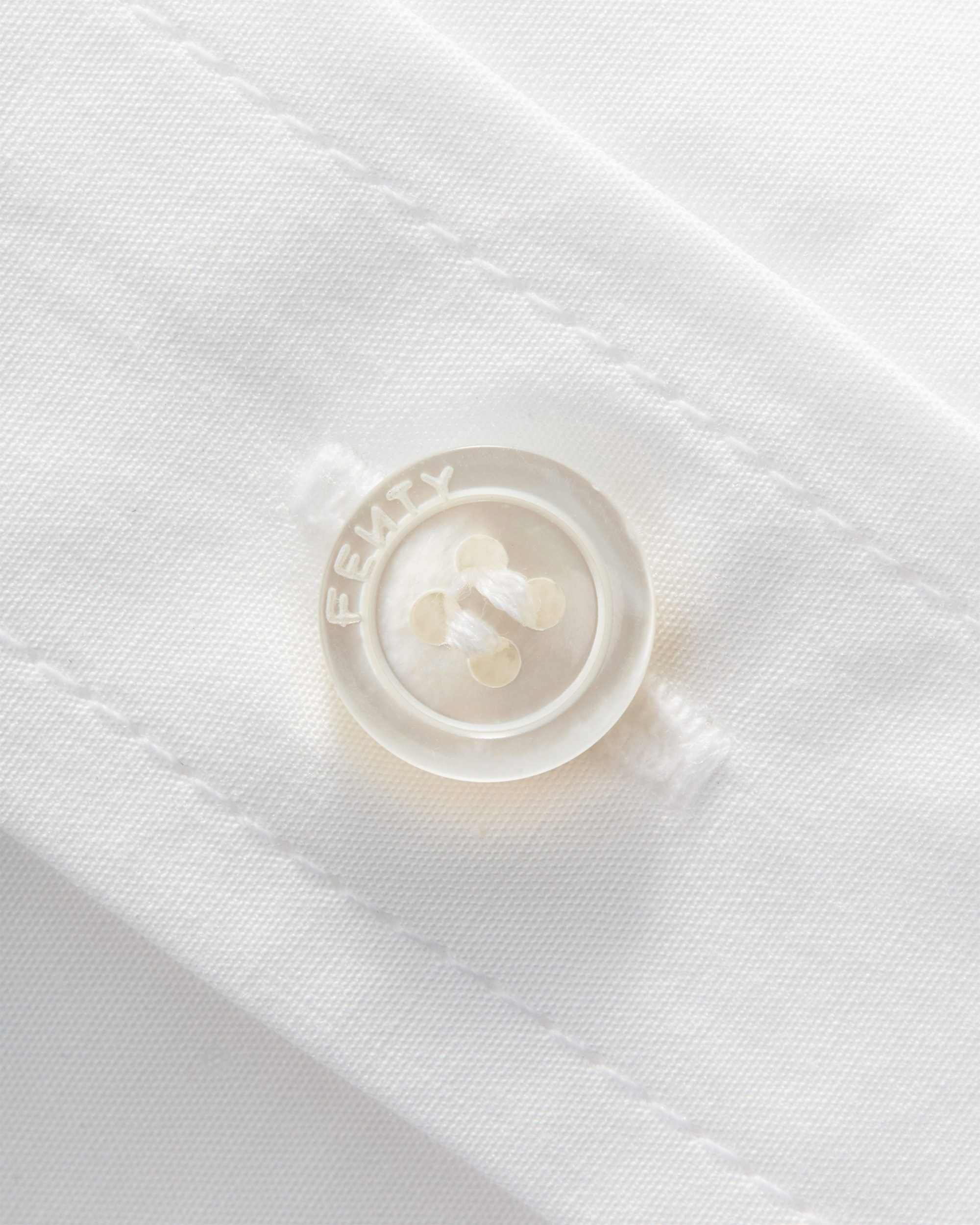
The visual identity was applied across garments and a completely custom packaging system designed by Commission which included e-commerce suite, boutique shopping bags, shoe boxes, accessories boxes, dust bags, shoe bags, garment bags, hangers, invoice and invoice wallets, swing tags, buttons tags, neck labels, garment labels, and garment branding.
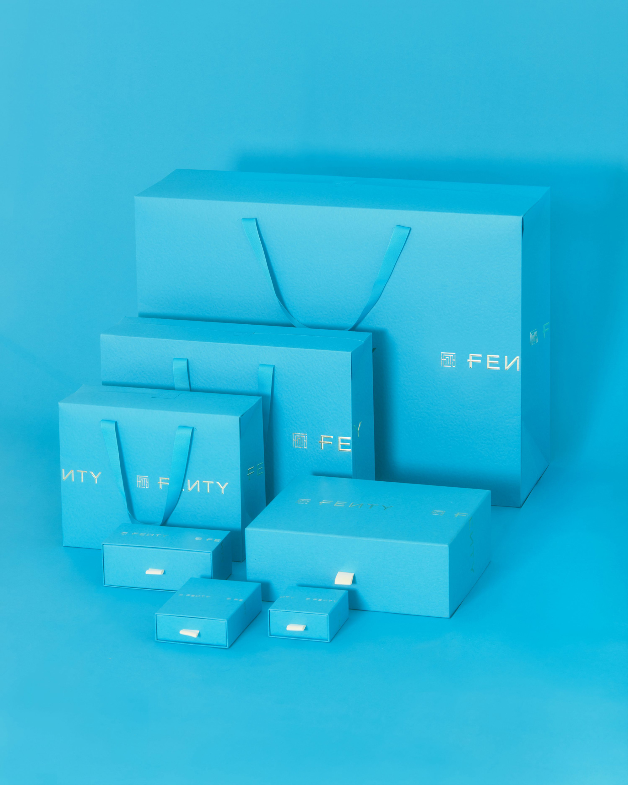
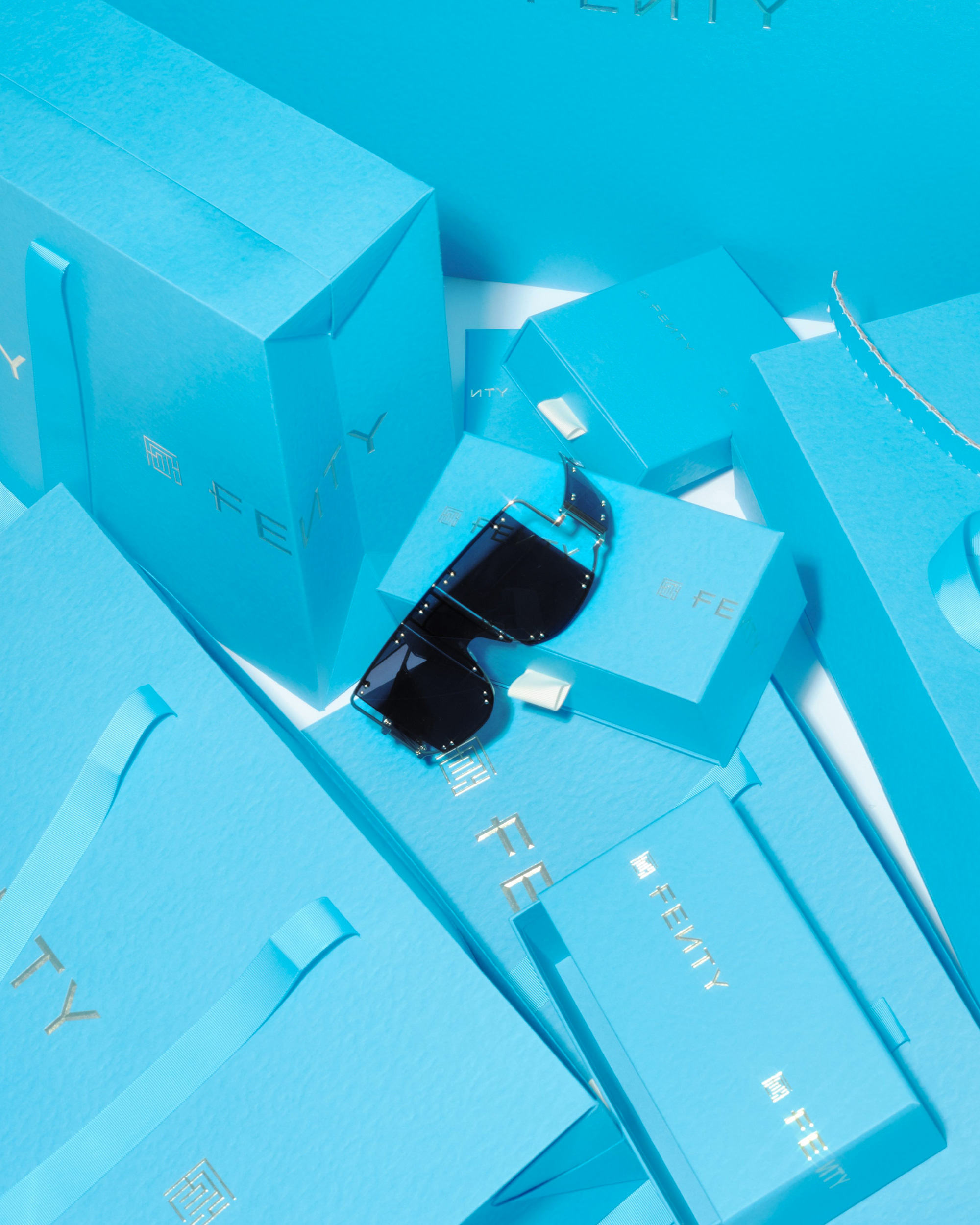
On the packaging, the logo runs across the middle of the boxes and bags but it’s not centered, making the logo bleed into the sides and cleverly mimicking the ticker motion in a static application. The blue color is quite nice but, for better or worse, I keep thinking/seeing Tiffany & Co., which isn’t a fault of this identity but rather how strong the association is between any kind of nice packaging that is all blue and the Tiffany & Co. brand. But I digress away from Tiffany & Co…. I’m not sure if blue was the right color choice — something about it feels off. Like, it’s too… conforming. Whereas the logo has a few uncomfortable elements the blue seems too comfortable for the otherwise non-conformist attitude of the brand. Nonetheless, the packaging does look good and the relative harshness of the logo looks quite nice sculpted and in gold foil.
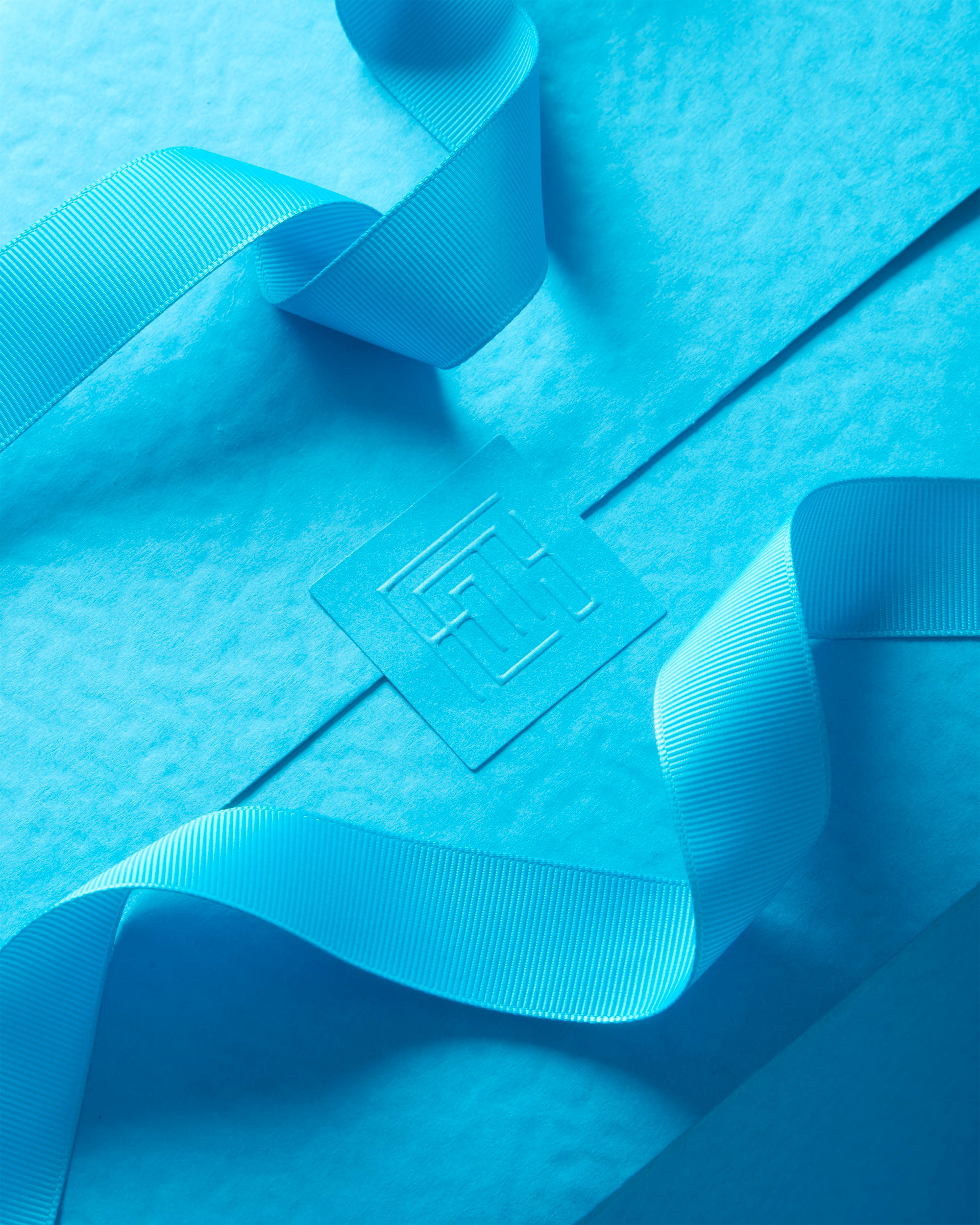
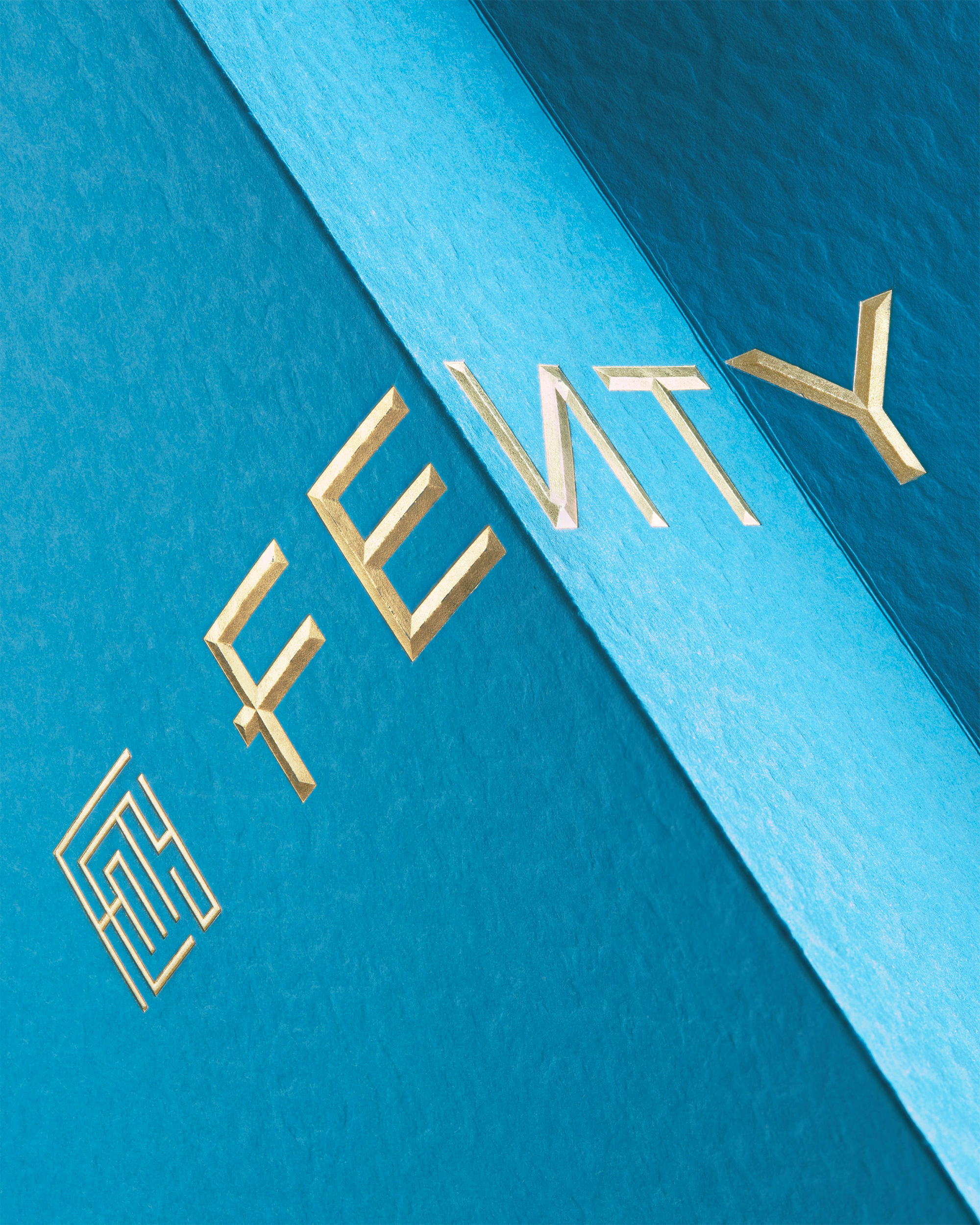
I could literally look at close-ups of paper and gold foil all year long.
The flexibility of the logo — to exist as a lock-up or to be used separately — along with the simplicity of its two elements works wonders in all the myriad applications and production methods. Overall, it’s a crisp and elegant identity and the website — through the inaugural photography (and actual products) — gives the brand the edge it promises.
Thanks to Andrew Ciobanasiu for the tip.

 Новости Союза дизайнеров
Все о дизайне в Санкт-Петербурге.
Новости Союза дизайнеров
Все о дизайне в Санкт-Петербурге.