Обзор лучших ресурсов по разработке бренда, разработке упаковки
contact us | ok@ohmycode.ru
contact us | ok@ohmycode.ru
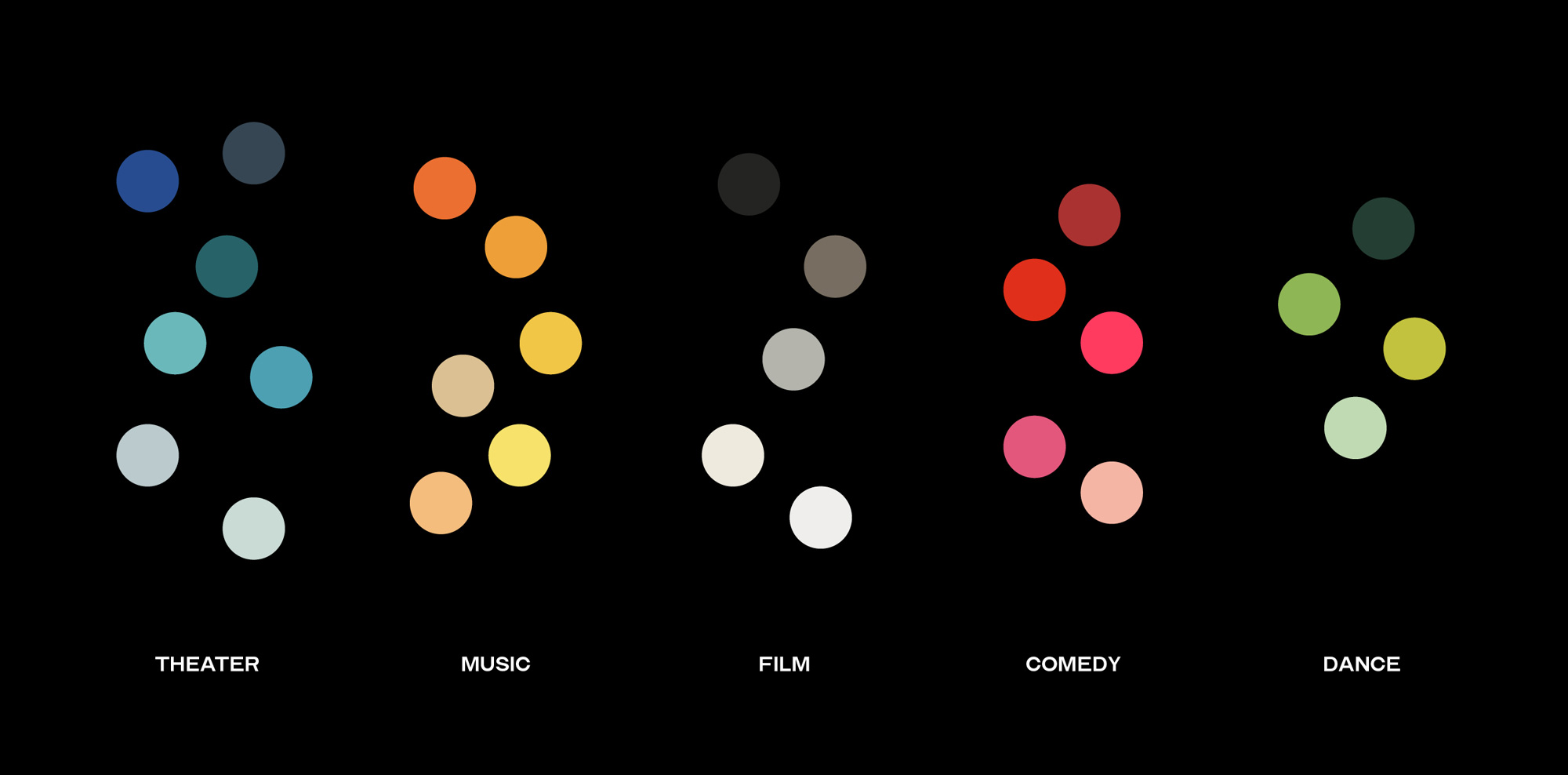
Established in 1902, Irvington Theater (previously Irvington Town Hall Theater) is a performing arts theater in Irvington, NY, (located 20 miles north of Manhattan) that attracts an audience from the “Rivertowns” that run along the Hudson river. The theater offers a diverse range of innovative cultural programming and, in collaboration with a handful of key Arts Partners, they curate high-quality theater, music, film, comedy, and dance for the greater New York metropolitan area. Last year, the theater introduced a new identity designed by New York, NY-based A.A. Trabucco-Campos and Brooklyn, NY-based Pràctica.
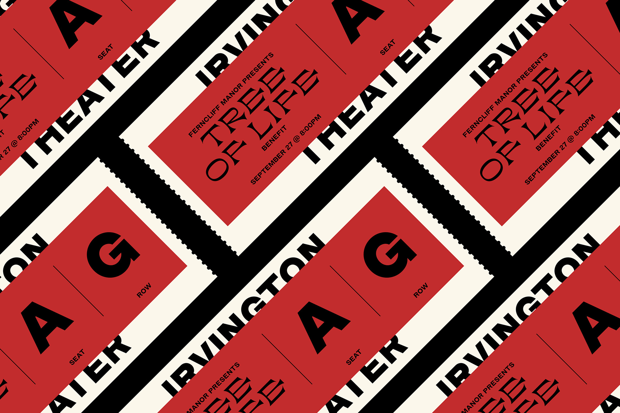
The logo is typeset in a custom-drawn typeface developed for Irvington Theater.
Irvington Modern Gothic is a revival of Modern Gothic, which originated with Barnhart Brothers & Spindler around 1897. It appears to be a modernization of older nineteenth-century gothics, although it has considerable resemblance to the much later European design, Helvetica Bold (1953).
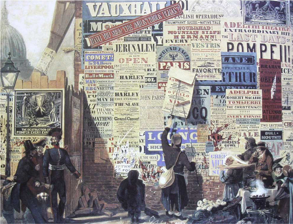
It’s neutral yet solid feel was a perfect complement to the expression of the display wood-inspired typefaces by The Pyte Foundry, which are a nod to the rich history of wheatpaste posters that littered the walls of cities in the Nineteenth century.
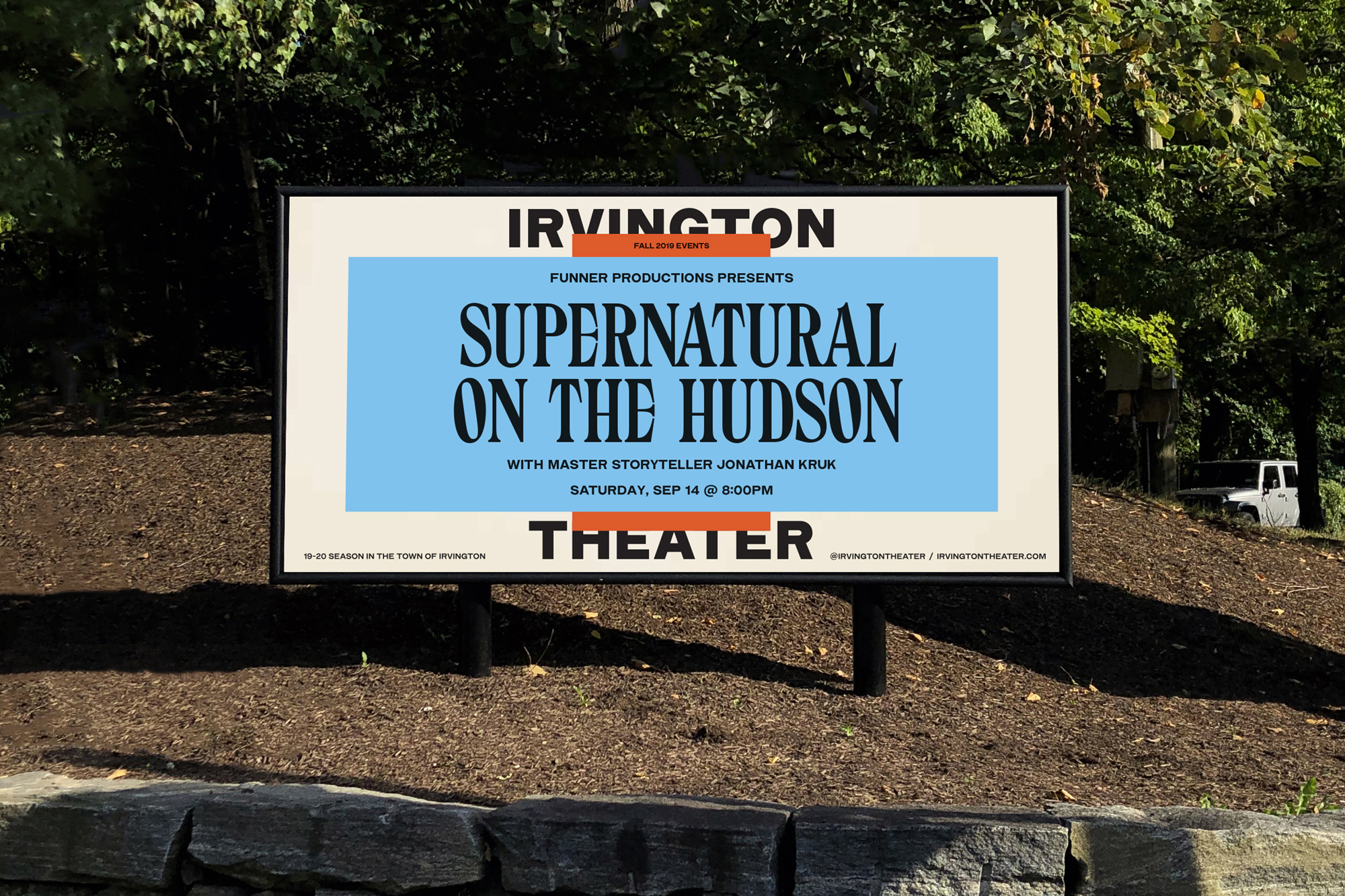
The old logo had the right intention and at a wider glance it was fine with its decent Art Deco wordmark but the ITHT monogram was so far from being properly resolved with the outer “T” being painfully unbalanced and the inner “TH” being uncomfortably interlocked, pushing the crossbar of the “H” almost to the ground. The new logo isn’t exciting by any means and as far as custom sans serif wordmarks go it’s not the best — it’s not the worst either, at all — but as the literal foundation for the identity system it does a solid job serving as a sturdy anchor. The custom type family the logo comes from is nice for sure and it does manage to capture the vintage-ness of the very early gothic sans serifs — the numerals in particular are deliciously clunky.
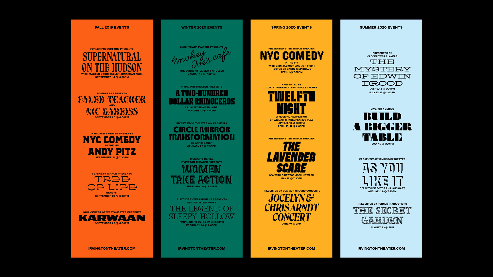
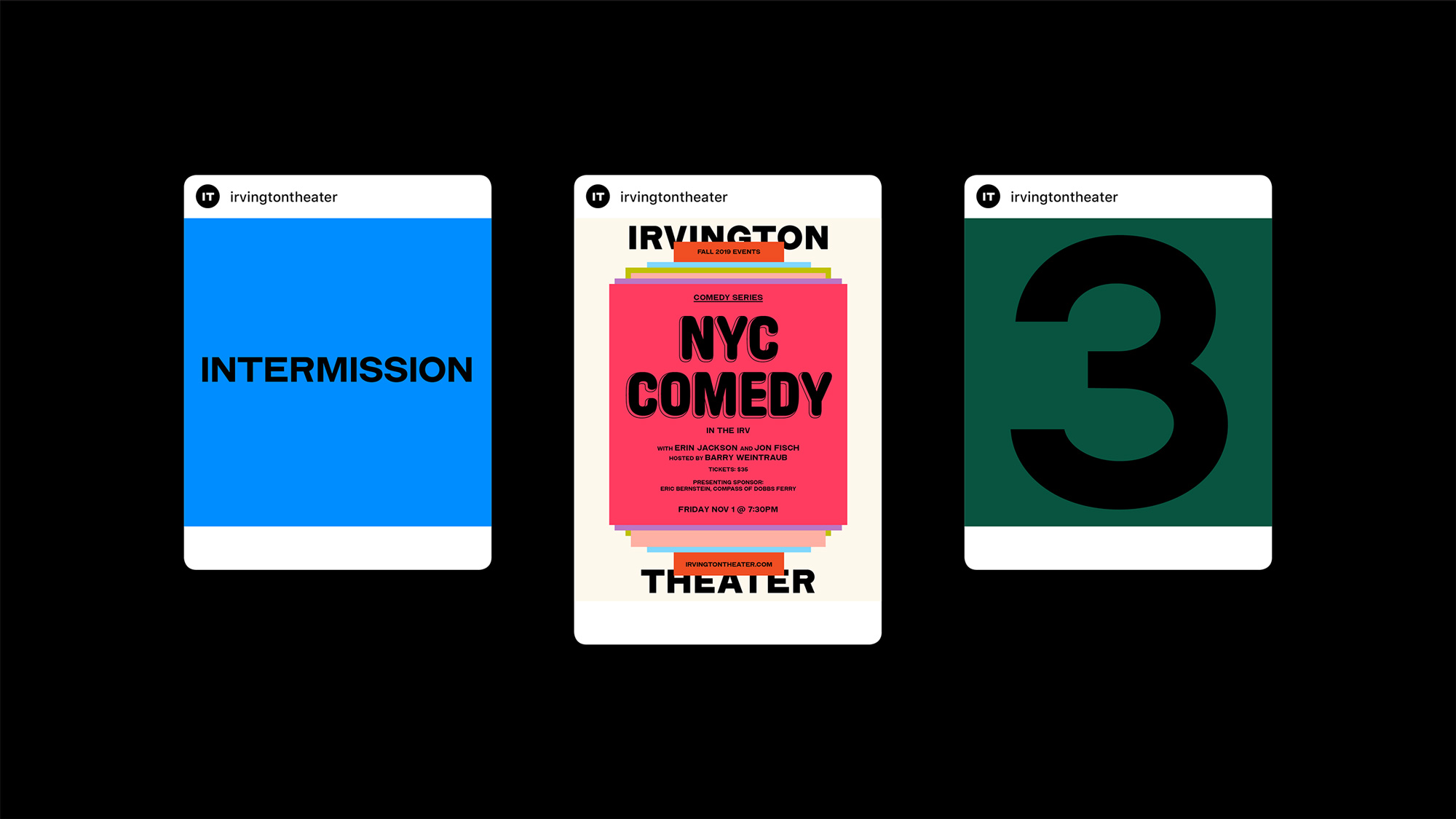
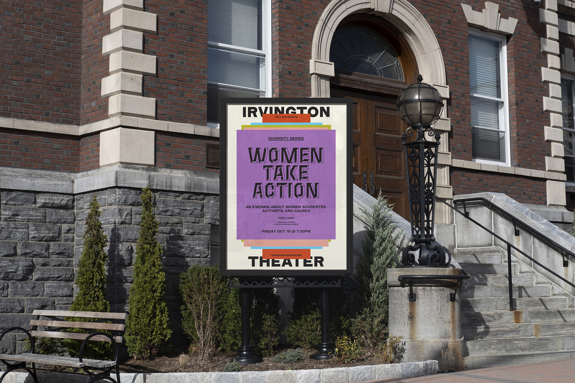
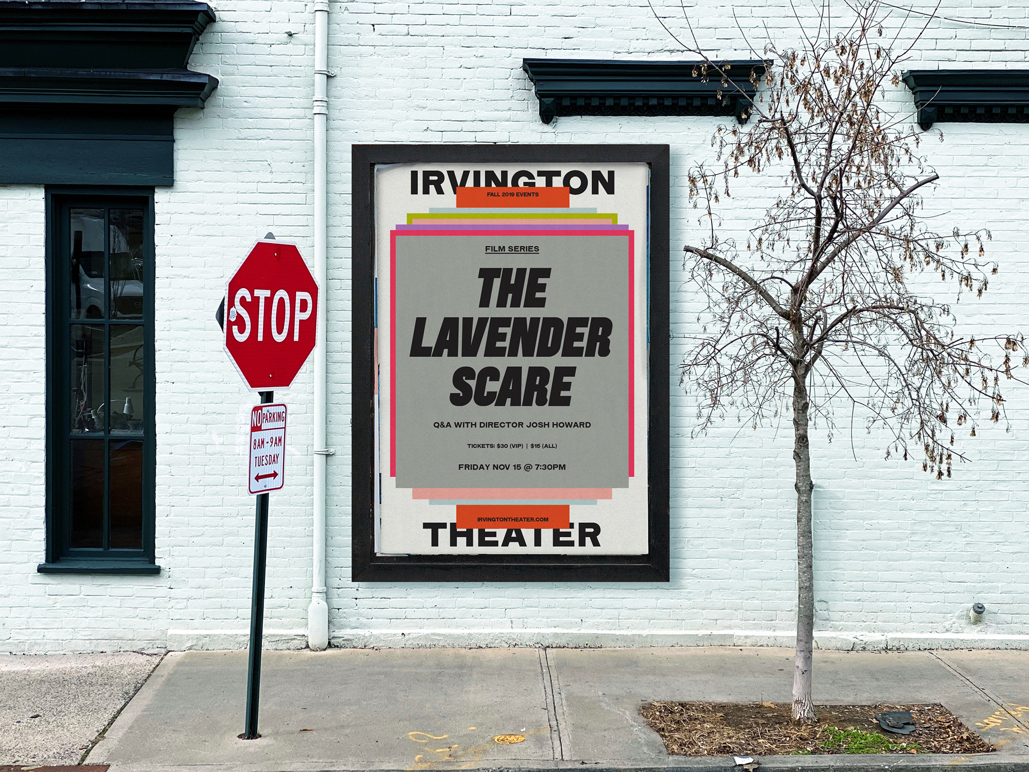
The brand identity is designed to capture the cultural energy flowing through the Theater: inspired by the visual language of old-school advertisement and wheatpaste posters, we created a system based on two main elements—layering and vernacular typography.
Layering is a metaphor of the passage of time, achieved both through stacking & color. The wood-inspired typography captures the vibrance of the varied cultural personalities passing through the Irvington Theater.
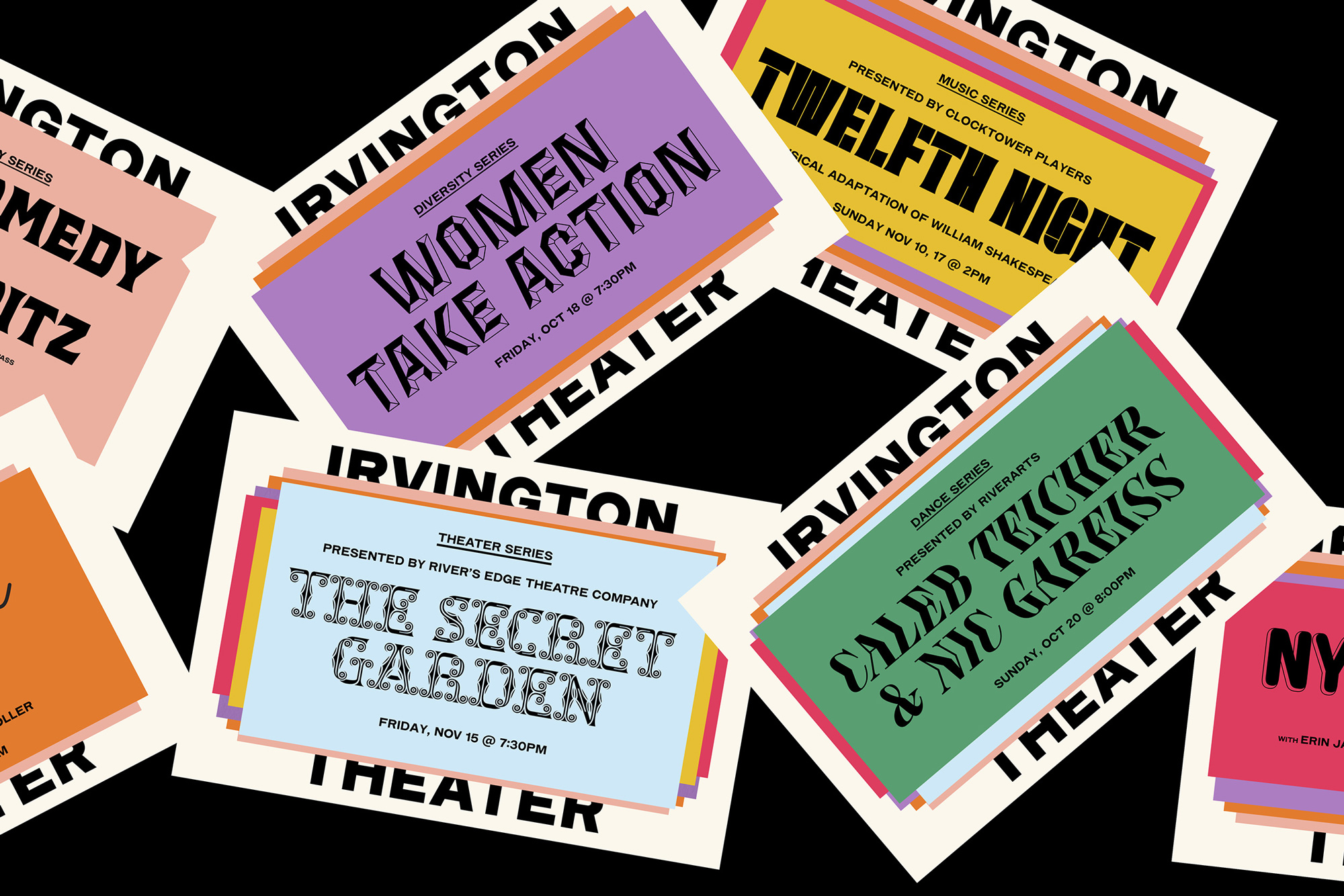
The simplicity of the logo pays off in the relative complexity of the identity system that stacks layers of placards that each hold the information of different events where the titles are typeset in a wild combination of eccentric typefaces. It’s the kind of typographic-driven solution many designers dream of getting approved by a client — I, myself, have presented design solutions that use a couple dozen typefaces but to no avail — in part because of the simple joy of using and combining so many different typefaces but also because it’s an effective way of conveying diversity, variety, and range — in this case of programming. The approach is very nicely pulled off in this system by limiting the funky fonts to the titles of each event and sandwiching it between the pared-down custom sans serif. Keeping all the typography in black helps temper down the chaos while the wide color palette helps separate the multiple layers that create a nice sense of depth not just visually but metaphorically in that the theater has a lot to offer throughout the season. On the flip side, it could be argued that the system overpowers the name of the theater and it could be difficult to see it after it’s buried under all those layers but the counter-argument is that, with time, the effect itself is what becomes recognizable as the theater’s main identifier.
Overall, I really like the textural effect of the identity and how it interprets the density and layering of the wheat-pasted posters of yore in a compact, single-serving system that works very well in both print and digital formats — the latter benefitting the most from the concept as it often has the opportunity of revealing all the layers one Instagram Story at a time.
Thanks to Lexi Vanni for the tip.
 each year since publication began in 2006

 Новости Союза дизайнеров
Все о дизайне в Санкт-Петербурге.
Новости Союза дизайнеров
Все о дизайне в Санкт-Петербурге.