Обзор лучших ресурсов по разработке бренда, разработке упаковки
contact us | ok@ohmycode.ru
contact us | ok@ohmycode.ru
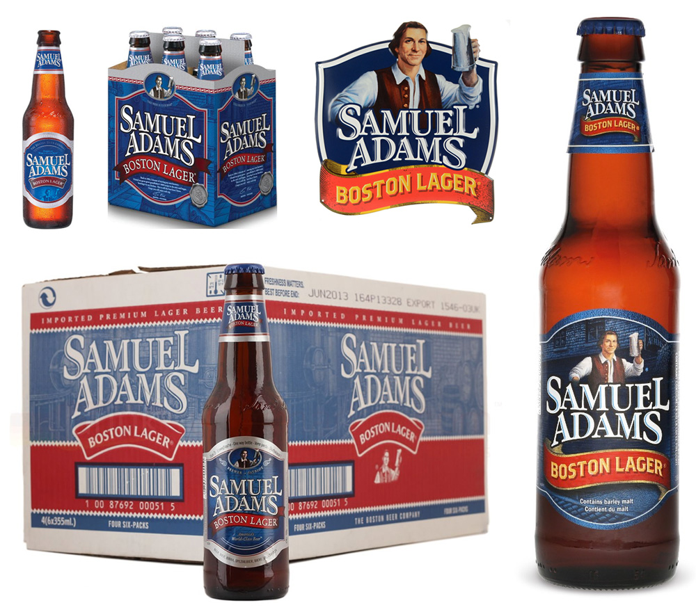
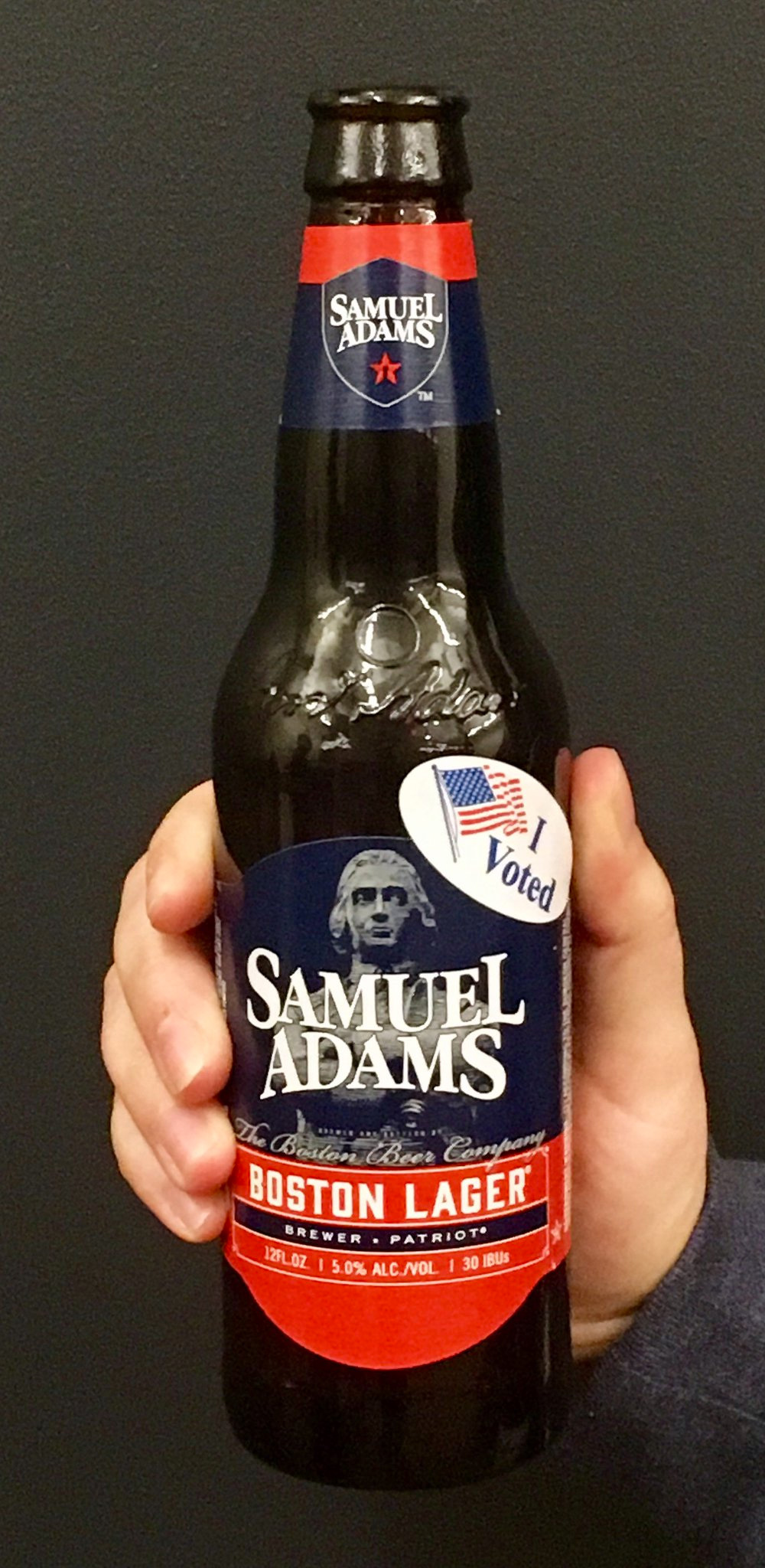
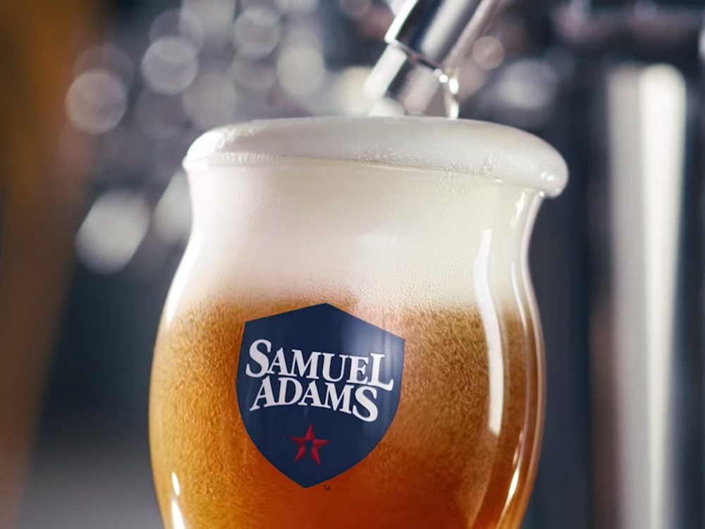
First brewed in 1984, Samuel Adams is a craft lager beer and the flagship brand of The Boston Beer Company. Founded by Jim Koch, who came from a family of brewers, The Boston Beer Company is independently owned — unlike its larger competitors that are part of huge beverage companies — and is one of the largest craft breweries in the U.S.. The beer is named after Samuel Adams, one of the Founding Fathers of the United States. (As a segue from yesterday’s non-post I can’t think of a better project to move on with.) Earlier this month Samuel Adams began rolling out a new logo and packaging. No design credit given.
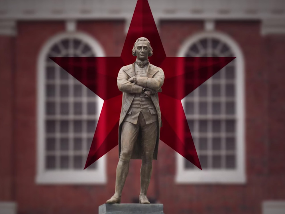
“The new look reflects a bold, authentic, patriotic version of Samuel Adams and a return to our roots and to the spirit of Samuel Adams, the great Revolutionary patriot. As you’ll see, we’ve prominently displayed an image of the iconic statue of Samuel Adams at Boston’s historic Faneuil Hall, which is located just down the road. To us, the star represents colonial America, and we positioned our perfect pint glass in the center to reflect that we’re putting great beer at the heart of America.”
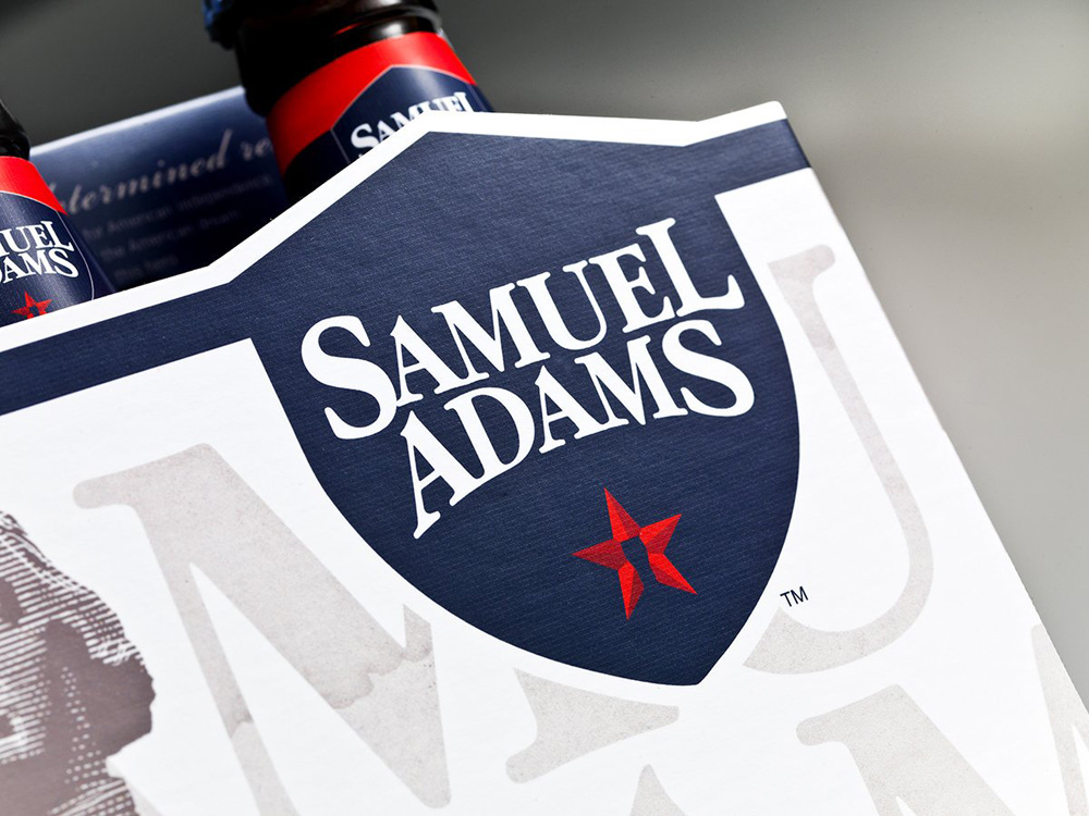
The new logo isn’t as new as it looks. It’s the same silhouette of the old logo but without the highlight and inside a more commanding shield punctuated by a star with a pint in its center. Removing the highlight makes the logo look more contemporary but it’s a shame they didn’t take this opportunity to redraw the logo properly. The initial “S” is super bold compared to the rest of the letters while the closing “S” looks exaggeratedly distorted now. The highlight in the old logo sort of distracted you from the details. Still, as a quick solution to dress up the old lettering, the new logo appears stronger and more revolutionary with the shield and star.
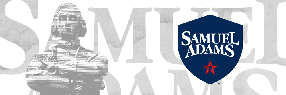
The biggest change is the move away from the more cartoonish Samuel Adams — which I always found grating as I don’t like to think of my beer on the same level as Frosted Flakes and Tony the Tiger — to an engraving of the Samuel Adams statue at Faneuil Hall. It represents the notion of craft better and it feels more like a grown-up’s drink.
Our beer, unchanged. Our look, revolutionized. Introducing the new face of the same, great @SamuelAdamsBeer Boston Lager. #fortheloveofbeer pic.twitter.com/sSET8bcJqM
— Samuel Adams Beer (@SamuelAdamsBeer) October 17, 2016
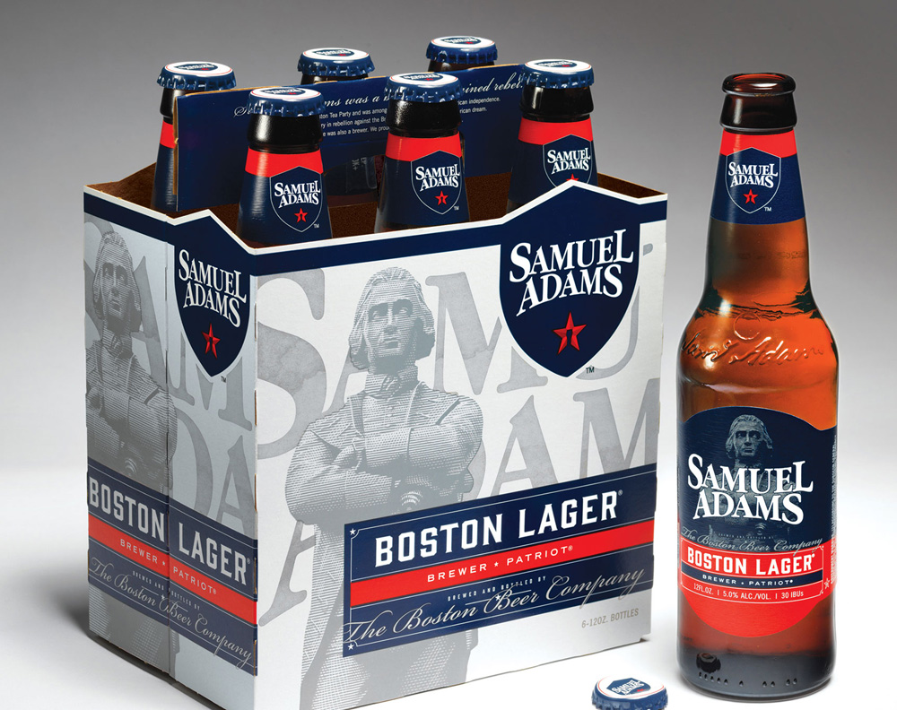
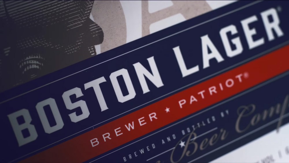
The new packaging is a major improvement over the old, which had an old-timey, tavern aesthetic that wasn’t highly differentiating. The new packaging has a great medley of things — the engraving, the flared serif uppercase, the script font, the rules, and more — that give the beer a very American, gung-ho attitude with a nice balance of it looking like it would photograph convincingly next to the American Constitution. The bottle label is a little too dark though, missing the contrast that the white background brings to the 6-pack.
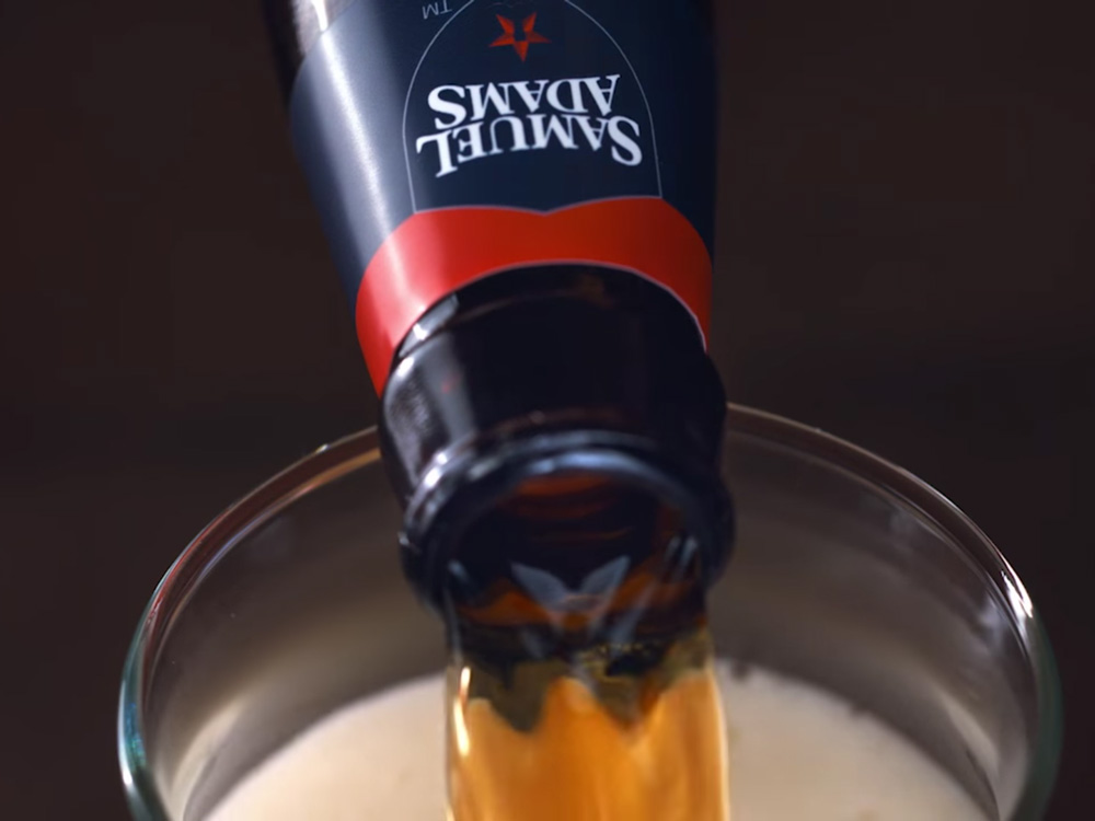
On the can, however, that same darkness and the engraving on blue, looks great. The red stripe running along its height is a strong device that breaks with beer can conventions. I wish I had a nice shot of it instead of this bearded gentleman pumping it.
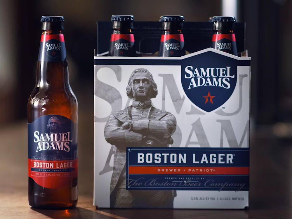
Overall, a major improvement, especially if you like your beer to look extra American, which this does in a classy way.
Thanks to Oren Kravetz for the tip.

 Новости Союза дизайнеров
Все о дизайне в Санкт-Петербурге.
Новости Союза дизайнеров
Все о дизайне в Санкт-Петербурге.