Обзор лучших ресурсов по разработке бренда, разработке упаковки
contact us | ok@ohmycode.ru
contact us | ok@ohmycode.ru
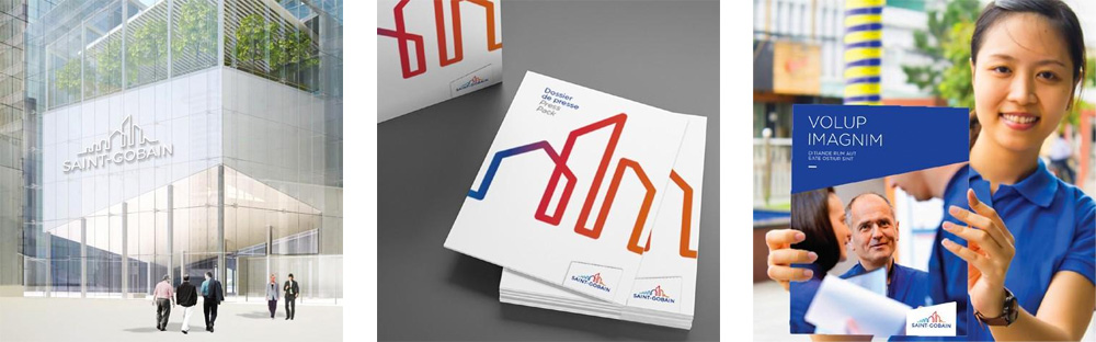
(Est. 1665 ‹ not a typo) “Saint-Gobain S.A. is a French multinational corporation, founded in 1665 in Paris and headquartered on the outskirts of Paris, at La Défense and in Courbevoie. Originally a mirror manufacturer, it now also produces a variety of construction and high-performance materials.” (Wikipedia)
Terre de Sienne (Boulogne-Billancourt, France)
Terre de Sienne project page
Saint-Gobain brand page
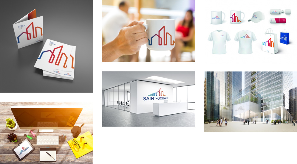
Saint-Gobain has always known how to renew itself while remaining true to its values. Now the Group has revealed a new identity, linking its historical logo (the arches of the Pont-à-Mousson bridge are still identifiable) with its strategy based on the construction markets. The new logo is full of motion: a skyline unfolds in an explosion of color, reflecting a Saint-Gobain that, after more than three centuries of existence, is more dynamic than ever.
Sometimes my ignorance gets the best of me: I had not heard of Saint-Gobain before and when the tip came across my inbox I thought Saint-Gobain was a town in France and this was a new tourism logo. Turns out Saint-Gobain is, like, a thousand years old and has as many more employees around the world. So, the old logo was fine, design-wise, but it really made it look like a destination brand where the only landmark is a bridge, more than a global corporation. The new logo sort of corrects that but not really… sticking with a skyline that, again, makes it feel like this is a city with bridges, giant houses, and tiny skyscrapers. Obviously, if you are aware of the company or do business with it, then my confusion issues are only my own. So assuming that I knew what Saint-Gobain is, yes, this logo is a proper evolution that better highlights the reach of the company while maintaining the equity of the old logo both by keeping the bridge but maintaining the overall shape and similar lock-up with the wordmark (in an overly friendly sans serif). The line drawing is fine, far from inspiring, but fine. The gradient helps liven it up a bit but it's a cheap trick to make a weak logo look more interesting. The applications could have maybe strived for something more interesting but ultimately they are fine too. Overall, if it were a city as I originally though, its tagline could be "Come live here, it's fine."
Thanks to Pablo Cabistani for the tip.

 Новости Союза дизайнеров
Все о дизайне в Санкт-Петербурге.
Новости Союза дизайнеров
Все о дизайне в Санкт-Петербурге.