Обзор лучших ресурсов по разработке бренда, разработке упаковки
contact us | ok@ohmycode.ru
contact us | ok@ohmycode.ru
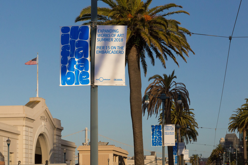
On display since May and ending soon in September, Inflatable: Expanding Works of Art is this Summer’s temporary exhibit at the Exploratorium in San Francisco, CA, a “public learning laboratory exploring the world through science, art, and human perception”. Curated by Christopher Jobson of Colossal, Inflatable brings together five artists from around the world who work in the mediums of textiles, technology, and air, for a series of large-scale pieces and installations. The identity for the exhibit was designed by the San Francisco office of COLLINS.
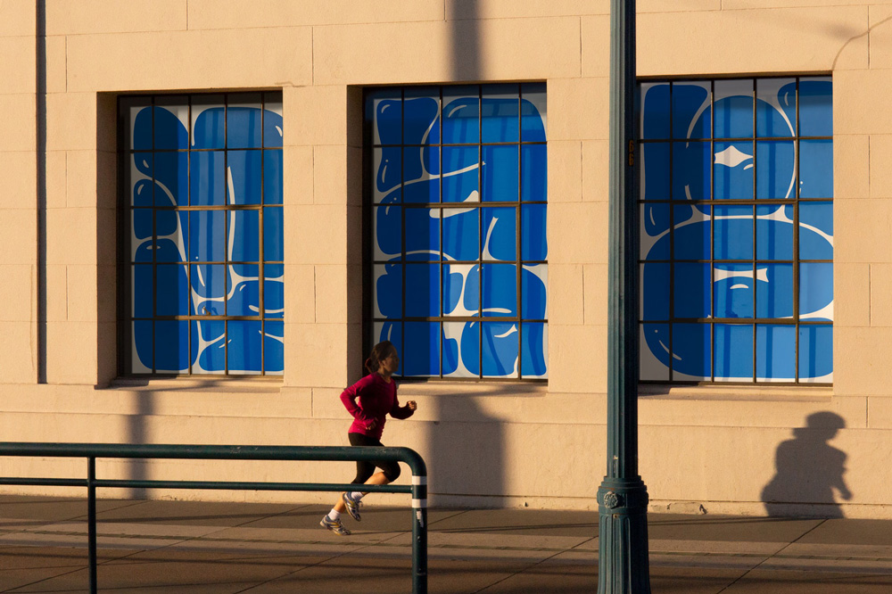
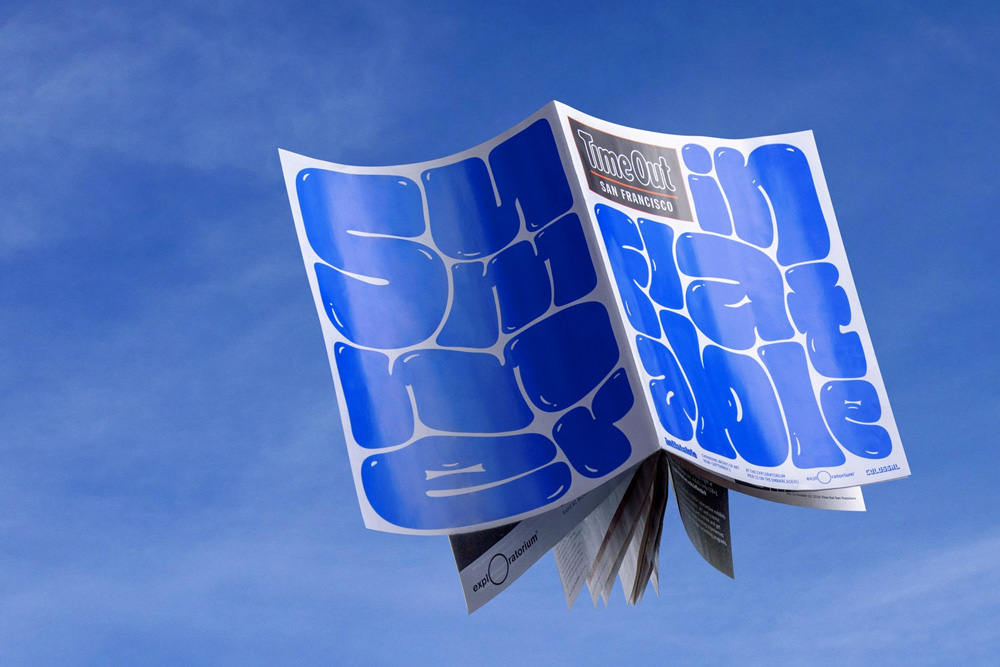
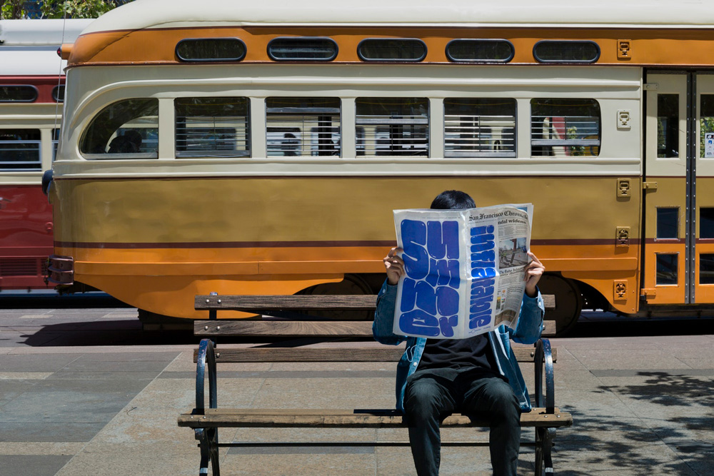
Extending the playful nature of the art into San Francisco’s streets, COLLINS created a design solution, wayfinding and marketing campaign all unified with a set of custom inflatable letterforms as tactile as the experience itself. The letters dynamically blow up to fill whatever space they’re in; from buses to billboards to banners. Each expression is unique, every surface a new canvas - we blanketed the city with bursts of bright blue, inviting viewers into the wondrous world of Inflatable.
Going in, we knew we had to address scores of different executions - from giant bus ads, street banners and signage systems to animated social media content and endtags. But we felt it was important that each expression be unique to its context - even though we knew such an idea was going to be terribly time intensive.
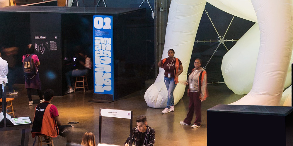
To make this possible, our team hacked existing 3D software to help us find the right arrangement and scale for each letter for every application. Those files were then taken by our team’s designer and animator, who went in together, correcting and refining for each execution. In partnership with our friends at the Exploratorium, we all worked to give the whole campaign a bouncy variety as whimsical as the Inflatables themselves.
I acknowledge this isn’t the usual type of identity project — a temporary exhibit at one museum — that gets a Review but I think that by the end of the post, you will be cheering for it along with me. The premise of the logo is pretty straightforward: making letters look as if they are inflatable. That premise, though, would be so easy to get so wrong. It could look too much like a children exhibit, it could look like the logo for one of those bouncy house mega places where parents’ souls go to die, or it could look, well, stupid. This logo, and its infinite variations, avoid all of those traps and deliver an innovative solution that is quirky, entertaining, edgy, and attention-grabbing. I will use the cliché that it demonstrates outside-of-the-box thinking only to mention that I love that the logo is actually confined inside the many boxes it lives in.
The confinement of the logo to each layout yields some really horribly-shaped letterforms but the results are all amazing in how free they feel from conventions and it’s also quite commendable that you can feel the kinetic energy in the static uses that, obviously, pays off in spades in motion.
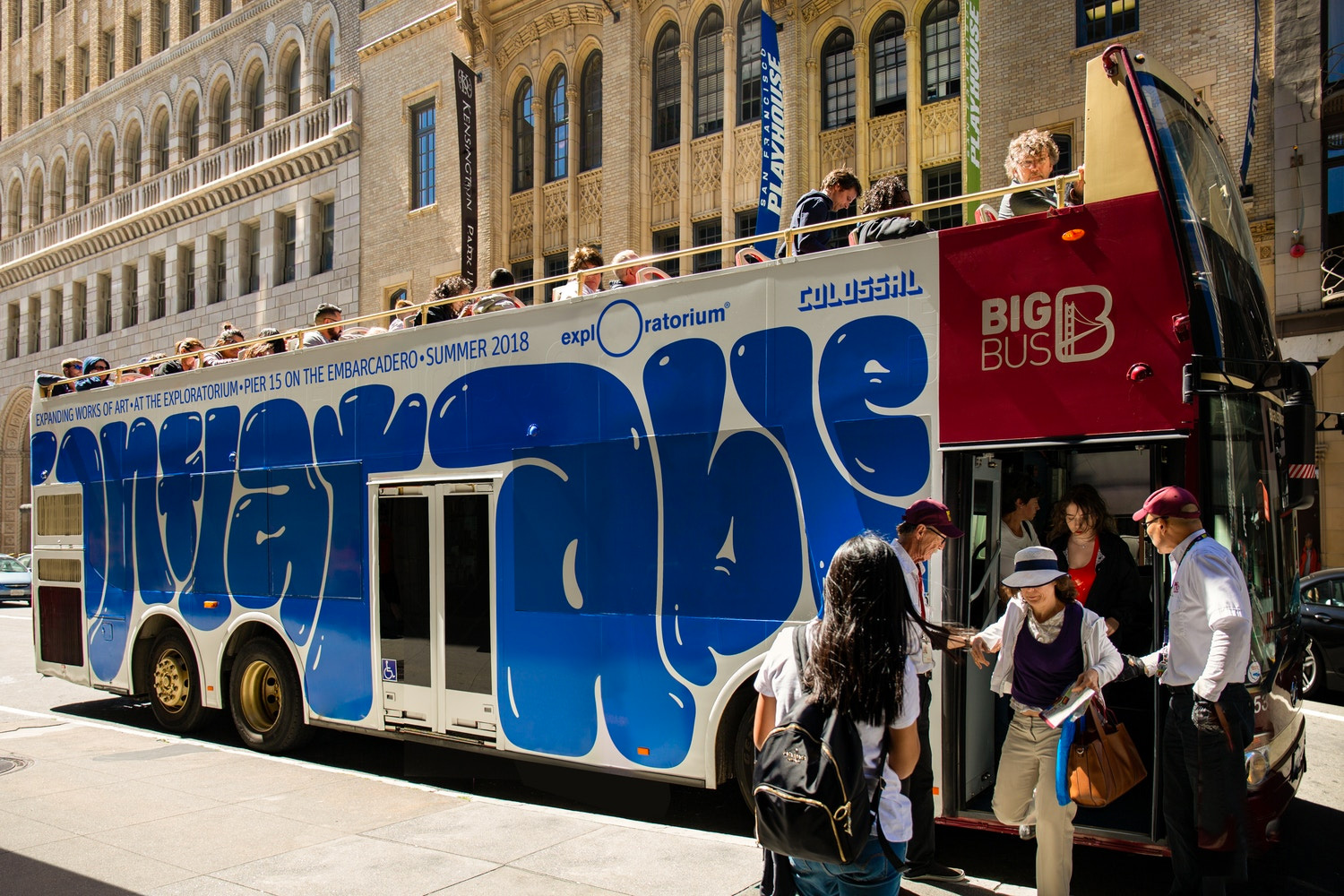
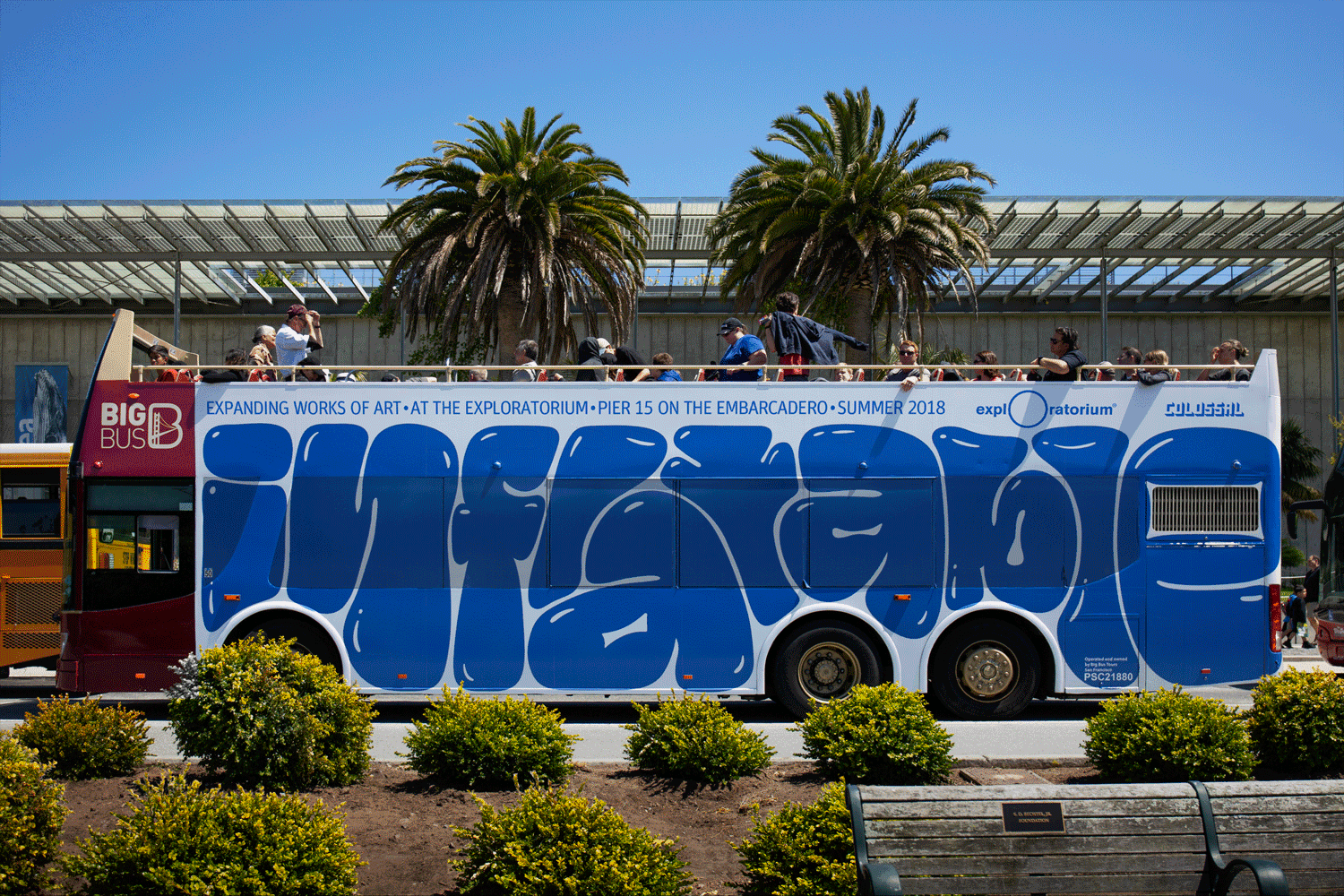
The commitment to generating custom renderings for each application is exceptional and creates a fantastic identity that is completely different across all touchpoints yet perfectly consistent. Wrapping the logo around a bus’s doors and tires is the kind of attention to detail that separates this from just another museum exhibit. (On a personal note, it’s pleasing to see the logo we designed for Colossal used in application outside of their website.)
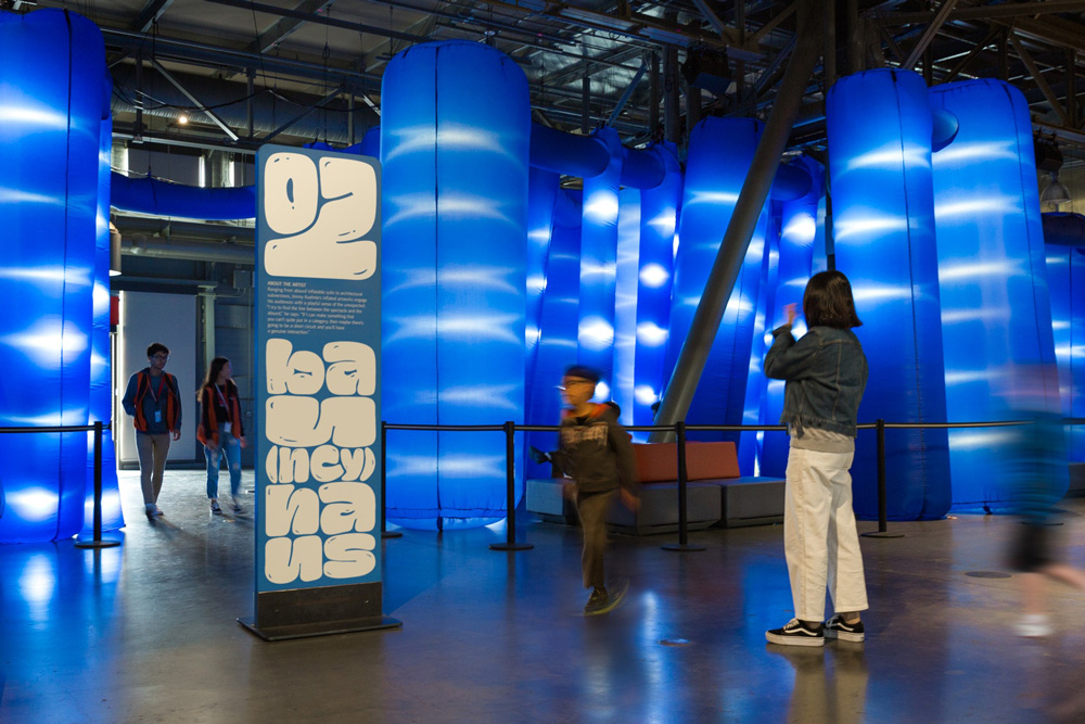
The balloon font is also used in the exhibit signage, which is a pretty bold move as it really challenges readability and it’s a testament to the Exploratorium that they didn’t take the easy or safe way out but instead went full balloon and deployed that funkiness throughout the exhibit. Overall, in the context of recent logos and identities where there is no trace of personality, this is a refreshing antidote and a reminder that logos and identities can be fun — granted, not all logos and identities are for exhibits of giant inflatable works of art but we can strive for a happy medium somewhere between this and a Neo-grotesque sans serif wordmark in black.

 Новости Союза дизайнеров
Все о дизайне в Санкт-Петербурге.
Новости Союза дизайнеров
Все о дизайне в Санкт-Петербурге.