Обзор лучших ресурсов по разработке бренда, разработке упаковки
contact us | ok@ohmycode.ru
contact us | ok@ohmycode.ru
First celebrated in 1956, the Eurovision Song Contest is an annual international TV song competition hosted and “played” by member countries of the European Broadcasting Union. Each country is represented by a singer performing an original song and then the viewing public selects the winner. Nearly 200 million people watch the televised event, which itself is quite a spectacle. One of the world’s longest-running live annual TV events, each edition’s host is determined by the winner of the previous edition so with Dutch singer-songwriter, Duncan Laurence’s win at Tel-Aviv in 2018, the Netherlands will host 2020 in Rotterdam. The identity for next year’s event has been designed by Utrecht, Netherlands-based CLEVER°FRANKE.
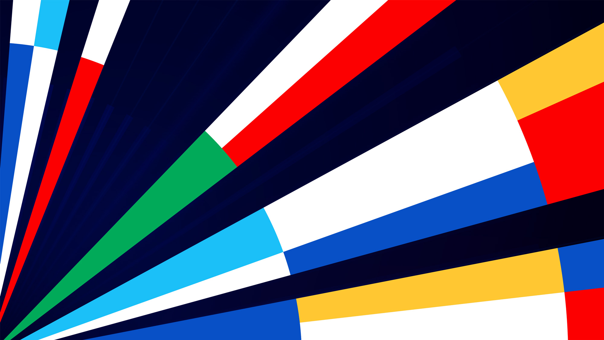
In the decades since it began, the competition has gone out of its way to embrace new countries, new talent and new technologies. To emphasise this message, we have developed a data-driven vignette that honours the history of the Song Contest in a contemporary way, while leaving room for future growth.
The vignette is an abstract representation of the flags of the countries that are participating in 2020. By adding the flags chronologically in order of the countries’ first Eurovision participation, we have created a colourful, abstract symbol. The vignette builds on the design from the three previous editions of the Eurovision Song Contest that were held in the Netherlands in 1970, 1976 and 1980.
The identity is true to the Dutch Design tradition: simple, intelligent, minimalist and experimental, without losing sight of the Song Contest’s humour and sparkle.
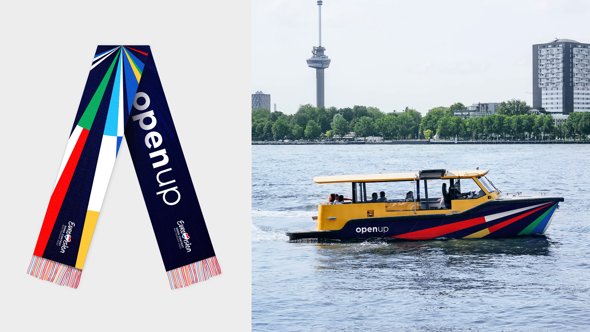
After covering the 2017 (my favorite) and 2018 (my not favorite) edition identities I somehow missed to cover the 2019 edition in Tel-Aviv. Designed by Awesome, the logo featured three triangles that came together to form a star, “reflecting the infinite stellar sky”. It was cheesy but groovily rendered in a showbiz kind of way. The new logo is not emotion-driven but data-driven, with each slice of the circle representing a year in the lifespan of the contest and, when colors are present, each representing the flag of the country that joined the contest for the first time that year. It’s a lovely nod to the growth of the contest as more countries are welcomed to participate. As a logo, it’s not particularly great as it’s a somewhat harsh graphic with odd empty spaces and a lot of noise to decode but, as a standalone graphic and in the context of the more “complicated” logos that Eurovision Song Contest typically uses, it’s quite interesting. The one real drawback is the “Open Up” element — which is this year’s theme and all logos must include the theme in it — where it gets completely lost against the visual vortex that is the main graphic — even capitalizing it properly would have helped in making it look like less of an afterthought.
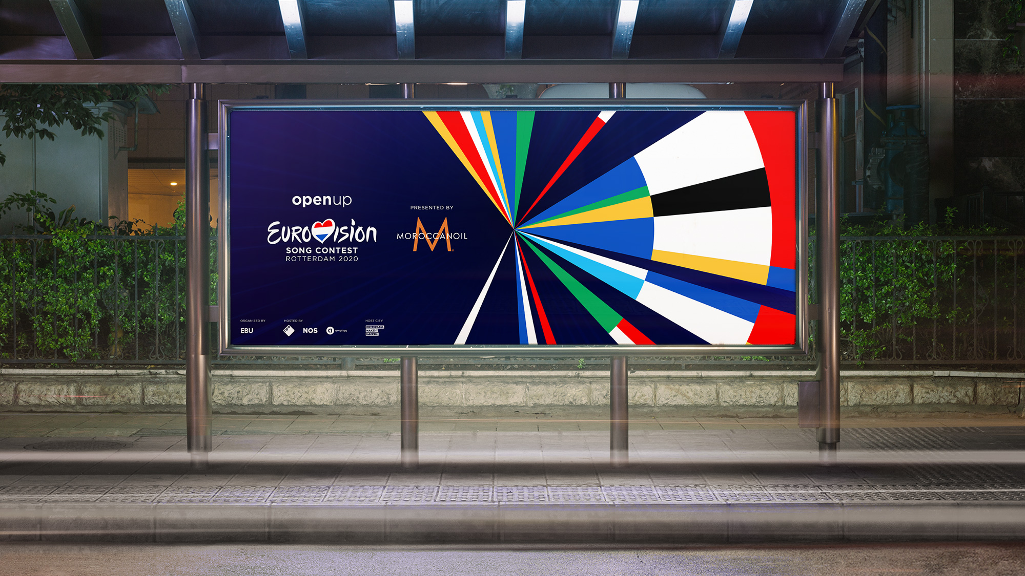
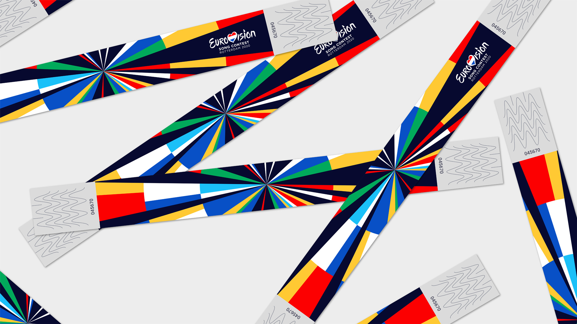
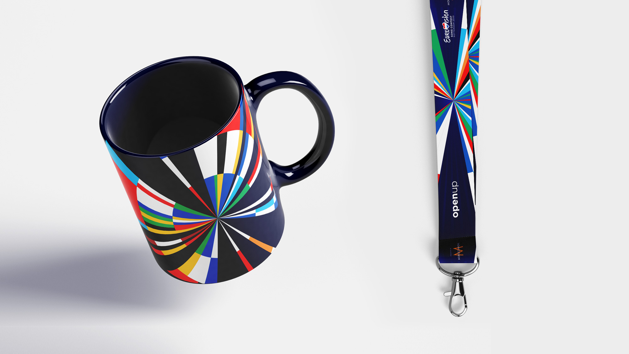
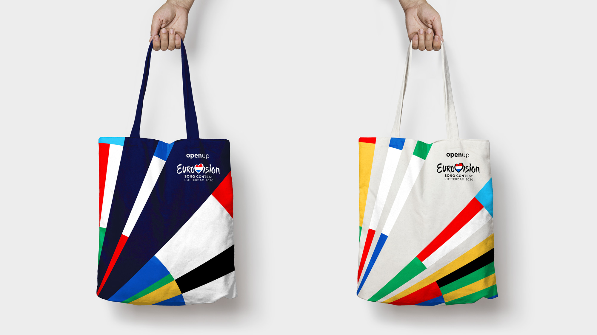
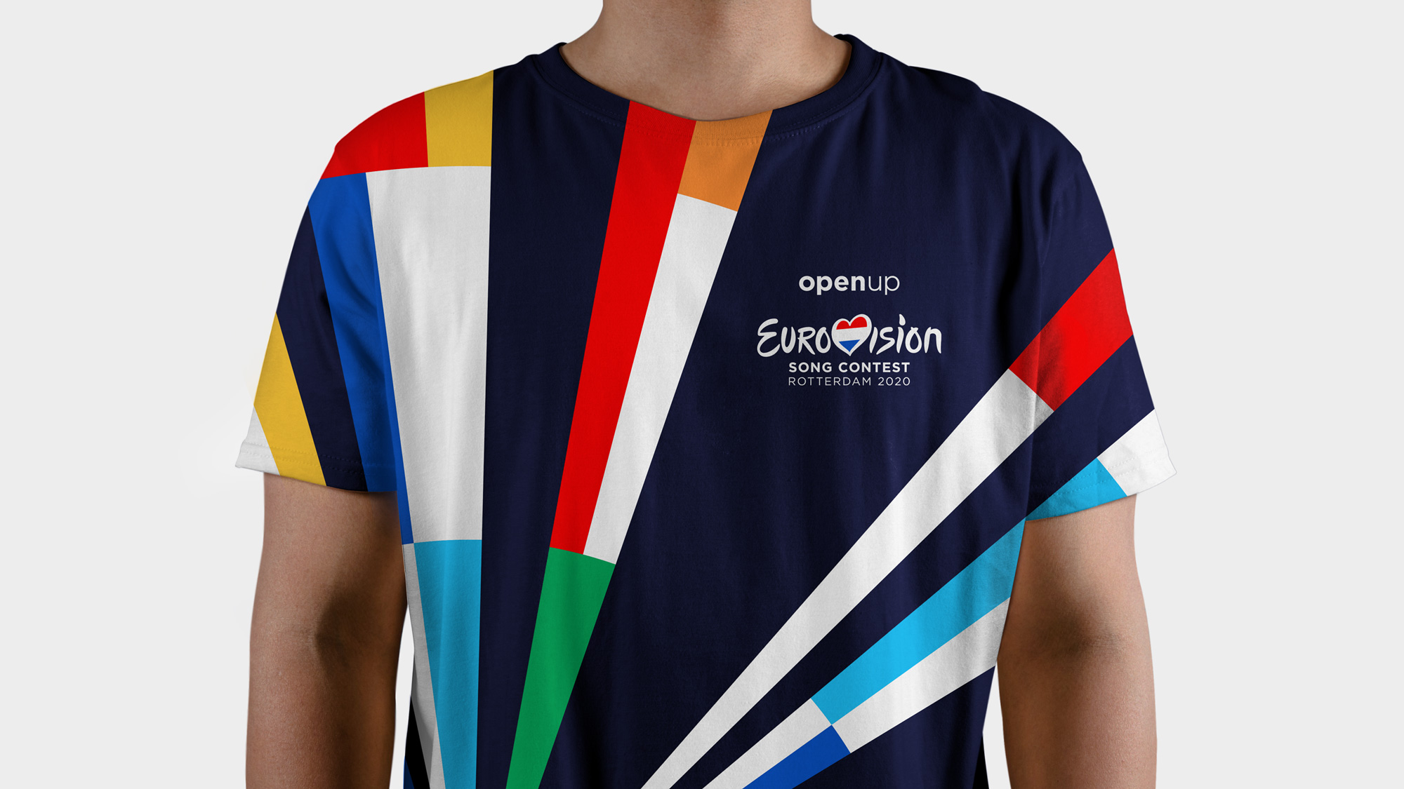
In application, the main graphic is blown up to serve as a big burst of color emanating from different points in each layout, which is a clever use of the logo to make it the hero of every touchpoint and it works so much better in this form than as a standalone logo. The main drawback of using the graphic so prominently is that it leaves the “open up” wordmark as the logo in the applications and it’s too generic-looking to be appreciated as the year’s theme, which is usually a big deal. Nonetheless, the applications are indeed striking and the liberties they took with the radial graphic to take out pieces where needed to accommodate information or secondary logos work very well to create a flexible system.
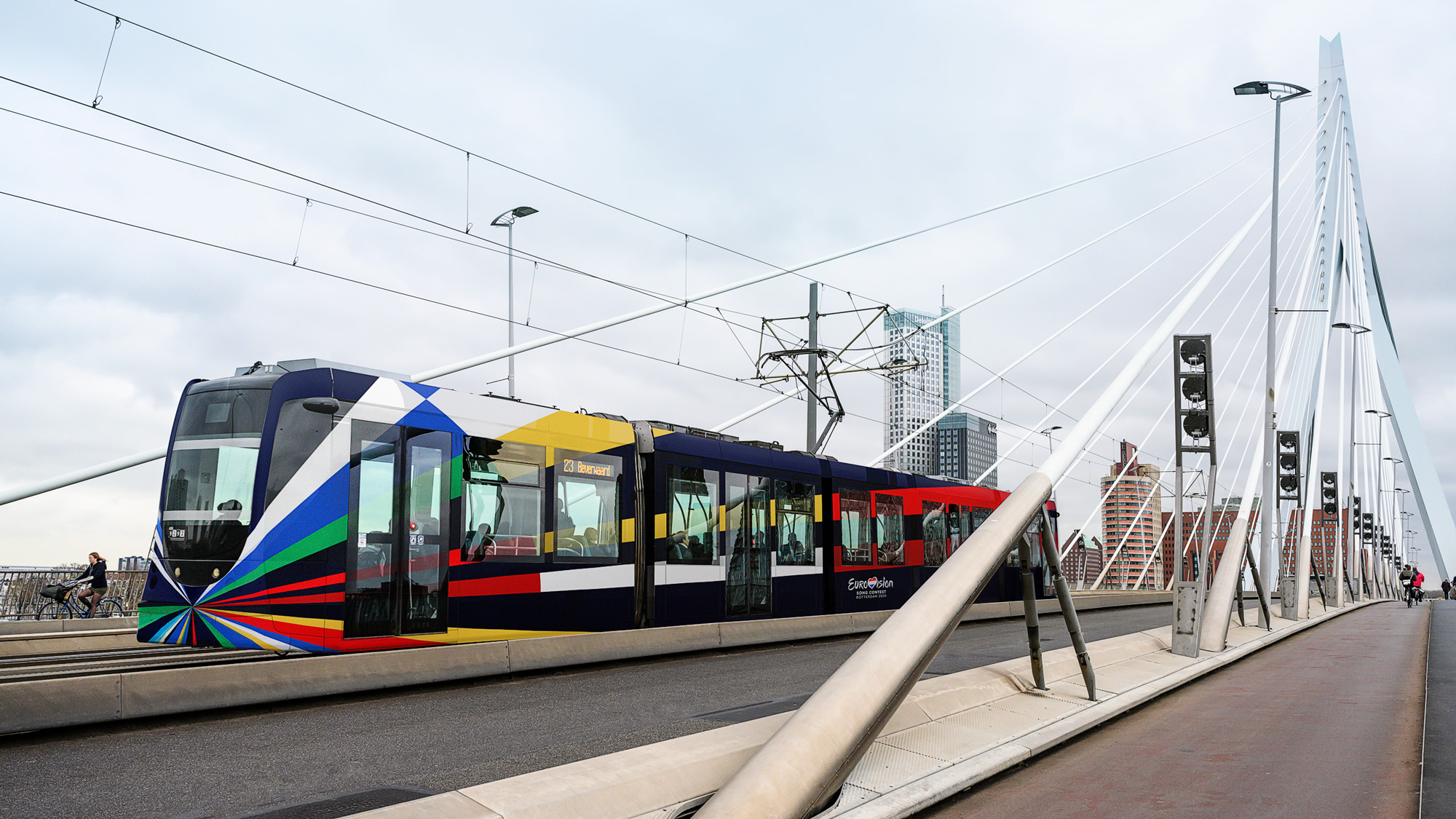
Overall, this is a thoughtful and clever concept that — despite my grievances about the theme’s lackluster presence — delivers a colorful and attention-grabbing identity for the one year it’s used. I mean, look at that train.
 each year since publication began in 2006

 Новости Союза дизайнеров
Все о дизайне в Санкт-Петербурге.
Новости Союза дизайнеров
Все о дизайне в Санкт-Петербурге.