contact us | ok@ohmycode.ru
contact us | ok@ohmycode.ru

Established in 1998 through the merger of Bank America and NationsBank, Bank of America is one of the United States’ leading financial institutions serving approximately 67 million consumer and small business clients with banking, investing, asset management, and other financial and risk management products and services. It is the second largest banking institution in the U.S., behind JP Morgan Chase, with 4,400 retail financial centers and approximately 16,100 ATMs. It also has a global presence in over 35 countries offering wealth management, corporate and investment banking, and trading. Earlier this month, Bank of America introduced an updated logo designed by Lippincott.
Bank of America today announced a new brand positioning focused on the question, “What would you like the power to do?” The positioning reflects the impact clients and communities can have when they have the power to achieve their goals, and the company’s role as a partner invested in their success. […]
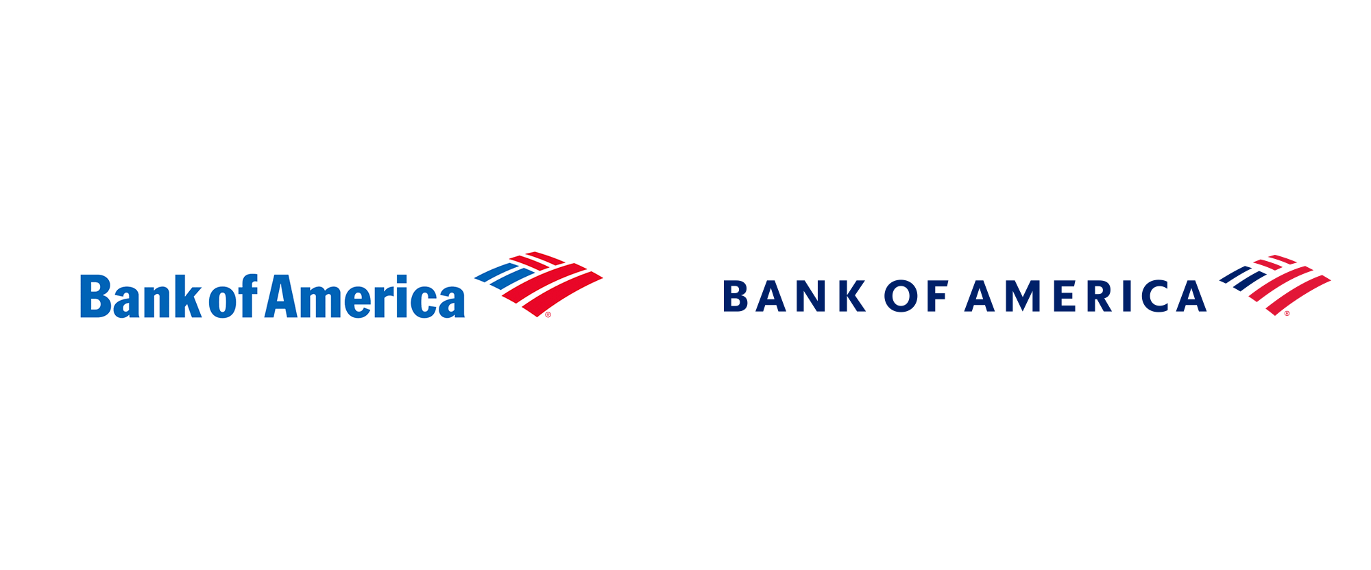
The Flagscape logo is also getting its first update since being introduced in 1998, reflecting a more modern brand that delivers both cutting-edge technology and high-touch solutions for clients.
The new Bank of America logo starts with a sophisticated all-caps style to better emphasize our name and reinforce our stature as the premier global financial services provider working to fulfill our clients’ holistic financial needs. The Flagscape’s stripes are set further apart and the shape is more evenly geometric to make the image of the flag clearer, reinforcing associations with our global scale, capabilities and leadership. The result is a refreshed logo optimized for physical and digital environments.


In principle — and as far as the large majority of its 67 million clients are concerned — the old and new logos are the same. It still says “Bank of America” in a stately way and it still has the “Flagscape” icon. It’s obvious but still worth mentioning that the goal here was a subtle evolution that allows the original design to adapt to 20 years of technology and aesthetic changes with an execution better suited for today’s uses.
The old icon was mostly fine but the counterspaces between the lines were a little too tight, easily getting blurry at the smallest of sizes. I like how tight the lines were set as it accentuated the stripes whereas now the counterspaces are almost as thick as the stripes — which is not bad, but definitely changes the feel of the icon. The new icon is a more literal interpretation of the American flag where all the stripes are equal weights, so there is a valid conceptual reason to thicken the counterspaces that, in turn, allow the icon to reduce much more than before. Since I’m a fan of controlled solutions, I like the more symmetrical construction of the new icon and all the lines reaching the edge of the overall shape (as opposed to the blue lines in the old icon that were a little bit shorter which, to their credit, made the icon look more intentionally weaved.)
The old wordmark, in some variation (perhaps customized at the time) of Franklin Gothic, was great but, unfortunately (as it’s such a great type family), who uses Franklin Gothic anymore? The new wordmark is more in tune with today’s wordmarks of the world and I appreciate that it’s not a straight-up geometric sans serif and still has a little bit of that old-school feel of Franklin Gothic somewhere in there.


Perhaps the best testament to the redesign is how well the logo works in single color and in smaller sizes. Check the corporate site to see how it looks on the nav bar. (The new icon does get a little jagged but the old one would have never been able to handle that size.)
As to the global brand campaign and positioning, “What would you like the power to do?”, it’s well-meaning but, as with most financial institutions’ positioning, it comes across as trying too hard to make them look likeable and accessible. I can, however, get on board with a financial institution that champions Ken Burns. Overall, nothing drastic, controversial, or unexpected in the logo redesign which has been undertaken with modesty and appreciation for the equity it has built over 20 years.
Thanks to Dustin Tyler Joyce for the tip.

 Новости Союза дизайнеров
Все о дизайне в Санкт-Петербурге.