Обзор лучших ресурсов по разработке бренда, разработке упаковки
contact us | ok@ohmycode.ru
contact us | ok@ohmycode.ru
First sold in 1987 and evolving as a line of sweet and savory snacks, Be Natural, owned by Kellogg’s Australia since 2000, is now focused on morning cereals and sweet snack bars. From grain flakes to granola, the cereals (and the bars) are made from “nutritious uplifting plant-based foods.” Last year, Be Natural introduced a new logo and packaging designed by Sydney-based Loop Brands.
Loop Brands were tasked to reinvent mainstream cereal and snacks and disrupt the category. Targeting consumers who are proactive about eating healthier and are mindful of the latest food trends.
‘Uplifting health from plant power’ became the linchpin of all communication to inspire the foodie in all of us.
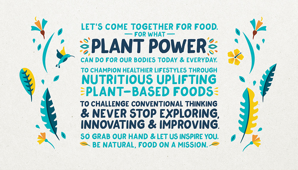
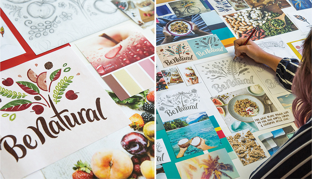
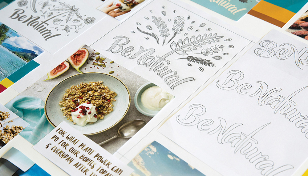
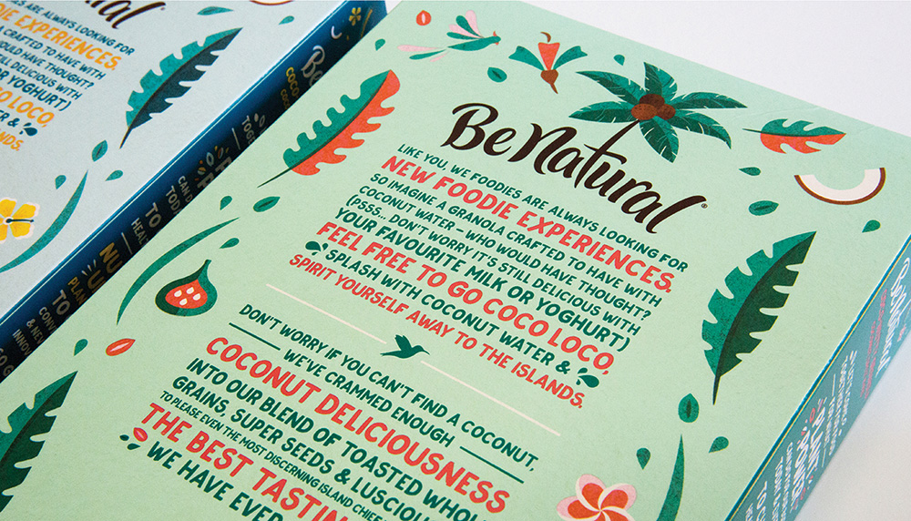
The old logo looked like a number of nature-y granolas, cereals, and other similar products — or maybe I’m just thinking of Nature Valley — with the friendly type and rough-edged textures. The old logo also had the bonus of sprouting leaves rather poorly from the “e” and “a”. It wasn’t terrible but nothing memorable either. The new logo breaks out, wildly, from the banner with a script wordmark on a curve — that is not particularly great, but attractive enough — that sprouts a flurry of “plant power” from the “t”, which feels a little forced but it gets the point across. While the typography is not my favorite part, I do love the explosion above as it has a cool Mid-Century Modern lite aesthetic and it changes to match the ingredients of each cereal and bar.
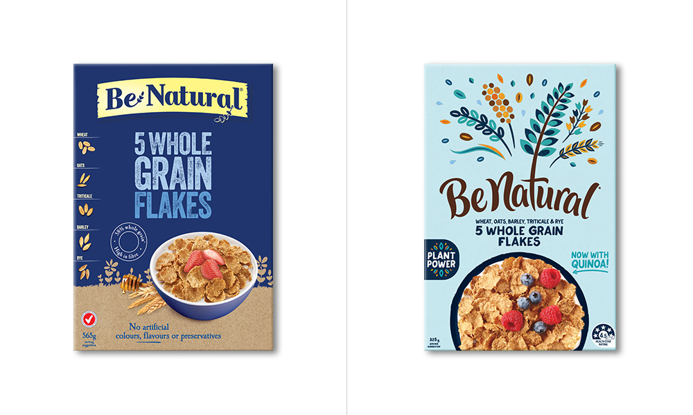
The old packaging was far from inspiring and its natural-ness felt like it had to be force-fed through the textured typography because it didn’t look any more enticing than a tub of I Can’t Believe it’s Not Butter.
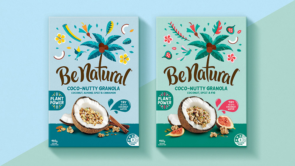
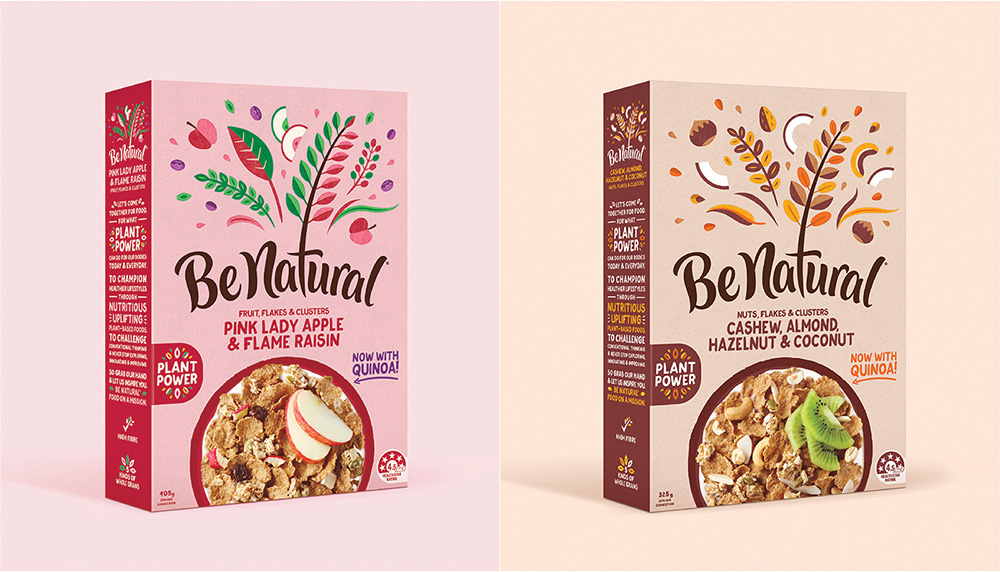
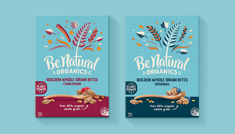
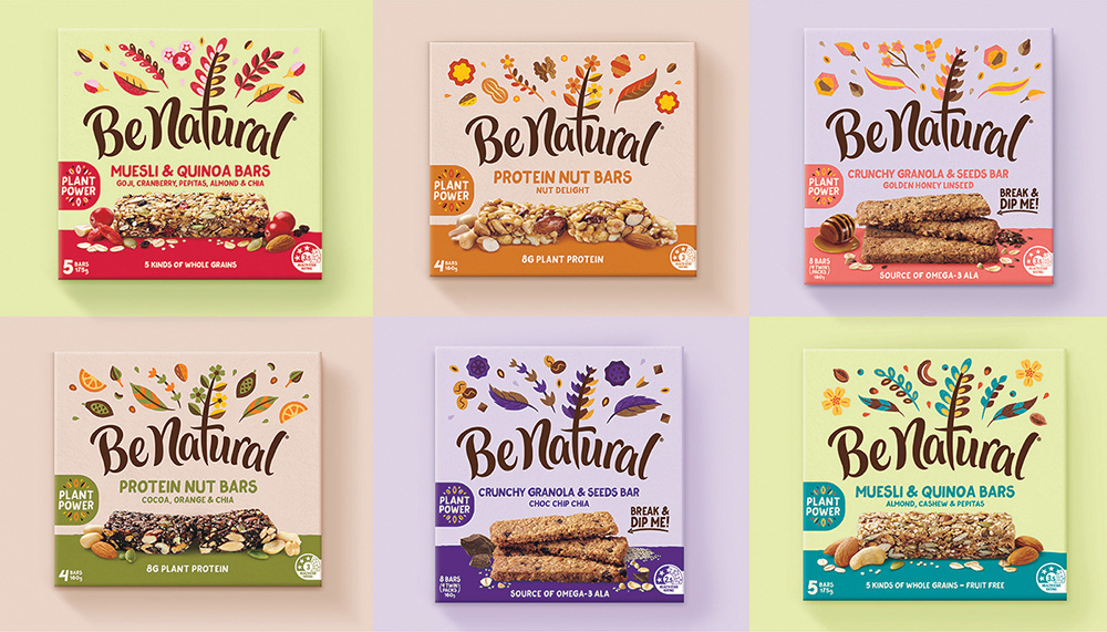
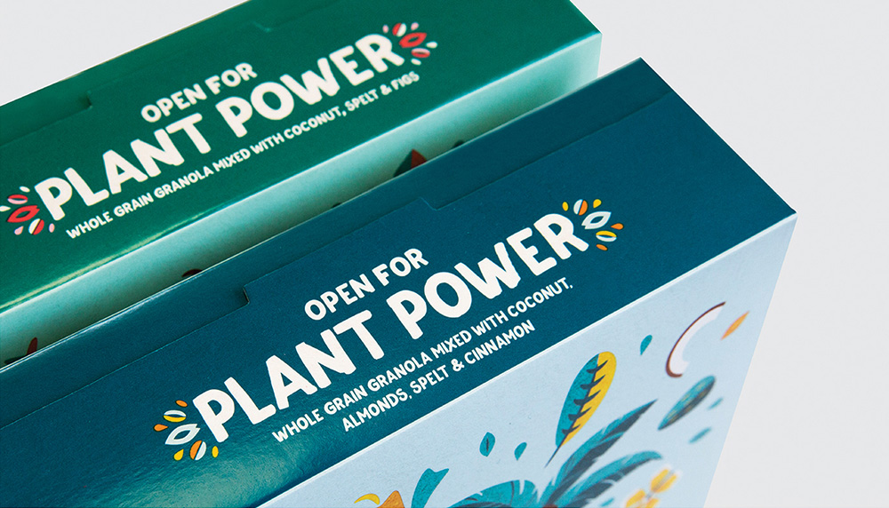
The packaging, especially the tall cereal boxes, make great use of the new logo by having the name wide and the plant power illustration take up nearly half of the packaging, creating a highly visible and distinct shelf presence that looks really great. The product photography could be better somehow — maybe at least not putting it in a coconut bowl — but for the most part it balances out well with the large logo. The typography throughout is decent, changing the rough textures of yore for a wobbly, hand-written effect (that could have been pushed further with a font with stylistic alternates; see “COCONUT DELICIOUSNESS below).
Overall, this is a sweet update that makes a huge improvement on the previous look while putting this in line with the aesthetics of smaller-batch (and dare I say artisanal) natural products yet with the marketing and distribution power of Kellogg’s.

 Новости Союза дизайнеров
Все о дизайне в Санкт-Петербурге.
Новости Союза дизайнеров
Все о дизайне в Санкт-Петербурге.