Обзор лучших ресурсов по разработке бренда, разработке упаковки
contact us | ok@ohmycode.ru
contact us | ok@ohmycode.ru
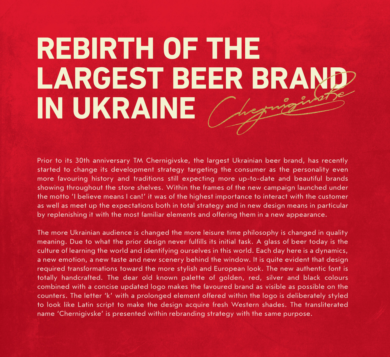
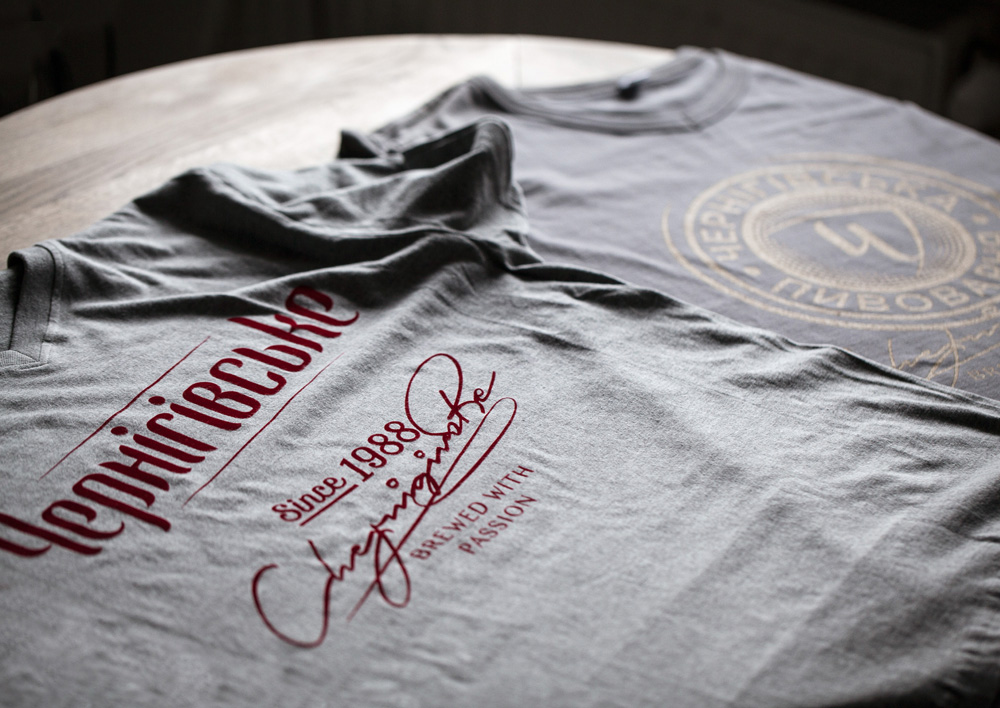
Established in 1988, Chernigivske is the leading beer brand in Ukraine in terms of sales volume and it’s part of beverage giant, Anheuser-Busch InBev. I don’t have a lot more information because my Ukrainian is a little rusty. Late last year, Chernigivske introduced a new identity and packaging designed by Kiev, Ukraine-based Reynolds and Reyner.
As a disclaimer/spoiler alert: I will probably be missing a lot of details or nuances about this redesign since I am not only unfamiliar with the beer brand but, other than some sprinkling of English, it’s all in a very different language — when it’s French, Portuguese, or German I can get the gist. Anyway, I’ll do the best I can.
Also, there are a lot more images on Reynolds and Reyner’s project page not posted here because it was simply too much to parse and include.
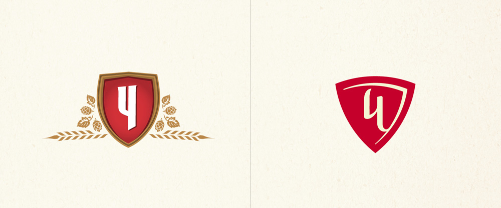
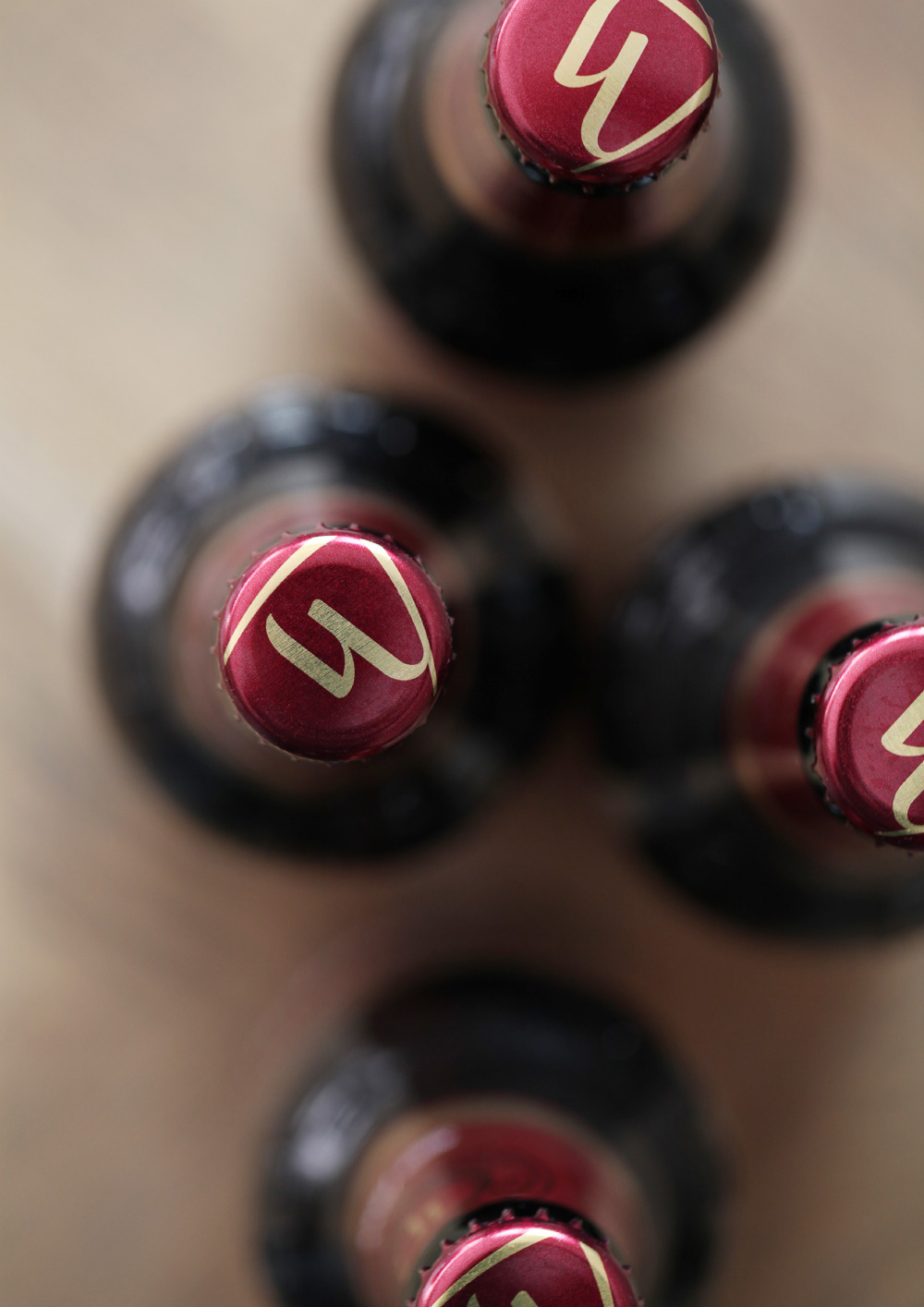
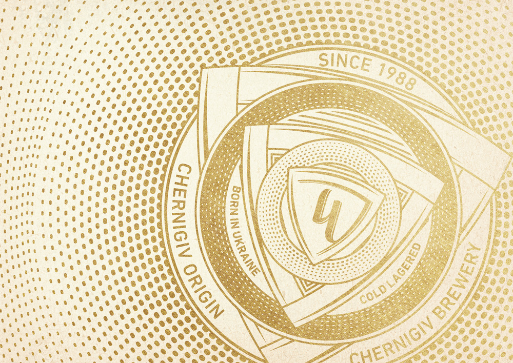
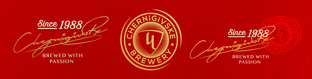
The old logo and monogram looked like any number of beer logos and monograms from around the world, featuring a red and gold color palette as well as some form of shield/crest and allusion to barley and hops. They were fine, to be honest, nothing terrible and nothing great. The new monogram presents the most evident change, going with a more stylized “Ч” — the Cyrillic letter for the “ch” sound — that sits inside a guitar-pick-like shield. It’s relatively attractive but the gold contour of the shield is a little awkward. The full wordmark now features a contrasting, thick-thin type structure that somehow feels very un-beer-like and more spirit-like, like something you would see on a Vodka bottle.
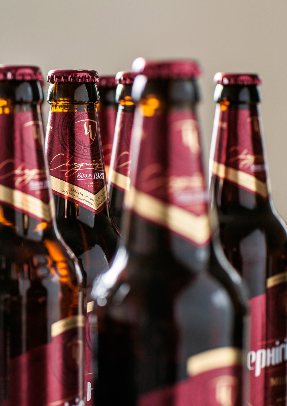
The main logo can also be accompanied by a range of English stuff, including a “Since 1988”, the name of the beer rendered as a signature, a “Brewed with Passion” tagline, and a monogram seal. Maybe, it’s a little too much but even if it were the right amount of stuff, maybe it’s one (or two or three) too many styles. I’ll admit that I do dig the signature execution a lot.
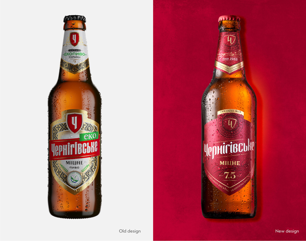
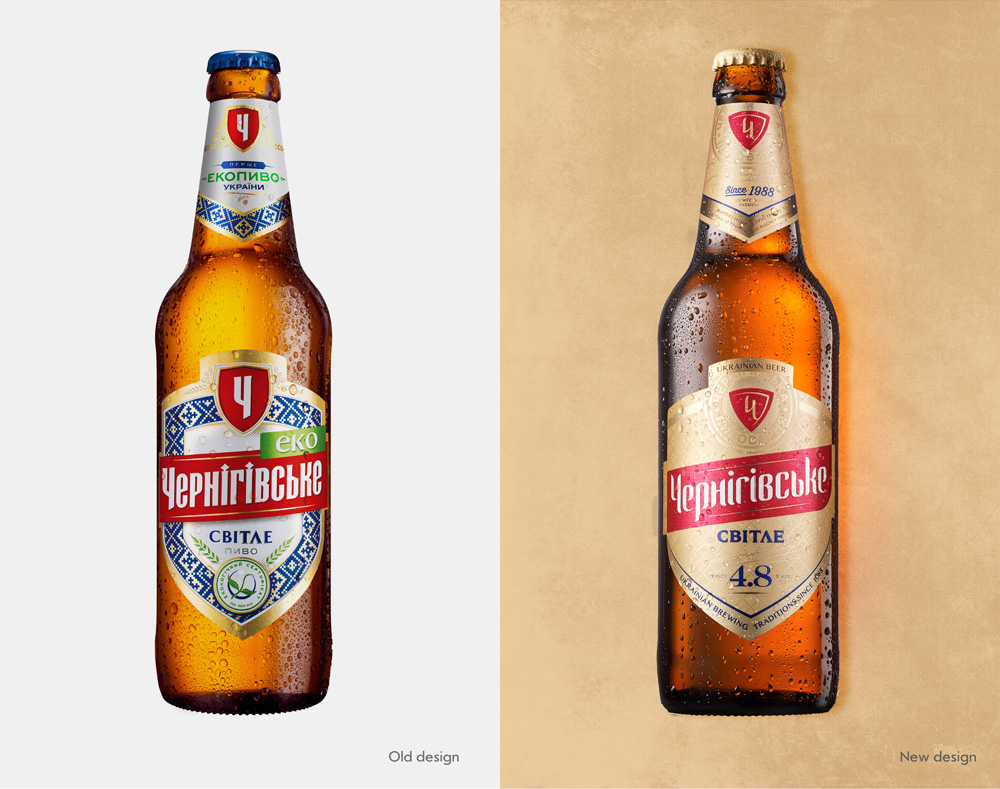
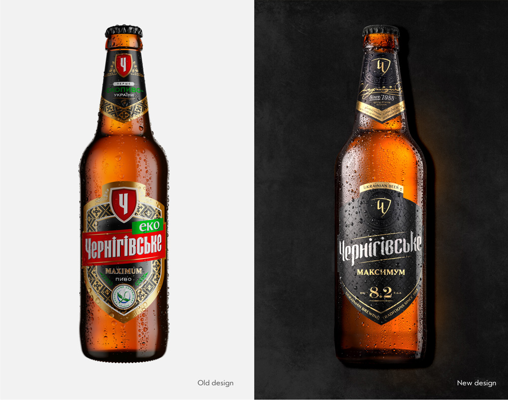
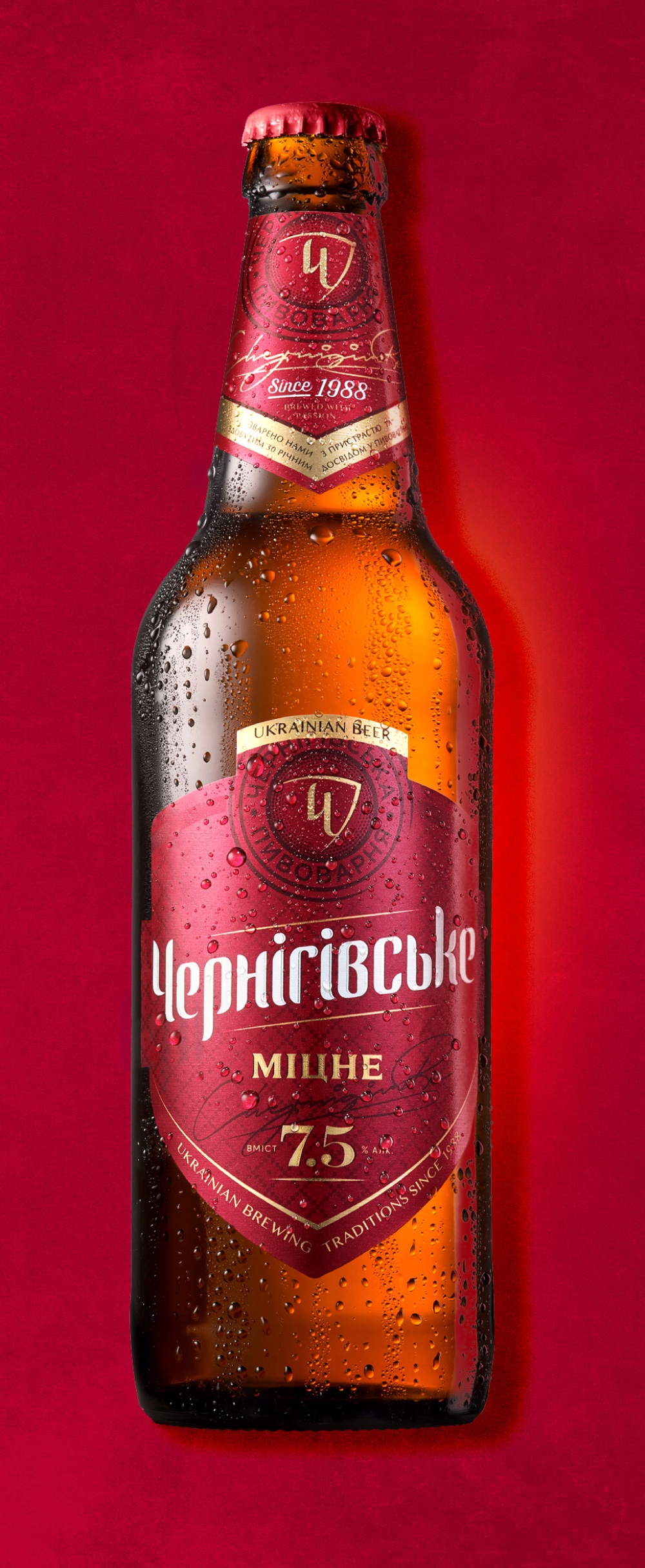
The old bottle labels were fine — other than the many green “eko” marks — and the thick borders with the pattern were actually pretty cool. The new labels feel a lot slicker for sure and more contemporary. There is a lot of detailing and subtle elements and textures that make them interesting but the overall look feels a little forced in trying to make the beer more premium.
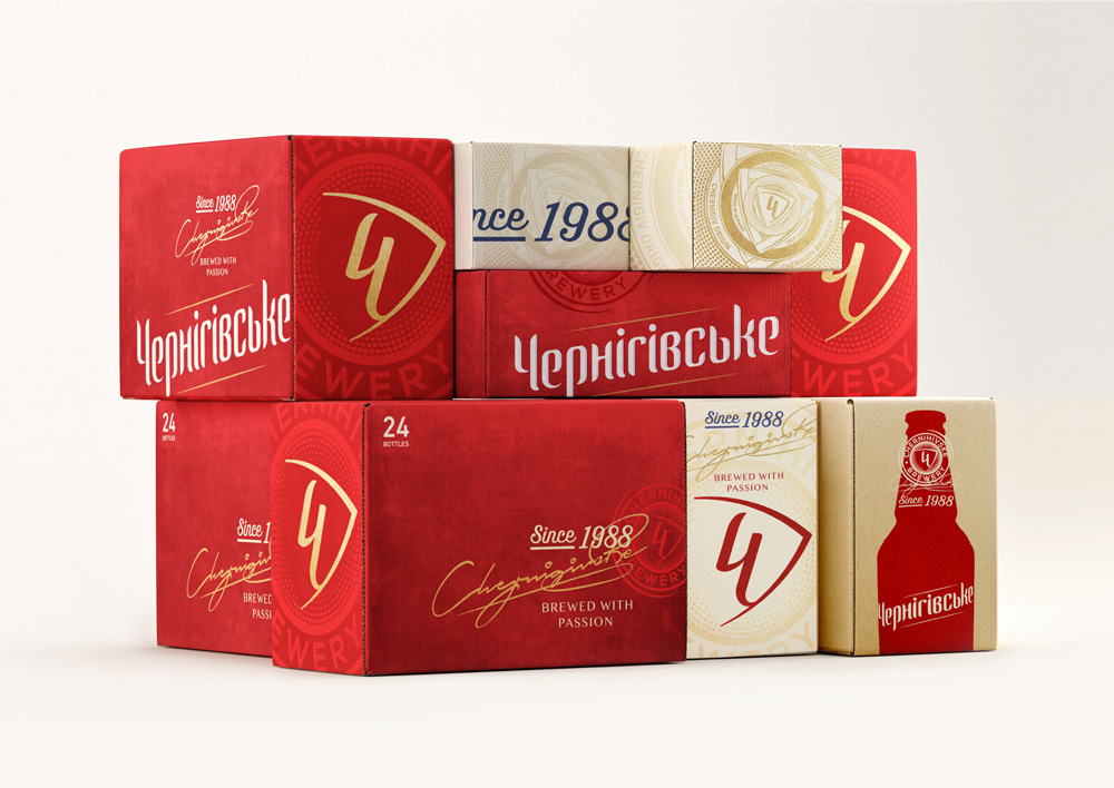
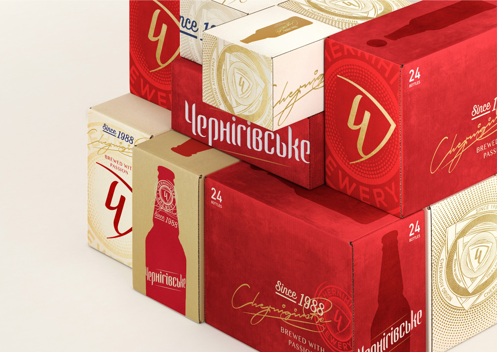
The cases introduce a range of identity elements that are a little dizzying. They create a somewhat cool-looking aesthetic but it’s like each panel of each box is singing a different tune and there is no real harmony throughout.
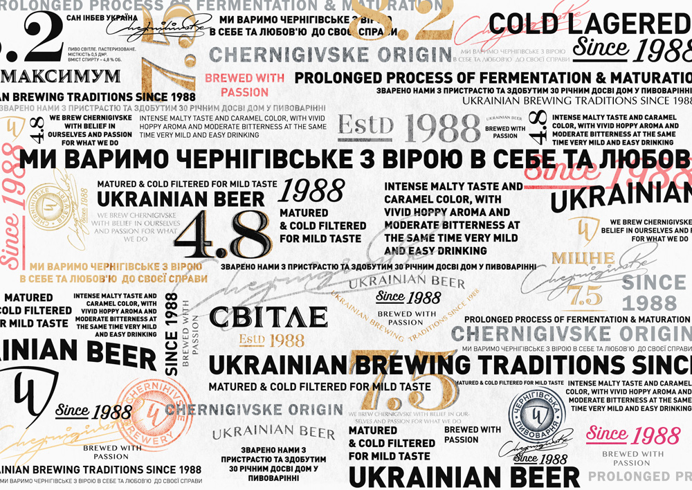
This one I really don’t get. It’s way too much of way too many things.
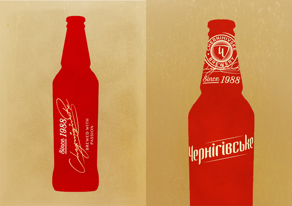
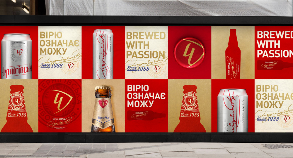
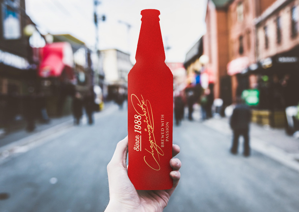
The identity then introduces a silhouette device that’s kind of interesting and maybe the shape of the bottle is very well known in Ukraine that it can stand on its own. These silhouettes work rather nicely with the typographic arrangements and the image directly above has a cool contrasting effect between the graphic bottle and photographic background.
Overall, the change is good, I guess, in that it elevates the beer to more of a lifestyle brand as opposed to a beer-that’s-most-widely-available-so-I-guess-we’ll-drink-that brand. It feels like they tried to follow the approach of a combination of Budweiser and Miller High Life but this doesn’t feel nearly as cohesive as either of those.

 Новости Союза дизайнеров
Все о дизайне в Санкт-Петербурге.
Новости Союза дизайнеров
Все о дизайне в Санкт-Петербурге.