Обзор лучших ресурсов по разработке бренда, разработке упаковки
contact us | ok@ohmycode.ru
contact us | ok@ohmycode.ru
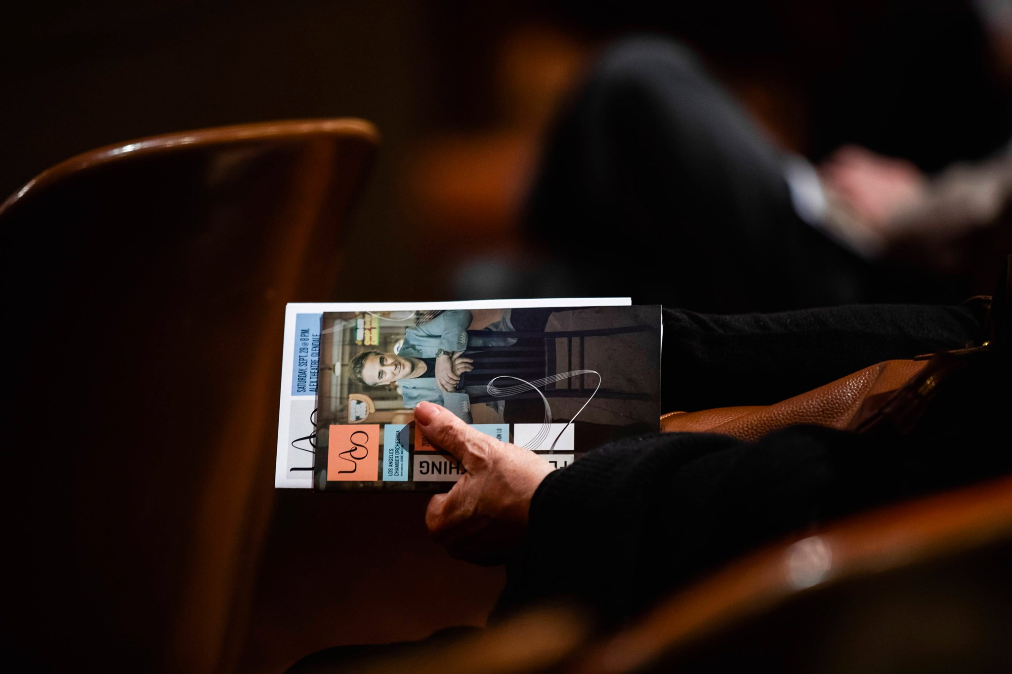
Established in 1968, the Los Angeles Chamber Orchestra (LACO) is, as its name most evidently implies, a chamber orchestra based in Los Angeles, CA. A “preeminent interpreter of historical masterworks as well as a champion of contemporary composers”, LACO performs at two venues, the Alex Theatre in Glendale and UCLA’s Royce Hall and has toured Europe, South America and Japan, performed across North America, garnered eight ASCAP Awards for Adventurous Programming, and has made 31 recordings. With the 2019-20 season kicking off this month and the debut of a new music director, LACO has introduced a new identity designed by New York, NY- and London, UK-based Brandpie.
LACO’s new purpose and messaging framework — [“The invigorating power of classical music”] — aims to fill audiences with wonder, provoke awe and foster emotional well-being through the invigorating power of classical music. This idea is expressed through the tagline, “Feel Everything”.
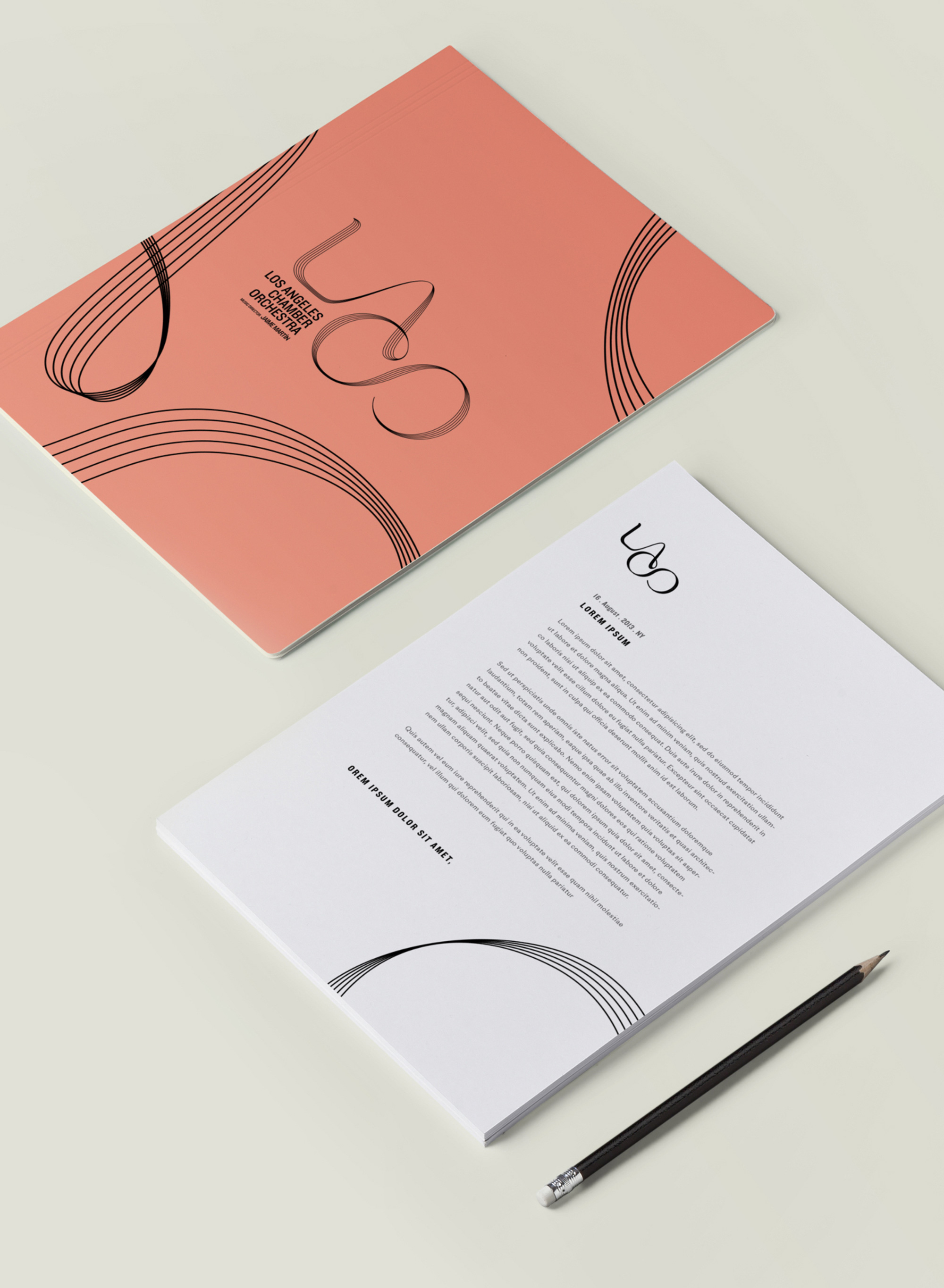
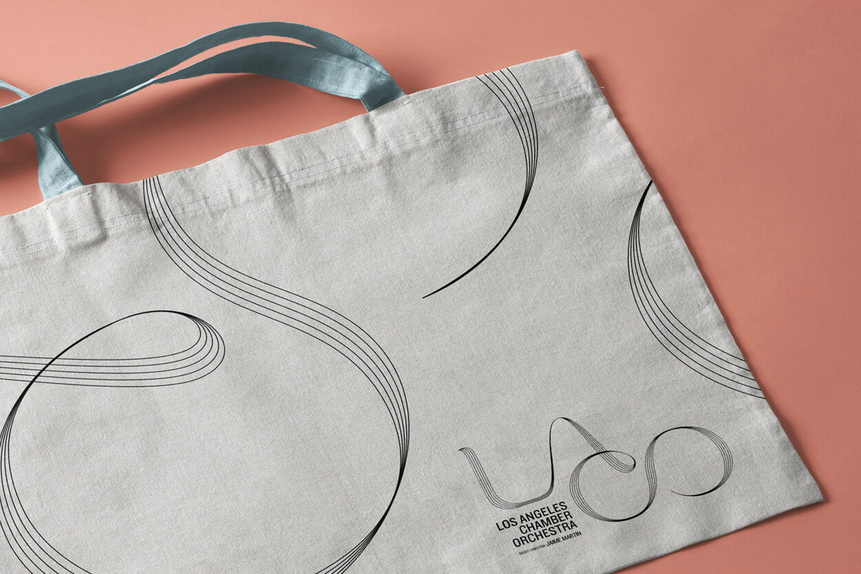
The creative redesign includes an entirely new logo, updated typography, a fresh colour palette and enhanced layout applications. The stroke lines of a music manuscript make up the logo and become a motif that represents how the audience feels the music.
The old logo wasn’t much of a logo, with some unassuming serif in very subtle shade changes inside a red square. Not very inviting or exciting. The new logo comes in two flavors, a display version with a multi-line construction; and a smaller-use version with a solid rendering of the lettering. My general interpretation of the contour is that it’s like a continuous movement of the conductor’s baton, swaying smoothly from one side to another that has resulted in a very nice visual rendition, especially in the display version. I love how the five lines — from the music staff, naturally — converge to form thin, contrasting strokes as the letters flow from one into the other. Splitting “LA” and “CO” into two levels not only makes for a more compact logo but it also cleverly allows the “C” to serve as the crossbar for the “A”. The solid version is not as elegant and as eloquently resolved… it certainly works as a smaller-use version but perhaps there could have been a little more contrast and the ending of the “O” could have been better resolved. Still, it’s a much more welcome solution than a lowercase geometric sans serif, which this could have easily been. The full name of the orchestra is typeset in Hoefler&Co’s Knockout, which is a very odd stylistic choice as it doesn’t have any visual synergy with the lettering.
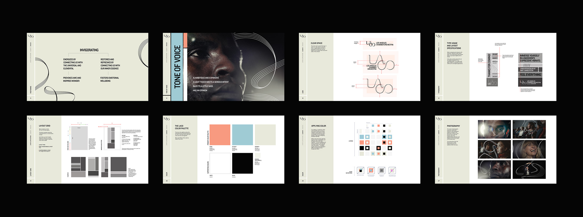
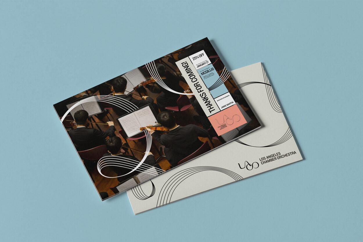
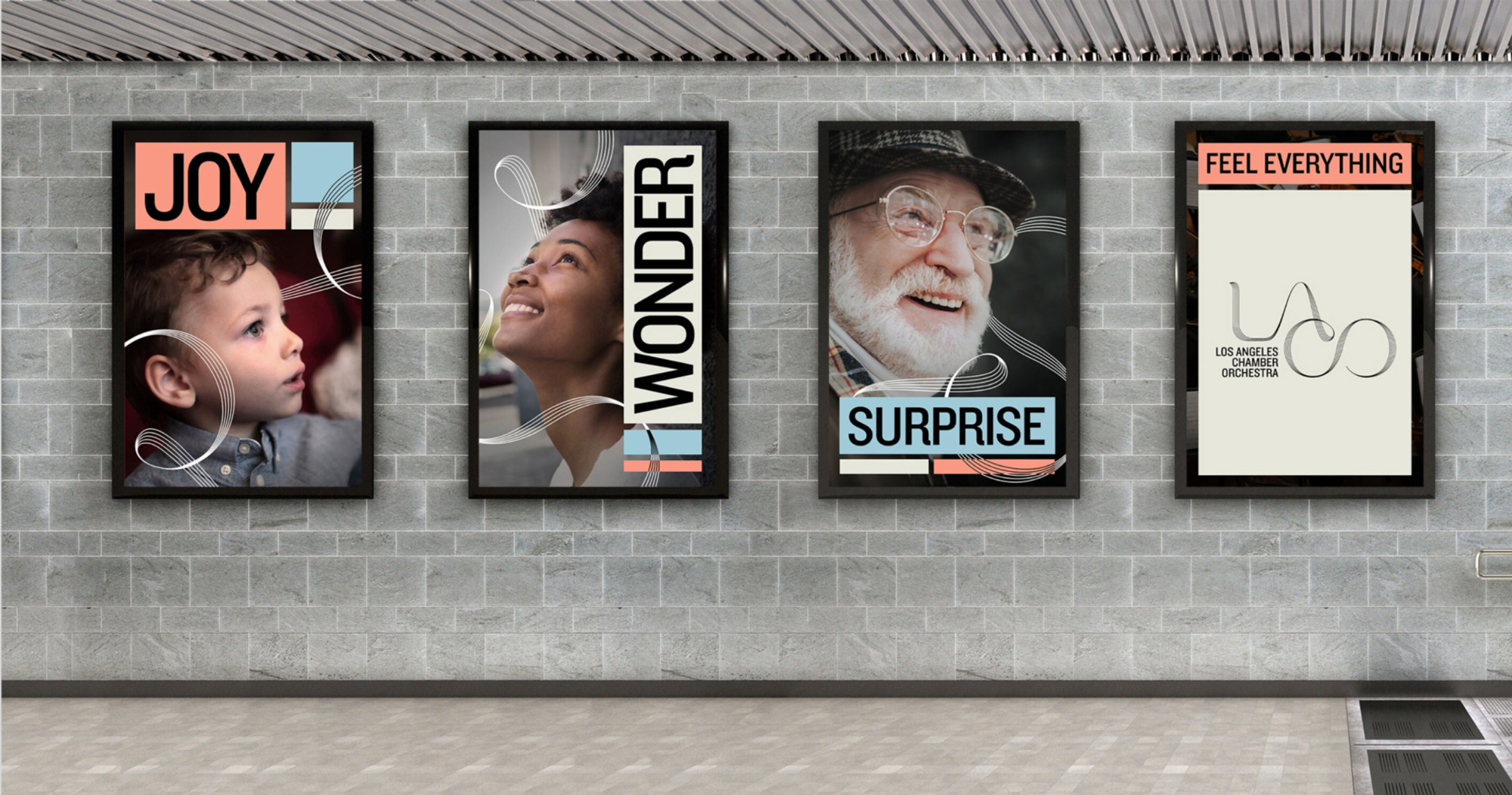
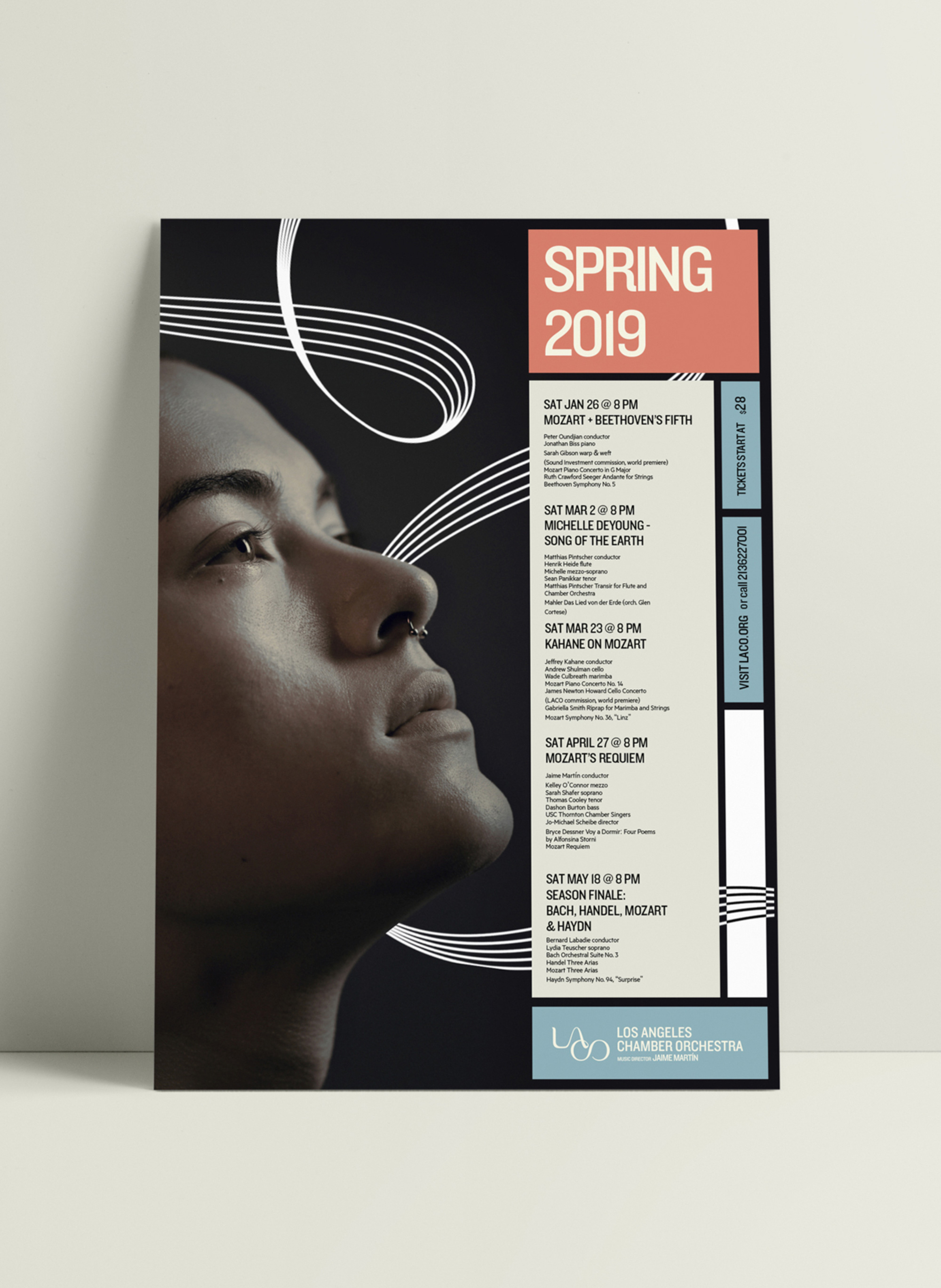
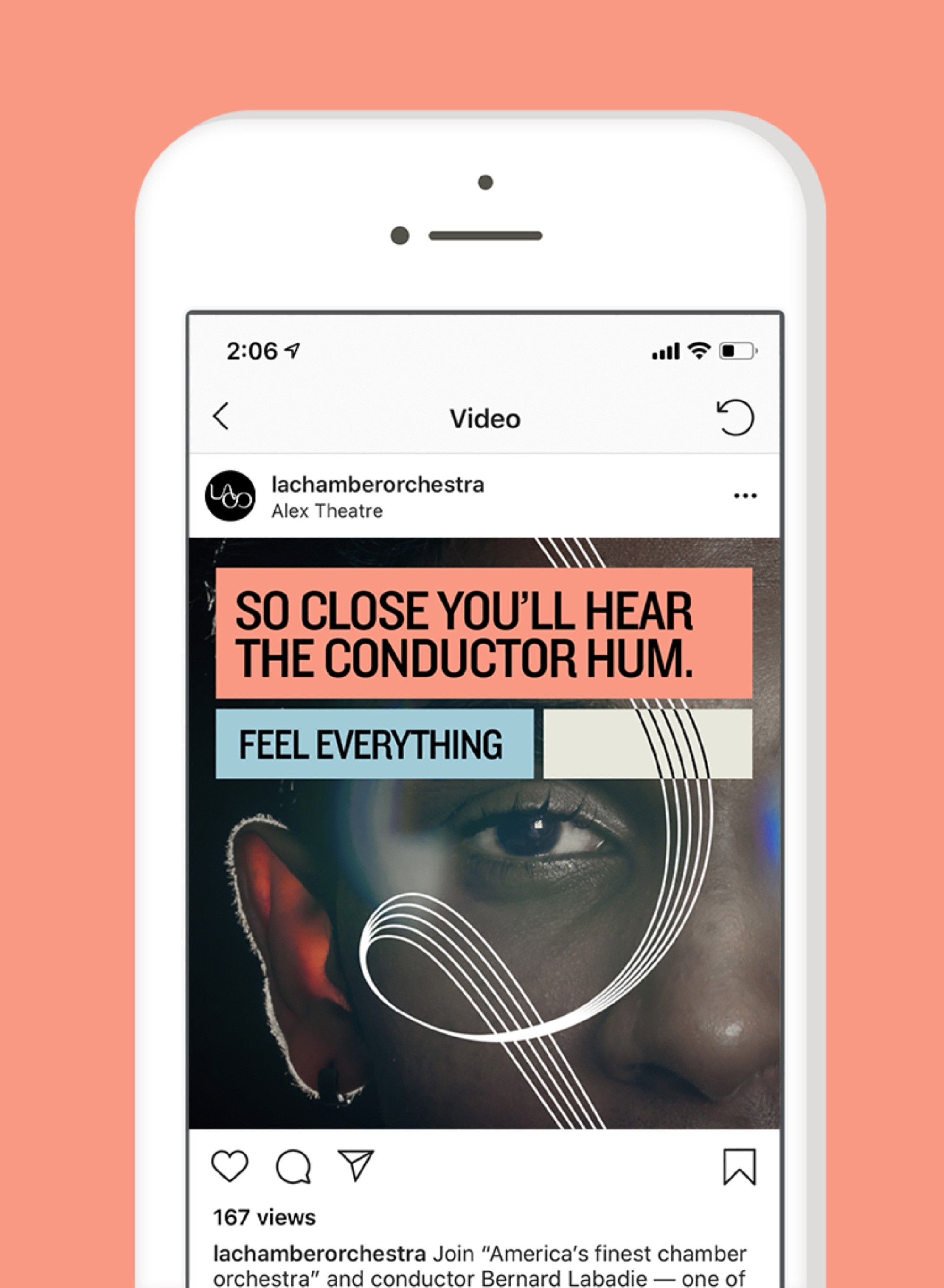
The same discordance that happens in the logo with the use of Knockout — and not that there is anything wrong with Knockout in general — is amplified in the identity which feels like it was designed by someone else in complete isolation from whoever designed the logo. The fluidity of the logo is stopped in its tracks by the use of heavy boxes, overly big typography, and a color palette that, although nice on its own, feels out of place here. The addition of swirly lines interacting with the layouts and the photography could have been interesting but those heavy boxes really kill the mood and when the lines invert color as they cross white boxes it looks kind of cheap. Maybe if all the boxes had been transparent with thin white strokes with the swirly lines in a matching thickness and a much more contemporary font choice, this could have been, well, a knockout. Nonetheless, the logo is a step very much in the right direction and there is always the 2020-21 season to revisit the applications.
Thanks to kiko84 for the tip.
 each year since publication began in 2006

 Новости Союза дизайнеров
Все о дизайне в Санкт-Петербурге.
Новости Союза дизайнеров
Все о дизайне в Санкт-Петербурге.