Обзор лучших ресурсов по разработке бренда, разработке упаковки
contact us | ok@ohmycode.ru
contact us | ok@ohmycode.ru
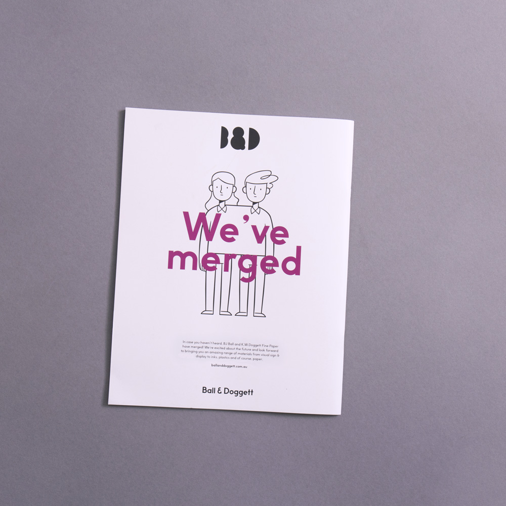
Formed in 2017, Ball & Doggett is the largest paper distributor in Australia and New Zealand after the merger of BJ Ball (established 1918) and K.W.Doggett (established 1975). Aside from the sale, distribution, and wholesale supply of paper, the company also offers packaging products, inks, and chemicals to the packaging, printing, and plastics industries. The new identity has been designed by Sydney, Australia-based For the People.
The new identity celebrates the physical nature and tactility of its product range. The simplified letterforms of the brandmark enable it to demonstrate various behaviours and material properties. Coupled with imagined weird and wonderful manufacturing processes, the identity presents the joy in all materials.
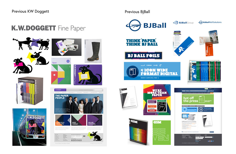
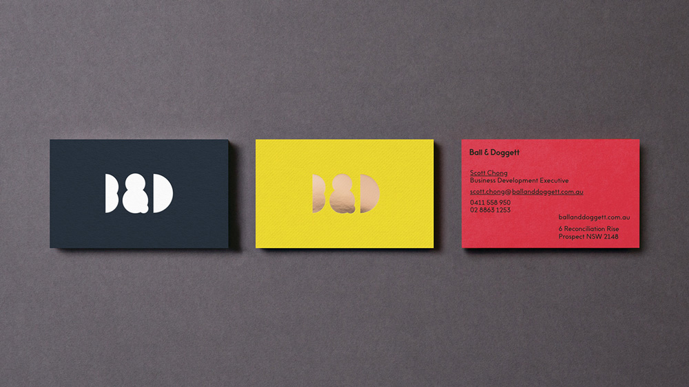
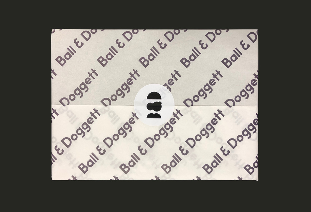
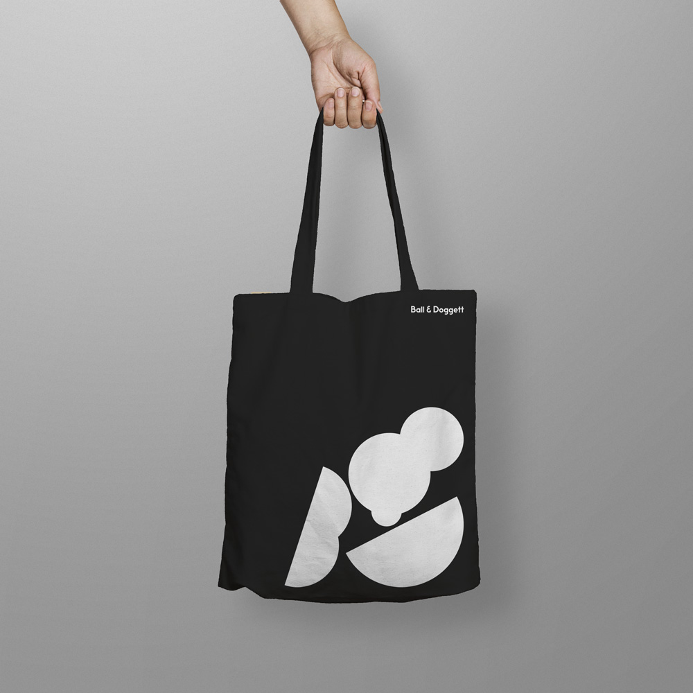
Neither of the old logos were great; K.W. Doggett was the least offensive with a type-only approach but it weirdly mixed Franklin Gothic with Gill Sans, which, no thank you, and BJ Ball had a clichéd paper airplane and an unappealing wide (stretched?) sans serif. So, nothing to miss about the old logos. The new logo focuses on the merger by introducing a monogram with a large ampersand unifying the old names into a new company. The execution is made using full and half circles that yield a huge ampersand, a small “B”, and a medium “D”. I know I’ve seen this before a number of times — because I just had a deja-vu-averse reaction to what happens to the “B” — so it’s not entirely the most original approach, although that doesn’t mean it’s wrong for this project. Paper companies have the tricky business of needing an identity that appeals to their designer audience but they also do a lot of sales to non-creative businesses so this slightly more daring, abstract logo is kind of “out there” when it comes to the B2B aspect. The wordmark is okay, although there is something weird about those “g”s. The color variations on the logo are okay too.
Being such a simple logo, it lends itself to some cool variations and explorations of how it can be represented. If you ever wondered what the MTV-of-the-paper-distribution-world would look like, here is your answer, and it’s mostly enjoyable.
When It came to anything printed, materials are pushed to the front in applications. This meant toning down or straight up avoiding excessive graphics, and instead leaning more towards utility of information, simplified typography and a focus on making the materials do all the talking. The material is the central piece - it’s colour, texture, smell, weight etc, and every piece of design is there to support it, not distract from it.
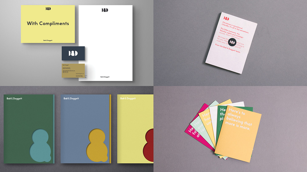
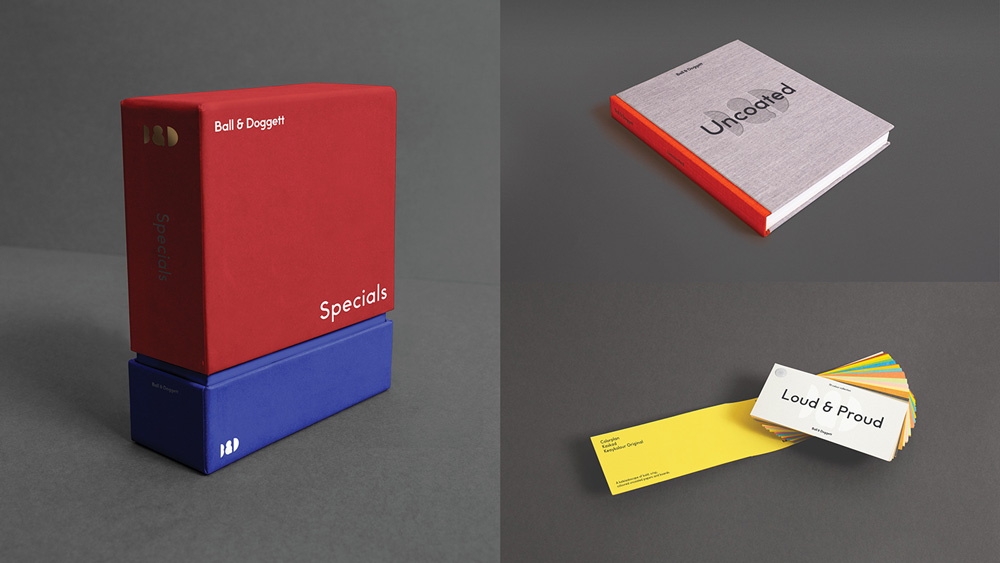
The print applications are still in process but the renders show a good range of flexibility that help highlight the papers offered. Nothing groundbreaking and perhaps a little shy in contrast to the explorations of the logo.
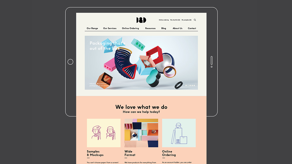
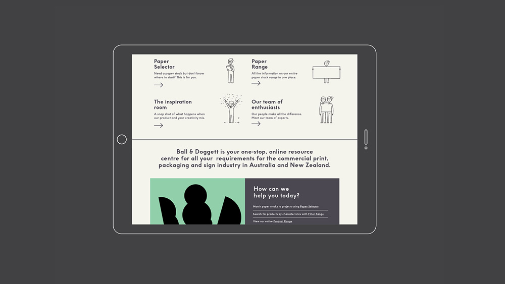
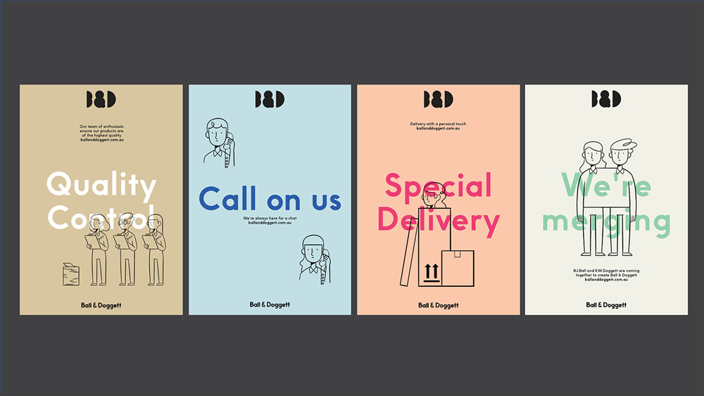
Understanding the need to tell a human story, we also developed a series of character illustrations to reflect the people of Ball & Doggett. These are then used for navigation and informative elements online, and across internal communications to facilitate the merger transition.
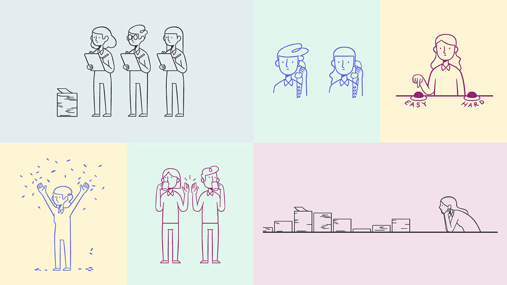
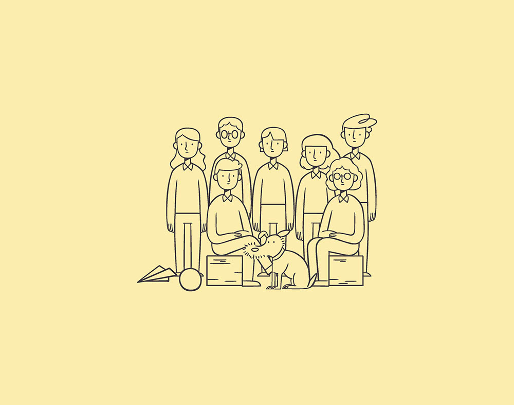
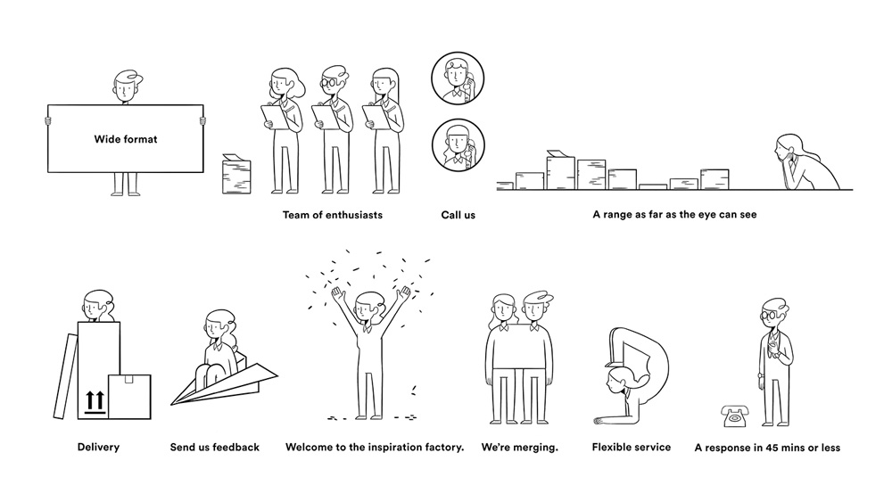
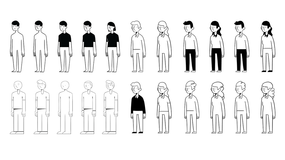
The best part of the project, though, are these illustrations. Finally, a set of illustrations that are playful without resorting to the trendy ones we’ve been seeing tons of that look like children’s book illustrations. These have great, grown-up personalities — they have actual faces — and the line work is fantastic.
Overall, this is a great redesign that gives the new company a mature and exciting creative aesthetic that the two previous companies simply couldn’t muster even as hard as they tried.

 Новости Союза дизайнеров
Все о дизайне в Санкт-Петербурге.
Новости Союза дизайнеров
Все о дизайне в Санкт-Петербурге.