Обзор лучших ресурсов по разработке бренда, разработке упаковки
contact us | ok@ohmycode.ru
contact us | ok@ohmycode.ru
Established in 1973, the Australian Film Television and Radio School (AFTRS) is Australia’s national screen arts and broadcast school and is regarded as one of the top film school’s in the world. It is a federal statutory authority, established by the Australian Film, Television and Radio School Act 1973. It focuses on the technical aspects, offering degrees in cinematography, directing, editing, screenwriting, and more. Recently, AFTRS introduced a new identity designed by Sydney, Australia-based M35.
After a deep, consultative 9-month process engaging all levels of the organisation, the resulting brand is built on a motion-first identity system — the timeline — communicating the fundamentals of contemporary storytelling and marking the School’s place in history. Applied across all channels and forms, the system drives recognition and impact, even when the mark isn’t present.
The old logo was kind of interesting with its angled typography and sharp cuts but maybe it was far weirder and aggressive than it needed to be. The new logo maintains a sense of weirdness and tension by introducing a “timeline” concept into the wordmark in the form of a constantly shifting interpolation of the same typography on various positions along the same horizontal line. I think. That was harder to verbalize than just looking at the animation above. In static form, the effect is applied to the “S”, where the duplication is most evident and it yields enough tension or enough of a glitch for the viewer to take notice. In motion, the effect is more obvious and more satisfying. The “A” has some extra funk, with its counter space going up all the way to the top; I’m not sure it was needed or what purpose it serves but I guess it adds a coolness factor to the logo.
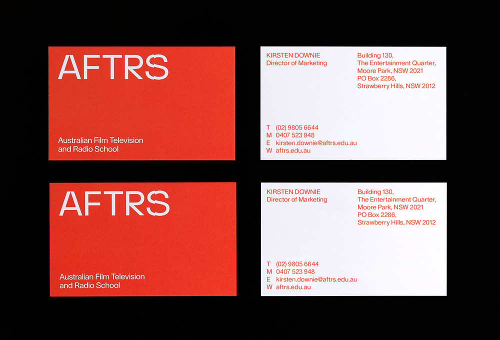
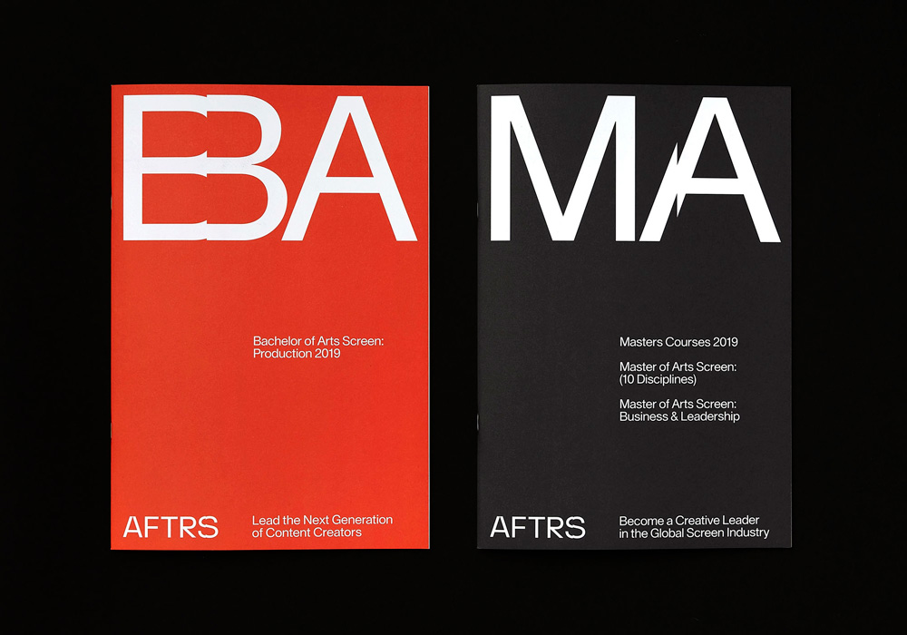
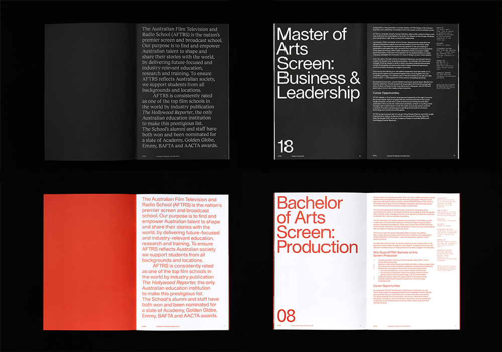
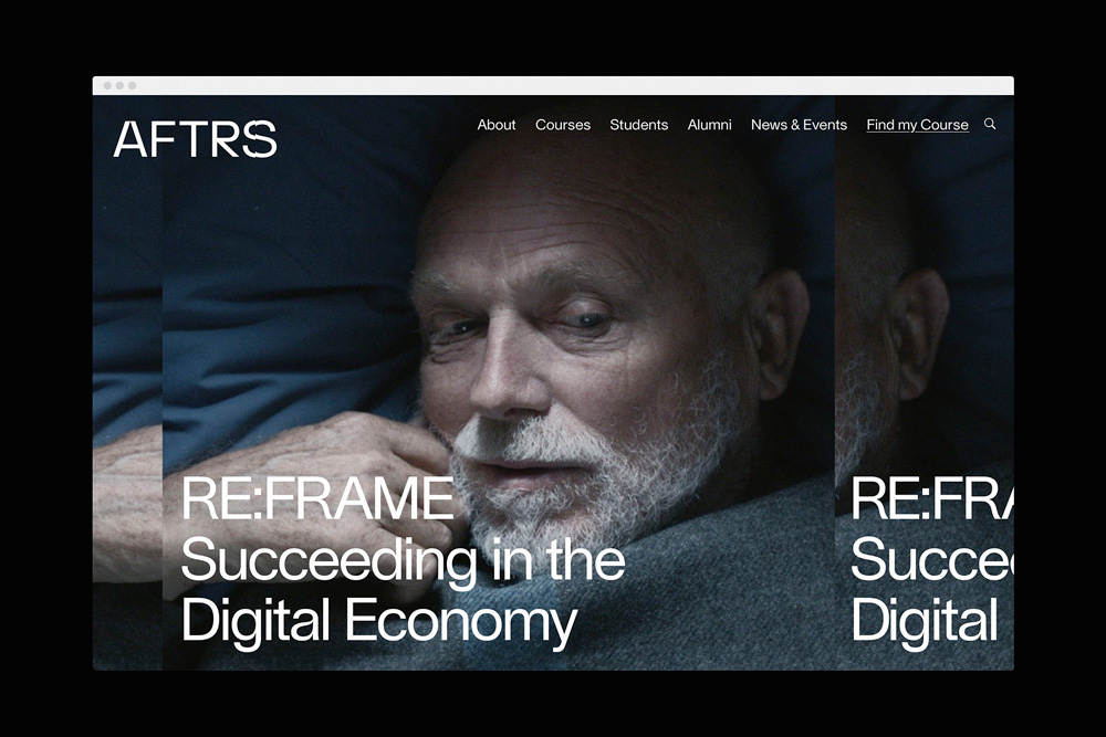
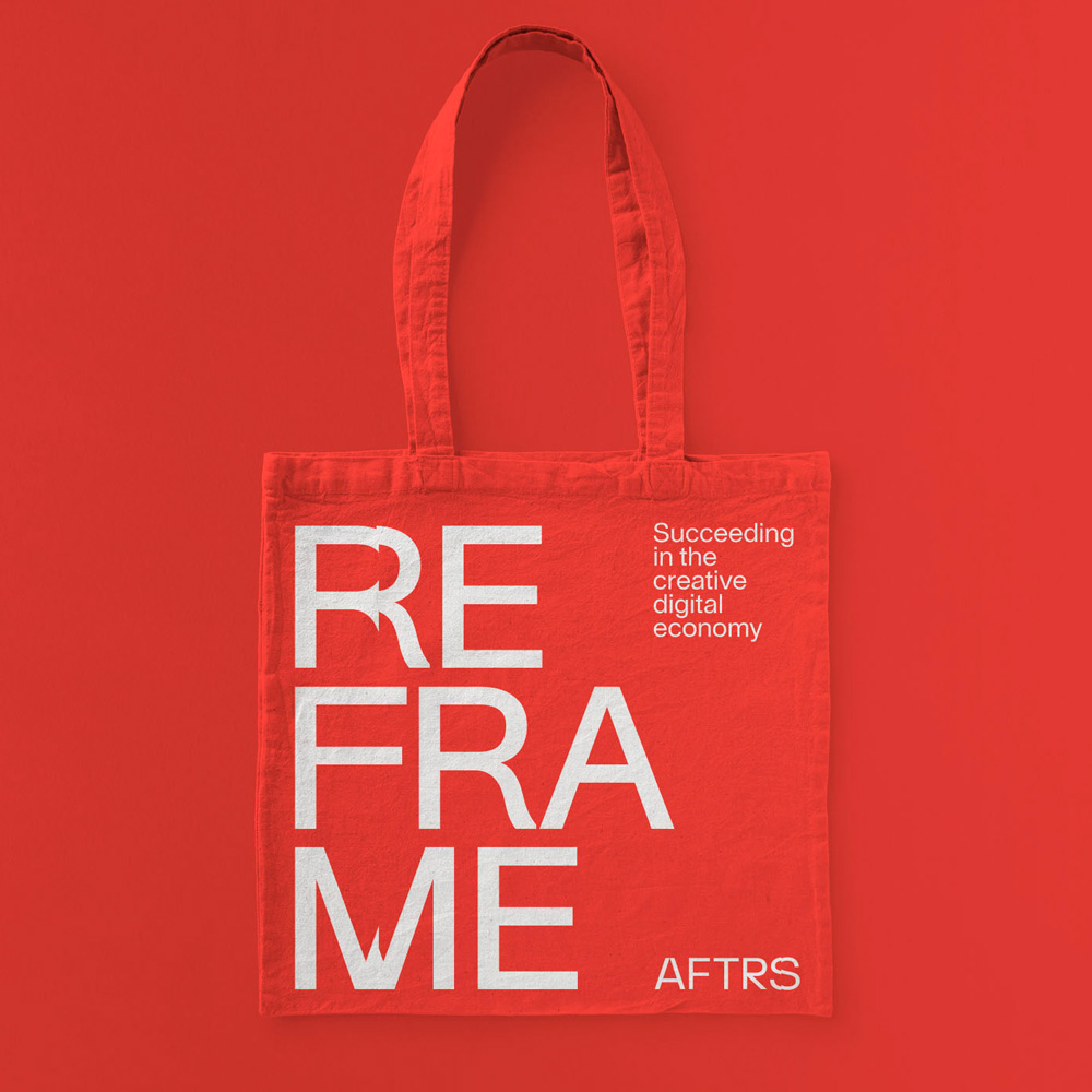
In application, the timeline crop effect works quite nicely when used across multiple lines of text, hitting all the letters along the exact same vertical line and since all the layouts are so minimal and controlled, the shift stands out a lot. The deadpan typography — all in Nizar Kazan’s Lausanne — is very well handled throughout and its delivery in the black and red/orange palette makes it a little more exciting. Overall, the identity has a bit of an edge to it to make the organization feel like a bold choice for those that attend but its simplicity tempers it as a rational choice as well.
Thanks to Simeon King for the tip.

 Новости Союза дизайнеров
Все о дизайне в Санкт-Петербурге.
Новости Союза дизайнеров
Все о дизайне в Санкт-Петербурге.