Обзор лучших ресурсов по разработке бренда, разработке упаковки
contact us | ok@ohmycode.ru
contact us | ok@ohmycode.ru
Established in 2003, Air Arabia is the first and largest low cost carrier in the Middle East and North Africa. Based in the United Arab Emirates, it flies to over 155 destinations across the Middle East, North Africa, Asia, and Europe with a fleet of 53 airplanes. At the end of last year, Air Arabia introduced a new identity designed by Interbrand.
Middle East pioneer low-cost airline AirArabia was at turning point in his history, looking to become a true world-player offering real-value and greater lifestyle relevance to its key stakeholders. A friendly and familiar, Arab and youthfully-spirited airline has commenced its journey of transforming itself into an iconic brand offering memorable journeys with a rejuvenated value proposition that can connect with all audiences.
Setting a new benchmark in operational excellence, innovation and profitability, the renewed AirArabia brand grows from the idea “Now, more than ever” and prospers with an ambitious, customer-relevant and non-complacent personality.
In preparation to present itself to the world and specifically to properly target its new audiences, AirArabia created a visual universe perfectly aligned with its new brand strategy. The brand identity is based on the creative idea of “Modern Nomad” reflecting the airline’s new positioning, eager to connect with a younger, international and connected target group and communicate the value proposition of “affordable travel”.
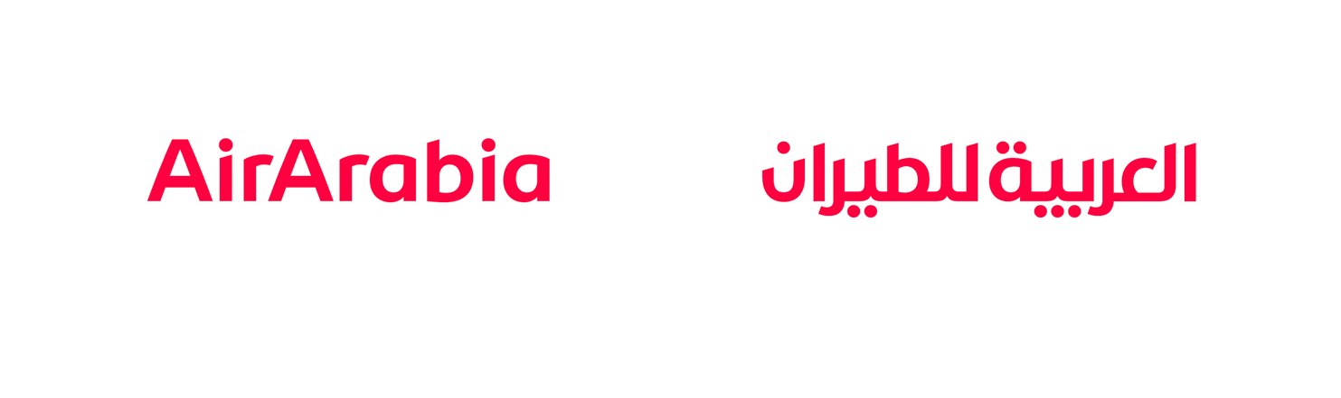
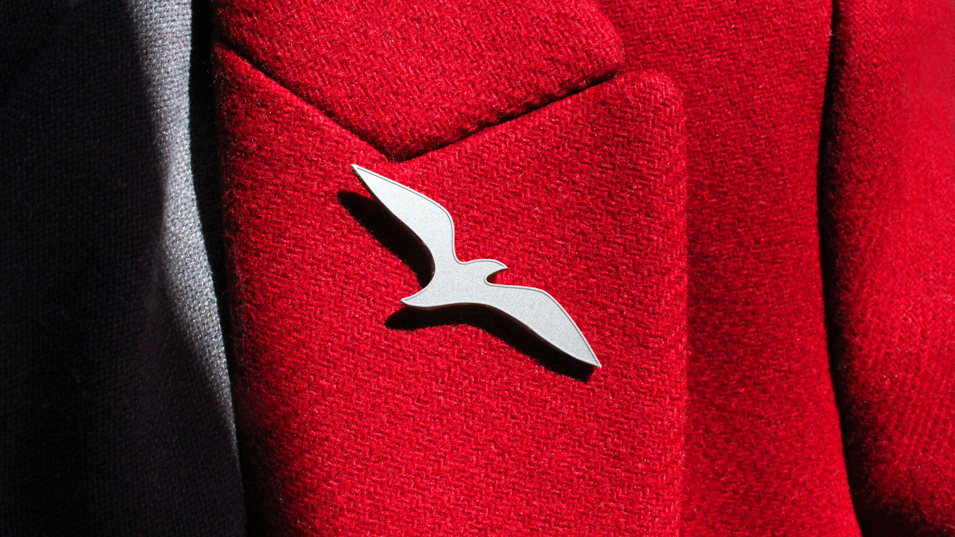
The logotype has evolved to reflect a more modern, simple, versatile, and global brand, with a morphology that provides a unique and ownable personality. The airline maintains its recognizable symbol, the seagull, but has given it a modern twist adding a fresh appeal while staying true to its original image. The new design was inspired by the angles of an airplane’s tail so that it could naturally live within that space.
The old logo was very sad, looking like the Alibaba of flying. One of my belief systems in life is to never trust an airline that puts “.com” in its logo. For a low cost airline it certainly reflected low cost. The new logo is a major improvement that makes Air Arabia feel like a premium low cost airline, making it much more attractive to either their young-traveller target or any traveller, period. While it’s a major improvement, the logo itself isn’t exciting or particularly interesting and I personally dislike the spurless sans approach — those tomahawk “r”s make me shudder — but understand that that is just me. It’s a decent wordmark, well executed and neatly translated into Arabic to create a very clear connection between the two versions.
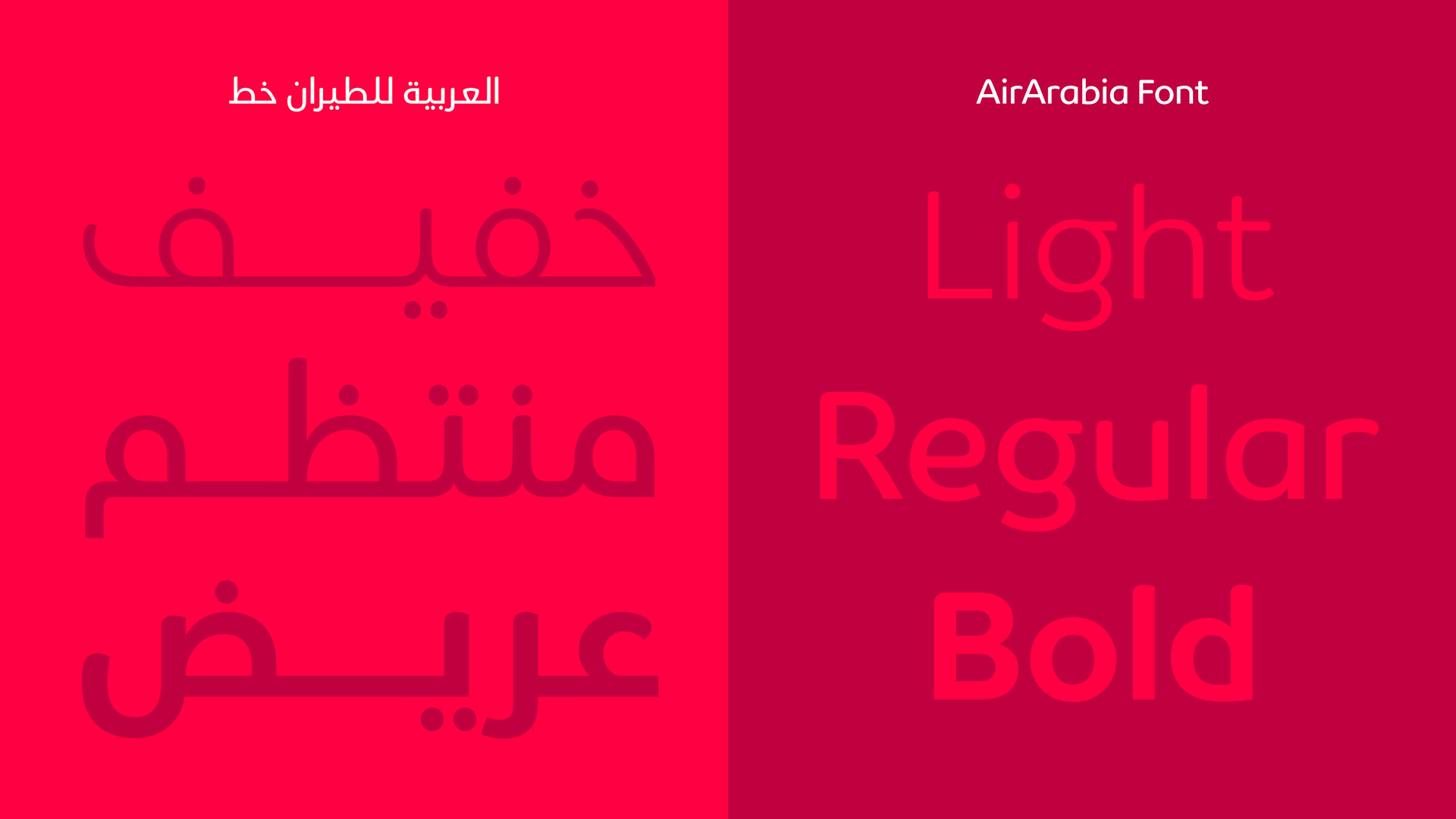
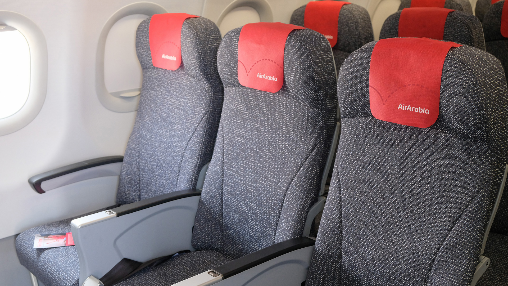
Although the custom type family follows the aesthetic of the logo, it introduces rounded corners in some but not all places. Again… it’s alright, but not a huge fan myself.
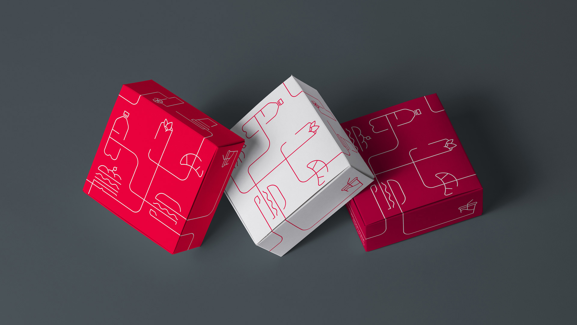
To represent the experience lived while travelling and the connections made from one destination to the next, a graphic device was created based on old cartographic systems that visually communicates AirArabia’s new claim, “Where Next”? This resource provides a more differentiated identity for the airline across all touchpoints. A Modern Nomad is an explorer eager for new experiences - this is represented in a device of continuous dotted lines. The on-going lines represent trips already taken and experiences already lived, and the dotted lines represent everything else yet to come. This graphic solution combined with the silhouettes of monuments and iconic destinations form the bases of the illustration style.
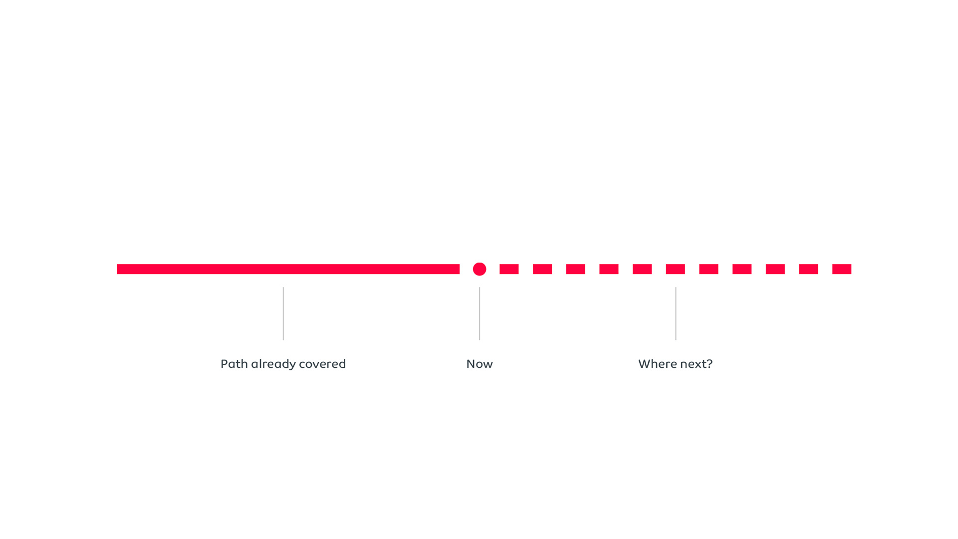

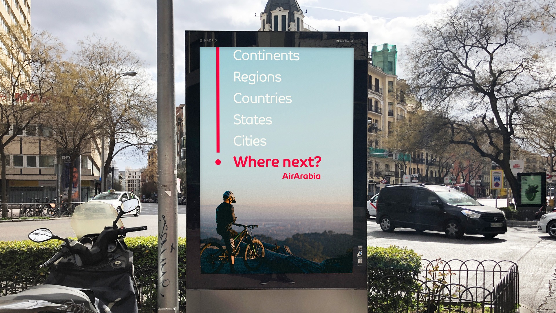
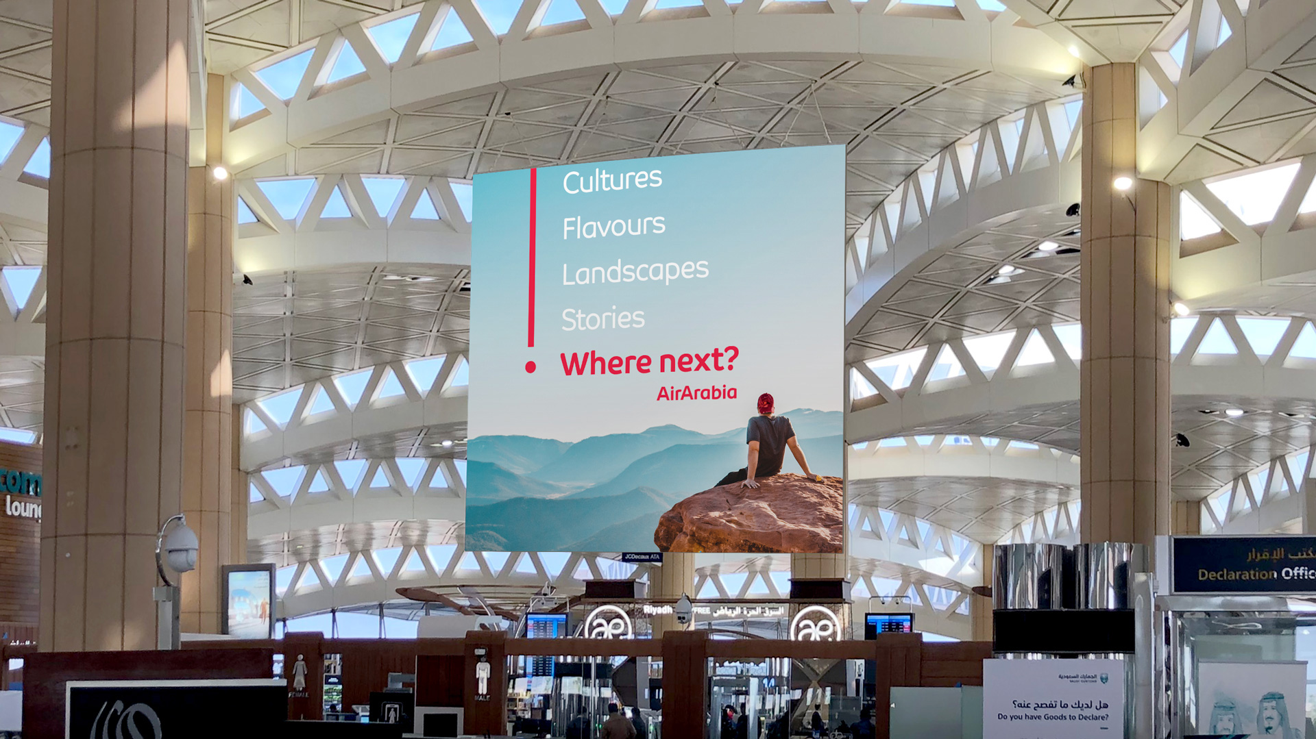
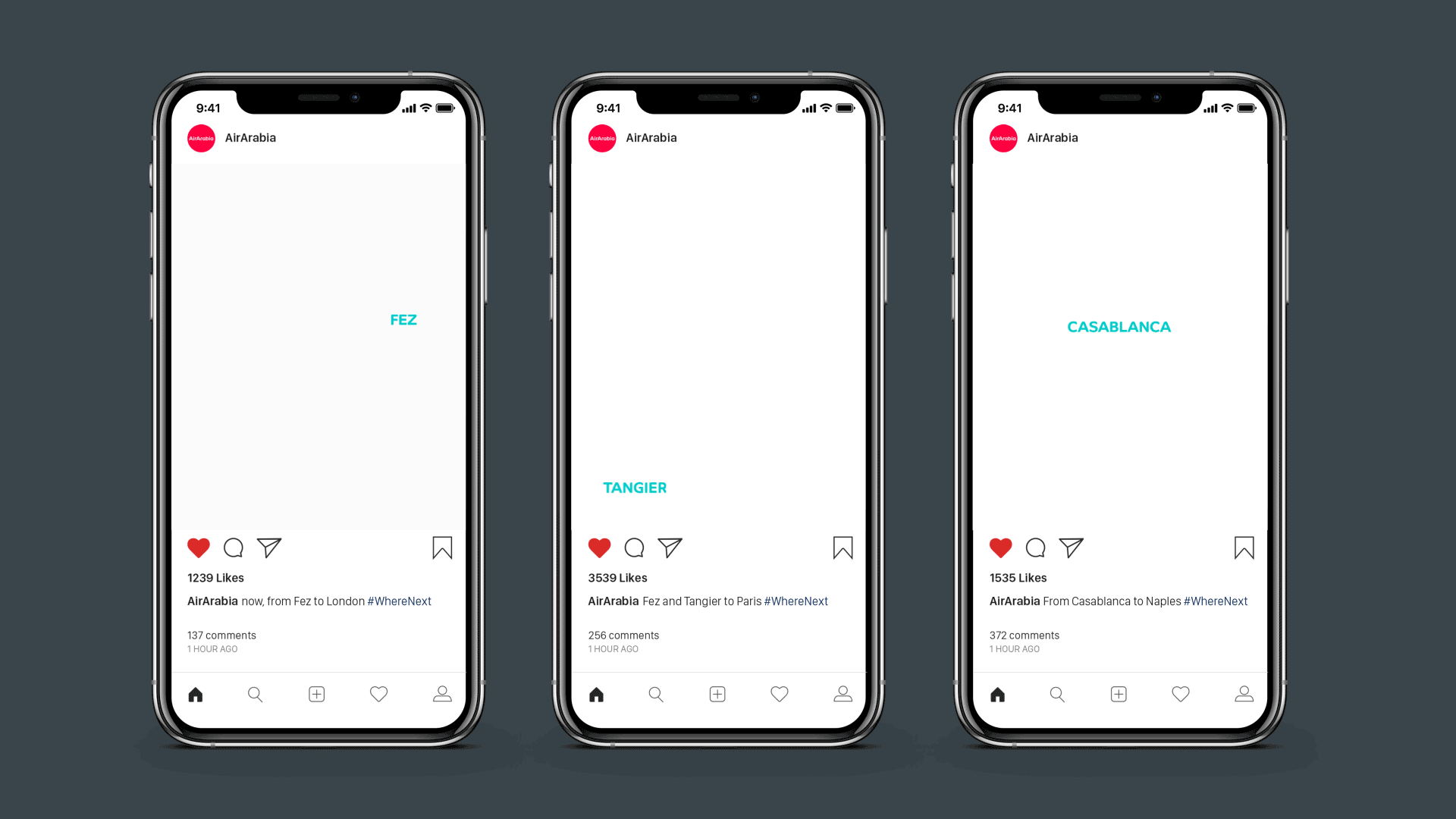
The path graphic is charming if a little clichéd for travel. In combination with the friendly font and “Where next?” tagline, it does the job well. Since this isn’t Lufthansa or Iberia or another major flag carrier, this is accessible and lighthearted, and pleasantly executed.
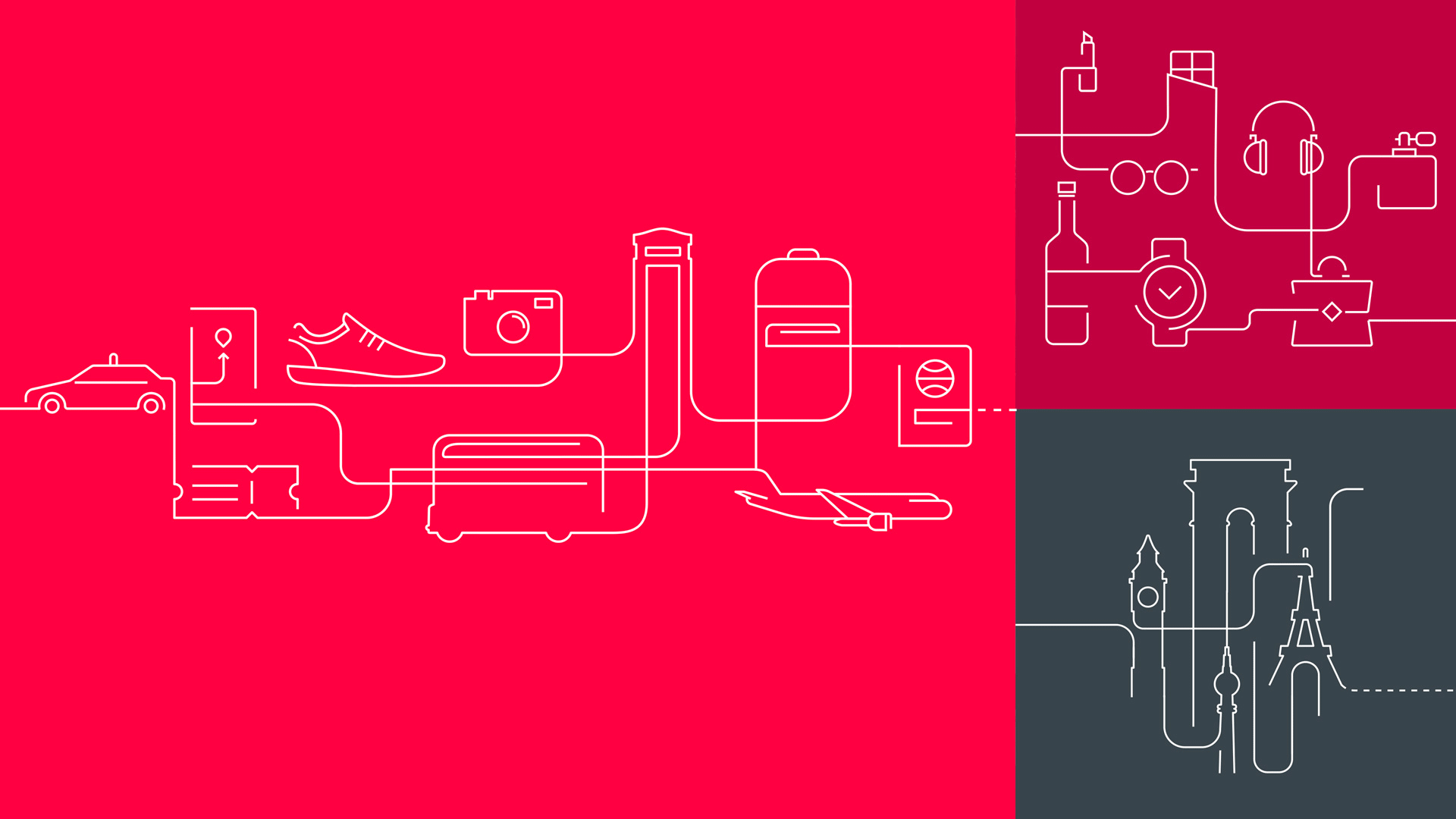
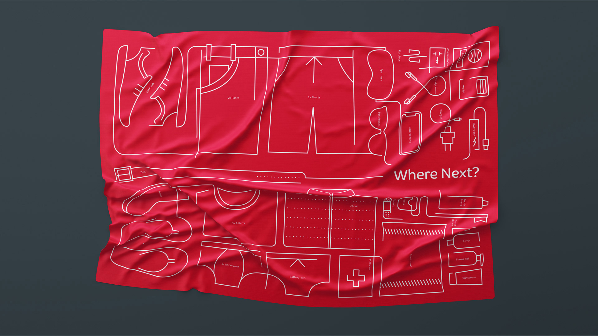
Not sure about this illustration stuff… I mean, it’s fine, but it feels like one thing too many in the system.

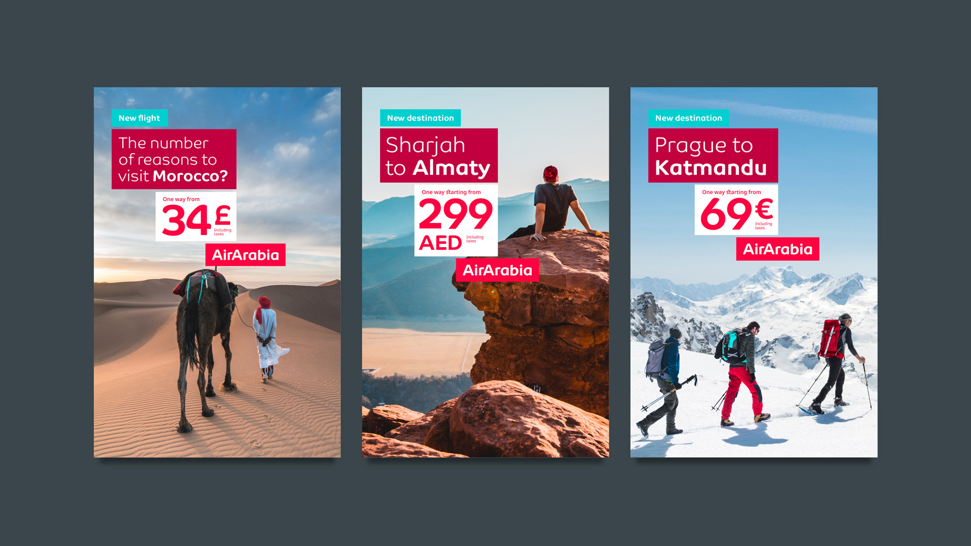
The promo system is good and I like the color palette of reds with the blue accent but I feel like I’ve seen this a number of times in the airline industry.
Interestingly, the icon doesn’t play a large role in the identity — only in the livery. The old one was fine but clunky. The new is fine as well, but more dynamic and active. I feel like its wings are huge but I’m no seagull expert.
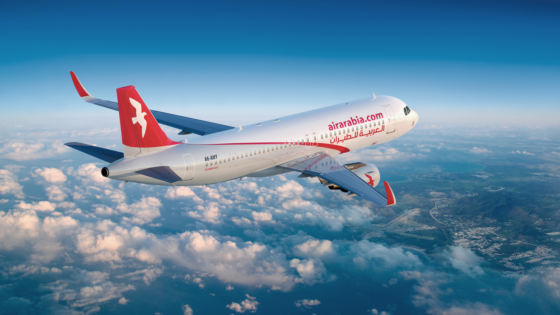
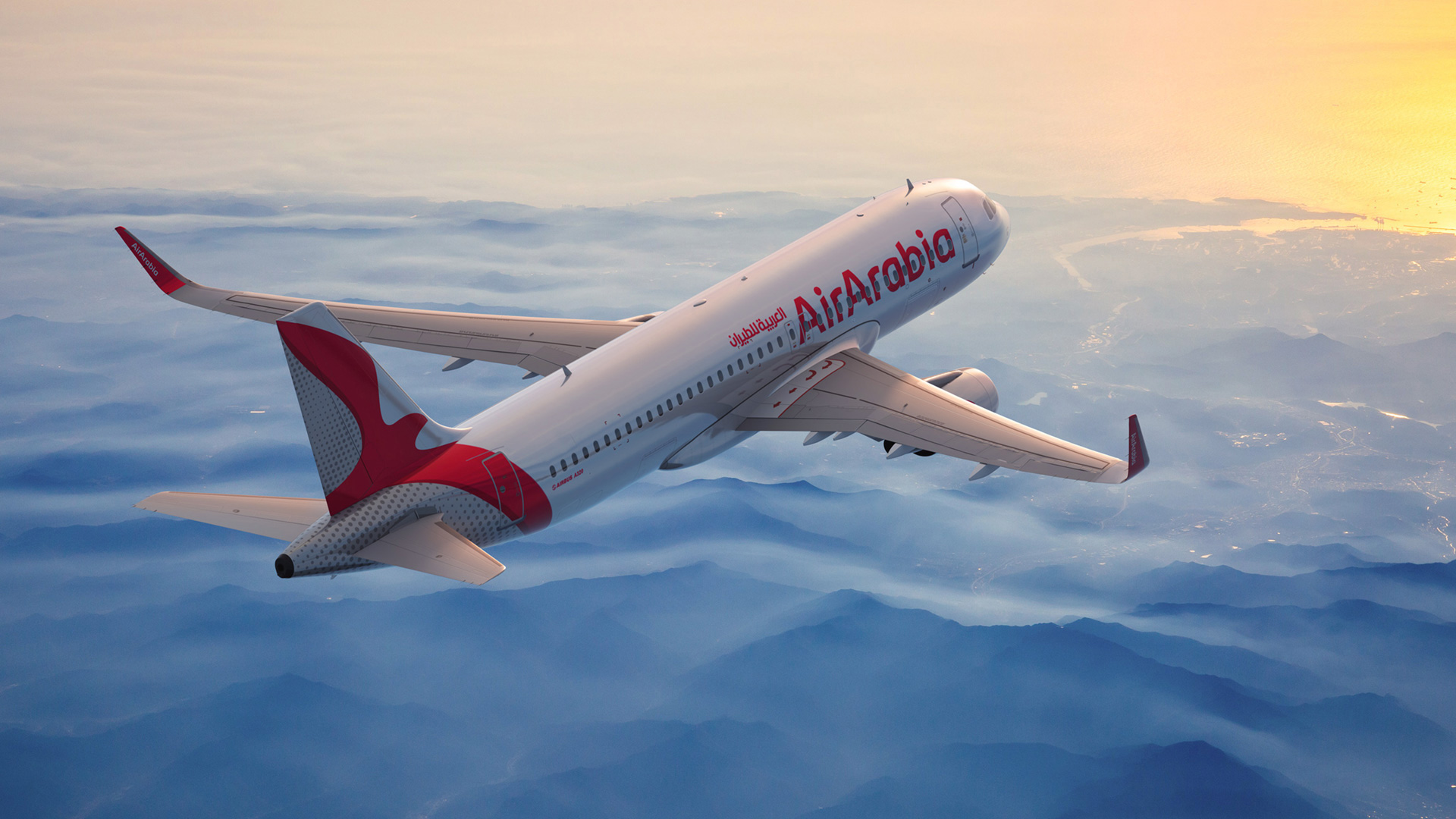
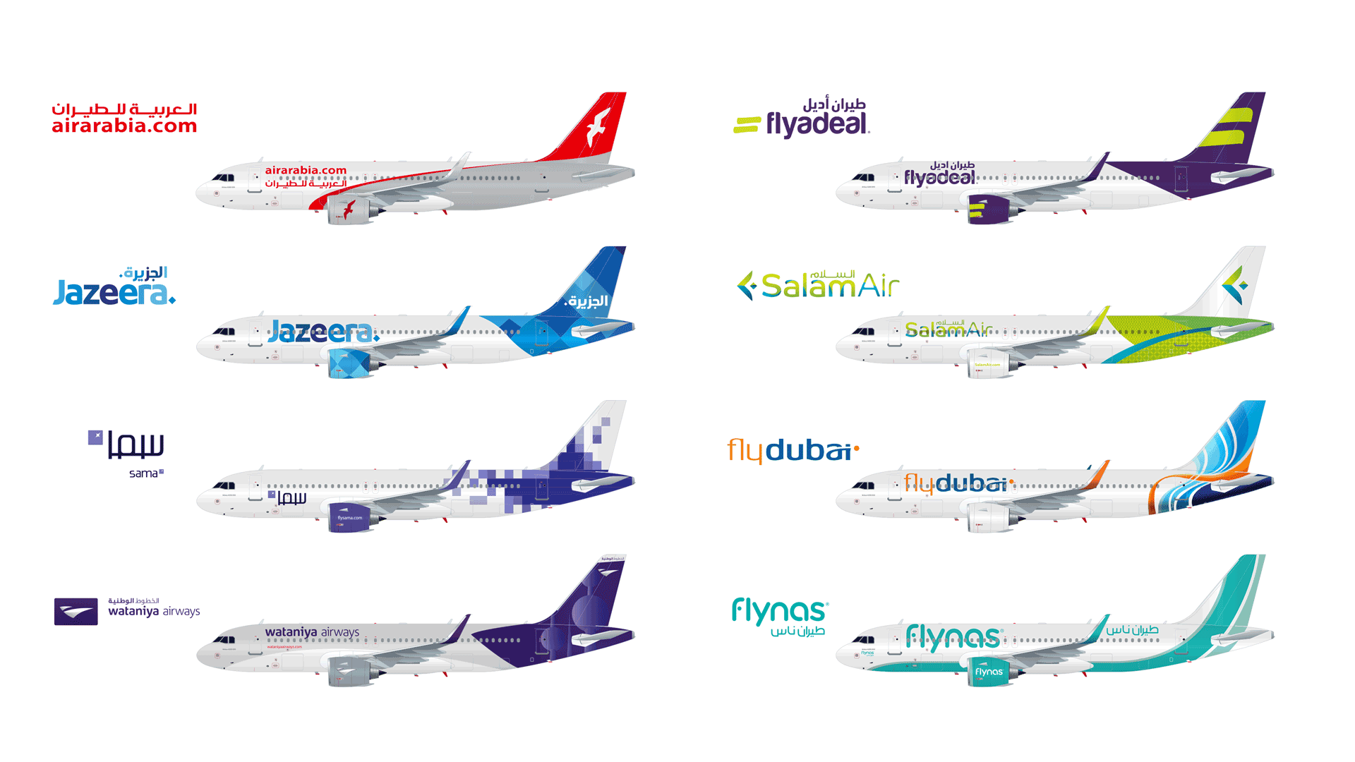
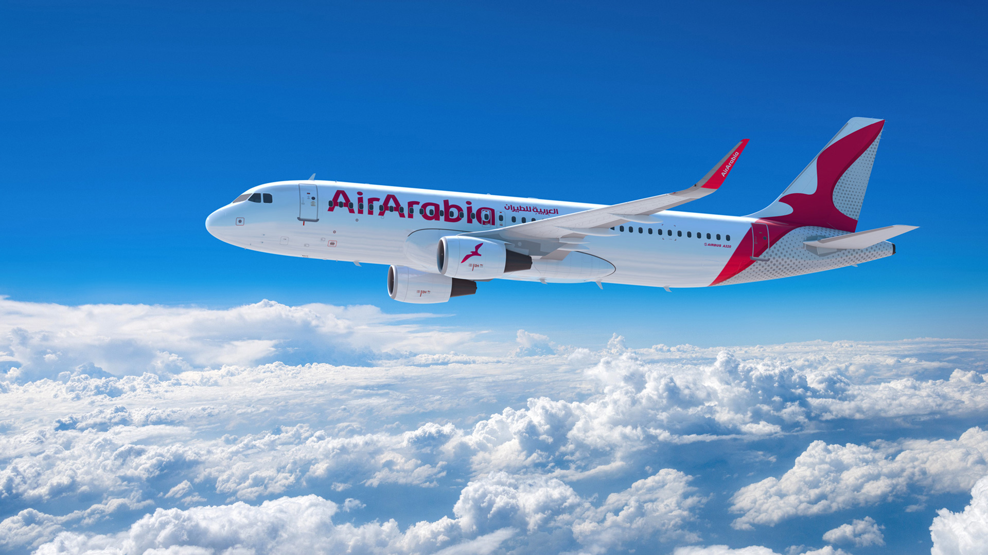
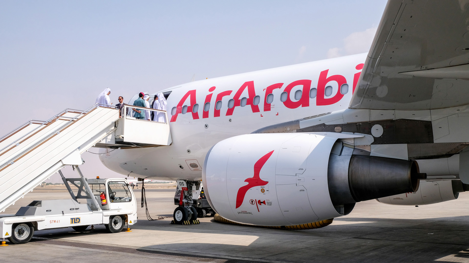
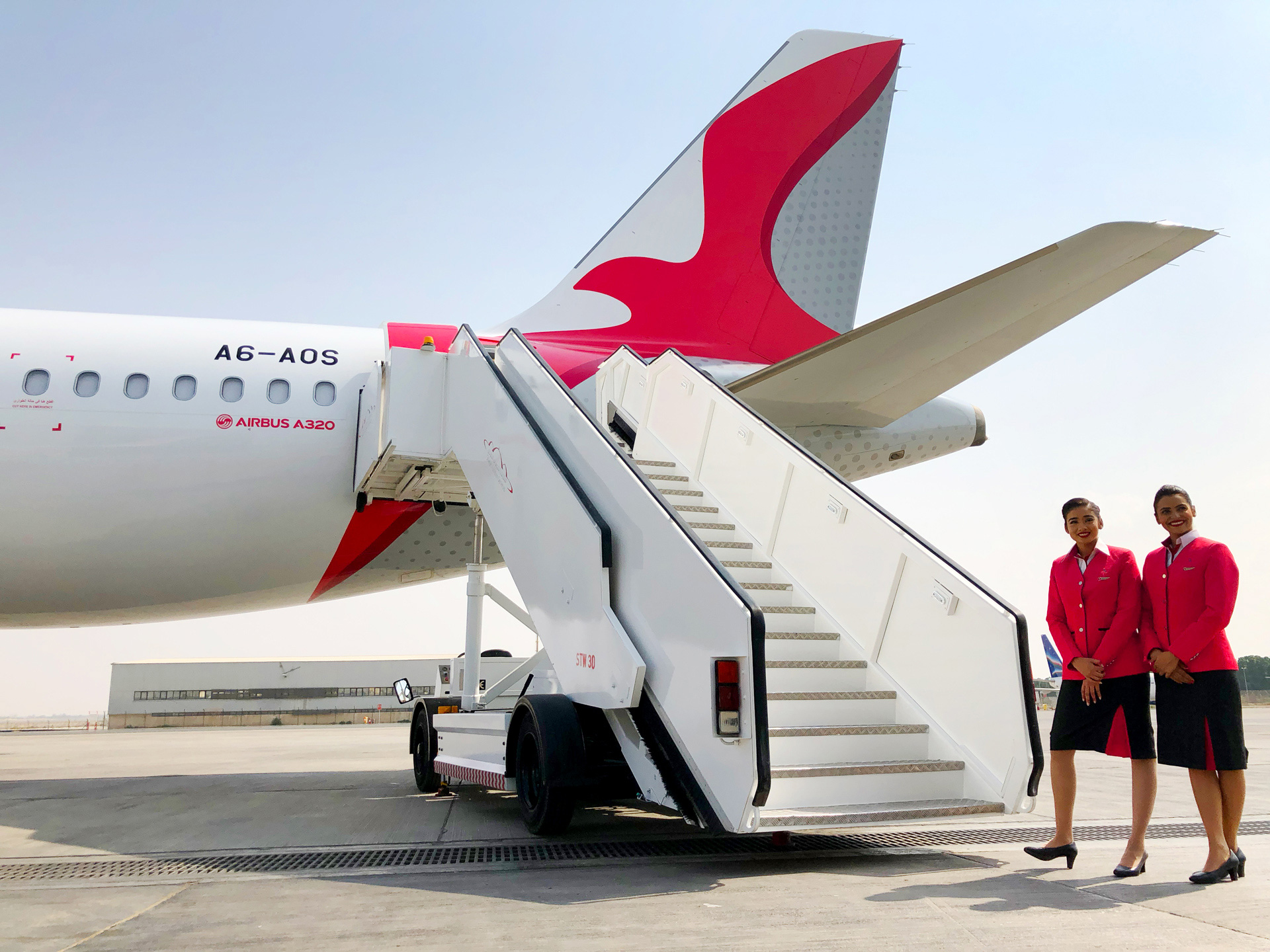
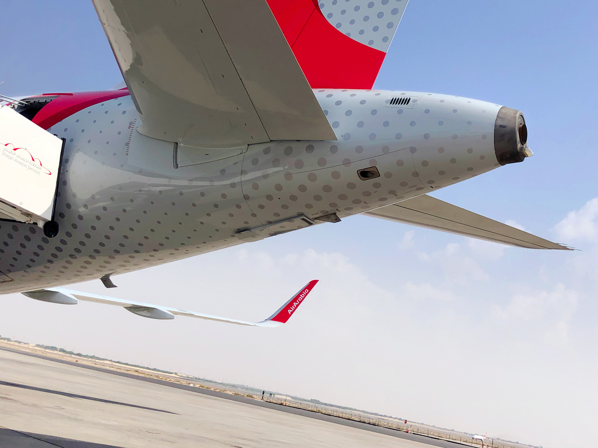
The livery is the biggest improvement in this project. The old one felt “heavy” with the back of the fuselage in gray and crammed logo on the front. The tail of the new livery is great, with the icon wrapping all the way across the fuselage. The dot pattern looks cool but it’s the only time that graphic device happens — would be nice to see that implemented somewhere else in the system.
Overall, this is a solid redesign that gives the airline more international appeal and now lives more confidently within the world of other prominent commercial airlines.

 Новости Союза дизайнеров
Все о дизайне в Санкт-Петербурге.
Новости Союза дизайнеров
Все о дизайне в Санкт-Петербурге.