Обзор лучших ресурсов по разработке бренда, разработке упаковки
contact us | ok@ohmycode.ru
contact us | ok@ohmycode.ru
Established in 2010 (originally as Football Association Women’s Super League), the FA Women’s Super League is the highest league of women’s football in England. The Super League was restructured for the 2018 - 19 season and is now a fully professional, 11-team competition for the top clubs in the country. Managed by the Football Association (FA), the women’s football competition also includes the FA Women’s Championship, that comprises 11 semi-professional teams, with promotion to the Super League to the team that finishes top of the division at the end of the season; and it includes the FA Women’s National League as well, representing the third and fourth tier clubs. Coinciding with the league restructure, the FA introduced a new identity for all entities, designed by London, UK-based Nomad.
The ambition was to create a family of league brands that champion the women’s game as a united force, and a modern and powerful movement in today’s society. Each brand reflects a core story that sits at the heart of the individual leagues and has been designed to appeal to The FA’s core target audience of 7-15 year olds.
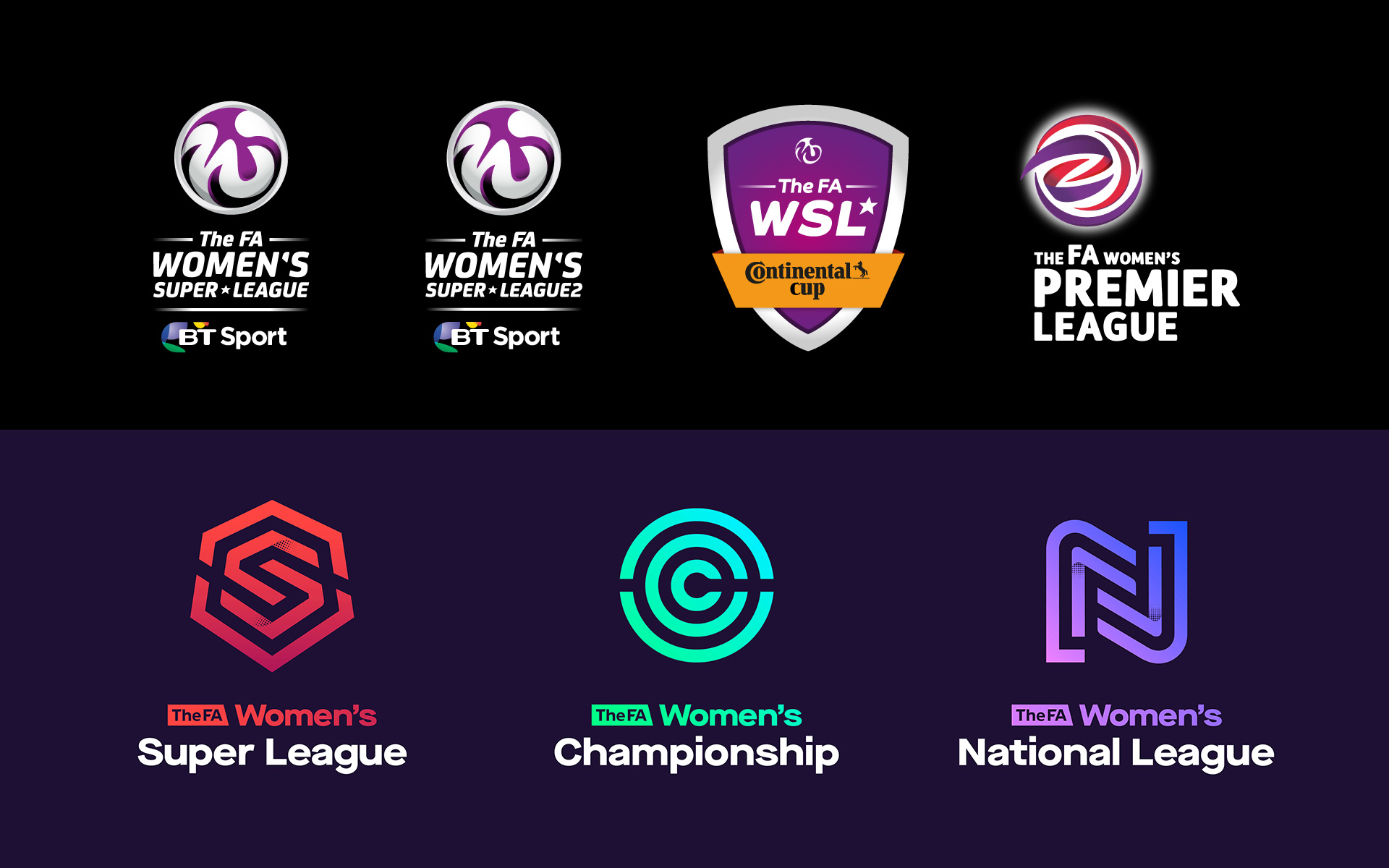
The old logos were very funky with a weird marble-like icon that maybe meant something (but I doubt it) and some relatively decent wordmark treatments. The distinction between the Super League and Super League 2 was almost non-existent and the Premier League stood out on its own even more weirdly with a glowing ribbon dance of an icon. The new logos establish a clear relationship between them through the concentric approach to each monogram, the gradient, the halftone pattern shadows, and a cleaner set of wordmarks.
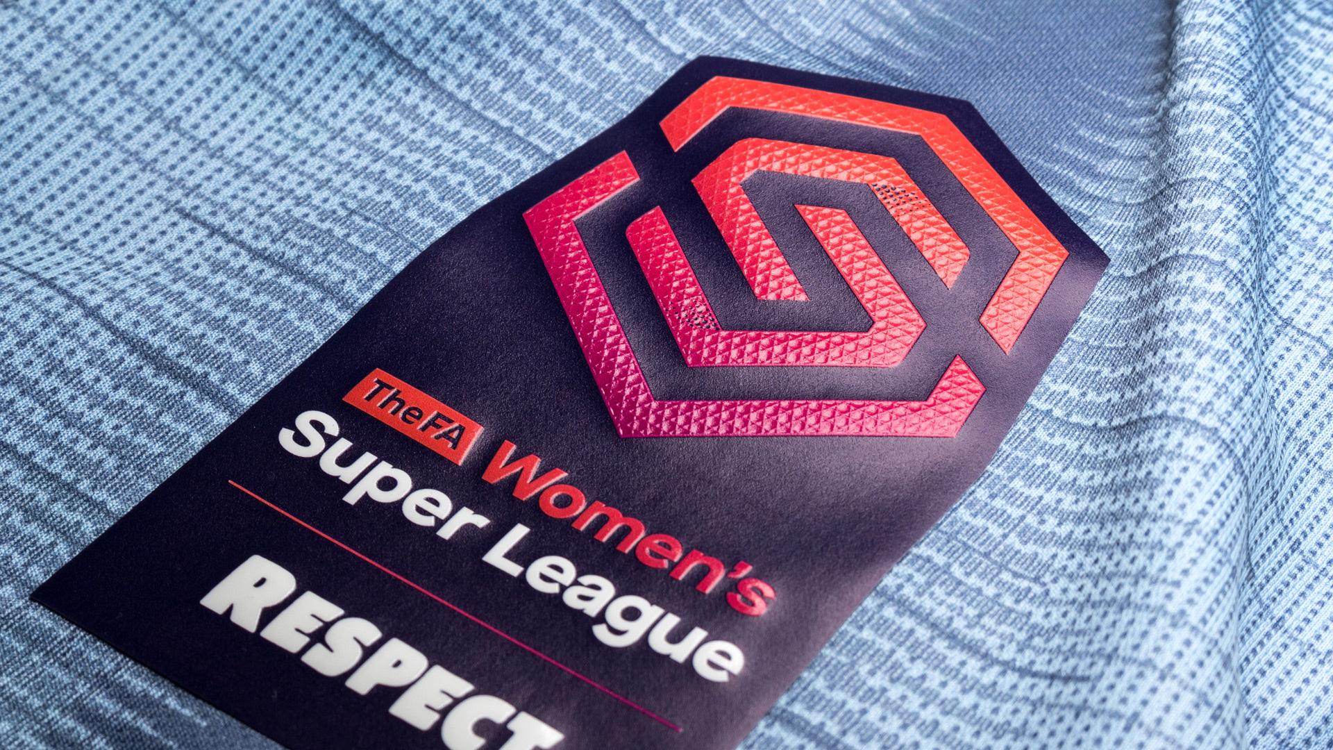
The Super League logo seems to have gotten the most love — with due reason as it’s the main league. It’s the most interesting and well solved of the three with a dynamic asymmetry (horizontally speaking), a good rhythm, and a nice arrangement throughout. The Championship logo is the least interesting because it has no twists or corners to allow it to have a shadow and the outer ring having two notches is kind of odd — but I get it that that was the formula. The one thing that I heavily dislike about that logo is the rounded corners on the inner “C”. The National League monogram is somewhere in between; it’s more intricate like the Super League but the outer extra rounded corners feel too heavy. Tying them all together is a modest type treatment in a simple typeface and lock-up with “The FA Women’s” descriptor. The color palette is fun and vibrant (as long as it’s on screen; getting those hues in print will not be easy).
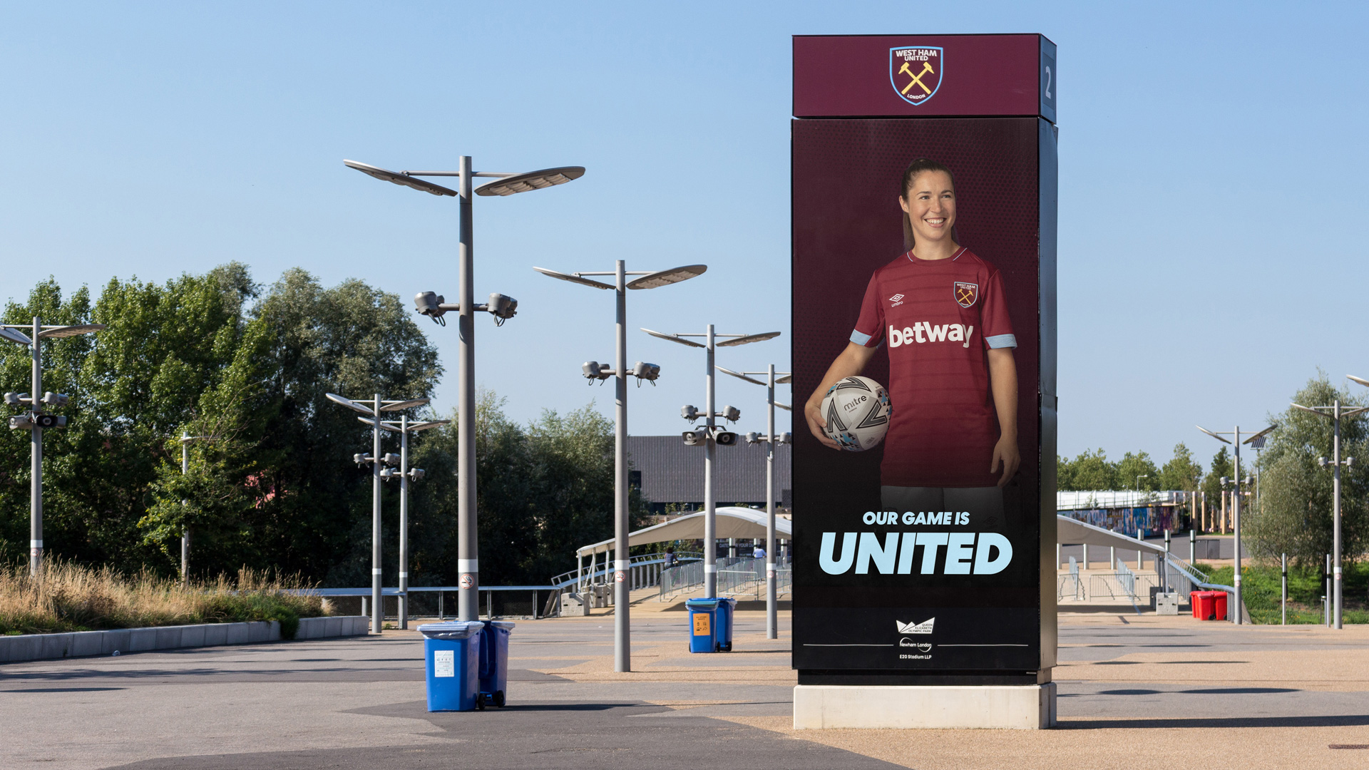
The launch campaign draws upon the many benefits of the game. Targeted social assets were created to help increase the awareness and widen the reach of women’s football. ‘Power of the Game’ also acts an internal mandate to help shape The FA’s proactive communications, and drive interest and participation across England.
Working with Stephanie Sian Smith we photographed players from across The FA Women’s Super League and The FA Women’s Championship clubs to capture their unique personalities to add impact and life to the campaign.
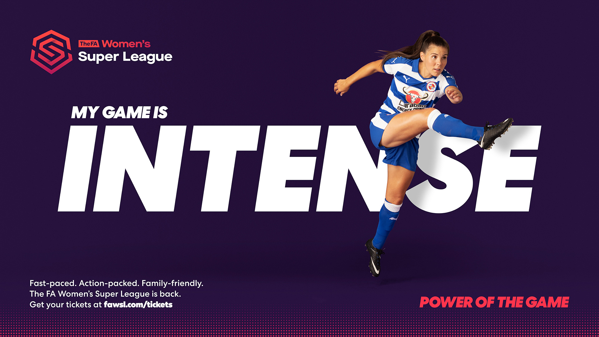
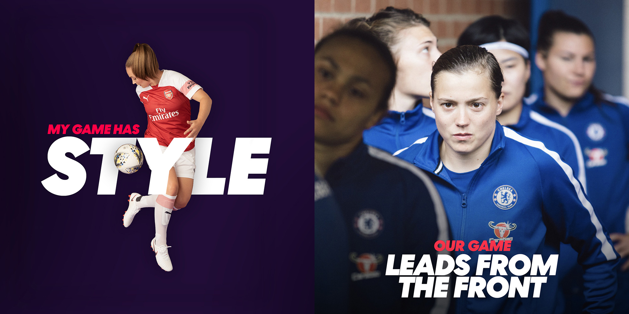
A halftone pattern and bold, uppercase italics permeate the identity and campaign along with some decent photos of the players. The ingredients are somewhat unrelated and the execution doesn’t quite bring them together in a way that’s super exciting. The first video of the Instagram account gets it more right than the campaign materials, which feel a little flat. Overall, the identity is on the right track but probably needs a couple of seasons and pushing of the visual language to really make the leagues and their games feel more like something you don’t want to miss.

 Новости Союза дизайнеров
Все о дизайне в Санкт-Петербурге.
Новости Союза дизайнеров
Все о дизайне в Санкт-Петербурге.