Обзор лучших ресурсов по разработке бренда, разработке упаковки
contact us | ok@ohmycode.ru
contact us | ok@ohmycode.ru
(Est. 2015, previously Monetise) Froda provides loans to small businesses. It is based in Stockholm, Sweden.
Snask (Stockholm, Sweden)
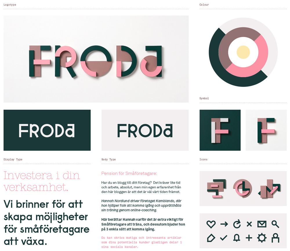
We decided to rename them from Monetize to Froda, meaning thrive in Swedish. We also gave them a very down-to-earth tone of voice as well as a bold and colorful visual identity. A brand that the big players couldn't copy or come close to. A challenger who could run between the legs of the giants and be much bolder. We created their identity from geometrical and colorful pieces of different material to work in a design system stretching from logotype to icons and patterns.
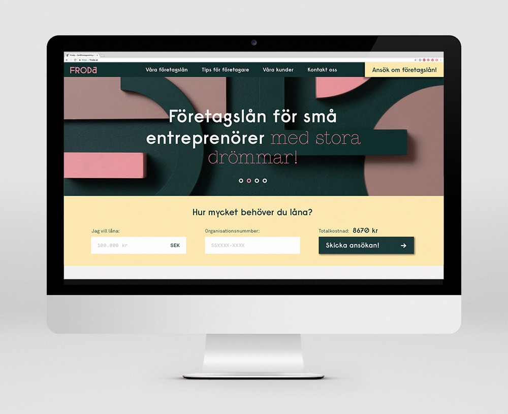
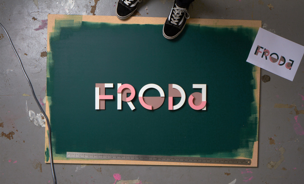
The old logo was funky with a kind of chart terrarium thing going on that wasn't all bad. The name, though, it did seem like the only ones monetizing anything were them and not necessarily the small businesses taking out the loans. "Thrive", as Froda translates, is a much more aspirational name and one that includes both the company and the clients in a joint effort to do so. The new logo, in its vector form, is funky in its own right and I wonder how appropriate it is for a loan company. I couldn't see it working in the U.S. — it's not exactly trusting-looking — but maybe it's perfectly normal in Sweden. If you are a fan of Paul Renner's original design of Futura this logo is for you. I'm a lukewarm fan. The wood version of the logo is more interesting because it reveals the structure and geometry behind the wordmark and conveys a richer layering of elements that, for obvious reasons, are lost in the flat version. The Froda website is slick, fun, and friendly and manages to marry the best of all worlds, including the more serious flat logo, the big wooden details, and the icons. There is a bonus thin-line stencil font that's basically just that, a bonus that doesn't necessarily tie in with anything else. Overall, it's all very nicely presented and it feels like the Airbnb of small business loans but maybe it's too much of a good thing for the market?


 Новости Союза дизайнеров
Все о дизайне в Санкт-Петербурге.
Новости Союза дизайнеров
Все о дизайне в Санкт-Петербурге.