Обзор лучших ресурсов по разработке бренда, разработке упаковки
contact us | ok@ohmycode.ru
contact us | ok@ohmycode.ru
Established in 2000, Webhelp is a global leader in customer experience, contact centers, and business solutions, helping clients manage their customer interactions at every stage possible. Headquartered in Paris, France, Webhelp has grown exponentially since 2011 through acquisitions in other parts of the world and is now present in more than 140 locations in over 35 countries, employing more than 50,000 people, and serving over 500 clients. Recently, Webhelp introduced a new identity designed by the Paris office of Futurebrand.
We helped Webhelp clearly express their strengths and vision for the future by incapsulating it in one inspiring and straightforward sentence: ‘We make business more human’. Building upon this powerful vision, we developed a strategic platform uniting the corporate and employer brand to better reflect and promote the unique and differentiating strengths of Webhelp - their people and the human touch that they bring to the work that they do.
Human is at the heart of the founders’ philosophy, and reflects the human touch Webhelp’s employees bring to the work they do and also highlights the rising desire of consumers to create emotional connections with the brands they engage with.
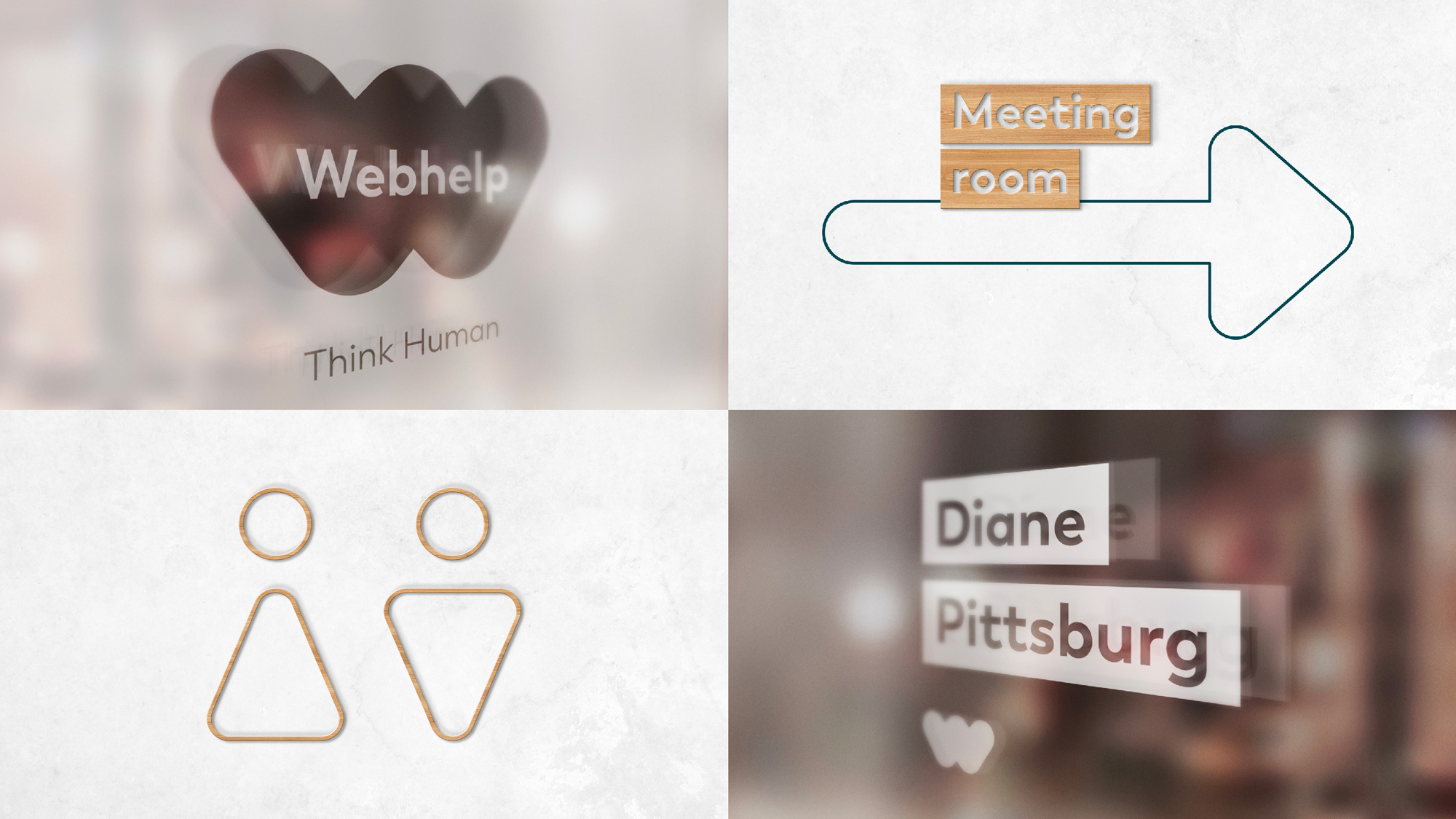
Along with the new logo, a bold and expressive brand identity system, tone of voice and environments were developed to reveal to the world Webhelp’s warm culture of support, agility and out of the box thinking.
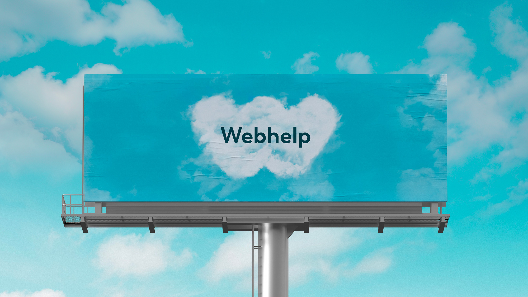
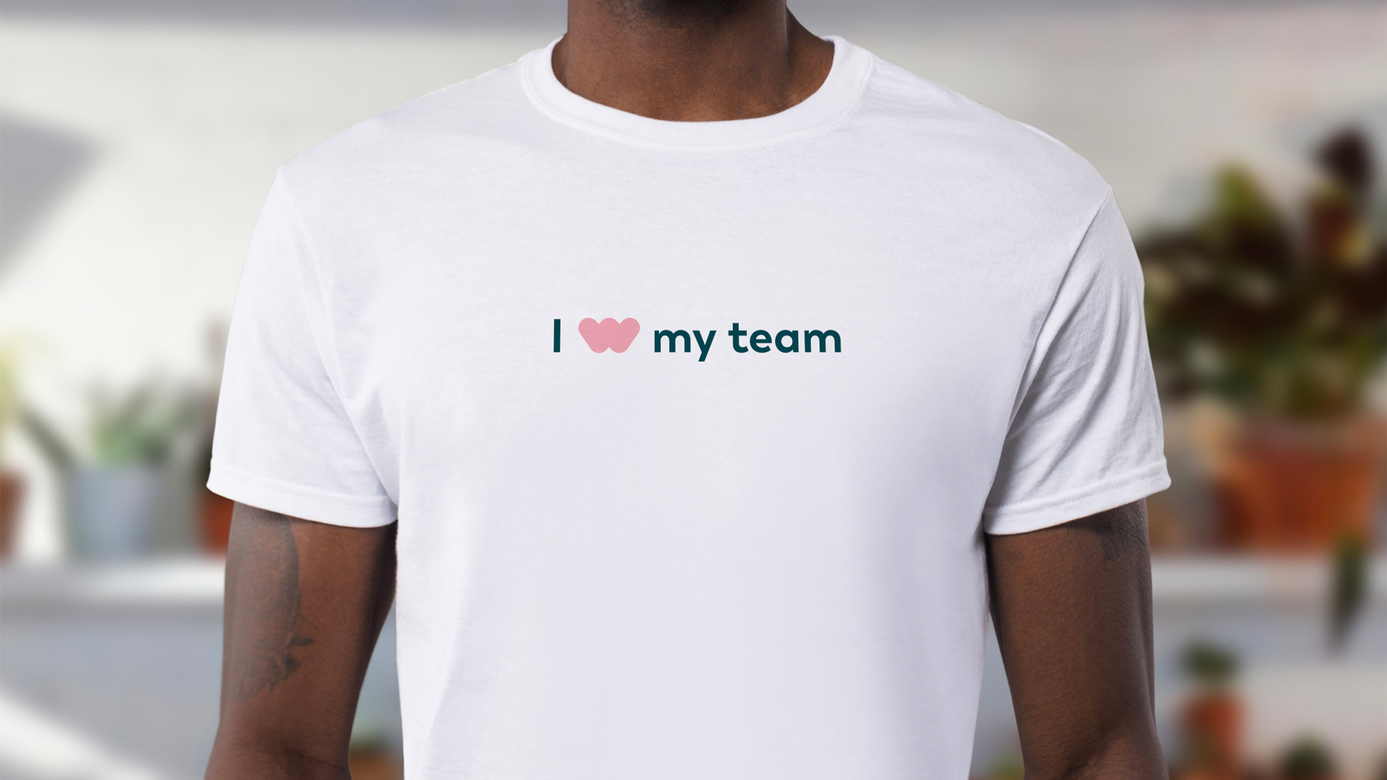
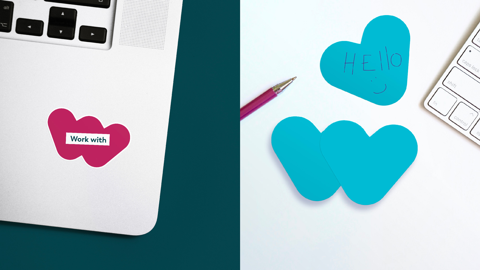
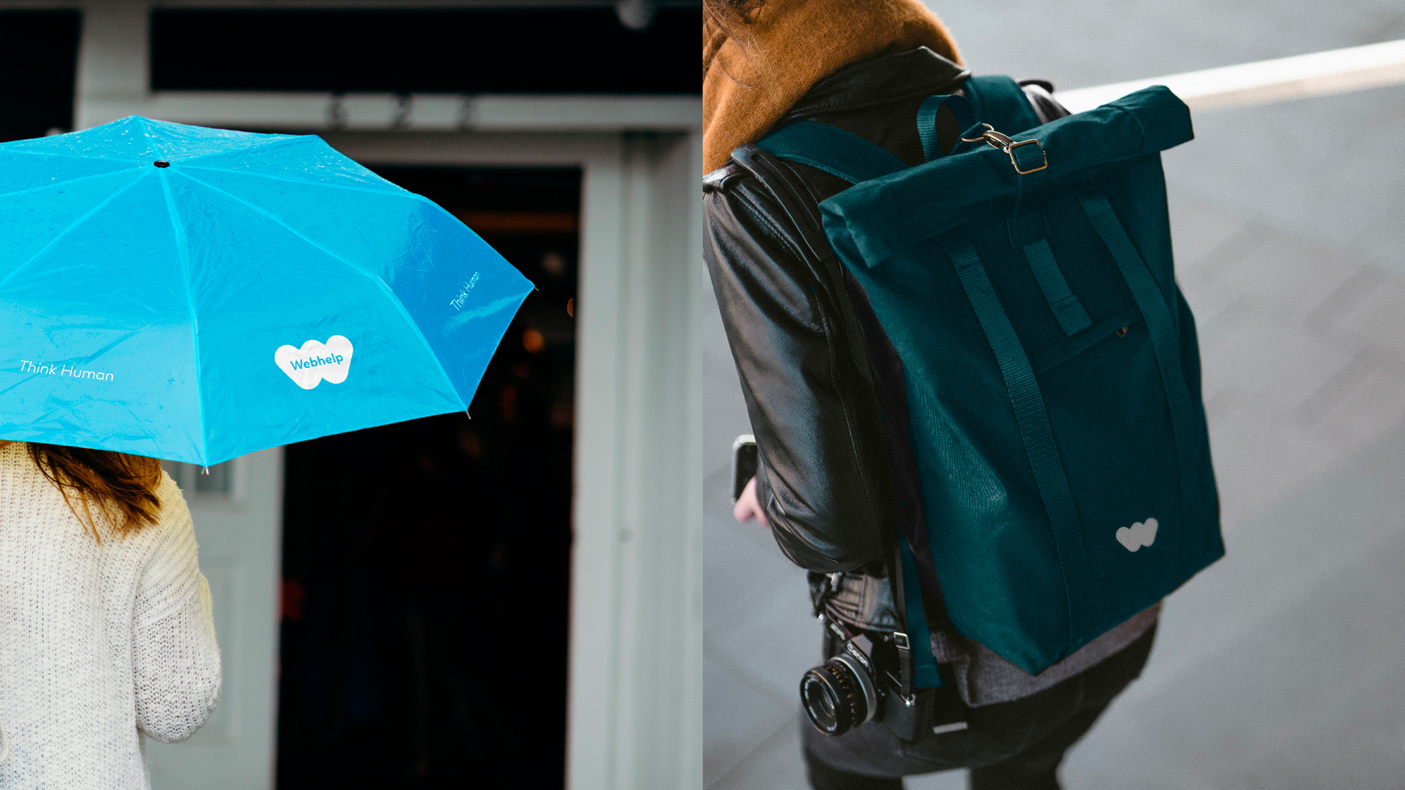
The old logo was very scary, not just for its sharp and aggressive corners but because someone thought, “This will make a great logo” with the weirdest, random-est shape possible and most generic font available. The new logo tries to add some humanity with a plump “w” meant to represent a heart. It’s a decent idea and it almost works. The “w” shape does manage to look like a heart if you squint and have a healthy dose of optimism and imagination but I feel like the shape needed a little more, well, love, or at least another round of refinement or exploration to take it beyond the basic shapes. The wordmark inside the “w” is only a little better than the old wordmark inside the shard of blue gradient and could have also been more interesting and memorable instead of a generic geometric sans serif. Turning the logo into things would have worked if they had chosen less cheesy imagery instead of a cloud, eggs, and a pretzel, none of which are convincing or charming.
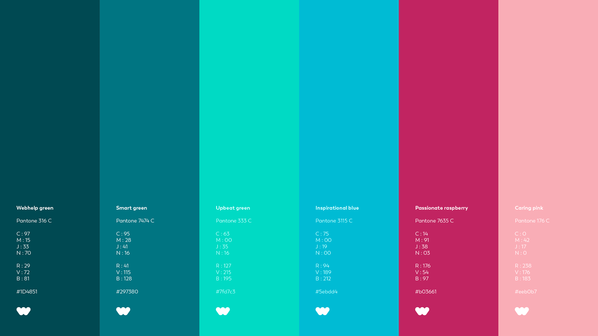
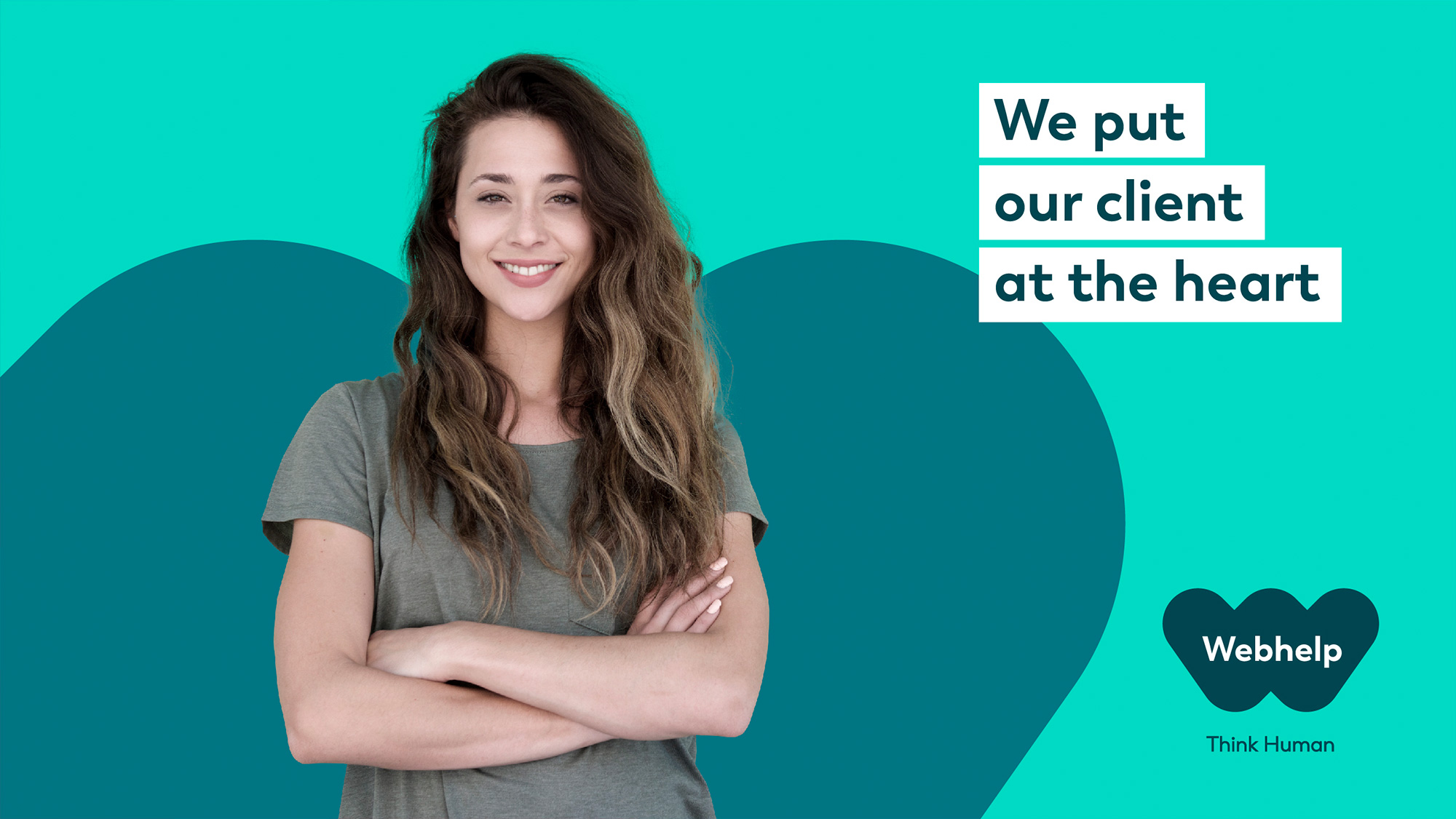
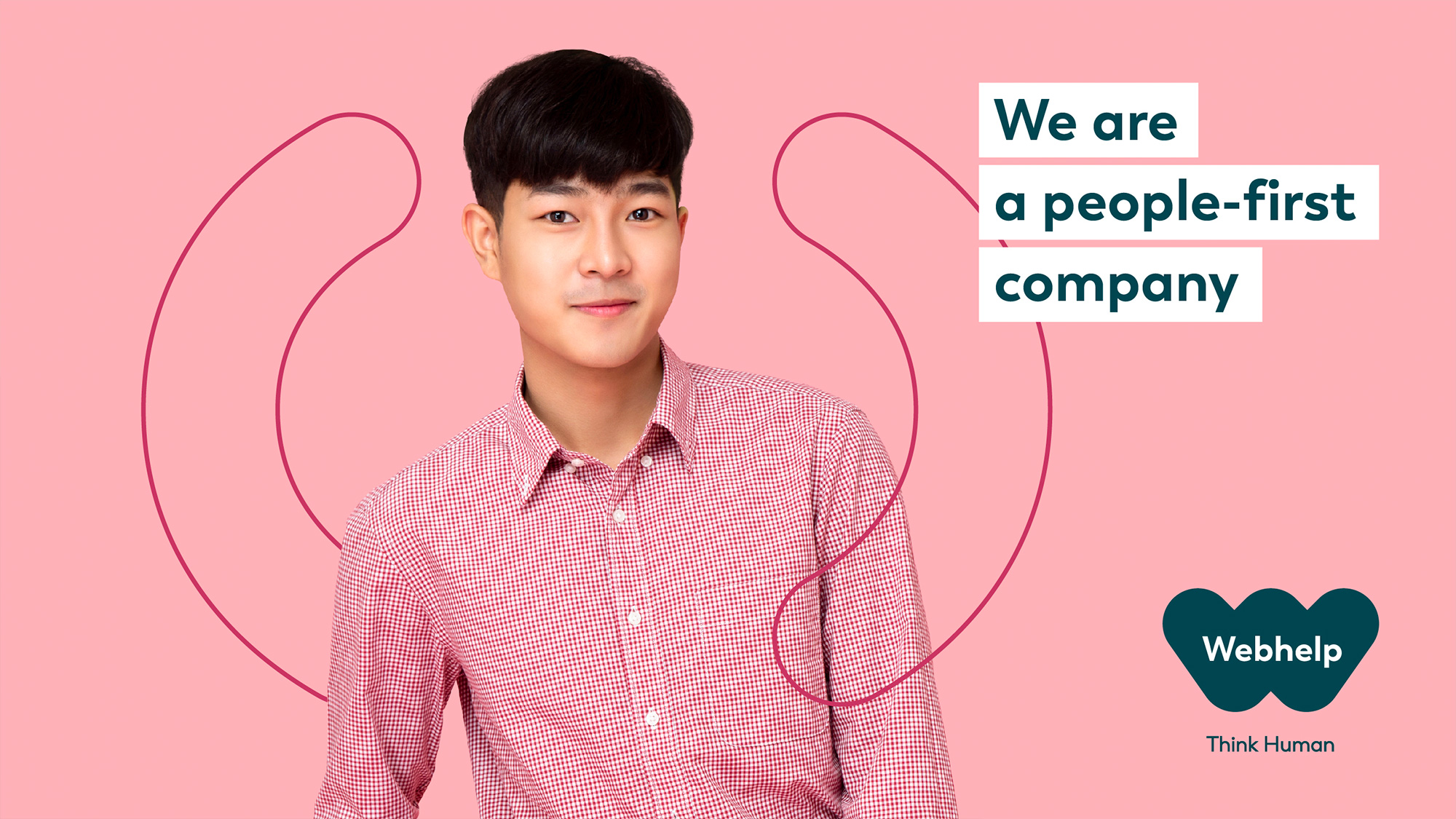
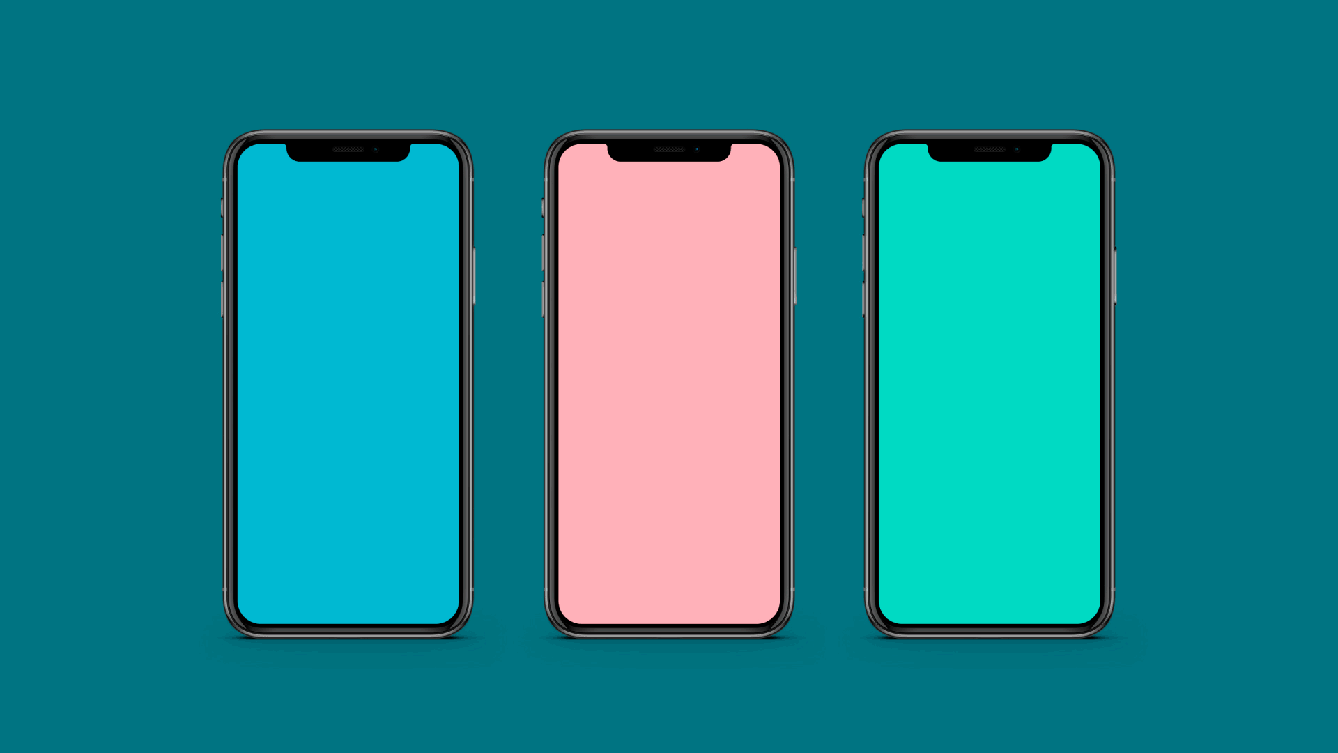
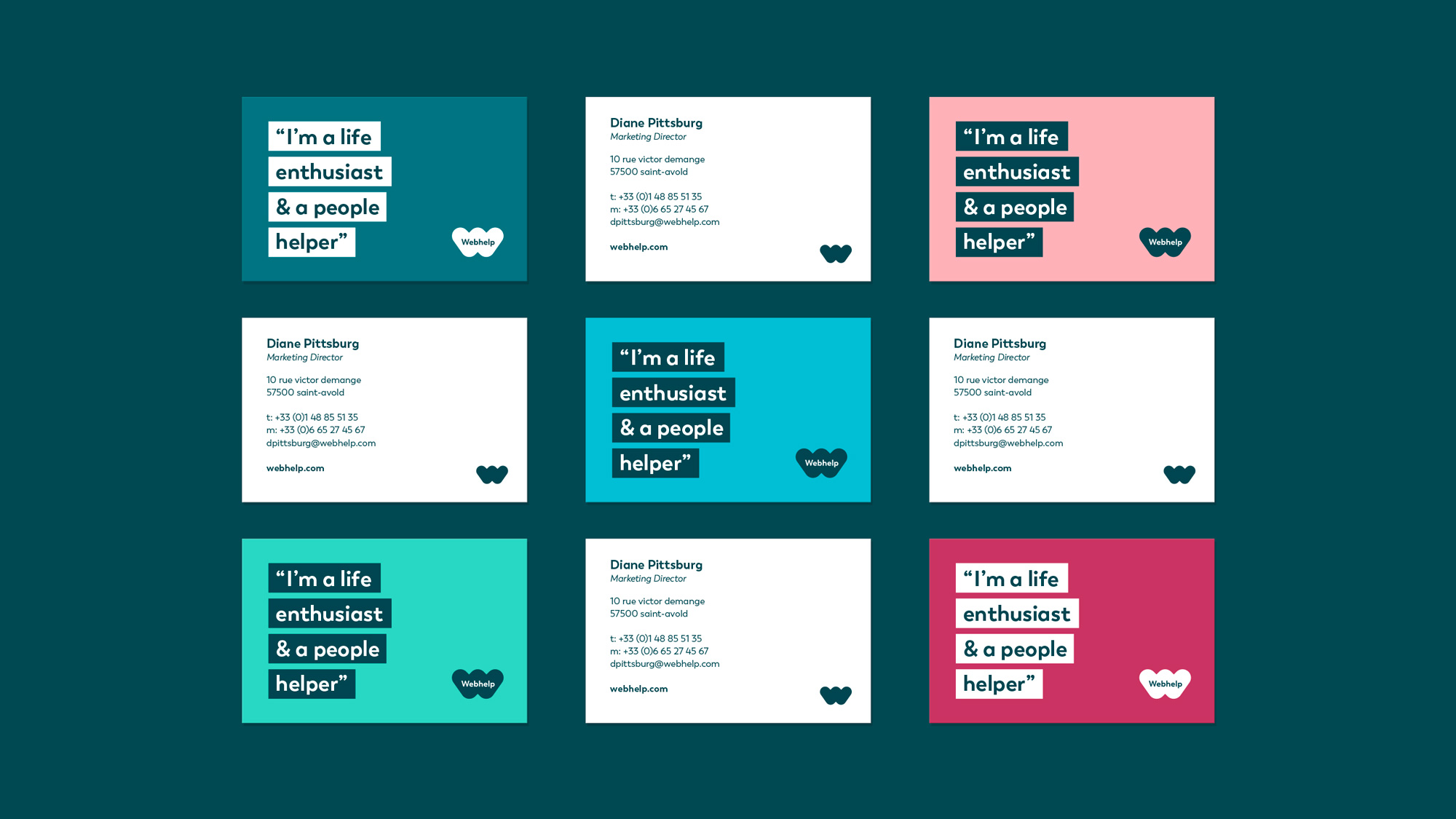
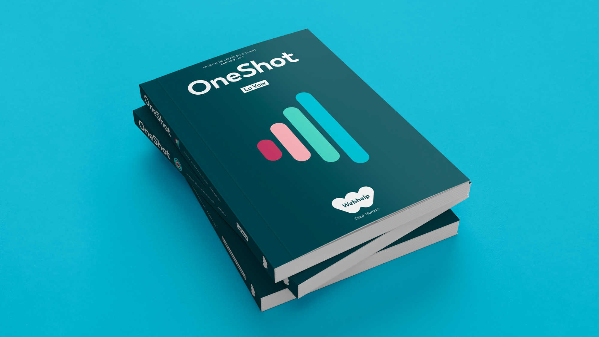
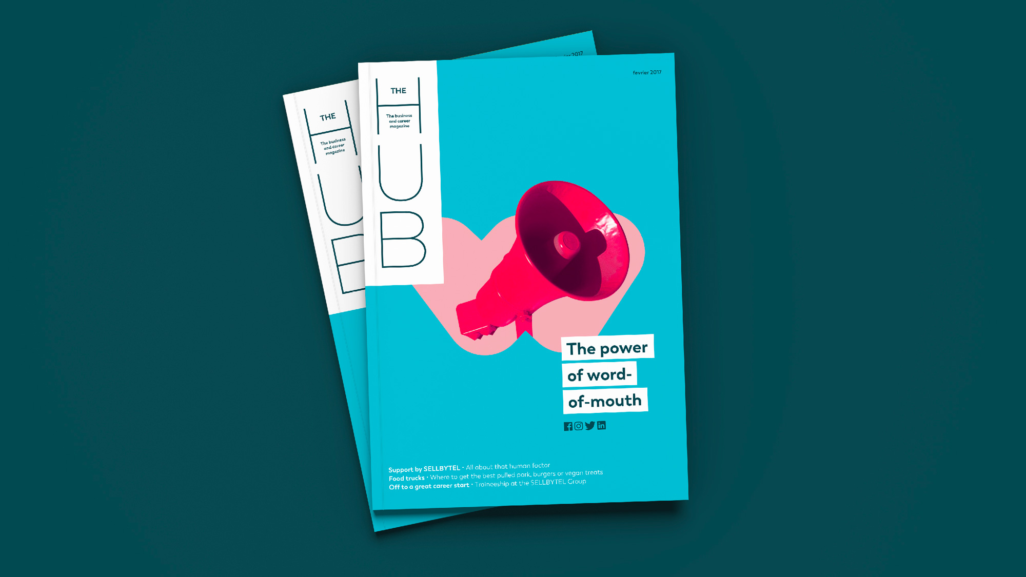
The identity starts to become slightly interesting with a nice color palette and the addition of rounded-corner graphics but it never quite gels into a cohesive system with a few too many things going on… from the headlines in thick white bars to the silhouetted people coming out of the hearts to some graphics being stroked. The nicest thing is when the “w” is used small in a corner without the wordmark but that doesn’t happen that often.
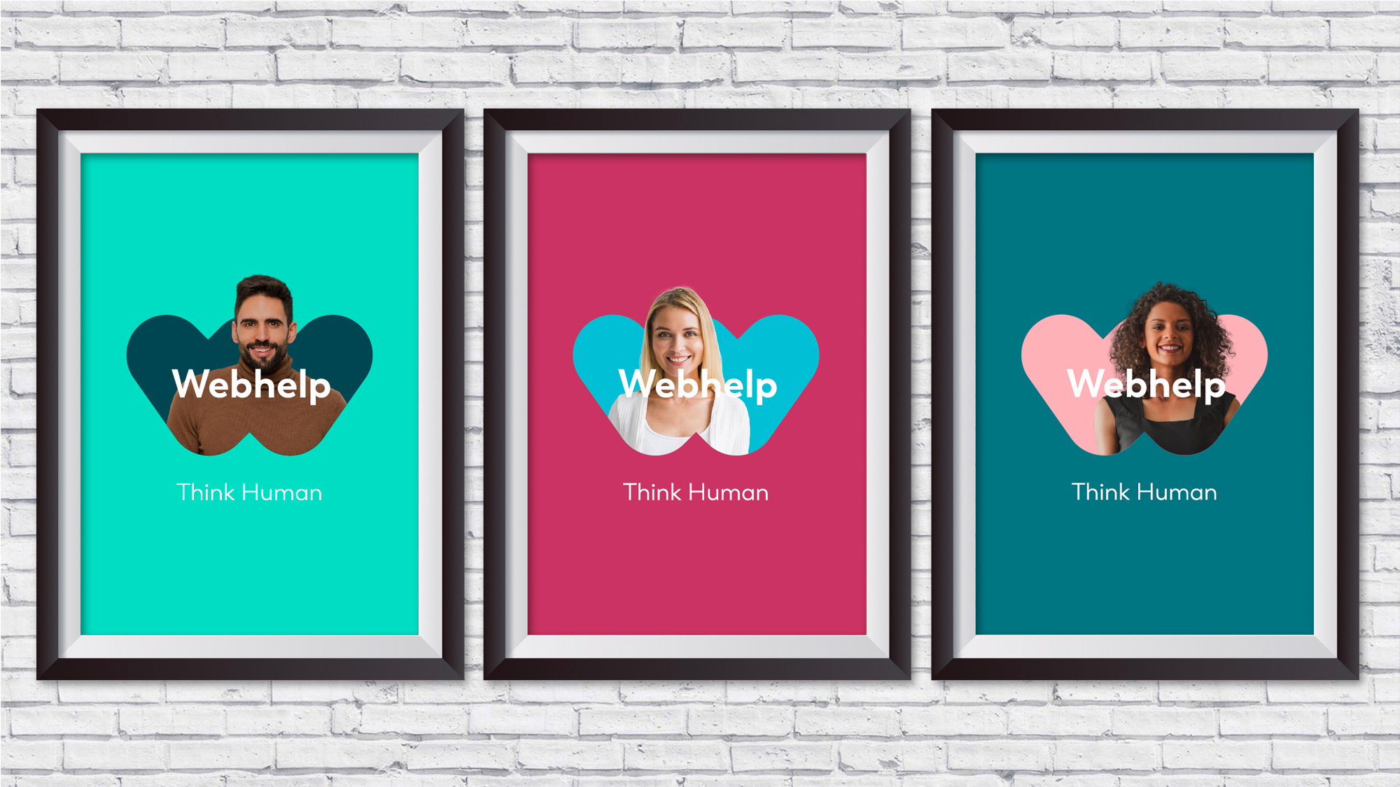
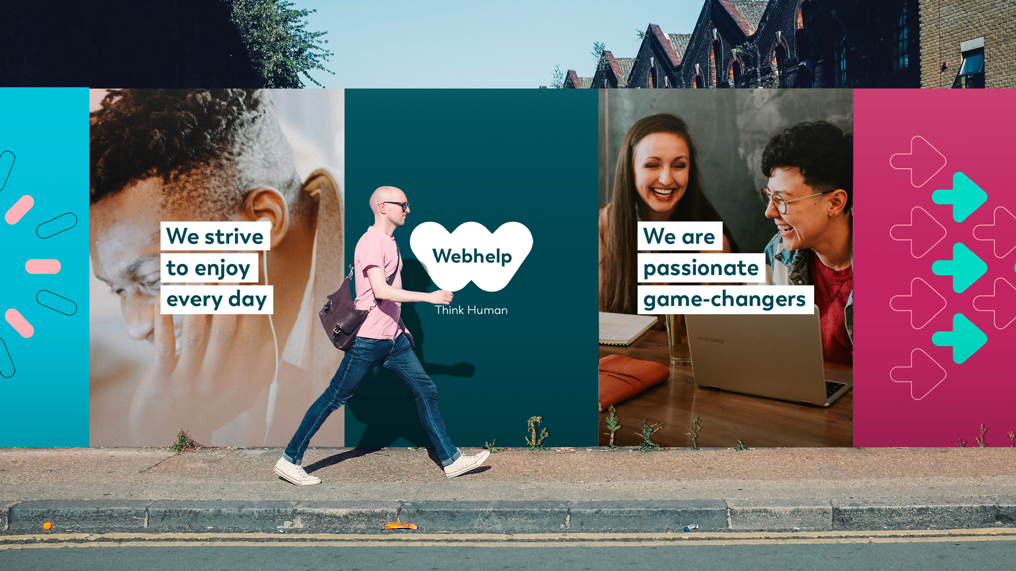
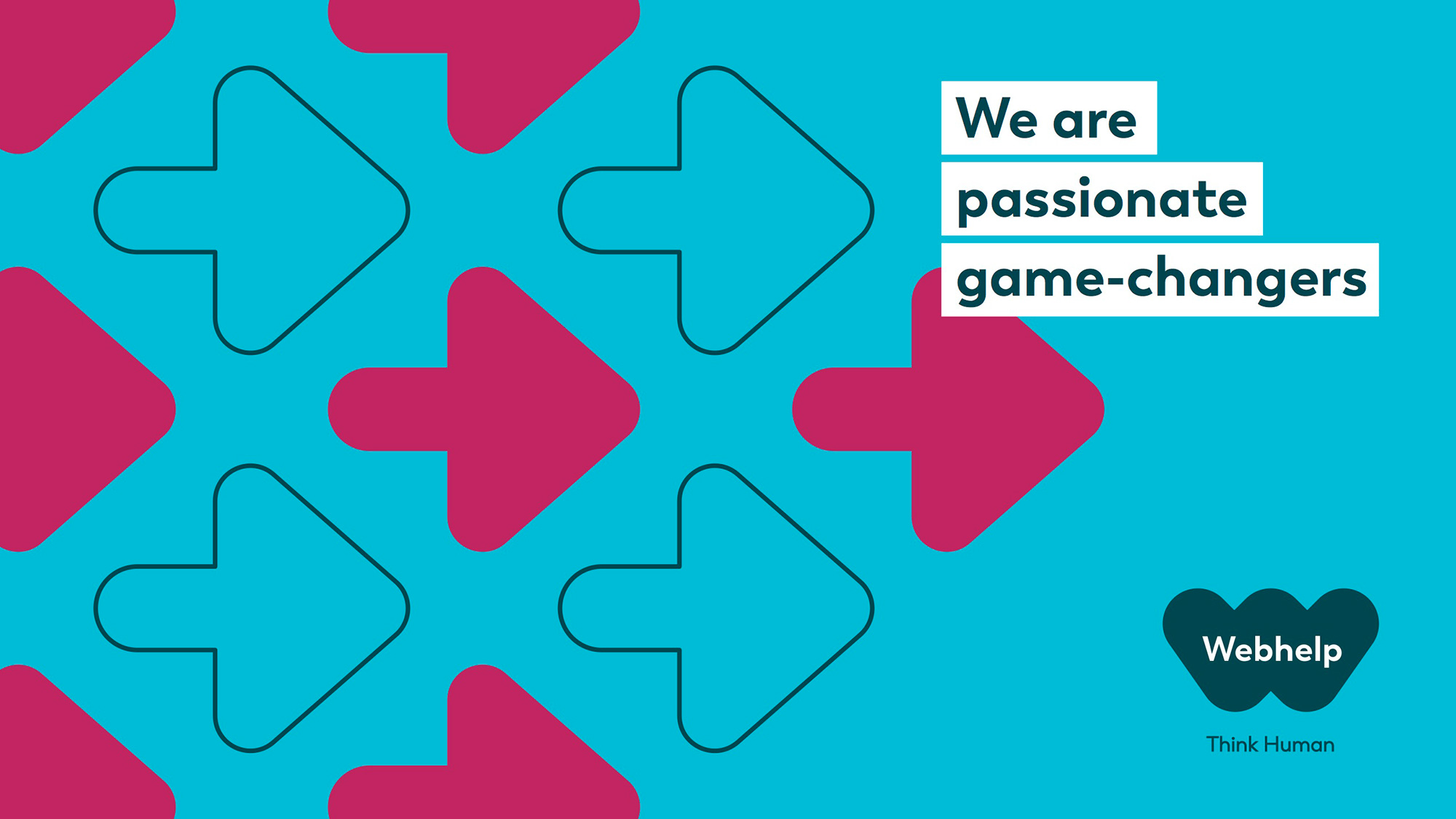
This image above is kind of random in that it’s not a specific application but I think it’s the most effective in this whole case study in actually feeling like there is a human connection with this company. From the warm hues, to the graininess of the photo, to the way the two images interact gets to what I think the company needed most. But this only happens in this one image.
Overall, most of this is fine — unsurprising but fine — and I feel like there was a solid foundation to this project but the execution didn’t quite build on it to deliver something that felt genuinely human.
 each year since publication began in 2006

 Новости Союза дизайнеров
Все о дизайне в Санкт-Петербурге.
Новости Союза дизайнеров
Все о дизайне в Санкт-Петербурге.