Обзор лучших ресурсов по разработке бренда, разработке упаковки
contact us | ok@ohmycode.ru
contact us | ok@ohmycode.ru
(Est. 2013) “DoorDash is a San Francisco-based technology company passionate about transforming local businesses and dedicated to enabling new ways of working, earning, and living. Today, DoorDash connects customers with their favorite local and national restaurants in more than 600 cities across the United States and Canada. By building intelligent, last-mile delivery technology for local cities, DoorDash aims to connect people with the things they care about — one dash at a time.”
Character (San Francisco, CA)
N/A
The new logo is an evolution, not a revolution — a streamlined version that stays true to the company’s roots. It is bold, iconic and inherently conveys speed, reliability and efficiency, much like the original which was inspired by the Japanese bullet train (Shinkansen).
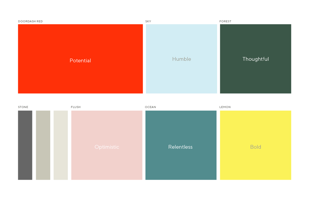
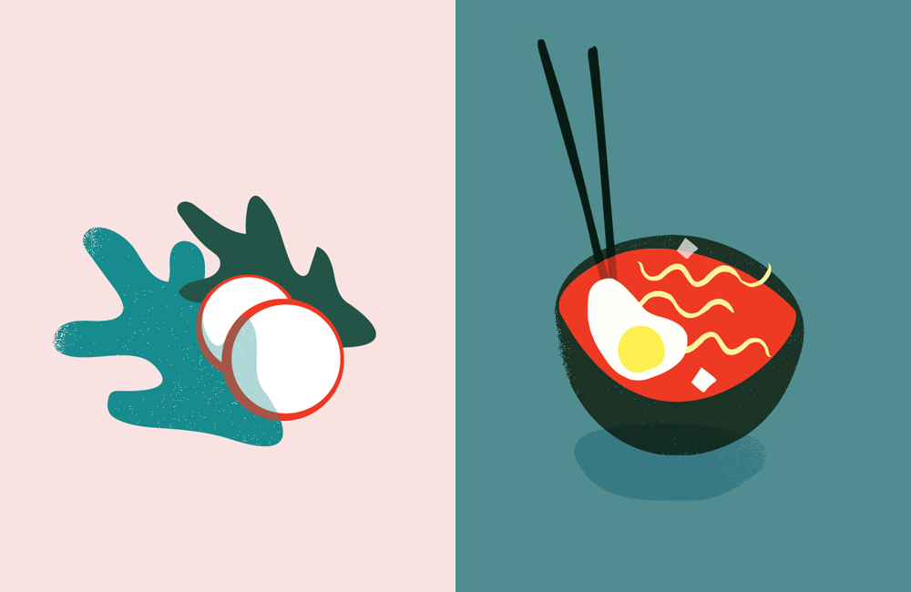
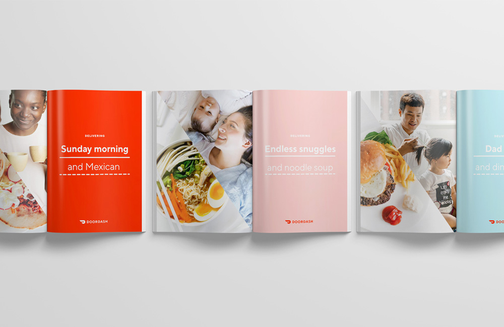
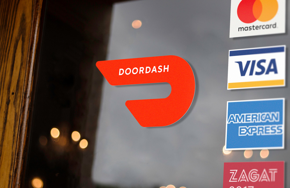

The old icon/monogram was apparently inspired by the Japanese bullet train. Being a delivery service I thought the icon was a pair of wings like Mercury’s winged shoes as it didn’t read at all like a train, bullet or otherwise. The new icon/monogram does look like a train a little more but only if someone were to mention it. It really looks like… nothing much. Maybe an abstract “D”. I mean, it’s not ugly or bad just kind of flimsy as an icon to build an identity around. When seen on the woman’s hat, for example, it’s just a random graphic. The one good thing about the icons is that it looks speedy. The wordmark is fine. The color palette is pretty. The illustrations… I wish there was more of those throughout the applications or even on the website. Instead there is more use of an icon set — which you can see here — with the normal line-drawings but these ones feature parts that are dashed lines (for DashDoor), which are kind of nice but I feel like I want to cut around them with scissors. The ads also use a dashed-line device, which gets kind of lost. And a final element is the use of an angle (as in the photos of those ads or in the video) that echoes the angle in the icon. Overall, everything is neatly executed and looks pleasing but that’s about it.

 Новости Союза дизайнеров
Все о дизайне в Санкт-Петербурге.
Новости Союза дизайнеров
Все о дизайне в Санкт-Петербурге.