Обзор лучших ресурсов по разработке бренда, разработке упаковки
contact us | ok@ohmycode.ru
contact us | ok@ohmycode.ru
Established in 1949, John Holland — named after its founder, Sir John Holland, an Australian engineer — is one of Australia’s largest and most experienced civil engineering contractors, working in Australia, New Zealand, and South East Asia, offering services from infrastructure and property development to rail and building. They have built tunnels, bridges, pipelines, rail lines, buildings small and large, hospitals, metro stations, and more. Recently, John Holland introduced a new identity designed by Sydney-based Frost* Design.
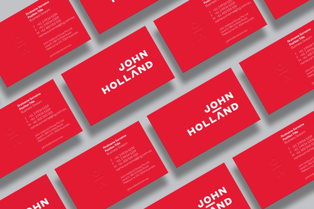
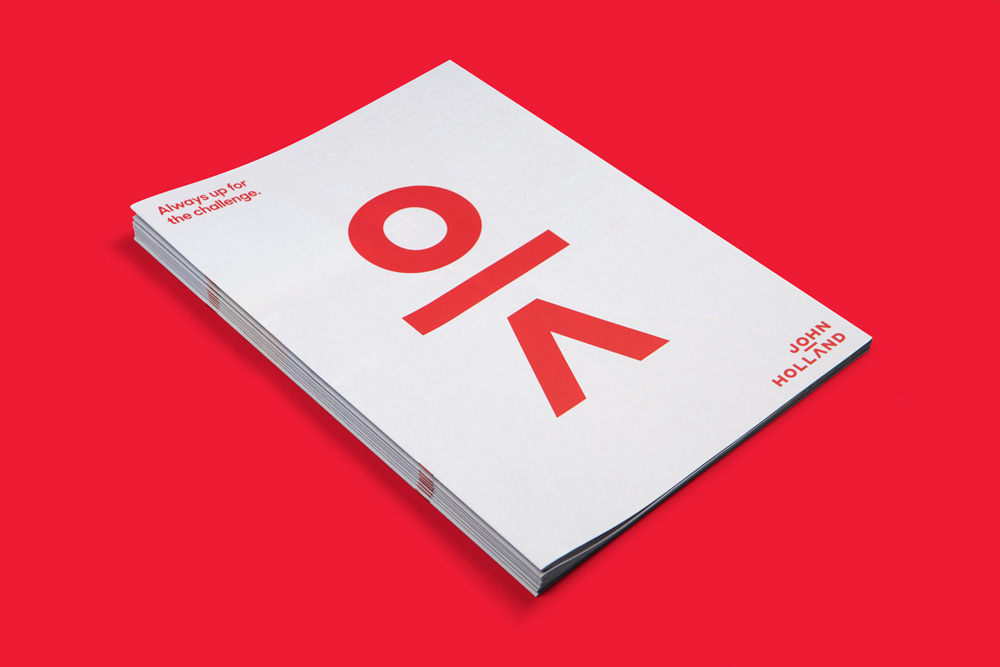
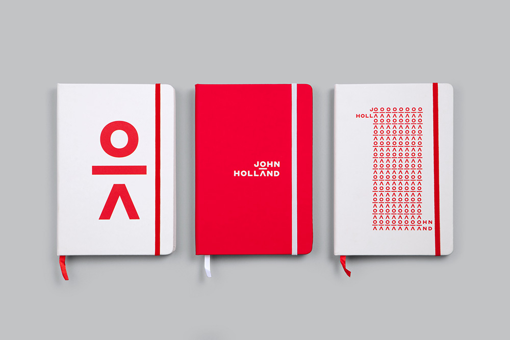
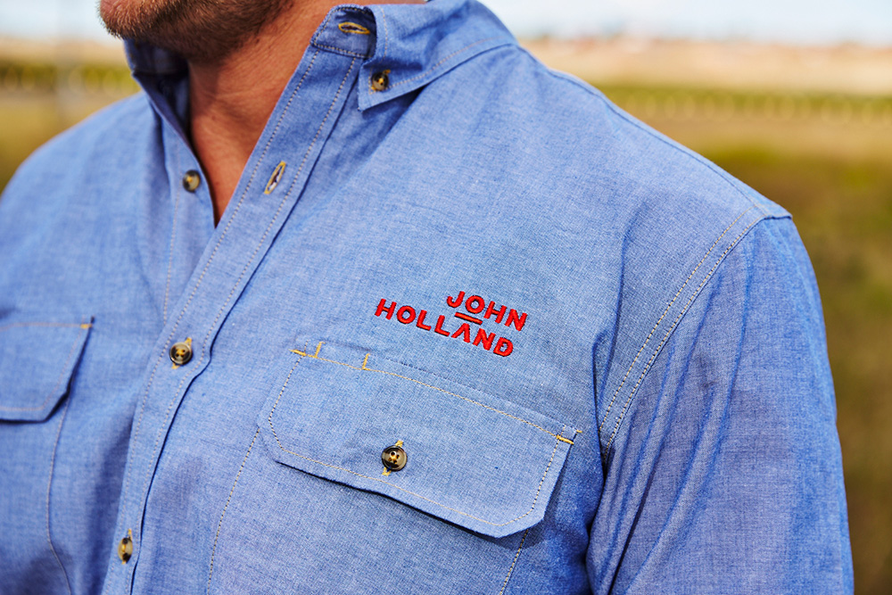
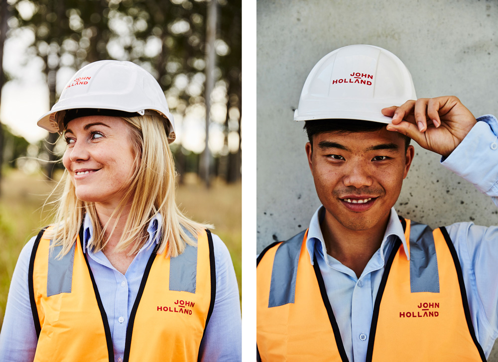
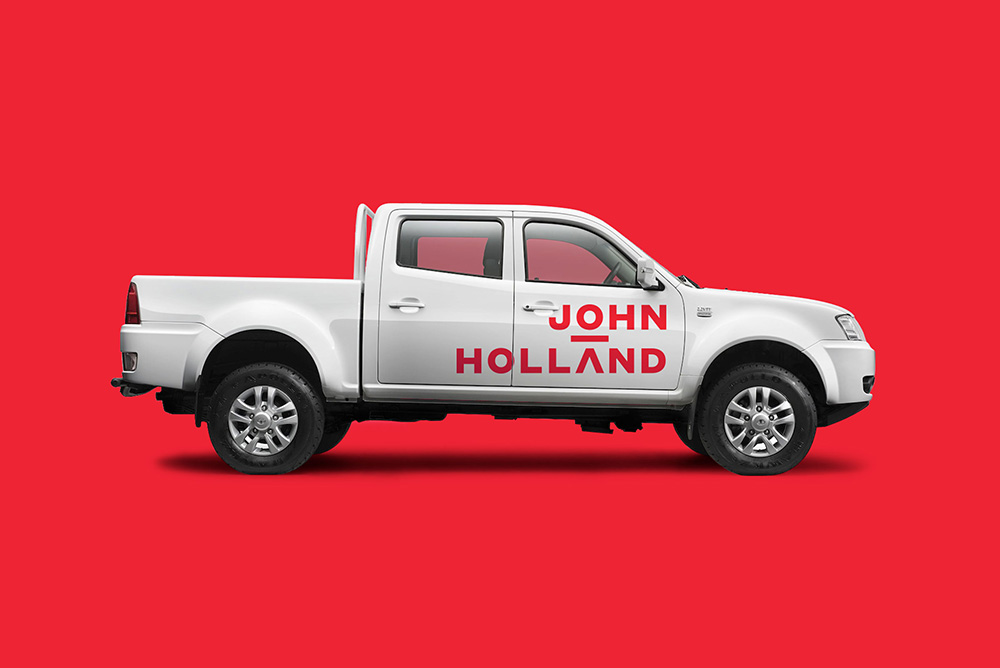
The new identity retains a clear link to John Holland’s heritage in terms of retaining the name and the iconic red colouring. At the centre of the logo, made from the lettering itself, is a person.
“Putting a person at the very heart of our brand mark shows our focus on people-centred solutions. Frost Design worked with us to create a shift that injects more meaning into our identity, while still making us easy to recognise,” says Barr.
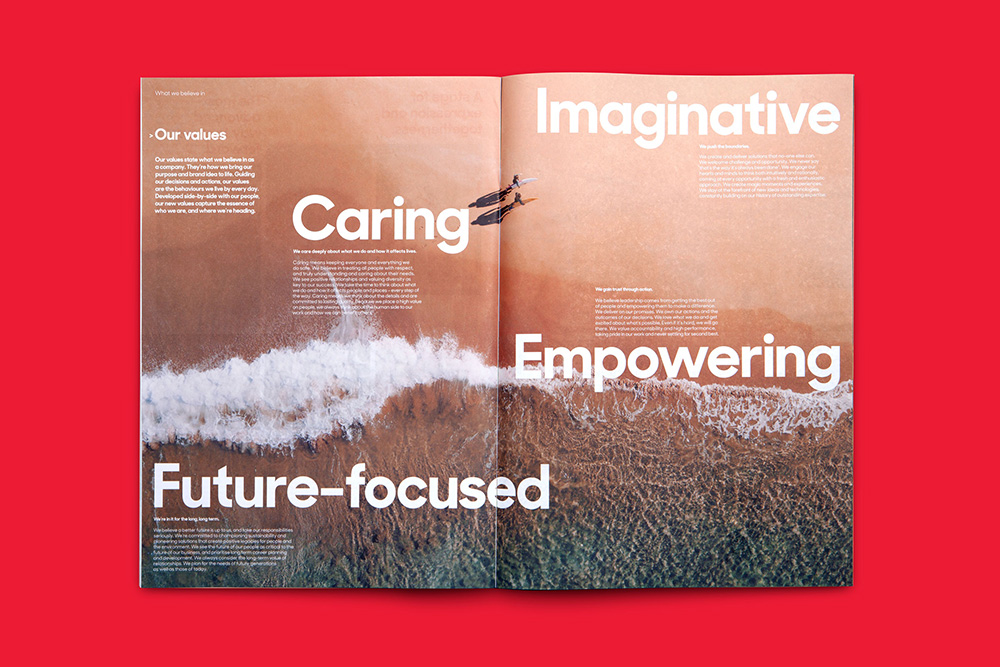
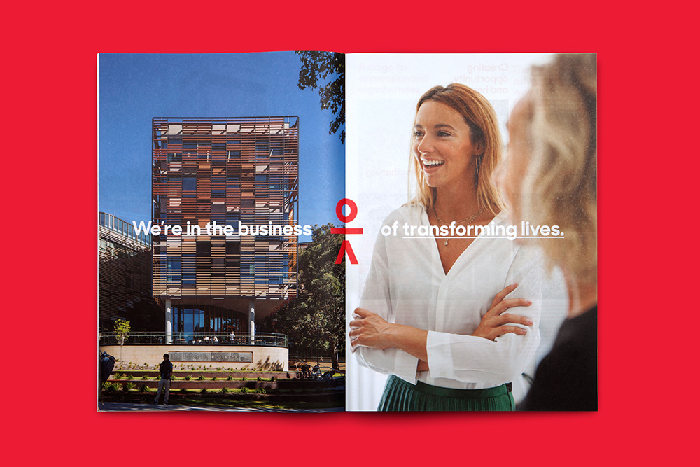
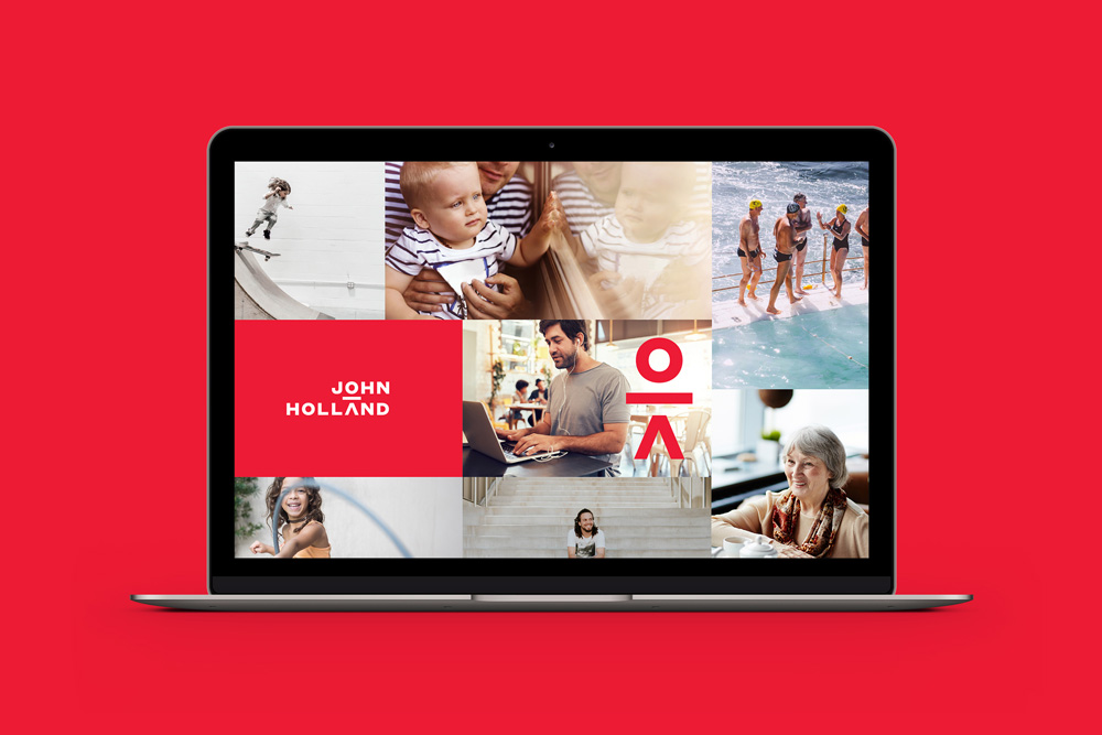
Frost* Design carried the human element across to other visual elements, including icons and illustrations that are expressive and unexpected along with a rich, warm and authentic photography style. The brand language has also changed to better reflect how John Holland transforms lives.
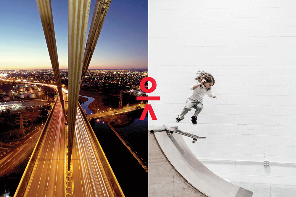
The old logo looked like something you would find at Radio Shack in the 1980s — in part because it used the mother of all 1980s fonts, Motter Textura — and while there was nothing wrong with it, it totally felt out of another lifetime. The new logo updates to today’s standard of a geometric sans but cleverly and masterfully finds and places an abstract person in between the two lines of text. The person is not hard to see but it’s also not fully given away at first glance, requiring a quick double take to notice it. The execution is spot on with a monospace structure that doesn’t feel stiff or computer-y and that takes advantage of the geometric shapes to make each character fill in the full width of each space. The icon works great on its own and serves as a playful element when placed between contrasting photographs.
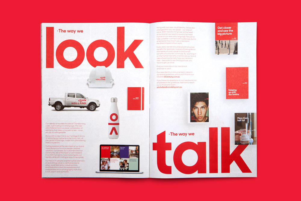
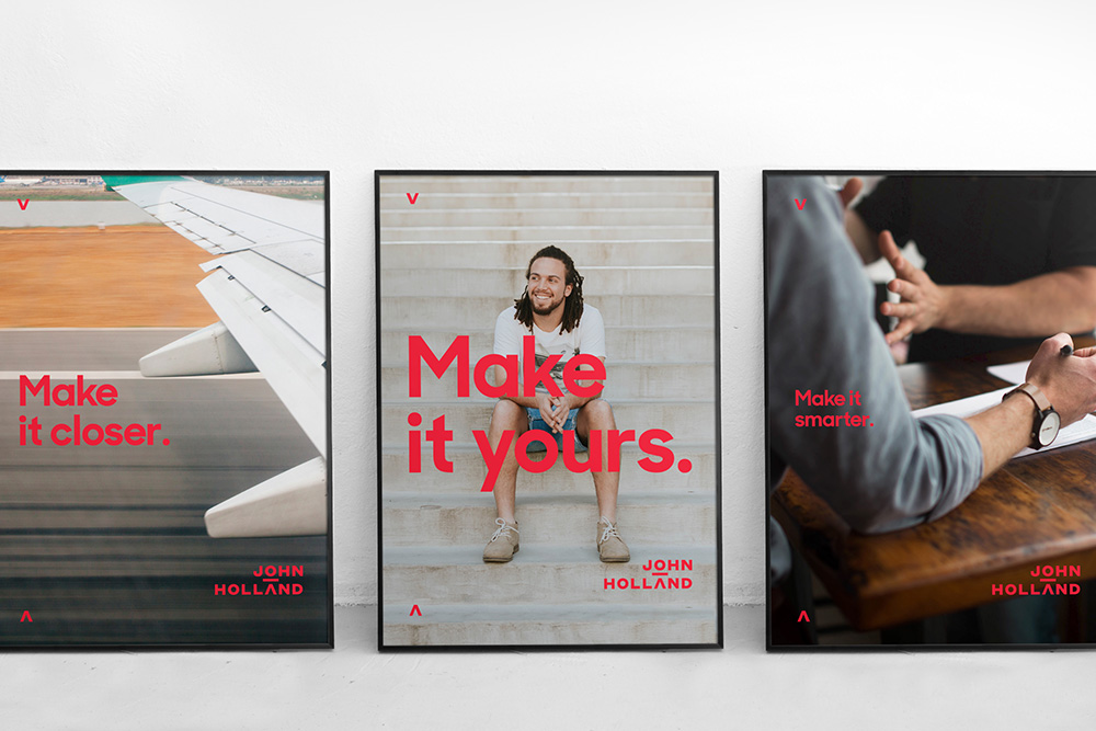

The applications are fairly straightforward but the bold, red typography has a strong impact and the up and down arrow that frame the headlines make for a good secondary element that helps tie the applications together, along with warmer copywriting and photography.
Overall, this is a great redesign that manages to look corporate and representative of the size of the company but at the same time it feels playful and, as unintellectual and literal as this insight is, having a person in the logo humanizes the company… which, to justify my deep observation, some other companies try to do with lesser degrees of success. You, person in the John Holland logo, are a gentleman, a lady, and a scholar.

 Новости Союза дизайнеров
Все о дизайне в Санкт-Петербурге.
Новости Союза дизайнеров
Все о дизайне в Санкт-Петербурге.