Обзор лучших ресурсов по разработке бренда, разработке упаковки
contact us | ok@ohmycode.ru
contact us | ok@ohmycode.ru
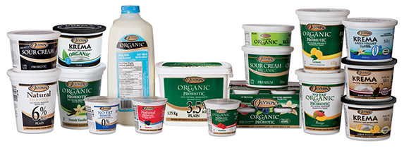
Established in 1982, Olympic Dairy is a Canadian owned and operated manufacturer and distributor of natural cultured dairy and organic products that offers over 140 different products in a variety of sizes and flavors. The company was bought by FF Cocon-enthusiasts Ultima Foods in 2004. This Summer, Olympic Dairy introduced a new logo and packaging designed by lg2.
“We looked to the brand’s location in beautiful BC and the positive energy that Canadians associate with the west coast for our inspiration. Nature, well-being, health, the sea and mountains, responsible consumption, wholesome food and balanced lifestyle - all these features also describe the Olympic family, especially as the entire range is natural and organic. It would have been a huge miscalculation to ignore Olympic’s origins and DNA. We instead decided to leverage the BC spirit and lifestyle to redefine the brand’s essence,” remarks Anne-Marie Leclair, Partner, Vice-President, Strategy, at lg2.
The old logo… yikes. I doubt they were trying too hard or thought they had a killer look, so we’ll give them a pass. The new logo pays homage to the snowy mountains found across British Columbia — perhaps specifically, because of the name, to the Olympic Mountains (although those are officially in the U.S., right on the border) — with a groovy serif featuring a snow-capped “M”. I like the idea and get what they are trying to do but I’m bothered by the snow looking like a sprinkling of pepper. By choosing to use the logo in white on dark backgrounds, the snow should not be “depicted”, instead it should be the visible pieces of rock that are depicted amidst the snow. So, in my mind, the top peaks of the “M” should be unfinished without an edge to give the impression of the snow covering completely the very top and slowly diffusing as it crawls down. Anyway… the logo is a major improvement and I love the wide serif that works perfectly in the top band of the packaging.
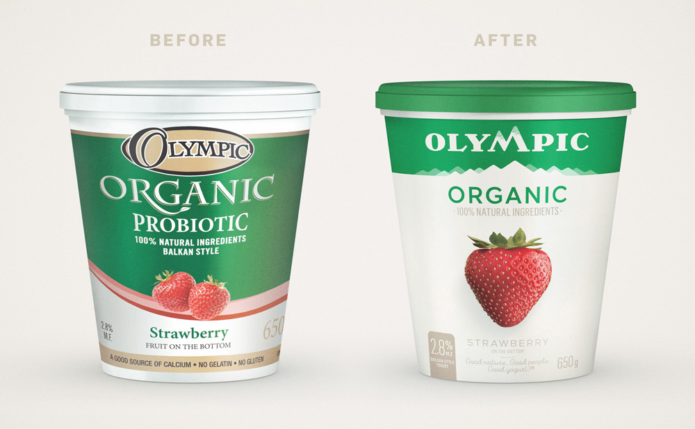
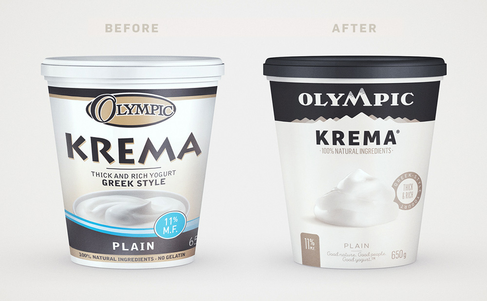
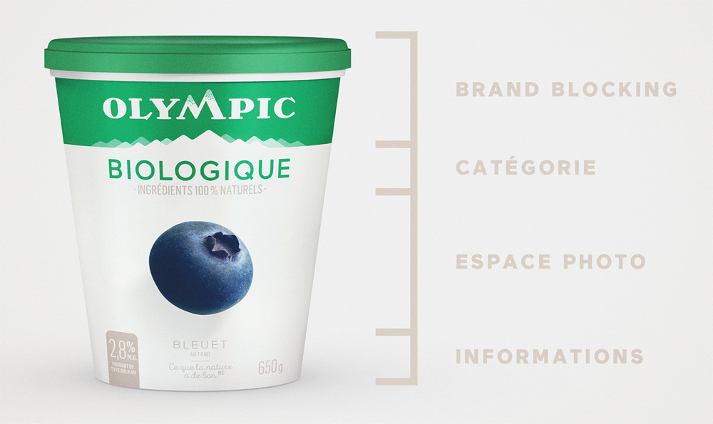
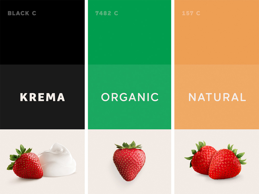
The old packaging did not elevate in any way the logo, instead it doubled down on swooshes and bad typography. Everything about the new packaging is infinitely better, starting with the top band that has the mountain range and from there blends into the product name and photography, all in a crisp execution.
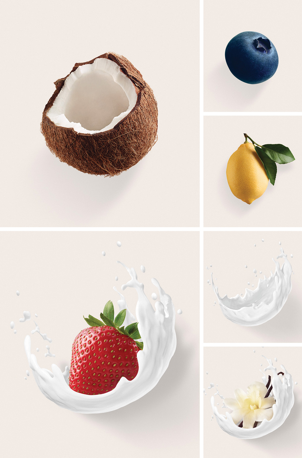
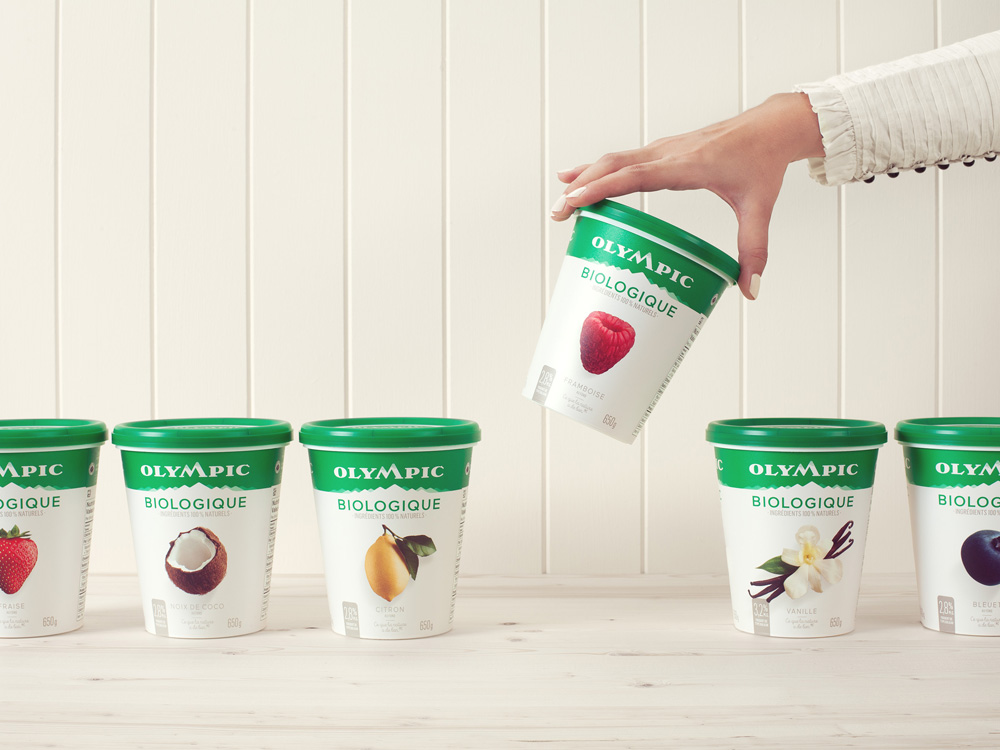
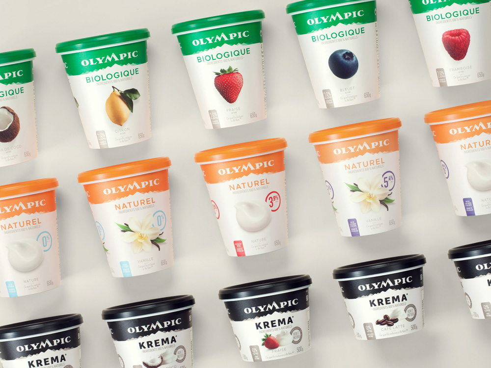
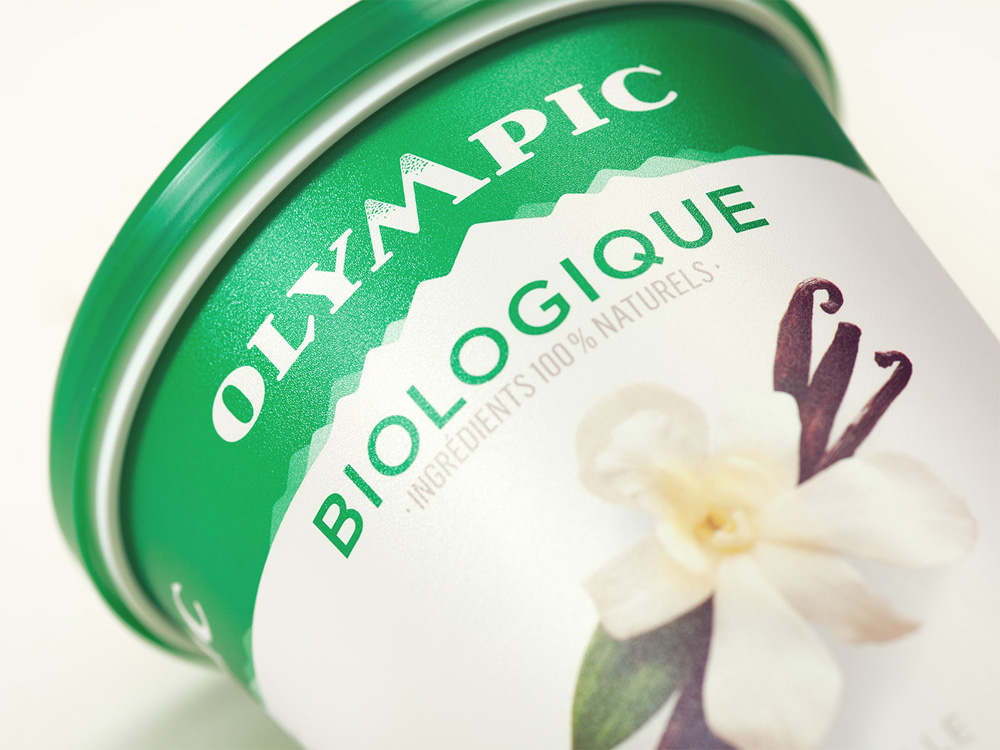
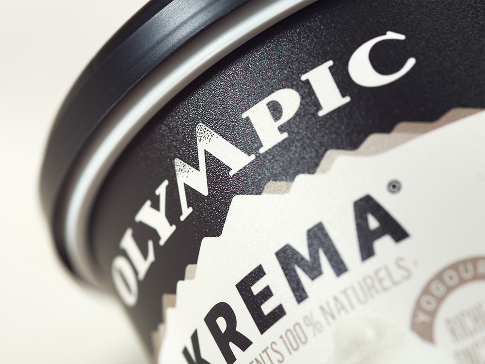
Not much more else to say… The update nails it across the board and gives the product the aesthetic and shelf presence it deserves if all the cows and farmers are as happy as the video above shows.

 Новости Союза дизайнеров
Все о дизайне в Санкт-Петербурге.
Новости Союза дизайнеров
Все о дизайне в Санкт-Петербурге.