Обзор лучших ресурсов по разработке бренда, разработке упаковки
contact us | ok@ohmycode.ru
contact us | ok@ohmycode.ru
Established in 2011 as the merger of three music-related organizations, Musikernes Fellesorganisasjon (“The Musicians’ Joint Organization” in English, MFO for short) is a member-based organization in Norway that supports the careers and livelihoods of any professional who has income from artistic or art education professions — originally primarily musicians. It provides its current 9,000 members with free legal advice, legal assistance, courses and conferences, application and contract assistance, and free collection service as well as insurance for them and, if applicable, to their musical instruments. MFO changed its name this year to Creo — which translates to “I think” — as a way to be more inclusive of artists that are not musicians and had introduced a new identity in Summer of 2018, designed by Oslo, Norway-based Dinamo, still under that name knowing they would be changing it. This post shows the application to MFO but everything transfers to the new name.
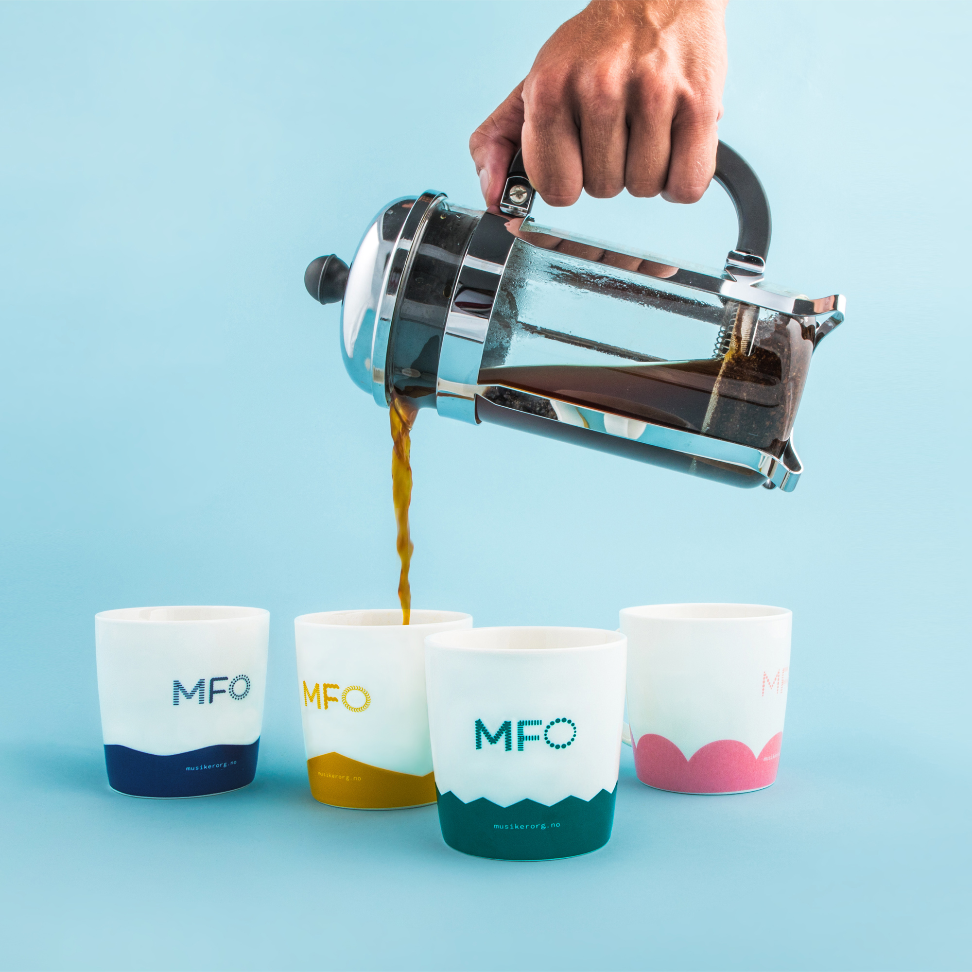
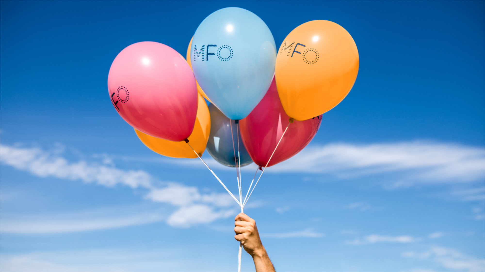
Dinamo created a concept we called Diversity United.
We found that numerous art forms can be represented with only a small number of common denominators: time, movement, variation, and intensity.
A variation of these factors will convey a wide range of rhythm, passion, dynamic, tension, expressiveness, emotions, reflections, etc. Various compositions will express both the connections and the differences in this community.
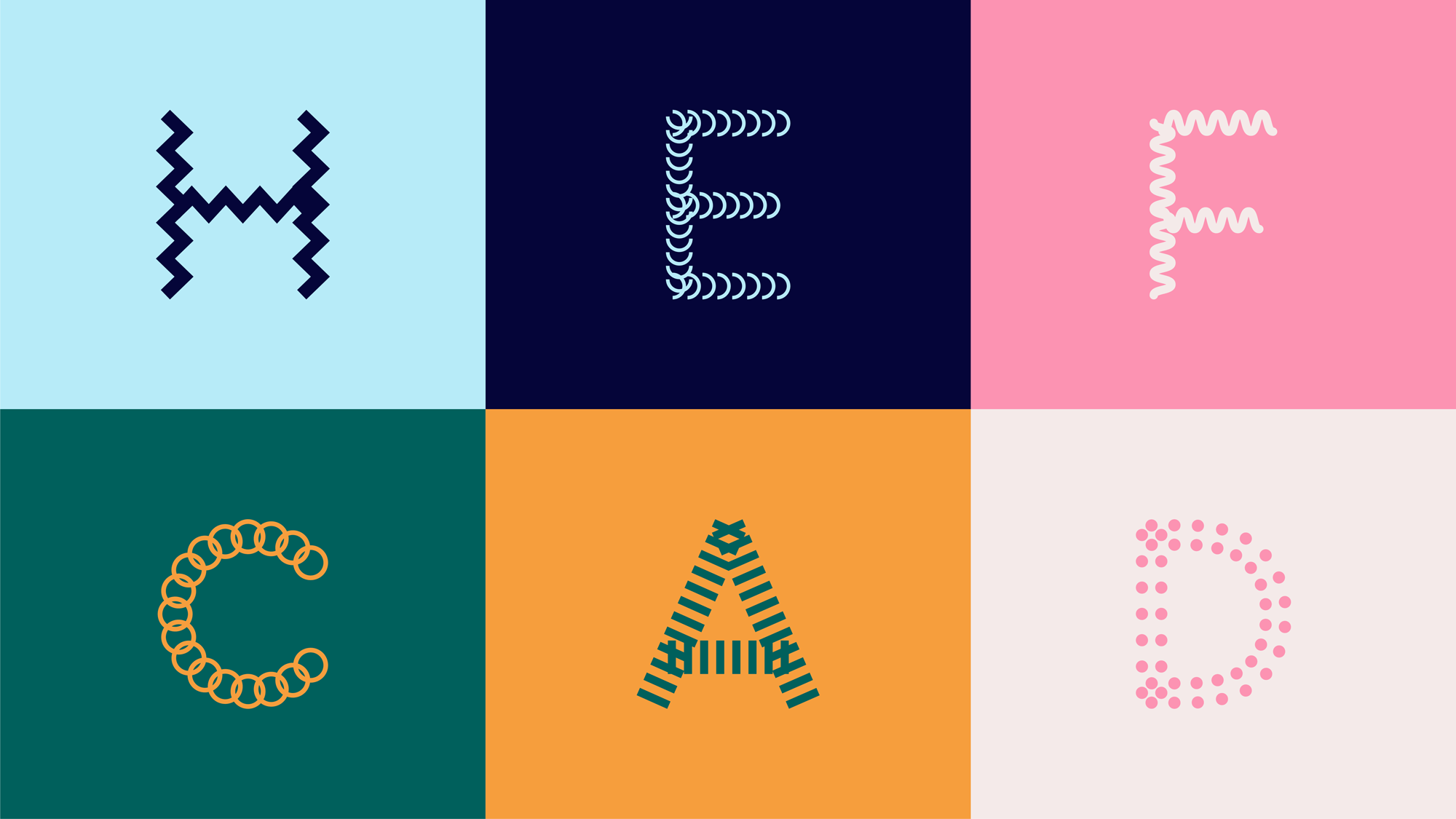
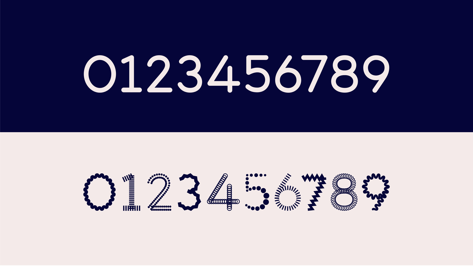
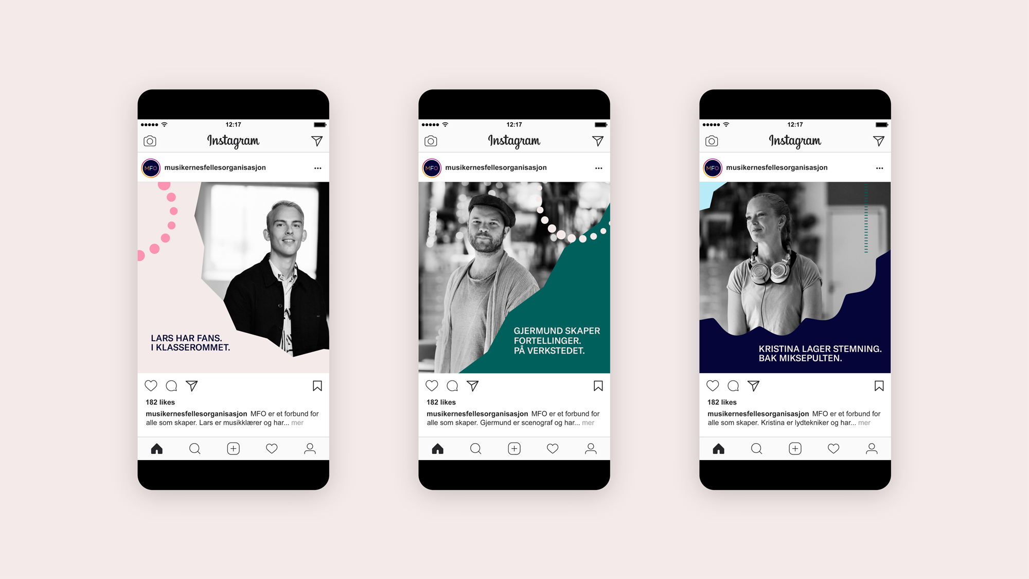
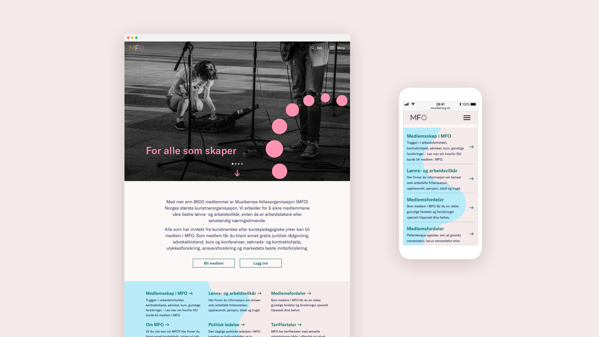
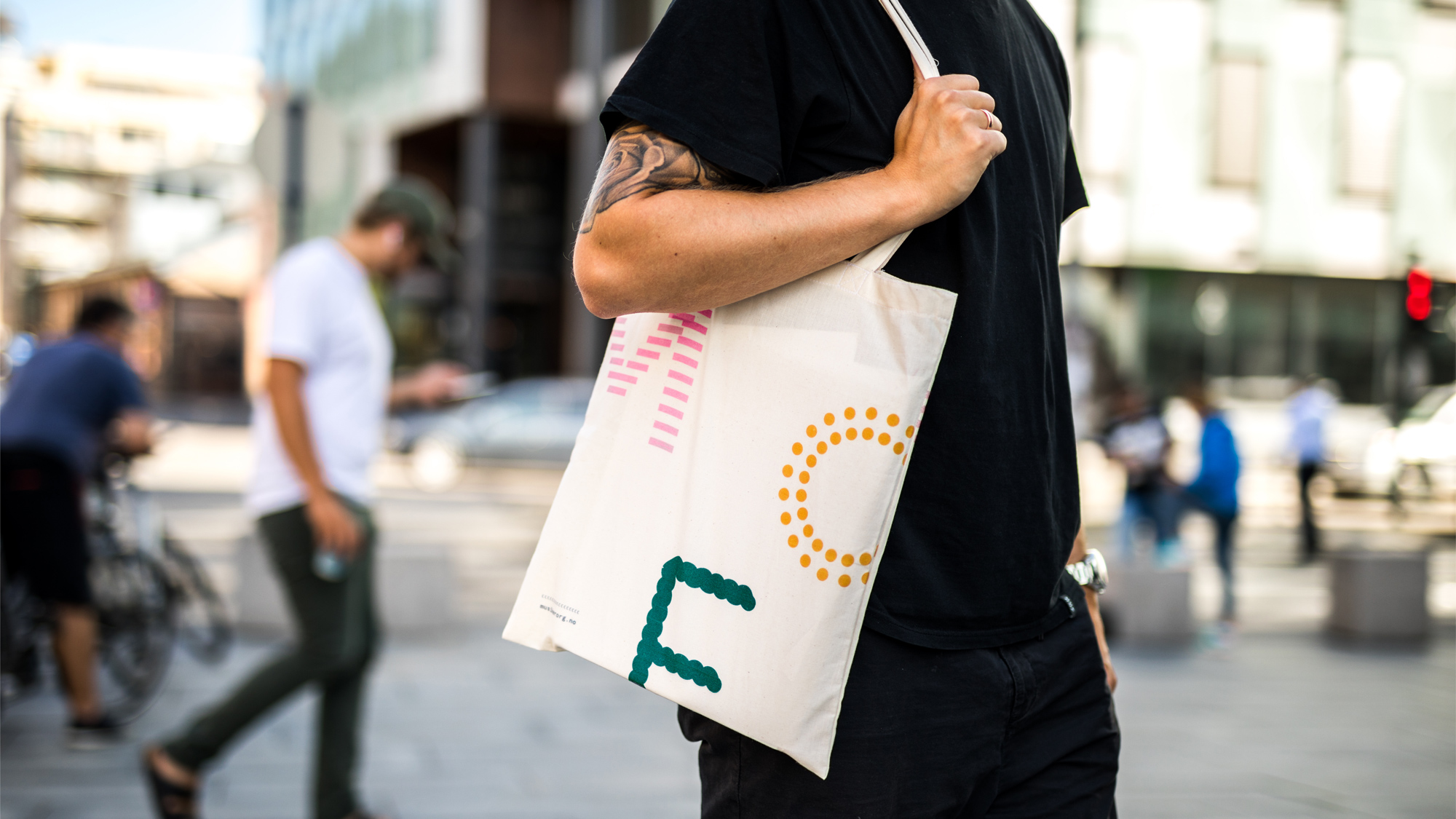
Three main elements have been developed for the visual identity: curves, repetitive shapes, and circles. They all have their respective parameters and variability options. When combined, we see an impressive range in both shape and expression: From soft, limited and calm movements, to strong, sharp and dramatic ones.
The continuous variation of these main elements is the core idea of MFO’s visual identity. They are the building blocks for all the visual tools; the dynamic logo, the graphic shapes, layout, typography, style and colours.
The continuous variation of these main elements is the core idea of MFO’s visual identity. They are the building blocks for all the visual tools; the dynamic logo, the graphic shapes, layout, typography, style and colours.
The old logo was awkwardly proportioned with a huge “mfo” — which, itself, had a huge “f” — and teeny tiny type around it that made it impossible to read in anything smaller than 10 inches wide. It had a double bar line from a music staff so it looked music-y, which was a good thing originally but a limiting thing eventually. The new logo conveys the idea of diversity in a fairly straightforward way: by having many diverse elements in it. It looks complex but it’s a simple concept at its core. For those with Brand-New-elephant-level memory, you might remember this project, which I bring up not to diminish MFO’s or to say it was copied but to highlight that it’s common to arrive at very similar concepts and executions through separate paths. Anyway… in this case, the logo is alright. I will always enjoy logos that change but there is something a little off about this one and, to me, I think it’s the “M” and “F” where the particles that make the letters overlap at the joints and create some awkward moments where the letters look sloppy. There are some cool combinations here and there but overall, the three letters never quite jive.
Those same principles then apply to the new name, Creo, which, in the logo, reads as CREO and coming from the name MFO, as well as the different styles for each new letter I keep wanting to read it as a C-R-E-O acronym instead of a full word, which may only be my problem as a non-Norwegian speaker but, I think, visually, the logo approach forces my brain to read it as such.
We developed our own font generator which will, with the help of simple parameters, generate a wide variety of messaging in its own display font. This is the foundation for the dynamic logo and all the shifting shapes. That way, the profile will continue to live and develop indefinitely as new impressions on all platforms are created - as diverse and vibrant as the community it represents.
I will also always applaud a logo generator because they are fun. Aside from working for the logo, the generator is also used for the typography used in applications.
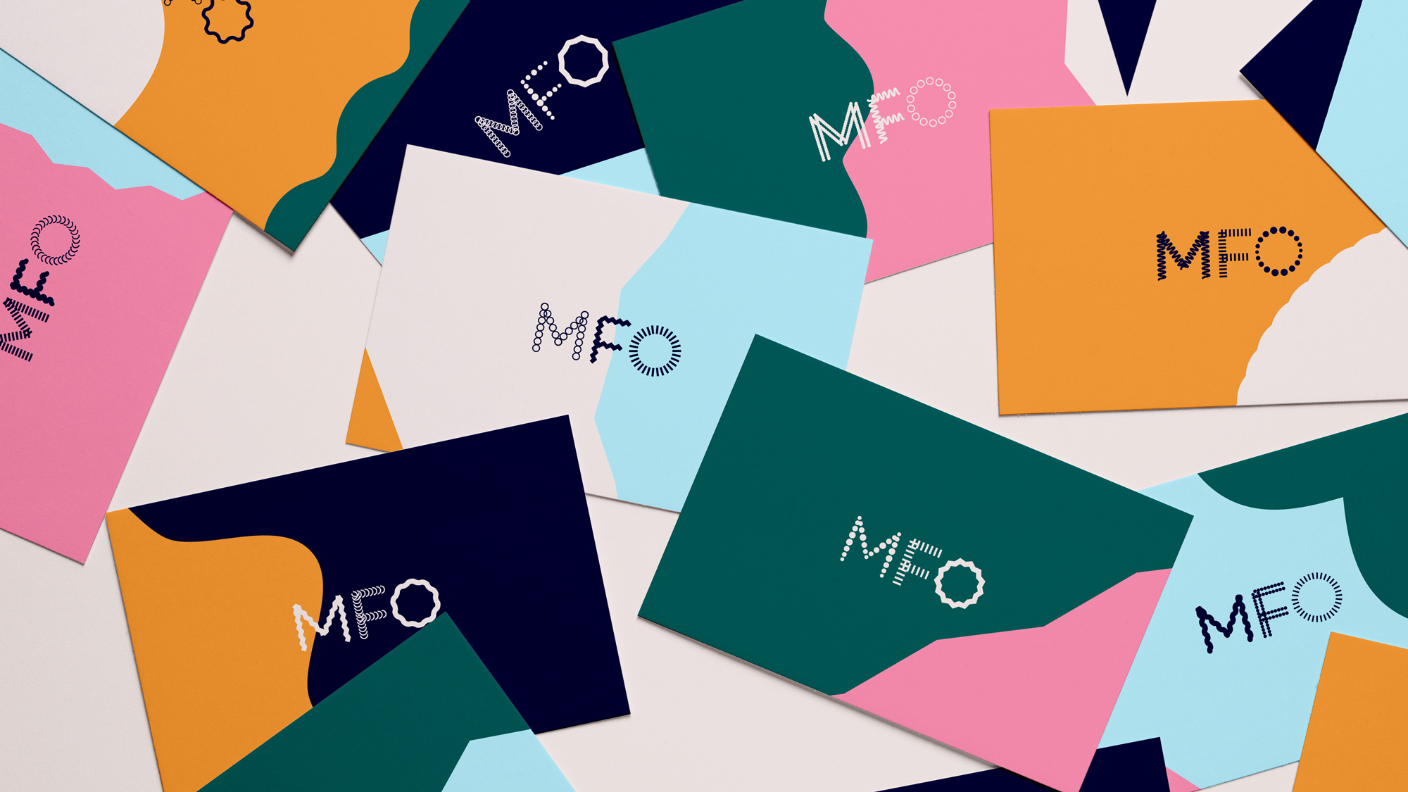
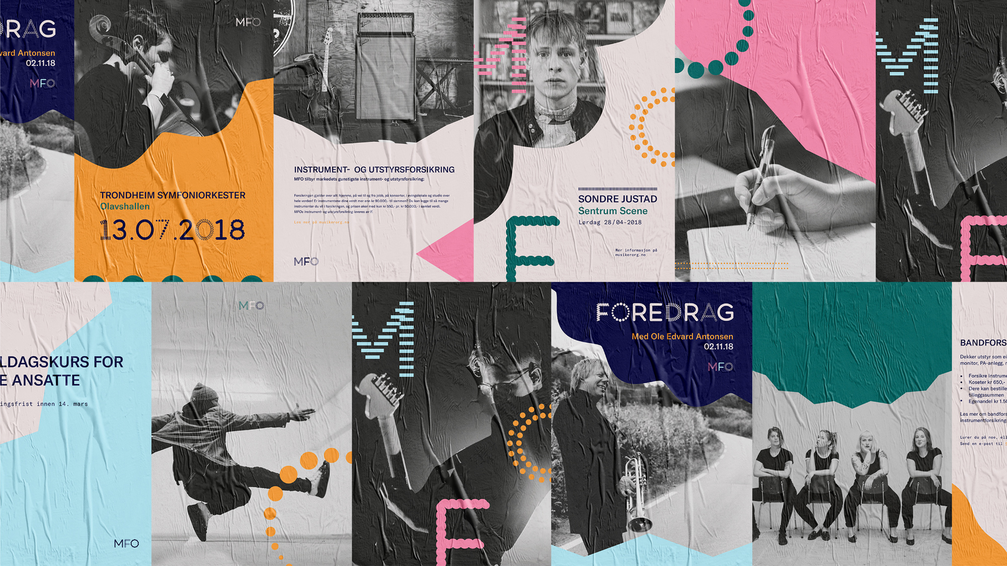
The applications are pretty great though and I like how the same individual particles of the logo have been blown up to create interesting, colorful compositions to serve as the basis for the layouts. I also really like how the funky shapes mask the photography, creating a unique and fun treatment.
Overall, this is somehow the kind of thing you would expect from a Nordic culture-based organization — meaning it’s slightly experimental and daring but feels perfectly at home for the intended audience. The applications are great and the ingredients are there but the logo (in either MFO or CREO form) perhaps needs one extra round of finessing.

 Новости Союза дизайнеров
Все о дизайне в Санкт-Петербурге.
Новости Союза дизайнеров
Все о дизайне в Санкт-Петербурге.