contact us | ok@ohmycode.ru
contact us | ok@ohmycode.ru
Established in 2003, acquired by Google in 2005, and first released in 2008, Android is a mobile operating system for smartphones, tablets, and other connected devices. Created as an open source platform, Android is free for anyone to download, customize, and distribute, allowing manufacturers to build mobile devices at lower costs, in turn giving more people access to mobile technology. More than 24,000 different phone and tablet models from companies like Samsung, Huawei, LG, and Nokia use Android, with some notable examples being Amazon’s Kindle Fire tablet and Google’s own Pixel phone. In total more than 2.5 billion devices around the world run on Android. With Android 10, their latest release — which also marks the move away from naming each release after a dessert in ascending alphabetic order to a number — Android introduced a new identity designed by Huge.
Note: Thank you for your patience on this review!
Huge and Google, in close partnership, evolved the Android brand to make it more modern, globally inclusive, and accessible. Our work spanned the entire brand experience: from brand architecture and strategy, to a robust identity system with comprehensive guidelines and partner assets, to a fully reimagined mobile-first digital experience on Android.com.
The Android brand has evolved over time. Back in 2014, we updated our logo and brand color, and this year, we’re introducing a more modern, accessible look.
The design of the logo draws inspiration from the most recognizable non-human member of the community, the Android robot. The robot belongs to everyone in the community, and has long been a symbol of the fun and curiosity at the heart of Android. Now, it has a special place in our logo.
We also changed the logo from green to black. It’s a small change, but we found the green was hard to read, especially for people with visual impairments. The logo is often paired with colors that can make it hard to see—so we came up with a new set of color combinations that improve contrast.

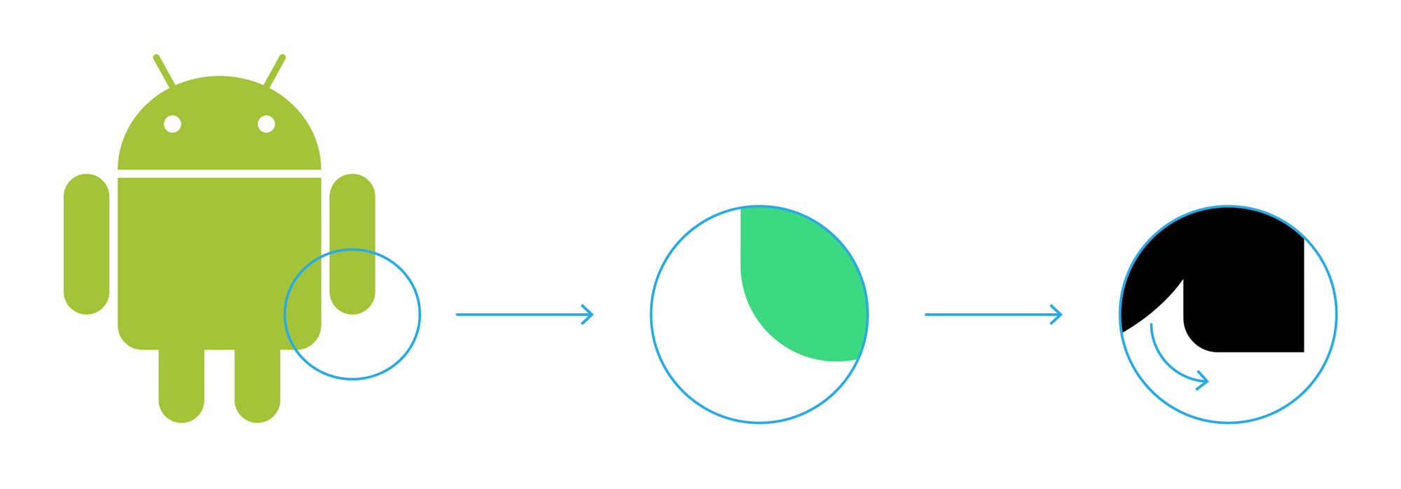


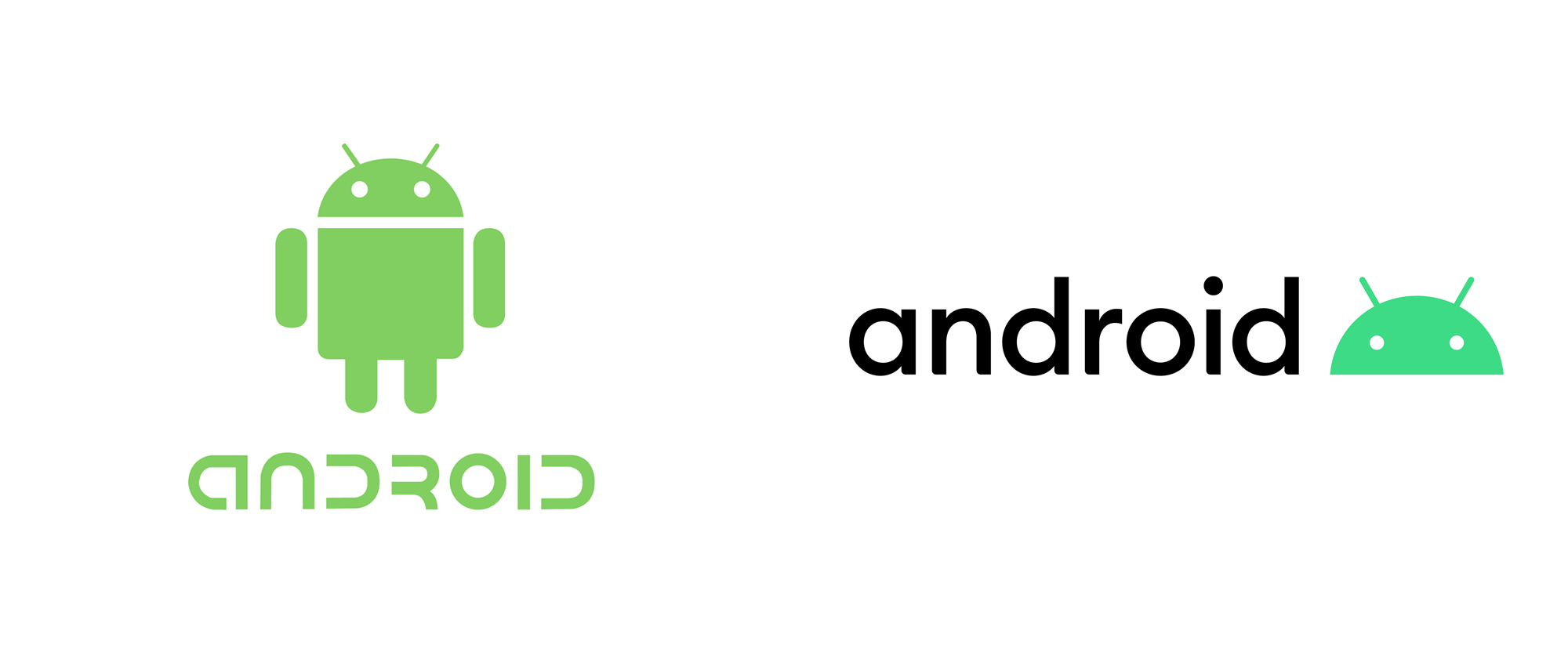
The old logo has revolved around the full-bodied robot for so long and that robot has become so well known and easily recognized that it’s hard to find many faults in it but, as sacrilegious as this may be, I have never been a big fan. I appreciate it but I have always thought of it as clunky and unappealing, especially when it gets dressed up. The old wordmark, that I really dislike and maybe it’s not that bad but the combination of unicase and widely open “D”s just irks me in every way possible. The new logo is probably an affront for many Android fans as it makes a drastic change to the robot by removing the body and to the wordmark by replacing the funky wordmark with a basic geometric sans serif — I can totally understand the disappointment. But this is so much better.
The head of the robot, on its own and with the legacy of the full-bodied version behind it, works amazingly well as an icon. It’s more compact, it reduces well, and it’s far more charming as it places focus on its expression, which is surprisingly endearing. The wordmark is far from exciting and looks exactly like what you would expect it to look in this decade but, given the global reach of the brand, it makes sense to make it as clear as possible. The new green is also a huge improvement, with a richer hue that is more distinct and energizing.

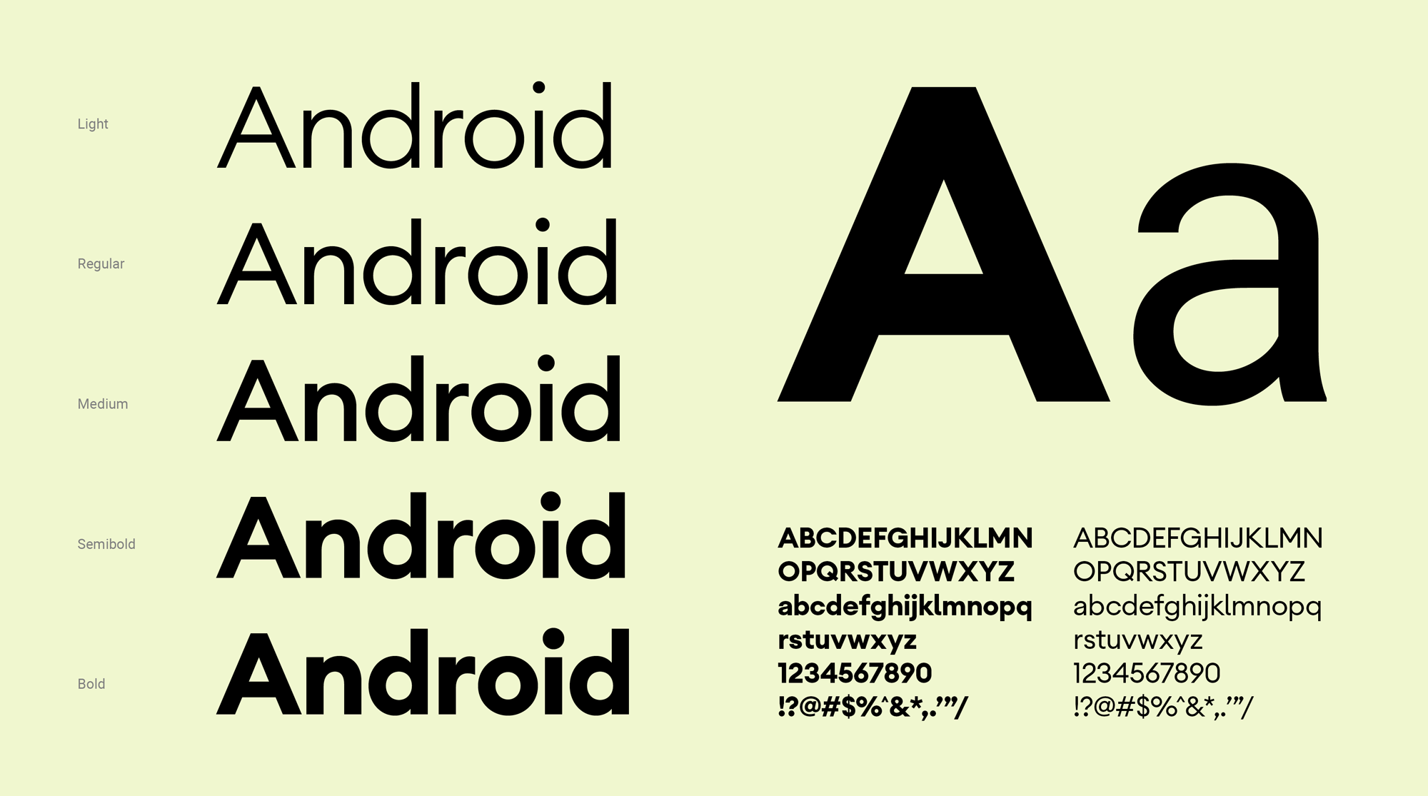
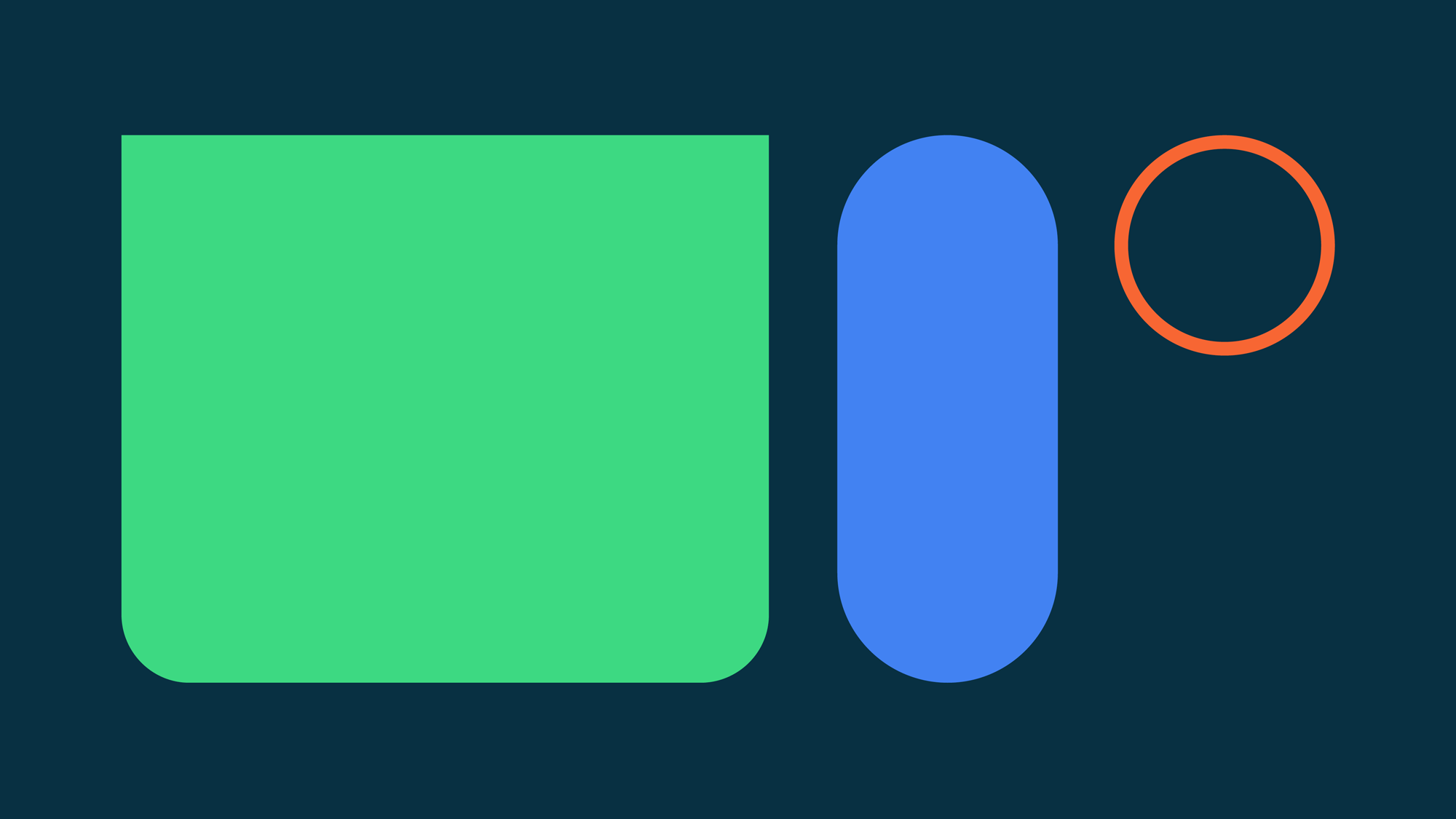
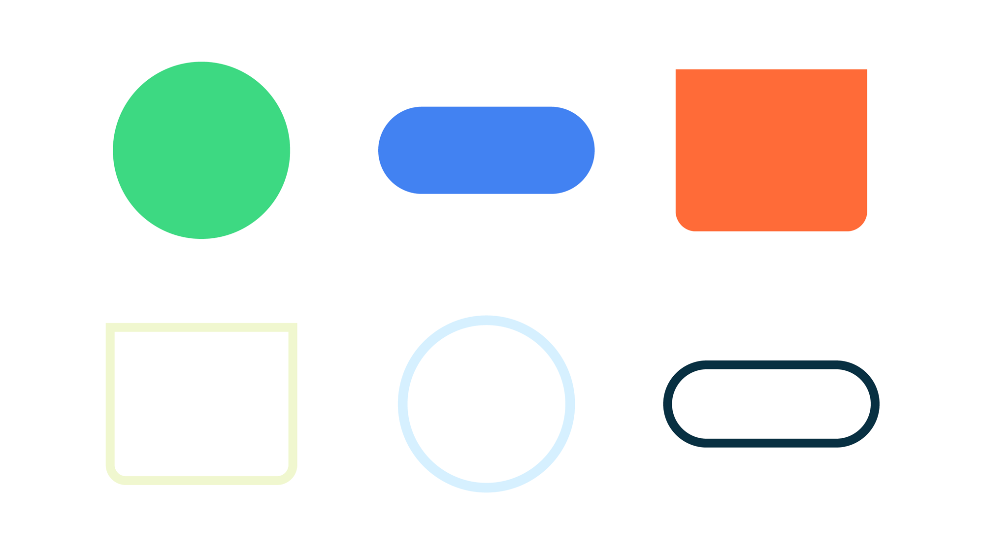
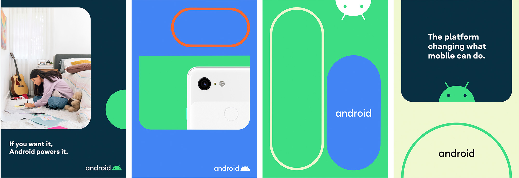
The identity revolves around a set of expanding, roving button-like shapes in both stroked and filled styles that even though they are fairly basic they expand quite nicely into a full visual language that feels playful and dynamic. The brand typeface is interesting, with a mix of Century Gothic and Avant Garde and hints of DIN and Helvetica that makes it look familiar yet does have some unique flair.
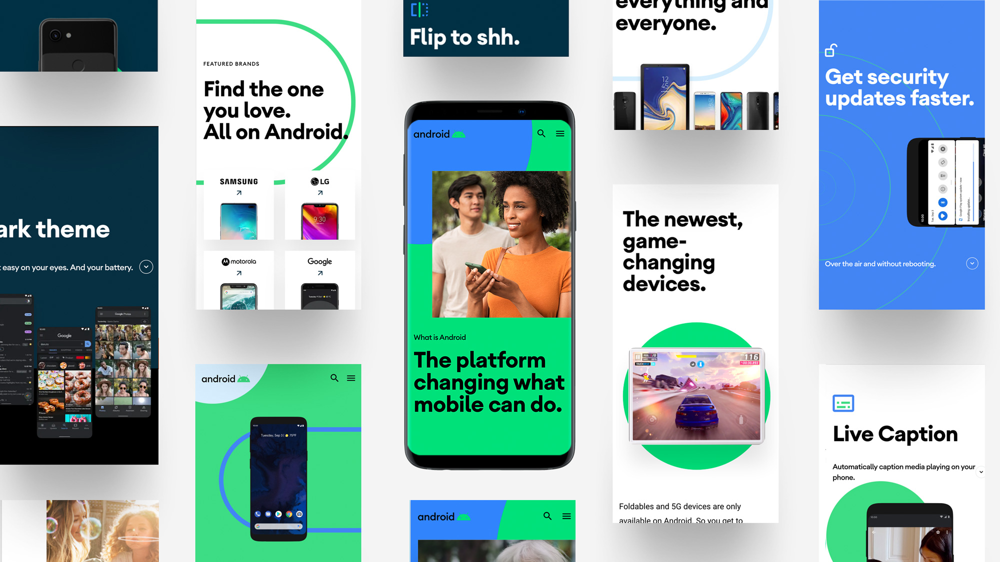
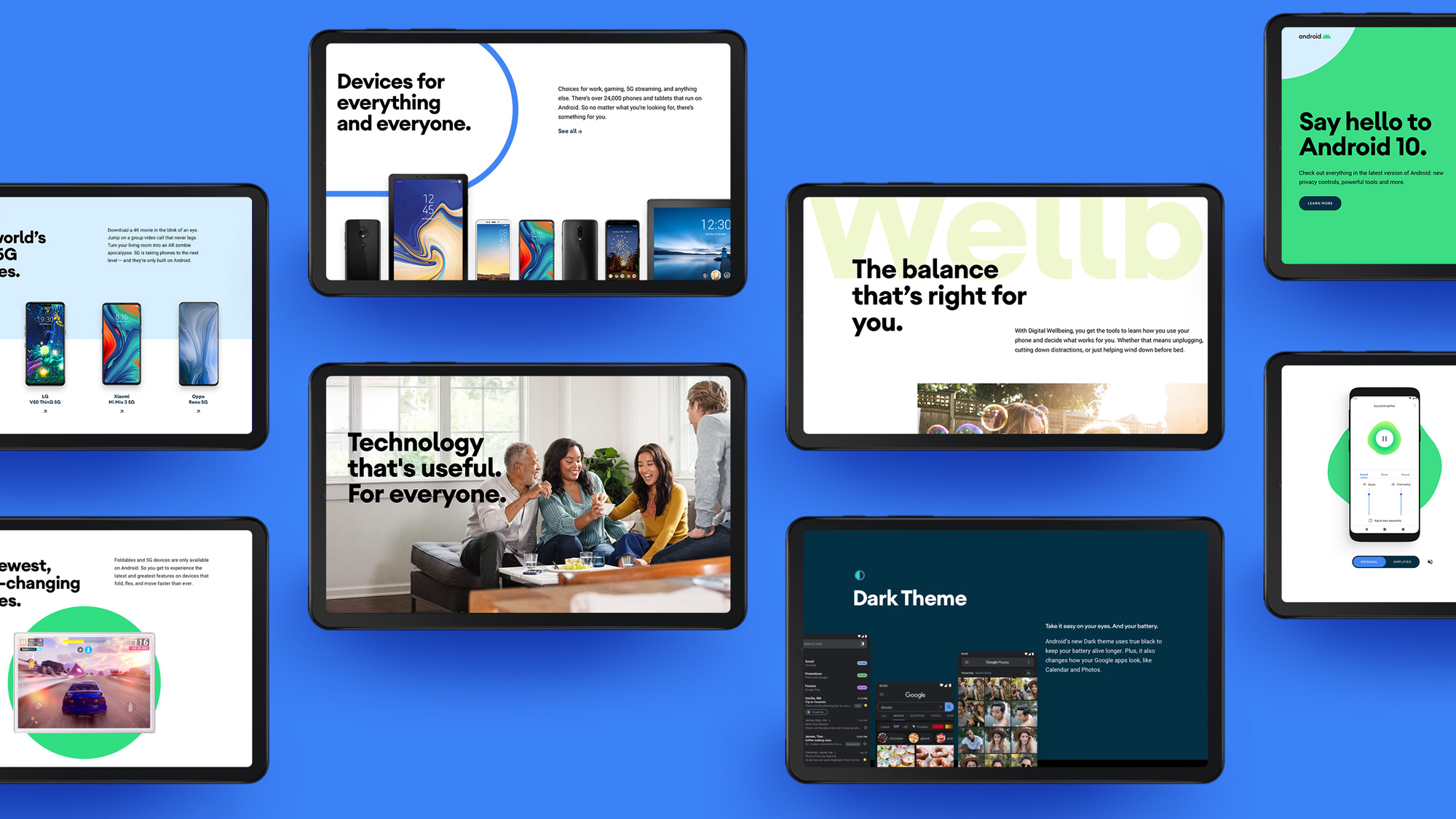
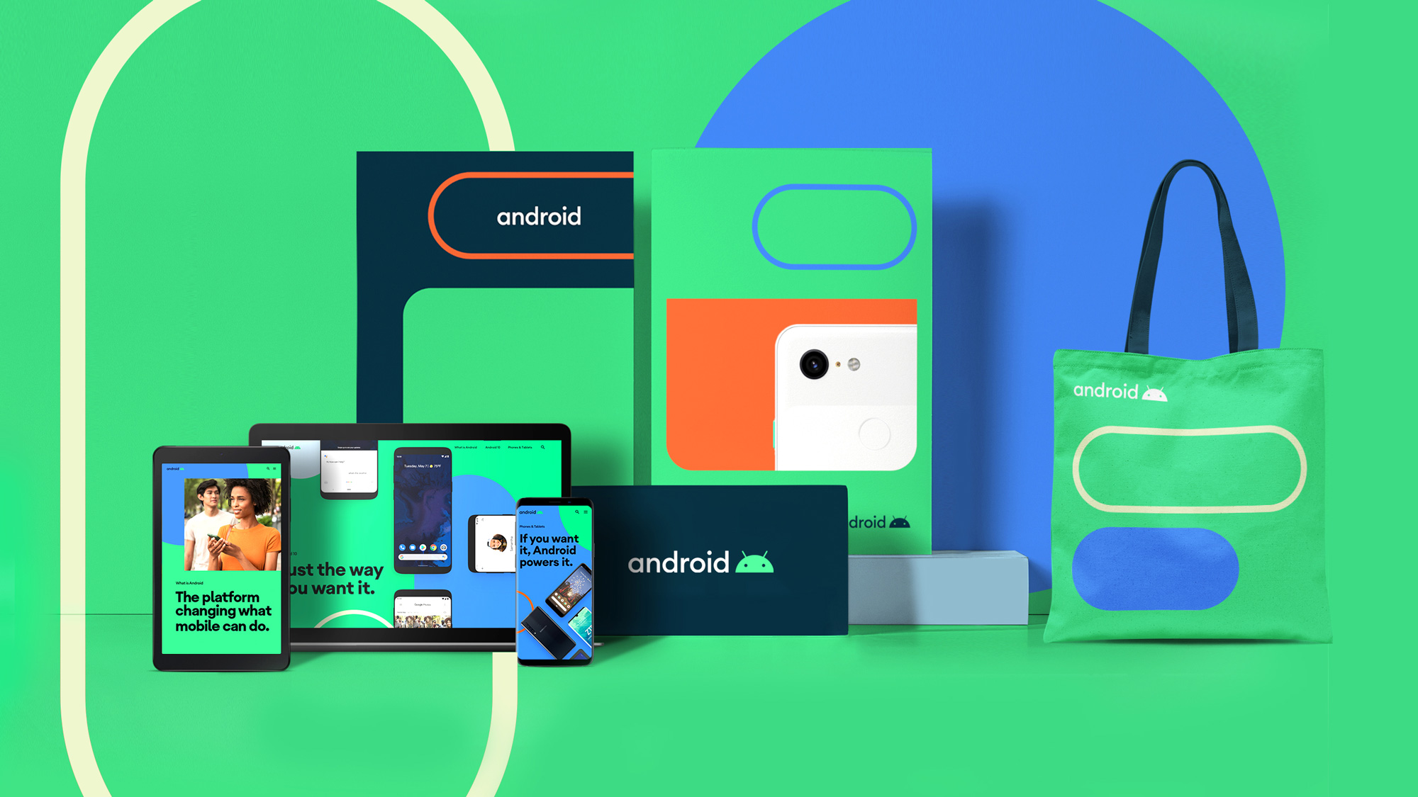
Although the caption above sounds a bit sarcastic, the collection of images do help portray the new visual language and scrolling and browsing through their new website also helps get a sense of how this all plays out which, in a nutshell, is: big, bold, and colorful in execution and cheerful and empowering in feeling. The button-like shapes make for surprisingly interesting compositions that provide a welcome twist to the usual simplicity of most tech identities.
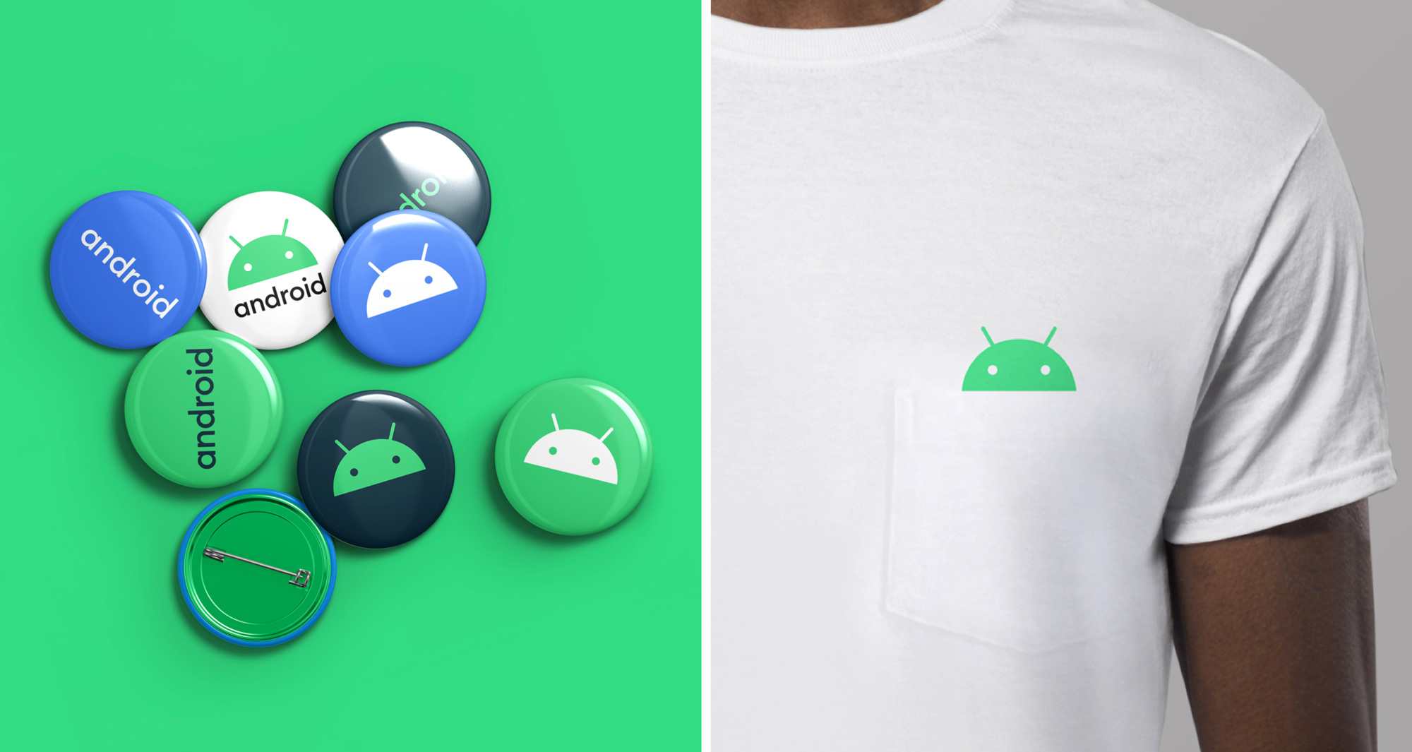
Overall, I find the update vibrant, exciting, and like a playful maturation of the Android brand at a point in its development where it’s pretty much taking over the world — device-wise — and its previously naive design just didn’t measure up to its impact.

 Новости Союза дизайнеров
Все о дизайне в Санкт-Петербурге.