Обзор лучших ресурсов по разработке бренда, разработке упаковки
contact us | ok@ohmycode.ru
contact us | ok@ohmycode.ru
Dating back to 1912, the Iceland National Football Team was first recognized by FIFA in 1946. The team is part of KSÍ (Knattspyrnusamband Íslands for long, Football Association of Iceland in English), the governing body of association football in Iceland, and have enjoyed some success since 2010, including the men’s team first appearance at the UEFA Euro 2016 and the 2018 FIFA World Cup in Russia, which earned them the bragging right of being the smallest country in terms of population to reach the World Cup. The women’s team, which began play in 1981, has yet to qualify for the FIFA Women’s World Cup but they are ranked 19 among the 159 women teams recognized by the organization and have qualified for the UEFA Women’s Euro record since 2009. Yesterday, KSI introduced a new identity for the two national teams, designed by Reykjavík, Iceland-based Brandenburg.
Over the past quarter of a century, the symbol of the national team has been composed of the initials of the Football Association of Iceland (KSÍ) along with a ball and Icelandic flag. This logo has been used both for the association and the national team of Iceland. As the activities of the association have developed and Iceland’s image has evolved and the national team’s achievements have increased, it has become increasingly difficult for the logo to fulfil this dual role. A need has arisen for a logo that can better encompass the fundamental values and essence of the team spirit - a passionate symbol of unity, which draws on our strengths, history and fighting spirit.
The guardian spirits have been the protectors of Iceland since 1918 and are the perfect symbol for the national team. They are symbols of solidarity and defend the stronghold, which other teams fear, our home ground. Their fighting spirit, resolve and perseverance are all-encompassing.
I usually place introduction videos at the end of my reviews as they serve as culminations of the presentation but, in this case, the video is so fucking awesome* it is to the benefit of us all to experience it from the start. I highly recommend watching the Icelandic version first, even if you don’t understand it, because it will give you goose bumps — it’s one of the best-sounding things I have heard all year. I had never thought about the Iceland National Football teams but after this video I am rooting for them non-stop.
* Sorry for the two curse words today. I try very hard to avoid them in general but sometimes they are needed to capture the totality of my emotions and today is that sometime.
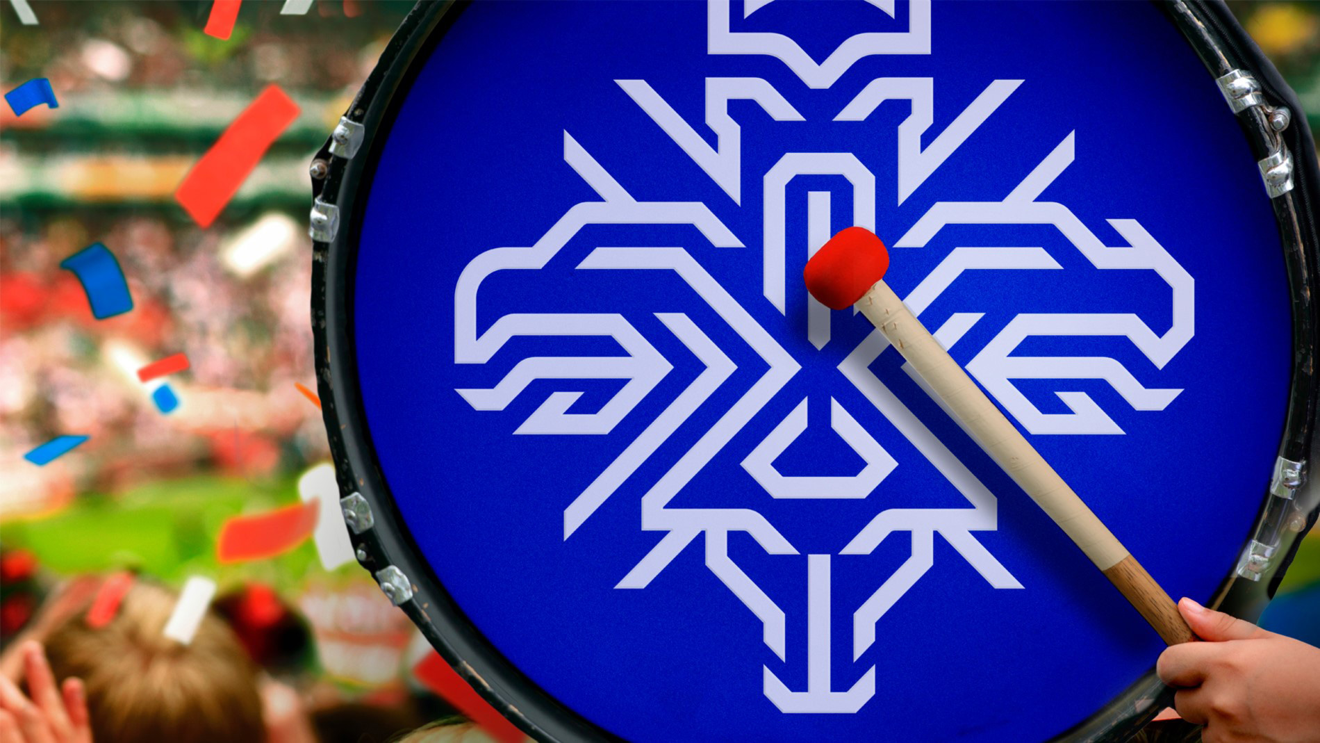
The new logo is a symbol of unfaltering solidarity, inspired by our heritage and formative history, which interweaves Iceland’s guardian spirits in a modern way. Intricate but clear, it is founded on the previous coat of arms - but stands alone as a distinctive symbol of Iceland’s national team.
Modern trademarks need to be flexible and adaptable in a variety of ways. What makes the symbol even stronger is that the guardian spirits can stand alone to form a comprehensive frameworks in certain cases.
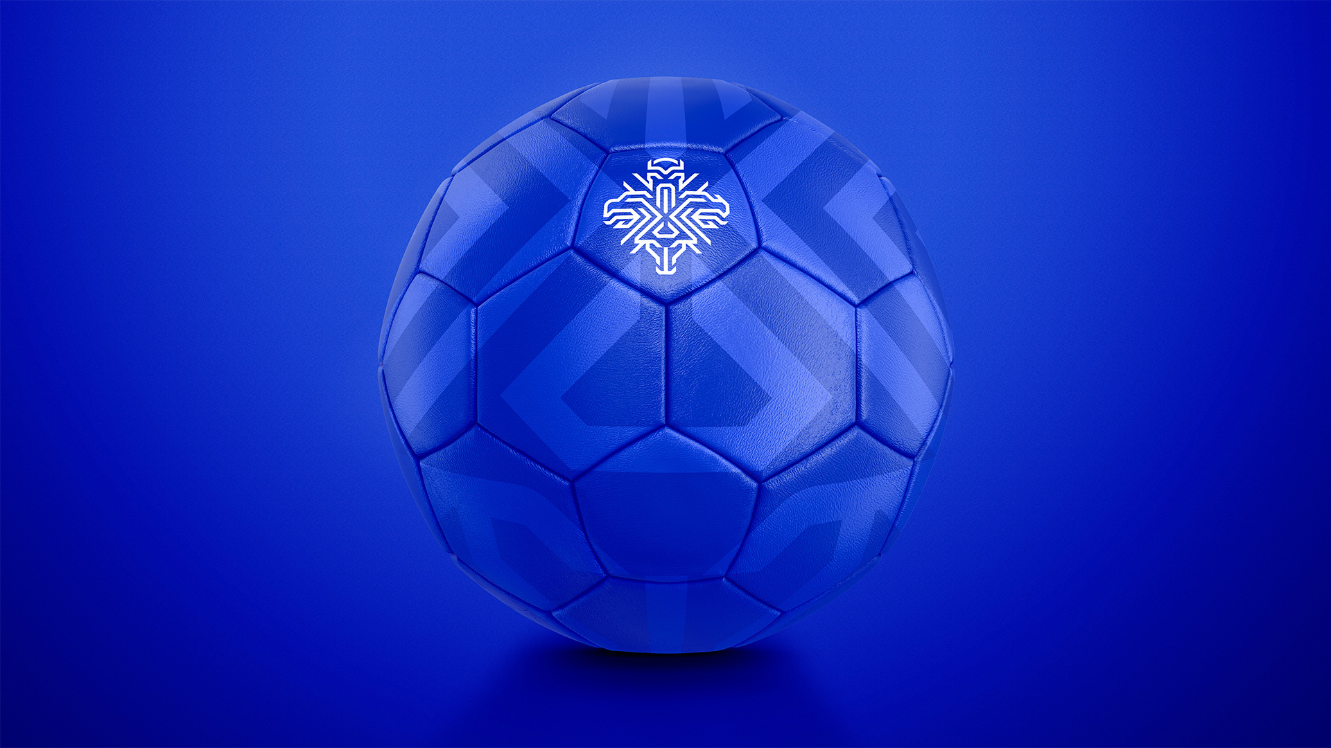
On to the logo… the old one was used by both the national teams and by KSI, which got a pretty nice new logo too earlier this year, so now the two entities have separate logos, which is a good thing as the KSI becomes more of an institutional representation and the teams now have more of an emotional representation. The old logo was more or less fine; if the ball had been rendered a little differently, it could have been better but it was definitely nice how the ball created the accent over the “I”. The new logo is unlike any other national team logo with a fully contemporary representation of their coat of arms — which, by the way, is kind of hilarious with the giant in full chill mode — in a heavily angular style that brings together the four guardian spirits into a fairly aggressive-looking mark. To be honest I don’t think I “like” it but, man, do I respect it. It’s pretty amazing how they were able to build the four characters through a series of straight and 45-degree angles into a single, connected mark. The bull is the hardest read but if you know to look for a bull you see the bull. The giant reads perfectly and I really like how the eagle and dragon are almost symmetrical except for the former’s beak and the latter’s, um, dragon mouth horn pointy thing — sorry, I don’t know my dragon anatomy very well. Long way of saying, it’s bad-ass.
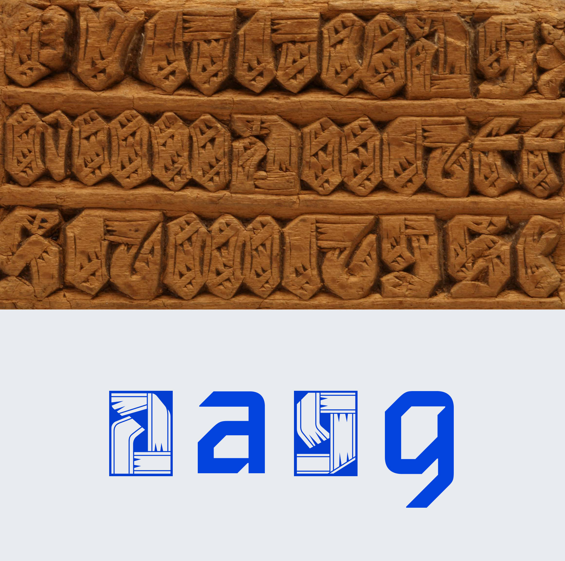
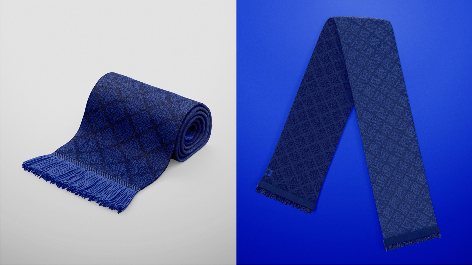
To strengthen the trademark, a bespoke typeface was created, with unique lower case letters. The typeface draws inspiration from Icelandic crafts and the result is a distinctive blend of old traditions and modern styles. The font will play a key role in implanting our logo and image in the minds of people around the globe.
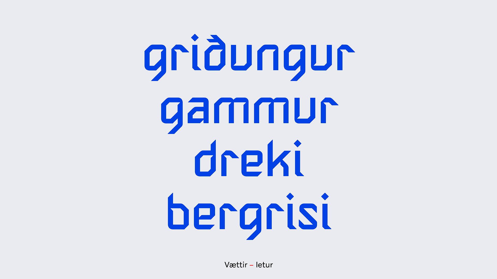
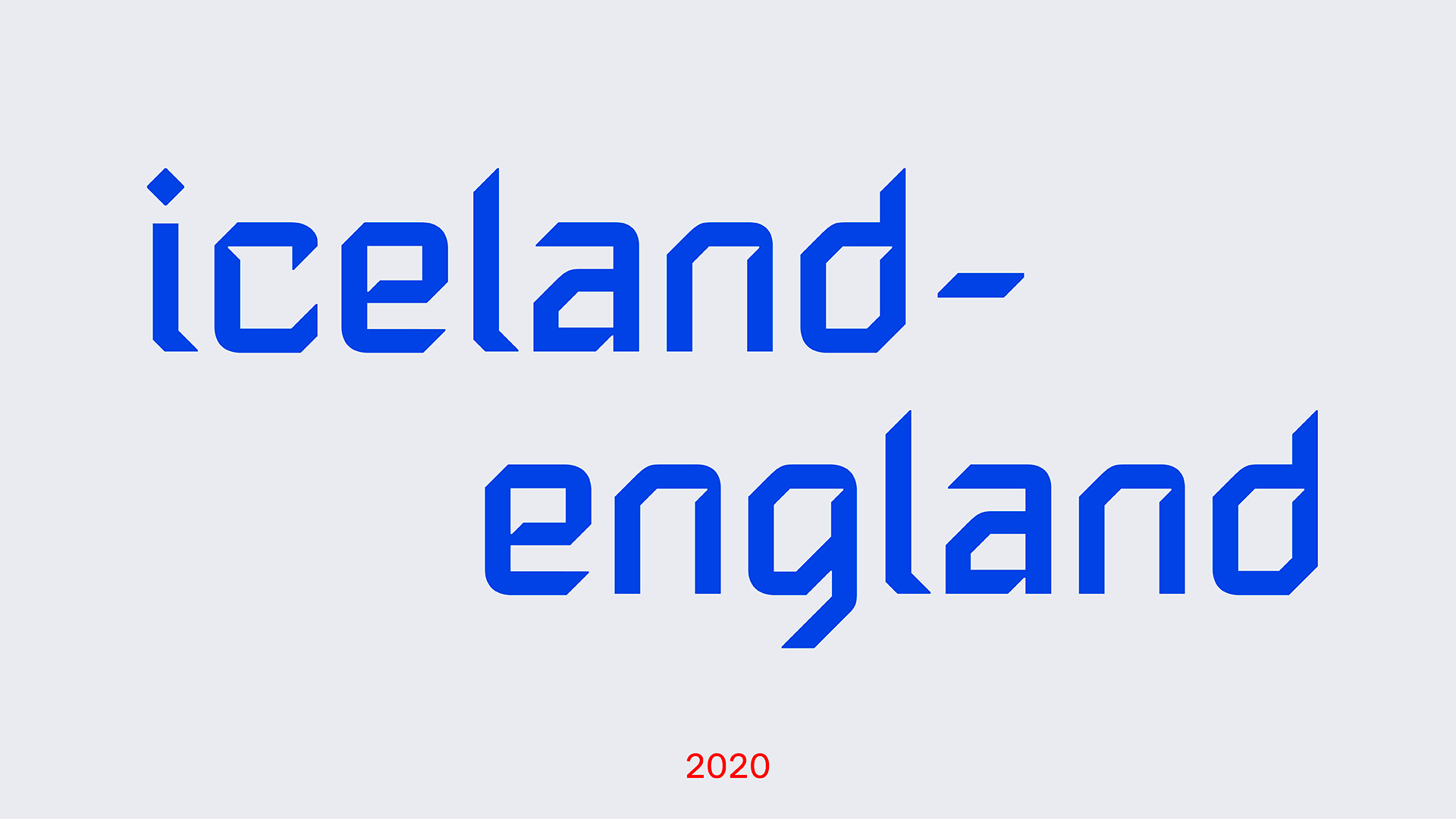
The custom typeface is kind of terrible but I actually love it in all its awkwardness and spikes going in all kinds of directions. There is something about it that makes it much more engaging than the usual spike/counter-spike sports typography. And I’m dying to see what they do with the below decorative version.
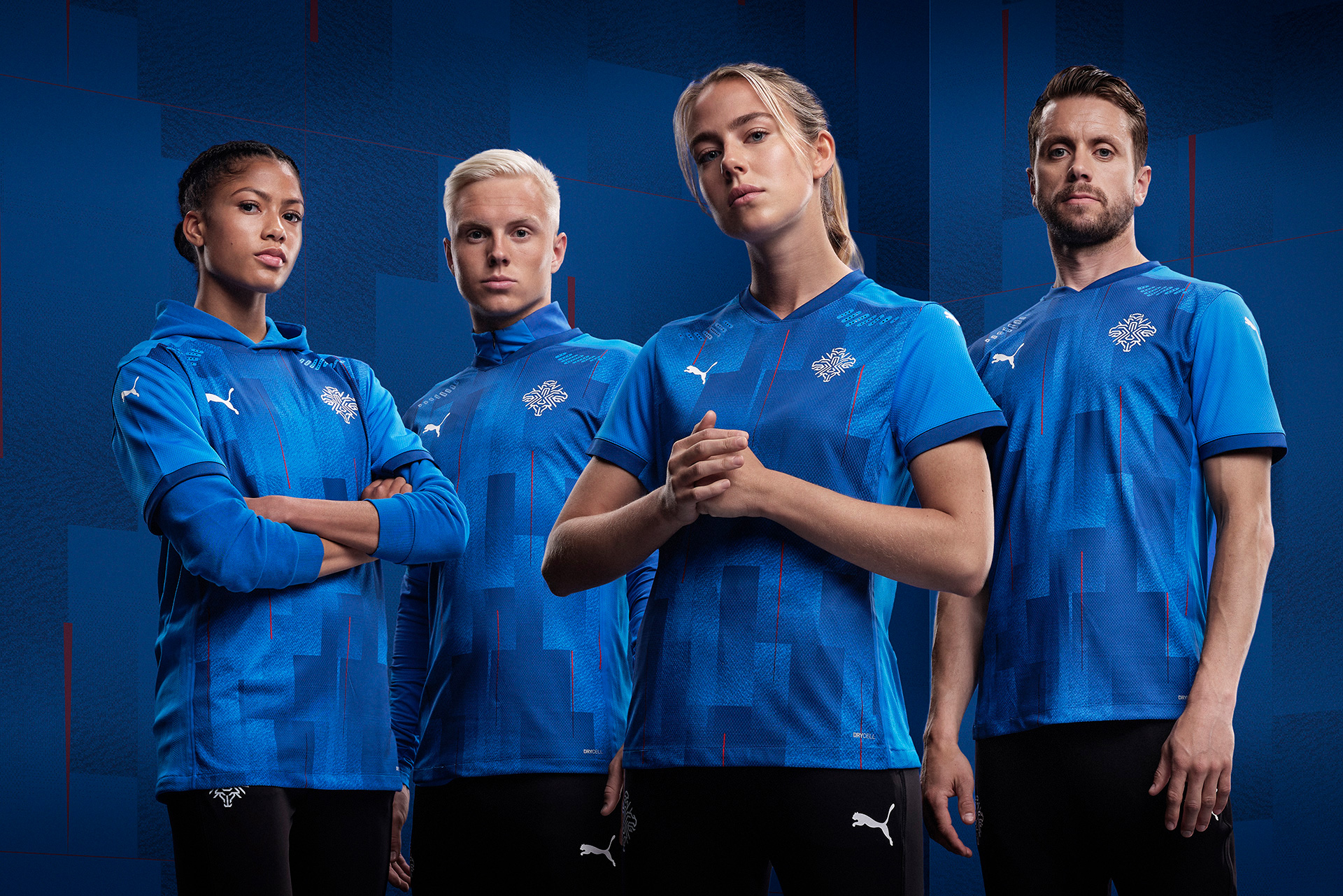
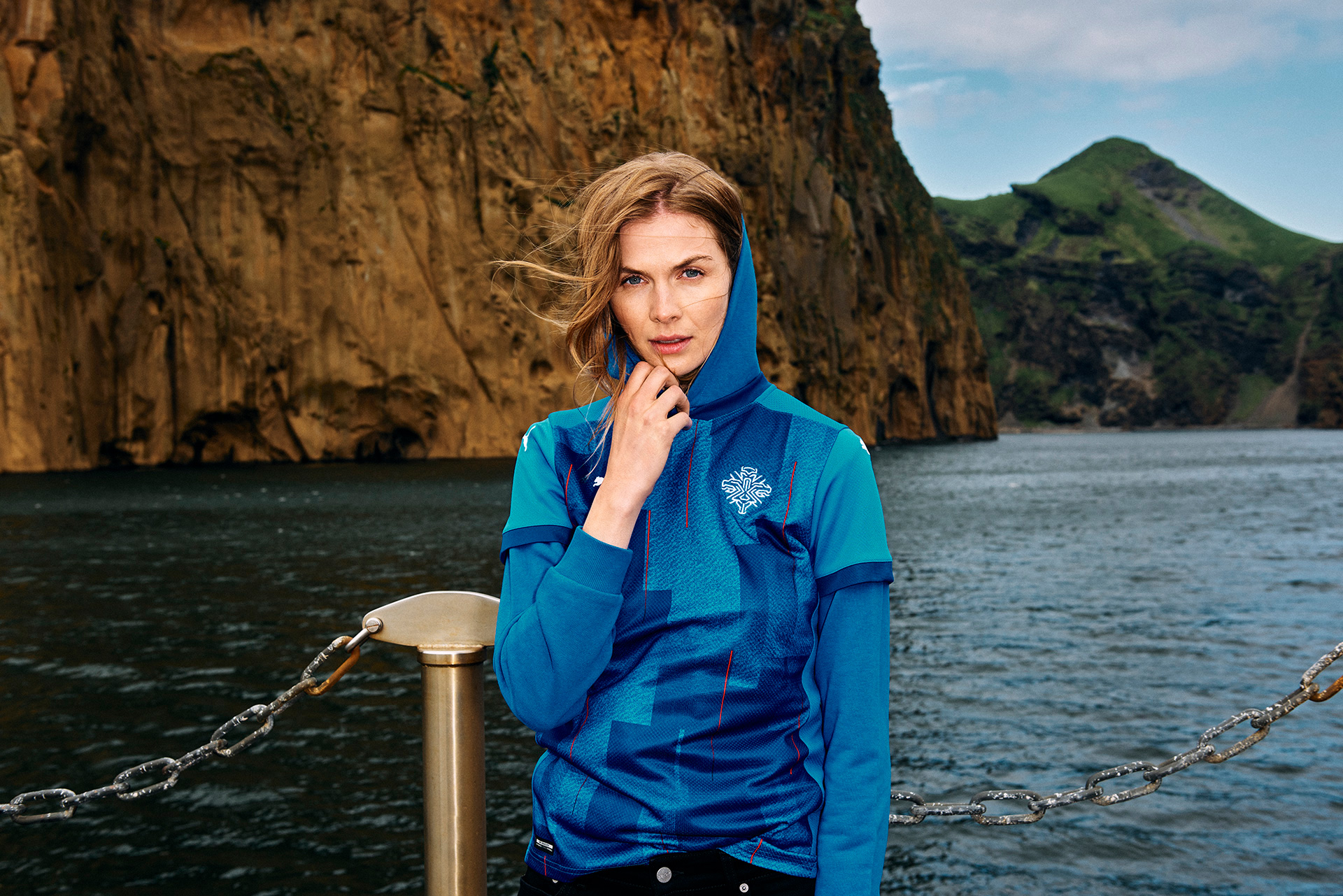
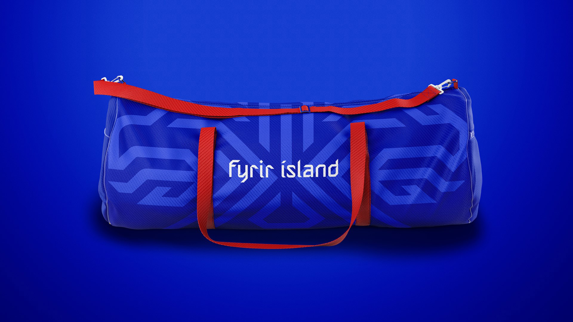
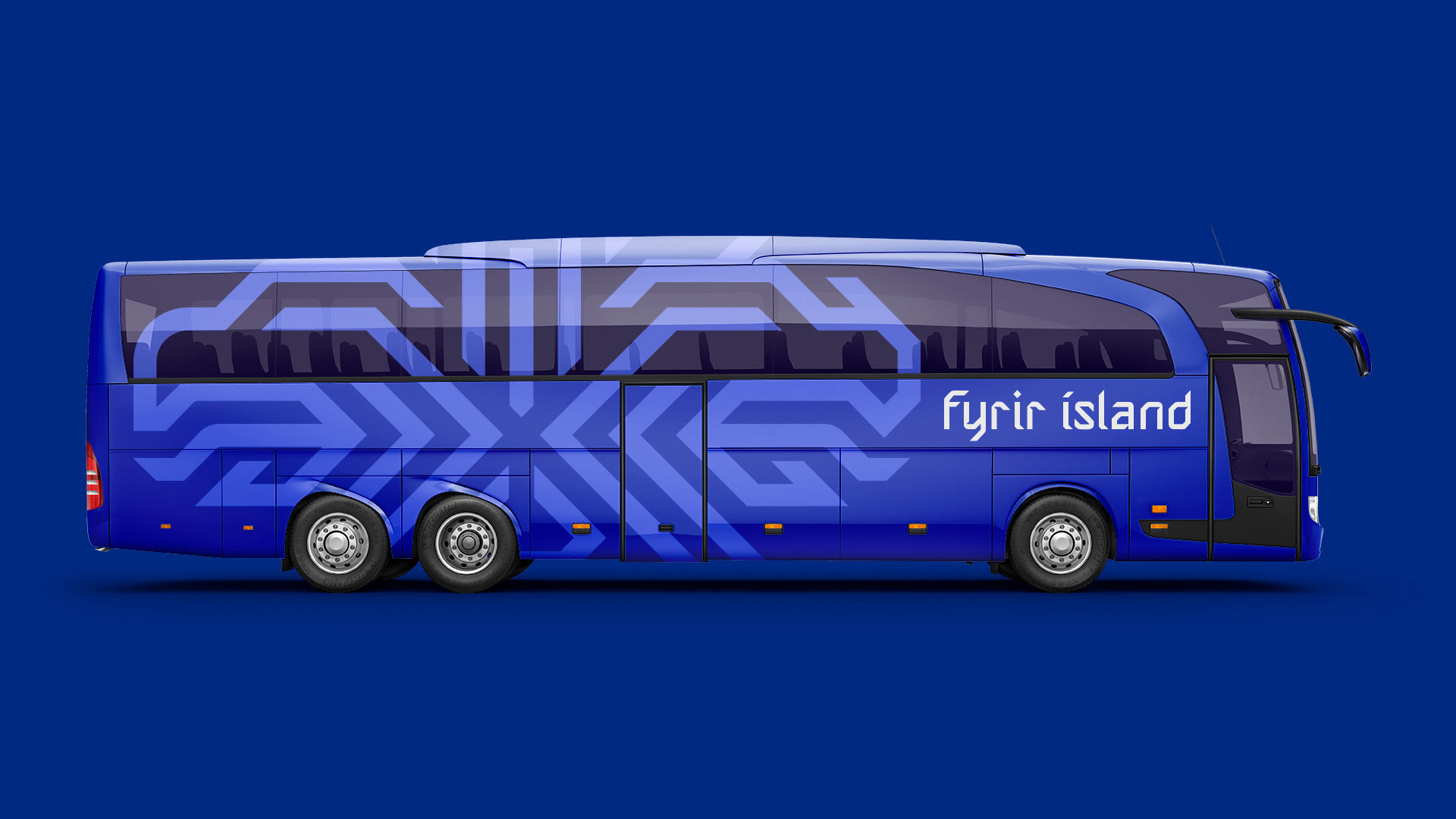
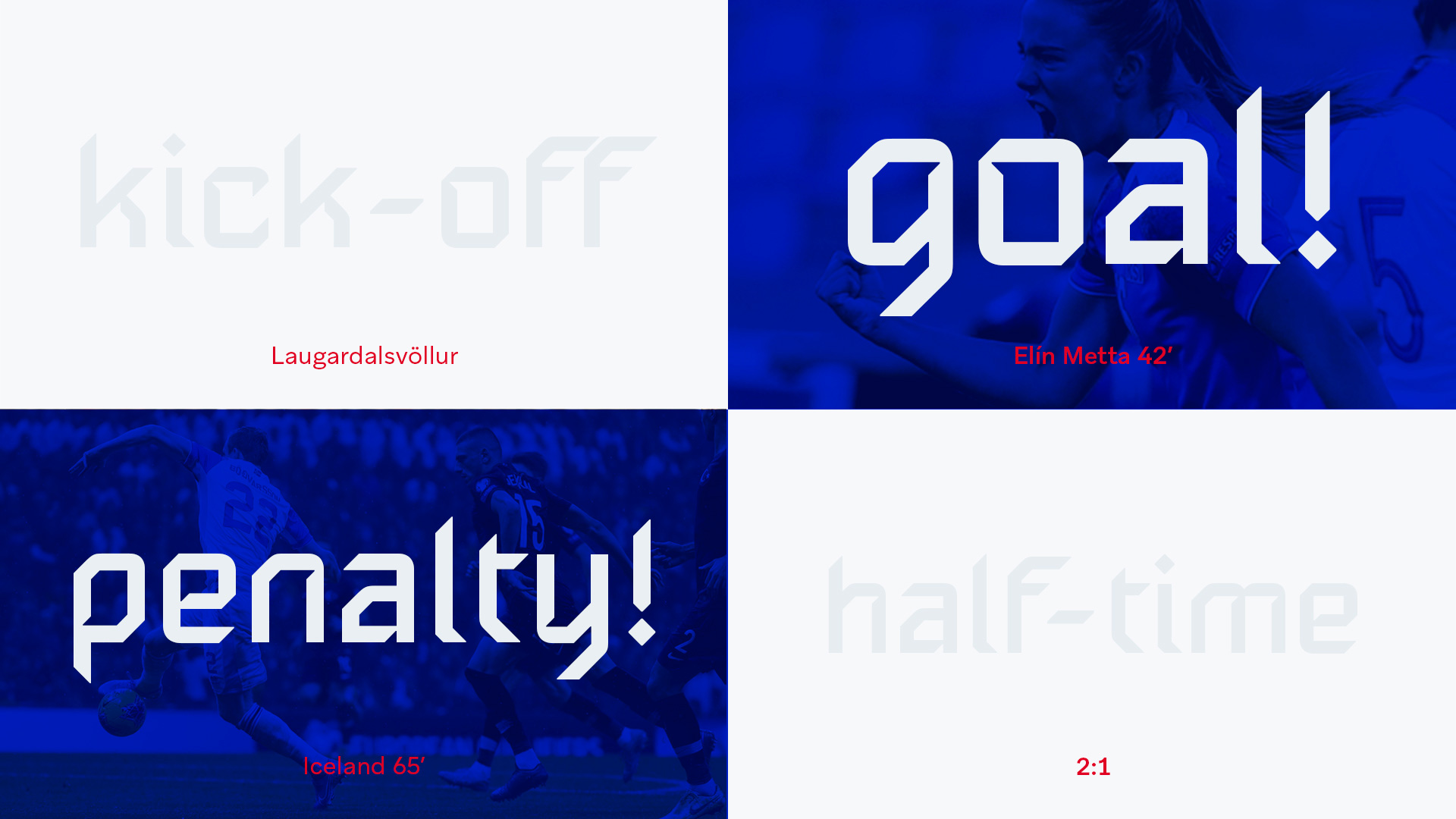
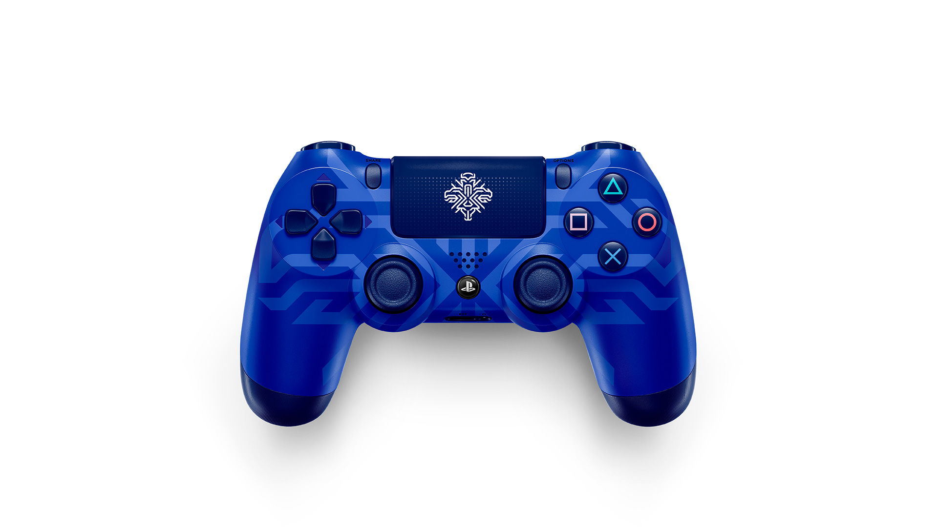
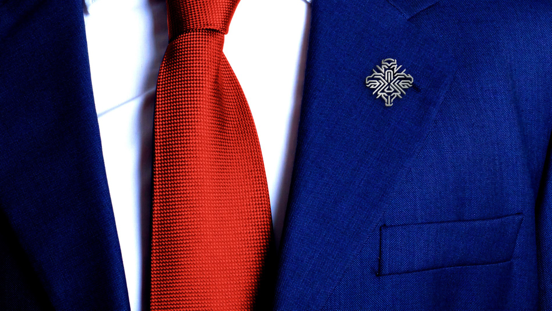
There is not much to the application, it’s the logo small on blue backgrounds or the logo big and ghosted on blue backgrounds or both together on blue backgrounds and if you complain about it one of the four guardians will smack sense into you. In general, like the logo, I don’t like it-like it but I happily admit it just looks great. There might be way too much of that blue… some white backgrounds will be welcome now and then.
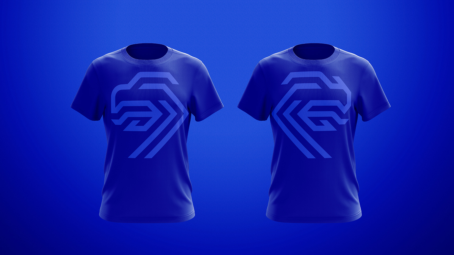
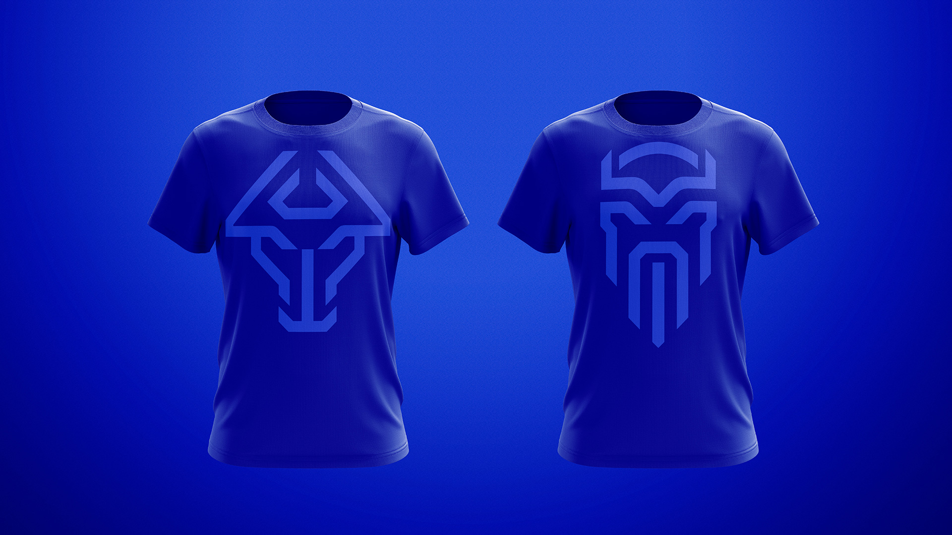
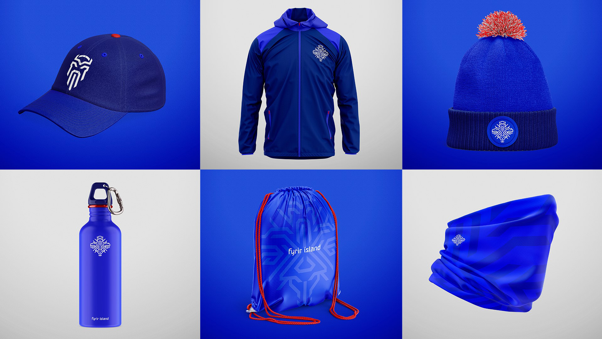
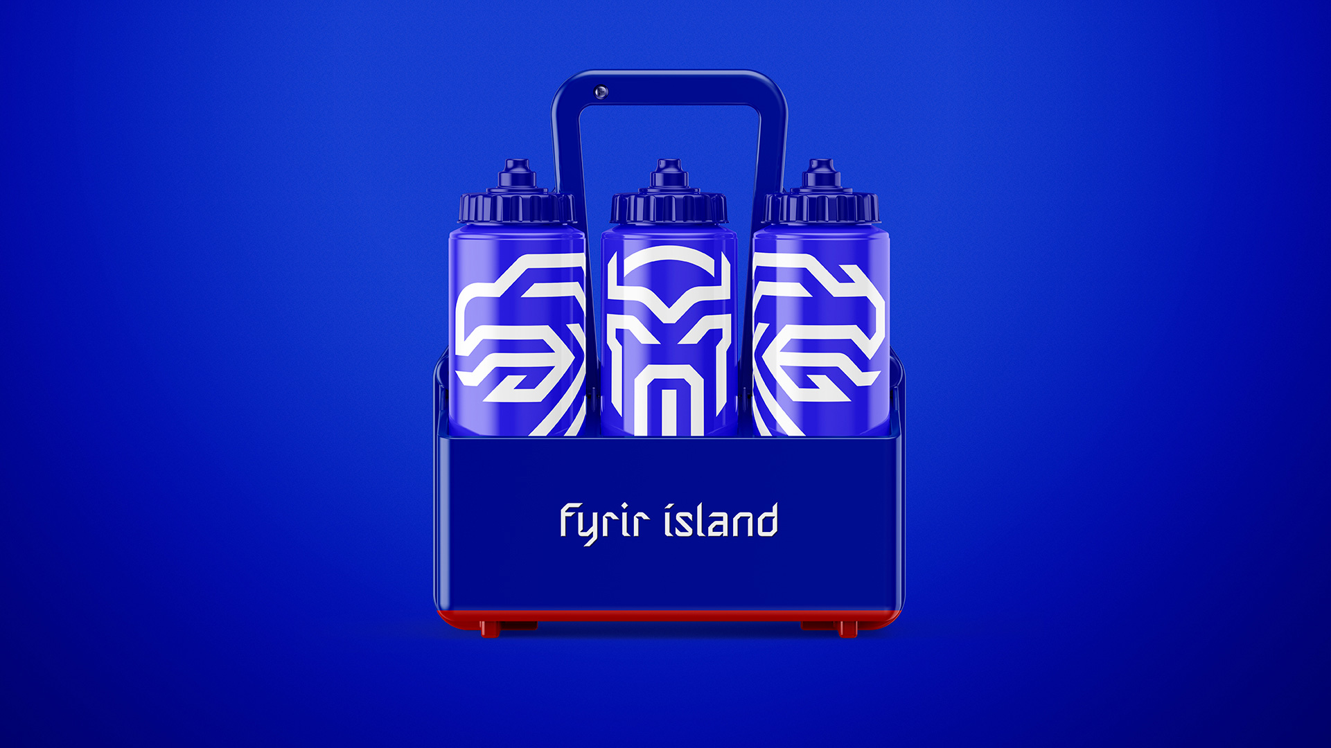
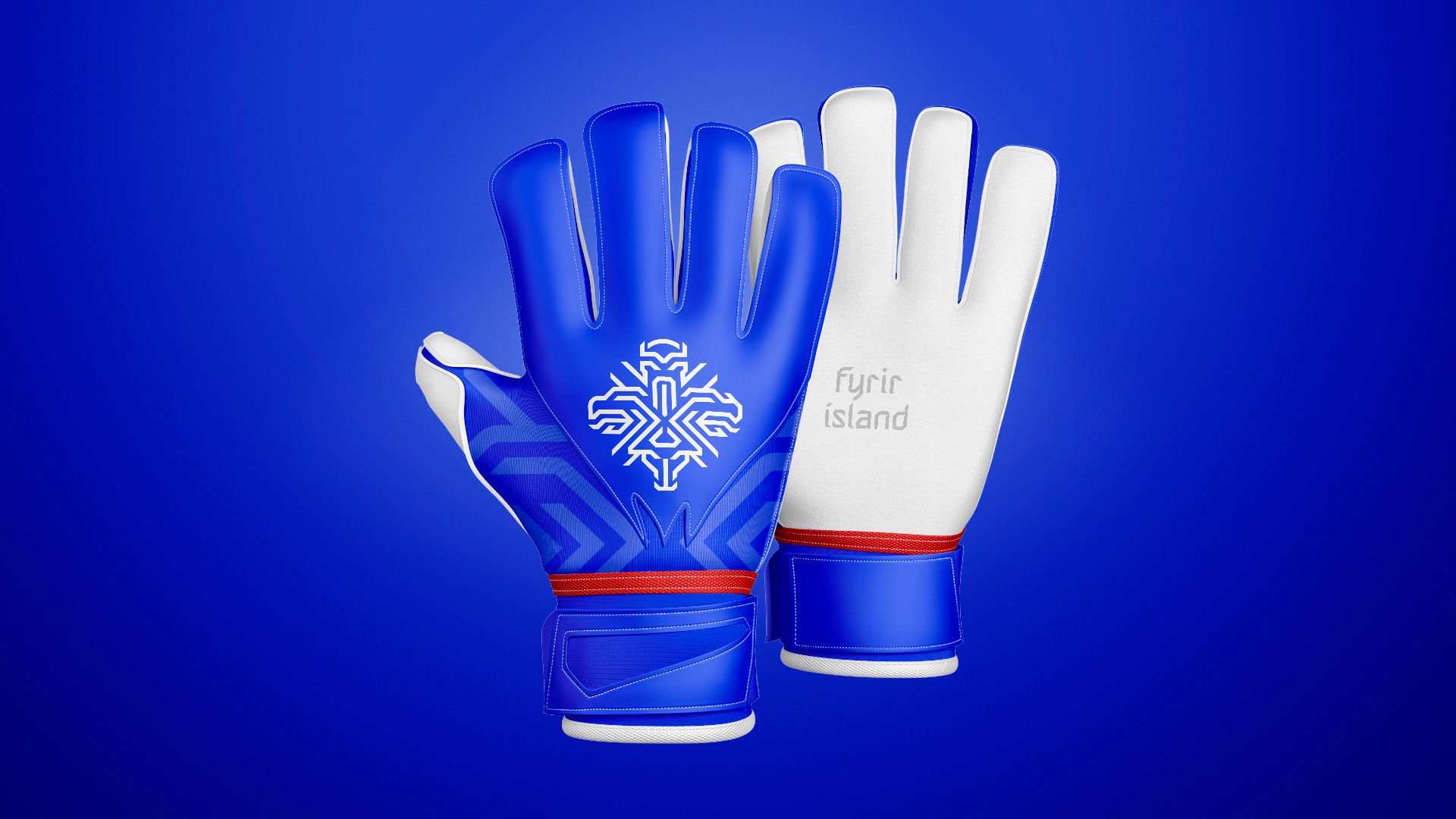
The option of creating guardian-specific swag is great because the merch options basically multiply by four, giving everyone something to choose or to collect them all.
Overall, this is such a great and unexpected national team logo and I think what it does best is to establish the Iceland National Football teams as young, up-and-coming competitors looking to the future as opposed to most national teams’ use of traditional crests and logos that rely on history and tradition alone holding on a little too tightly to the past. Go guardian spirits!
Thanks to Paul Richard Cook for the tip.
 each year since publication began in 2006

 Новости Союза дизайнеров
Все о дизайне в Санкт-Петербурге.
Новости Союза дизайнеров
Все о дизайне в Санкт-Петербурге.