Обзор лучших ресурсов по разработке бренда, разработке упаковки
contact us | ok@ohmycode.ru
contact us | ok@ohmycode.ru
First broadcast in 2008, Fama, ¡a bailar! (“Fame, let’s dance!” in English) is a reality TV competition show in Spain where 16 participants, competing in pairs, enter a “dancing academy” to learn different styles of dancing with the final pair not eliminated taking a €30,000 prize. It is loosely based on the 1980 movie Fame that “chronicles of the lives of several teenagers who attend a New York high school for students gifted in the performing arts” (of which there was a remake in 2009). The show played for seven seasons until 2011 and after a seven year hiatus returned this March to Movistar and has two weeks left before the finale. The new identity for the show was designed by Madrid, Spain-based erretres.
‘Fama A Bailar’ by Movistar+ is based on concept of quality, rigor and authenticity, with dance as a universal value and the success of the dancer being the result of talent and hard work. Movistar+ sought a universal audience, with young people as the core target audience. Both the strategic concept and visual identity were developed to communicate the values of effort, progress, youth and quality.
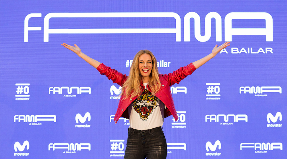
The ‘Fama A Bailar’ campaign strategy started with an umbrella concept: the fame is inside you - let it free. We synthesised this concept into a campaign tagline with the power to express an emotion both universal and personal, connecting the value of dance with that of the brand. This directly appeals to the entire target audience, and integrates the phrase into every instance of the campaign’s application. “Fama Vive en Ti” is a flexible concept, able to adapt to the needs of the extensive range of large-scale and social media applications.
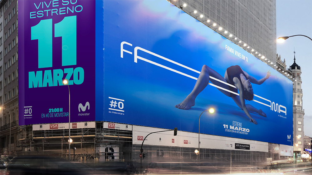
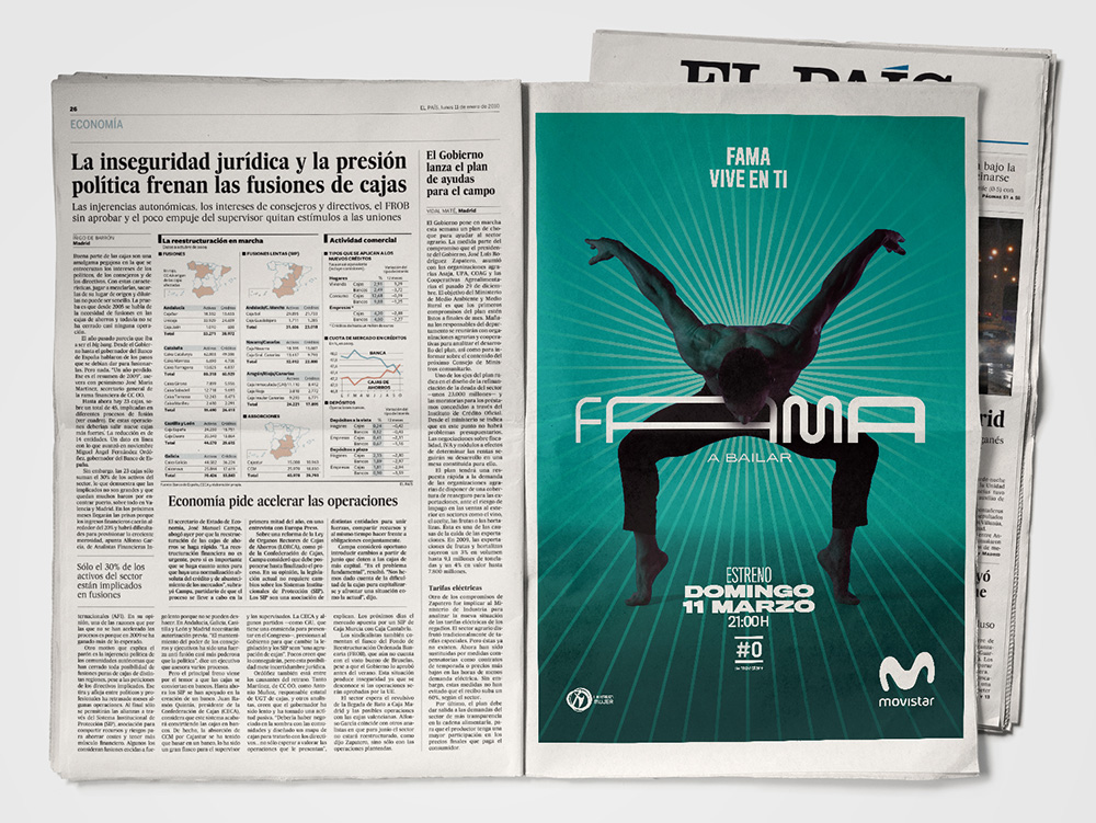
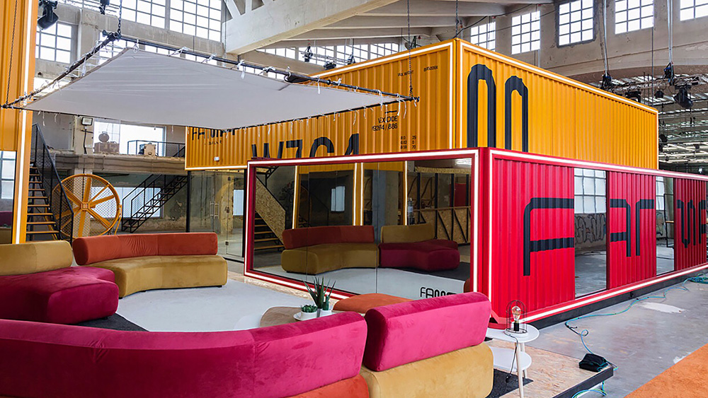
The old logo was based on the movie posters but modified in a way, it looked like, that minimized the chances of getting sued. Close enough to trigger an association but crappy enough to look like its own standalone thing. The new logo is a complete departure that signals the rebirth of the show with a decidedly more contemporary aesthetic. The logo is a geometrically-driven wordmark with an elastic structure that allows its letters to stretch, bounce, and rearrange themselves as a way to convey dance and movement. It’s a decent concept but the logo (and how it stretches) feels oddly stiff. Like, of all the ways to convey dance, this was the least fluid. It’s the equivalent of the Sprockets dance. Nonetheless, there is also something interesting about it, especially in static form, when the elasticity is widely exaggerated as in the image above. Like the old logo, the “a bailar” piece of the puzzle isn’t fully resolved and feels tacked on. I am guessing everybody calls the show “Fama” so it’s not a huge deal.
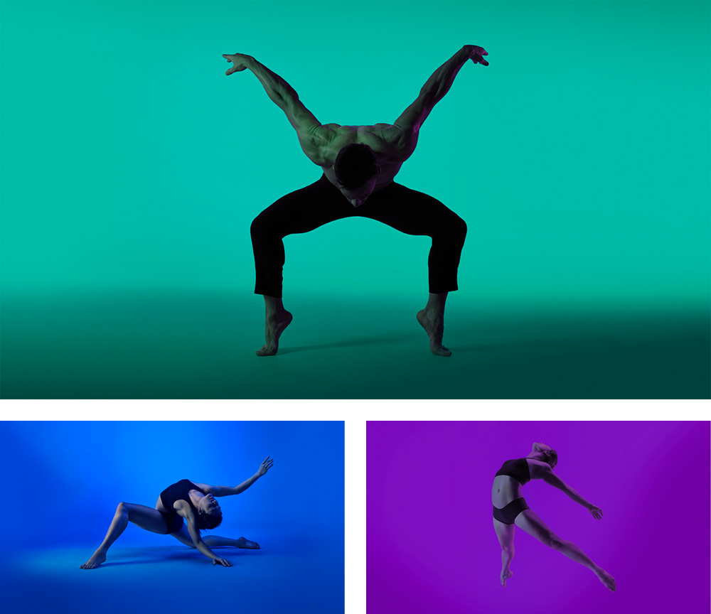
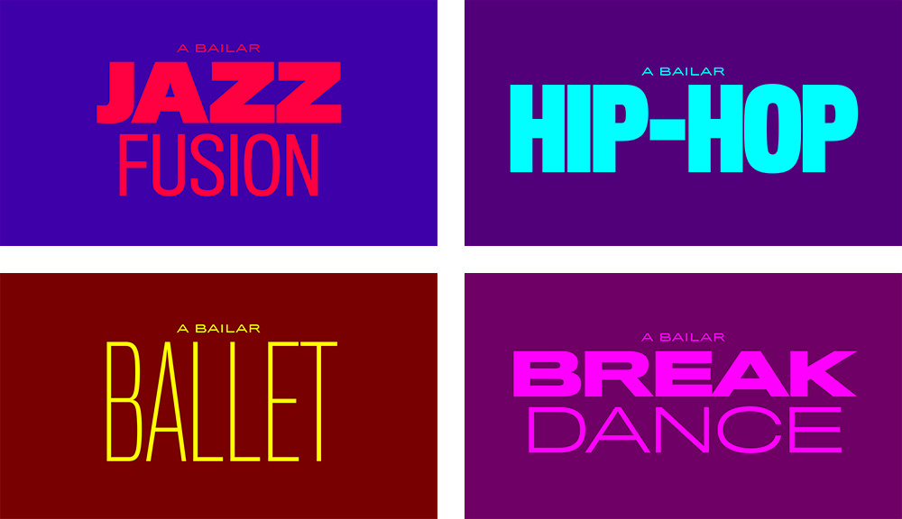
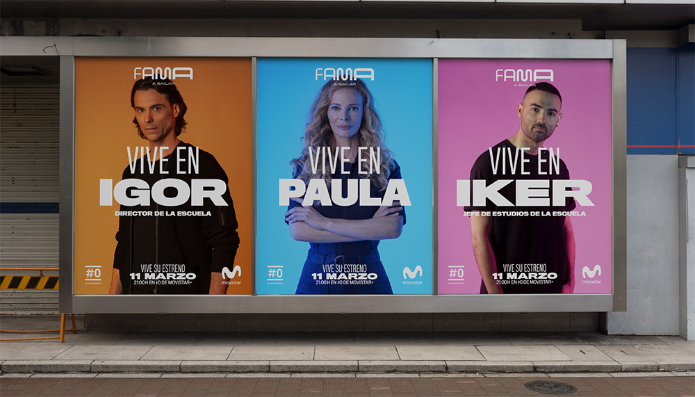
The identity is composed of custom photography that is fairly attractive, engaging, and nicely hued on each individual shot that is then paired with a mix of wide and condensed sans serif typography. I kind of like the type treatments but I feel like they clash heavily with the logo. They do do a good job of integrating the “a bailar” part, building it into sentences (like “A bailar Ballet / let’s dance ballet”). The color combinations can be a little jarring.
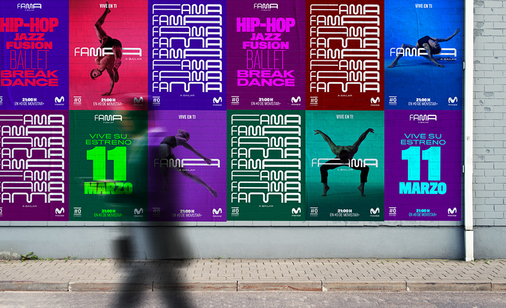
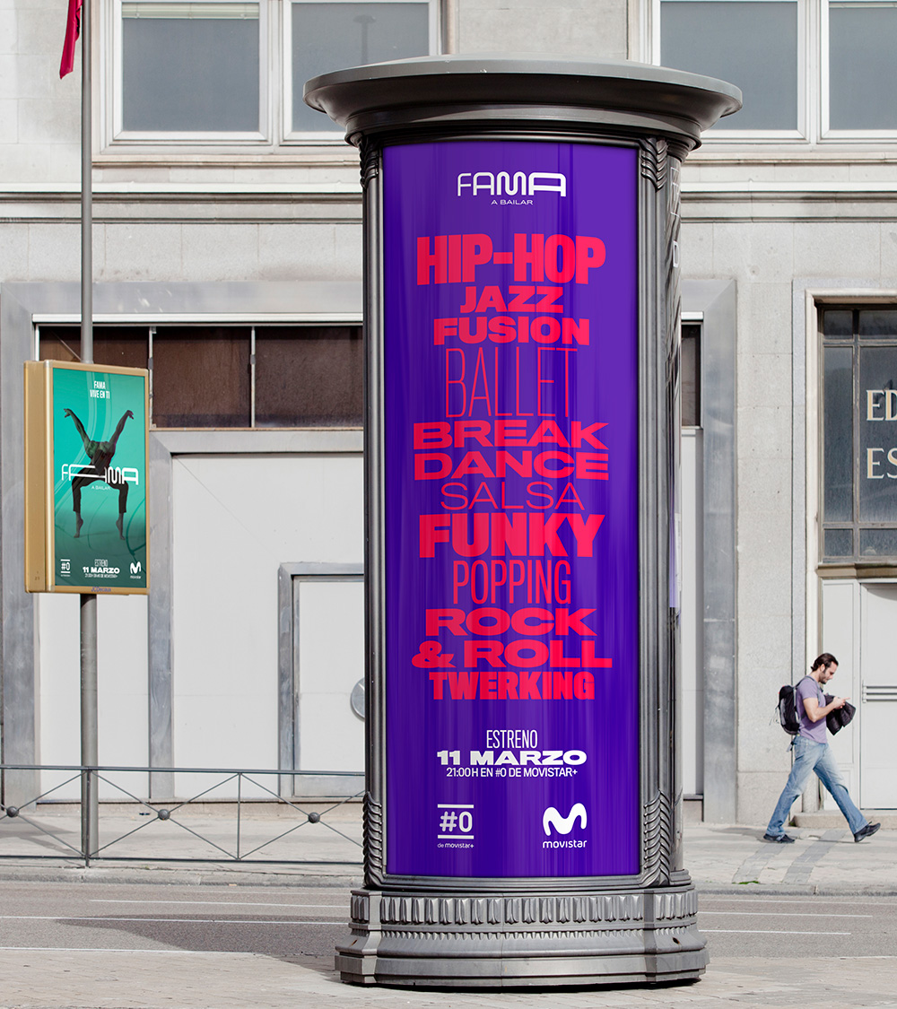
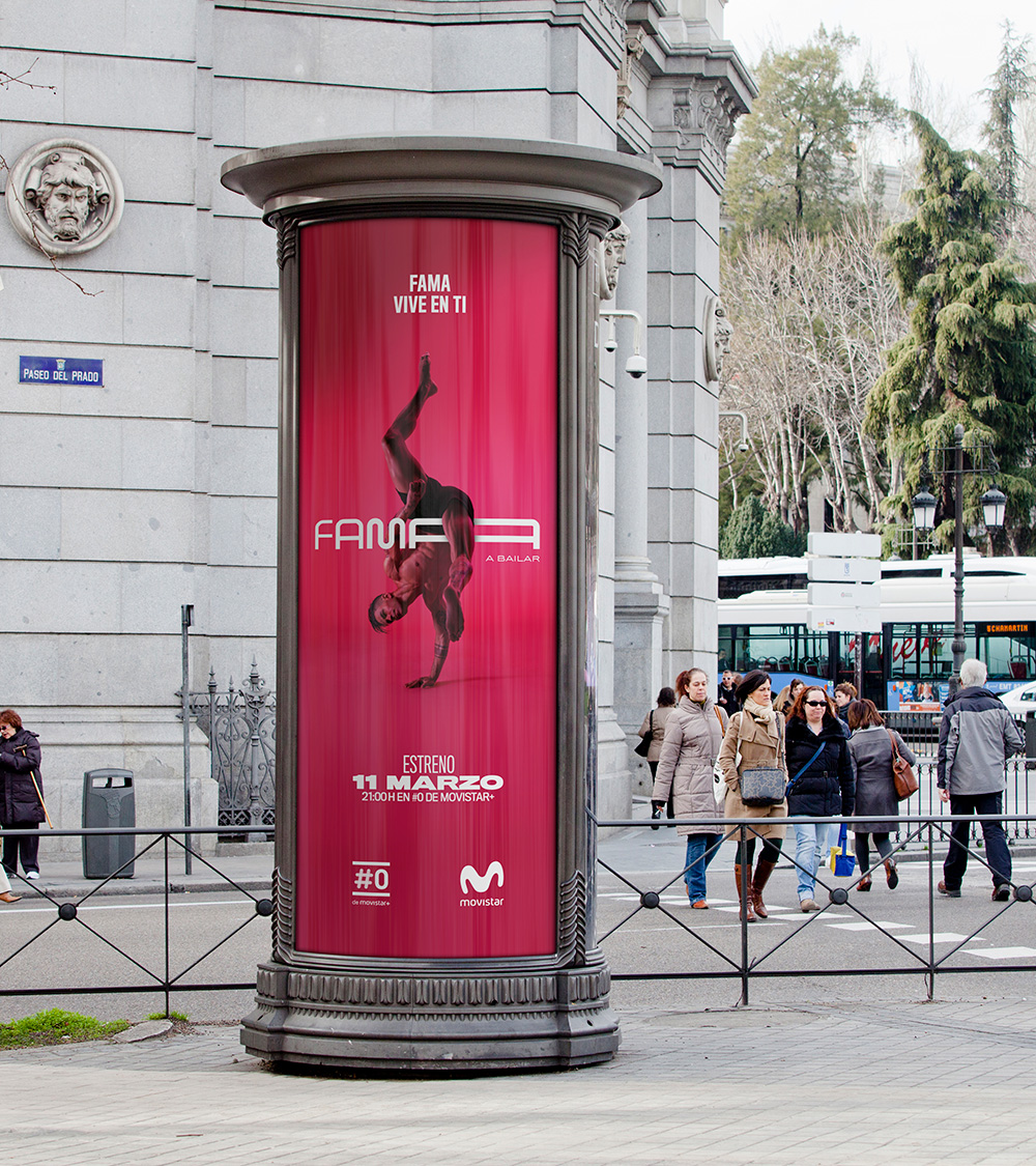
The applications are kind of interesting. The energy is certainly palpable but it also feels like way too many things in too many approaches thrown into the posters to see what, if any, sticks with the audience.
Overall, this is a TV show so it doesn’t have to be the most cohesive, full-fledged identity program in the world and its main job is to generate a sense of excitement and gather as many viewers as possible, which I think the logo and campaign do well and help build a visual ecosystem around the show. It doesn’t quite make me want to stop writing this sentence and break into dance but, I’ll also admit, that Flashdance could be playing in the background at full volume and I would still be able to finish writing this se

 Новости Союза дизайнеров
Все о дизайне в Санкт-Петербурге.
Новости Союза дизайнеров
Все о дизайне в Санкт-Петербурге.