Обзор лучших ресурсов по разработке бренда, разработке упаковки
contact us | ok@ohmycode.ru
contact us | ok@ohmycode.ru
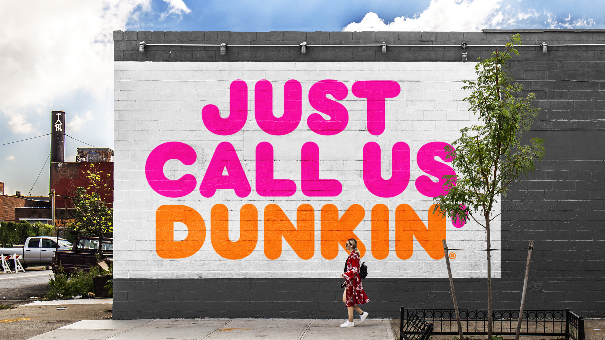
Established in 1950 with a single store in Quincy, MA, Dunkin’ Donuts is the world’s biggest baked goods and coffee chain with more than 11,300 restaurants worldwide — 8,500-plus in the U.S., 3,200-plus across 36 countries. This week, the company announced it would be changing its name to Dunkin’, dropping the Donuts part. For the record, it will still sell donuts. A new identity has been designed by Jones Knowles Ritchie, as part of Dunkin’s new agency appointments along with BBDO New York and Arc Worldwide.
The new branding conveys the company’s focus on serving great coffee fast, while embracing Dunkin’s heritage by retaining its familiar pink and orange colors and iconic font, introduced in 1973. Beginning the first of the year, the new branding will appear on packaging, as well as the company’s advertising, website and social channels. Going forward, the new “Dunkin’” logo will also be featured on exterior and interior signage on all new and remodeled stores in the U.S. and, eventually, internationally. The brand tested the new logo extensively, including on exterior signage at Dunkin’ locations featuring its next generation design concept over the past year.
Retaining the familiar pink and orange colors and iconic font that were introduced in 1973, the new branding will appear on packaging, as well as the company’s advertising, website, and social channels. The new Dunkin’ logo will also be featured on exterior and interior signage on all new and remodeled locations in the U.S. and, eventually, internationally.
I’m taking a not-too-wild guess that one of the key drivers of this change was the popularity of Dunkin’s coffee offering and avoiding any possible confusion to new customers as to whether only donuts are served. They remedied this in the early 2000s when they annexed a coffee cup to the wordmark but it has always looked like an unfortunate appendage to what is otherwise a new-classic American logo. Now there is no more coffee cup. And no more “Donuts”. Just Dunkin’. The biggest update to the logo is making the apostrophe pink in keeping with the well-known color palette. Any major changes — made at the same time as dropping “Donuts” — would have probably yielded catastrophic backlash. So, all things considered, this new logo is pretty great. The challenge is wrapping one’s head about the name change.
Unlike yesterday’s WW Weight Watchers post — where “WW” is a name no one calls Weight Watchers — there is plenty of precedent for “Dunkin’ Donuts” being called “Dunkin’”, starting with its well known slogan, “America Runs on Dunkin’”, which was introduced in 2006 and, although, I don’t frequent Dunkin’ Donutseses, or hang around an office where donuts are brought in on the regular, I have heard enough references to Dunkin’ Donuts as Dunkin’ — and even in my head I’ve referred to it as that — so it’s in no way a stretch. They are simply making it official. It’s probably also a benefit in the minds of health-conscious consumers who might feel wrong about getting coffee from a place where 300-plus-calorie goods are sold, it’s as if the coffee will fatten you by extension. No donuts, no calories. Win win.
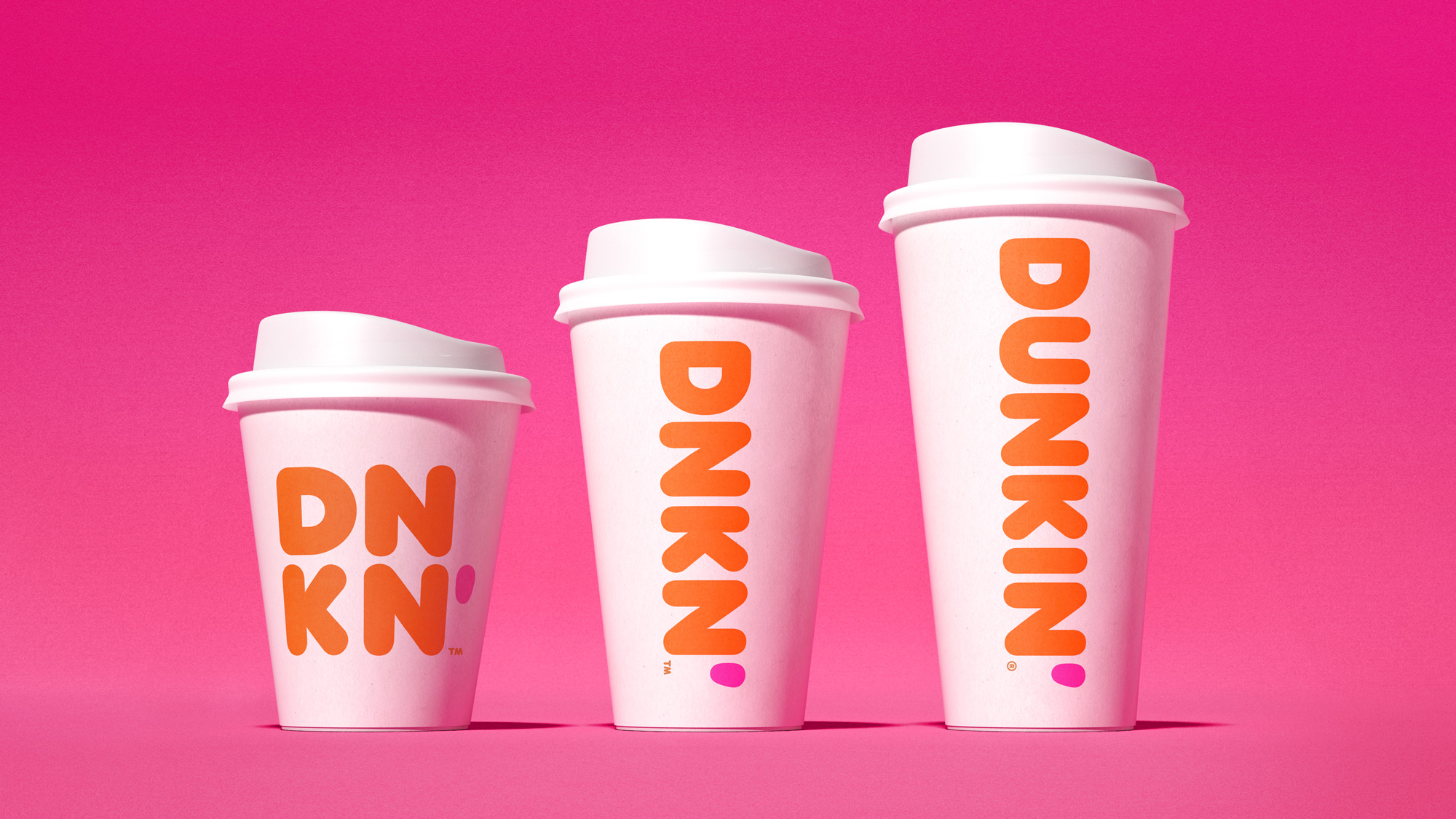
Where they might be pushing their luck is shortening Dunkin’ to DNKN’. I kind of like the boldness of it and it’s undeniably recognizable but I wonder if it somehow hurts the brand at this point — like, what else is going to go missing? They lost not just “Donuts” but also all the vowels? I’ll admit, though, those cups look great.
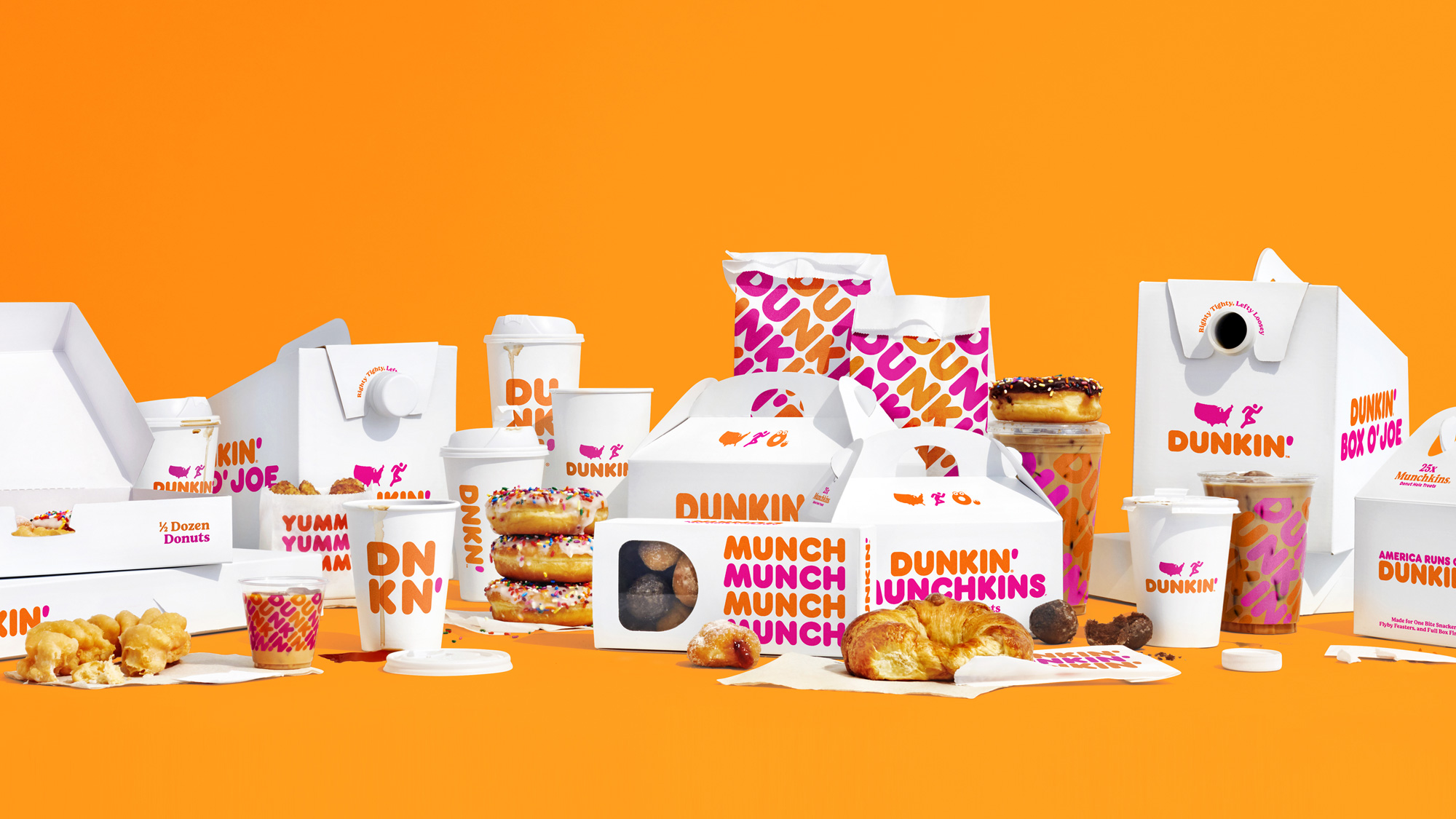
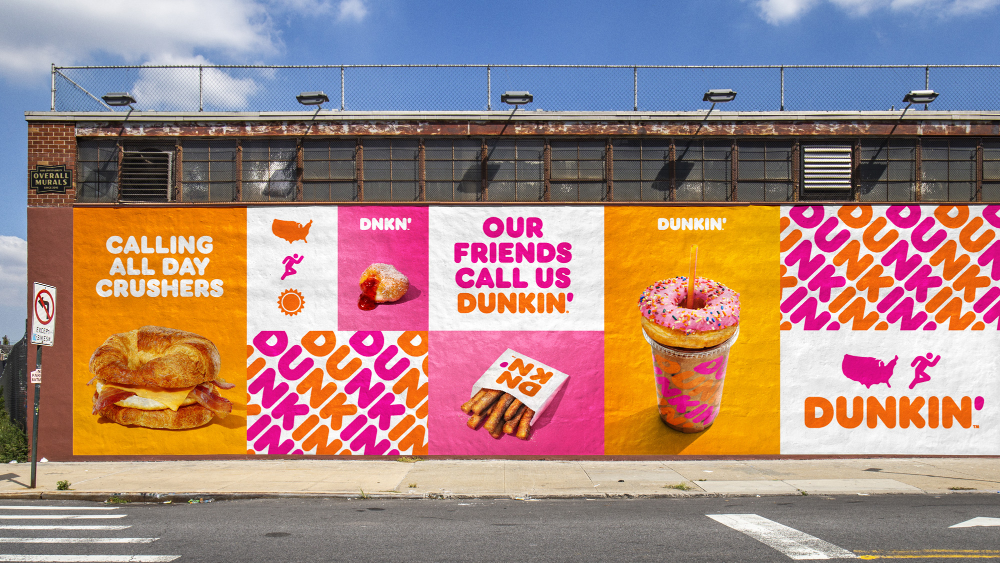
The rest of the packaging and graphics are not a drastic change but instead build on the rounded sans serif visual language that has been in play for many years and they now double down on it with a little more simplicity. The instances where the type goes at a 45-degree angle in a pattern are really nice. Overall, this update positions Dunkin’ somewhere between the higher-end aesthetics of Starbucks and the accessibility of McDonald’s — if you ask me, that’s a pretty sweet spot to be in. Adopting a single-word name will increase the brand’s flexibility as it continues to dominate its market and, probably sooner than you think, will most like spawn lifestyle-ish apparel and other covetable items that I don’t think would have been possible with “Donuts” weighing it down.
Thanks to Mitch for the tip.

 Новости Союза дизайнеров
Все о дизайне в Санкт-Петербурге.
Новости Союза дизайнеров
Все о дизайне в Санкт-Петербурге.