Обзор лучших ресурсов по разработке бренда, разработке упаковки
contact us | ok@ohmycode.ru
contact us | ok@ohmycode.ru
Established in 1821 (originally as Manchester Guardian until 1959), The Guardian is a British newspaper with an approximate circulation of 146,000 and a website that reaches 152 million unique visitors a year. As part of a three-year plan that was set in motion in 2016 by its parent company, Guardian Media Group, to help curve the losses of The Guardian and its sister publications, The Observer and The Guardian Weekly, and to break even by 2019, the newspaper changed its printed version from a “Berliner” dimension to a Tabloid dimension that debuted yesterday. Along with the physical change, The Guardian introduced a new website, new masthead, and new headline font (in collaboration with Commercial Type), led by the in-house design team.
We have grounded our new editions in the qualities readers value most in Guardian journalism: clarity, in a world where facts should be sacred but are too often overlooked; imagination, in an age in which people yearn for new ideas and fresh alternatives to the way things are.
We have thought carefully about how our use of typography, colour and images can support and enhance Guardian journalism. We have introduced a font called Guardian Headline that is simple, confident and impactful. This was a collaboration with the design experts Commercial Type, who created the original Guardian Egyptian, and is easier to read. We’re using a range of energetic colours, and the much-loved Guardian visual wit and style remain at the heart of the look. The masthead has a renewed strength and confidence to represent the Guardian’s place and mission in these challenging times.
The old logo was introduced in 2005, when The Guardian shrunk to its previous Berliner size, and was part of a huge type family designed by Paul Barnes and Christian Schwartz (later sold by their Commercial Type) which was (and still is) a remarkable type family — its main problem being that if you buy it and use it, your design will look like The Guardian. As a logo, though, its length was less than ideal for small spaces — especially digital spaces which, back in 2005, weren’t as prevalent as they are now — and I always felt that the all lowercase approach made it feel less serious than it was. The new logo masthead ups the gravitas with a very elegant, serious, and business-minded serif. It’s as if the old logo joined crossfit, got a masters degree in business and got ripped and savvy, as the new letterforms build on the structure of the original but with more acute serifs and pronounced thicks and thins. It looks pretty fantastic and has a strong, confident presence.
The old monogram… that, I actually disliked heavily in how the lowercase “g” sat inside the circle, all cramped and missing the key element of its ear. The new uppercase “G” sits infinitely better inside a circle but, somewhat oddly, it features a stencil design that is nowhere to be seen in any of the print or online applications. I imagine this was done so that when the monogram is seen very small, it tricks the eye into seeing the missing pieces as the thin connecting line found in the logo but at regular small sizes — on the feed in Instagram or Twitter on a phone — the stencil effect is still visible and given that phones and resolutions keep getting bigger this seems like a less than beneficial aesthetic or functional feature. Nonetheless, as a “G” in a circle it looks fantastic but as part of the visual identity it may not be as harmonious.
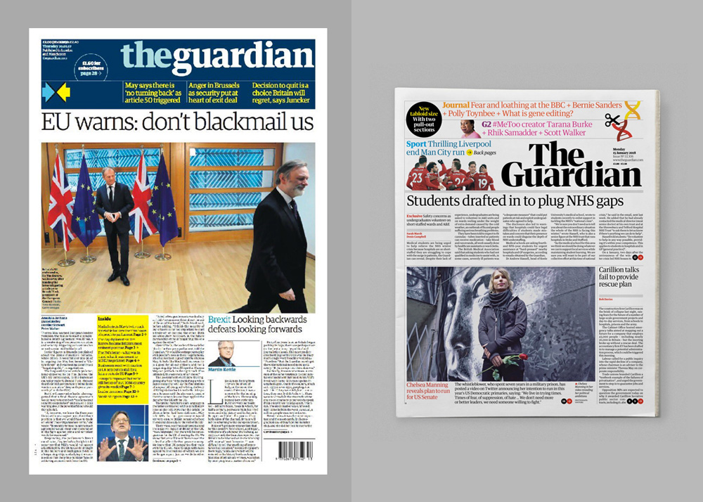
In print and online, the logo has stayed on the right, maintaining one of the newspaper’s distinctive features but has lost the thick blue bar, which was perhaps its most distinctive asset. It wasn’t a pretty bar but it was effective both to spot the printed edition and to quickly realize you had landed on The Guardian’s website. As elegant and nicer as the new versions are they also blend in more with other publications. Of course, it’s a matter of time and the idea is that in a few months’ time, that tall, stacked serif masthead will quickly scream “THE GUARDIAN!”.
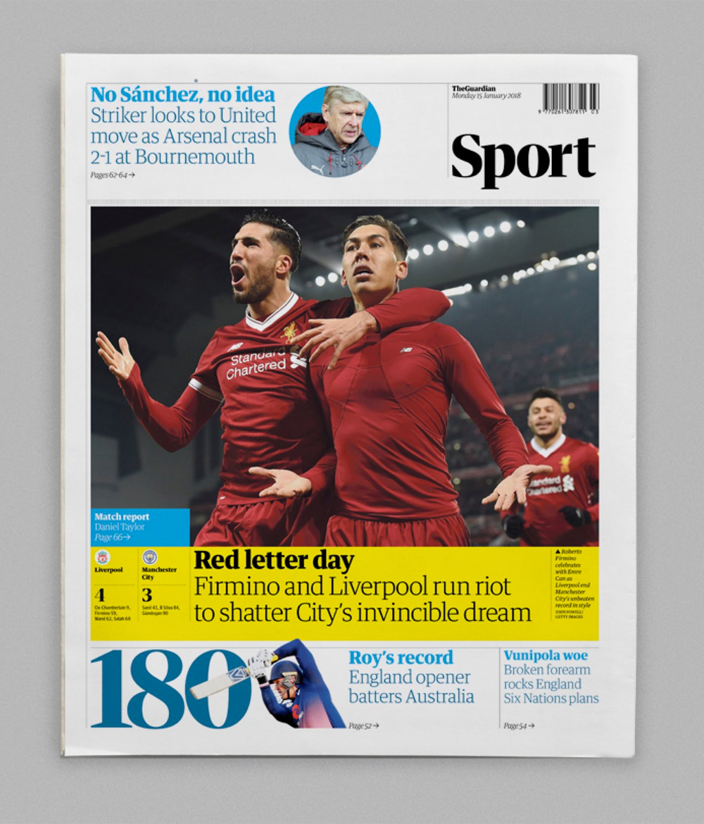
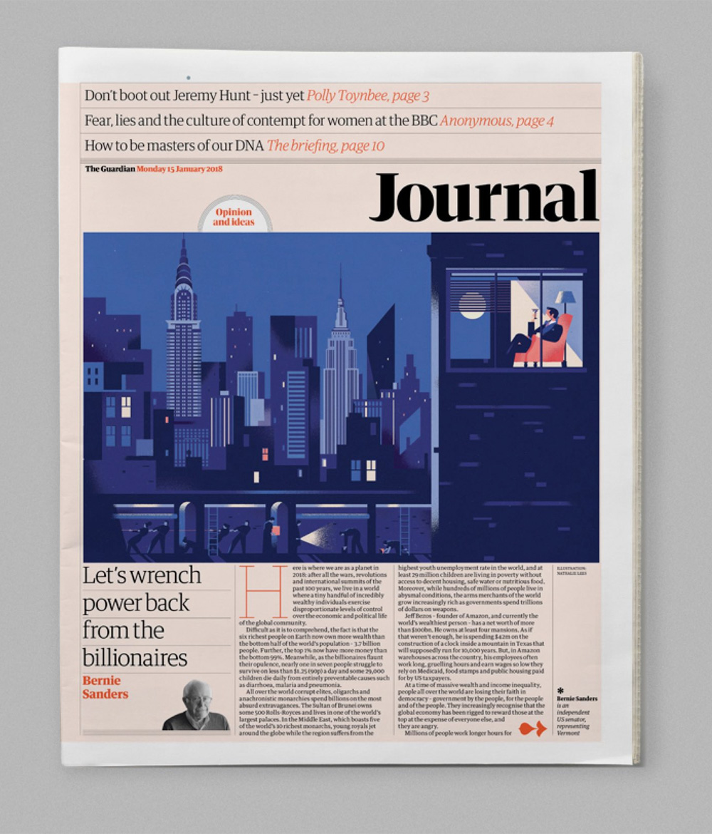
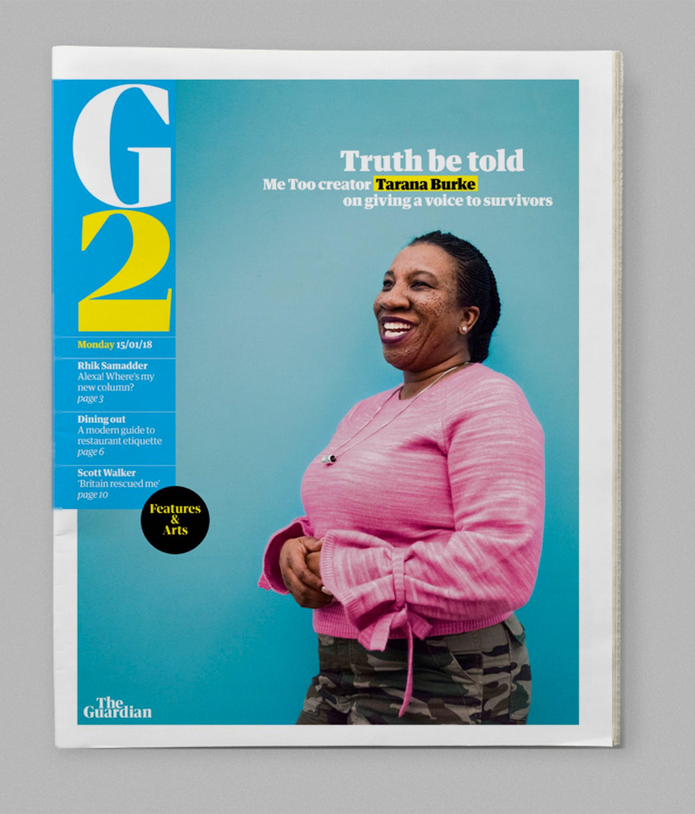
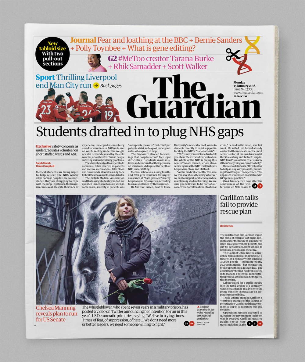
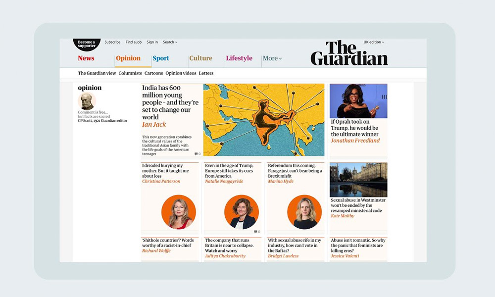
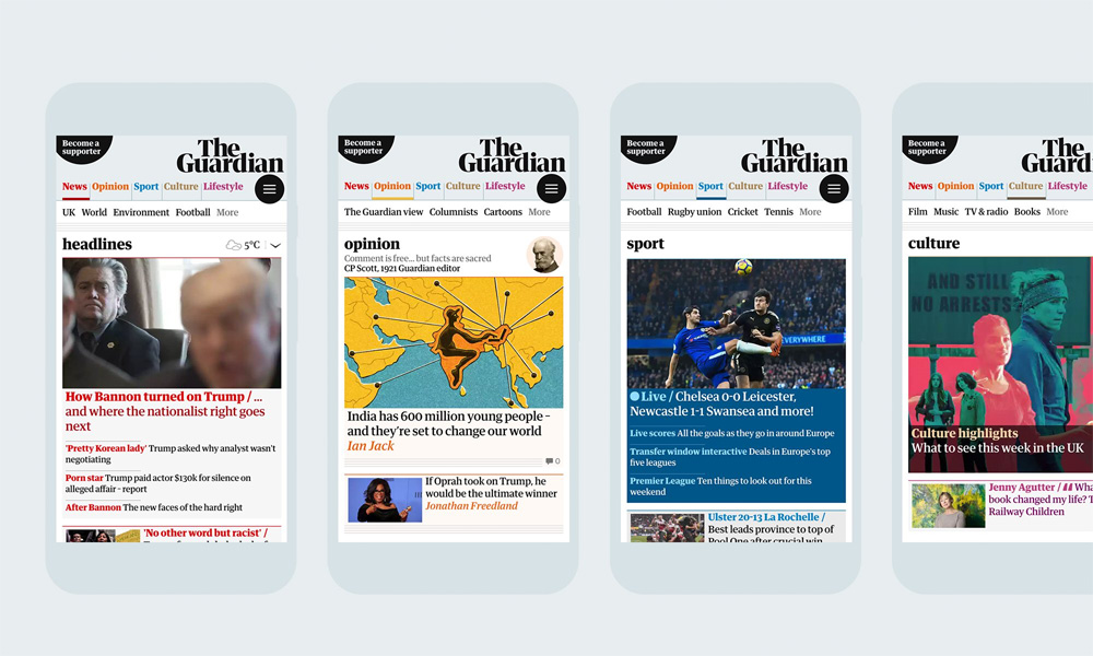
I won’t get much into the editorial design but based on these few layouts, it looks quite nice and the introduction of the new headline font — that you can see in the section headlines like “Sport” and “Journal” — works great with the existing type family. The “G2” treatment is particularly cool.
Overall, the change is positive and serves as a good message to send along with the physical change of the newspaper that even though it was a drastic measure to help save losses it was also an opportunity to rethink how The Guardian wants to be perceived and what message it wants to send, which I think is something along the lines of establishing a sense of authority, confidence, and staying power.

 Новости Союза дизайнеров
Все о дизайне в Санкт-Петербурге.
Новости Союза дизайнеров
Все о дизайне в Санкт-Петербурге.