Обзор лучших ресурсов по разработке бренда, разработке упаковки
contact us | ok@ohmycode.ru
contact us | ok@ohmycode.ru
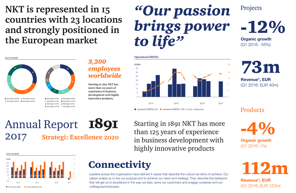
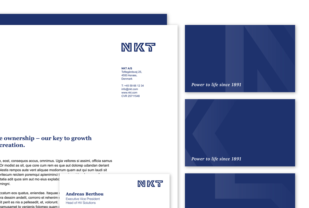
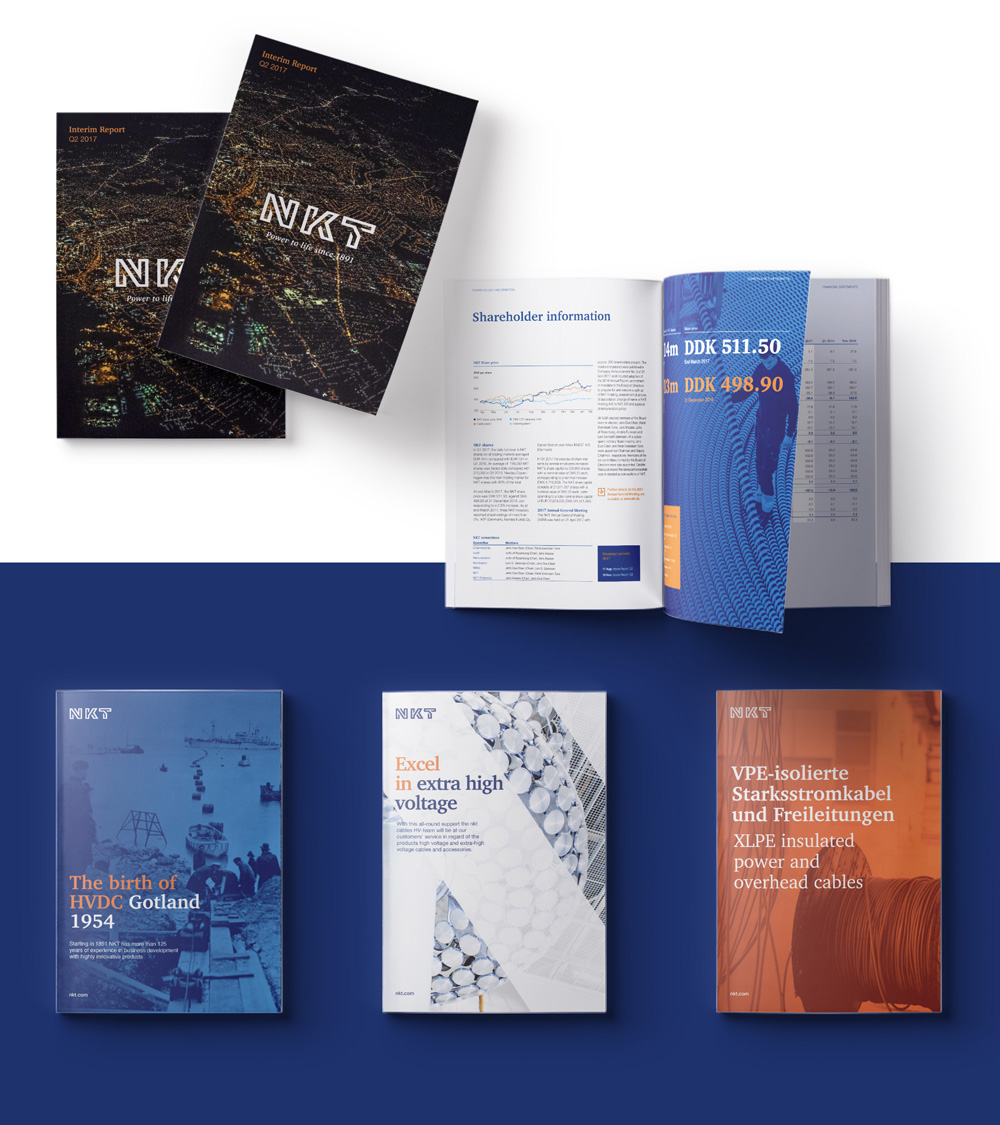
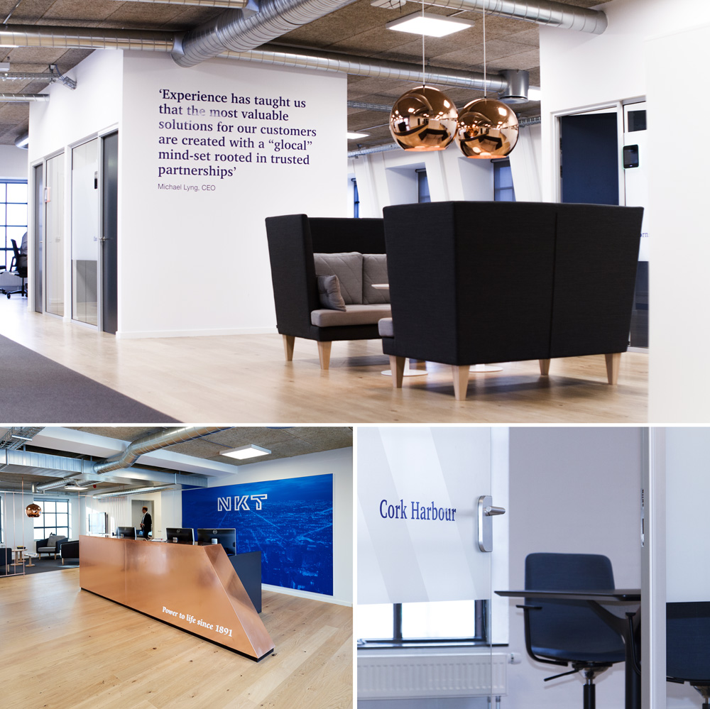
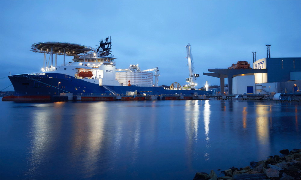
Established in 1891, NKT is a global pioneer in the cable industry and specialized in the development, manufacture and marketing of high-end cables, cable accessories, and cable solutions for construction, mining, power distribution, power transmission, railways, telecom, and more. Headquartered in Denmark, NKT employs over 3,400 people and was recently spun off from its holding company as well as acquiring Swedish company ABB’s cable business. The identity for the new independent business has been designed by Copenhagen, Denmark-based IDna Group.
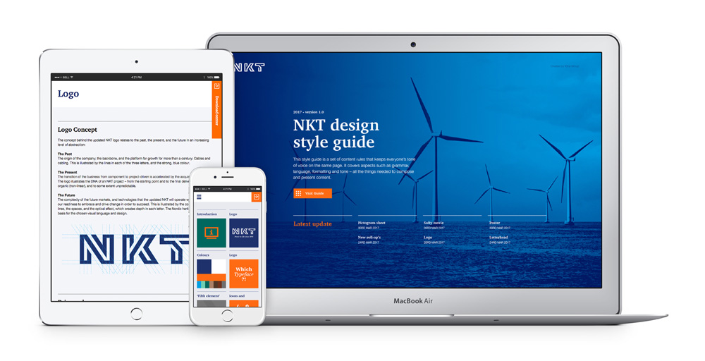
The concept behind the updated NKT logo relates to the past, the present, and the future in an increasing level of abstraction:
The past
The origin of the company; the backbone and the platform for growth for more than a century: cables and cabling. This is illustrated by the lines in each of the three letters and the strong, blue colour.
The present
The transition of the business from component to project-driven was accelerated by the acquisition of ABB HV. The logo illustrates the DNA of a NKT project - from the starting point to the final delivery - all unique, organic (non-linear), and to some extent unpredictable.
The future
The complexity of the future markets and technologies that the updated NKT will operate within underlines our readiness to embrace and drive change in order to succeed. This is illustrated by the complexity in the lines, the spaces, and the optical effect, which creates depth in each letter. The Nordic heritage forms the basis for the chosen visual language and design.
The old logo was decent although too lowercase-y, especially considering that the name is an acronym (for Nordiske Kabel og Traadfabriker) and those rarely work well in lowercase. The “kt” pair was kind of charming with the matching angles but the lowercase “cables” in dry Gill Sans was not. The quarter piece of cable to the left… kind of weird. The new logo is excellent, with a bold and serious presence while at the same time conveying the idea of connectivity and layering. I love how each letter is a single line contorting from start to finish to not just form the letter but imply dimension and depth. The resulting inline effect is perfectly achieved and there is a great texture to the logo. The kerning might be an easy thing to complain about but given the combination of letters this is very well handled. The rationalization is a bit much and the revealed grid isn’t so much a grid as it is a collection of lines but, luckily, the logo is so good it can withstand the selling points.
The typography, on its own and in application, is an odd choice as it doesn’t quite complement the logo and it somehow makes it feel like another company.
Icons are alright.
NKT’s colours help support the identity and provide a recognisable element. The colours are carefully harmonised with each other. For many years, the dark blue colour has been NKT’s primary colour and by maintaining it in the updated logo, the logo is linked back to NKT’s long history. The logo carries undertones of NKT’s proud, Nordic and pioneering heritage, and the colour palette stems from the same DNA.
The bright orange colour invigorates the dark blue colour and creates a good energy and contrast between them. This contrast is important for the identity, which is why the orange colour is featured on several elements throughout the identity. The tertiary colours help bring more life to the identity and are a reflection of the various materials used in NKT’s products, for instance copper and aluminium.
The applications are good, technically speaking. Everything is well laid out and in its place but I feel like the bold energy and presence of the logo is somehow lost in the applications. I think the orange makes it all feel more friendly than it should and the serif could have been something more aggressive or at least something that looks less like Georgia.
Overall, it’s a great evolution on the strength of the logo alone and the applications are good and effective despite my reservations about it. More than anything, what I think this identity does really well, is make cables seem cool and bad-ass.

 Новости Союза дизайнеров
Все о дизайне в Санкт-Петербурге.
Новости Союза дизайнеров
Все о дизайне в Санкт-Петербурге.