Обзор лучших ресурсов по разработке бренда, разработке упаковки
contact us | ok@ohmycode.ru
contact us | ok@ohmycode.ru

Established in London, UK, in 1940, Puffin is one of the world’s leading children’s publishers carrying some of the biggest names in classic and current children’s publishing. Puffin began 3 - 4 years after its parent brand, Penguin, was established by Sir Allen Lane with his brothers Richard and John, when it launched a series of children’s non-fiction picture books. Early successful titles included The Lion, the Witch and the Wardrobe by C. S. Lewis, Charlotte’s Web by E. B. White, Charlie and the Chocolate Factory by Roald Dahl, and now publishes, among many other titles, popular properties like Percy Jackson and Diary of a Wimpy Kid. To prepare for its 80th year in business, Puffin has introduced a new identity designed by Brighton, UK-based Crush Creative.
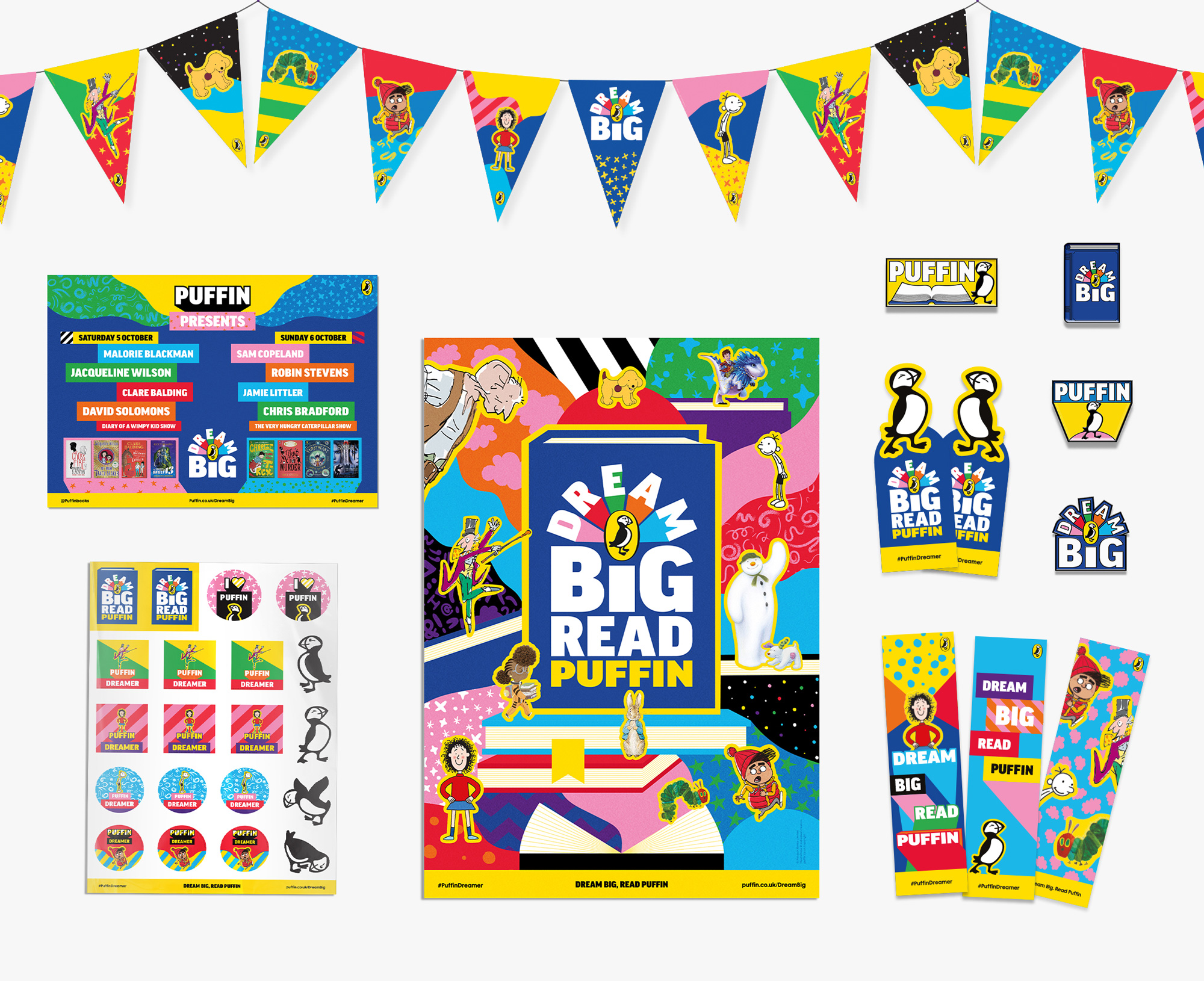
As with many children’s entertainment brands, they wanted to find a way for multiple books and characters, from the BFG to the Jolly Postman and the Christmasaurus, to be present across designs.
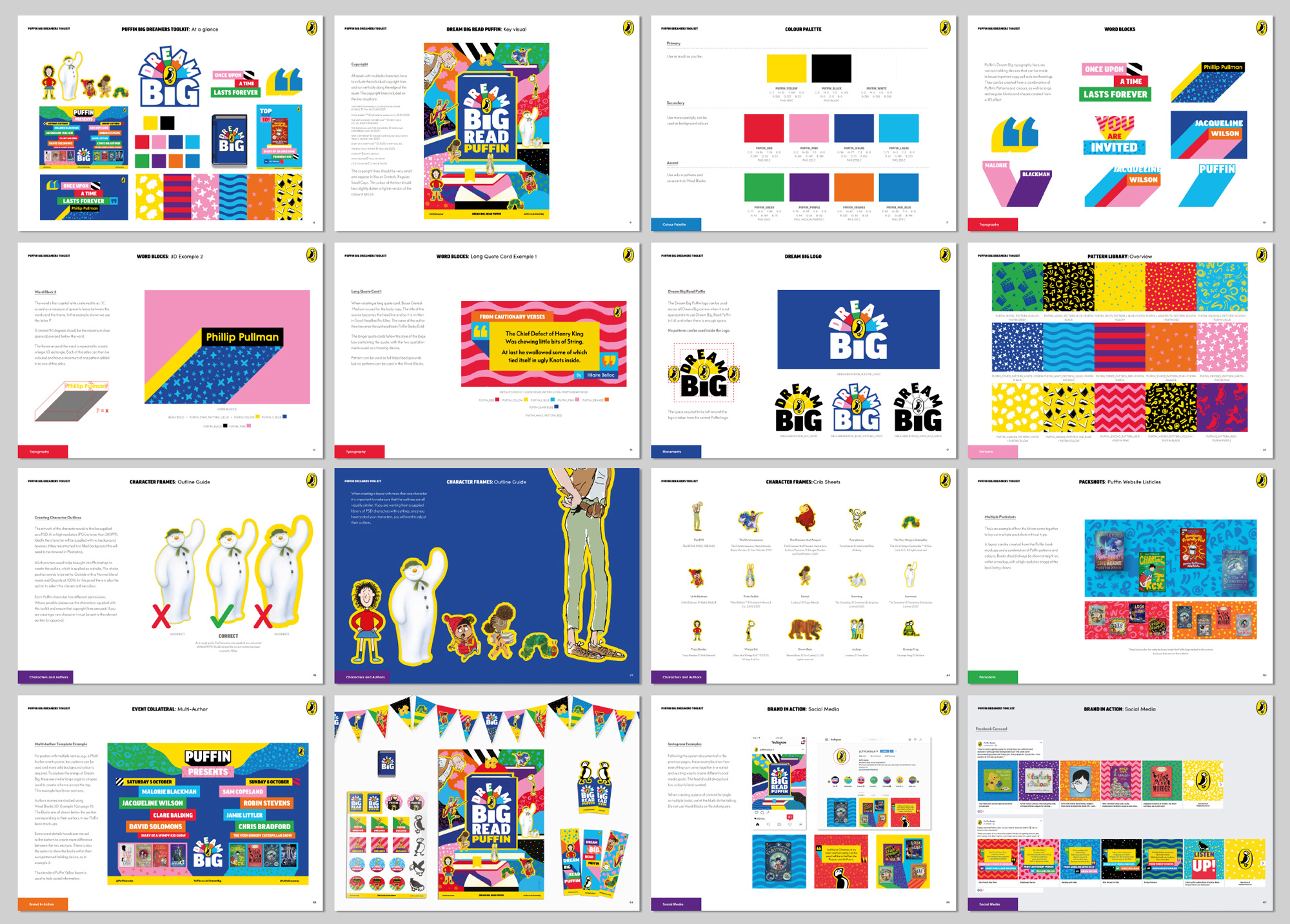
Our solution was to create a colourful abstract world for Puffin and all its characters to live in. We created a new Brand identity system including new fonts, colours and an extensive range of patterns. As well as the tools for their Dream Big, Read Puffin campaign, with a logo, posters and POS. All characters and authors are now unified with a Puffin Yellow outline, and there is a system in place to house all information in a structured and eye-catching way.
This isn’t a standard post given that there is no “before” logo, there is no “after” logo, and there isn’t even a “new” logo — it’s a new identity around the existing, well-known Puffin logo. Even when I have covered other identity-only updates, it’s a little more straightforward. Not that this is complicated but there are a lot of moving parts, literally, to see before being able to write/read about them. So now that you have seen them and I have cleared my throat with this paragraph, let’s get to it…
At the core of the new system is a set of patterns that range from literal depictions of relevant objects like books, film clappers, and stars to abstract waves, dots, and other dingbats. All together, as a whole, look pretty good but I do wish they were either more consistent in style or completely distinct from one another, whereas right now they feel almost the same but not quite. The color combinations can also be a little jarring and sometimes patterns are 1 color, sometimes 2, and sometimes 3. I’m all for variety but I think these patterns could have been more cohesive. In the end, though, when they are used almost like patchwork in application as part of the shadows or as backgrounds they do look quite festive and engaging.
Another element is the use of blocks of type with hard shadows that stretch to the bottom of the layout — it’s an old design trick but filling in the shadows with the patterns gives it a fun spin. Heavy-stroked words can also be given the hard shadow treatment (as seen in the pattern and character pairings image) but those don’t feel fully resolved.
Probably my favorite aspect of the system is how quotes come together (below) and how that can extend into headline treatments — their Instagram account looks fairly cohesive with them — that start to create a recognizable visual language.
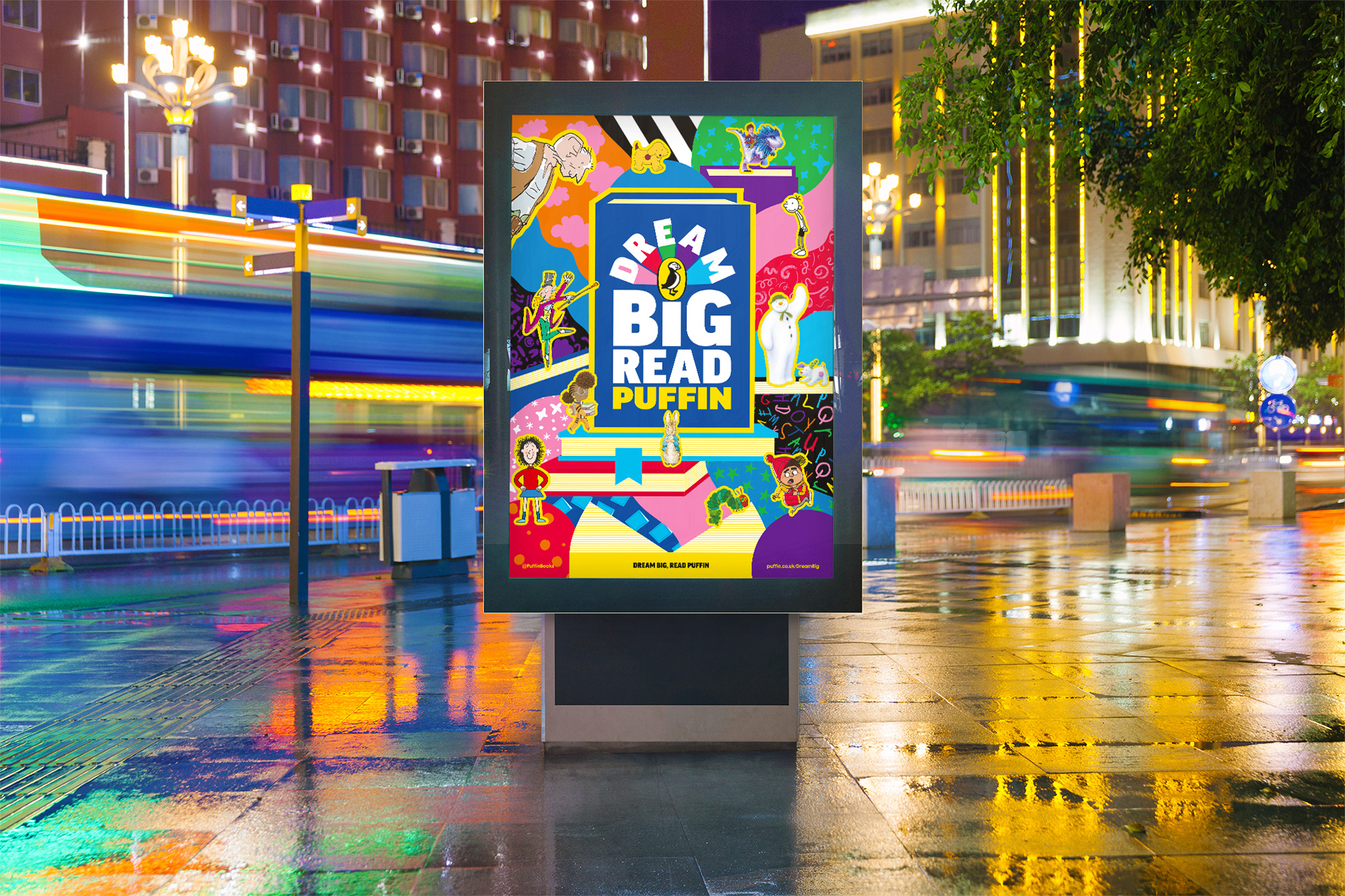
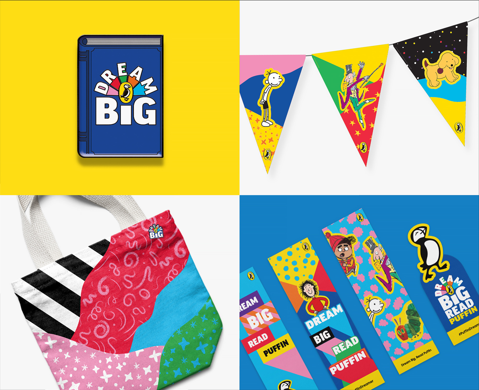
In application, the different elements, along with the characters from the books, have the flexibility to come together in different configurations for the myriad ways and mediums in which Puffin has to communicate with its audience. Overall, while there are some elements that could be finessed, this has a colorful and textural exuberance that is undeniable kid-like.
 each year since publication began in 2006

 Новости Союза дизайнеров
Все о дизайне в Санкт-Петербурге.
Новости Союза дизайнеров
Все о дизайне в Санкт-Петербурге.