Обзор лучших ресурсов по разработке бренда, разработке упаковки
contact us | ok@ohmycode.ru
contact us | ok@ohmycode.ru
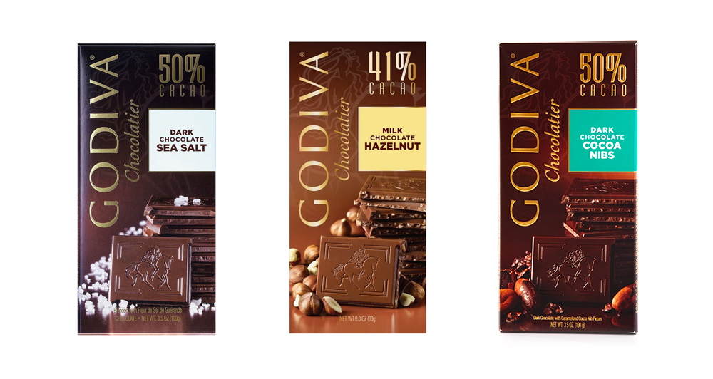
(Est. 1926) (This project applies ONLY to the bar packaging) “Godiva Chocolatier was brought to America in 1966 and has been the leader in premium chocolate ever since. Godiva owns and operates hundreds of boutiques worldwide specializing in fine chocolates and chocolate gifts. Godiva products are also available for purchase at Godiva.com, through seasonal mail-order catalogs, by phone, and at select fine department and specialty stores.”
Pearlfisher (New York, NY)
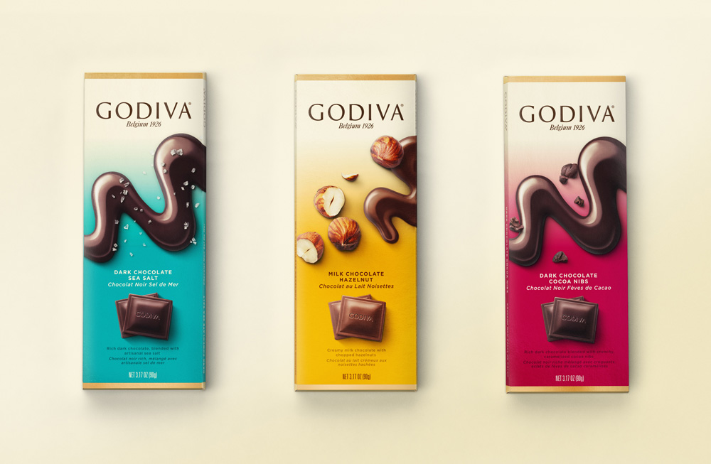
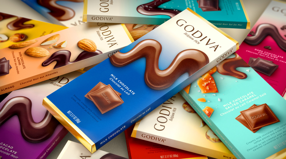
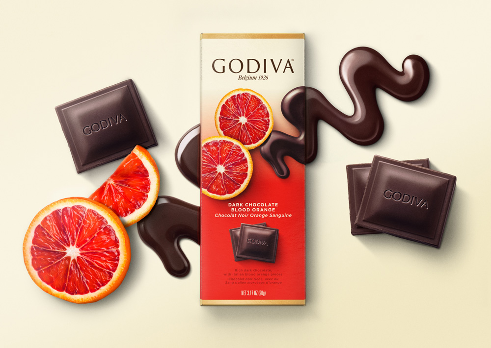
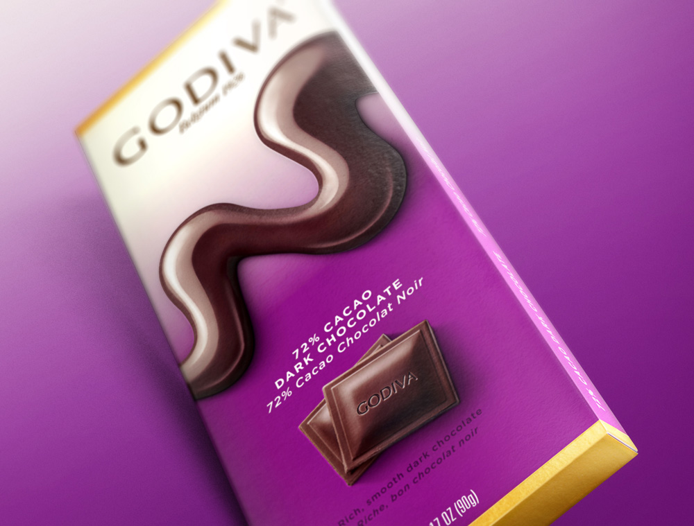
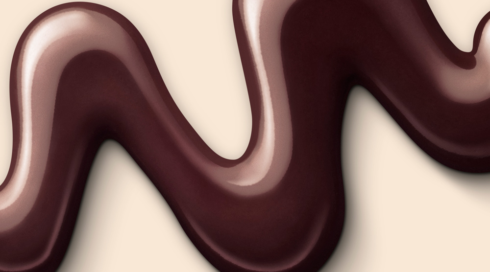
To elevate Godiva in a bold and unexpected way, Pearlfisher New York crafted a new design, which reinforces their unique investment in the mastery of chocolate craftsmanship, creativity and quality, and brought Godiva’s fine ingredients front and center, quite literally. The resulting design creates a visually arresting, approachable and appetizing brand expression. A brand new equity for the icon – a chocolate drizzle that reflects the motion of a chef’s hand – was developed to translate the brand’s emphasis on gastronomy, while simultaneously attracting consumers with taste appeal.
Married with a refined color palette, the bars are infused with a welcome and warm elegance, reinforcing Godiva as the choice for an everyday moment of indulgence.
I had never paid much attention to the Godiva packaging even though I have probably eaten the equivalent of my own weight of it during my lifetime (if you knew how much I weigh, you would be impressed by that statement) so now that I've taken a moment to analyze it… it was pretty terrible. I mean, it LOOKS like chocolate and it looks fancy but all the elements are a mess of styles and aesthetics that add up to something that passes off as packaging on the shelf. Still, killer chocolate. The new packaging is a drastic move away from the original — and away from the aesthetics of other Godiva products — with a friendlier aesthetic that also drops the faux luxury of the old packaging. The gradients are a great way to create better distinction between flavors and the ingredient photography further helps. I'm on the fence about the "drizzle"… I like the visual of it, how it breaks from the rectangular-ness of the bar but it also starts to look too much like chocolate syrup, which takes away from the higher-end status that Godiva occupies in grocery stores. Overall, what this does well the best is break away from the dark brown color palette that drives most chocolate packaging.

 Новости Союза дизайнеров
Все о дизайне в Санкт-Петербурге.
Новости Союза дизайнеров
Все о дизайне в Санкт-Петербурге.