Обзор лучших ресурсов по разработке бренда, разработке упаковки
contact us | ok@ohmycode.ru
contact us | ok@ohmycode.ru
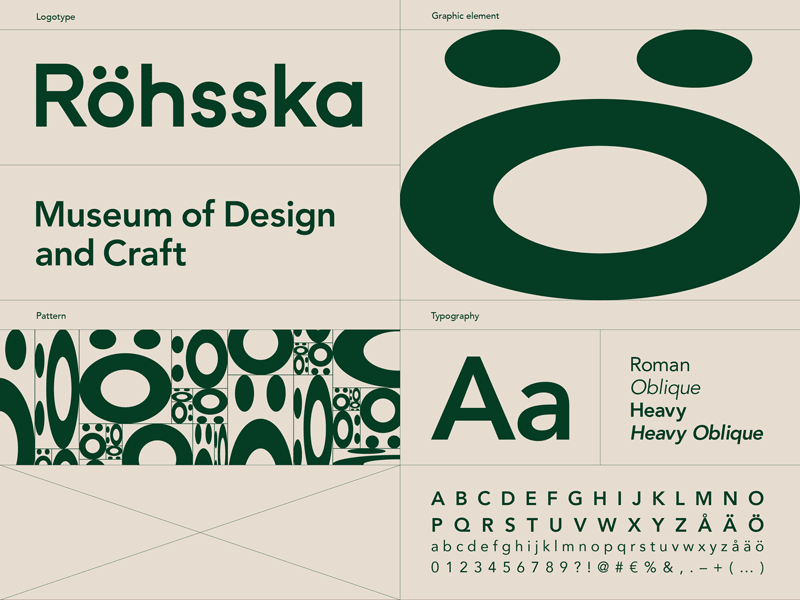
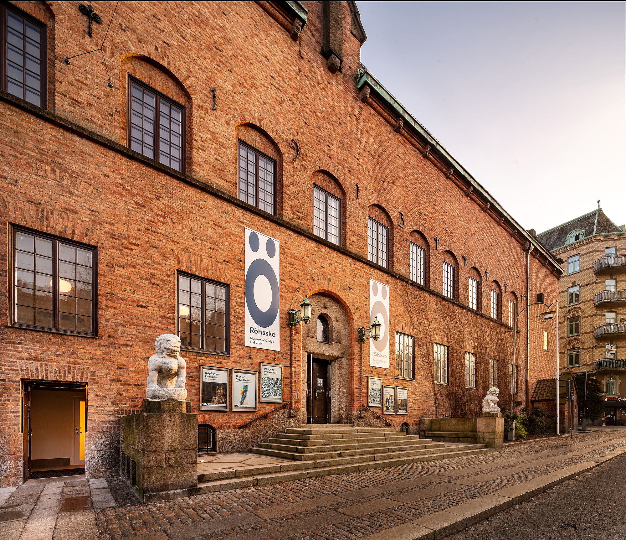
Established in 1916, Röhsska is a museum in Gothenburg, Sweden, dedicated to historic and contemporary design and craft. Its collection of 50,000 artifacts covers glass, ceramics, textiles, ribbons, fashion, furniture, and products, primarily from Sweden but also from other parts of Europe, Japan, and China. After two years of being closed for restructuring and renovations, Röhsska reopened in February and introduced a new identity designed by local firm Aoki.
When Aoki started work on the new identity, we wanted to challenge the picture of what good design is and who is entitled to interpretation preference. Our client wanted to keep the old symbol for the museum, namely the Ö. Aoki saw a problem with having taken too much space and thereby competing out the very name Röhsska.
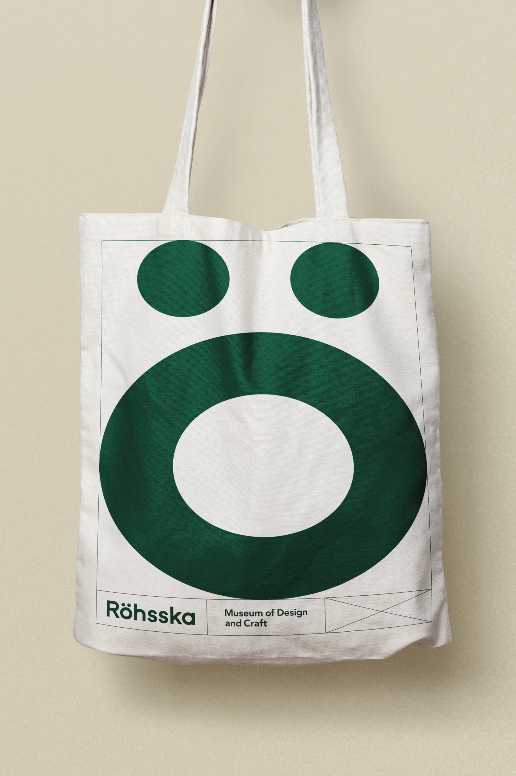
For decades, Ö: has been a symbol of the Röhsska Museum which many people recognize. In the new graphic concept, Ö: pushes the boundaries and takes place in their time. […] The letter is pressed together and stretched depending on how much space is available. It defies the calculated harmony and proportions of the golden ratio, while being related to a strict framework. In other words: Ö: It relates to the golden section in the same way that design relates to its complex and changing environment.
Previously, Ö: et has played a central role as a logo for the museum and has taken a large place in the graphic profile. It is a strong graphic symbol that has now been clarified with a new word picture - Röhsska - which is designed on the basis of the Ö’s forms and a payoff that blows away any conceivable doubts about what activities it is: Museum of Design and Craft. The point is so clear that even the one who does not know the museum before will understand what activity it is about.
I’m not sure when the “Ö” icon was first introduced but it’s quite bold for the museum to have gone any number of years with just the icon and no wordmark. And not just any icon but one that is extremely minimal. It’s even bolder for the museum to do what it’s doing now, which is squeezing and stretching the icon in extreme ways and given that the icon is made of three circles, some of the resulting ellipses can be downright ugly, especially in the “O” part as its thickness changes at each axis. Yet, the concept is interesting and daring and, when paired with the new straight-faced wordmark, it becomes more viable with the support of something that spells out the name of the organization. The addition of “Museum of Design and Craft” then makes it clearer that the deformation is playfully on purpose.
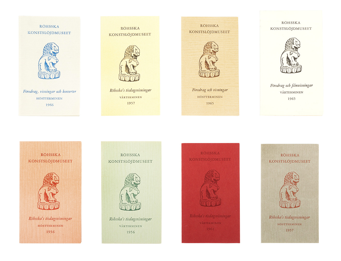
When choosing colors, Aoki has been inspired by the museum’s old invitation card from the 50s and 60s, where the color of the paper has changed differently over time. For many years, the invitation cards looked the same, but over time, the original colors have got different shades. In the same way, the Röhsska Museum is constantly changing when history and contemporary are linked together.
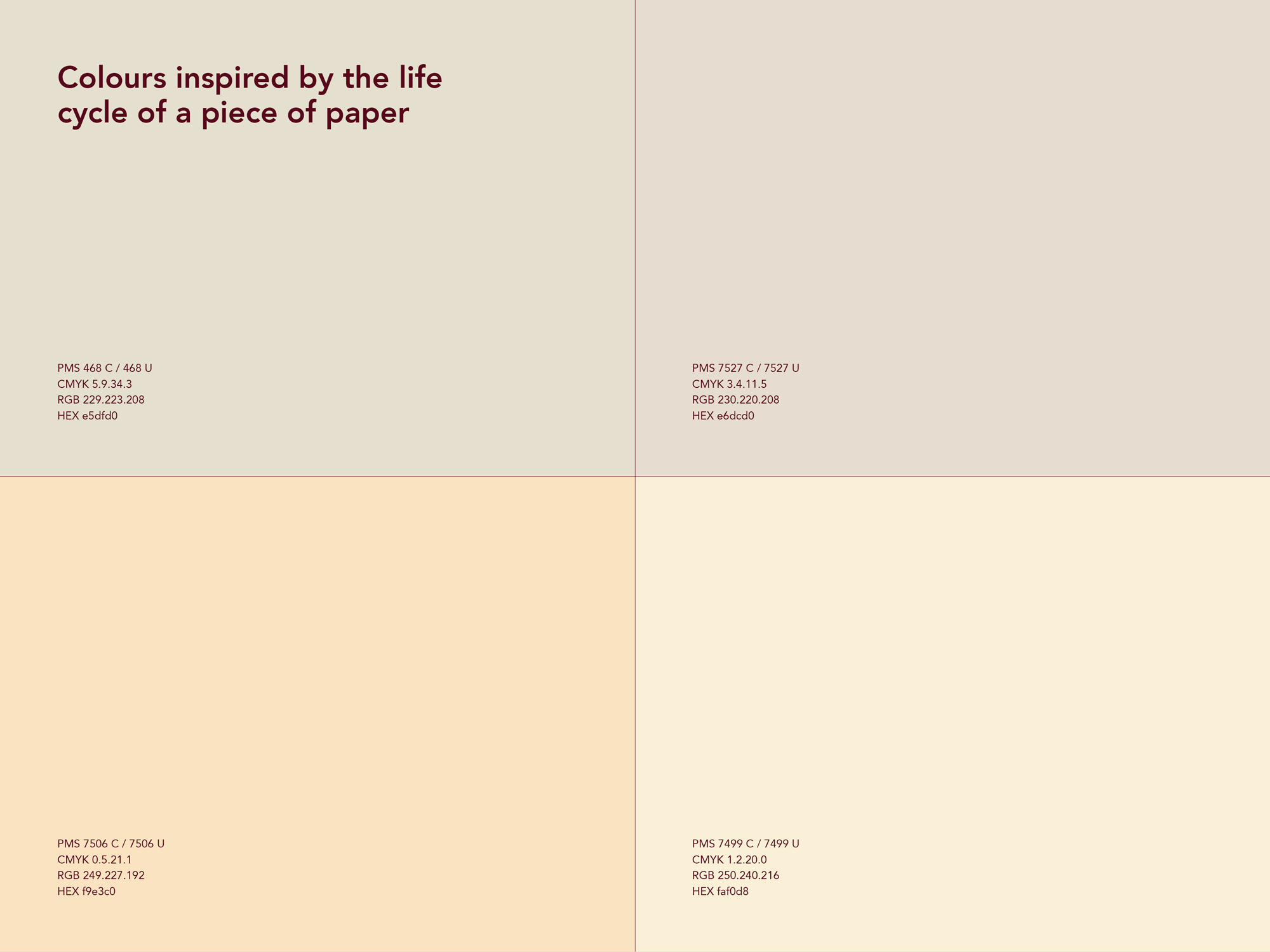
I love the inspiration for the color palette which is a great nod to the aging nature of museum artifacts, while aptly avoiding trendy colors.
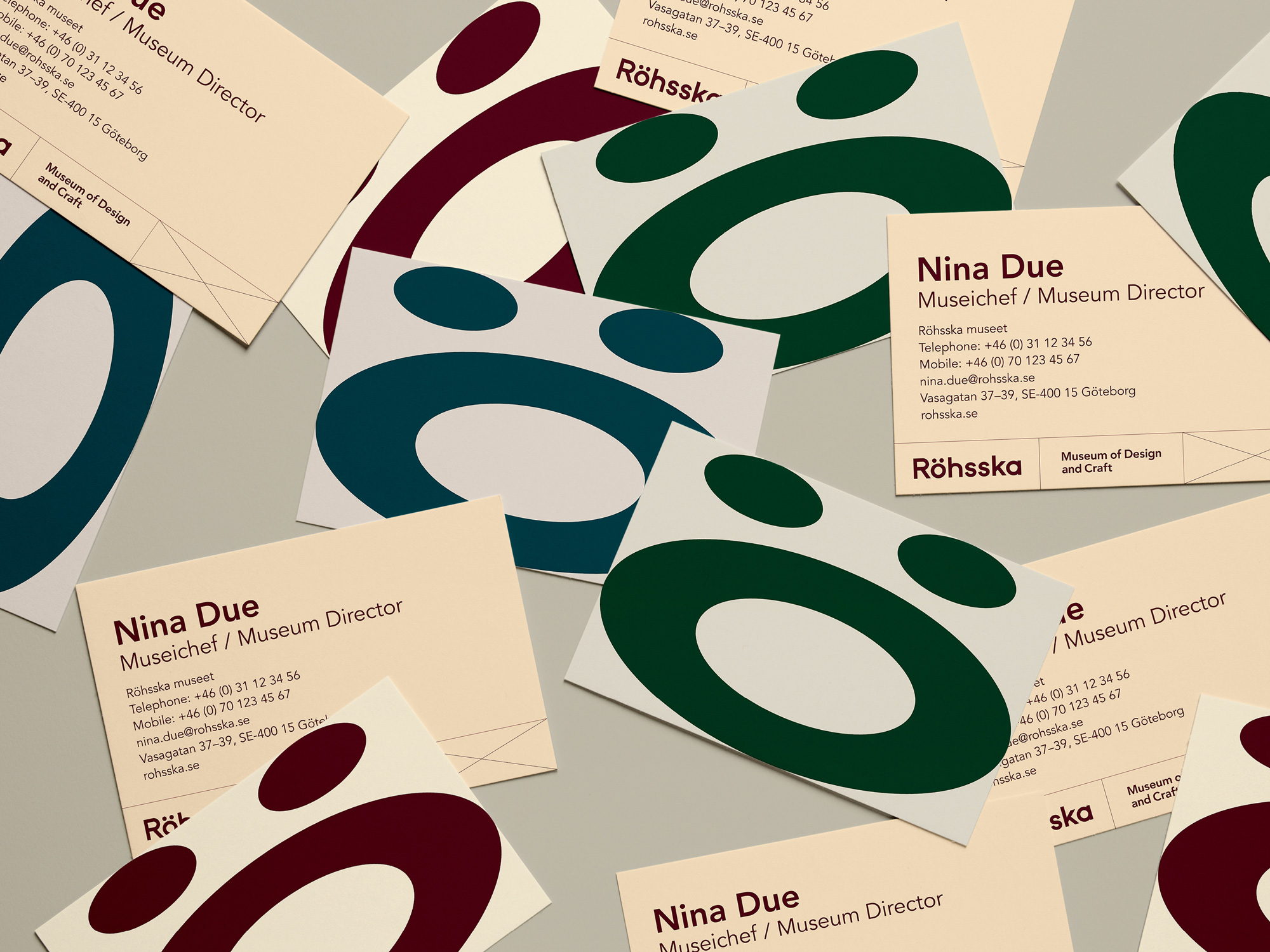
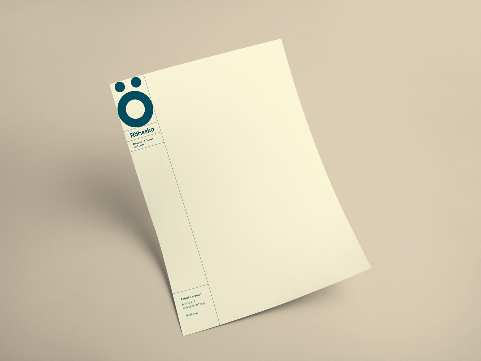
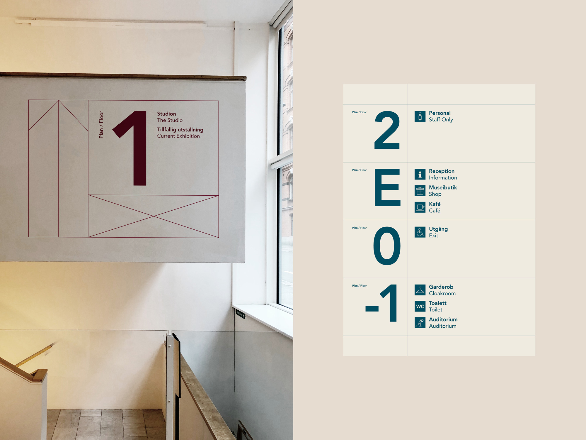
In application, the identity uses a visible grid to organize information and help clarify the borders within which the icon contorts. In digital renders as above, it looks great, but once the realities of trimming, bleeds, and shifting on press occur, it might yield some unfortunate results as the icon gets cropped on the outer edges.
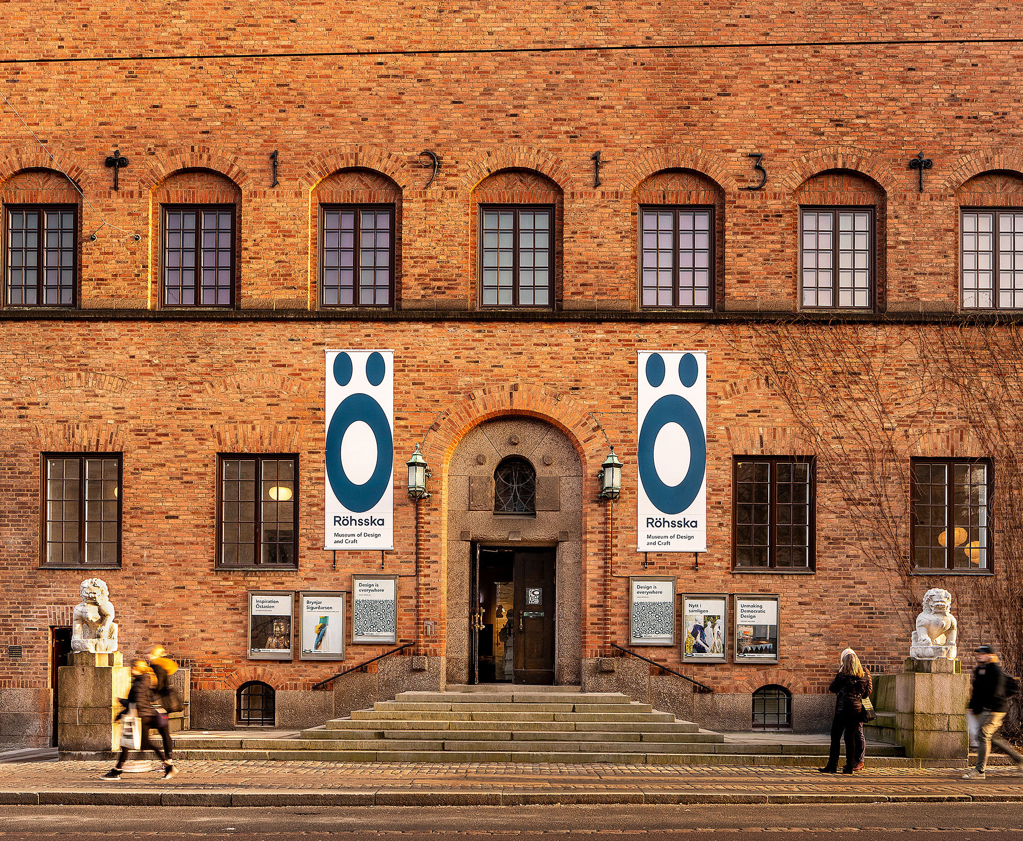
Overall, I find this to be a great graphic exercise and very appropriate for a European design/craft museum — I don’t think many other museums could pull off something like this. I’m not sure if the message of “Design is for everyone” comes across through the identity but I do feel like, in a way, it does challenge the preconceptions of what good design or art is by presenting it through a relatively uncomfortable identity that may have some people be all like : O
Thanks to Julius Mattsson for the tip.

 Новости Союза дизайнеров
Все о дизайне в Санкт-Петербурге.
Новости Союза дизайнеров
Все о дизайне в Санкт-Петербурге.