Обзор лучших ресурсов по разработке бренда, разработке упаковки
contact us | ok@ohmycode.ru
contact us | ok@ohmycode.ru
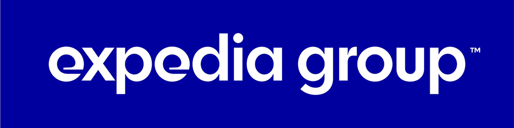
Established in 1996 (originally as Microsoft Expedia Travel Services; spun off in 1999 with its own IPO), Expedia Group is one of the world’s largest travel platforms owning some of the most well-known online travel services including the eponymous Expedia, “competitors” Travelocity and Orbitz, Hotels.com, and Hotwire among 20 brands. Their timeline is like a lava lamp of acquisitions and spin-offs. This week, Expedia Inc. changed its name to Expedia Group and introduced a new identity designed by New York, NY-based Pentagram partner Paula Scher.
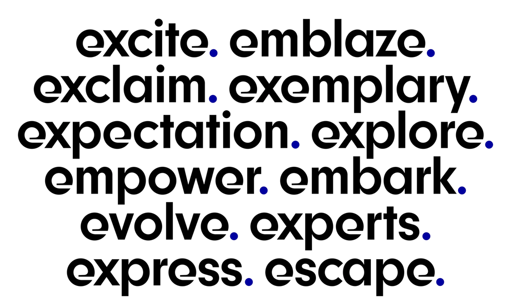
The identity centers on a distinctive lowercase “e,” which the designers drew as an aerodynamic letterform with a tapered eye and flat-cut terminal, then worked with type designer Jeremy Mickel to develop a full custom font, Expedia Group Display. The unique typography enables Expedia to own the “e”; in applications like promotions and collateral, it is immediately recognizable and accessible.
The old logo looked like it belonged on a daytime talk show more than a giant corporation. The combination of elements — hand-drawn, swoopy “E” with a light, lowercase wordmark — was very awkward and barely had any presence. The new logo boldly corrects that with an attention-demanding “e” monogram that, to me, hints at a plane’s wake as it cuts through the sky, in this case, as if it were cutting through a ring and forming the “e”. This is a very difficult combination of curves and shapes to pull off and in general I like the idea but there is something slightly off about the execution, in particular the bottom-right quadrant of the monogram where the “e” goes straight. I wonder if instead of a hard horizontal line it could have been ever so slightly curved. I also keep seeing a second “e” in the counter space and even though it’s definitely not meant to be there I find that counter space very clunky. I wonder, again, if that vertical-flat-end of the crossbar should have been tapered much more to make it feel more aerodynamic. I like the concept and I really like the texture the “e” generates when used smaller but when it gets used really big it’s not the most pleasing (as is the case in the gangly logo animation you experience when you visit Expedia Group’s website for the first time).
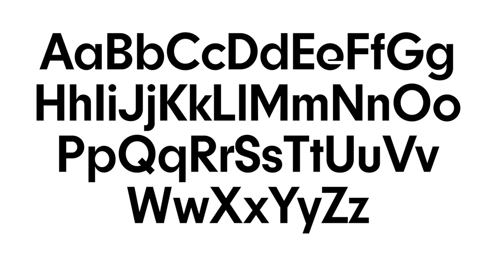
The cohesive system extends the typography to Expedia’s many B2B sub-brands, and to an endorsement line that may appear alongside the consumer brands. Secondary type is set in the sans serif , and the palette features a brilliant blue, as well as black.
On the wordmark, sub-brands, and words-with-multiple-“e”s the result is intriguing as the letter forces you to pay a little more attention to what you are seeing instead of just glossing over a sub-brand name or potential headline but that may be, in part, because how the “e” breaks the rhythm from an otherwise geometric sans serif.
In general I’m torn between liking it and disliking it but it’s undeniable that, through so much repetition of the “e”, it has the potential to be a remarkably recognizable corporate logo.
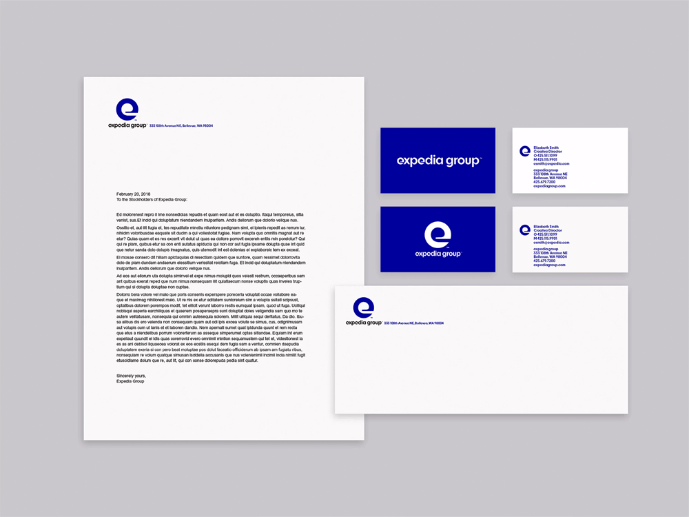
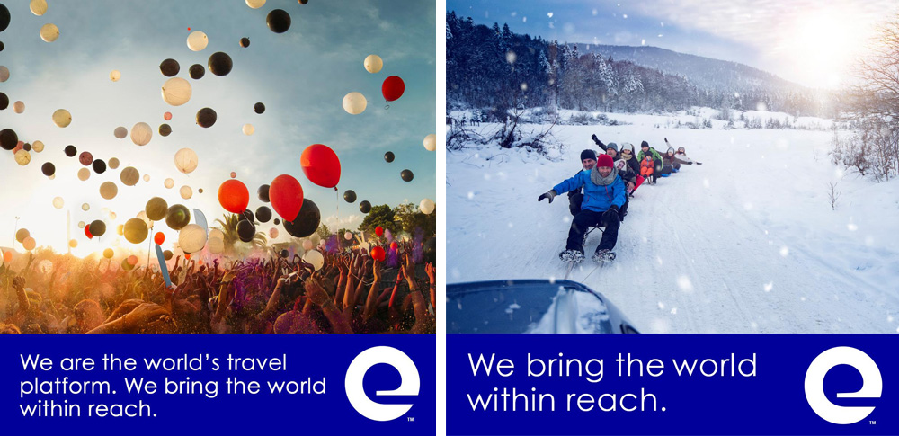
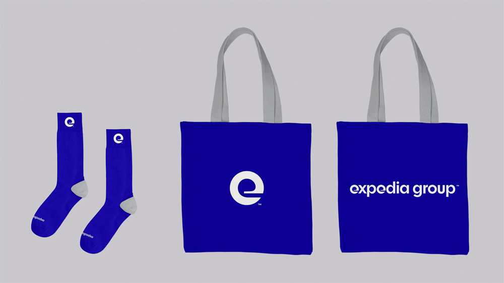
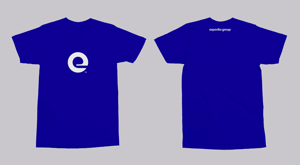
The applications are far from inspiring — although the transition from mock-up socks to real-life socks provides hope. Not that corporate identity applications have to go all out like brand identity applications but given the boldness of the monogram, the identity explorations could have used some extra chutzpah to sell the whole concept as being more bold and daring. Overall, this is way more appropriate than the old logo and gives Expedia Group a recognizable logo with a very strong presence.

 Новости Союза дизайнеров
Все о дизайне в Санкт-Петербурге.
Новости Союза дизайнеров
Все о дизайне в Санкт-Петербурге.