Обзор лучших ресурсов по разработке бренда, разработке упаковки
contact us | ok@ohmycode.ru
contact us | ok@ohmycode.ru
Established in 1969, Project Management Institute (PMI) is a nonprofit professional organization for “those who consider project, program, or portfolio management their profession”. Through advocacy, collaboration, education, and research PMI works to prepare more than three million professionals around the world — with chapters in more than 80 countries — to work as project managers. The organization also issues professional certification, sets global standards, and conducts academic research. This year, as part of their 50th anniversary, PMI has introduced a new identity designed by Superunion.
The Project Management Institute, a globally recognized professional organization for project management, recently celebrated its 50th Anniversary. As part of celebrating its past, PMI looked into its future, seeking to redefine their role—and by extension—an entire profession. Superunion helped them identify a new positioning for the future of work. Working together, we took their brand from focusing on project management to The Project Economy, a world in which people and organizations collaborate on projects to deliver value. For their visual identity, we created a language of symbols for The Project Economy to infuse it with meaning, and to represent what PMI stands for as they continue to lead the profession into the future.
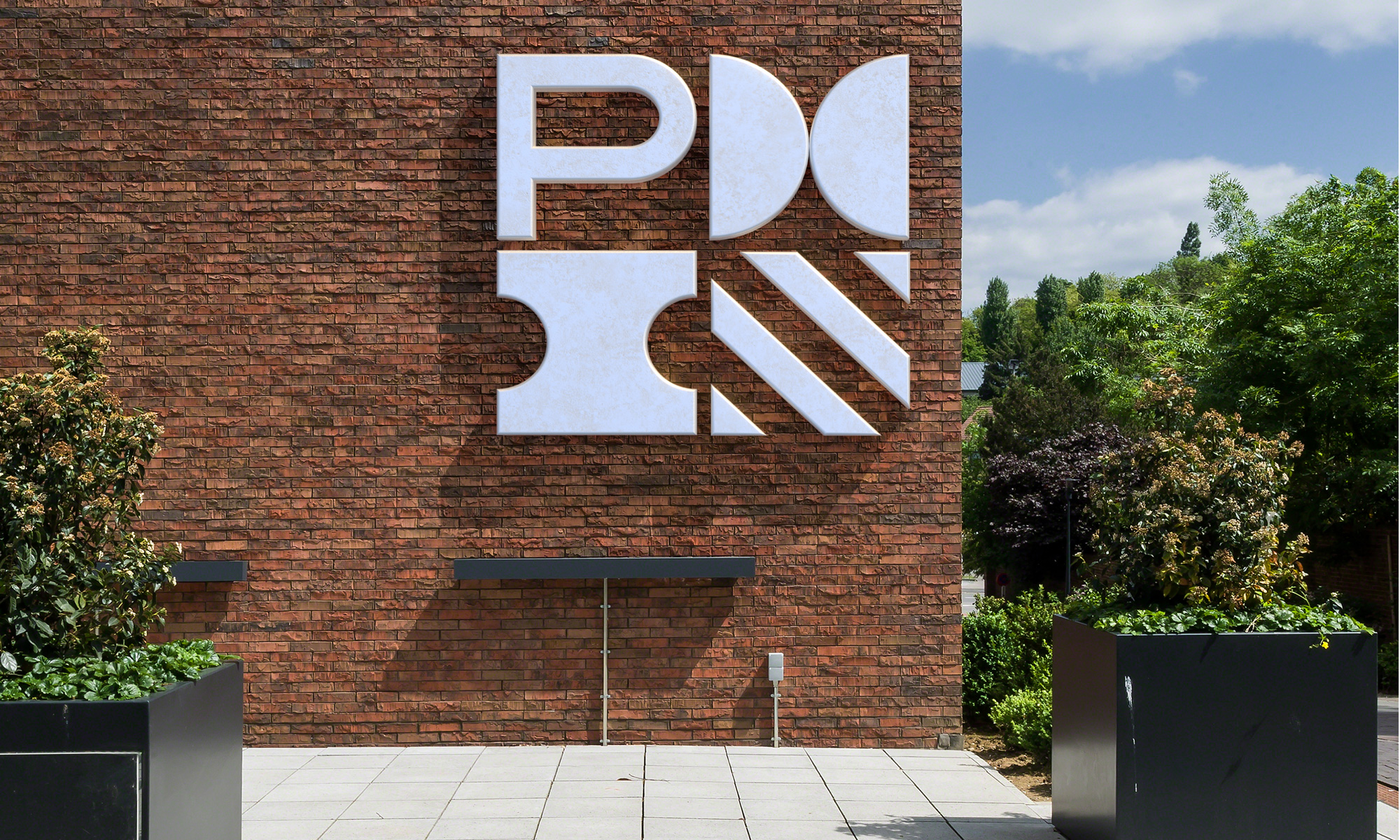
The old logo was rather painful to look at with its bland 1980s corporate identity traits like a globe, a condensed serif, and some funky negative space stuff in the acronym (which was sort of interesting and almost well resolved but the “P” killed it). The new logo is instantly more contemporary and the bits and pieces that make up the “PMI” bundle provide, to me at least, a sense of “management” in arranging things together neatly as if it were elements of a project. Visually, it’s a slightly difficult thing to decode because the “P” is so literal in contrast to the “M” and “I” that are highly abstracted and the addition of the square which is just a bonus and isn’t a letter. Certainly, with the full name next to the bundle, it’s all clearly explained, with the “P” and the bolded “Project” standing out, allowing the orange bit to be decoded as an “M” and the blue bit as an “I” (not a movie ticket). The purple square remains a mystery but it also sets up its usage as a wildcard that can be replaced for different things (like the charming chapter identifiers below). It’s a slightly odd logo but, in the end, I do think I like it and its ability to expand into sub-brands for the organization.
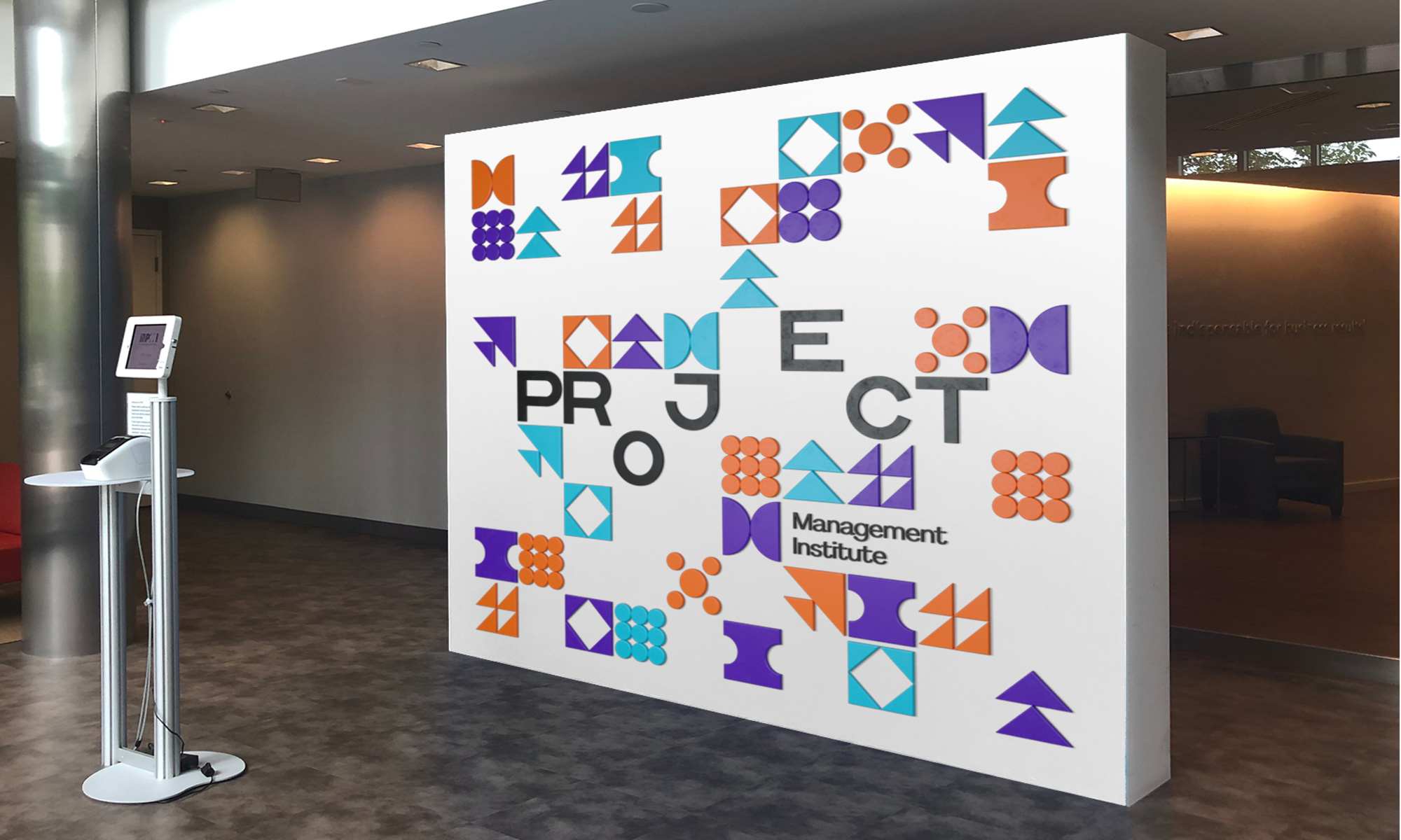
The additional icons do require subtitles to be understood but they are all believable interpretations and although they don’t seem very consistent, they do share only a handful of elements — circles and triangles inside a square — to tie them all together and they are fun to look at when animated.
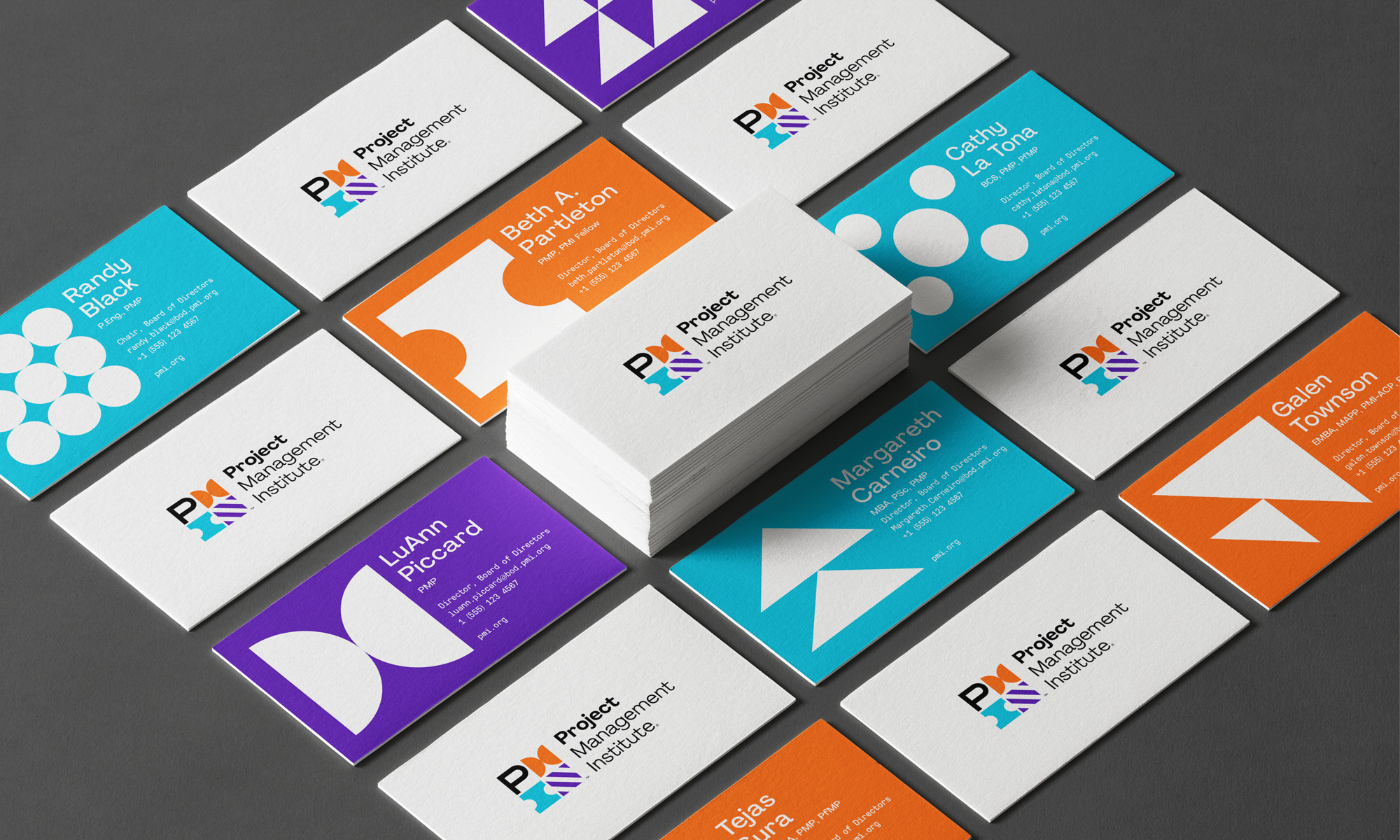
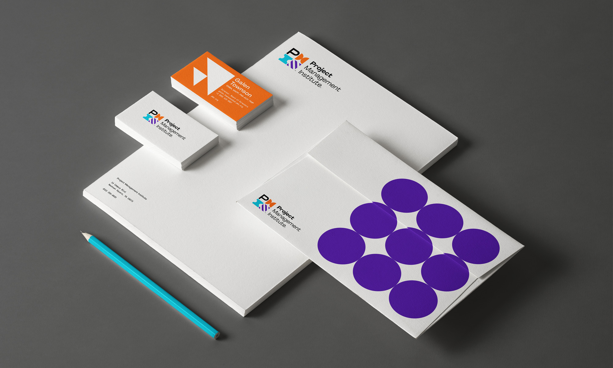
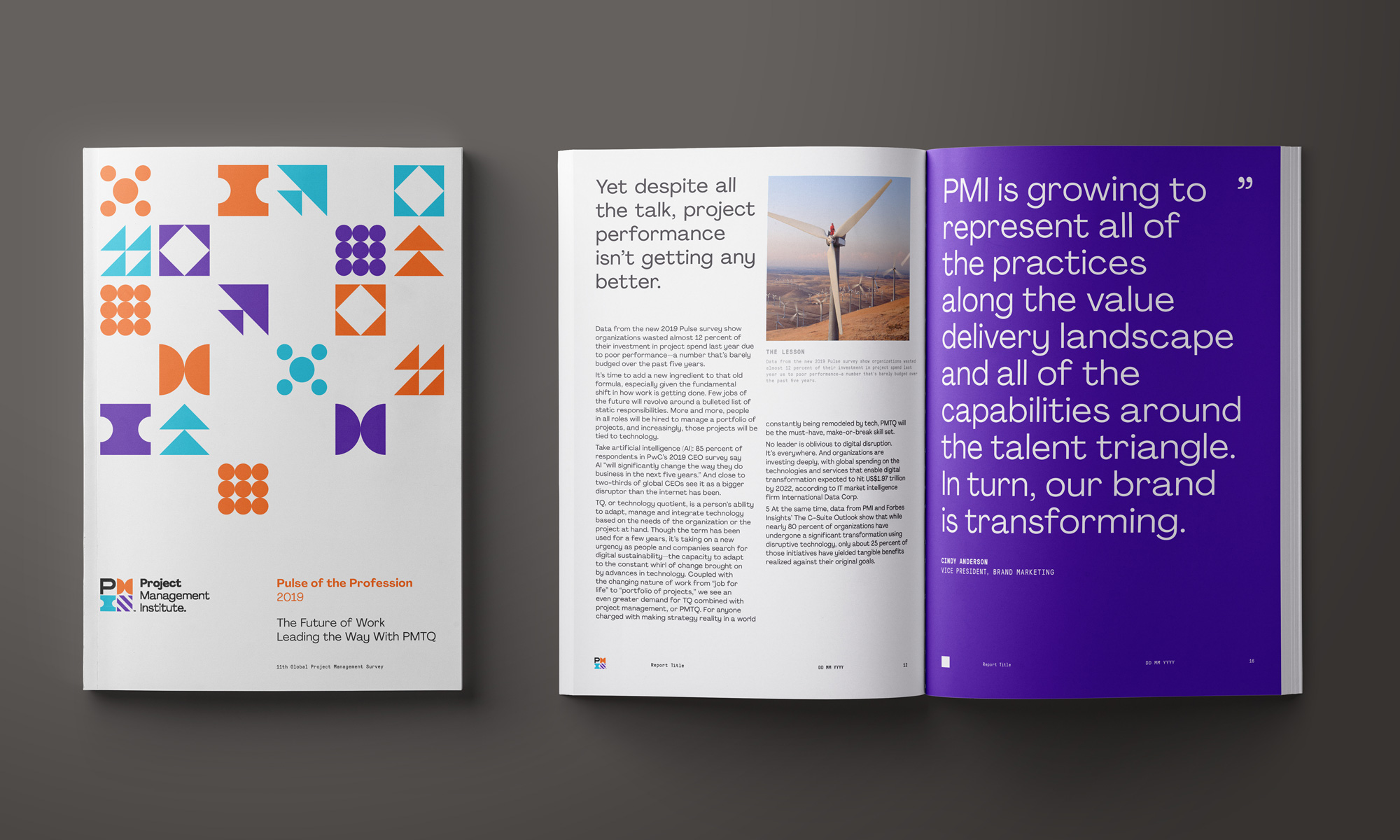
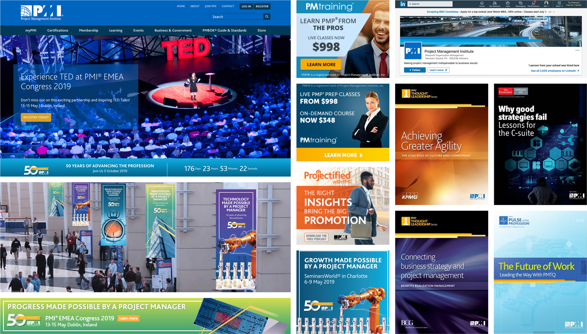
The applications make good use of the icons by deploying them one by one in large sizes as in the business cards or as gridded patterns in smaller sizes. On the latter I particularly like how they didn’t fill the full grid but left squares open, which create more interesting layouts. The main typeface used, Pangram Pangram’s Agrandir, is relatively unique and quirky.


Overall, this has a welcome vibrancy and youthfulness that is a huge improvement over the old identity, which was weighing it down with its datedness, and in its puzzle-like aesthetic it visually clicks with the organizational nature of project managers.
Thanks to Deirdre Spencer for the tip.
 each year since publication began in 2006

 Новости Союза дизайнеров
Все о дизайне в Санкт-Петербурге.
Новости Союза дизайнеров
Все о дизайне в Санкт-Петербурге.