Обзор лучших ресурсов по разработке бренда, разработке упаковки
contact us | ok@ohmycode.ru
contact us | ok@ohmycode.ru
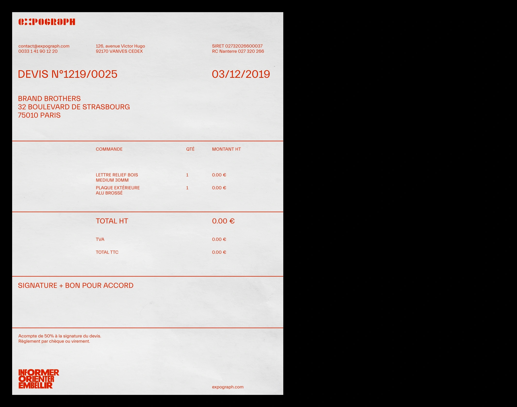
Established in 1973, Expograph is a designer and manufacturer of signage, wayfinding systems, decoration, and visual communication for indoor and outdoor applications. Located in Vanves, on the outskirts of Paris, France, the company covers the creation, technical feasibility studies, manufacturing, installation, and removal of projects for corporate offices, hotels and restaurants, arts and culture institutions, retailers, and events. Recently, Expograph introduced a new identity designed by Paris-based Brand Brothers.
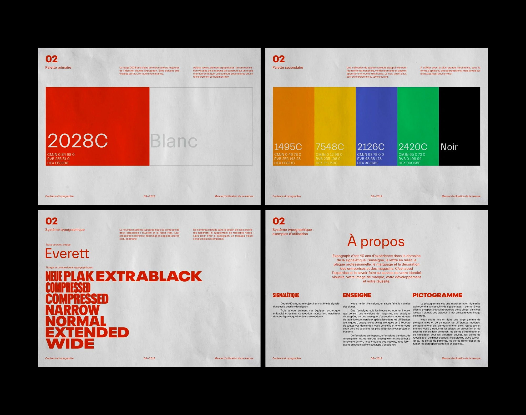
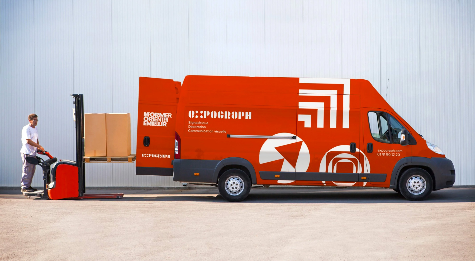
In the spring of 2019, we were mandated to completely rethink the visual identity. Their mantra: inform, guide, embellish. We immediately, together with the communication team, refocus the approach towards a more radical, more direct, more raw axis, expressing technicality and systemic thinking through their graphic identity. The new logo, based on a typographic house design, is a monochromatic typogram, whose characters have been designed on the basis of a series of identical rectangles. The “X”, moving towards four directions, becomes the starting point of the new visual system: a collection of forms, which we constantly enrich, which assemble to infinity and evoke by a subtle way the three great promises of the company. The many variations range from print to vehicles; the new website, meanwhile, will be operational by the end of 2019.
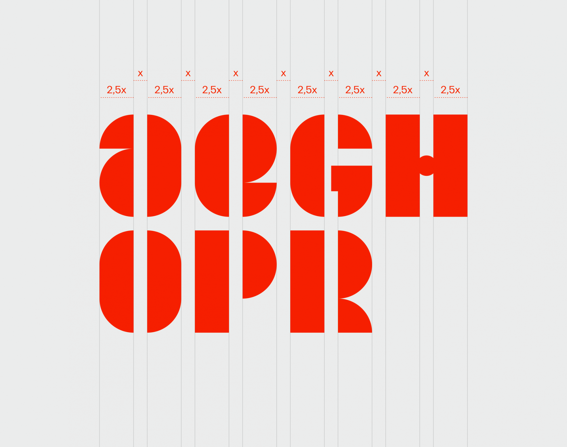
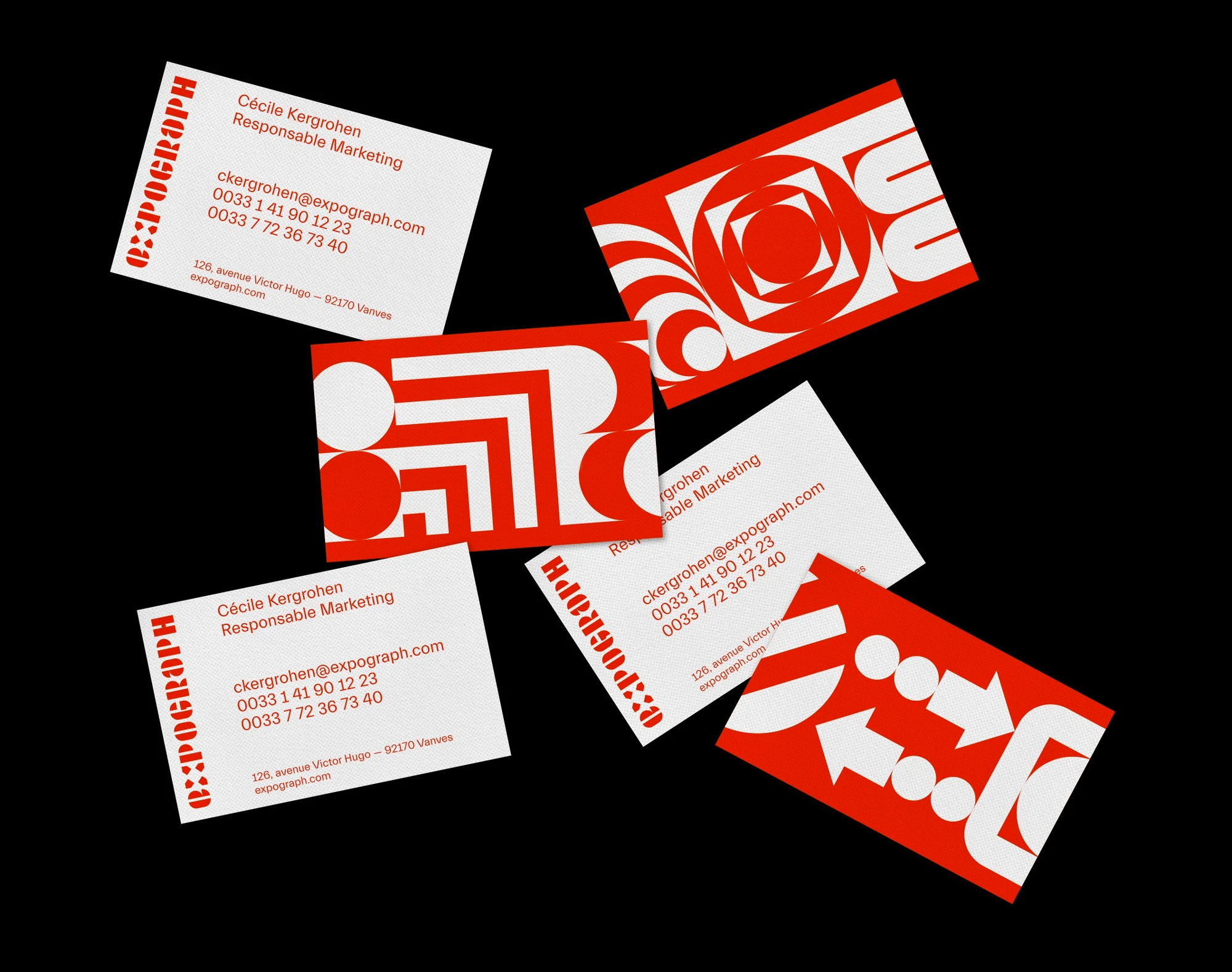
The old logo tried too hard to be design-y, with a number of kooky things happening in the wordmark — weird unicase “e”, green “g”, crossbar-less “A” — and a head-scratcher of a monogram of most likely a mirrored “e” but also possibly a combo of the “e” and the “G” rotated. Either way, not good. Clearly though, Expograph enjoys unconventional solutions as the new logo keeps things on the design-y side with a custom wordmark made of strict geometric shapes, sticking to a strict grid. Maintaining the unicase approach of the old logo, the characters in the new logo are successful to varying degrees… the “e” and “a” are interesting, the “R” is actually quite pretty, the “H” is weird with its tiny dot as a crossbar, and something in the “G” is off — by then, the interesting solution to the “X” sort of gets lost in the shuffle with too many things vying for attention. At first glance it makes for a good design that looks interesting but there is a lack of unity and inconsistent rhythm to it… the red color doesn’t help in that it’s hard to look at it for more than a few seconds. The logo does set the tone for the rest of the modular identity.
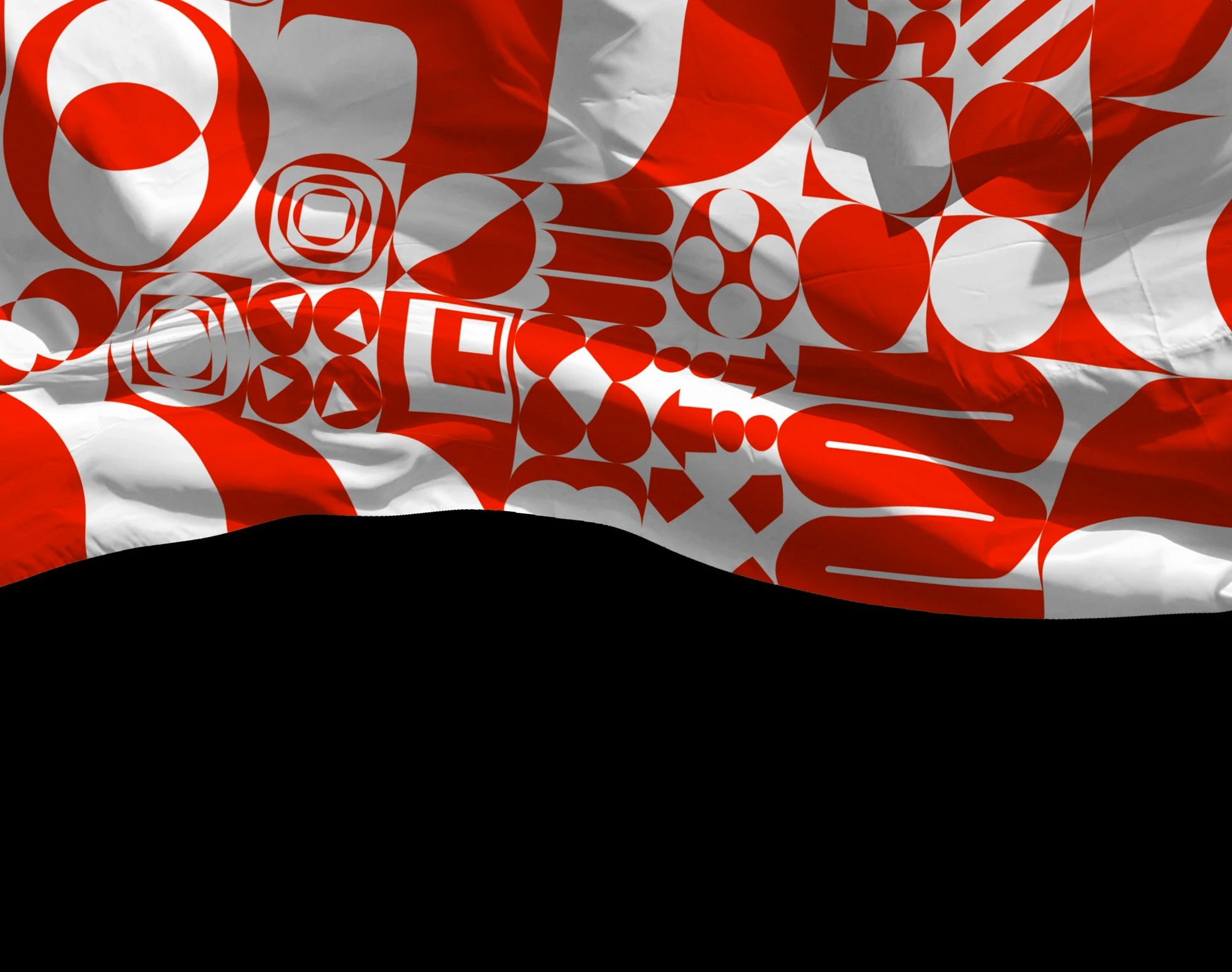
At the core of the identity is a set of abstract geometric forms and mini compositions that can then be used separately or as larger patterns. As with the logo, at first glance, this looks cool and engaging but when you try to start breaking down the individual compositions and how they work together, there is, again, a subtle lack of inconsistency and bumpy rhythm that doesn’t quite allow the bits and pieces to completely gel together… let us proceed with the applications and we’ll see how we feel by the end of it.
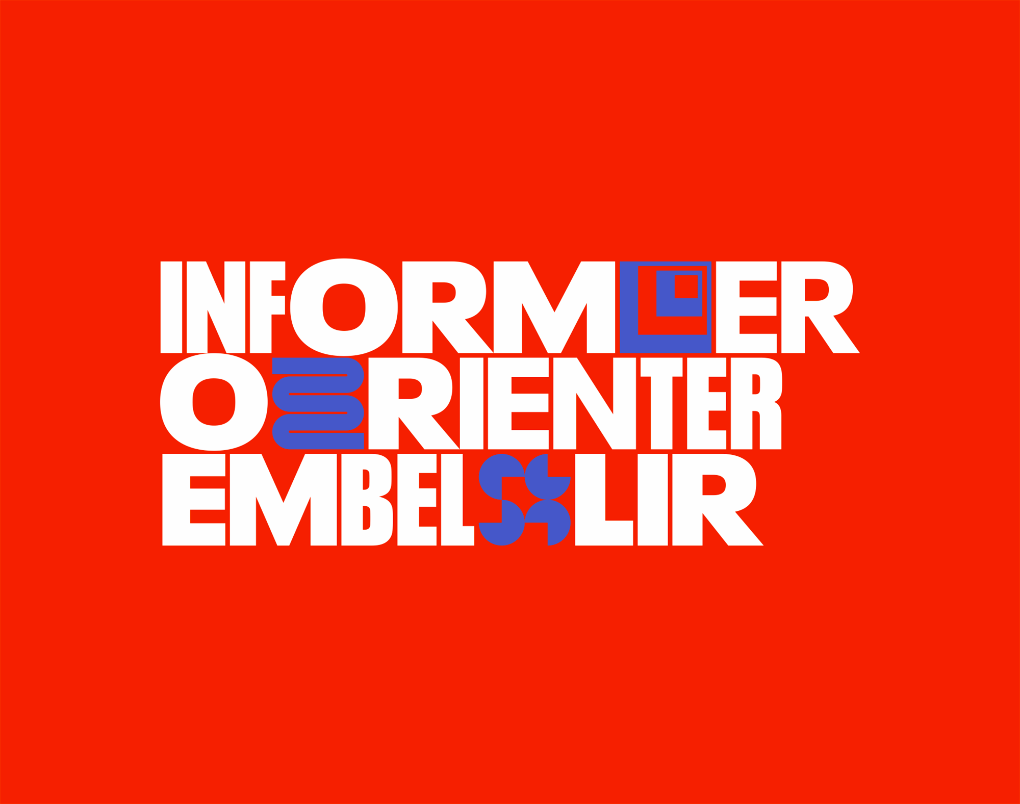
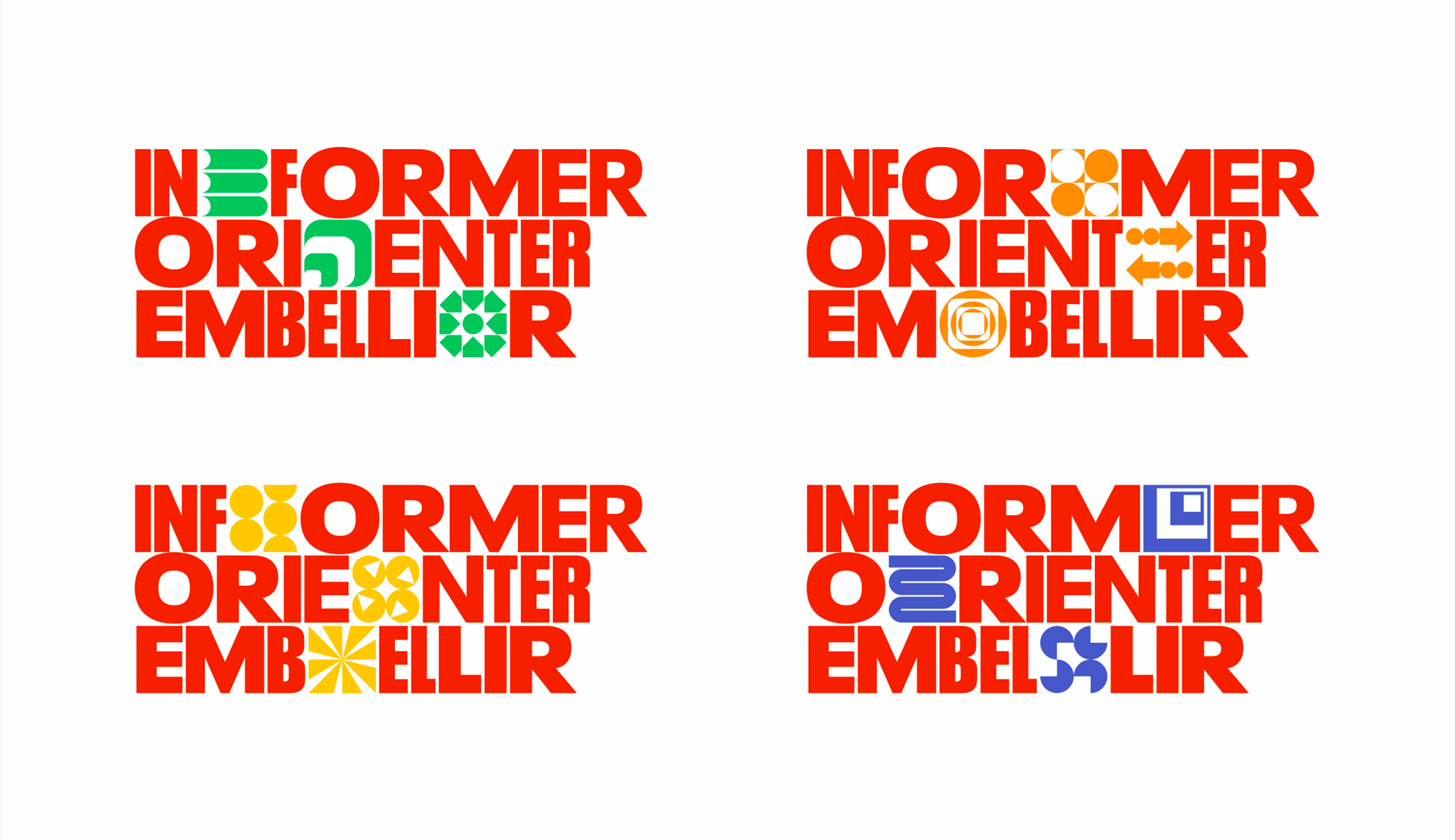
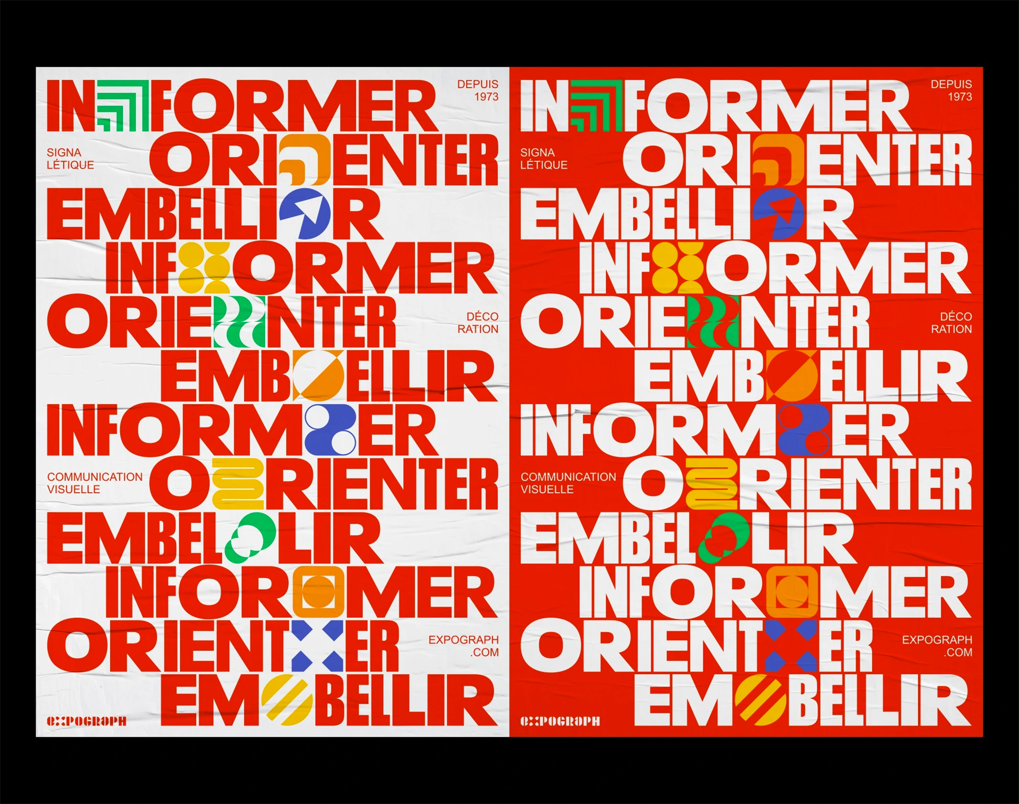
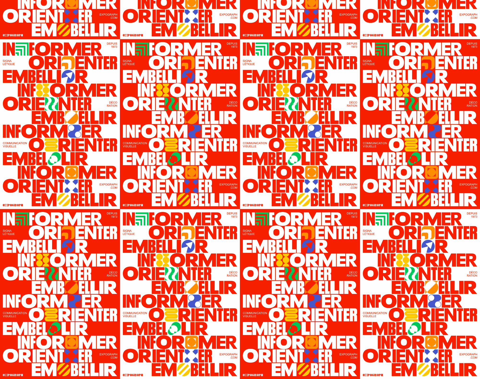
A first range of applications includes the tagline with each character typeset in mixed widths of Neue Plak and abstract shapes shoehorned in different places. To use their tagline as a model of critique: it embellishes but I’m not sure it informs or guides. When repeated in poster form, I will certainly admit that it does convey creativity, which is an important aspect of the business. Moving on…
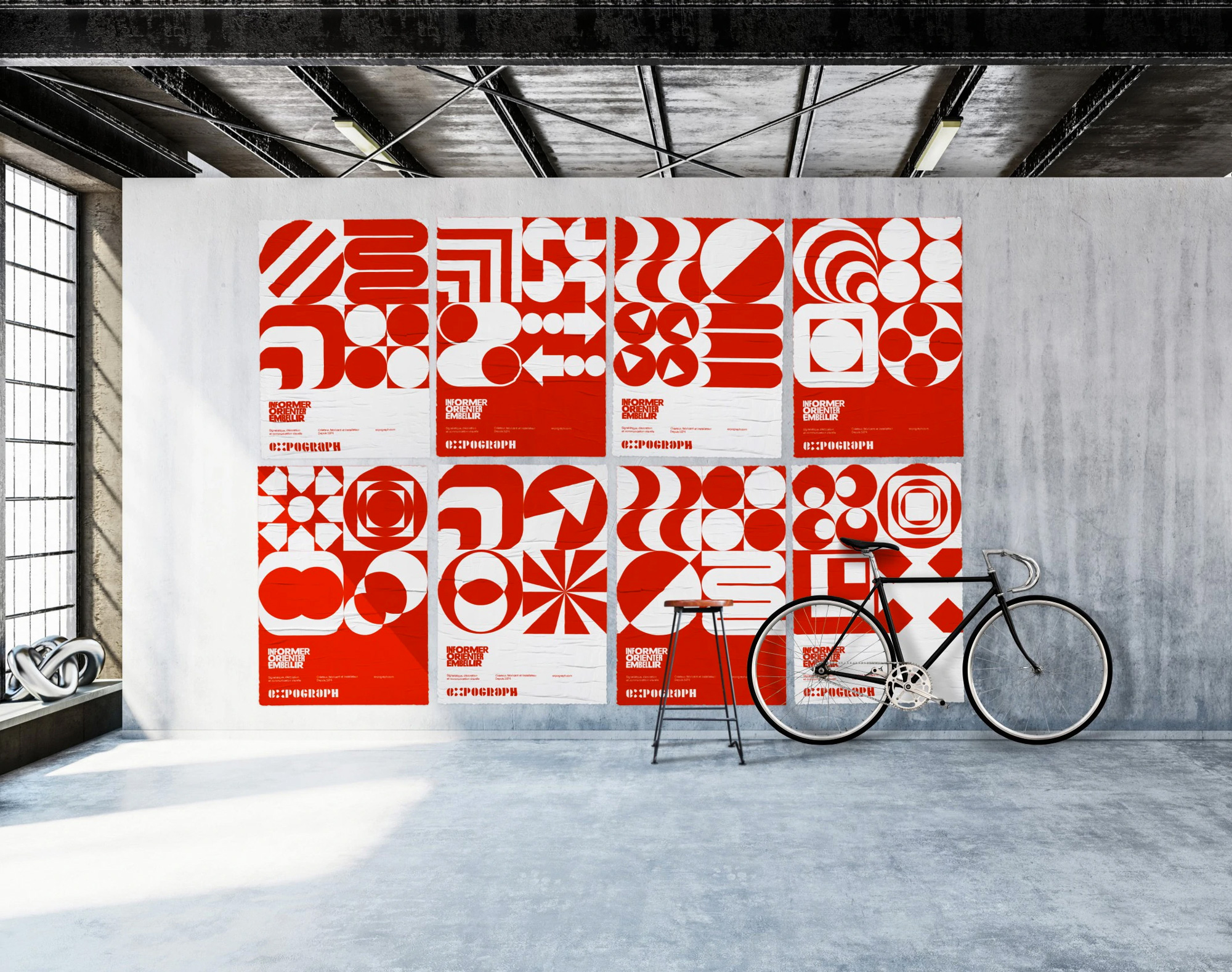
The second range of applications is an all-red deployment of the abstract shapes in various configurations and there is relative sense of restraint with the tagline rendered without additional shapes, clean supporting typography, and a controlled chaos approach to the layouts. Seeing the posters above, though, shows that the main three elements are each operating on their own: the logo is doing one thing, the tagline is doing another thing, and the shapes are doing yet another thing. Other than being red, they don’t really work together.
So now that we have seen all of it, let us conclude… so far you may have gotten the impression that I don’t like this but the problem is that, on the surface, I do like it because I sure like me stuff on stuff with stuff arranged modularly and the thumbnails of these project are super fun-looking so I do appreciate its energy and boldness but on the less excitable part of my brain my impression is that this is just turning up the volume to 11 for the sake of going to 11. Lastly, I will admit, where it matters most, that if I had to choose between a vendor with Expograph’s old identity and Expograph’s new identity, I would totally choose the latter based on the identity alone and actually feel very confident that they would be a quality, creative partner, so rationalization be damned and emotion shall prevail.
 each year since publication began in 2006

 Новости Союза дизайнеров
Все о дизайне в Санкт-Петербурге.
Новости Союза дизайнеров
Все о дизайне в Санкт-Петербурге.