Обзор лучших ресурсов по разработке бренда, разработке упаковки
contact us | ok@ohmycode.ru
contact us | ok@ohmycode.ru
Established in 1857, Santander is a Spanish banking group with operations around the world and is Spain’s largest bank. Before 2004 Santander Group owned banks under different names but that year began a process of all consumer-facing branches adopting the Santander name and flame logo. As of 2017, Santander has more than 202,000 employees, serving 133 million customers and more than 4 million shareholders. Last week, Santander introduced an evolution of its logo and new identity designed by the Madrid, Spain, office of Interbrand.
The brand changes to become more modern, more digital and more in tune with new generations, while retaining its most distinctive traits: the name, the colour red and the “flame”, which are developed to gain greater visibility and improve the user experience in the digital world.
This change is an example of the cultural transformation the Bank is undergoing to help people and businesses prosper in a simple, personal and fair way.
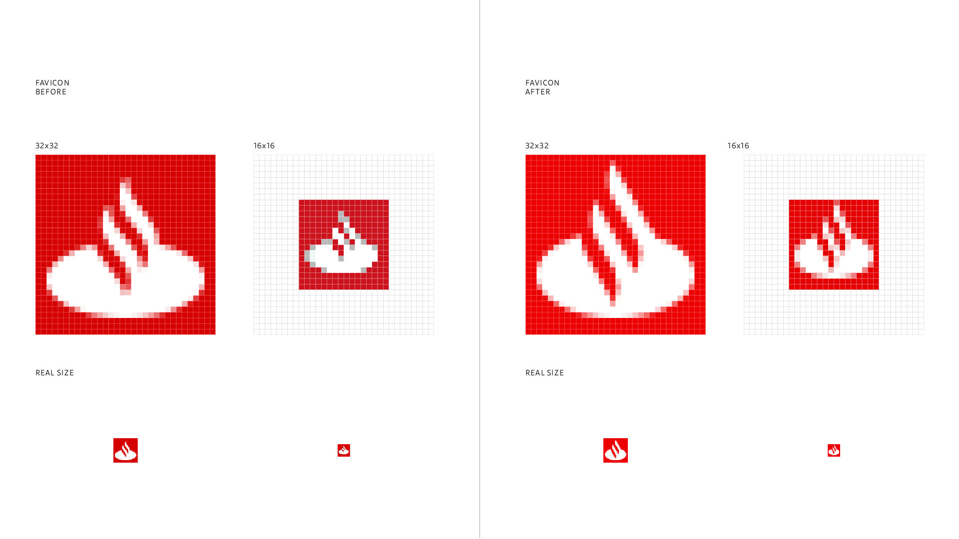
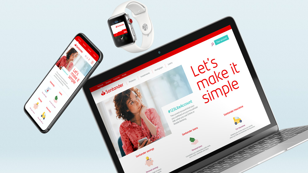
The new logo is more modern, simple and digital. The flame has a greater presence and the word Santander is clearer, more legible and simpler - able to adapt to any media and any channel.
It has been freed from the red square to gain more flexibility and modernity. New versions, such as the vertical version, have been created to respond to specific needs and the flame gains more focus and Independence.
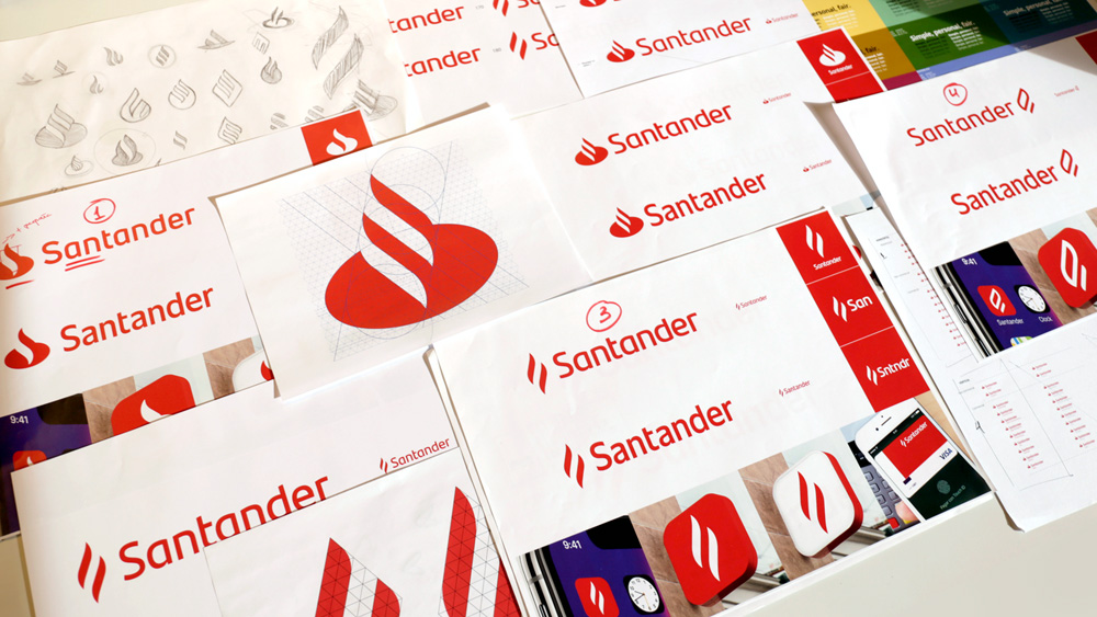
I have always liked Santander’s flame logo with its implied “S” and uncommon overall shape (it’s not square, it’s not round, it’s not entirely symmetrical) and the serif wordmark introduced in 2007 was sharp and elegant. The new logo smoothes out the flame icon by removing the slight curl it used to have at the top and bottom of the flame which, yes, yields a cleaner icon but also loses the “S” shape, which is not integral to its existence but was a nice, subtle tie-in to the name. The icon retains the essence but at small sizes it looks less like a flame and more like two bare diagonals. It may not be a huge problem as the idea of Santander’s logo being a flame is now well engrained.
The wordmark… it’s no secret that I heavily dislike this style of “n”s and “r”s — à la FF Dax — and my initial reaction to it, while not entirely negative, is not positive either. But the “a”s and “d” are actually quite nice and I wish they had given the “n” and the “r” the same connection when curve meets vertical. Moving past my personal biases and preferences, the new wordmark does work well and provides a better complement to the icon with a wordmark that visually matches its weight more closely.
The new logo adapts well to shifting spaces where it has to live and remains recognizable in long and short form.
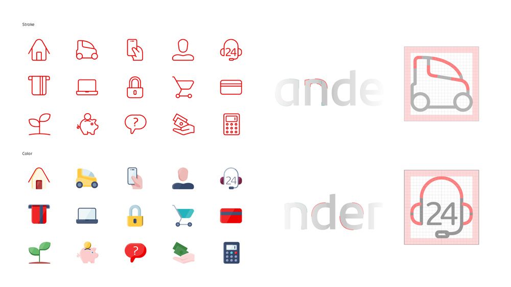
Not a fan of the icon set. They point out the sharp corner of the “n” which, even though it’s the part I dislike, it’s a very distinctive aspect not reflected in the icons. The full-color versions start to veer into cartoon-y territory.
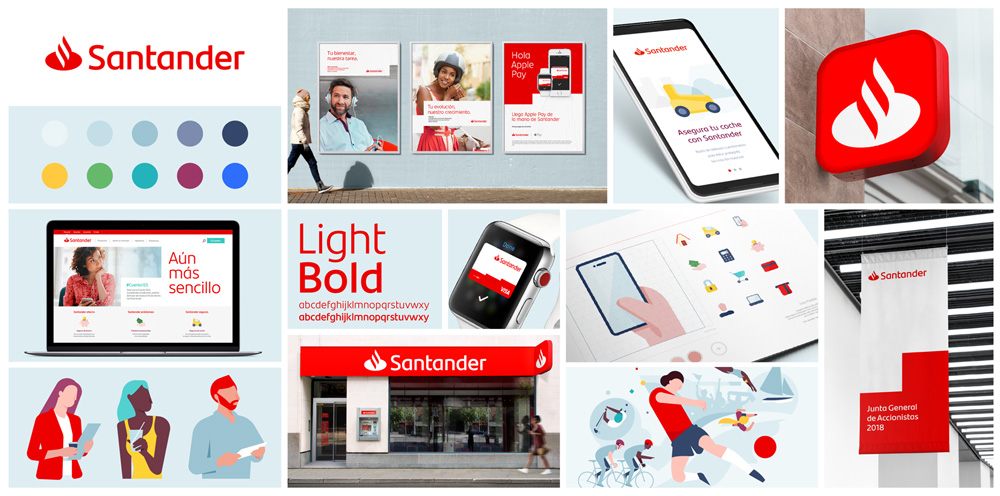
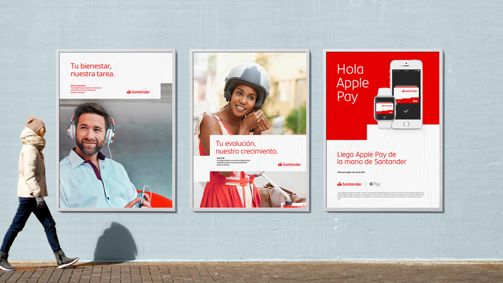

The identity is fairly straightforward — it kind of has to be in order to be manageable on a global scale — but it does introduce one distinctive element in the shifting boxes that help add a little bit of visual interest to the layouts without it becoming too hard to implement. I’m not sure the illustrations serve much of a purpose — maybe it has to do with lack of application samples but maybe it has to do with photography being a better approach for a global bank.
The Santander Brand has evolved to accompany the bank’s transformation. A simpler and more modern Brand. As you can see in our launch campaign, the protagonist always pursues a better version of himself in order to prosper.
Overall, this is a decent evolution. Nothing super exciting but also nothing hugely different for anyone to get up in arms about.
Thanks to Elliot Banks for the tip.

 Новости Союза дизайнеров
Все о дизайне в Санкт-Петербурге.
Новости Союза дизайнеров
Все о дизайне в Санкт-Петербурге.