Обзор лучших ресурсов по разработке бренда, разработке упаковки
contact us | ok@ohmycode.ru
contact us | ok@ohmycode.ru
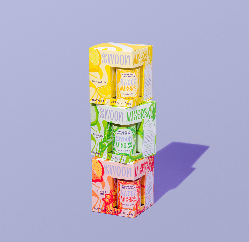
Launched in 2015, Be Mixed is (was) a zero-sugar cocktail mixer developed from natural ingredients and sweeteners derived from monk fruit and stevia extracts. Created by two friends who met at business school, Cristina Blankfein and Jennifer Ross, as a response to sugar-laden cocktails, Be Mixed has just been renamed Swoon Mixers and rolled into the Swoon brand, a sugar substitute syrup that has zero sugar and no chemicals, also created by the two friends and launched in 2019. Swoon Mixers come in flavors like Cucumber Mint, Margarita, and Ginger Lime, that can be mixed across a variety of spirits including vodka, rum, tequila, gin, whiskey, and wine. Re-launched last month, the new packaging was designed by Center and in-house, the Swoon logo was originally designed by Brooklyn, NY-based Red Antler, and the Swoon Mixers logo by Center (both designed at each firm by Andrew Galloway).
The old logo had a decent idea and execution in the “MIXED” part of the logo but the lowercase, italic “be” killed the vibe — not sure why they didn’t just keep it in the same approach, even if it was smaller and centered above but the mixing and matching of type styles was too much, even for a mixer. The new logo is great in part because the original Swoon logo is extra delicious with so many curves that it makes Lombard Street look like a straight line. The “MIXERS” addition to match the original logo is perfectly executed with the “M” being a flipped “W”, the “e” being unicase like the “n” and the “R” being weird for, well, just for shits and giggles. I really love both logos for their sheer typographic joy and amount of fucks given — zero.
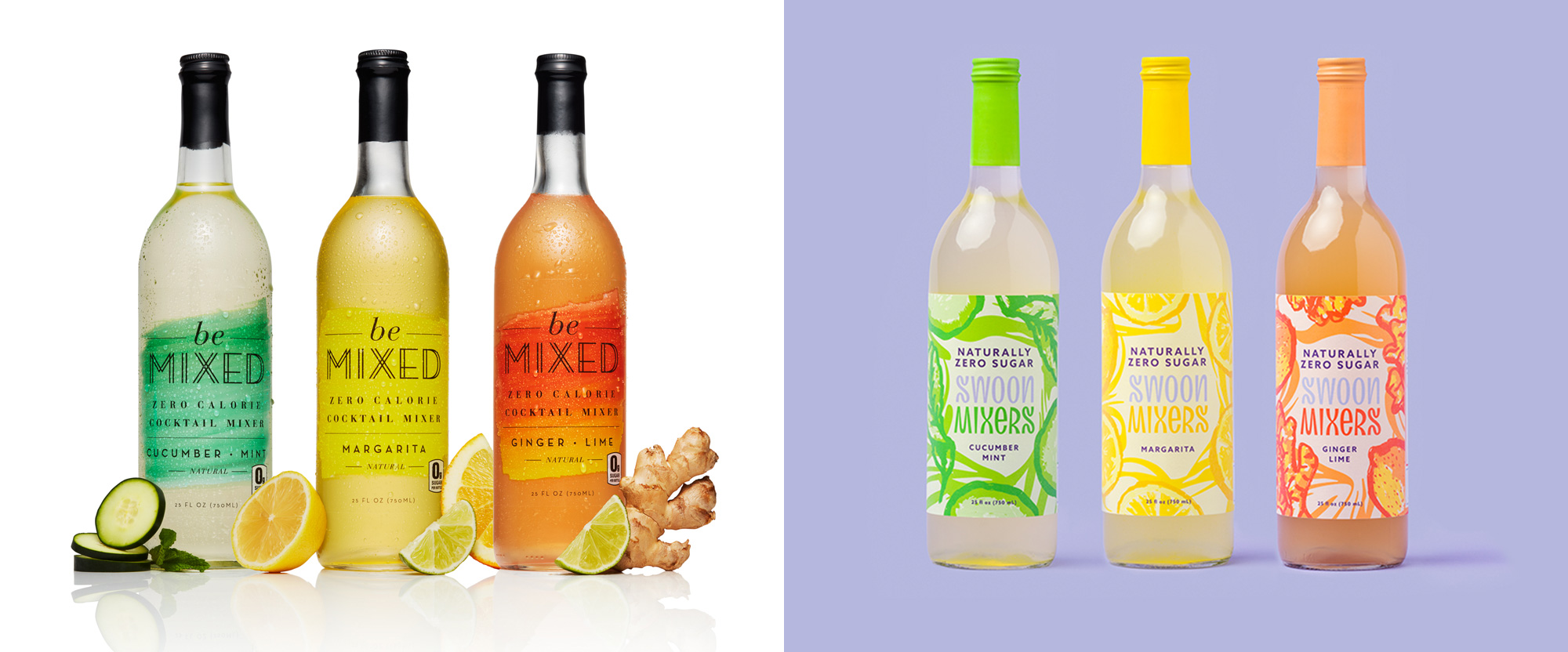
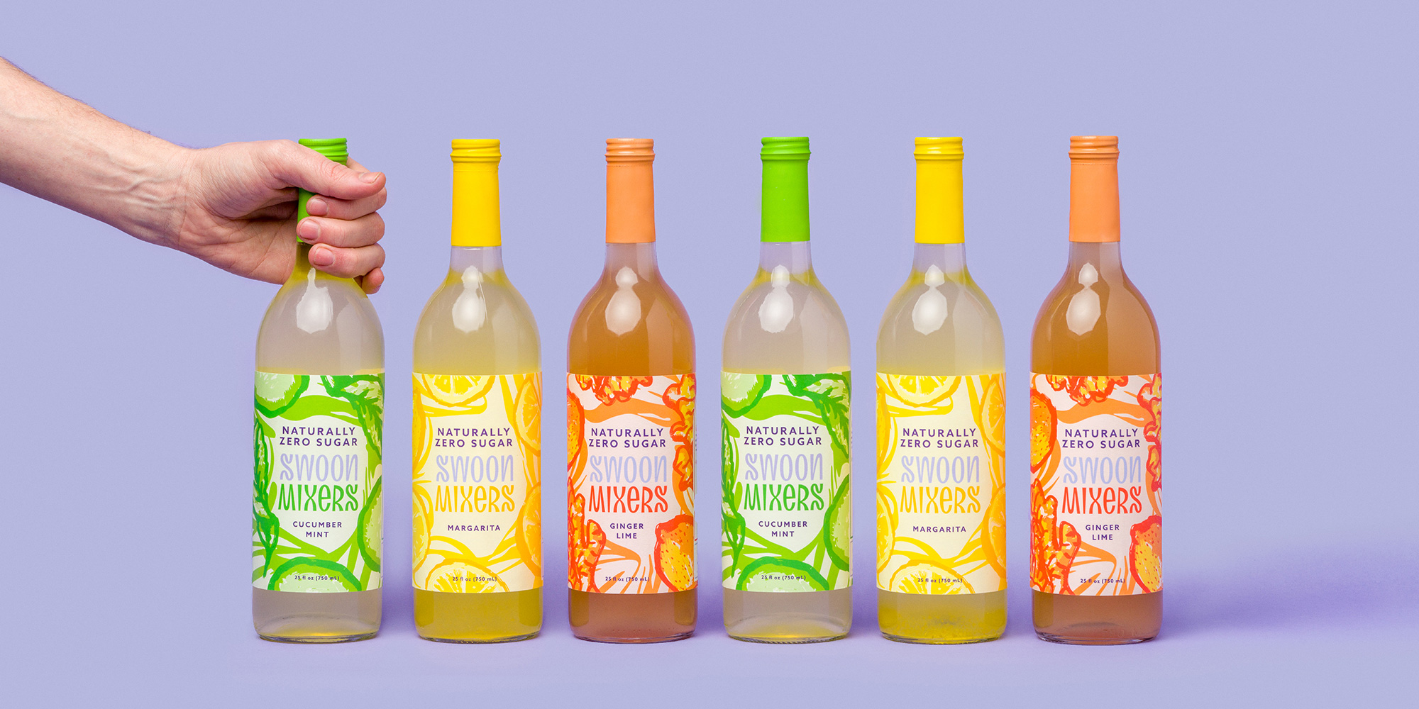
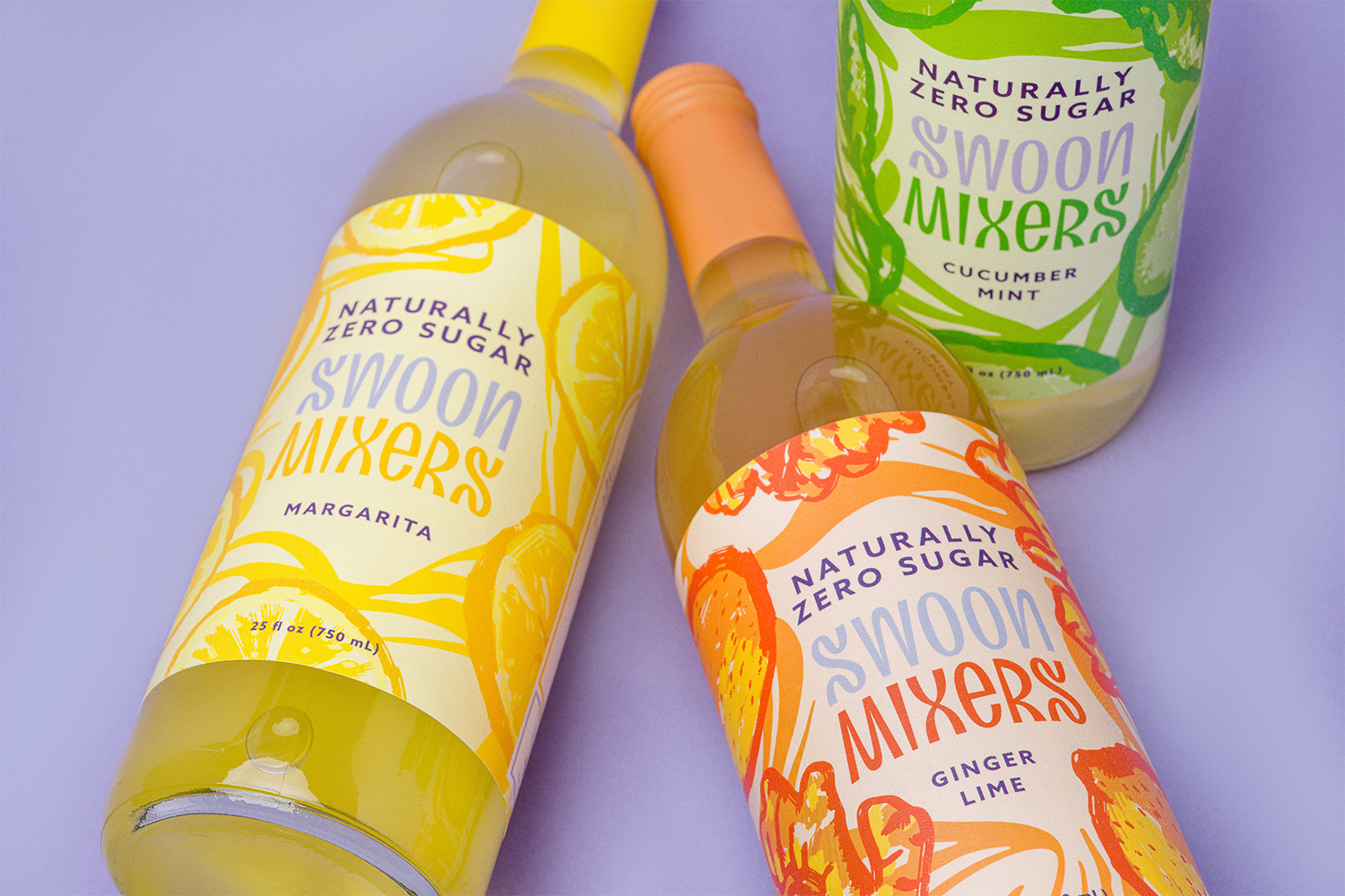
The old bottles were pretty nice, although they had even more fonts on it than just the logo. The new bottles are pretty nice too, with some vivacious illustrations that give the product a lot of texture. The one strange thing is how much “SWOON” recedes into the background by keeping it in the lavender brand color that, one, doesn’t mix so well with the other colors and, two, is far too light to compete with everything else around it. I assume the goal was to prioritize and push mixers and, to that end, it did succeed.
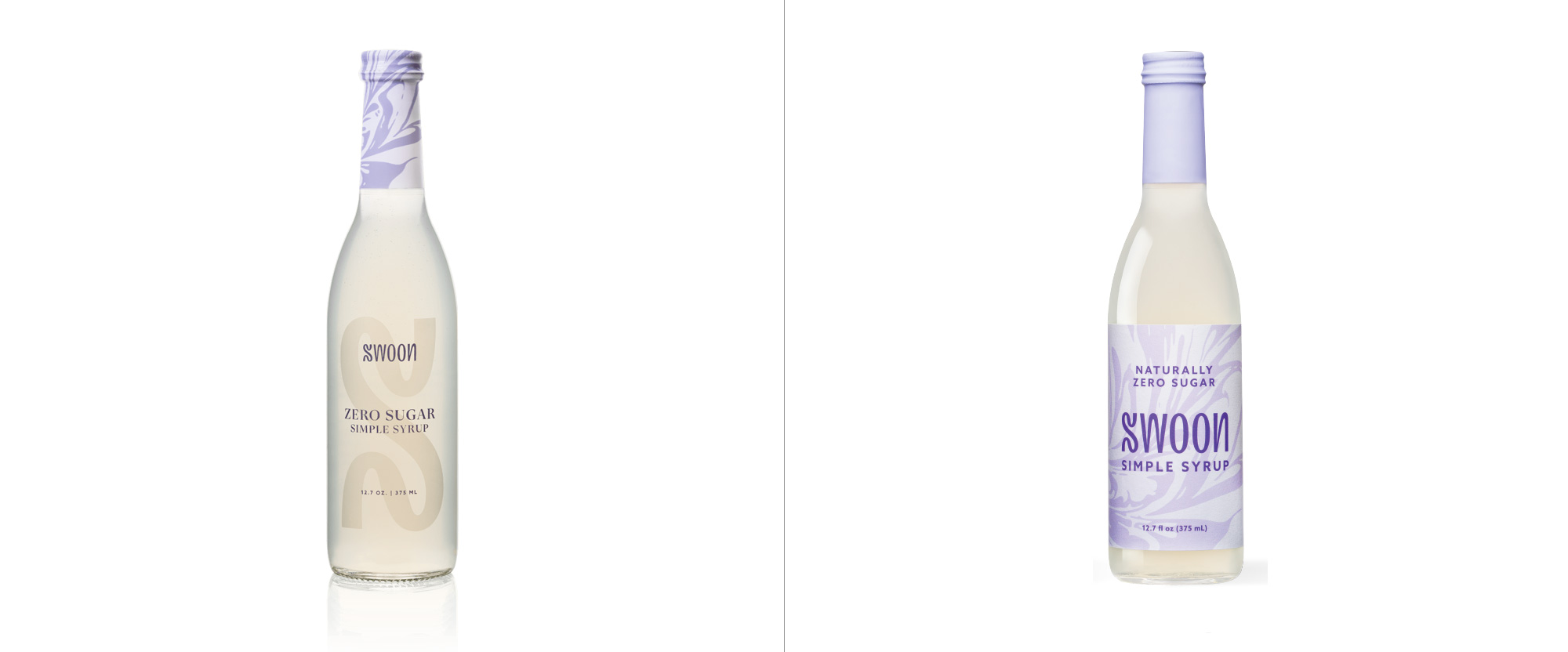
The syrup bottle also got an illustrative update and while the old one was nice and elegant, this one feels much more energetic. Both are pretty good but this new update definitely brings it more in tune with the mixers.
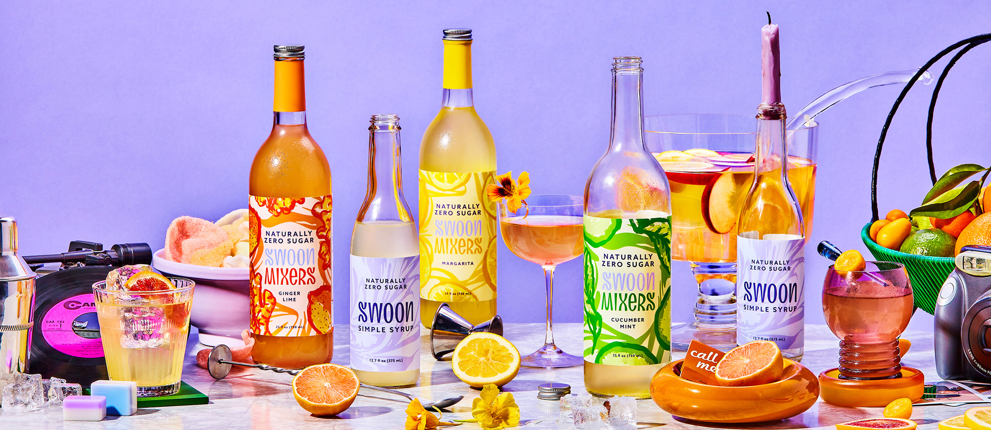
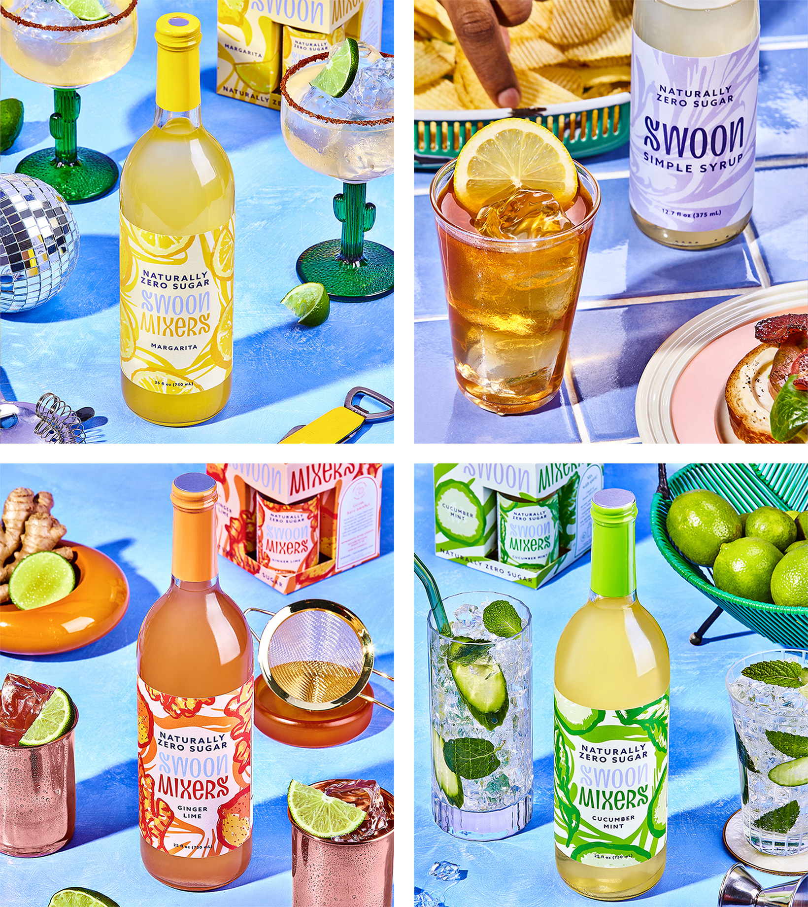
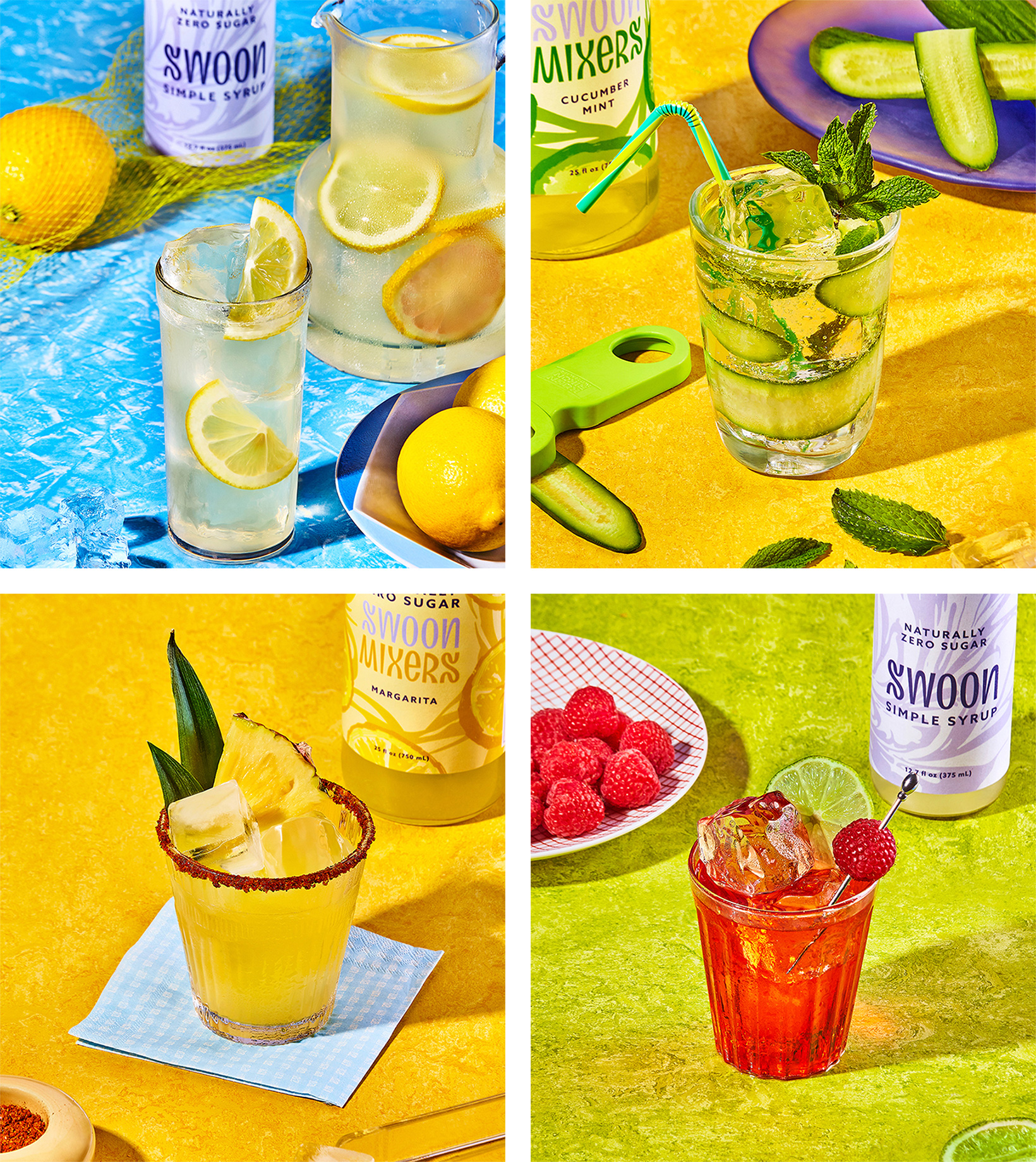
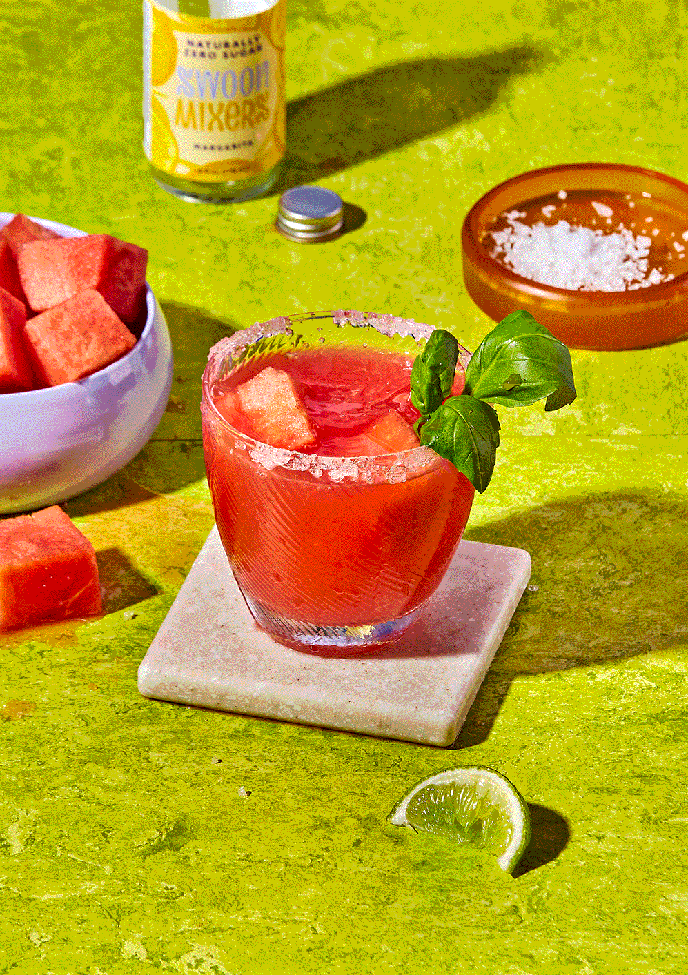
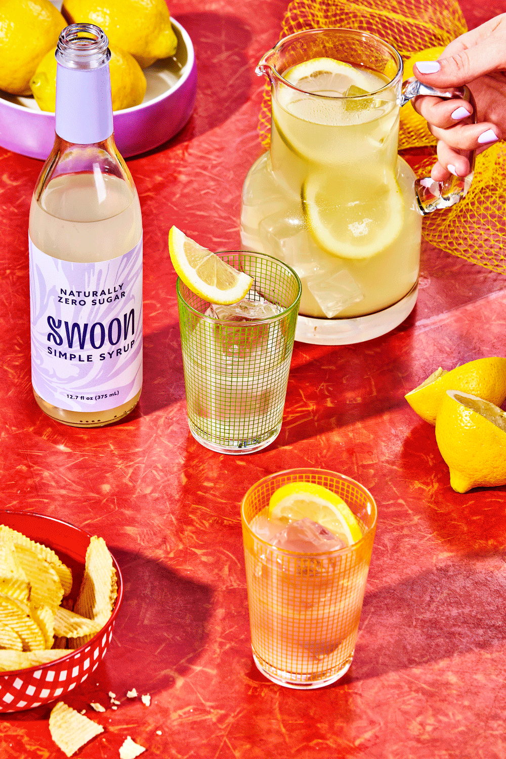
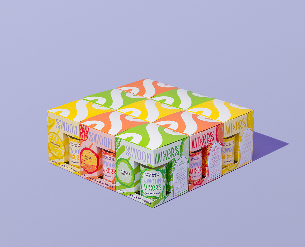
Overall, from logo to bottles, this exudes fun and good times and you can even taste the sweetness just from looking at it.
 each year since publication began in 2006

 Новости Союза дизайнеров
Все о дизайне в Санкт-Петербурге.
Новости Союза дизайнеров
Все о дизайне в Санкт-Петербурге.