Обзор лучших ресурсов по разработке бренда, разработке упаковки
contact us | ok@ohmycode.ru
contact us | ok@ohmycode.ru
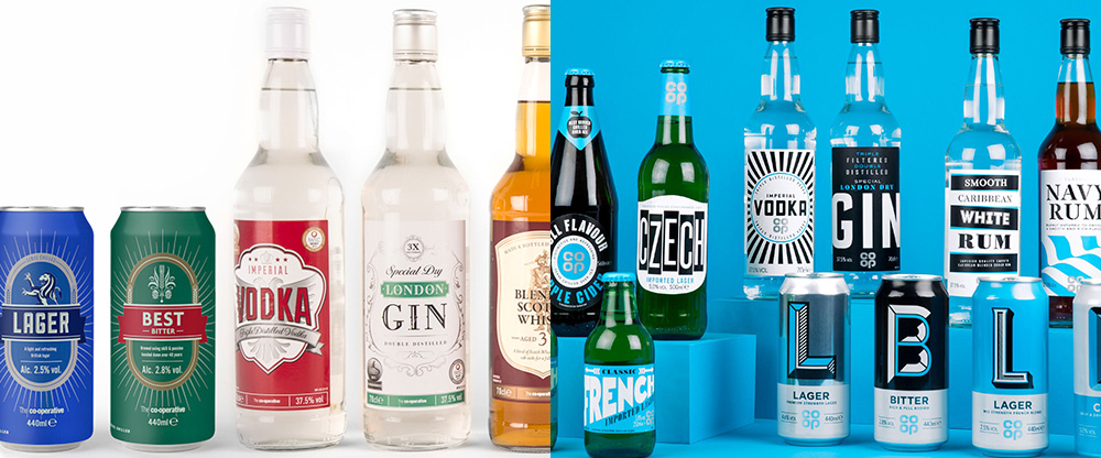
Established in 1844, Co-operative Group (simply Co-op to friends) is a British consumer co-operative and one of the oldest and largest in the world with 2,800 convenience and medium-sized stores, making it the UK’s fifth biggest food retailer. As part of its own private label products, Co-op offers a range of beers, ciders, and spirits that was recently redesigned by Leeds, UK-based Robot Food.
Research undertaken by Robot Food found that many retailers were reluctant to break from an apologetic, ‘me-too’ design approach and content to remain a ‘needs must’ alternative.
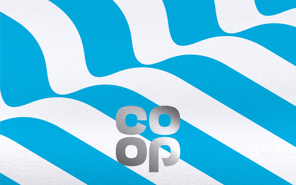
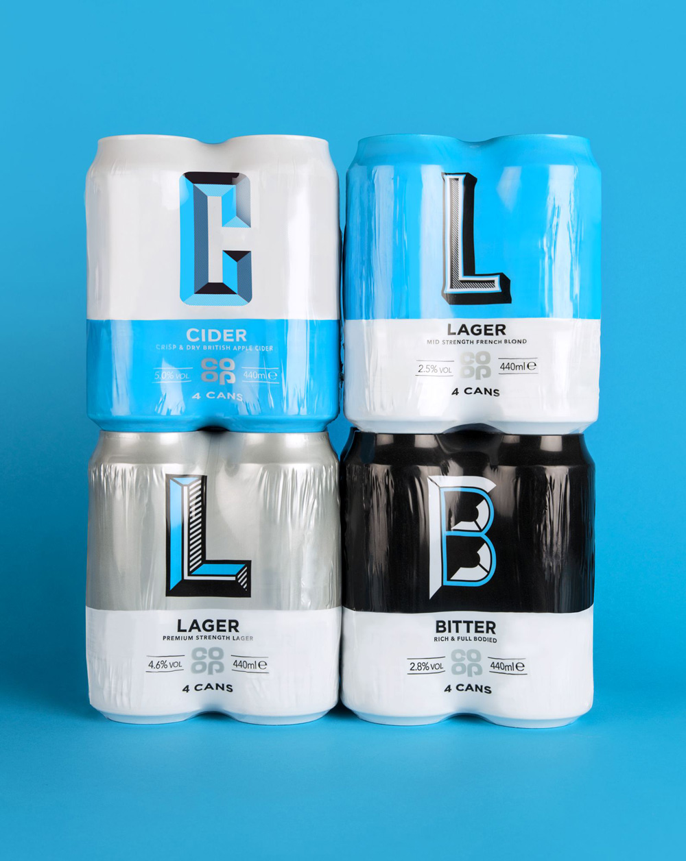
The team’s strategy was game-changing for the category; to not shy away from own-brand status and for beers, ciders and spirits to shout loudly through bold, attention grabbing design. A fixed colour palette and silver Co-op brand mark was applied across the breadth of products for consistency and to allow more freedom when it came to designing each individual SKU.
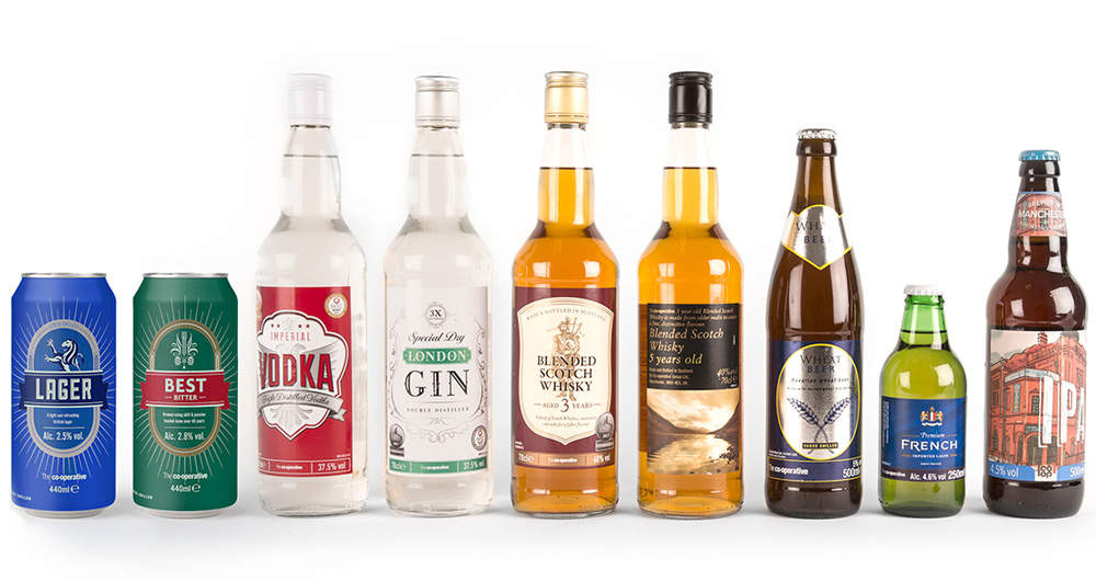
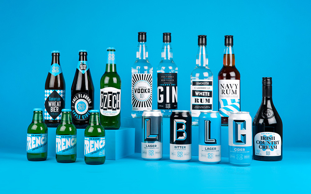
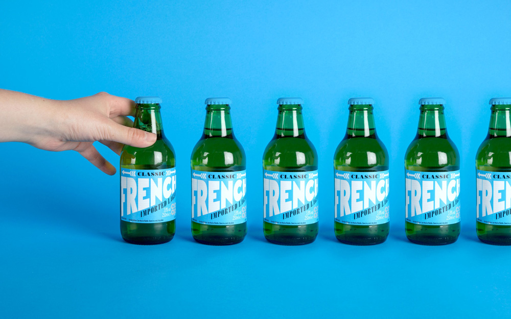
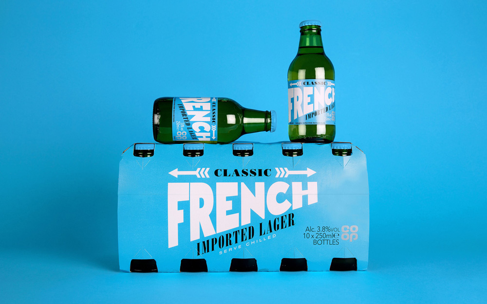
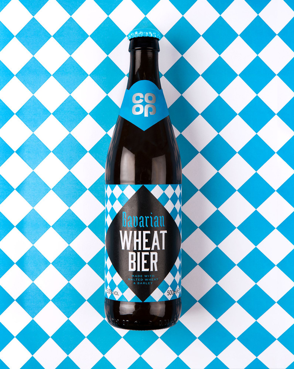
From vodka to wheat beer, expressive typography and impactful graphic treatments create a unique, ‘ownable’ look for each product, while the Co-op’s distinctive blue proudly identifies the collection as a whole. The result is an eclectic but cohesive range that sits confidently alongside the leading brands and rewards savvy Co-op customers with beautiful design worthy of any basket.
The old packaging was amazingly chameleon-esque. Each product looked exactly like it belonged in its category and could pass as a substitute for any of its competitors. It was almost impossible, though, to realize this was Co-op’s own brand, which to a certain degree is the goal of many private brands… to look exactly like the others and downplay the fact that it’s not a big brand. The opposite strategy is to make the private brand so cool that it makes the other brands less desirable, which is what this new design is doing and it does so through a flexible system with great range and fantastic typographic results that span styles, moods, and old and new trends but all done in a fresh new way.
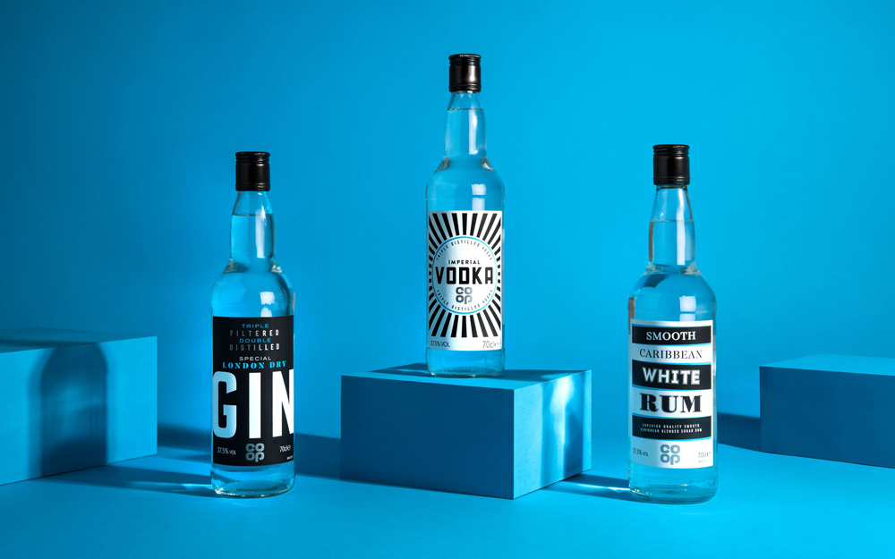
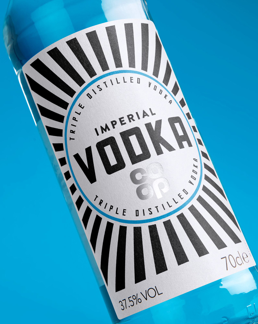
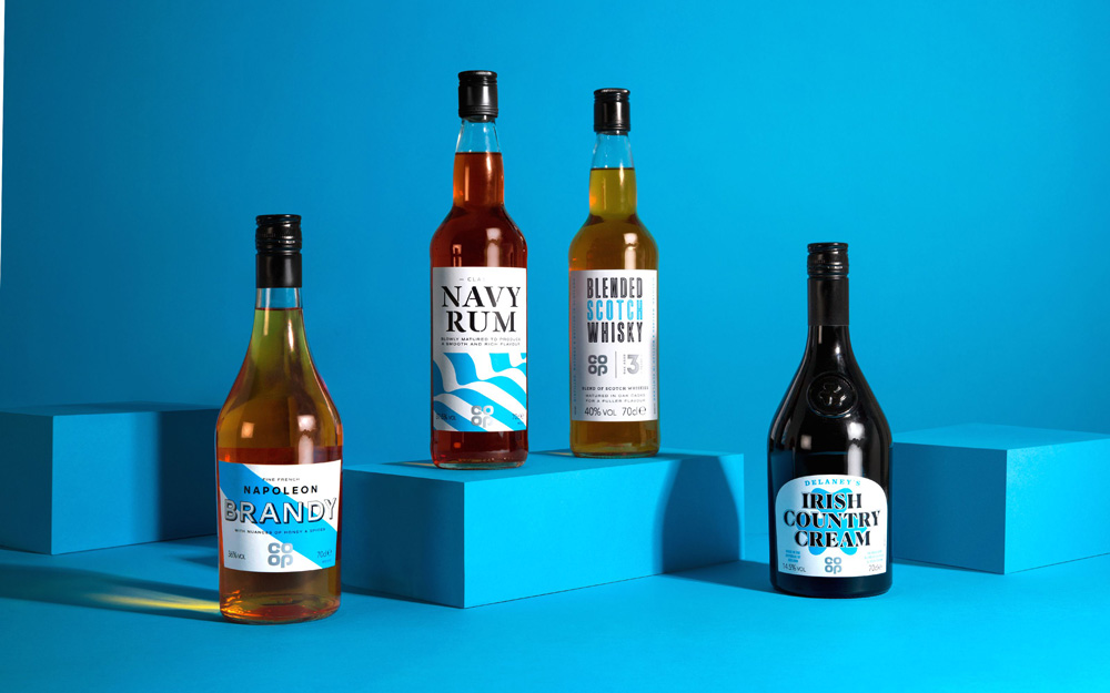
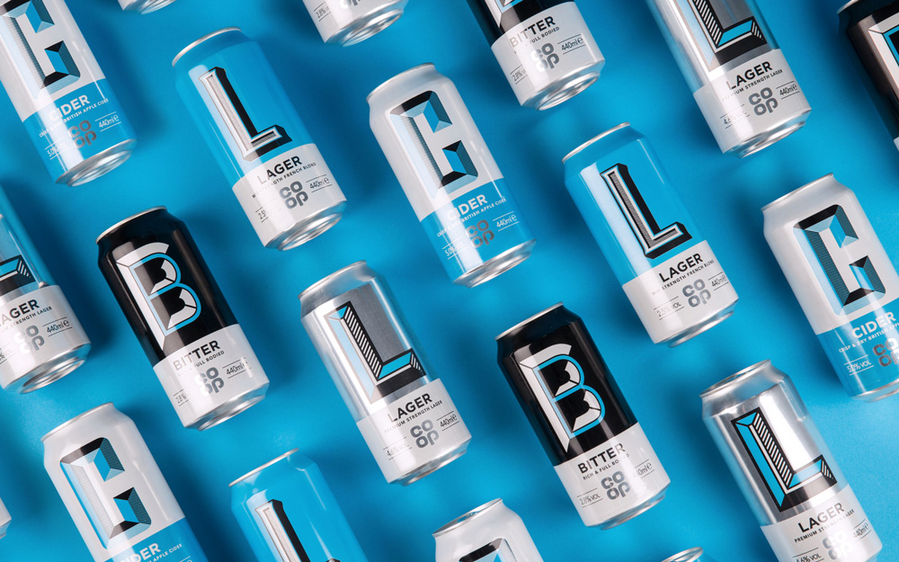
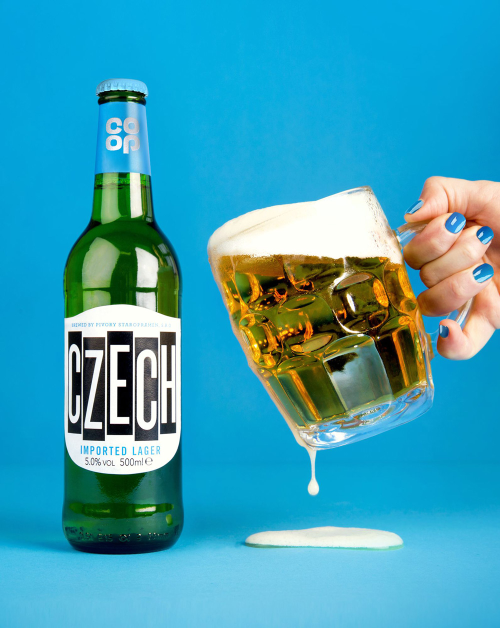
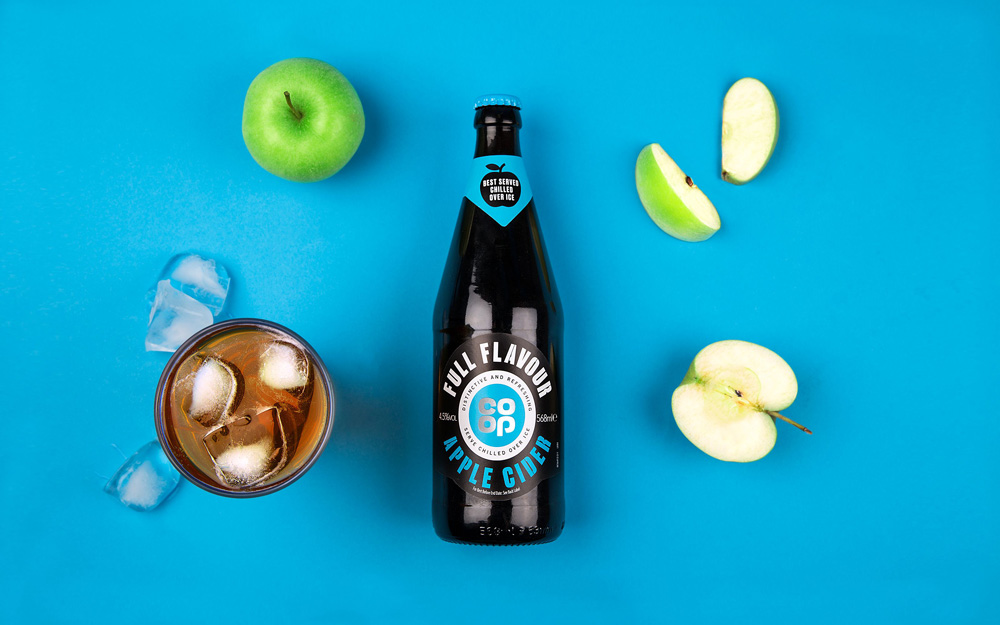
Given the freedom of the system it’s hard to nitpick at things — not that there is much to nitpick — as there is no real right or wrong answer since none of the products in each category follow directly or break fully from the norm, rather they operate somewhere in between the spectrum of sameness and differentiation but always with a surprise twist in pattern, type, or composition. One thing that I would love to see in this case study are photos of the products on the shelves and how each of these stand out in their own category, especially since the combination of bright blue, black, and white is very uncommon in spirits and beers — I bet they are almost a shock. Cheers to that.

 Новости Союза дизайнеров
Все о дизайне в Санкт-Петербурге.
Новости Союза дизайнеров
Все о дизайне в Санкт-Петербурге.