Обзор лучших ресурсов по разработке бренда, разработке упаковки
contact us | ok@ohmycode.ru
contact us | ok@ohmycode.ru
Established in 1955, Lufthansa is one of the leading airlines in the world. Based in Germany, Lufthansa flies to 211 destinations in 74 countries with a fleet of close to 350 planes and is the largest European operator of the Airbus A380. This week, Lufthansa introduced a new logo, identity, and livery designed in-house in collaboration with Munich-based Martin et Karczinski.
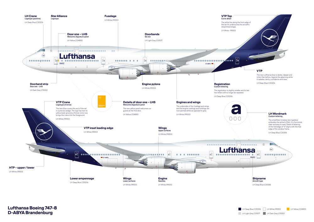
On the occasion of the 100th anniversary of the crane, every detail of the design was reworked - to meet requirements of the digital age. The new Lufthansa appearance gives the individual elements a new, modern quality to sharpen their impact. The designers found great importance in taking up the unique design tradition of the Lufthansa brand and leading it into the future.
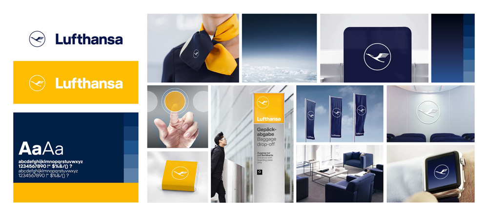
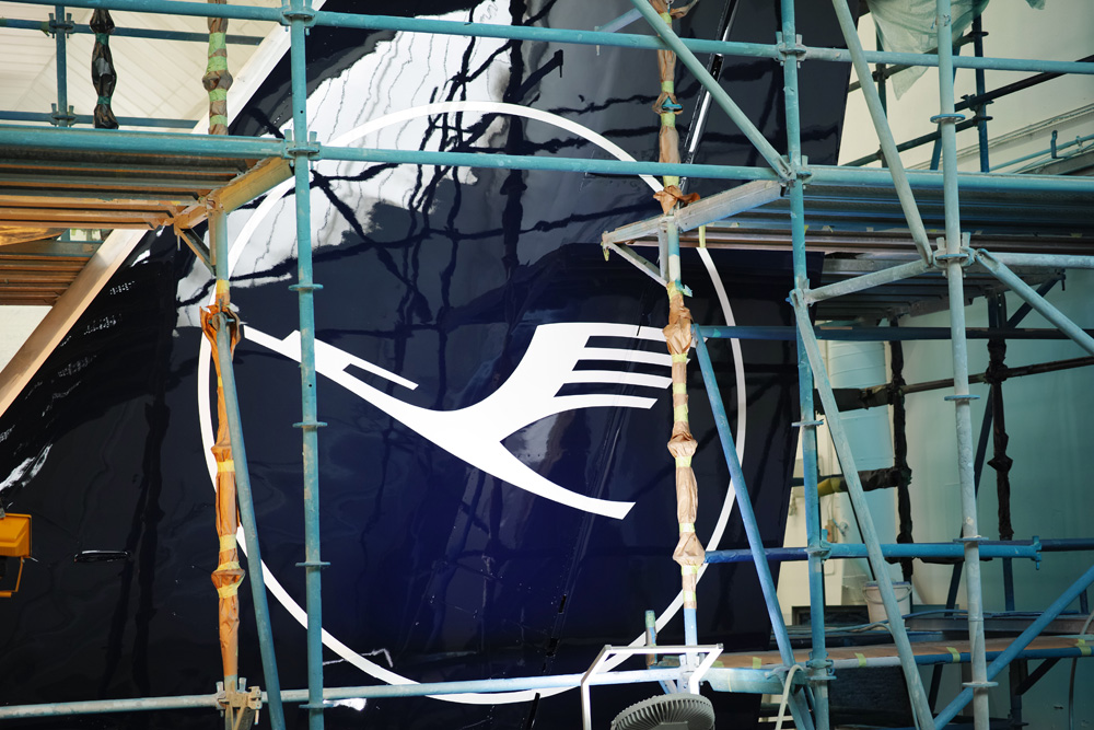
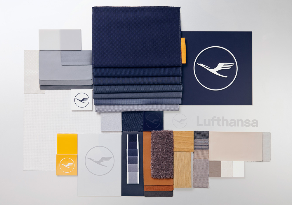
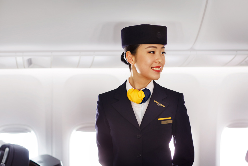
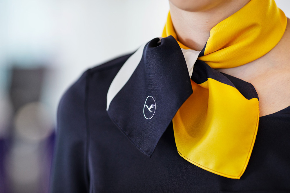
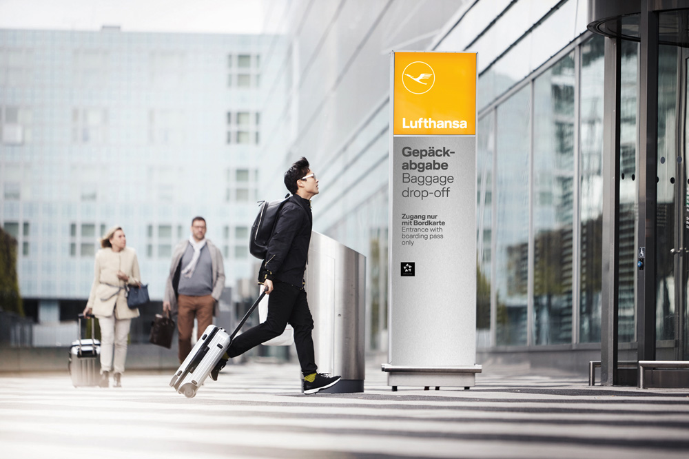
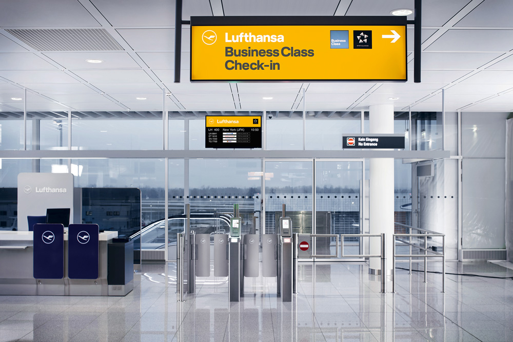
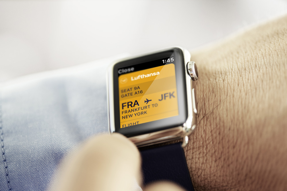
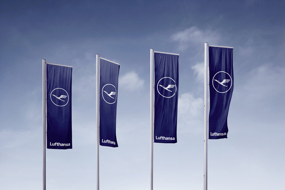
The crane, designed exactly 100 years ago by graphic artist Otto Firle, a distinctive icon in the sky, remains the airline’s iconic symbol. In the future, it will be slimmer and fit for the digital world. A thinner ring makes the crane look more elegant, bringing it into the foreground and granting it more space. All in all, the trademark will gain lightness and elegance. The familiar blue-yellow color combination of Lufthansa will also be retained - but the use of these primary colors will be redefined. The blue specially developed for Lufthansa is somewhat darker, more elegant and is becoming the leading brand color. It stands for reliability, clarity and value.
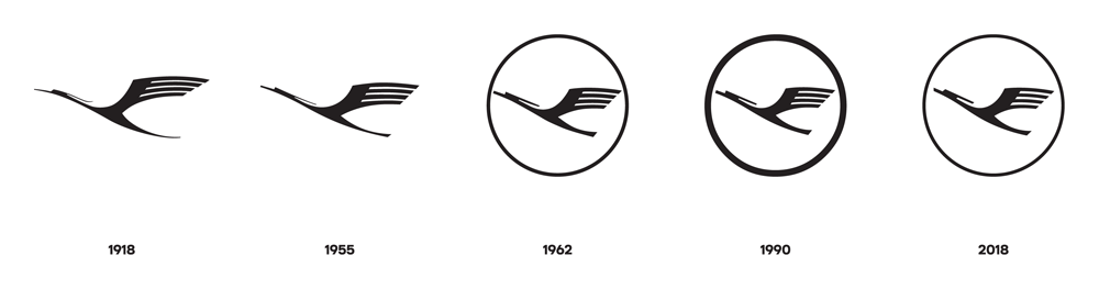
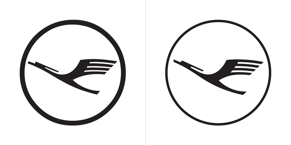
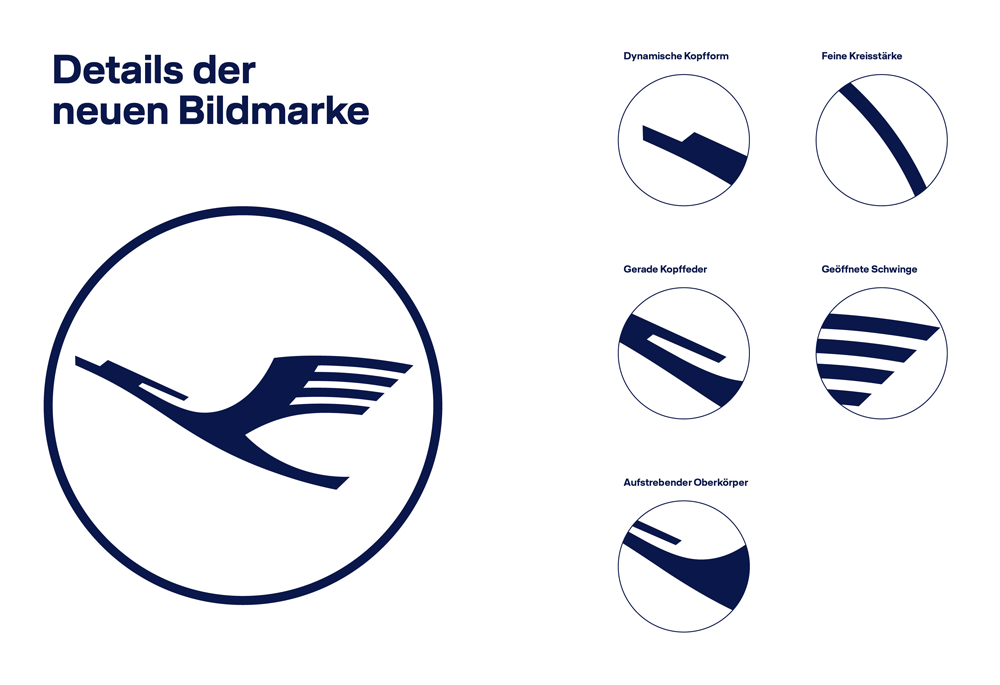
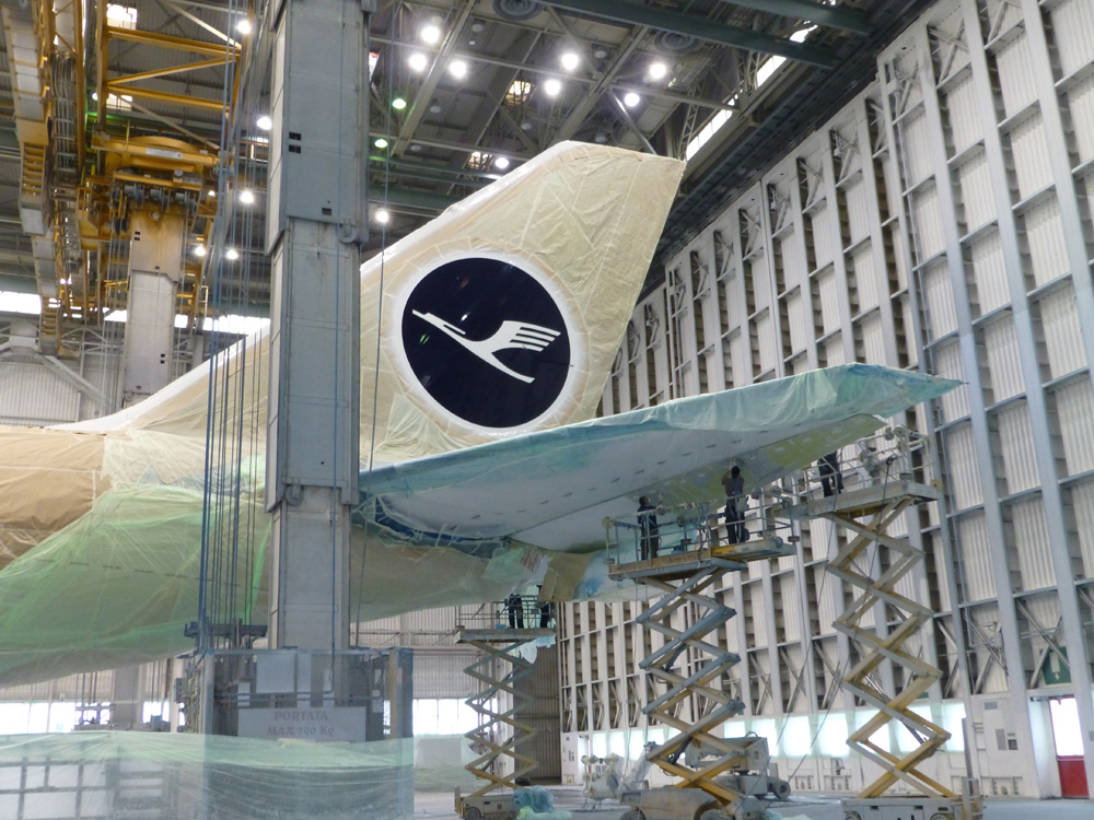
The crane icon has been in use for 100 years, designed in 1918 as part of the livery of the first German airline, Deutsche Luft-Reederei, later adopted by Deutsche Luft Hansa, and later-later by Lufthansa. Most of us associate it with Otl Aicher, who designed a comprehensive identity program around it in the early 1960s that gave it the more modern look it has had for most of our lifetimes (and established the blue and yellow combination as one of the key brand elements). In essence the crane icon remains the same as it has been since 1962 but has been redrawn to perform better under digital duress. The biggest change is the thinning of the ring which, as subtle a change as it is, it makes a fantastic difference in making it feel more elegant. The feathers in the wings of the crane have been opened up slightly making the icon easier to read at small size. The changes are minimal but each one provides a performance improvement.
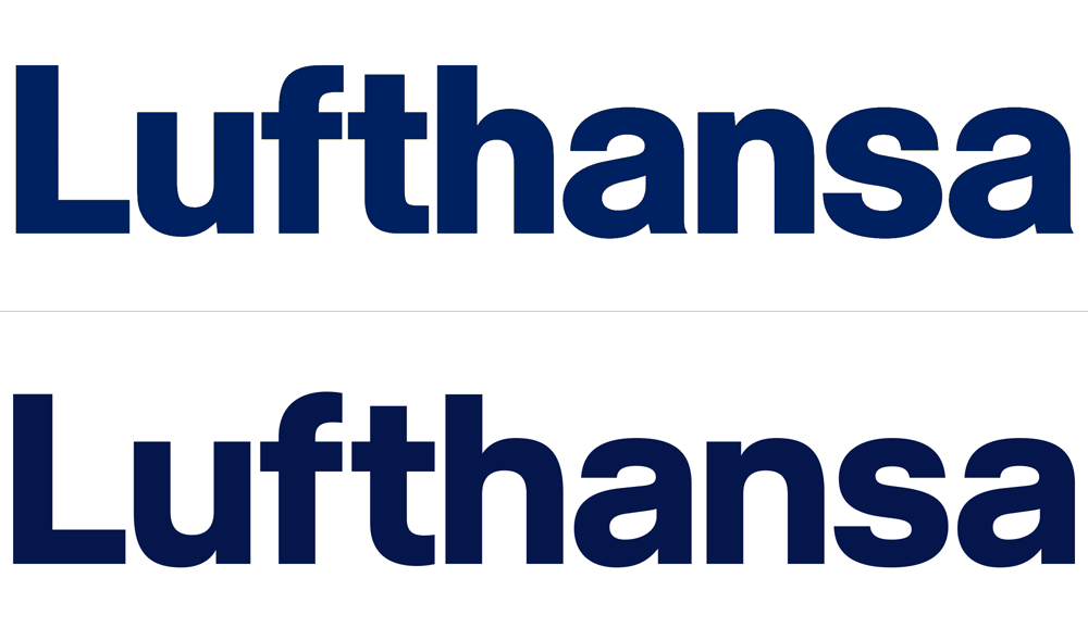
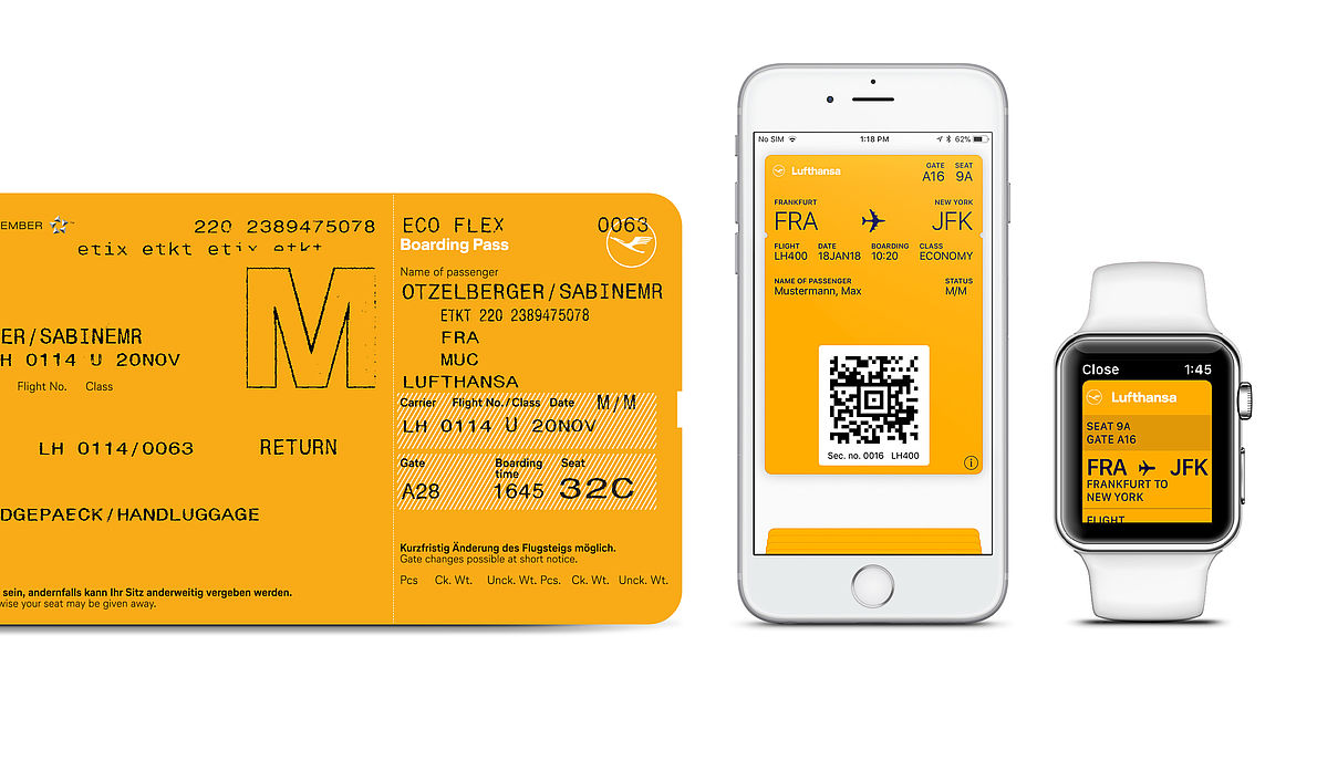
The wordmark has been redrawn as well and the changes are even more subtle than with the crane but, again, every change yields a more pleasant result. If you look closely at the before/after image of the wordmark, the counterspaces between letters are beautifully solved.
The resulting logo, for the bulk of the audience, will look pretty much the same and that’s fine. It’s clear the idea wasn’t to reinvent the identity but to improve on it the same way you improve on airplanes — you can’t fly the same ratchety thing for decades, you iterate and improve.
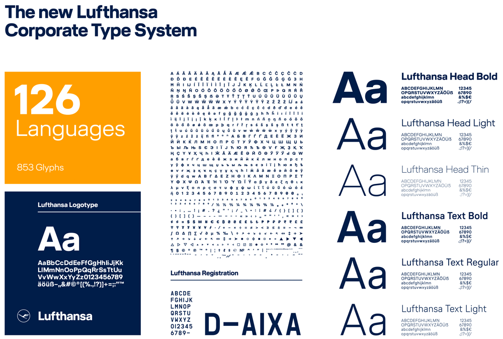
The new type family is a more Universe-esque Helvetica and it looks fine. As you know, I’m not a fan of Helvetica so while I appreciate the de-Helvetica-ization of it, it’s still a variation of the same thing.
One of the biggest complaints about the redesign — particularly in the livery as you will see below — is the loss of yellow. While it’s not gone, it has definitely been demoted to being a complementary, accent color to the primary dark blue. I agree that yellow is one of the most iconic things about Lufthansa but after seeing all the images here I also think it will survive just fine without it at the center of the identity. Blue is the most ubiquitous color in the airline industry and it’s not distinctive at all so I think the responsibility rests on the crane to be the one key thing that makes Lufthansa Lufthansa.
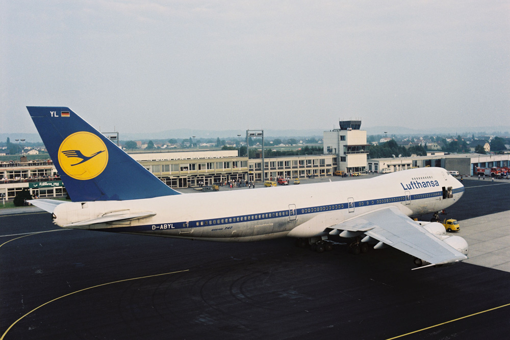

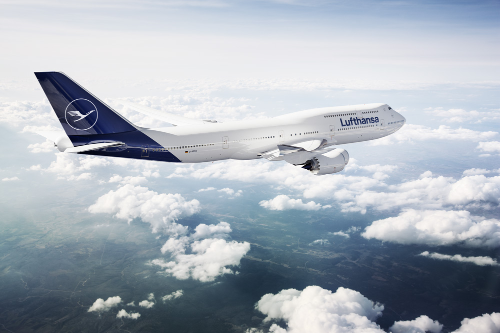
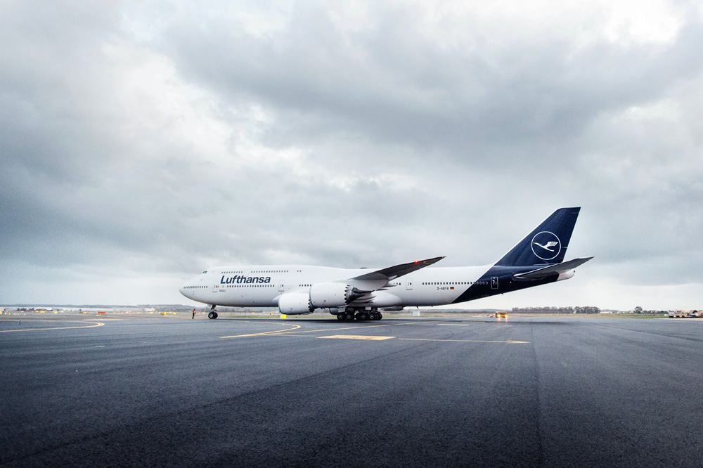
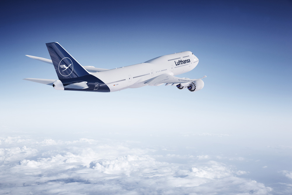
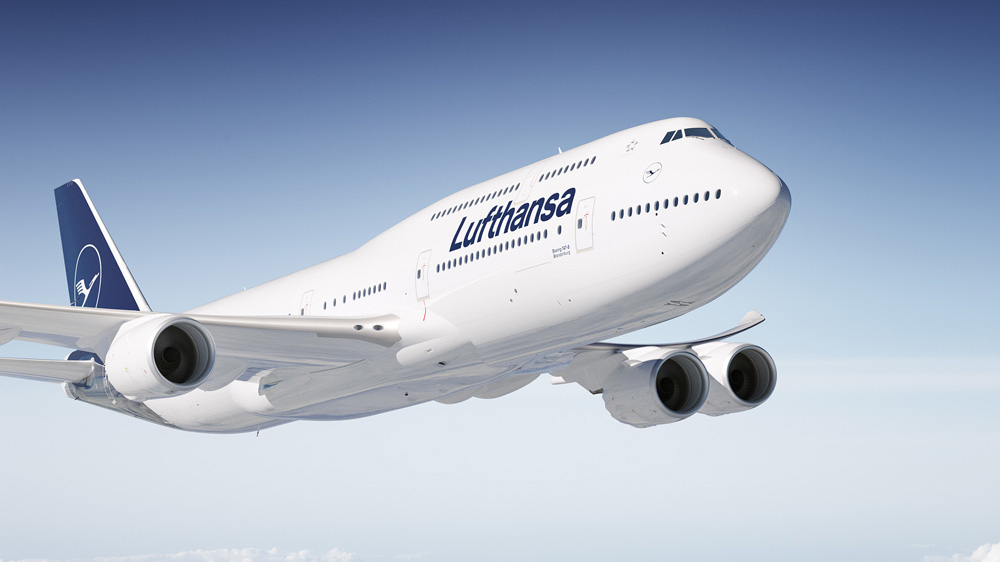
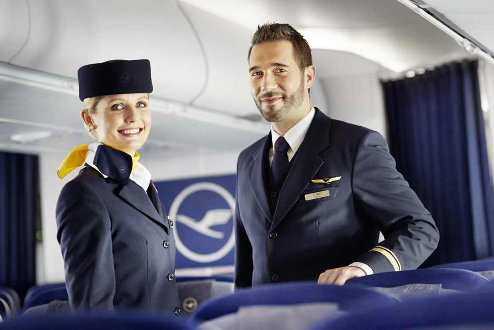
The change to the livery is indeed a shock to the system. The yellow crane on the blue tail fin is a classic. There is no doubt about that but I feel that this new livery is far more elegant and contemporary.
It’s evident that a lot of work and thoughtfulness has gone into this update and I believe it shows. There is a strong confidence in all the executions and each element adds up to a cohesive whole of a quiet elegance.
Openness and curiosity - the launch of the new Lufthansa brand launch marks the start of the new #SayYesToTheWorld brand campaign. It questions familiar ways of thinking and habits. Lufthansa opens up the world to all explorers. With style, ambition and quality. With empathy for each individual. Reliable and trustworthy.
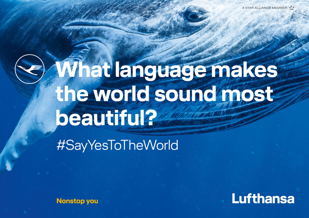
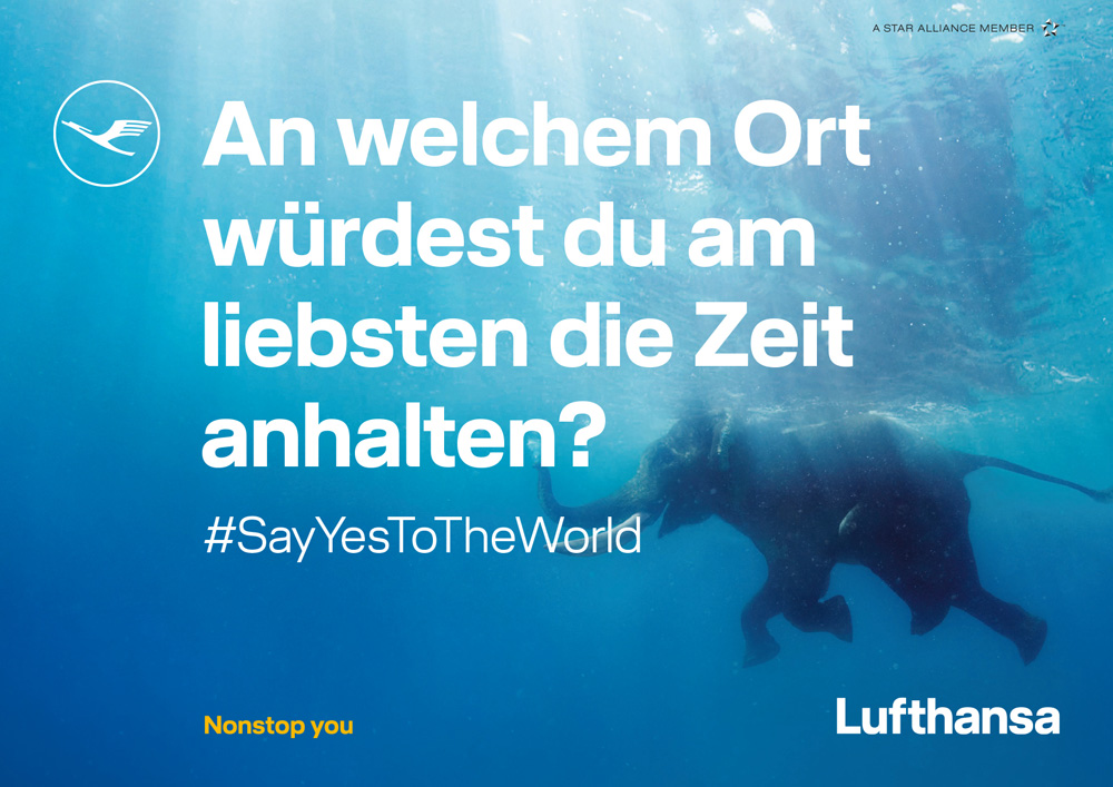
I’m not going to muse too much about the ads but it does fall within the annoying genre of airline ads that try to be way too philosophical. The crane icon looks nice, though.
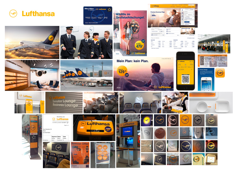
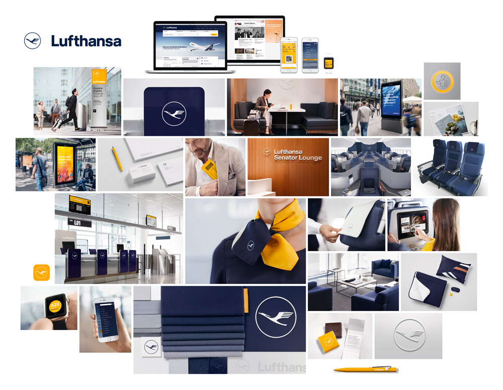
Looking at the two images above, it’s hard to deny the improvement. In part, yes, the old identity samples have been chosen to make the new identity samples look fantastic but there is certainly a reflection of reality in the old samples where we still imagine the Lufthansa identity looking like the materials in A5/05: Lufthansa und Graphic Design but bad things happen to good identities in the real world, even with the most stringent standards and guidelines. In ten years it would be interesting to see how close to the image directly above things really are. Anyway… I think the redesign is quite great and thoughtfully planned and executed and if what you really miss is the yellow, perhaps switch your airline allegiance to Spirit Airlines.

 Новости Союза дизайнеров
Все о дизайне в Санкт-Петербурге.
Новости Союза дизайнеров
Все о дизайне в Санкт-Петербурге.