Обзор лучших ресурсов по разработке бренда, разработке упаковки
contact us | ok@ohmycode.ru
contact us | ok@ohmycode.ru
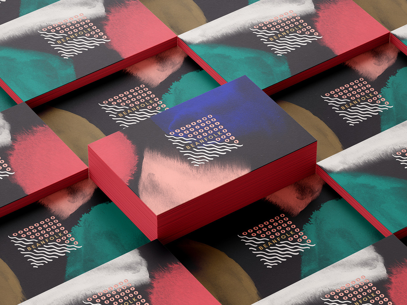
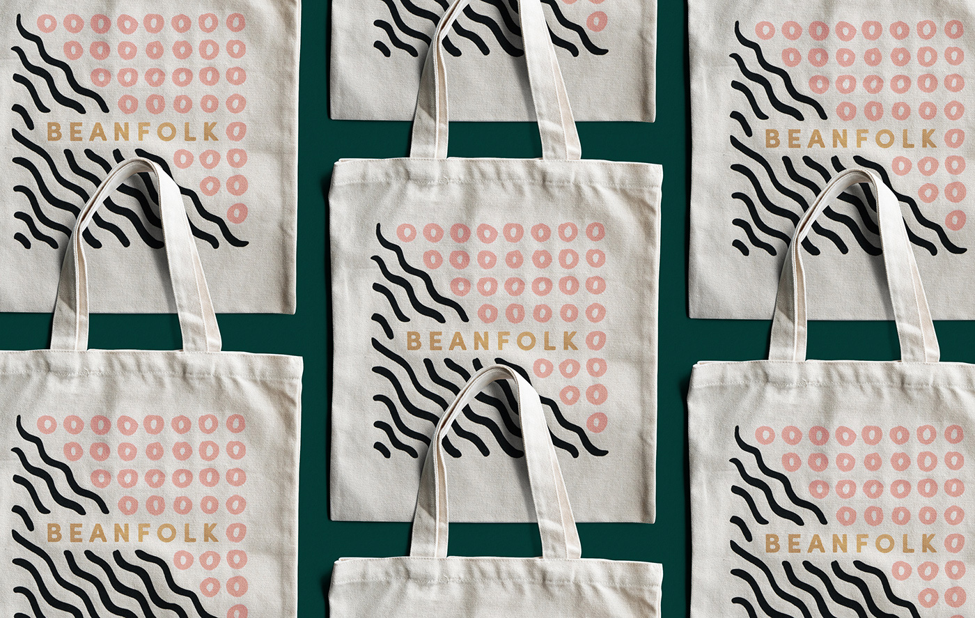
Established in 2014, Beanfolk is a coffee company that grows and roasts its beans in Papua New Guinea and sells wholesale to coffee shops, restaurants, and other roasters in Shanghai. As they prepare to sell direct-to-consumer in the near future, Beanfolk has introduced a new identity designed by Los Angeles, CA-based Outfit.
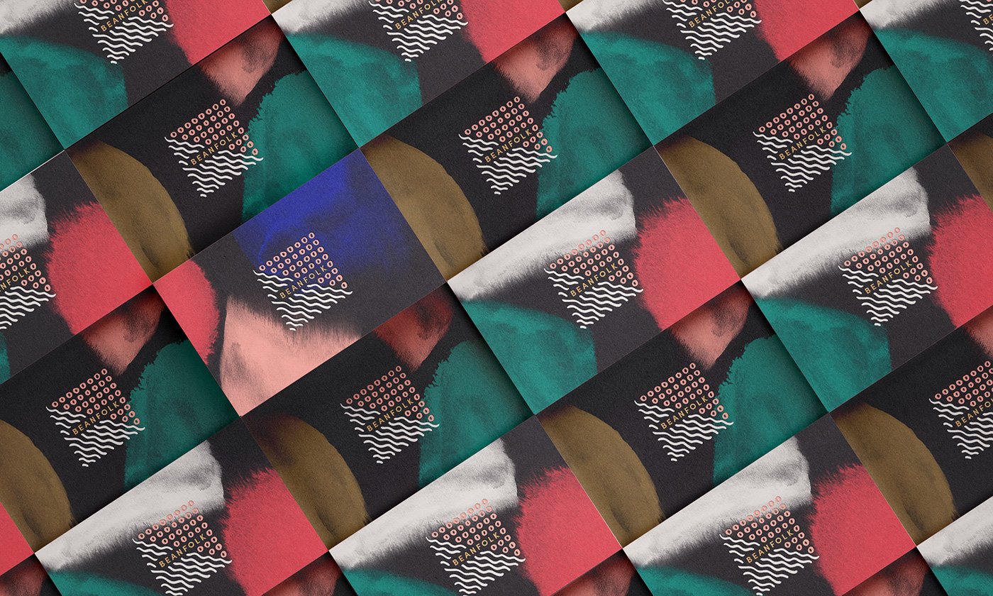
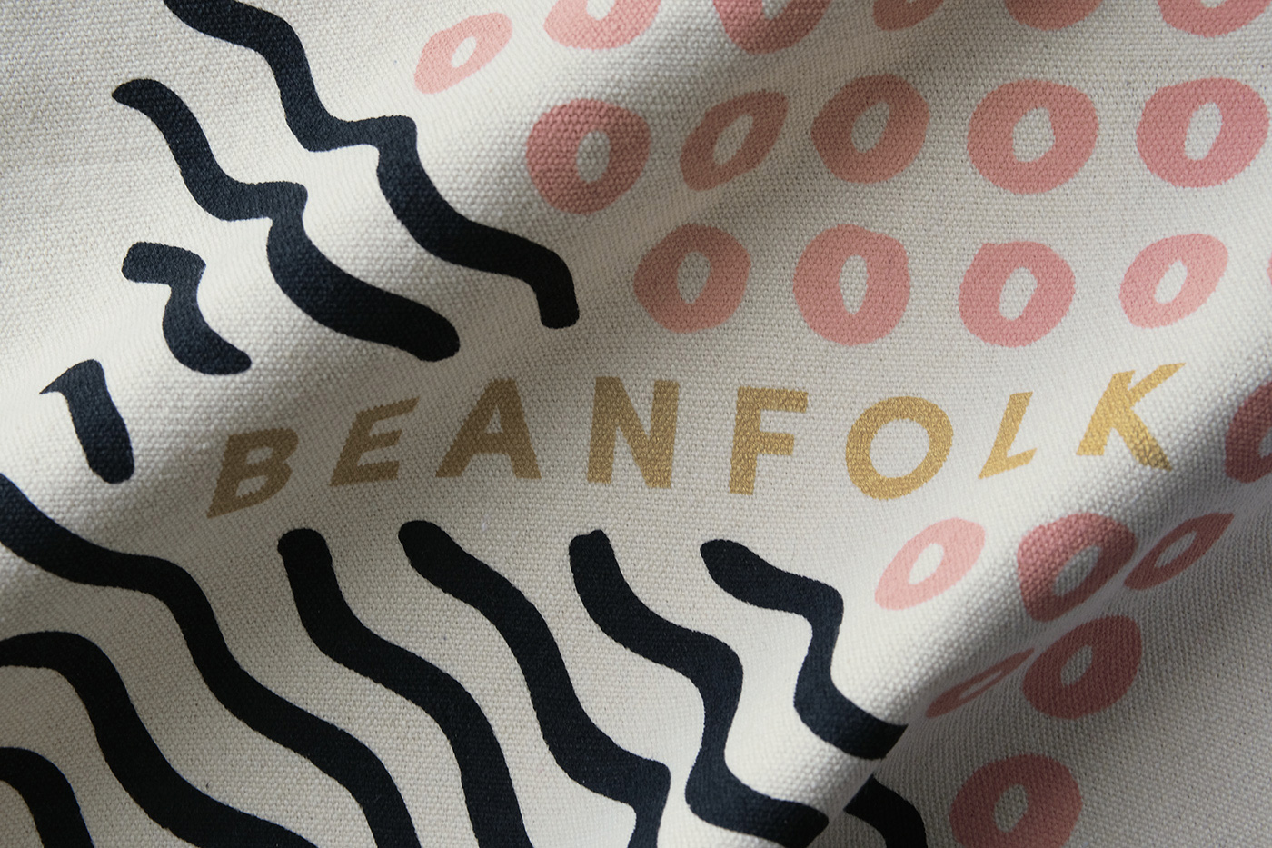
Inspired by Beanfolk’s connection to Papua New Guinea, as well as its commitment to creativity, sustainability and craft, we translated this brand story into vibrant, organic textures, colors, and intricate linear motifs—all tempered by panel blocking and contemporary, clean typography.
A balanced blend of the raw and the refined.
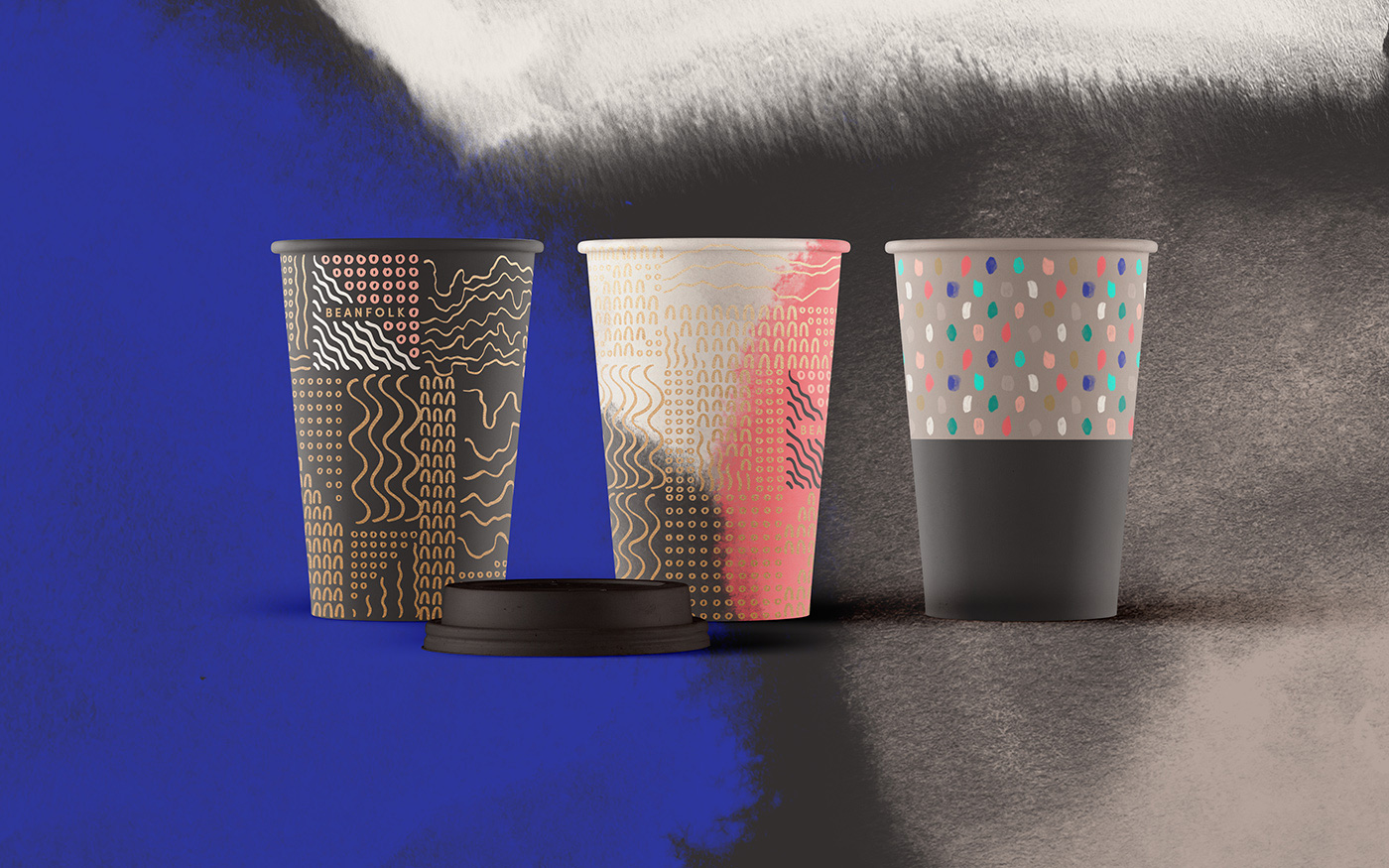
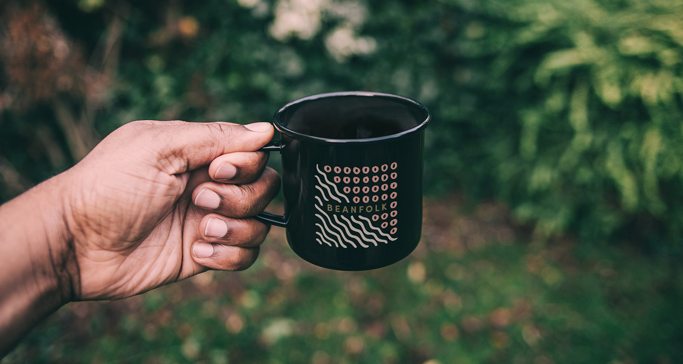
Even though I wouldn’t have been able to spell out the specific references in the logo as presented in the first image, I instantly got the sense of patterns of agricultural fields in the logo and the idea of land and water coming together to create goodness. The execution is quite lovely in a hand-drawn style where all the wavy lines and individual circles are each different, making it feel more genuine in its intent. The wordmark is pretty straightforward and in its simplicity serves as a good complement to the drawings. Bonus points for a “responsive” logo where the smaller it gets the less units it has, maintaining the open feel of the logo.
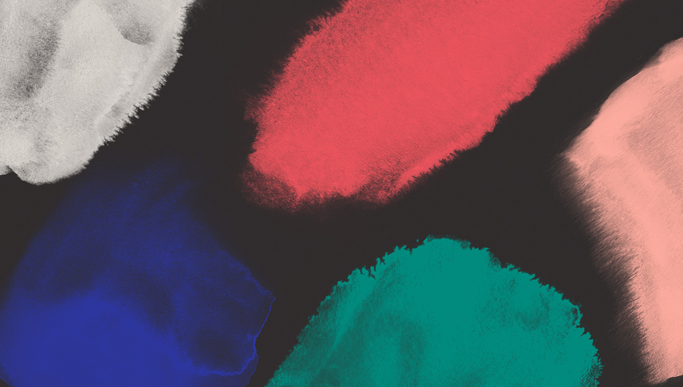
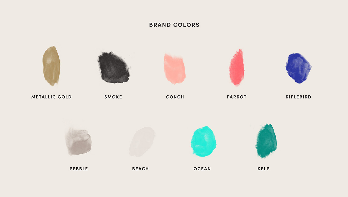
One of the nicest things about this project is the color palette that covers a broad range of colors that all mix together quite well and because the colors are used so much in the feathered, brush-stroke-like textures you get a lot of additional hues and tones through their transparency as they interact with the dark gray backgrounds or with each other. I’m usually not a fan of naming colors but these seem apt and authentic.
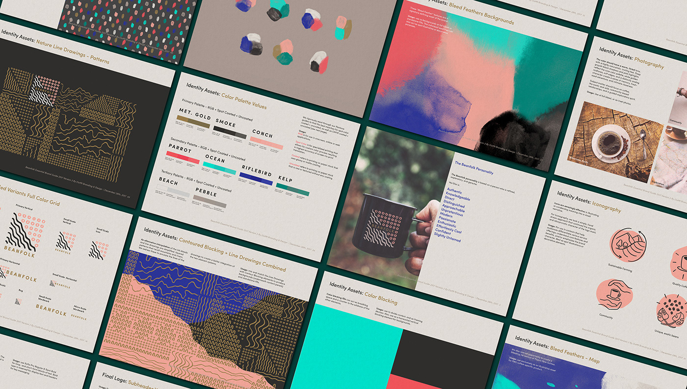
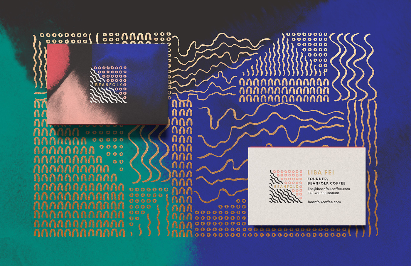
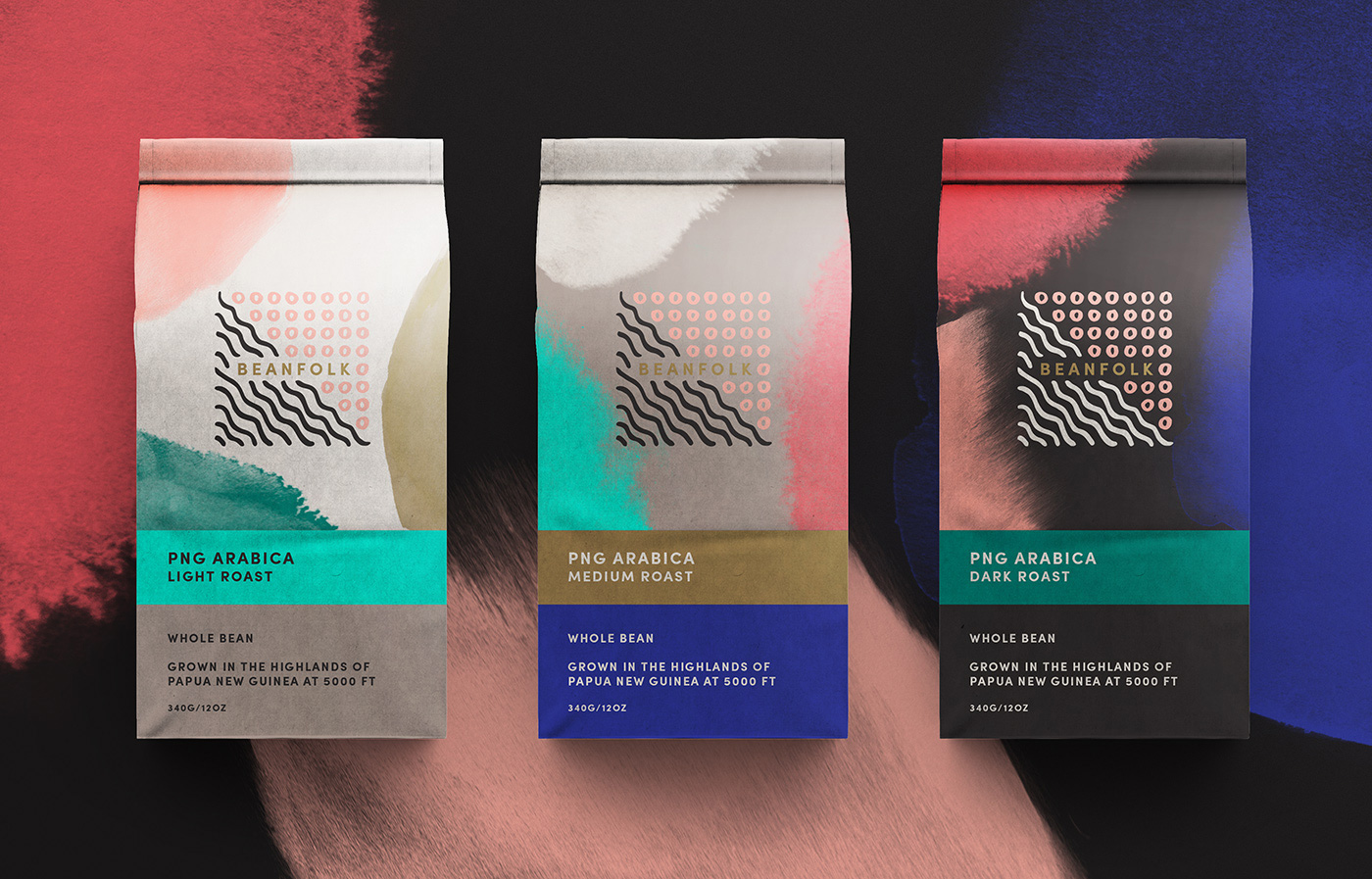
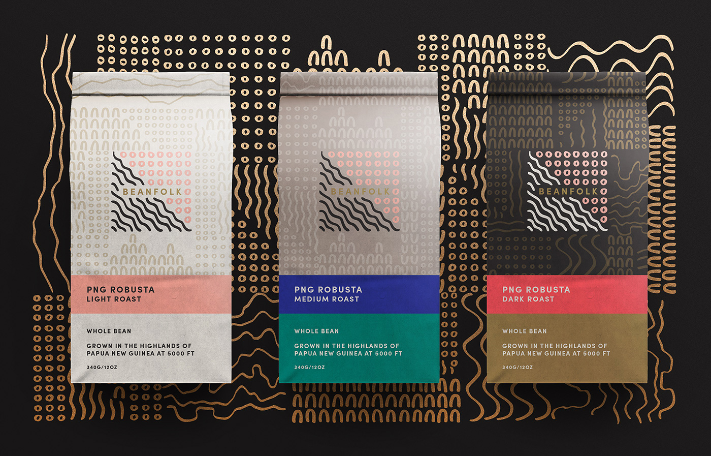
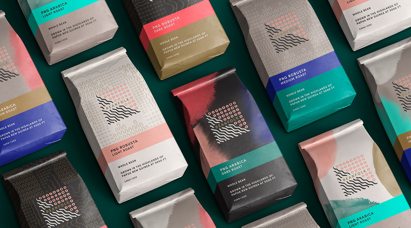
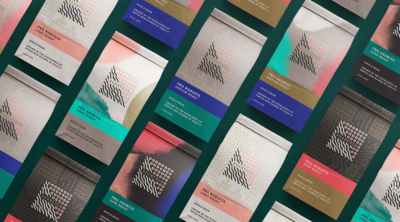
The packaging looks great, mixing the primal drawing patterns and brush textures in the background in different color configurations as a backdrop to the logo. The two color blocks on the bottom are very simple but because the color palette is so nice they add great richness to each bag — the PNG Robusta Dark Roast (in “Smoke”, “Parrot”, and “Gold”) is scrumptious.
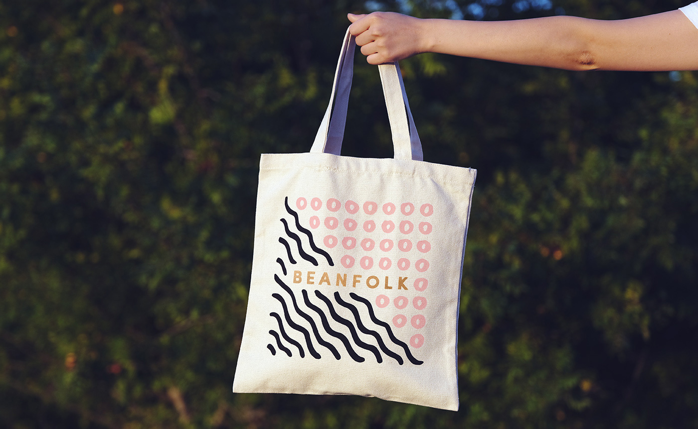
Overall, I love the richness of color and texture and how it contrasts so well against other coffee brand approaches that turn out too cold or clinical. This feels like coffee that comes from the land — what land? Any land! A metaphorical land — and has been taken care of every step of the way by people that care… by bean folk, if you will.
 each year since publication began in 2006

 Новости Союза дизайнеров
Все о дизайне в Санкт-Петербурге.
Новости Союза дизайнеров
Все о дизайне в Санкт-Петербурге.