contact us | ok@ohmycode.ru
contact us | ok@ohmycode.ru
Established in 1907, The Scout Association is the largest national Scout organization in Europe and national charity in the UK with the mission to “actively engage and support young people in their personal development, empowering them to make a positive contribution to society.” Open to 6- to 25-year-olds, Scouts now has a membership of over 618,000 young people and adult leaders across 8,000 community-based Scout Groups nationwide (all independent charities in their own right). Recently the organization announced a new strategy (“Skills for Life”) and a strategic plan through 2023. Along with these, Scouts introduced a new identity designed by London, UK-based NotOnSunday.
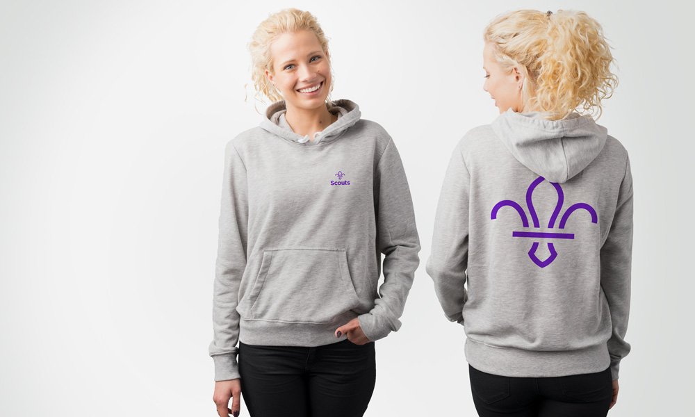
NotOnSunday have been working closely with the team at Scouts to create a bold new brand and visual identity, focusing on skills for life as their key benefit. As part of the re-brand we’ve refreshed the Scouts logotype, to reflect a more relevant image of Scouting, while still retaining its strong heritage, including the iconic fleur-de-lis.
It was important for us that we created a brand that was fun and exciting whilst retaining strong links to its heritage. We did this through creating a new contemporary fleur-de-lis that will be immediately recognisable, and more usable in print, fabric and digital. Along with extensive guidelines we worked with the team to create a series of brand templates that follow a simple and adaptable system for the Scouts members to use.”


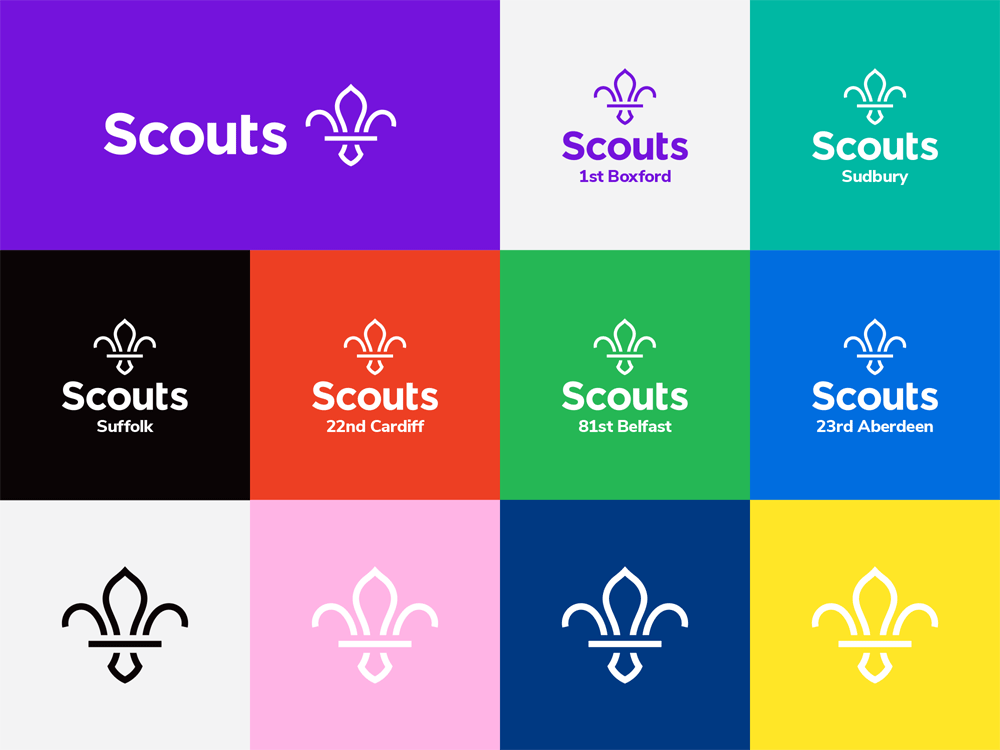
The old logo was bad, looking like a really lame car racing event with its obnoxiously-big swoosh, questionably large and wildly spaced ellipsis, italic everything, and squared-off wordmark. The new logo is a major improvement, with a minimalist fleur-de-lis better suited for all kinds of applications and sizes that still maintains its fleur-de-lis-ness without all the usual visual fanfare they carry around. I like the simplicity of the icon and the center shape is great but I would question if the two sprouts on the sides needed a little extra curl. The wordmark is fine, nothing surprising, and friendly-looking enough. The kerner in me wants to pull that last “s” closer to the “t”. Nonetheless, the combo of icon and wordmark works well with a good contrast in thickness between them and when the logo has a location underneath I like how that smaller type matches in weight with the icon.
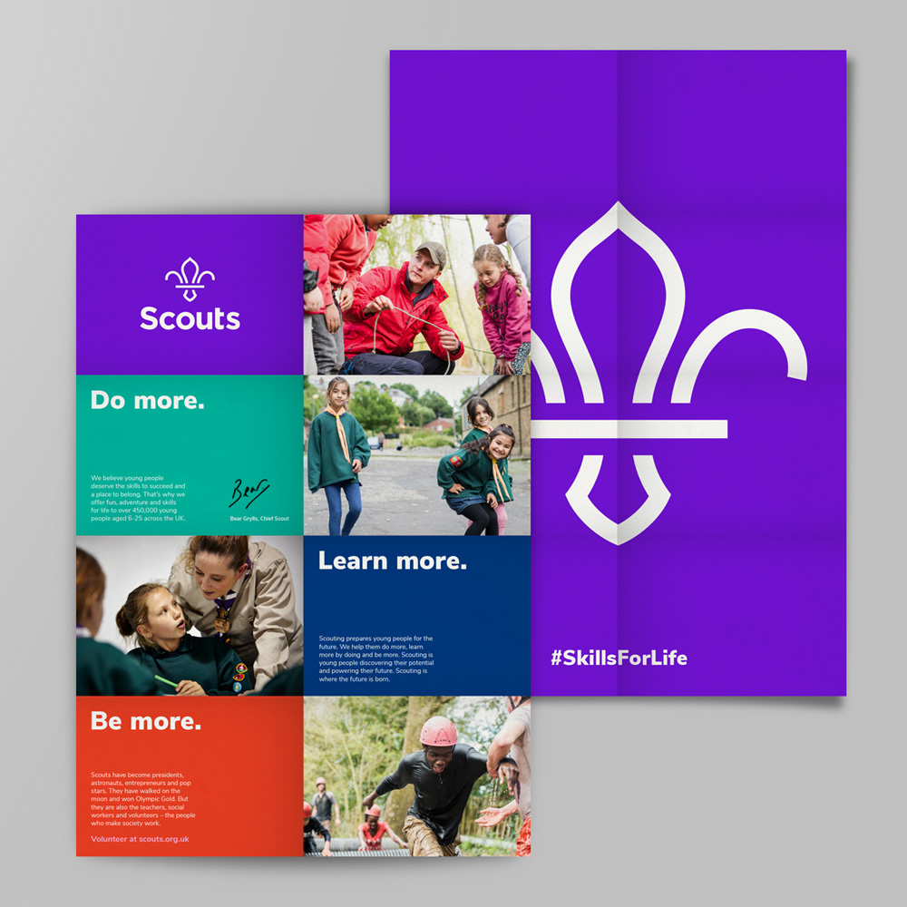
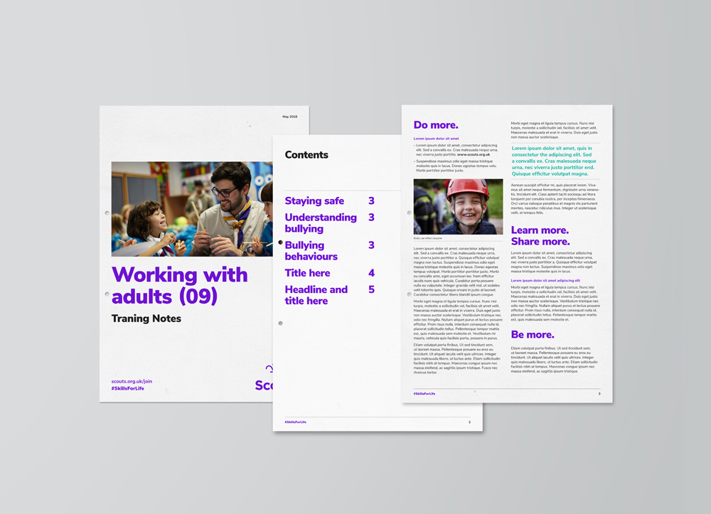
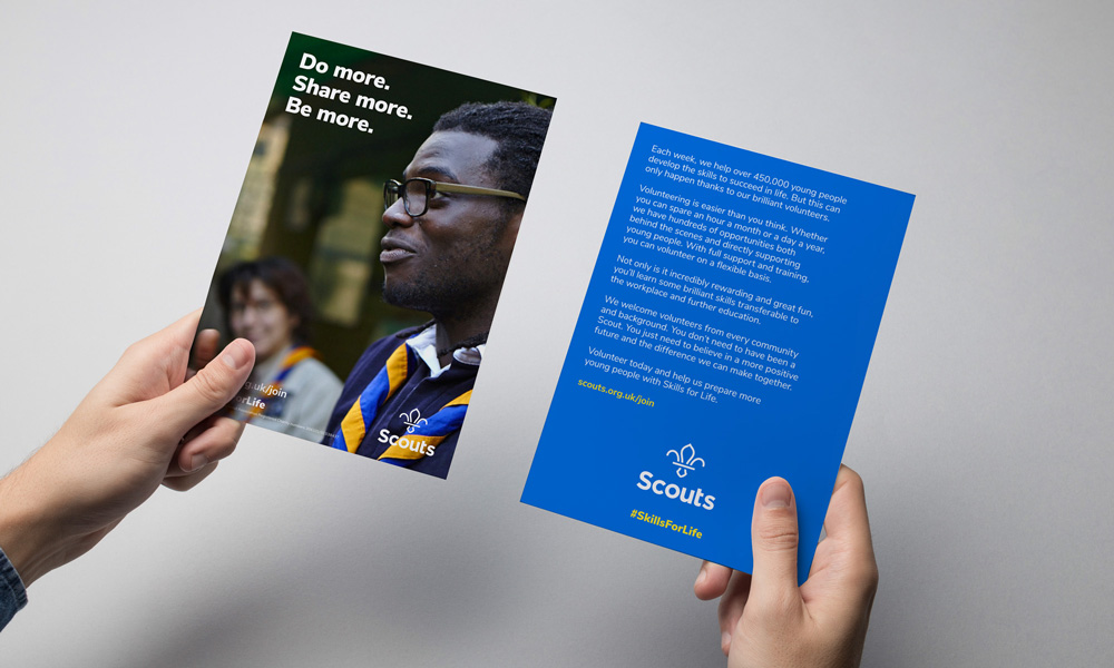
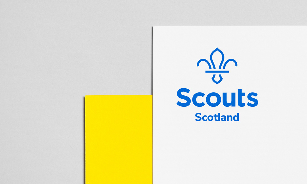
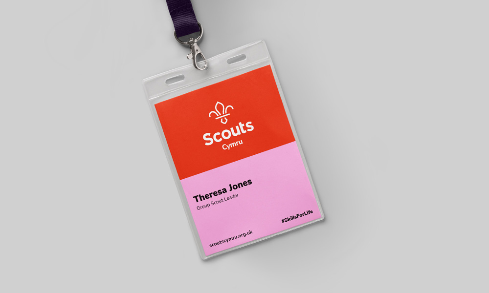

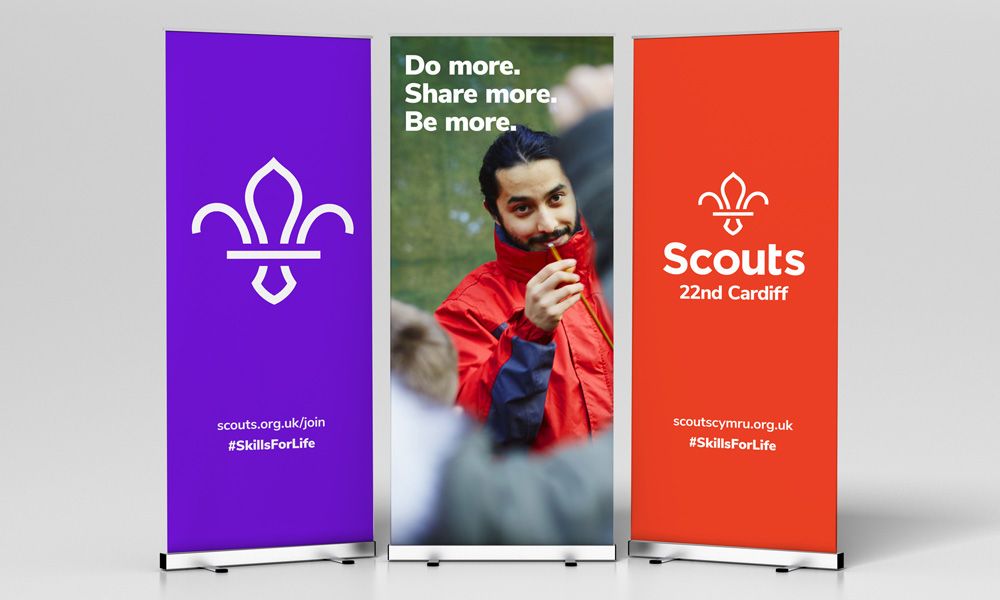
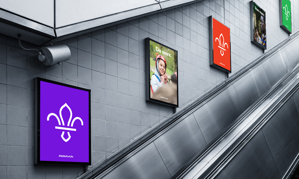

The applications are all fairly straightforward relying on photography of kids and young adults being scout-y, which is hard to argue against. The layouts could use a little something extra somewhere somehow. It’s all just centered type or left-aligned type and that’s it. It’s understandable that you don’t want to overcomplicate things for an organization with 8,000 locations all trying to produce materials that need to look like they belong with each other but maybe one moment of layout flair could have been beneficial.
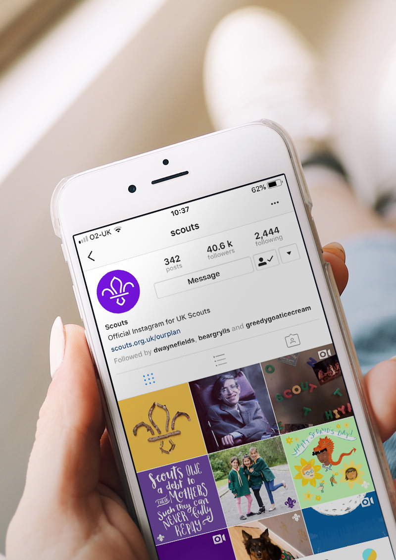
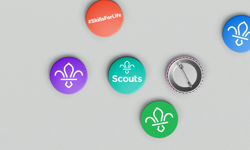

Overall, this is a very positive change, giving the organization a more flexible icon and a less dated look — check their old (still active) website to see how dated things were — that can also carry some gravitas and support a lovely TV spot like the one above.
Thanks to Oskar Kurz for the tip.

 Новости Союза дизайнеров
Все о дизайне в Санкт-Петербурге.