Обзор лучших ресурсов по разработке бренда, разработке упаковки
contact us | ok@ohmycode.ru
contact us | ok@ohmycode.ru
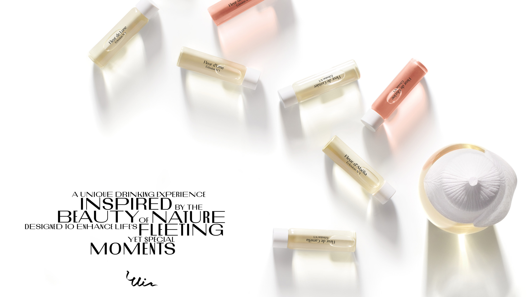
Launched in 2019, Ui (pronounced oo-ee) is a new floral alcohol, created by Pernod Ricard’s Breakthrough Innovation Group, that is crafted in Japan using traditional techniques of rice fermentation with flower yeast and once opened can be further enhanced with a seasonal accord (as in a fragrance accord, not a treaty) which is a blend of natural ingredients — the first one in the series being Cherry Blossom. Ui, launching with a slow and selective rollout, was specifically created for and being targeted to women as a sophisticated alternative to other sugar-filled drinks. The identity and packaging for Ui has been designed by London, UK-based Notable.
Our goal was to demonstrate Ui’s category-challenging credentials by creating a brand that also felt unlike any other in the sector. The first step was to develop a Foundational Idea for Ui which captured the inspiration behind the product itself (nature and in particular flowers) and also reflected our audience’s outlook on life. This is how we landed on “Live a Life in Full Bloom”.
We then set to work creating the brand identity and launch plan for Ui. The creative inspiration for the brand identity was the idea of ‘force and fragility’ present in nature and women. In the same way that nature and flowers have dramatically contrasting elements, our brand has bolder graphic devices mixed with subtler ‘quiet strength’ moments.
When it came to the launch plan for Ui, there was a deliberate decision not to go mass but instead, introduce the brand via a soft launch approach. We created a launch concept—‘Women of Note’—that centred on speaking to and bringing together interesting, inspirational women by hosting a series of small events and tastings. All of which has enabled Ui to build and engage with a like-minded community.
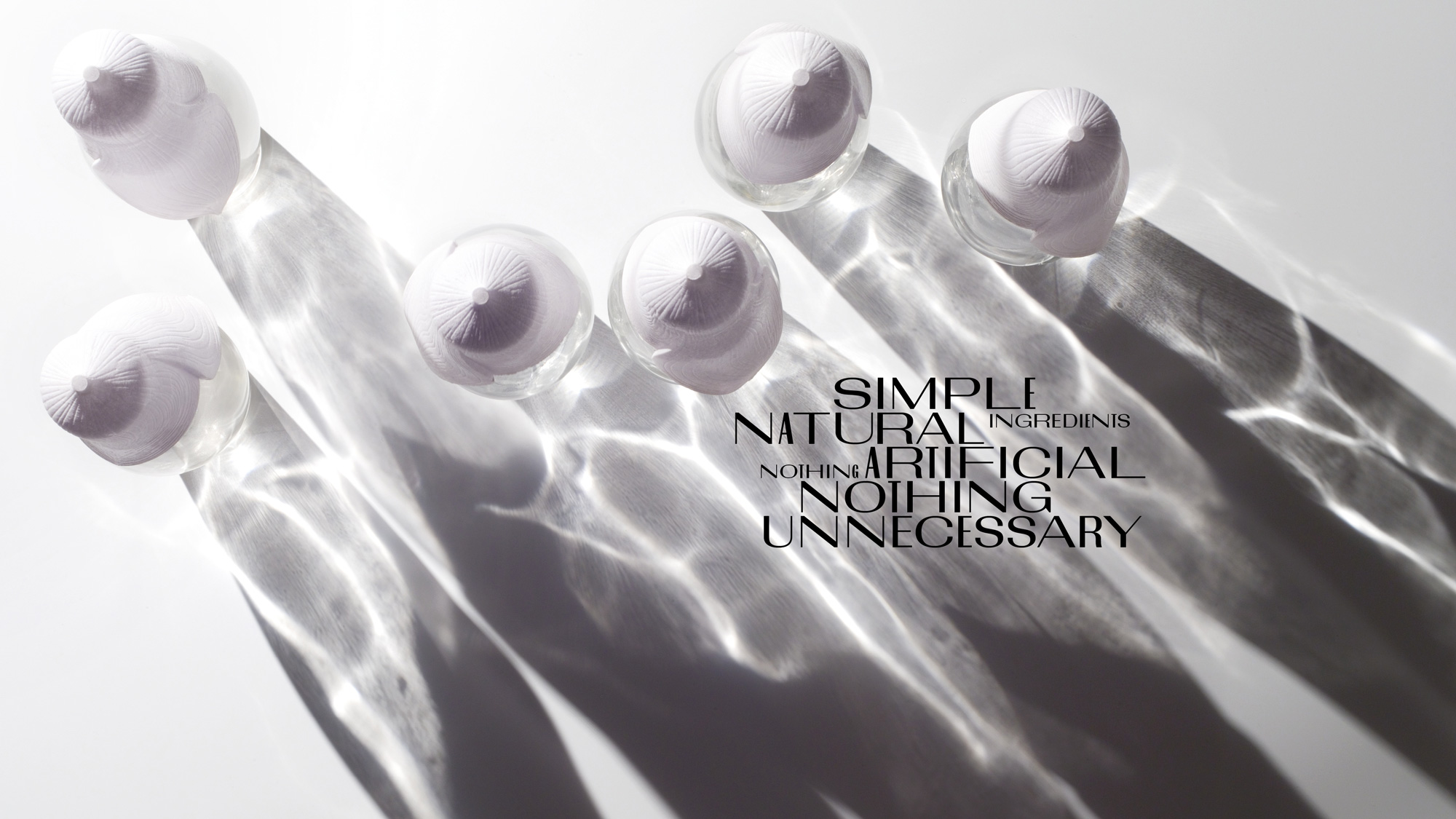
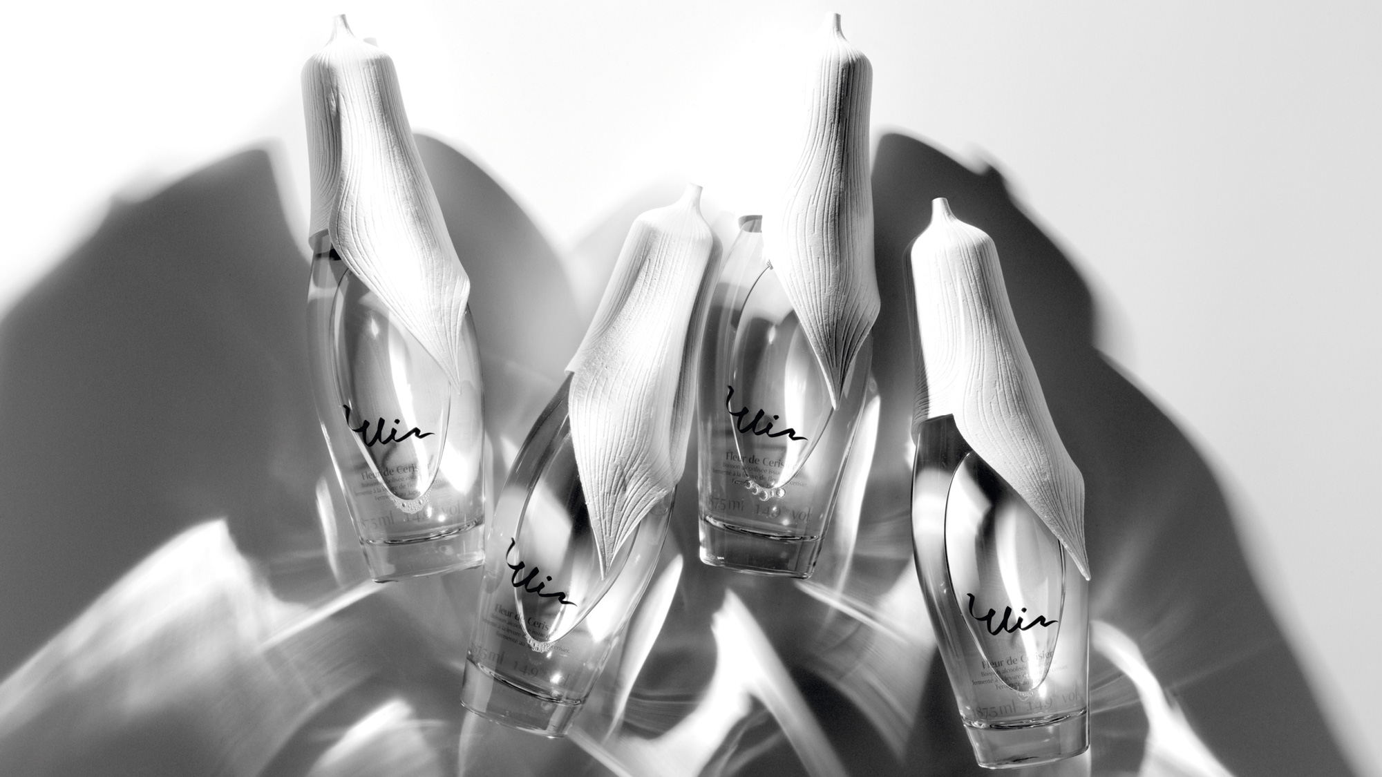
From the start, the product is very overt about its target audience with a clear feminine aesthetic and I don’t mean that in a douchey gender-confining way but there is no way you look at that logo and think, “Rambo”. The fully detailed version of the logo with the multiple lines is quite delightful and I love how they have taken the ribbon structure that we sometimes see in logos — like this — and loosened it to make a literal ribbon. It looks super pretty. The first more minimal version, with the dark and light combination, still works well but is not as effusive and the second more minimal version, in all black, loses most, if not all, of its elegance and dimension, which is unfortunate as that’s the version used in the packaging.
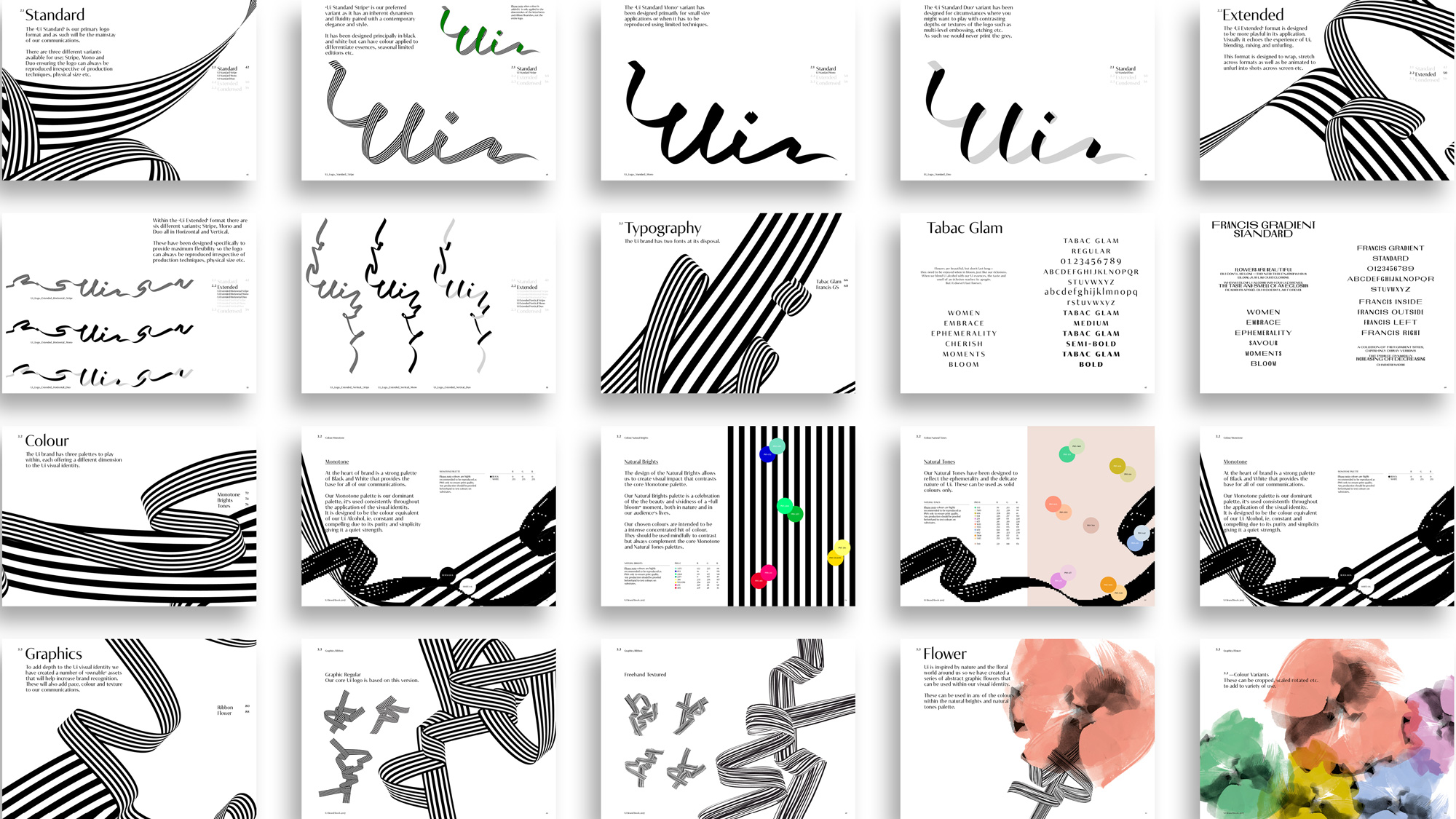
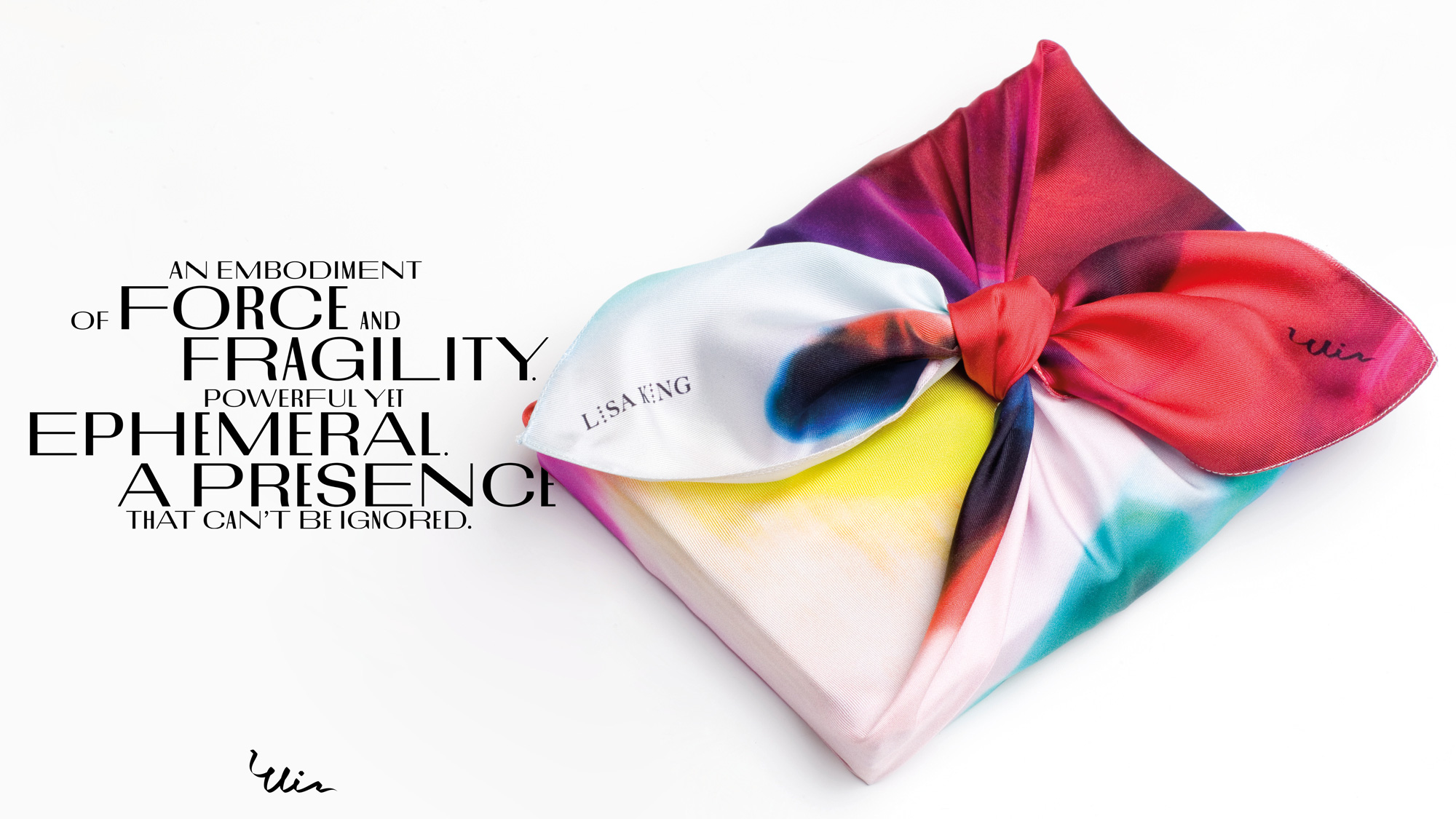
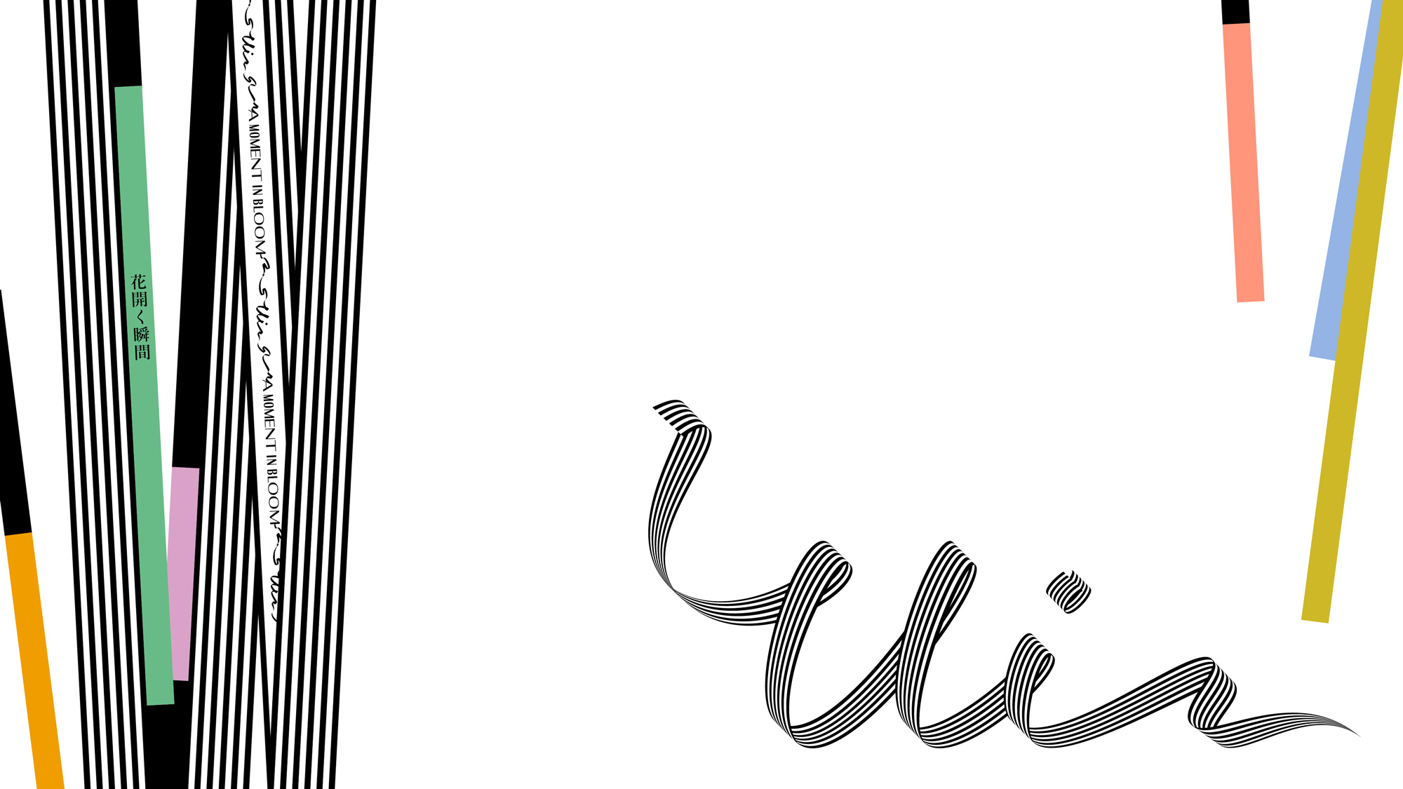
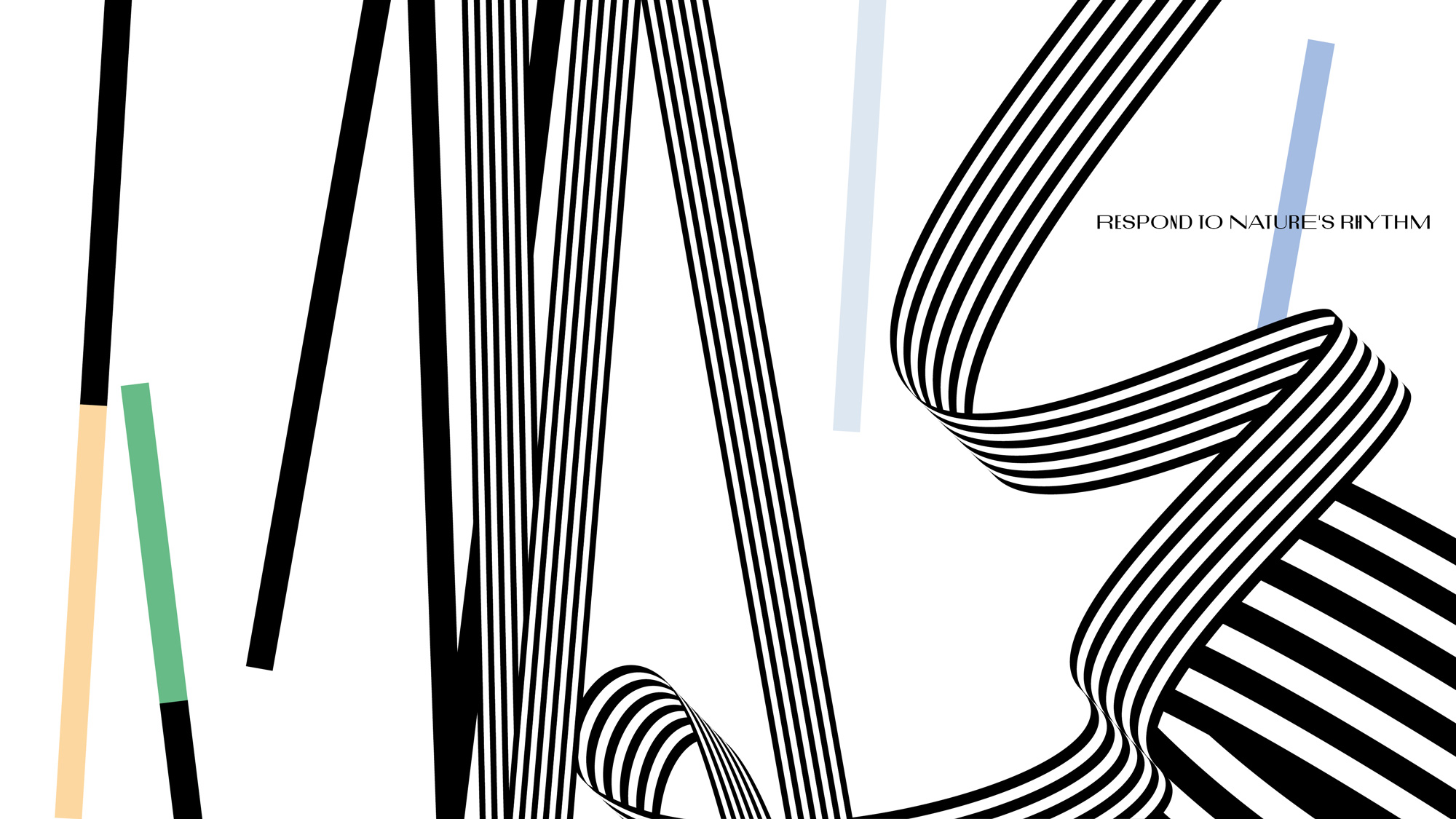
I’m not really sure what all is going on in the visual language but I definitely appreciate its relative experimentation with the loopy ribbons and the straight ribbons and the color bars and the weird condensed/extended typography and the watercolor flowers instead of what today would typically just be a moody sans serif in black. So, yeah, why not?
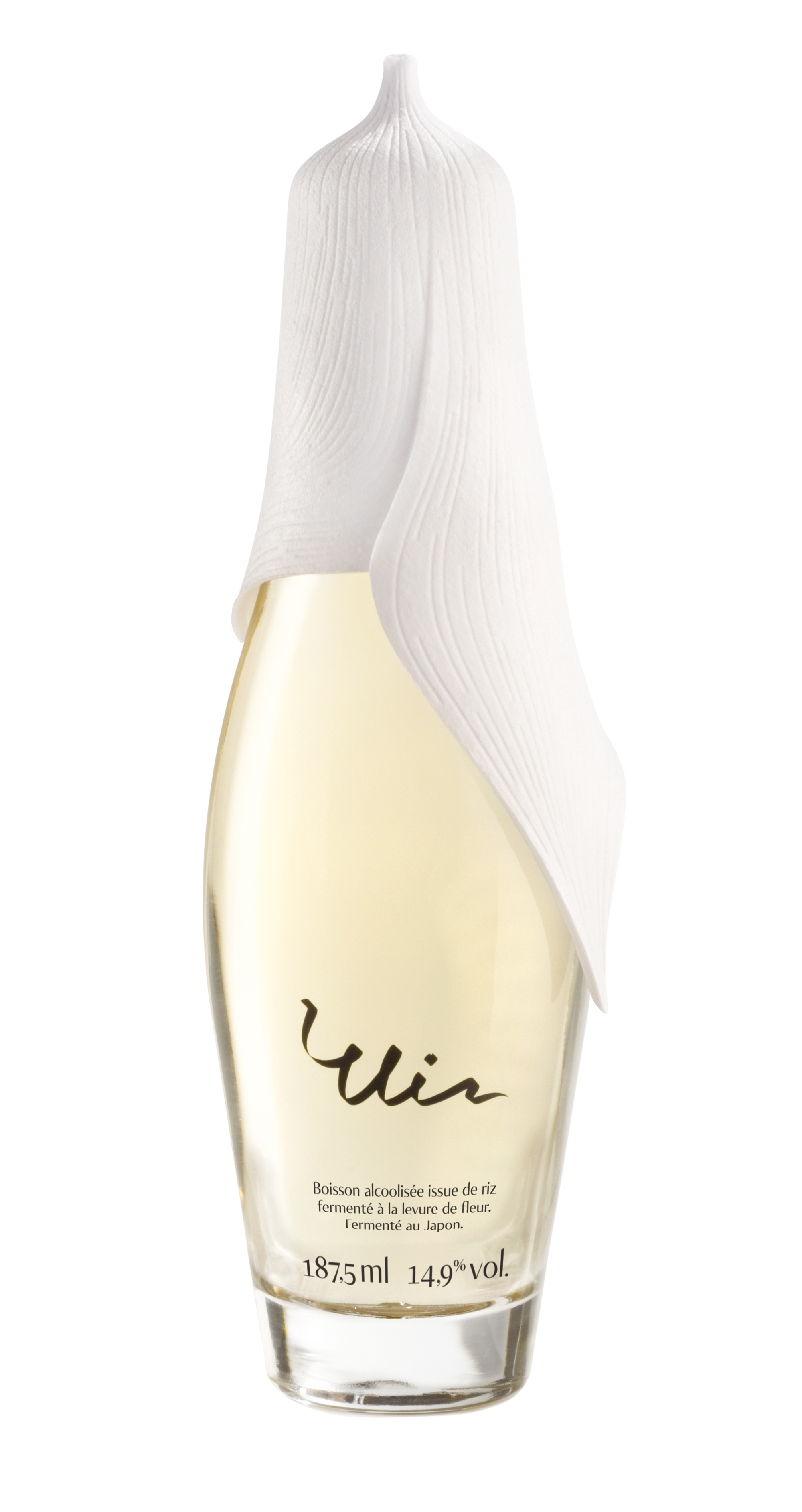
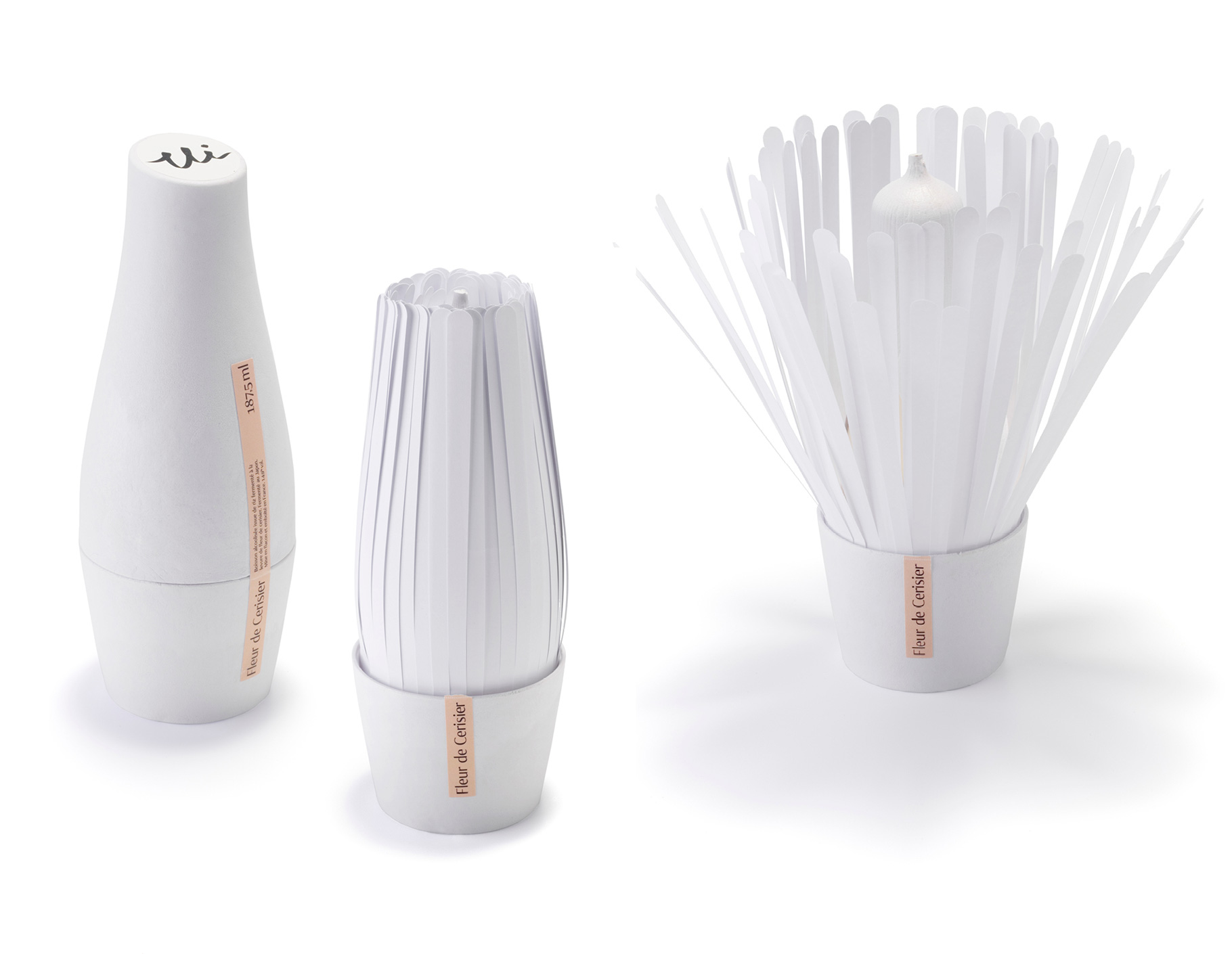
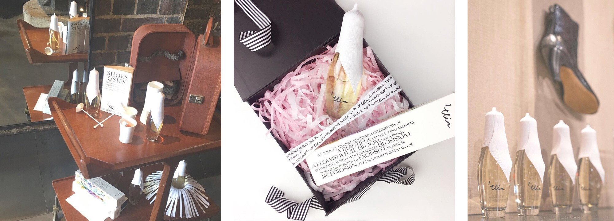
The packaging spares no expense, with a large flower thing serving as the cap for a sinuous custom bottle that is then placed inside a shape-fitting container that opens up like a flower. The flower metaphor is heavy y’all. I really like the label strip that keeps the outer packaging sealed but I wish they had used the full version of the logo somehow on this outer container. The bottle itself, I’m not gonna lie, it makes me uncomfortable. Maybe it’s some deep-seeded Freudian shit but that giant, draping flower with an accentuated tip is a little unsettling to me… the lack of color, the texture, its size… I dunno. Nonetheless, its high-end-edness is evident and as a gift to bring over to someone’s party it’s kind of epic, becoming a whole topic of conversation and a fun moment gathering around as it’s being prepared. Definitely beats serving shots of Tito’s.
Overall, as a small-batch (I’m assuming) sort of novelty-test-experimental product that pushes the extremes and attempts to innovate in the category, this is undoubtedly effective, very clearly positioned, and memorable.

 Новости Союза дизайнеров
Все о дизайне в Санкт-Петербурге.
Новости Союза дизайнеров
Все о дизайне в Санкт-Петербурге.