Обзор лучших ресурсов по разработке бренда, разработке упаковки
contact us | ok@ohmycode.ru
contact us | ok@ohmycode.ru
Established in 1912, Dale Carnegie provides personal development and growth training for pretty much anyone who wants (or needs) to be better at their job, in presentations, or just in general to have more business (and life) success. The organization carries the name of its founder, who wrote some of the most influential books on self improvement and interpersonal skills, including Public Speaking: a Practical Course for Business Men (1926) and How to Win Friends and Influence People (1936). Headquartered in Hauppauge, NY, Dale Carnegie is represented throughout the U.S. and in over 90 countries, with more than 2,700 trainers leading programs in 30 languages every day. Earlier this month, Dale Carnegie introduced a new identity designed by New York-based Carbone Smolan Agency, with foundational research and strategy from Siegel+Gale.
The website is planned to be updated next year but in the meantime you can see the new look in digital action in this brand microsite.
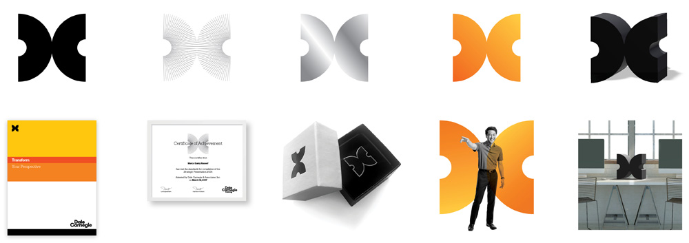
The new Dale Carnegie visual identity features a crisp new logo. Taking the form of a “DC” monogram, the logo’s resemblance to a butterfly symbolizes the transformative nature of Dale Carnegie training courses. This new visual identity - coupled with strong, professional branding and a vibrant color scheme - conveys the inner potential of every professional and the enduring nature of Dale Carnegie’s values.
The old logo had one of those faceless corporation looks where they might be hiding something underneath their public offering… like, sure, we offer training on the first floor but in the basement we are building an army of zombie pigeons to take over the world. So, not quite, and maybe the icon did intend to convey something about strengthening the fabric of relationships or some metaphor like that. Still, paired with the current website, the organization shows none of the polish it aims to instill in others. Not sure why I went off on the old logo so much… anyway…
The new logo is a drastic change and includes a great DC monogram that, given it’s a thick ring split in half, feels surprisingly fresh and the butterfly concept, as cloying as it is, is ad hoc. With the wrong visual approach, the butterfly thing could have turned out cheesy but the all-black logo and unconventional lock-up help give it a more serious and dominant presence. The wordmark is pretty nice too; I wish the two stacked “e”s aligned perfectly (they don’t).
At Dale Carnegie, we see the spark and inherent strengths in trainees. Our work takes intuition and insight, and these curated portraits represent those brand values. In our training, individuals learn how to collaborate more effectively, which touches everything from teams to organizations. The power of relationships is an integral part of our brand.
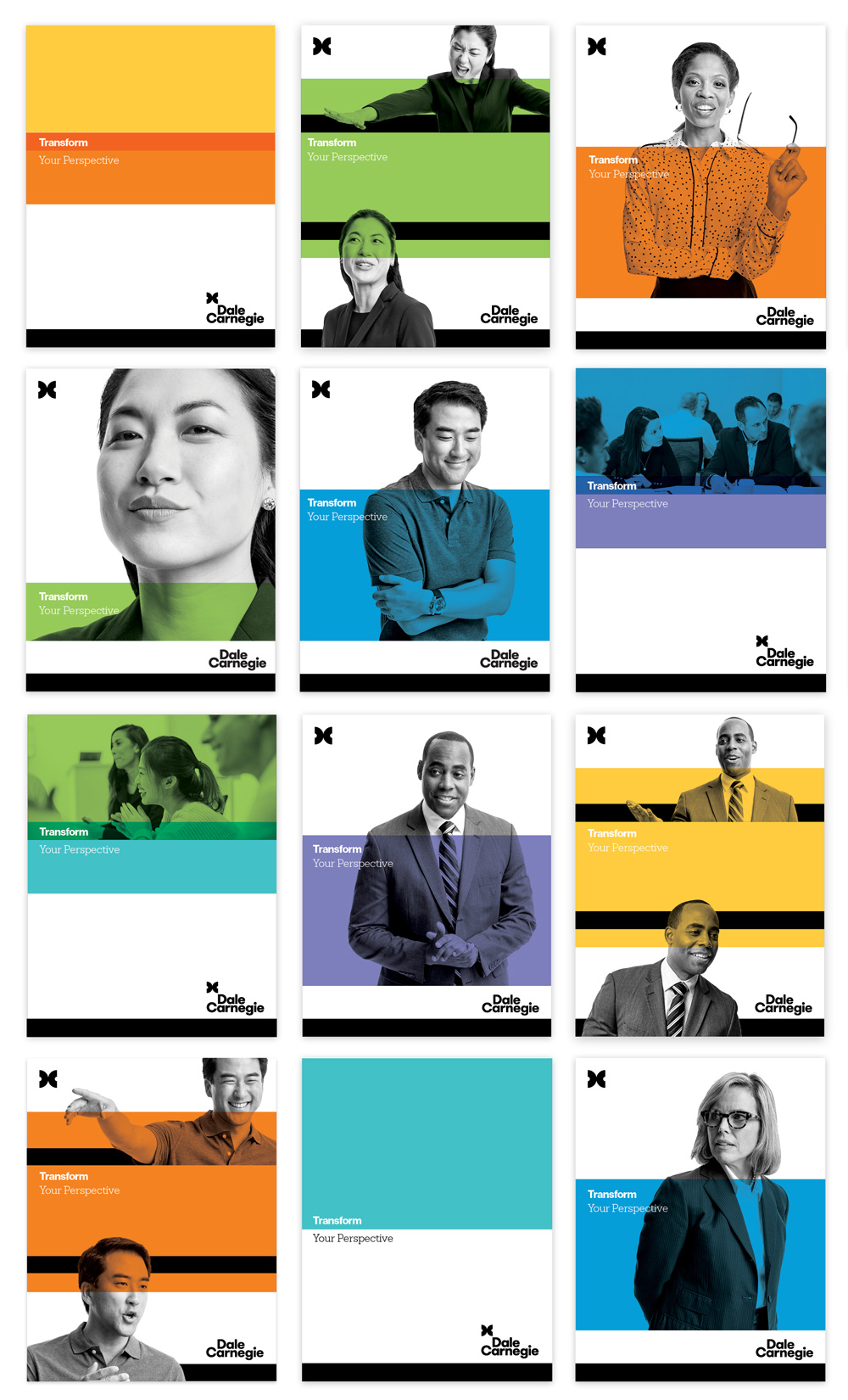
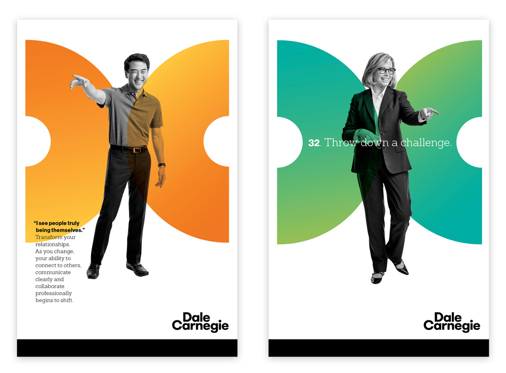
In application, the monogram and the wordmark can be separated and help frame the content in between along with some heavy black bars, which I really dig. The logo can also be used as the centerpiece of a poster or layout and given a gradient… it’s an okay variation and mostly a good way of building some equity into the logo. Color starts to make an appearance in application and it’s an odd palette for some reason; I mean, it’s fine, but in choosing one out of every color in the rainbow there is no clear, defining color. The one thing that sort of ruins all the nice applications are the photographs. I am 100% sure the client loves them and I will agree 100% that they get the job done and communicate exactly what the organization wants to but they feel so heavily posed and unnatural… some of them are downright annoying, like the two directly above.
If you Google-image “Dale Carnegie Brochure” you can get a sense of just how bad the communication materials are (or have been) and what a drastic transformation this is — regardless of my superficial concerns with the smiles and pointing fingers of the new cast. You could almost see it as the equivalent of a caterpillar turning into a butterfly. Light sarcasm aside, overall, this is a strong update with a more confident presentation and a strong logo that has the potential to work almost like a badge of honor — I’m actually surprised there wasn’t a render of a lapel pin on a suit! — for those that have completed training with the organization.

 Новости Союза дизайнеров
Все о дизайне в Санкт-Петербурге.
Новости Союза дизайнеров
Все о дизайне в Санкт-Петербурге.