Обзор лучших ресурсов по разработке бренда, разработке упаковки
contact us | ok@ohmycode.ru
contact us | ok@ohmycode.ru
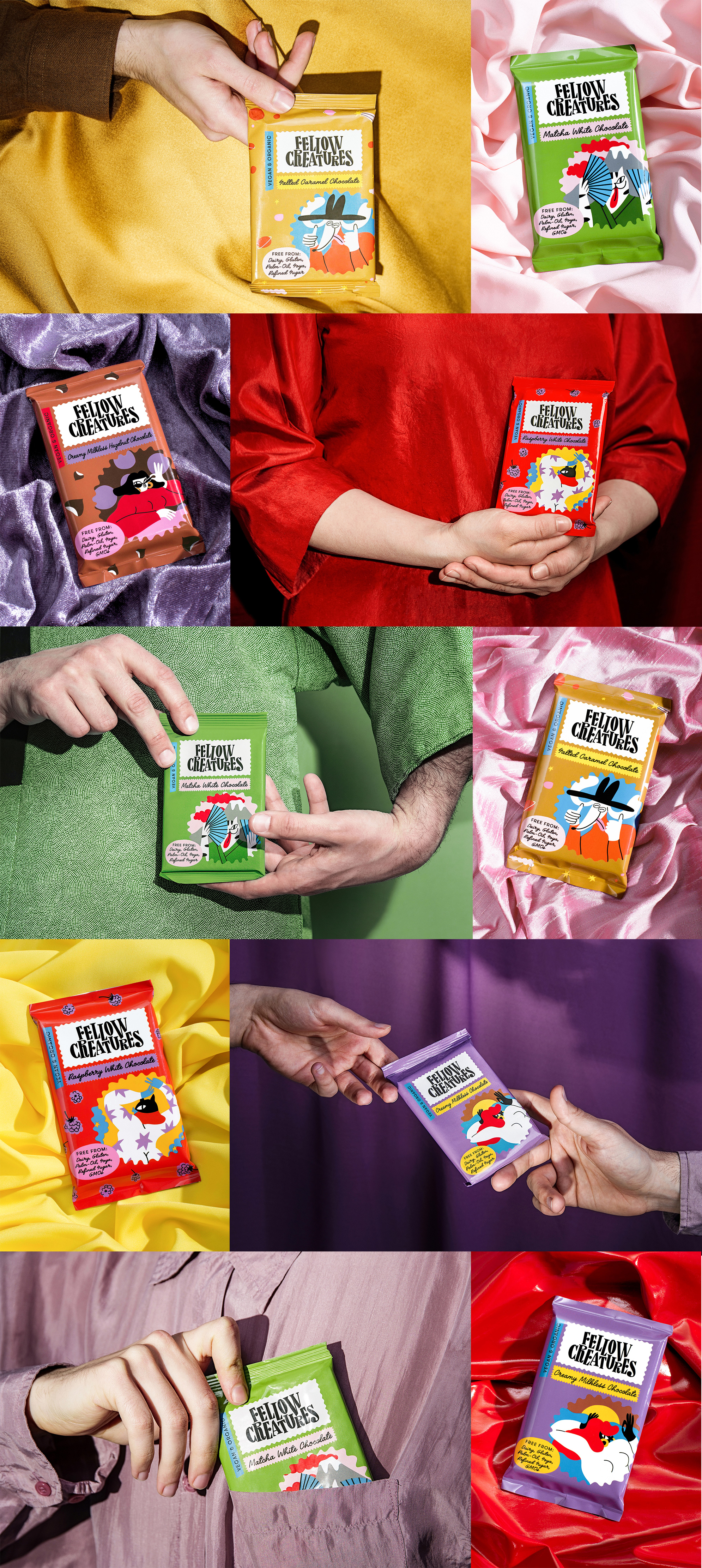
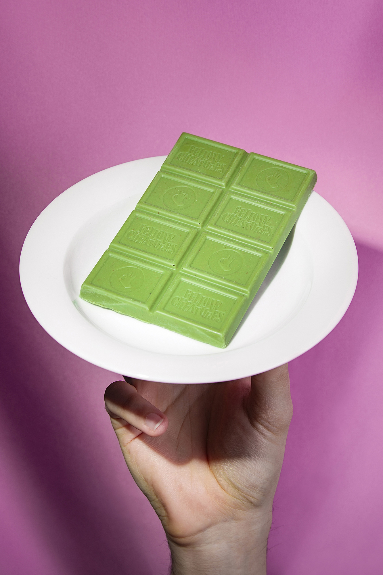
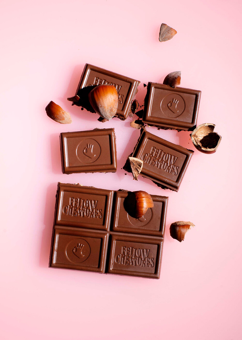
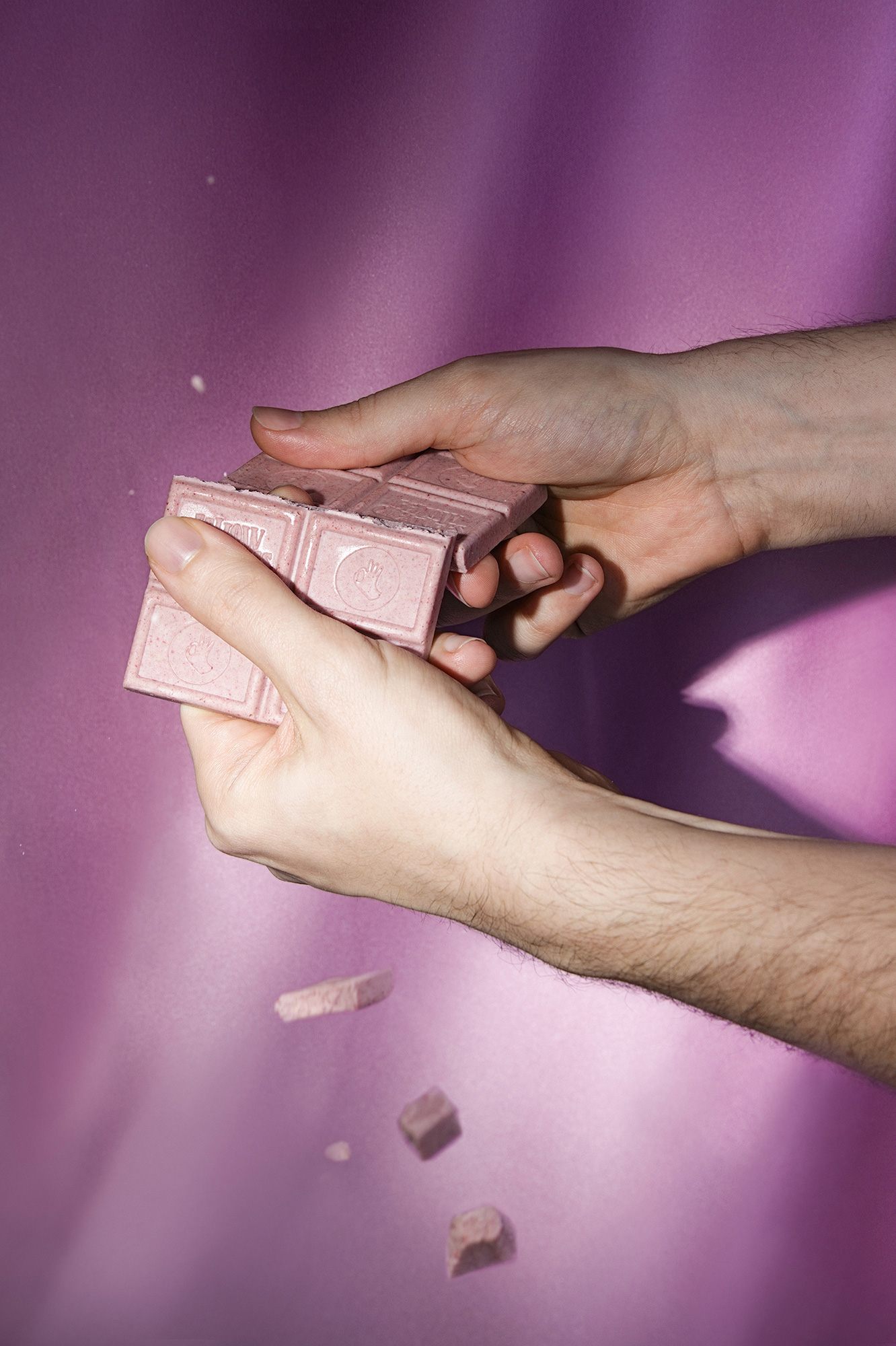
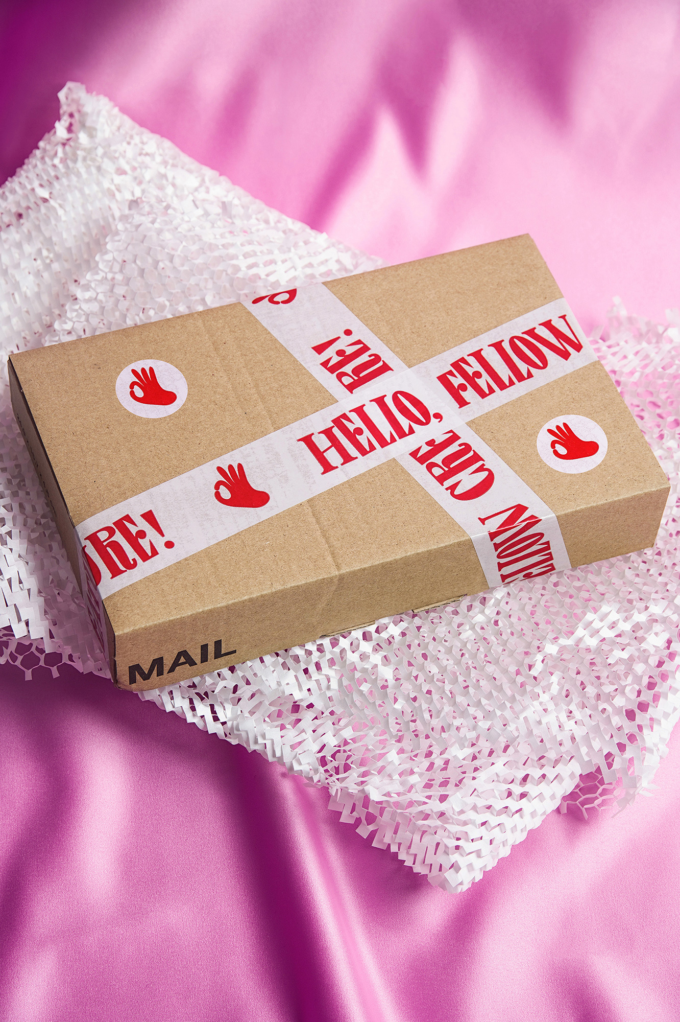
Established in 2019, Fellow Creatures is a brand of vegan chocolate based in Scotland with the claim of making the “creamiest, most velvety milk-style vegan chocolate ever”. Made with coconut butter, their chocolote is also dairy-free, gluten-free, and palm-oil-free as well as being done with a lot of heart and consideration for the world and its humans — read their about us page, it’s quite charming and uplifting. Available for worldwide shipping on their website and, recently, at Planet Organic, the UK’s largest fully certified organic supermarket, their chocolate is also available as a monthly subscription because yes please. The identity and packaging for Fellow Creatures was designed by Budapest, Hungary-based Classmate Studio.
We created a unique, friendly, and colourful identity and package design for them that represents the personality of the company and distinguishes it on the market. We used contemporary and brave colour palettes and the layout of the package with organic shapes to support Egle Zvirblyte’s amazing characters and illustrations. The logotype was built up with our unique Fellow Serif font that gives a playful look for the brand. In addition we used Blitz as a contemporary script to compliment the stroke-line details and Walsheim as a playful, but simple body font. The main concept of the logo was to look as much fun as it’s possible to have the same visual result that we feel when we eat chocolate.
Like vegan chocolate, I don’t know if this logo is for everyone, I don’t even know if it’s for me. I’m somewhere between really liking it and really disliking but the latter is mostly due to the “R”s that look like “P”s with a horse’s tail coming out their front side. Other than that, I love the bounciness of the logo and super quirky combination of spiky serifs and big ball terminals in the “E” and “F” that give this a whole lot of character. On its own but more so when combined with the thin script typeface, the logo takes on a fun 1940s - ’50s googie aesthetic that I have always found quite enjoyable.
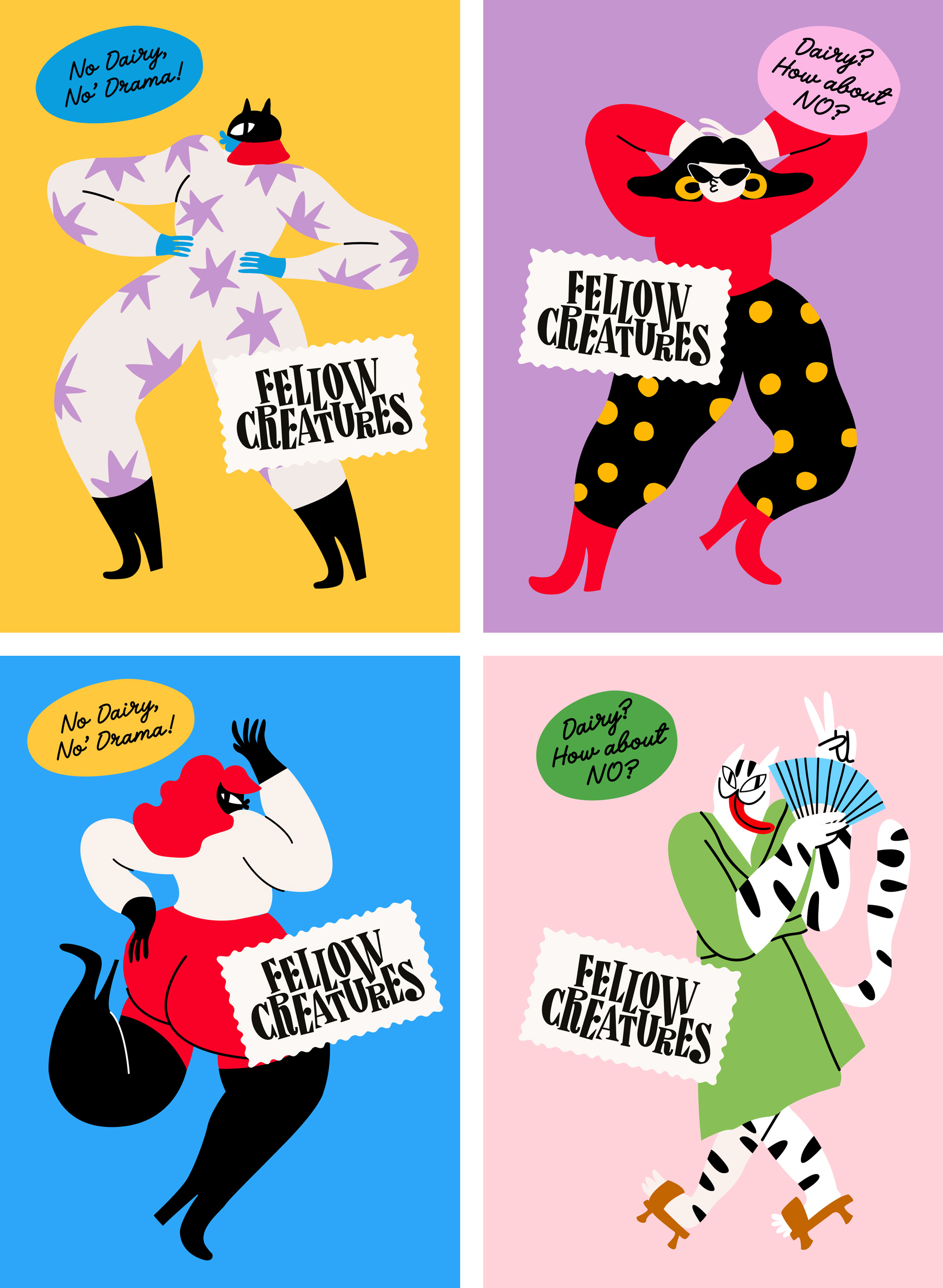
The illustrations, by London, UK-based Egle Zvirblyte, are great, with a cast of creatures that range from humans to cats to dogs all with exuberant proportions, gestures, and outfits.
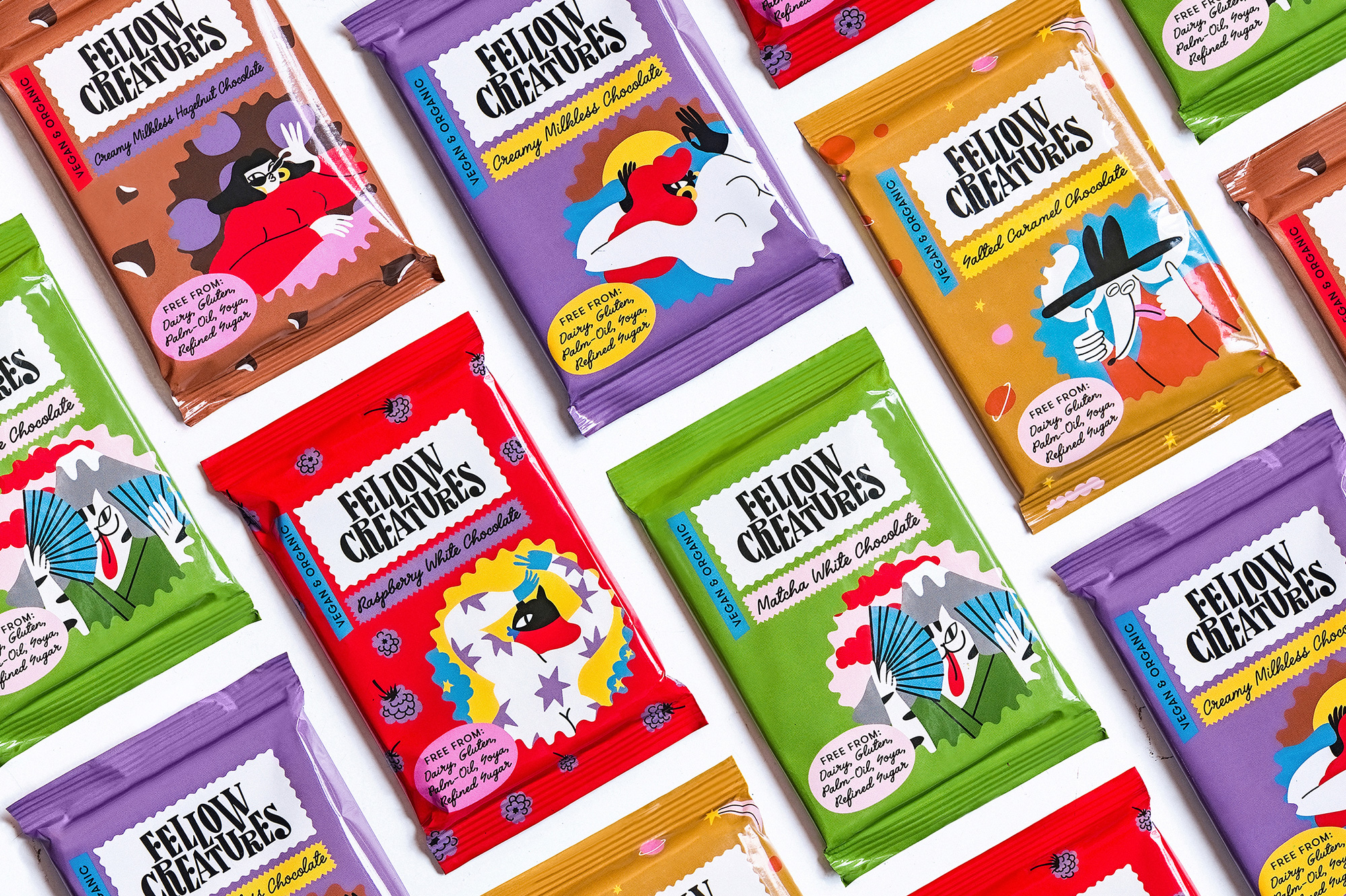
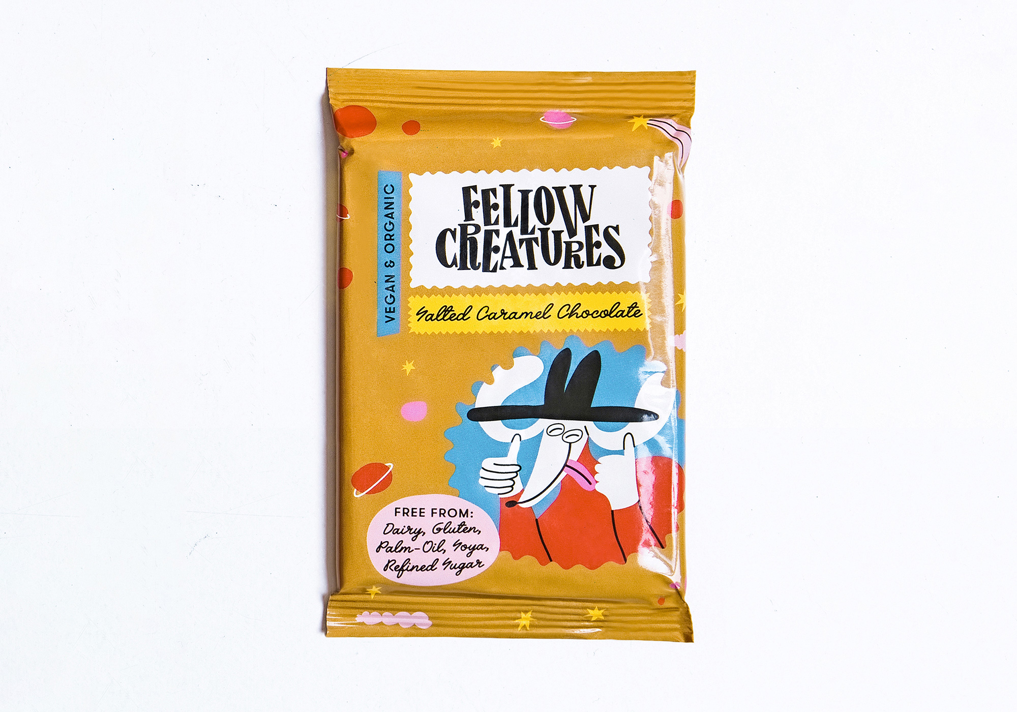
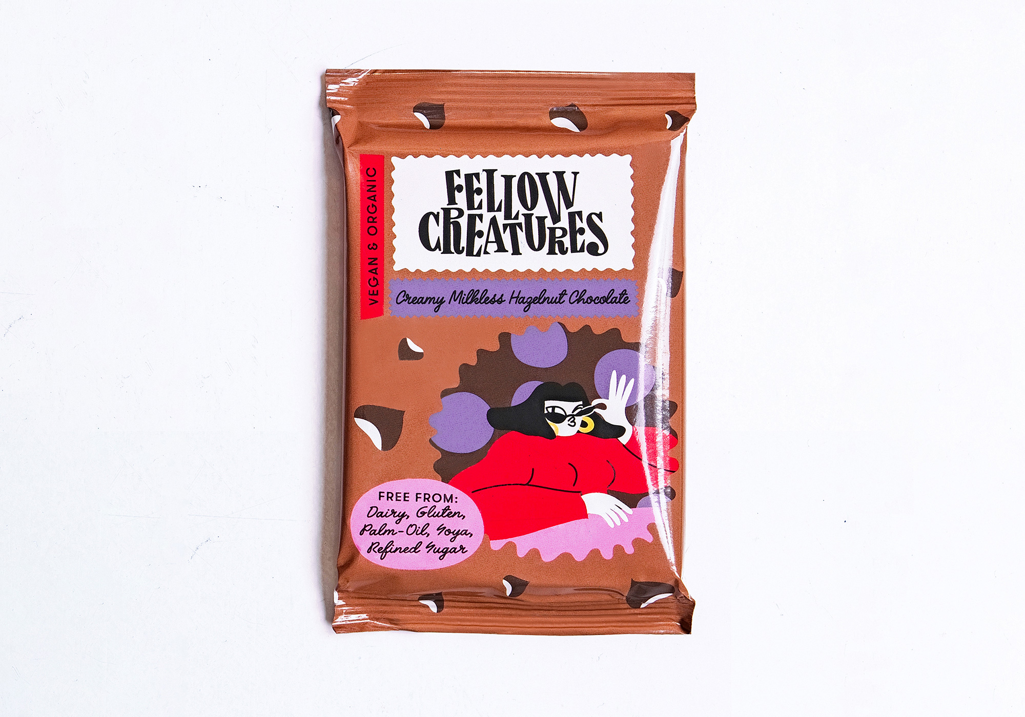
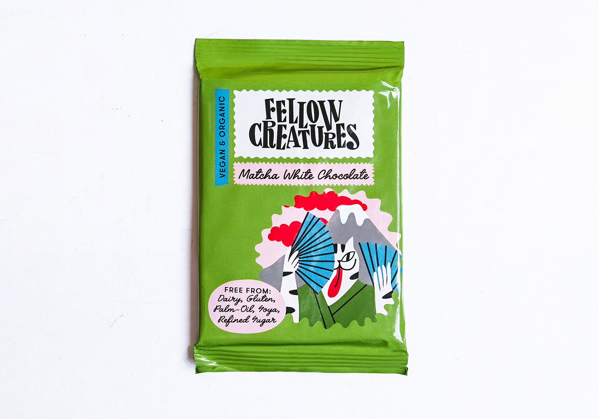
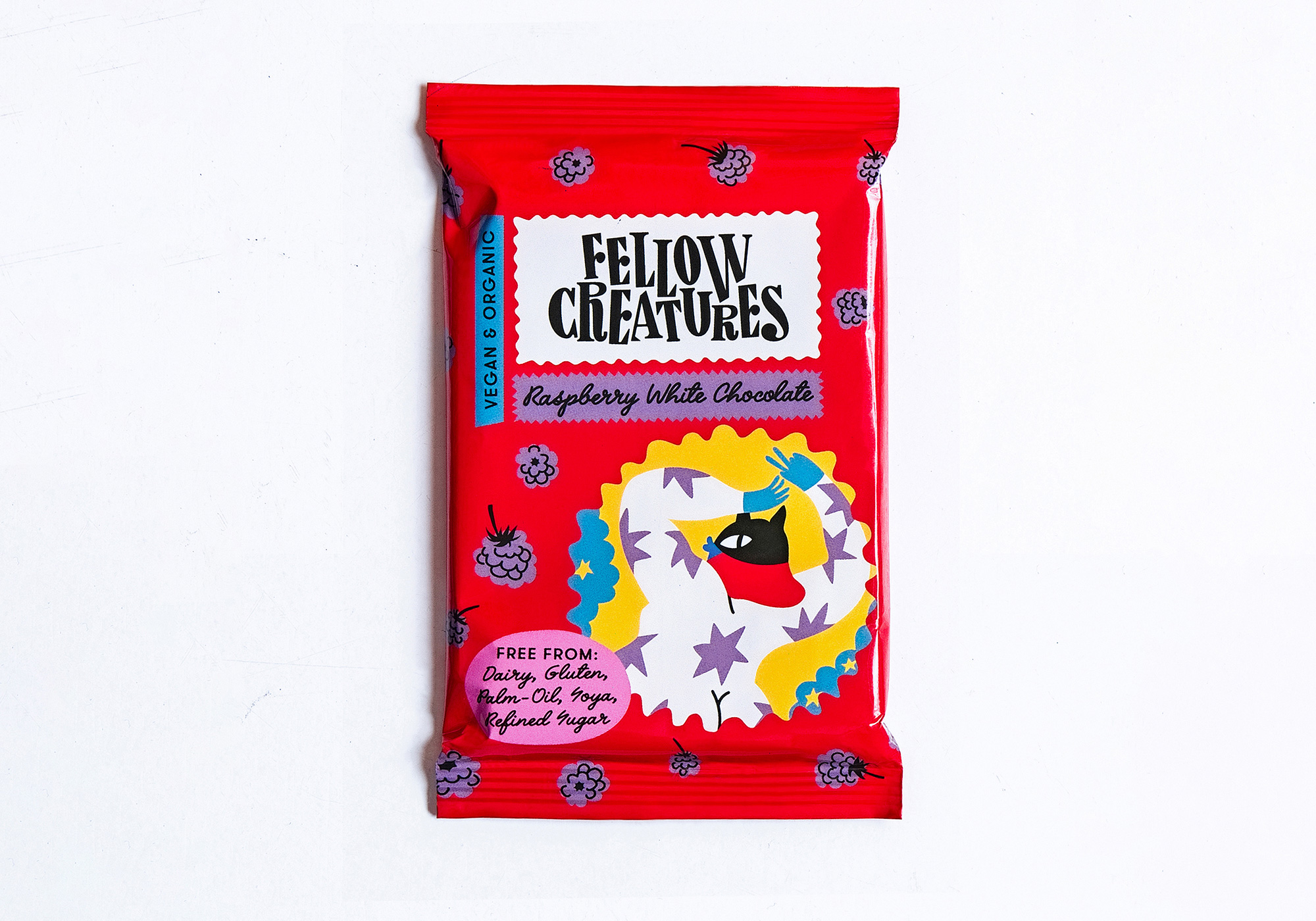
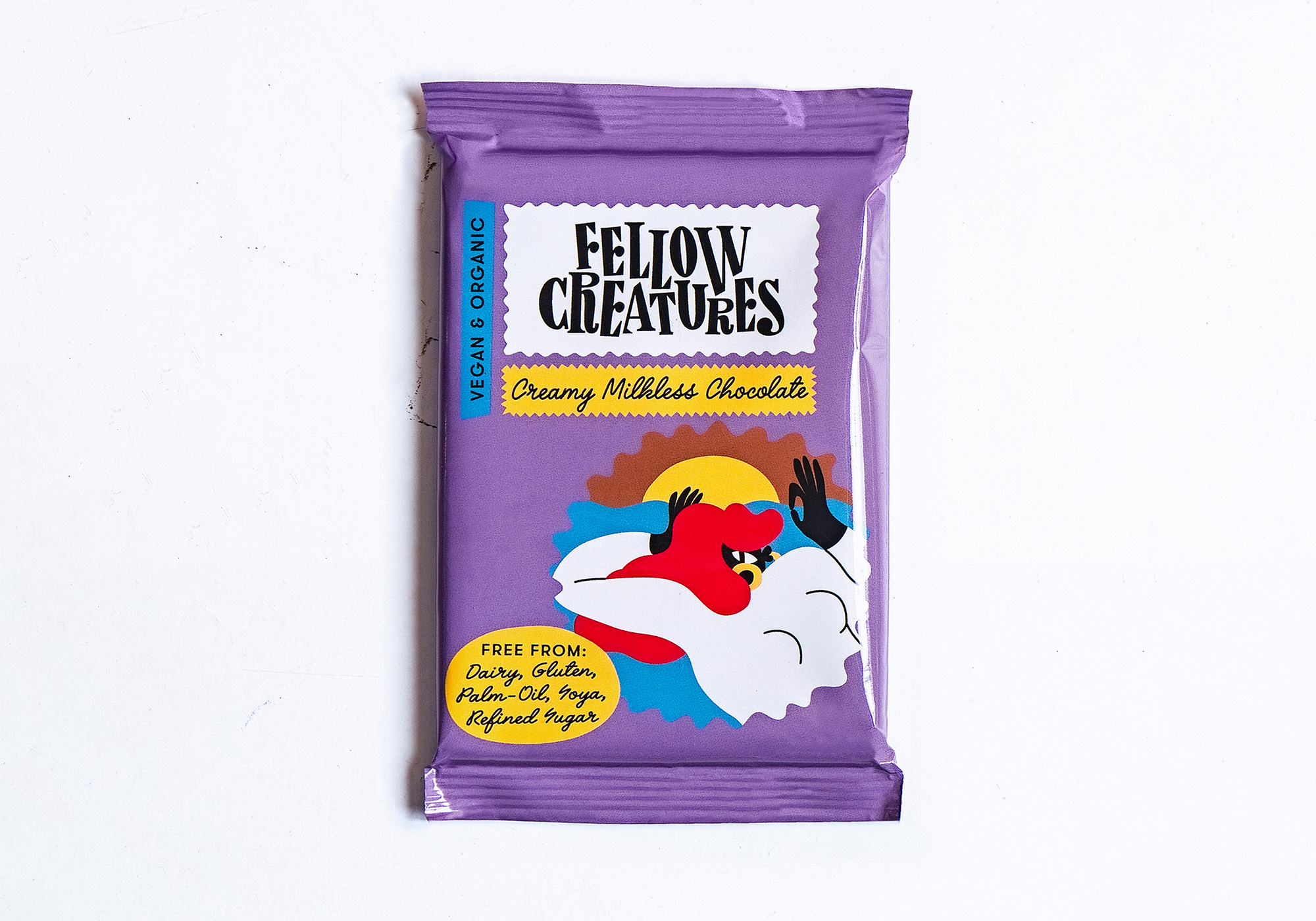
The packaging is fun, colorful, and energetic, mixing its various elements in literally groovy holding shapes that, even though they are all arranged the same across the different flavors, come across as distinctly varied. One detail that I really like is how all the illustrations have something black, which ties nicely to the black logo and typography.
A bonus

 Новости Союза дизайнеров
Все о дизайне в Санкт-Петербурге.
Новости Союза дизайнеров
Все о дизайне в Санкт-Петербурге.