Обзор лучших ресурсов по разработке бренда, разработке упаковки
contact us | ok@ohmycode.ru
contact us | ok@ohmycode.ru
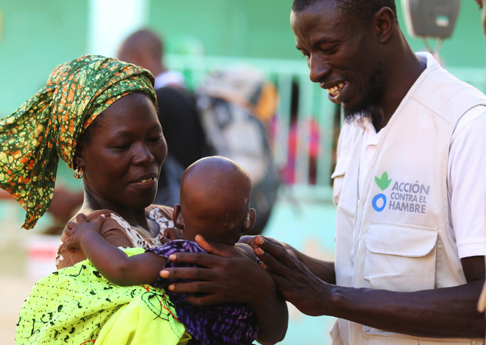
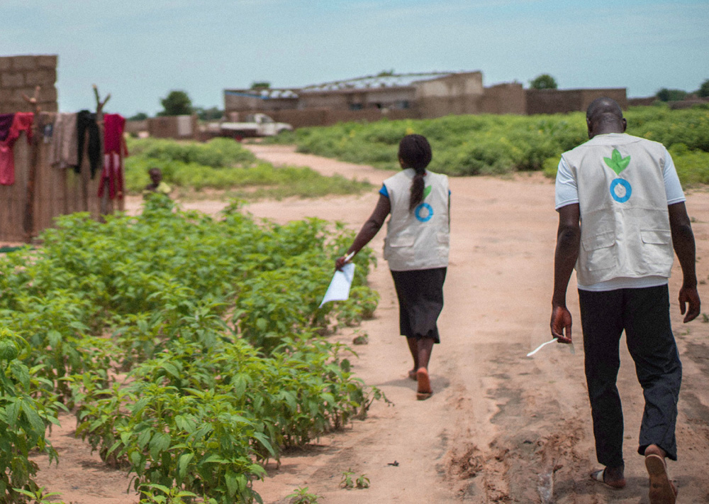
Established in 1979, Action Against Hunger is a “global humanitarian organization that takes decisive action against the causes and effects of hunger” with the mission to save the lives of malnourished children while providing communities with access to safe water and sustainable solutions to hunger. The organization is present in 45 countries with over 6,500 field staff assisting more than 14.9 million people by establishing nutrition; food security; and water, sanitation, and hygiene programs. In 2015, it raised €76.3 million from private supporters and €219.5 million from public donors with 86.4% going directly to support these programs. This October, Action Against Hunger introduced a new logo and strategy designed and conceived by London, UK-based johnson banks.
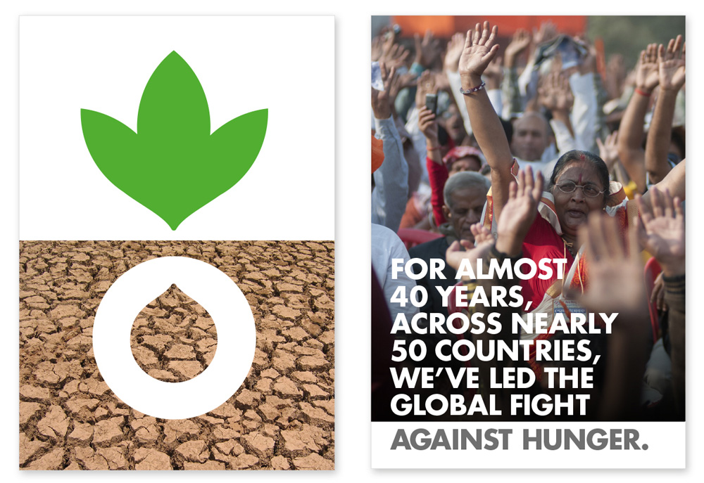
For decades, an illustrated plant and its root had been in use, and the organisation was in two minds about this. For long-term employees, it had longevity and familiarity on its side. For newcomers and outsiders, it was confusing - was it a symbol for a farming organisation, or (in some people’s eyes) a marijuana leaf? After lengthy discussions, and one false start, we agreed that a visual mark was imperative to ‘glue’ the organisation together, and it needed to evolve from the old symbol in some way.
Their new symbol replaces the ambiguity of the old by simply representing two key elements of their work - food and water - whilst tweaking and adapting the core colours. As one employee pointed out if we’re driving into a warzone in Mali and people can’t read our logo, at least they should be able to recognise our symbol. We can also incorporate the symbol into the typography in certain applications.
The old logo — or various old logos, for that matter — had undoubtedly poor execution but it was mostly clear by spelling out the name big and bold (in most instances). The icon was hard to understand as it doesn’t quite convey the idea of “food” as it focused more on the food security aspect of its programs by representing farming more than the immediate solution of a meal. The new logo doesn’t solve the ambiguity of the icon as it’s still a leaf but more than being descriptive, the logo needs to be recognizable to communities of people that are not sitting idly trying to interpret the meanings of logos but looking for a recognizable visual device that helps them survive. Maintaining the equity of the logo is a good move and evolving it to include water is an improvement that extends the mission of the organization beyond food. Execution-wise, the icon is nicely done with minimal elements and curves. (Betting on at least 7 people saying “It looks like the Adidas logo”.) The wordmarks in the different languages replace Futura Condensed from the old logo with Futura Bold and have a simple structure of three lines where “Action” is always at the top, “against” in the middle, and “Hunger” in the bottom. The varying type sizes across all three lines and across all examples drives my graphic-OCD bonkers but it’s perfectly understandable why it has to be that way and easily adapt to any language.
We were looking for a rallying cry that could work in dozens of languages, and realised that there is a ‘for’ and ‘against’ in every language - pour/contre, para/contra, für/gegen, and so on. Therefore a clear for/against theme emerged which is proving to be very flexible, links well to their name and offers a clear response to the question, ‘why are you here?’ ‘For action, against hunger’.
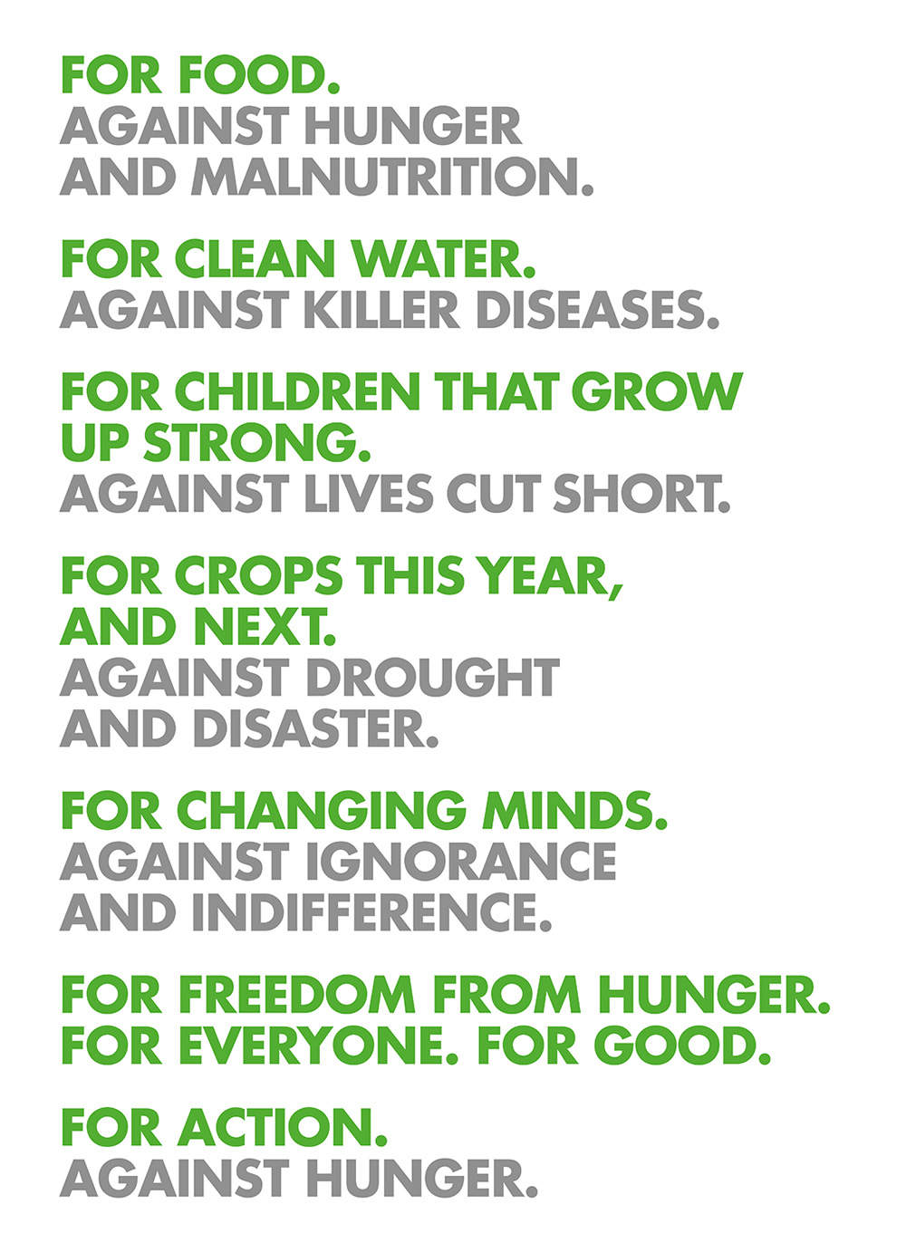
As with any johnson banks project, writing is a big piece of the brand and the “for/against” structure is one more great piece of verbal branding that handily captures the various goals of the organization and can be translated into any language.
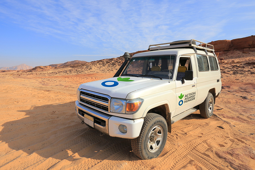
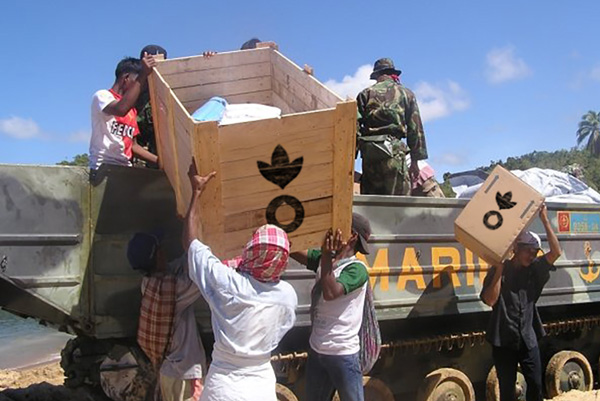
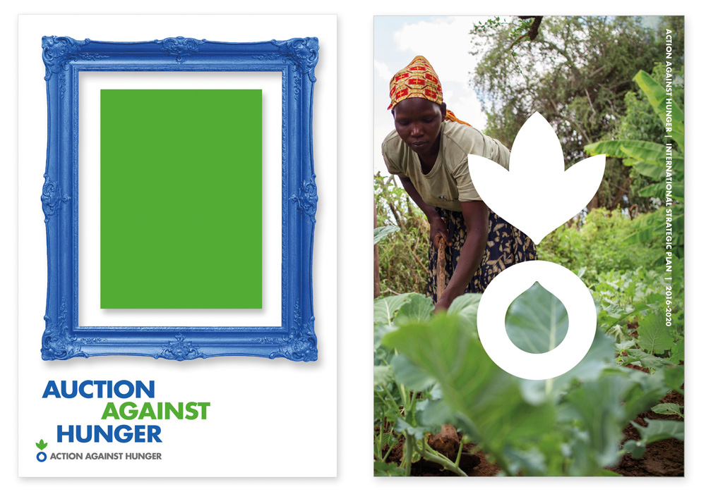
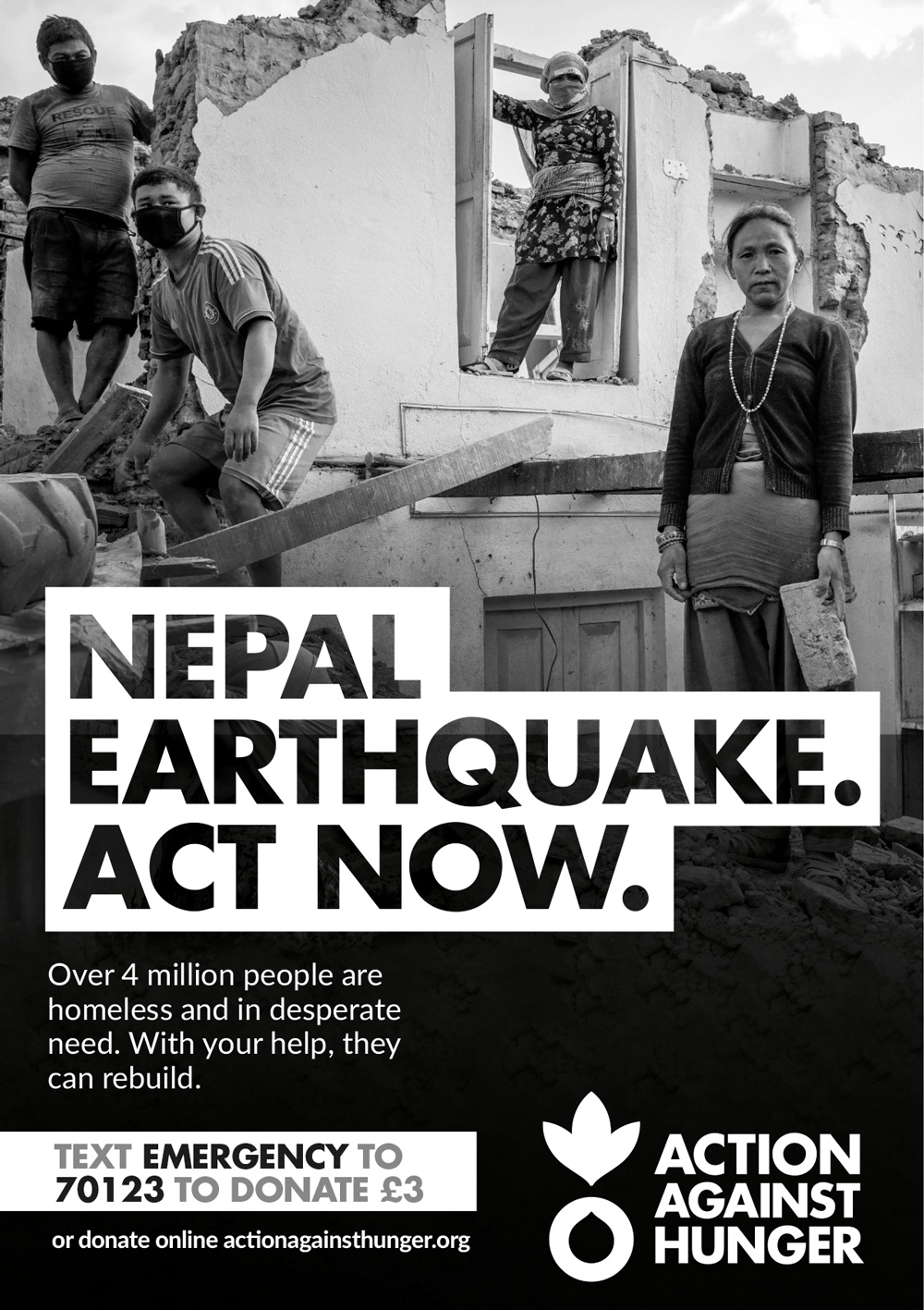
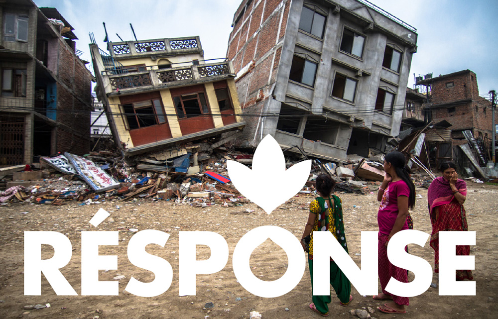
In application, there is no need for fancy footwork: you want the logo to be clear and easy to see and the messages to be loud and clear. The logo in color or black and white is easily discernible and effective while Futura Bold, set in anything over 21pt, will always convey a sense of urgency. The blue and green color palette may not be the most thrilling in the world but in its equity with the brand and quick associations with earth and water, there is no need to do anything else. Overall, a great improvement that clarifies and solidifies the essence of the organization while also establishing a sophisticated identity that will help with fundraising efforts.

 Новости Союза дизайнеров
Все о дизайне в Санкт-Петербурге.
Новости Союза дизайнеров
Все о дизайне в Санкт-Петербурге.