Обзор лучших ресурсов по разработке бренда, разработке упаковки
contact us | ok@ohmycode.ru
contact us | ok@ohmycode.ru
Established in 2008, OneFootball is a football (soccer) media platform headquartered in Berlin, Germany. Its flagship product is a mobile app that, among other traits, users can customize to follow their favorite team and is complemented by a very strong social media presence, reaching altogether more than 70 million fans worldwide every month. Its audience skews heavily young, with 75% in the 13 to 34 demographic and, interestingly, 93% is male. With regional offices in London, New York, Mexico City, and São Paulo, OneFootball operates a 24-hour newsroom to generate and provide a comprehensive stream of content that includes statistics and live scores of 200-plus leagues and competitions worldwide as well as breaking news, highlight clips, transfer rumors, and live streaming. This week, OneFootball introduced a new identity designed by DesignStudio.
OneFootball needed a brand that would adapt to the rhythm of every fan. A ‘vibesmith’ that would understand the mood, set the tone and generate buzz before, during and after the game. Our strategy of ‘Hype The Game’ brought this to life with impact and vibrancy.
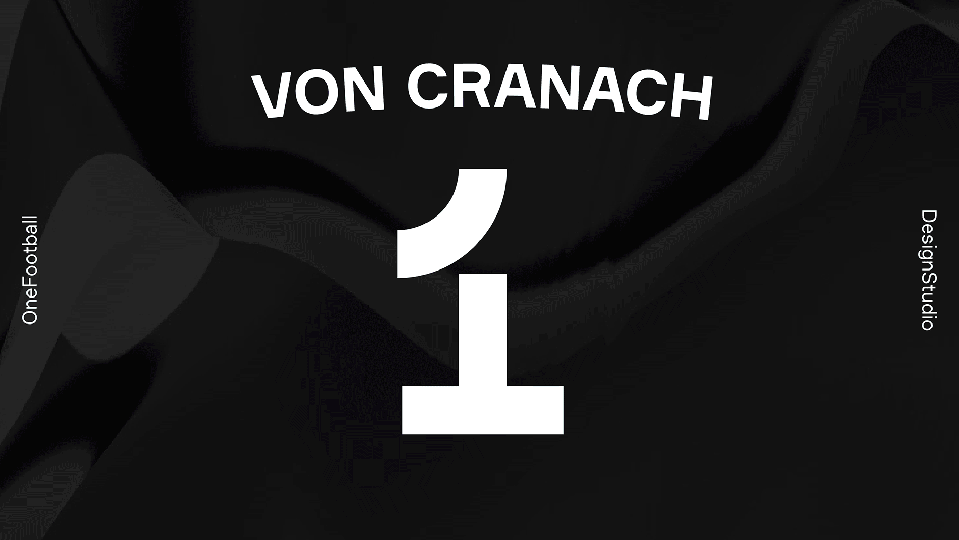
We gave the symbol its mojo back with a simpler design to represent the number ‘1’ and to demonstrate a person kicking a football. We combined this with our ‘Hype generator’, developed in collaboration with Artificial Rome it’s the ultimate design tool for generating exciting visuals no human could re-create. It has three states: Fracture, Neutral and Flux; ranging from jerky, tense movements to smooth flowing motions affecting everything from the logo, type and graphic patterns.
The old logo used the football pictogram from the 1972 Summer Olympics in Munich. Given that the company started in Germany and is about football, I guess it made sense. Lazy but made sense. The icon was accompanied by an interesting wordmark but perhaps with too different a personality than the icon. The new icon almost made me fall out of my seat when I saw it: At first I thought it was only a “1” with a ball as a period but then I quickly realized it was a “1” AND it was a pair of legs in the motion of kicking a ball. Damn. So good. This is my favorite icon of 2020 so far. Not only is it clever and perfectly executed to convey its double reading but its bold, italic motion also fits the young audience and their need for quickly-consumable content. The wordmark plays a very secondary role, only appearing on the footer of the website, and it’s more or less fine, perhaps trying a little too hard to be cool with the “N” and “A” echoing the joints of the icon and I wonder if they should have pushed it all the way by those two letters being segmented — or left alone because as they are they look weird.
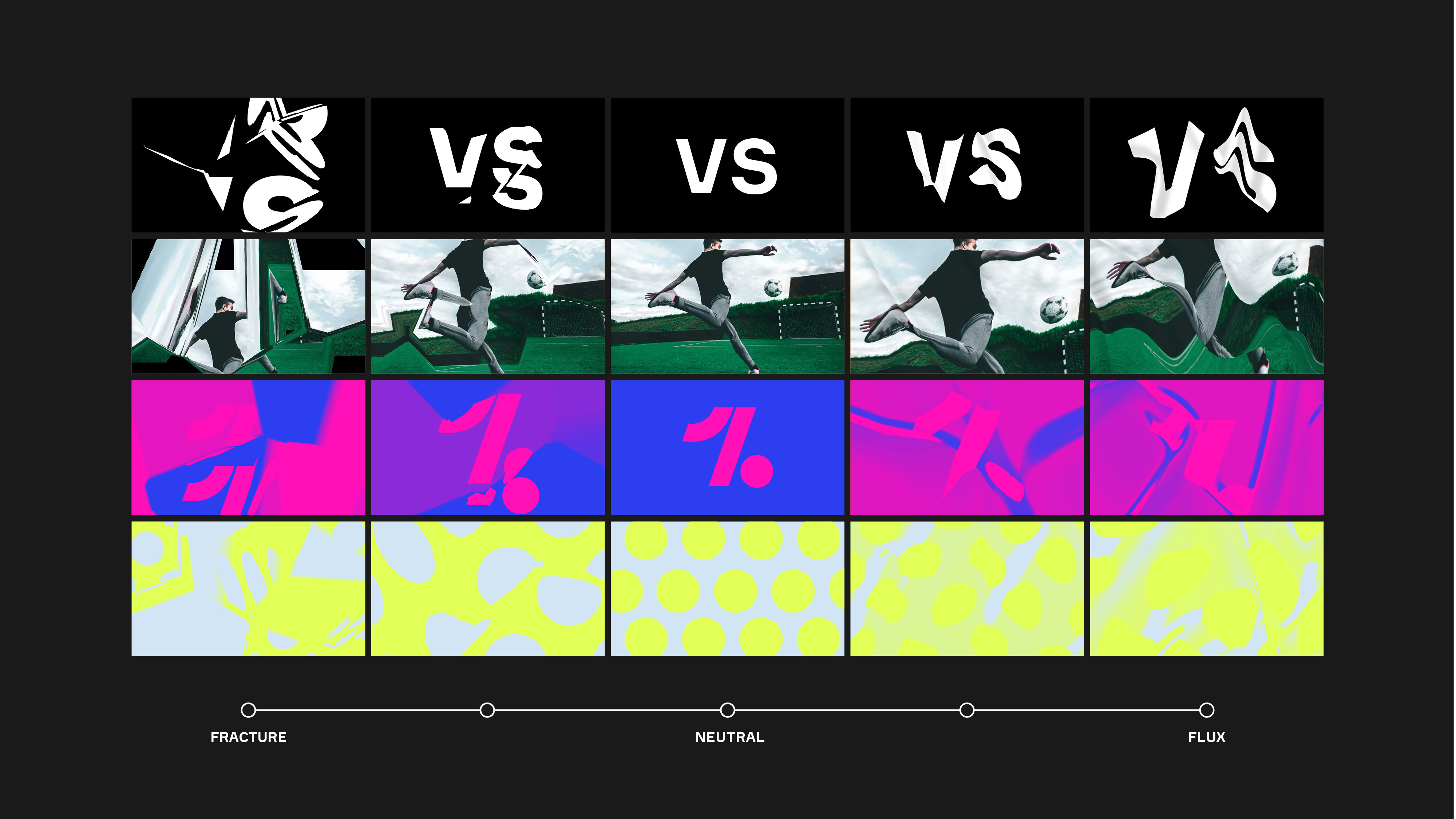
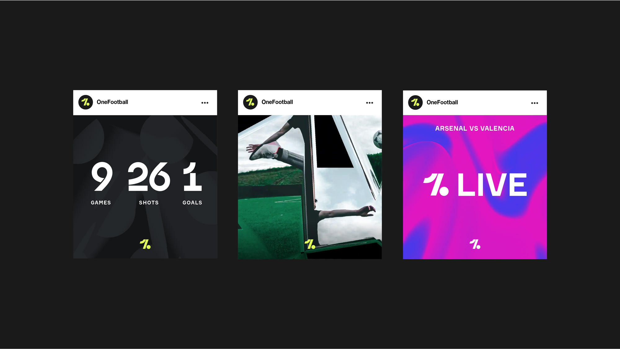
Things then start to get a little weird or, at least, depart from my 42-year-old demographic, with a generator that distorts the icon, the typography, and patterns across a spectrum of “hype” that goes from jerky “Fracture” to wavy “Flux”. This is literally visual hype adding a 100% stylistic layer over the icon and shapes that is pretty much unrelated to football. Now, I’m not saying it’s wrong because I think this is perfect for the audience and it adds a sense of excitement to the content to basically build up the hype. It’s simply cool for the sake of being cool and, for better or for worse, I think it succeeds.
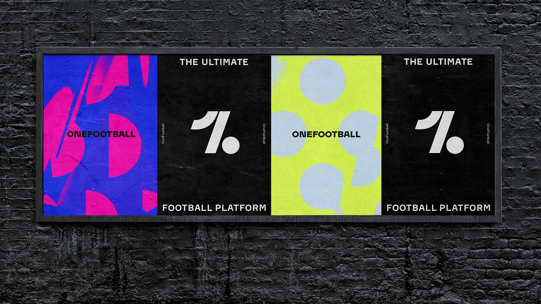
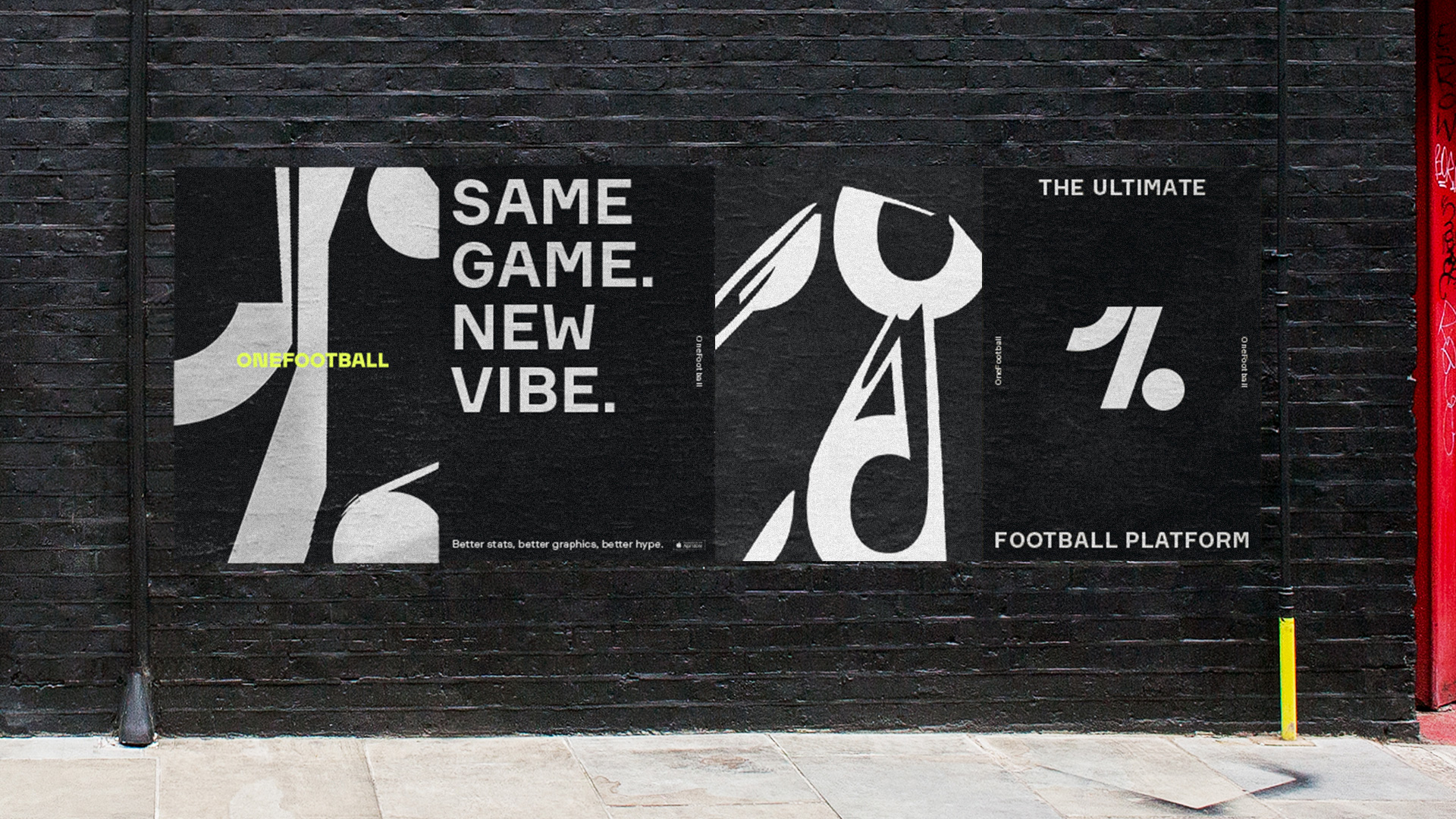
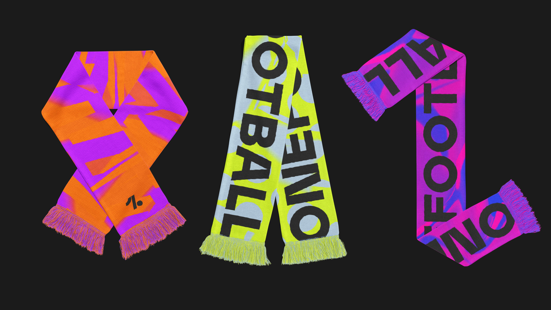
This reminds me of the (Electronic Sports League) project, which I mention not to say that it’s a stylistic copy but that after seeing the applications I got a sense that this could all easily apply to the esports industry which, again, points to the appropriateness of this identity for the young, male demographic at the platform’s core. The few, judge-able, applications shown — those being the posters, as I don’t know what to do with the spinning-glove-and-Playstation-controller information — are visually striking in a literal way but there really isn’t much to them, which, once more, it may leave me feeling like a lot is missing but, as my kids say, “That sounds like a you problem”.

Overall, this is quite good for the audience and adds a whole layer of coolness to OneFootball that can be merchandise-d and further establish the visual language of the platform across its app and social media channels. Lastly, one more shoutout to the icon because damn.
 each year since publication began in 2006

 Новости Союза дизайнеров
Все о дизайне в Санкт-Петербурге.
Новости Союза дизайнеров
Все о дизайне в Санкт-Петербурге.